Designs made by our community
Staff-picked ads, product scenes, and brand assets made in Hiding Elephant. See what production-ready creative looks like, then start your own.






















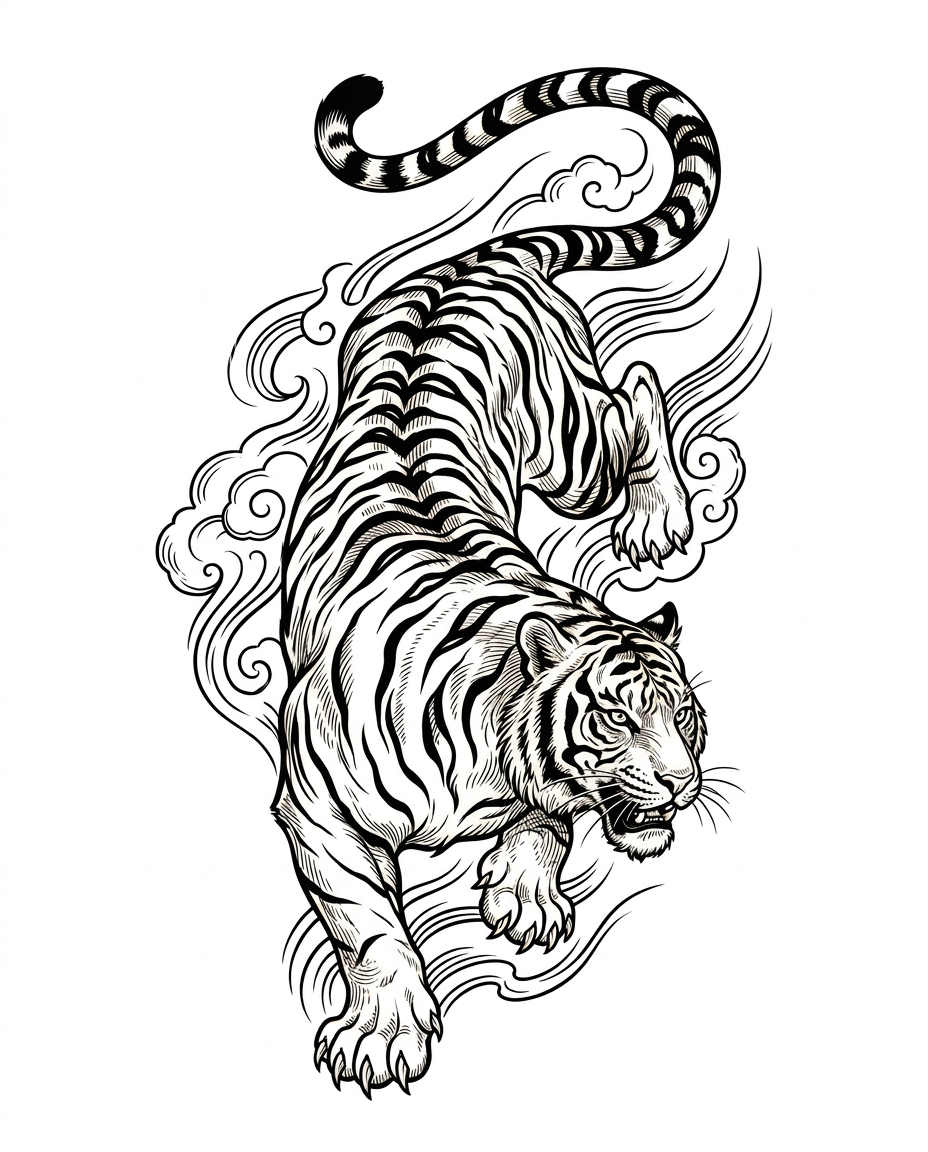
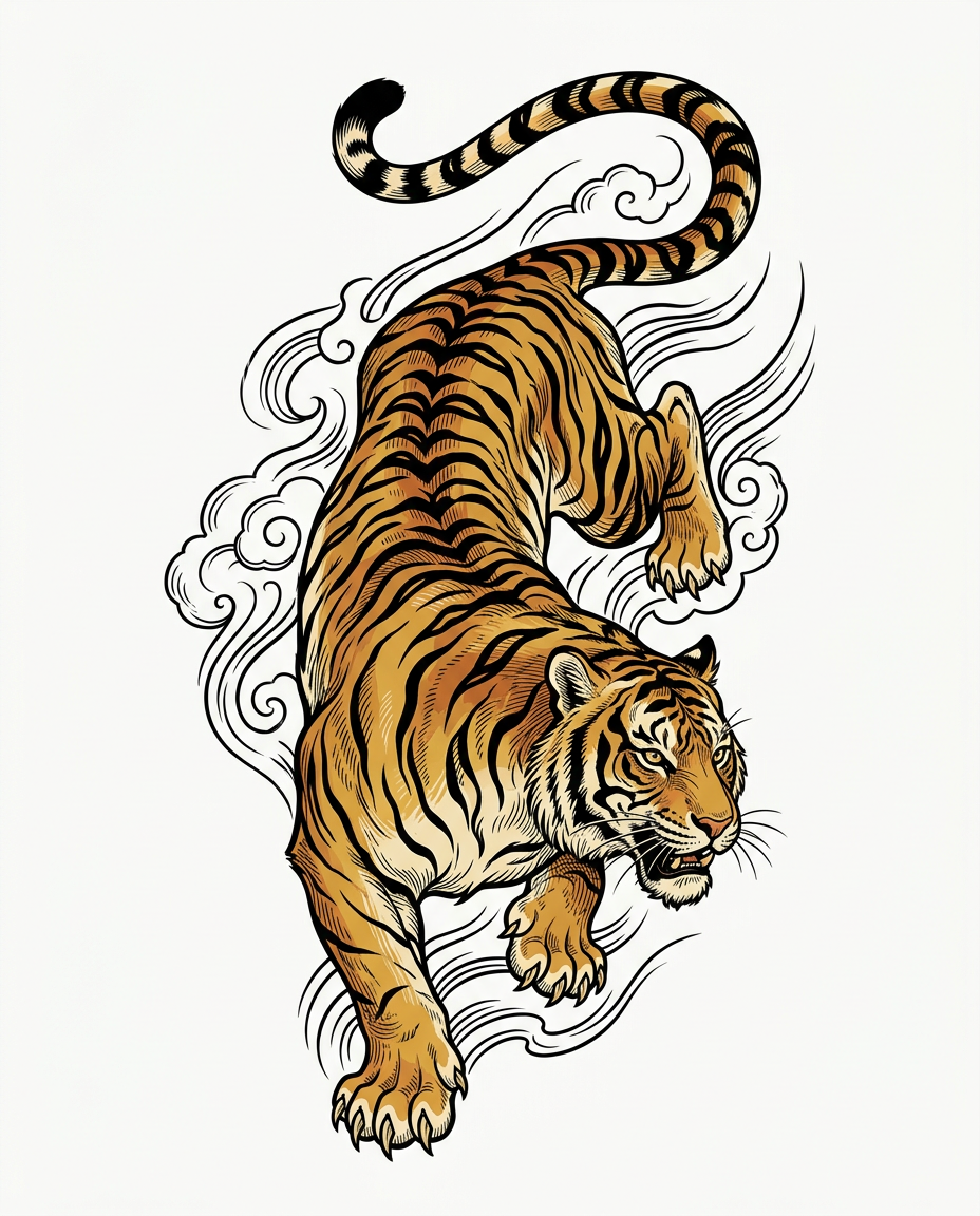
BIG CAT ENERGY — Japanese Traditional Big Cat Illustration Series Objective: Create a premium, highly detailed Japanese-inspired animal illustration for a contemporary luxury coffee brand called BIG CAT ENERGY. The illustration will serve as the central graphic artwork for a premium product packaging collection. ART STYLE AND REFERENCE DIRECTION Use the three supplied reference images as direct visual references for artistic style, linework, animal anatomy, composition, and rendering technique. Combine the visual characteristics of traditional Japanese ukiyo-e woodblock prints, vintage Japanese tiger posters, expressive sumi-e ink painting, and contemporary Japanese tattoo-inspired animal illustration. Reference the first image for the tiger's powerful anatomy, dynamic descending pose, expressive face, intricate stripes, and traditional Japanese printmaking aesthetic. Reference the second image for energetic brushwork, fluid movement, expressive black contours, dramatic animal interaction, and the contrast between dark ink and warm spotted fur. Reference the third image for bold vector-like outlines, stylized but anatomically convincing animal forms, carefully illustrated spots, swirling ornamental forms, and confident graphic composition. Translate these qualities into a refined, original illustration with the craftsmanship of a traditional Japanese animal print and the clarity of contemporary vector artwork. Do not reproduce the reference images literally. Create an original illustration that captures their visual language. ILLUSTRATION TECHNIQUE Create the artwork using crisp, controlled, hand-drawn contours with deliberate variations in line weight. Combine strong outer silhouettes with intricate internal linework, engraved details, selective crosshatching, and carefully layered color shapes. The illustration should have the visual richness of a hand-carved woodblock print while maintaining the precision and scalability of professional vector art. Use: Bold, confident exterior contours. Fine internal lines defining anatomy, musculature, facial structure, and fur patterns. Traditional Japanese ink-inspired brush marks used selectively. Layered, clearly separated color regions. Stylized directional strokes that communicate movement, tension, and physical power. Carefully controlled negative space around the animal. Flat, saturated colors with restrained tonal shading. Subtle handmade irregularities that give the artwork an authentic printmaking character. Avoid photographic fur, airbrushed gradients, glossy 3D rendering, and generic digital painting. Every mark should appear intentional, graphic, and suitable for professional reproduction. ANIMAL DESIGN Illustrate one powerful big cat as the sole primary subject. Preserve realistic species-specific anatomy while allowing expressive stylization through posture, facial expression, and linework. The animal must have: Anatomically convincing proportions. A clearly defined head, shoulders, torso, legs, paws, and tail. Expressive eyes and a strong, recognizable facial structure. Carefully rendered fur markings appropriate to the specific species. Natural articulation and convincing weight distribution. A distinctive silhouette that remains recognizable when reduced to a small packaging emblem. The animal should feel commanding, instinctive, elegant, and powerful—not cute, friendly, or cartoonish. COMPOSITION Create a vertically oriented illustration with the animal occupying most of the canvas. Use a dynamic, flowing pose inspired by traditional Japanese animal prints. The body should create a strong visual rhythm through curved anatomy, directional movement, and a balanced arrangement of limbs and tail. Maintain a clearly readable silhouette and allow sufficient breathing room around the animal. Optional supporting elements may include restrained Japanese-inspired wind strokes, stylized clouds, flowing water, abstract mountain contours, or a small number of botanical accents. These elements must remain secondary and must never compete with the animal. The composition should work both as a standalone art print and as a central graphic on premium coffee packaging. COLOR AND SURFACE Use a sophisticated, limited palette appropriate to the selected animal. Render colors as distinct, clean shapes that could be separated into print layers. Metallic effects should be suggested through carefully designed highlight shapes rather than realistic reflective rendering. The illustration must remain visually strong against a dark charcoal or black background, with a silhouette that can also be adapted to a transparent background. OUTPUT REQUIREMENTS Produce a single, finished animal illustration—not a packaging mockup. One animal only. Full animal visible, including tail and paws. Centered, vertically composed artwork. Clean, uncluttered background; preferably transparent, or plain white if transparency is unavailable. No coffee bags, boxes, labels, bottles, cups, or other products. No typography, lettering, logos, Japanese characters, or decorative text. No frames or presentation boards. No photographic textures or realistic studio environments. Sharp contours, high detail, and print-ready visual clarity. Suitable for later vector tracing, refinement, and professional packaging production. Final aesthetic: A striking Japanese-inspired animal illustration combining traditional woodblock-print character, expressive ink work, bold contemporary vector contours, and premium graphic-design discipline. It should feel timeless, collectible, powerful, and unmistakably crafted rather than generated from a generic animal illustration template.
by @Elephant_1649093
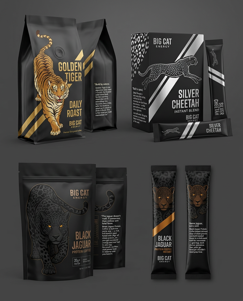
Create a highly sophisticated, commercially viable packaging design collection for BIG CAT ENERGY, a premium coffee brand built around the power, instinct, elegance, and distinctive character of big cats. Design four coordinated but visually distinct product SKUs: GOLDEN TIGER — DAILY ROAST — 12 oz ground coffee in a valve bag. SILVER CHEETAH — INSTANT BLEND — instant coffee stick packs and an outer box. BLACK JAGUAR — PROTEIN COFFEE — premium stand-up pouch. BLACK JAGUAR — PROTEIN COFFEE INSTANT — individual instant coffee stick packs. Use the three attached reference images as the primary visual direction. Study their linework, animal anatomy, composition, color relationships, movement, traditional Japanese visual language, and dramatic use of pattern. The goal is to translate these visual qualities into a unified, premium contemporary packaging system that feels collectible, powerful, timeless, and immediately recognizable on a retail shelf. 2. Core Art Direction: Japanese Traditional Animal Illustration Develop the illustrations using a sophisticated fusion of traditional Japanese ukiyo-e woodblock printing, Japanese ink painting, vintage Japanese tiger posters, and contemporary Japanese tattoo-inspired animal illustration. Reference image interpretation: Reference 1 — Traditional tiger poster: Follow its commanding tiger anatomy, dynamic forward movement, curved striped body, dramatic mountainous scenery, strong silhouette, and vintage Japanese printmaking character. Translate its bold composition into a refined central tiger emblem suitable for luxury coffee packaging. Reference 2 — Japanese ink painting of battling big cats: Study the expressive brushwork, gestural outlines, fluid movement, energetic negative space, and controlled combination of solid black and warm spotted fur. Apply these qualities selectively to the jaguar and cheetah illustrations without overcrowding the packaging. Reference 3 — Contemporary Japanese-inspired spotted cat illustration: Study the bold, confident contour lines, stylized anatomy, intricate spots, swirling cloud forms, cherry-blossom accents, and strong graphic separation between foreground and background. Adapt these elements into a more restrained, premium, print-friendly visual language. Do not copy the reference compositions literally. Use them as a cohesive artistic vocabulary and create original animal illustrations specifically composed for each package format. 3. Illustration Technique Create artwork that looks like expertly crafted vector illustration informed by traditional printmaking. Linework and anatomy Confident, deliberate outlines with a mixture of heavy exterior contours and delicate internal detailing. Anatomically convincing big cats with expressive faces, powerful shoulders, natural joints, articulated paws, and believable body proportions. Elegant, controlled curves that communicate weight, tension, agility, and forward motion. Carefully illustrated whiskers, facial markings, ears, claws, musculature, and fur patterns. Intricate but intentional detail, with sufficient simplification for small-scale printing. Printmaking character Subtle woodblock-inspired irregularities and hand-inked character incorporated into clean vector shapes. Layered engraved lines and selective crosshatching to suggest volume. Controlled tonal separation rather than airbrushed gradients. Solid, clearly defined shapes suitable for metallic foil stamping, screen printing, embossing, and spot-color production. A balance between traditional Japanese illustration and contemporary luxury graphic design. The finished illustrations must appear intentional, art-directed, and professionally finished—not like stock animal graphics or unrefined AI-generated artwork. 4. Brand Identity and Shared Packaging System Brand name: BIG CAT ENERGY Establish a consistent visual identity across all four SKUs using: Matte charcoal-black or deep black foundations. A restrained palette of metallic gold, antique bronze, silver, gunmetal, and amber, depending on the product. Large, bold, condensed uppercase typography. A distinctive central animal emblem. Strategic use of negative space and controlled ornamental detailing. Diagonal or vertical graphic bands that reinforce speed, power, and direction. Fine Japanese-inspired ornamental elements used sparingly. Premium tactile finishes that remain realistic and feasible for commercial packaging. The words BIG CAT ENERGY should function as the master brand identifier. Product names should be more prominent than secondary descriptive copy. Typography should be bold, legible, and contemporary, with subtle influence from vintage Japanese poster lettering and premium spirits labels. Do not use illegible faux-Japanese characters, random kanji, or decorative text that resembles Japanese writing without meaning. Avoid an overly themed souvenir aesthetic. The Japanese influence should come primarily from the illustration, composition, linework, and graphic rhythm rather than excessive decorative symbols. 5. SKU ONE: GOLDEN TIGER — DAILY ROAST Packaging format A premium 12 oz ground-coffee bag with a one-way degassing valve. Show a realistic upright flexible coffee pouch with a matte charcoal-black finish, sealed top, gusseted base, and a visible valve where appropriate. Visual identity Mood: Bold, classic, powerful, refined, and timeless. Draw an original Japanese woodblock-inspired tiger as the central graphic emblem. The tiger should feel like a formidable mountain guardian, combining physical strength with controlled elegance. Depict the tiger in a powerful descending or forward-moving pose, with a muscular striped body, expressive face, focused eyes, and meticulously illustrated fur markings. The tiger must be instantly recognizable through its orange-gold body, deep black stripes, warm cream highlights, and carefully controlled shadows. Graphic composition Matte charcoal-black background. Gold foil tiger stripes running diagonally or vertically across the front. Large central tiger illustration in warm antique gold, amber, and black. Optional restrained mountain contours, stylized clouds, or traditional Japanese landscape details integrated into the illustration. Strong, bold, condensed typography reading GOLDEN TIGER. Smaller uppercase descriptor reading DAILY ROAST. Master brand name BIG CAT ENERGY, positioned consistently with the other products. Use metallic gold selectively to highlight the tiger's stripes, eyes, selected contours, and graphic bands. The illustration should remain readable even when foil details are absent or reproduced in flat ink. The overall effect should evoke the gravitas of a premium whiskey label combined with a contemporary Japanese art print. Back-panel blend story Include the following copy exactly, with professional typesetting and comfortable readability: “Bold by nature. Golden Tiger is our signature daily roast — a rich, full-bodied craft blend built for the morning ritual that starts everything else. Smooth, never bitter, with the depth to stand up to cream or drink it black. This is the roast you build momentum on.” Arrange the copy in a clean, well-defined text block. Preserve the exact wording and punctuation. 6. SKU TWO: SILVER CHEETAH — INSTANT BLEND Packaging format Show a coordinated premium instant-coffee box containing individual slim stick packs. Include both the outer carton and several individual sachets to demonstrate how the visual identity scales down. Visual identity Mood: Fast, athletic, sharp, energetic, and technologically contemporary. Create an original Japanese-inspired cheetah illustration in profile, captured mid-stride. Its posture should communicate acceleration, agility, precision, and forward momentum. The cheetah should have anatomically convincing proportions, an elongated athletic body, distinctive tear markings, and accurately differentiated spots. Unlike the Golden Tiger, this design must emphasize movement over mass. Graphic composition Deep black base. Metallic silver cheetah-spot pattern, abstracted into geometric marks rather than literal photographic fur. One striking silver diagonal stripe cutting across the front of the box. A sleek silver line-art cheetah in profile, integrated into the stripe or positioned beside it. Bold uppercase typography reading SILVER CHEETAH. Smaller uppercase descriptor reading INSTANT BLEND. Consistent master branding: BIG CAT ENERGY. Use high-contrast silver against black, combining polished metallic highlights with matte silver ink and subtle gunmetal shading. Optional Japanese-inspired wind strokes or abstract motion lines may reinforce acceleration, but keep the design clean and disciplined. Individual stick-pack adaptation Create a simplified, instantly recognizable version for narrow sachets: Black background. One bold metallic silver stripe. Small cheetah icon or simplified profile silhouette. Compact, legible SILVER CHEETAH branding. Minimal secondary information. The small-format design must remain recognizable at a glance. Do not transfer the full box illustration onto the stick pack. Back-panel blend story Include the following copy exactly: “Built for speed. Silver Cheetah is zero-prep, fast-acting caffeine for the mornings you don't have ten minutes — or the pre-workout push you need right now. Just add water. No grind, no brew, no excuses. Same bold flavor, none of the wait.” Preserve the wording and punctuation. Use a clear hierarchy between the story, preparation instructions, product information, and mandatory packaging information. 7. SKU THREE: BLACK JAGUAR — PROTEIN COFFEE Packaging format A premium stand-up pouch with a matte-black surface, sealed top, and realistic flexible packaging construction. Visual identity Mood: Stealth, strength, restraint, intensity, and uncompromising premium quality. Create an original Japanese-inspired jaguar emblem with a powerful, compact physique, a focused expression, and a grounded, deliberate posture. The jaguar should feel different from both the tiger and the cheetah: heavier, quieter, more controlled, and more mysterious. Use deep black and gunmetal linework to render the jaguar. Its anatomy and silhouette should emerge gradually from the dark surface. The eyes should be the single vivid color accent: a restrained, luminous amber that feels intense and precise rather than supernatural or cartoonish. Signature surface treatment Matte-black packaging base. Extremely subtle black-on-black jaguar rosette pattern. Low-contrast, tactile patterning that becomes visible under directional light. Deep bronze or gunmetal line-art jaguar. Restrained amber eye details. Selective blind embossing or debossing to give the rosette texture physical depth. Minimal metallic detailing and generous negative space. The rosette pattern must be biologically recognizable as jaguar markings, not tiger stripes or generic leopard spots. The illustration should feel integrated into the material rather than placed on top like a sticker. Typography and layout Use bold, condensed, slightly aggressive typography with a premium performance-oriented aesthetic. Feature: BLACK JAGUAR PROTEIN COFFEE Include BIG CAT ENERGY as the master brand. Reserve a prominent, clean information area for the protein claim. Use 20g+ PROTEIN only if this quantity is confirmed for the final product formulation. The overall appearance should be the darkest and most understated design in the collection. Luxury should emerge through material, contrast, precision, and detail—not excessive decoration. Back-panel blend story Include the following copy exactly: “The jaguar doesn't rush. It conserves, then strikes with total force. Black Jaguar Protein Coffee is built the same way — a rich, full-bodied roast fused with 20g+ of clean protein, so you get sustained energy and real fuel in one cup. No crash, no filler. Just power held in reserve until you need it.” Preserve the supplied text exactly in the concept artwork. In final commercial production, substantiate protein and performance-related claims and ensure all required nutritional information is accurate. 8. SKU FOUR: BLACK JAGUAR — PROTEIN COFFEE INSTANT Packaging format A premium slim instant-coffee stick pack designed for portability, quick recognition, and consistency with the Black Jaguar Protein Coffee pouch. Visual identity Maintain the same visual language as the Black Jaguar pouch, but introduce one distinctive accent stripe to communicate grab-and-go convenience. Graphic composition Matte-black background. Subtle black-on-black jaguar rosette pattern. Deep bronze or gunmetal jaguar icon. Restrained amber eye detail. One bold bronze or amber stripe crossing the pack face. Compact, high-contrast BLACK JAGUAR branding. Smaller descriptor: PROTEIN COFFEE INSTANT. Master brand identifier: BIG CAT ENERGY. Simplify the jaguar into a highly recognizable emblem. Avoid tiny facial details, elaborate scenery, or intricate ornamental borders that will disappear at this scale. The accent stripe should be the key difference between the instant stick pack and the stand-up pouch. Preserve their shared black, bronze, and amber identity. Back-of-pack blend story Include the following copy exactly: “Same jaguar, zero wait. Black Jaguar Protein Coffee Instant delivers 20g+ of clean protein and bold roasted flavor in a stick pack built for movement — gym bag, desk drawer, glovebox. Tear, pour, go. Strength shouldn't need prep time.” Keep the concept typography minimal and readable. Include the product story as a layout demonstration, but do not fabricate ingredients, nutritional values, certifications, preparation instructions, or regulatory information that has not been supplied. 9. Unified Collection Presentation Present the four SKUs together in a premium packaging design showcase, with enough visual separation to evaluate each product individually. Arrange the products as follows: Golden Tiger — ground-coffee pouch. Silver Cheetah — instant-coffee carton with stick packs. Black Jaguar — protein-coffee stand-up pouch. Black Jaguar — protein-coffee instant stick packs. Show each package from a predominantly front-facing, three-quarter product angle. Use realistic proportions, controlled studio lighting, subtle contact shadows, and accurate material reflections. The scene should resemble a high-end packaging design presentation for a premium specialty-coffee launch, not an advertising lifestyle photograph. Use a neutral charcoal or warm dark-grey studio background that does not compete with the package artwork. The primary objective is to demonstrate: A coherent brand family. Four unmistakably different product identities. The Japanese-inspired animal illustration system. Distinctive material and finish treatments. Clear typography and retail-shelf legibility. Realistic packaging construction. How the artwork adapts across bags, boxes, and stick packs. Show the front artwork clearly. Include additional flat front-panel views or separate detail views if necessary to communicate the graphic system accurately. 10. Technical and Production Considerations Develop the artwork with vector-style clarity and production-aware detailing. Crisp, clean contours with deliberate line-weight variation. Clearly separated color and metallic-foil areas. High-resolution, print-oriented visual quality. No essential details dependent on extremely fine lines. Realistic matte laminates, foil stamping, and embossed textures. Artwork that can be adapted to a dieline without losing its visual hierarchy. Sufficient clear space around product names and essential information. Readable typography without distorted letters or fabricated copy. No unnecessary gradients or photographic fur textures that undermine the vector aesthetic. Metallic finishes should be represented convincingly in the mockup while remaining identifiable as separate production treatments. 11. Strict Negative Prompt Avoid playful cartoon animals, cute expressions, mascot-style characters, generic stock wildlife imagery, photorealistic animal photography, childish illustration, excessive Japanese clichés, random kanji, illegible decorative typography, crowded compositions, generic energy-drink graphics, excessive neon colors, cheap gradients, plastic-looking metallic effects, inconsistent animal anatomy, incorrect animal markings, duplicated limbs, malformed paws, excessive ornamental clutter, indistinct product names, misspelled text, invented certifications, fabricated nutritional claims, and inconsistent branding between SKUs. Do not make all four packages look identical. Each animal must have its own visual personality while remaining part of the same brand family. Final Creative Direction The finished collection should feel like a meeting between traditional Japanese animal printmaking and contemporary luxury performance branding. Golden Tiger represents strength and ritual. Silver Cheetah represents speed and movement. Black Jaguar represents restraint and stored power. BIG CAT ENERGY is the unifying identity: bold, instinctive, refined, and unmistakable. Prioritize original illustration, sophisticated composition, material contrast, typographic discipline, and commercial usability. The result should be distinctive enough to stand out on a crowded coffee shelf while retaining the timeless character of a collectible Japanese-inspired art print.
by @Elephant_1649093












cambia al chico de la izquierda de la foto 1, por la chica de la derecha de la foto 2. No camies mas nada de la foto 1, y quiero que la chica de la foto 2 tenga el mismo formato que los otros 2 chicos, el mismo formato de dibujo. La cara no la cambies, solo ponla con el mismo formato que los otros 2
by @Elephant_8242754



Change this image to 4:5 aspect ratio. Analyze what type of content this is and handle the transformation appropriately: - If it's a product photo: keep the product exactly the same, only extend or crop the background - If it has text, logos, or graphic elements: preserve all text and graphics exactly as they are - If it's a portrait or photo of people: keep the subject intact, extend or crop the surrounding environment - If it's a landscape or scenery: seamlessly extend or crop the natural environment - If it's artwork or illustration: maintain the artistic style consistently Apply the most appropriate transformation based on what you see in the image.
by @Elephant_7361556

Change this image to 4:5 aspect ratio. Analyze what type of content this is and handle the transformation appropriately: - If it's a product photo: keep the product exactly the same, only extend or crop the background - If it has text, logos, or graphic elements: preserve all text and graphics exactly as they are - If it's a portrait or photo of people: keep the subject intact, extend or crop the surrounding environment - If it's a landscape or scenery: seamlessly extend or crop the natural environment - If it's artwork or illustration: maintain the artistic style consistently Apply the most appropriate transformation based on what you see in the image.
by @Elephant_7361556
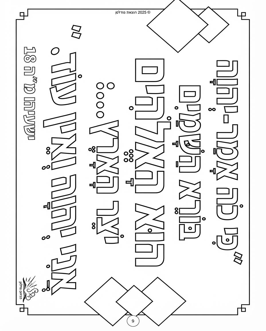
Change this image to 4:5 aspect ratio. Analyze what type of content this is and handle the transformation appropriately: - If it's a product photo: keep the product exactly the same, only extend or crop the background - If it has text, logos, or graphic elements: preserve all text and graphics exactly as they are - If it's a portrait or photo of people: keep the subject intact, extend or crop the surrounding environment - If it's a landscape or scenery: seamlessly extend or crop the natural environment - If it's artwork or illustration: maintain the artistic style consistently Apply the most appropriate transformation based on what you see in the image.
by @Elephant_7361556

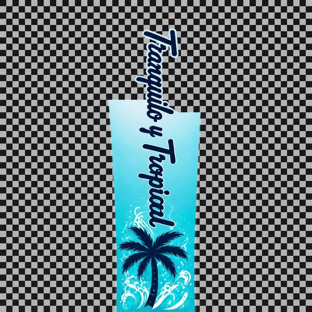
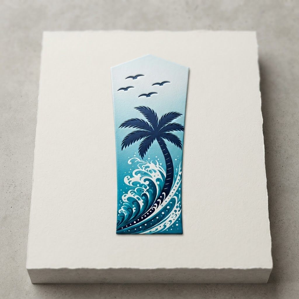
Premium logo presentation mockup concept for A vibrant tropical graphic featuring a dark blue palm tree, crashing ocean waves with white seafoam, and flying birds against a gradient blue sky.. Logo or brand mark displayed on a clean neutral surface with subtle depth, refined shadow, precise alignment, elegant design-studio presentation, no extra readable text. Incorporate the attached brand element reference image (Reference A: brand element "Tropical Wave Palm Graphic") into the composition where natural — preserve the depicted brand element's appearance.
by @Elephant_9130383
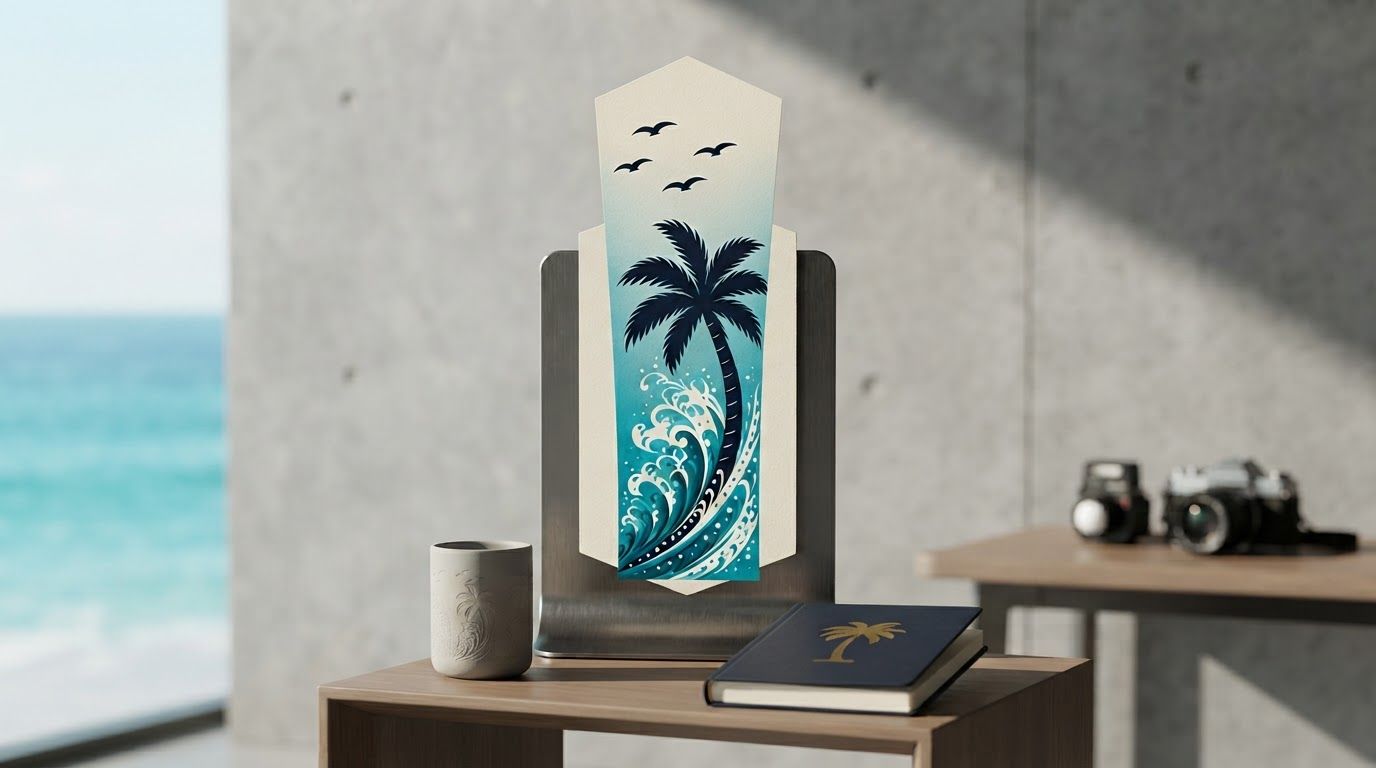
Client presentation mockup for brand. Polished scene showing the design direction applied to a realistic surface, screen, poster, or object, premium agency presentation style, no readable placeholder text. Incorporate the attached brand element reference image (Reference A: brand element "Tropical Wave Palm Graphic") into the composition where natural — preserve the depicted brand element's appearance.
by @Elephant_9130383
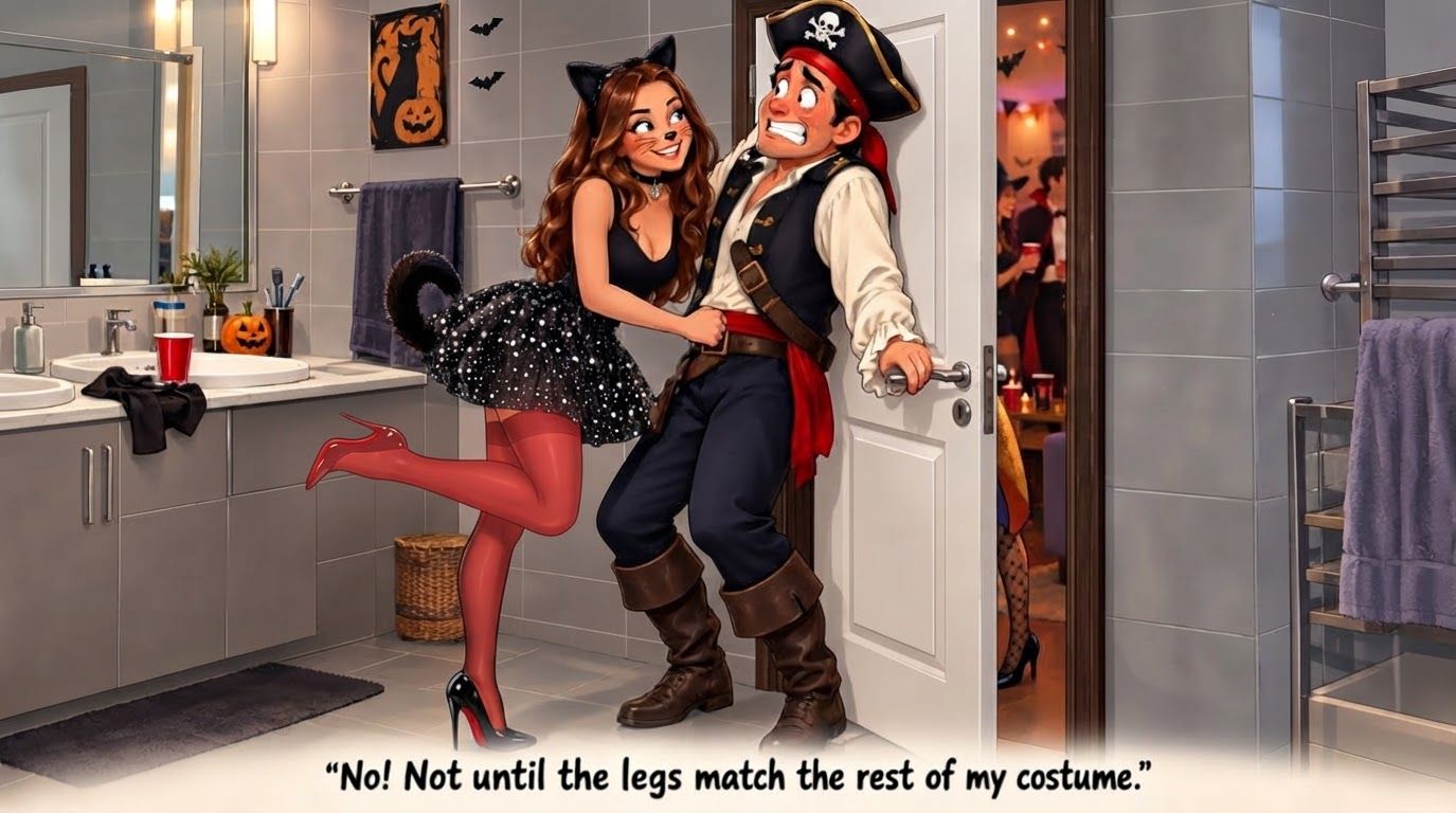
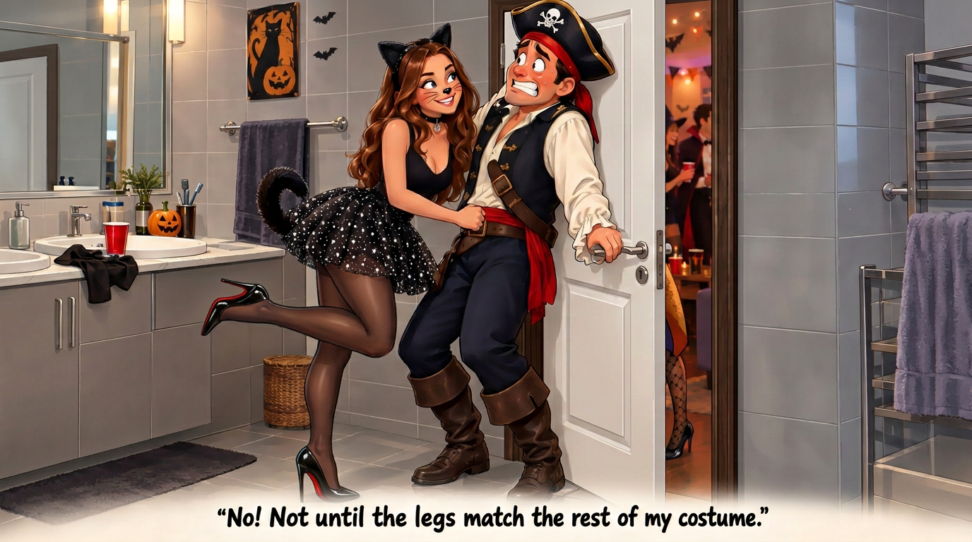
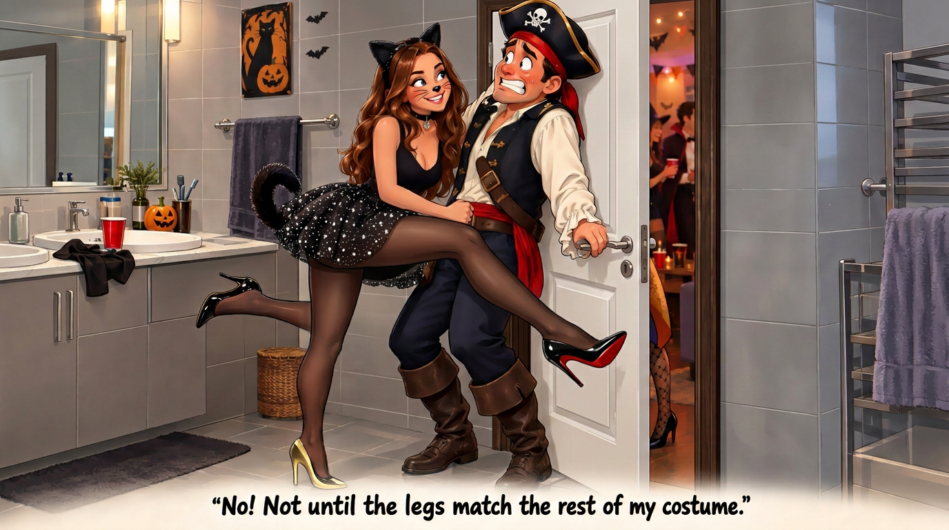
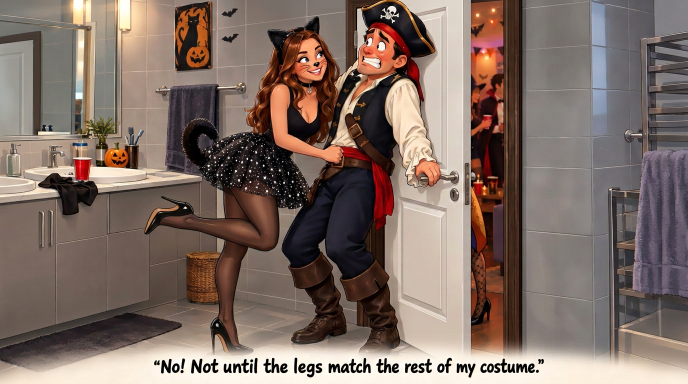
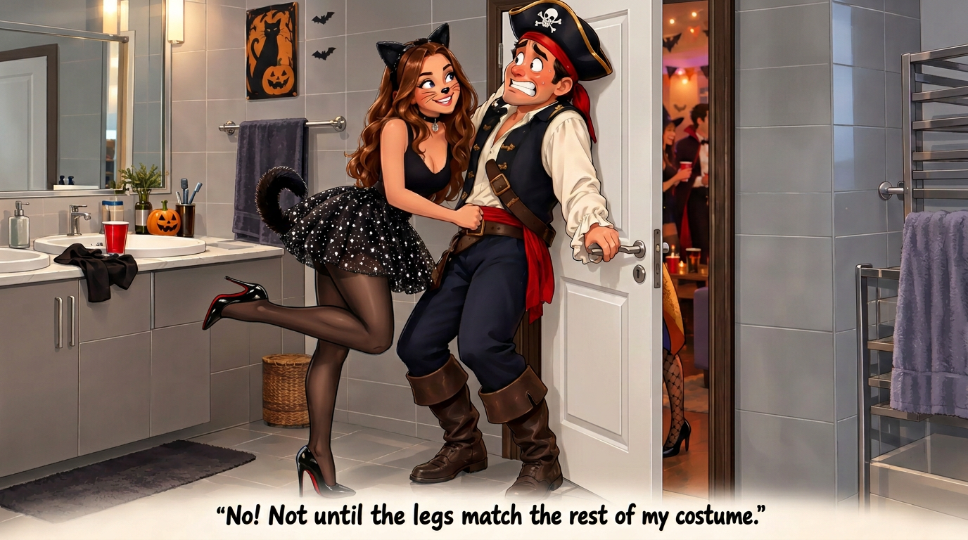
This photo has a temporary semi-transparent red marker painted on it. The marker is not part of the scene. Inside the marked region only, do this: raise her right leg knee higher up. Then remove the red marker completely. The finished image must contain no red paint, highlight, or drawing. Keep framing, lighting, and everything outside the marked region identical.
by @Elephant_1649093
What's next?Explore more features
Go from browse to build