Designs made by our community
Explore unique graphic designs and images crafted by creators around the world using Hiding Elephant's AI design tools. Get inspired and start creating.


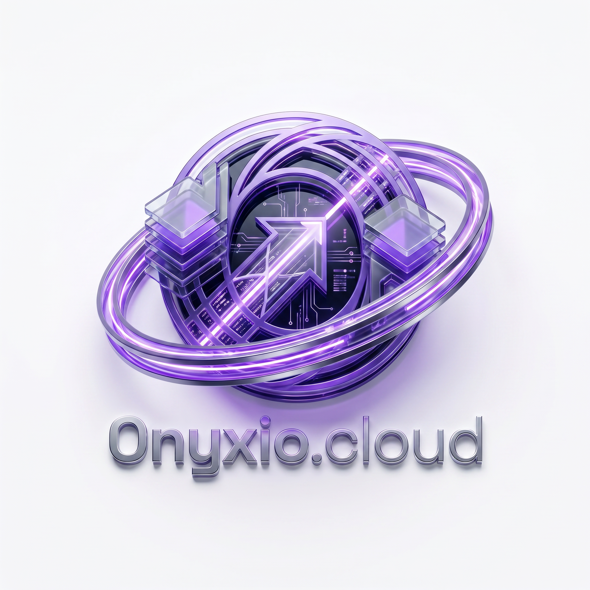
A futuristic 3D logo for "Onyxio.cloud". The icon is a sophisticated digital archive vault made of stacked data panels. A glowing circular ring wraps around the archive, representing intelligent document search and retrieval. Premium glassmorphism, metallic purple gradients (#7C3AED), dark space accents (#0A0D16), clean white background, enterprise software branding, cinematic lighting, highly detailed 3D icon, modern SaaS identity.
by @Elephant_2830755
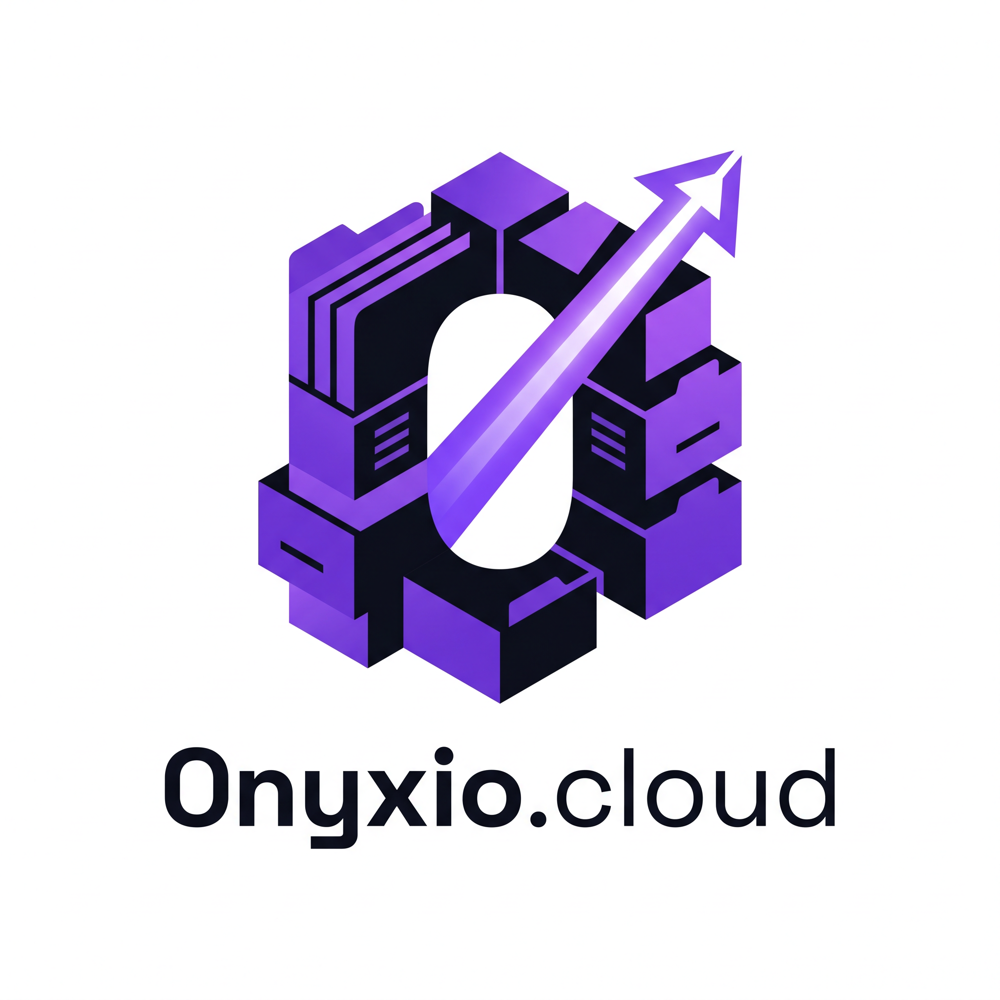
Design a premium and highly memorable logo for "Onyxio.cloud", a Document Archival & Retrieval System (DARS) platform. Instead of using generic cloud icons, create a unique abstract symbol that combines the concepts of: • Digital document archiving • Intelligent search and retrieval • Organized data storage • Secure records management • AI-powered information access The icon should feature stacked document layers transforming into a modern geometric "O" shape through negative space. Integrate subtle visual elements inspired by indexed files, document folders, data blocks, and search pathways. The design should communicate the idea of finding the right document instantly from a massive archive. Color Palette: • Primary: #7C3AED (Vibrant Purple) • Secondary: #0A0D16 (Deep Space Black) Typography: • Text: Onyxio.cloud • Font Family: Space Grotesk • Modern geometric sans-serif • Premium enterprise software branding Style: • Flat vector logo • Clean white background • Minimalist and futuristic • Enterprise SaaS aesthetic • Scalable for favicon, dashboard, mobile app, and website • Strong negative space usage • No generic cloud icons • No shields, locks, or stock symbols Visual Concept: Imagine thousands of archived documents organized into intelligent layers, with one highlighted path leading instantly to the desired file. The icon should subtly form the letter "O" while representing document indexing, archival storage, and rapid retrieval. Keywords: Document Management System, DARS, Enterprise SaaS, Knowledge Base, Digital Archive, Smart Search, File Indexing, Data Retrieval, Information Architecture, Modern Tech Branding, Abstract Geometric Logo, Premium Vector Identity.
by @Elephant_2830755
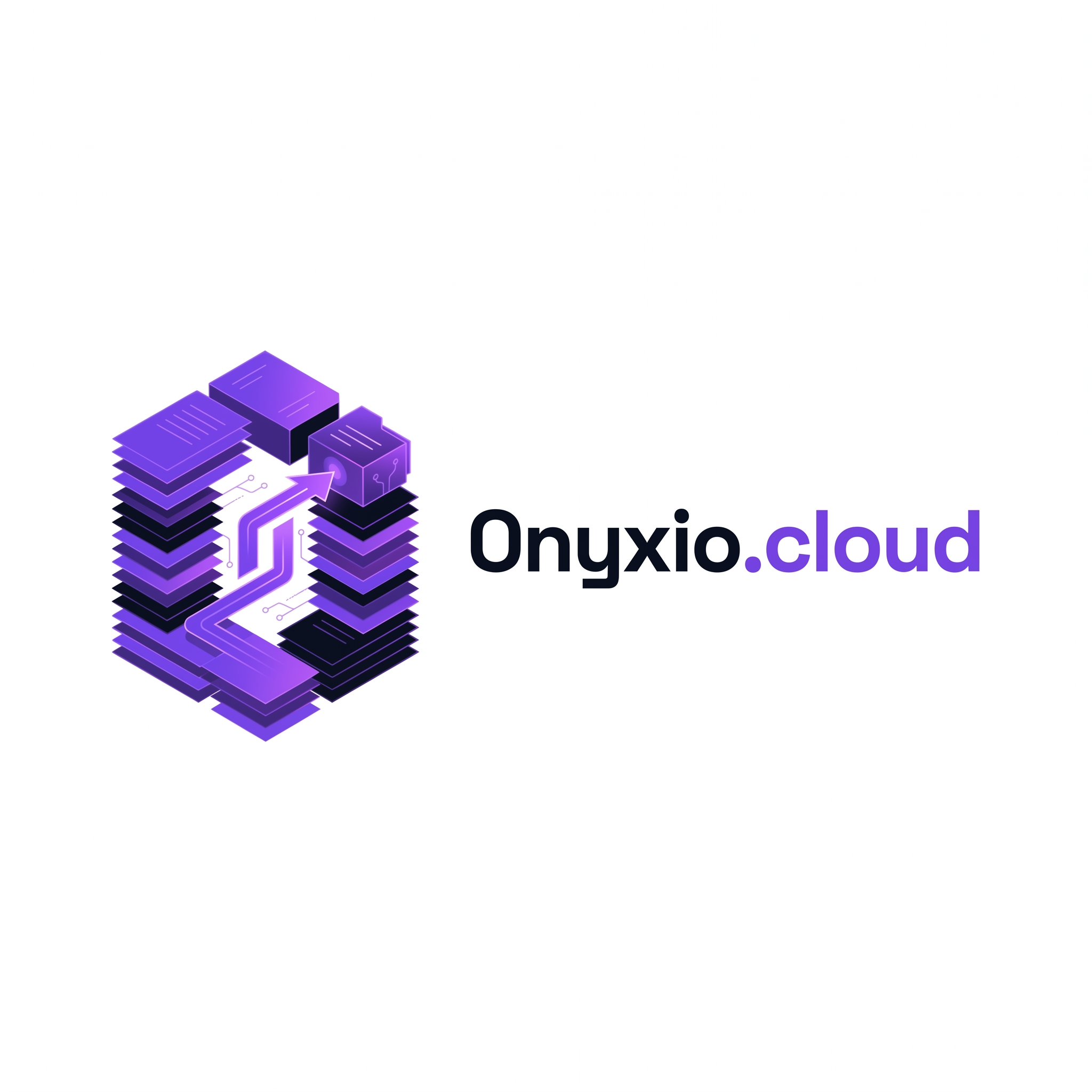
Design a premium and highly memorable logo for "Onyxio.cloud", a Document Archival & Retrieval System (DARS) platform. Instead of using generic cloud icons, create a unique abstract symbol that combines the concepts of: • Digital document archiving • Intelligent search and retrieval • Organized data storage • Secure records management • AI-powered information access The icon should feature stacked document layers transforming into a modern geometric "O" shape through negative space. Integrate subtle visual elements inspired by indexed files, document folders, data blocks, and search pathways. The design should communicate the idea of finding the right document instantly from a massive archive. Color Palette: • Primary: #7C3AED (Vibrant Purple) • Secondary: #0A0D16 (Deep Space Black) Typography: • Text: Onyxio.cloud • Font Family: Space Grotesk • Modern geometric sans-serif • Premium enterprise software branding Style: • Flat vector logo • Clean white background • Minimalist and futuristic • Enterprise SaaS aesthetic • Scalable for favicon, dashboard, mobile app, and website • Strong negative space usage • No generic cloud icons • No shields, locks, or stock symbols Visual Concept: Imagine thousands of archived documents organized into intelligent layers, with one highlighted path leading instantly to the desired file. The icon should subtly form the letter "O" while representing document indexing, archival storage, and rapid retrieval. Keywords: Document Management System, DARS, Enterprise SaaS, Knowledge Base, Digital Archive, Smart Search, File Indexing, Data Retrieval, Information Architecture, Modern Tech Branding, Abstract Geometric Logo, Premium Vector Identity.
by @Elephant_2830755


Design a world-class, modern SaaS and cloud technology logo for "Onyxio.cloud". Create a highly distinctive and memorable icon that avoids generic cloud symbols. The logo should feature an abstract geometric mark formed from interconnected angular shapes that subtly represent cloud infrastructure, scalability, security, and intelligent connectivity. The symbol should feel innovative, premium, and enterprise-grade, suitable for a next-generation cloud platform. Use a sophisticated color palette: Primary: #7C3AED (Vibrant Purple) Secondary: #0A0D16 (Deep Space Black) The icon should combine clean geometric precision with smooth futuristic curves, creating a unique visual identity that feels both powerful and elegant. Incorporate subtle negative space techniques to suggest the letter "O" without making it obvious. Typography: Brand Name: Onyxio.cloud Font Style: Space Grotesk, modern geometric sans-serif Strong, balanced letter spacing Professional B2B technology branding Style Requirements: Flat vector design Clean white background Minimalist but memorable Premium startup meets enterprise software aesthetic Dribbble-quality presentation Scalable for website, favicon, app icon, dashboard, and print No stock elements, no generic clouds, no shields, no locks Visual Inspiration: A fusion of cloud architecture, digital networks, data flow, and futuristic infrastructure, expressed through a bold abstract symbol that instantly feels like a billion-dollar technology company.
by @Elephant_2830755
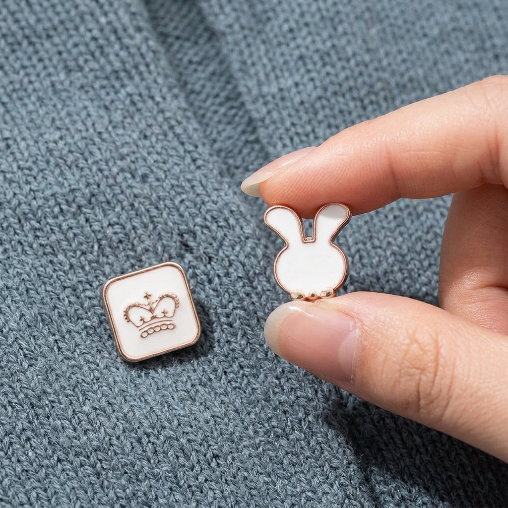
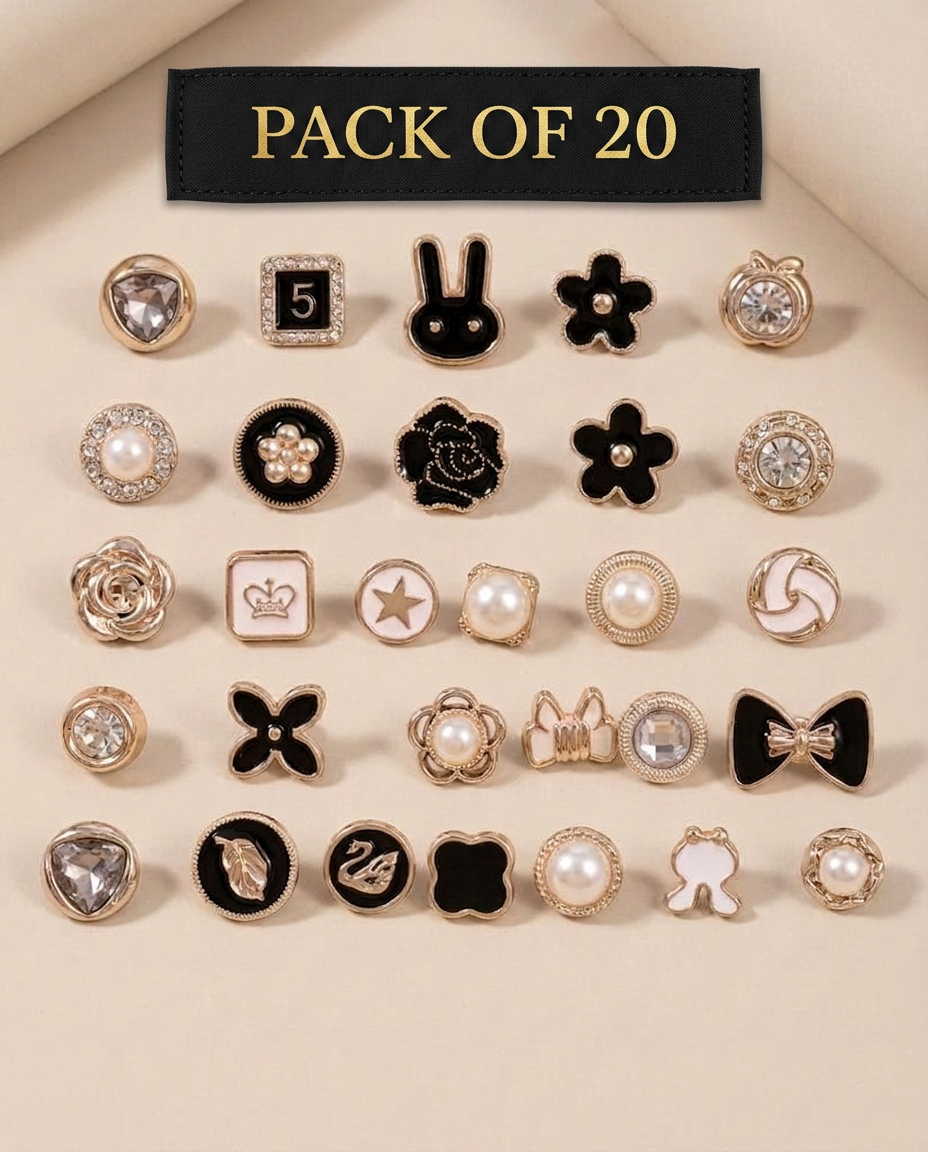
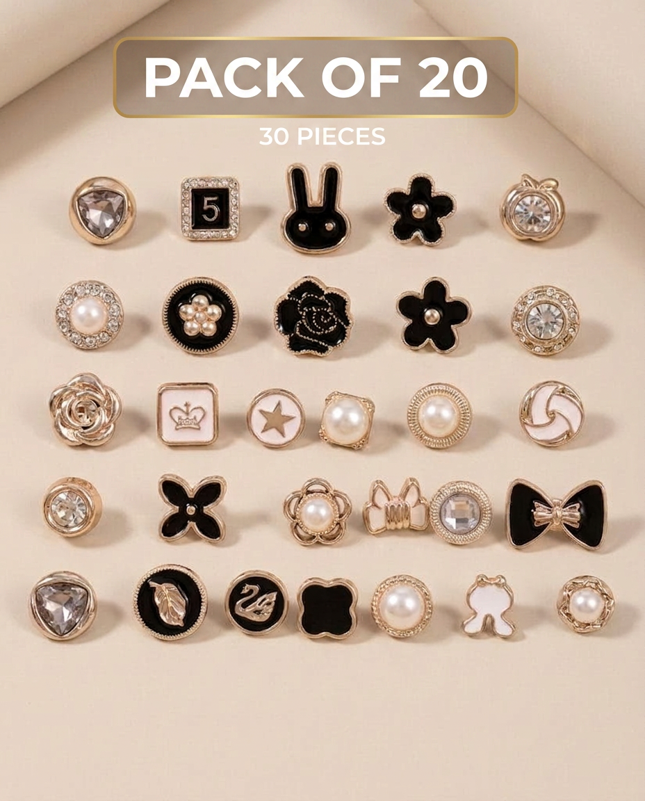
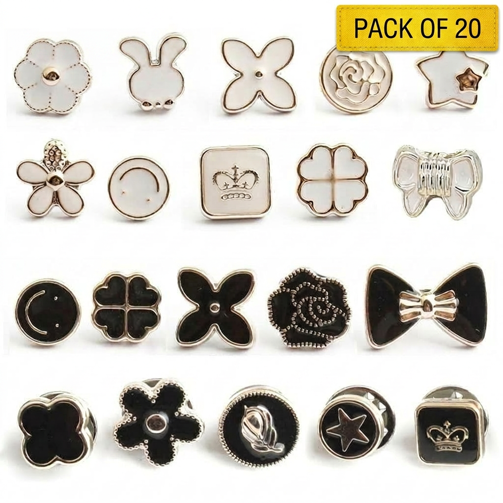
A professional high-end product photography display featuring a collection of {{asset:123}} brooches, all arranged in a uniform size and symmetrical grid layout. The background is a clean, minimalist, soft-focus neutral studio backdrop with elegant soft-box lighting to accentuate the textures and metallic details of the jewelry, with all original text labels and branding removed. AND SHOW ALL PRODUCT IN SAME SIZE
by @Elephant_9365971
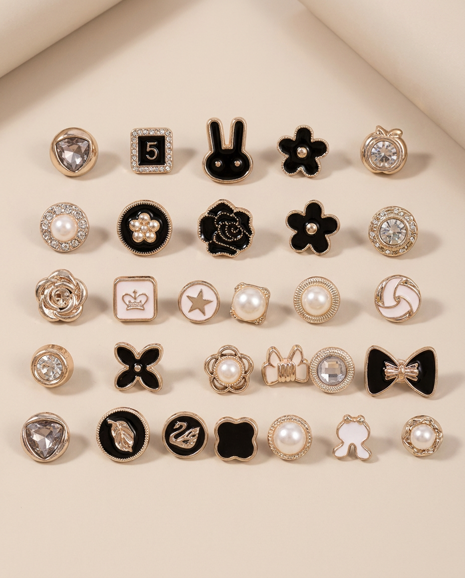
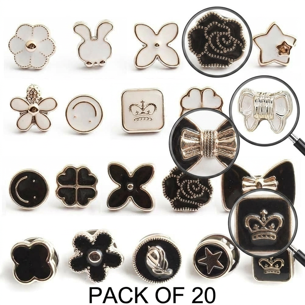


Design a premium, award-winning vector logo for "Priyadarshini", a Kerala Government initiative promoting women's mobility, empowerment, and free public transportation through KSRTC. Create a clever monogram using the letter "P". The vertical stroke of the "P" transforms into a smooth road, symbolizing safe and accessible travel. The curved section of the "P" forms the elegant side profile of a confident woman using negative space. At the end of the road, integrate a minimal flying bird, symbolizing freedom, independence, opportunity, and the ability to move forward without barriers. The logo should communicate: * Women's Empowerment * Freedom of Movement * Public Transportation * Inclusion and Accessibility * Progress and Social Development Style: Minimalist vector design, strong negative space, clean geometric construction, modern government identity, timeless and memorable symbol, international logo competition quality. Color Palette: * Kerala Green (#0E7A3D) * Deep Navy (#173F5F) * Golden Yellow (#F4B400) Requirements: * Flat vector only * No gradients, shadows, or 3D effects * Must work perfectly in black and white * Scalable for bus branding, tickets, websites, mobile apps, and official documents * Balanced composition with a strong visual hierarchy Typography: Use a clean modern sans-serif typeface for "Priyadarshini". Optionally include the Malayalam text "പ്രിയദർശിനി" beneath the English name. Keywords: female profile, letter P logo, road icon, flying bird, freedom, mobility, empowerment, Kerala government scheme, KSRTC, minimal vector logo, negative space logo, civic branding, award-winning identity design, professional logo presentation on white background.
by @Elephant_4132019
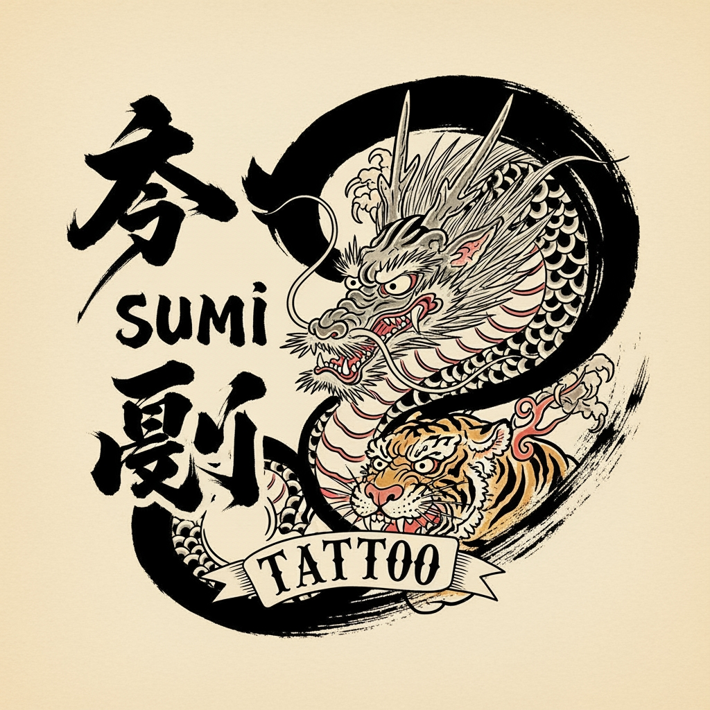
FAÇA UMA LOGO PARA EMPRESA SUMI, ELES FAZEM TATTO , Tatuagem japonesa tradicional com respeito ao traço, à história e a cada corpo que a carrega. Preciso que tenha Sumi tattto(do lado e a logo do lado de Sumi, a plaavra tatto seja em uma tato masi old school e menor, que será apenas para sinalizar que é um studio de tatuagem. Use a criatividade
by @Elephant_8905440
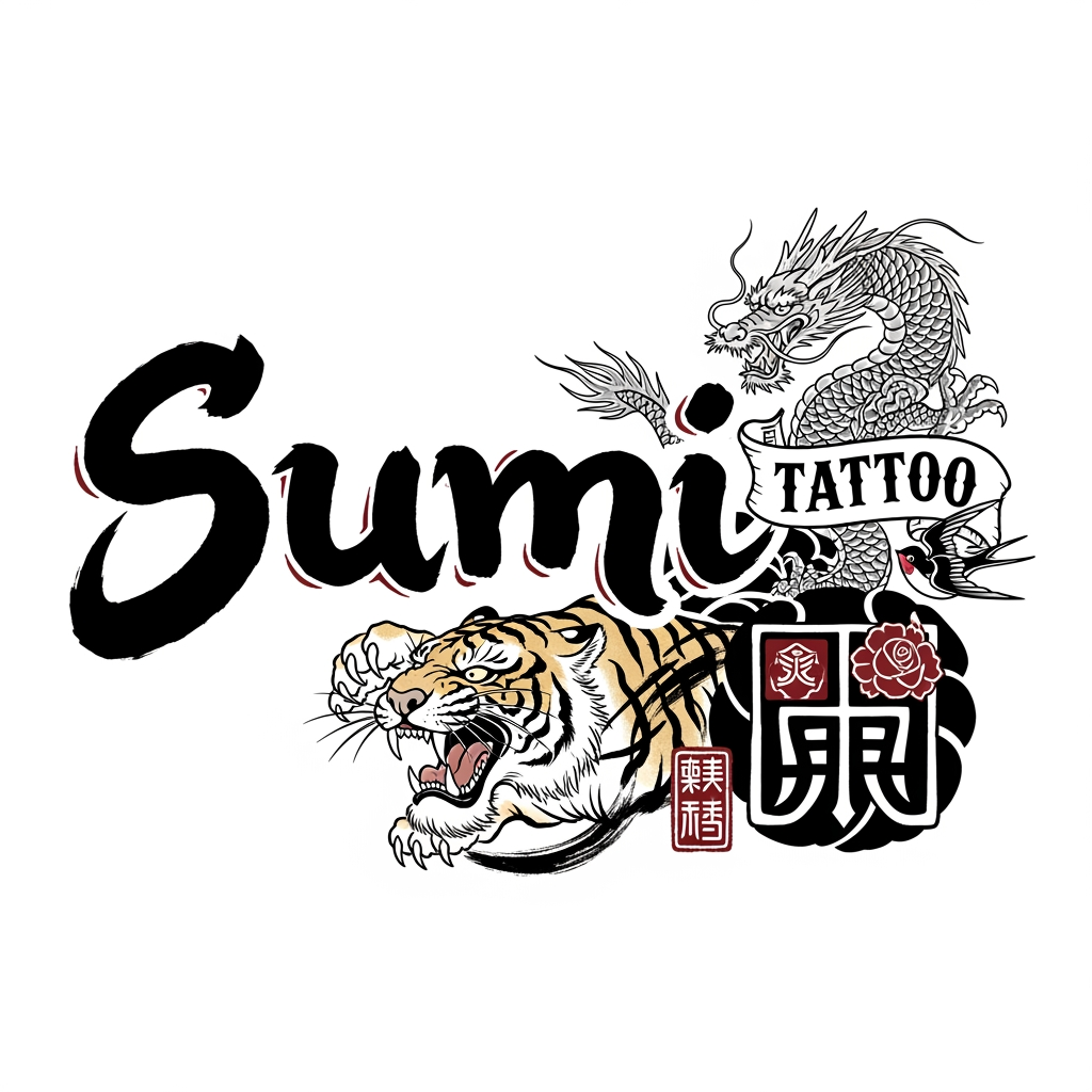


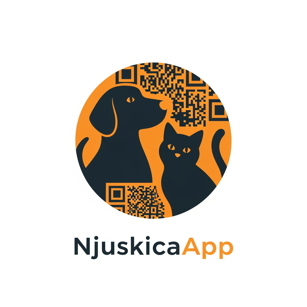
Modern minimalist logo for NjuskicaApp, app-icon style. Friendly dog and cat silhouettes in negative space, enclosed inside a perfectly symmetrical shield emblem (or circular badge). Integrated subtle QR-code geometry seamlessly built into the icon. Flat vector, bold clean lines, orange and charcoal colors, premium SaaS branding, Dribbble quality, no text, no open shapes, strong geometric balance, scalable favicon and mobile app icon.
by @Elephant_9148558
What's next?Explore more features
Go from browse to build