Designs made by our community
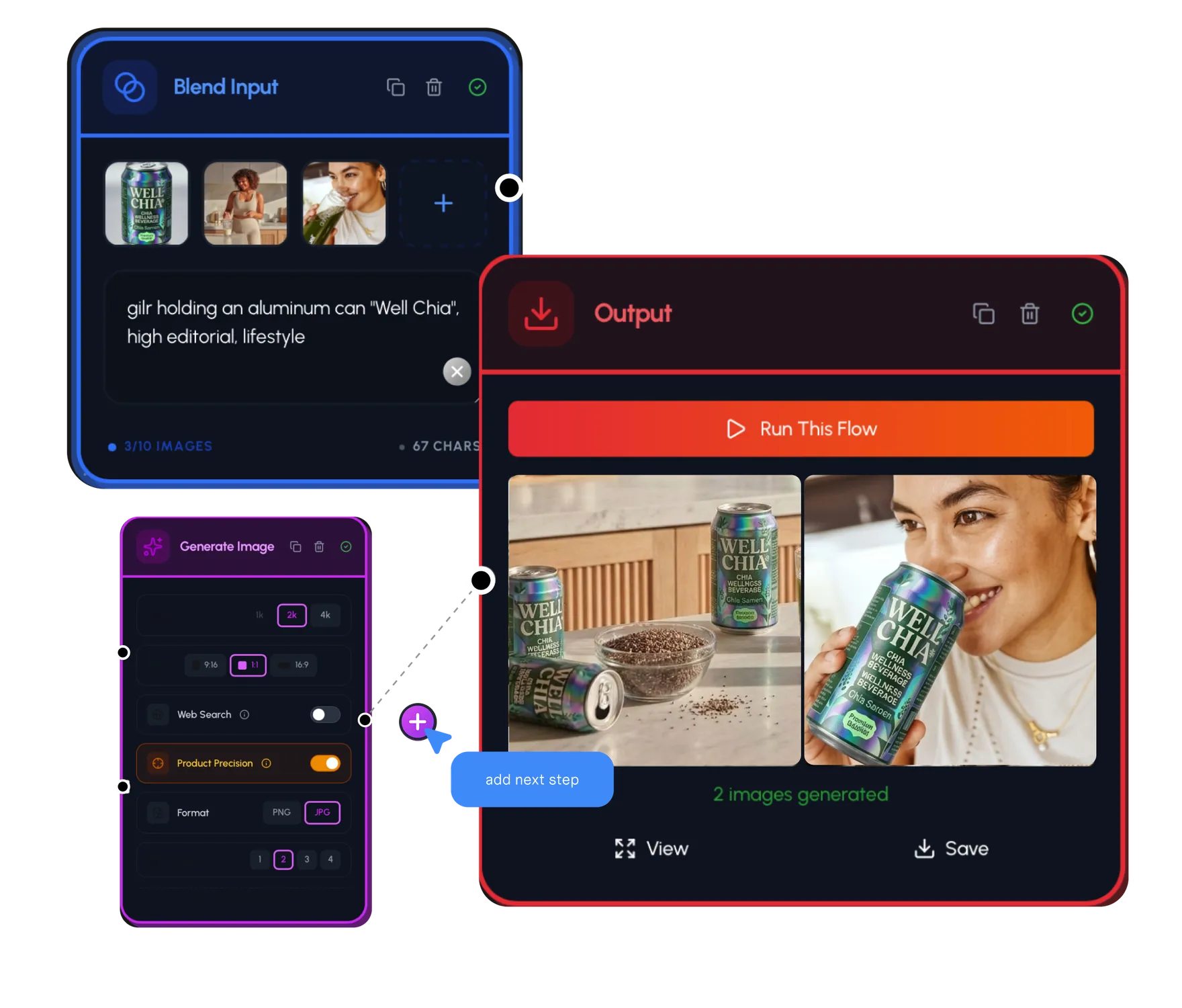
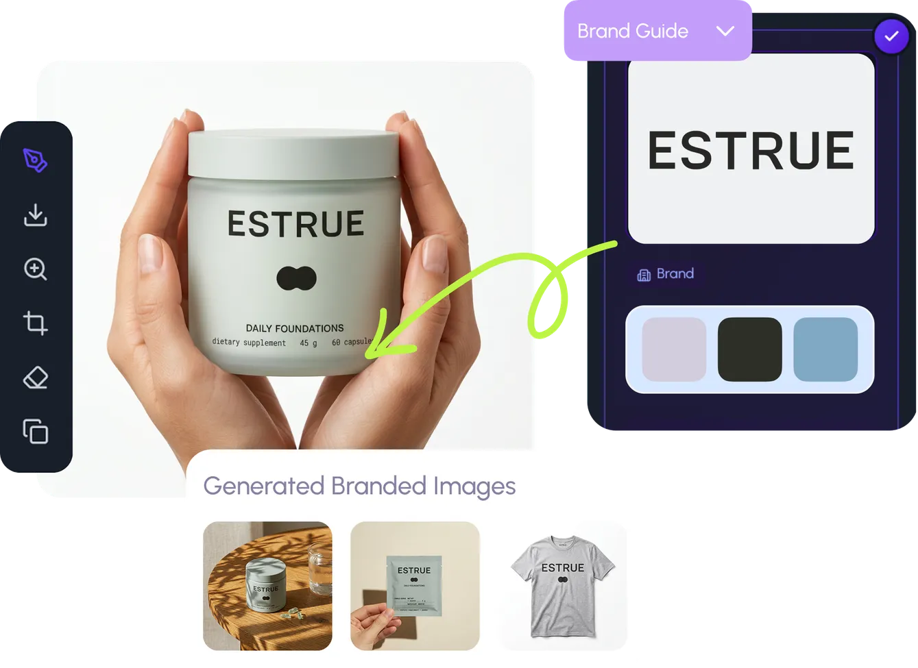
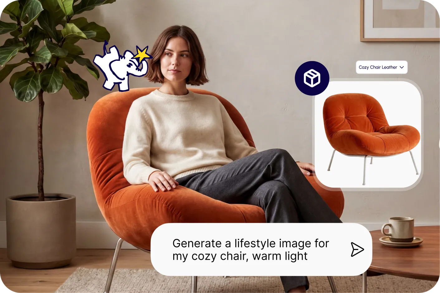
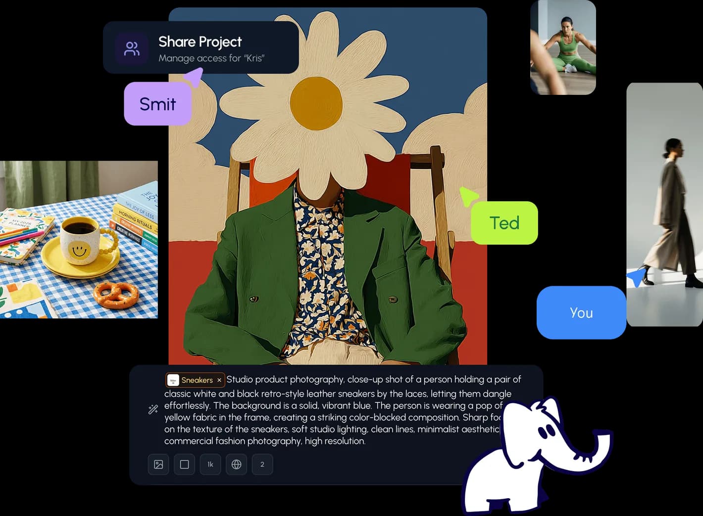
Staff-picked ads, product scenes, and brand assets made in Hiding Elephant. See what production-ready creative looks like, then start your own.

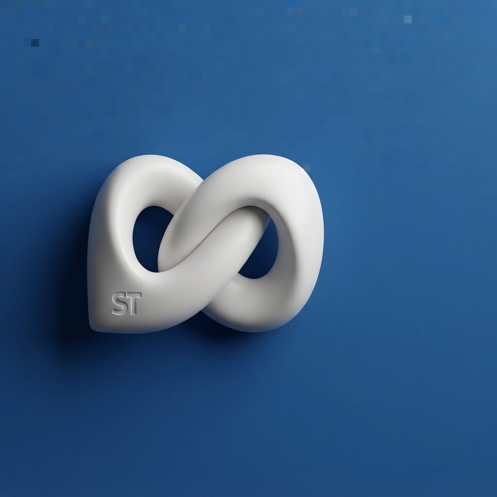
Square social feed visual for brand. Strong central subject, clean composition, platform-ready crop, cohesive color and mood, clear empty area for caption or headline to be added later, no readable text generated. Incorporate the attached brand element reference image (Reference A: brand element "Logo") into the composition where natural — preserve the depicted brand element's appearance.
by @Elephant_9992032
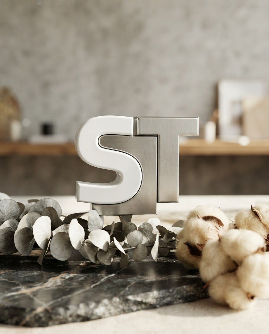
Portrait social feed visual for brand. Scroll-stopping focal point, editorial crop, balanced foreground and background, designed for a 4:5 feed placement, no generated text or UI elements. Incorporate the attached brand element reference image (Reference A: brand element "Logo") into the composition where natural — preserve the depicted brand element's appearance.
by @Elephant_9992032
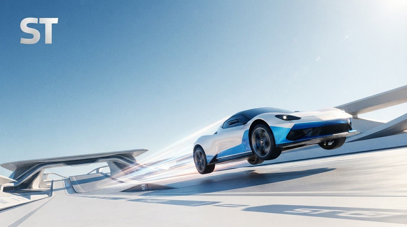
Landscape launch announcement visual for brand. Energetic campaign image, strong focal object or scene, clean branded atmosphere, generous open space for announcement copy to be added later, no rendered typography. Incorporate the attached brand element reference image (Reference A: brand element "Logo") into the composition where natural — preserve the depicted brand element's appearance.
by @Elephant_9992032

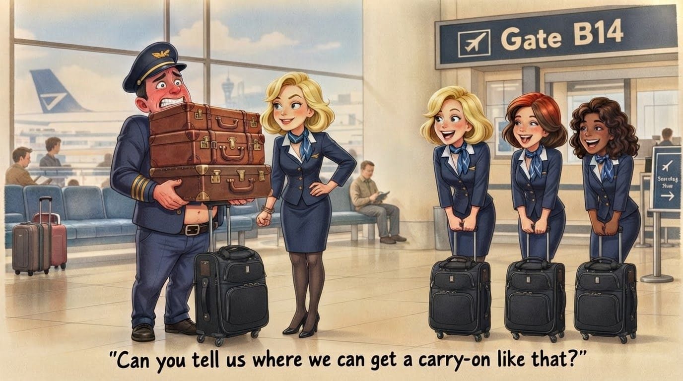
please revise the image accordaing to these adjustments. The pilot: Can to show him with his eyes opened? Keep his smile and red face but show him more nervous and embarrassed than looking like he's lifting something heavy. Also can you replace one of the bags he's hold be an actually black suitcase with wheels (check reference image)? . Show that black suitcase and maybe one or with other regular bags stacked up to his chest. Next the flight attendant by the pilot: Show her stand more upright with her arm straight still making a fist towards the pilot's hip Lastly the other three Flight Attendants: All you need to do is show all of them with their black suitcase with wheels stand by them. Let me know if you have any questions. Have their suitcases look like the second image
by @Elephant_3756952
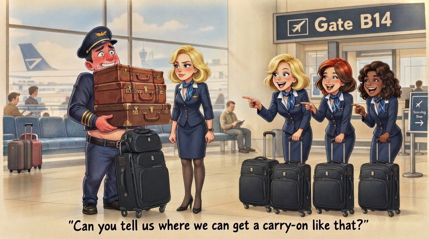
please revise the image accordaing to these adjustments. The pilot: Can to show him with his eyes opened? Keep his smile and red face but show him more nervous and embarrassed than looking like he's lifting something heavy. Also (I'll send you a picture of this too) can you have one of the bags he's hold be an actually black suitcase with wheels (check reference image)? It would make it look more modern. Show that black suitcase and maybe one or with other regular bags stacked up to his chest. Lastly about the pilot. Next the flight attendant by the pilot: Show her stand more upright with her arm straight still making a fist as it is Lastly the other three Flight Attendants: All you need to do is show all of them with their black suitcase with wheels stand by them. Let me know if you have any questions. Have their suitcases look like the second image
by @Elephant_3756952
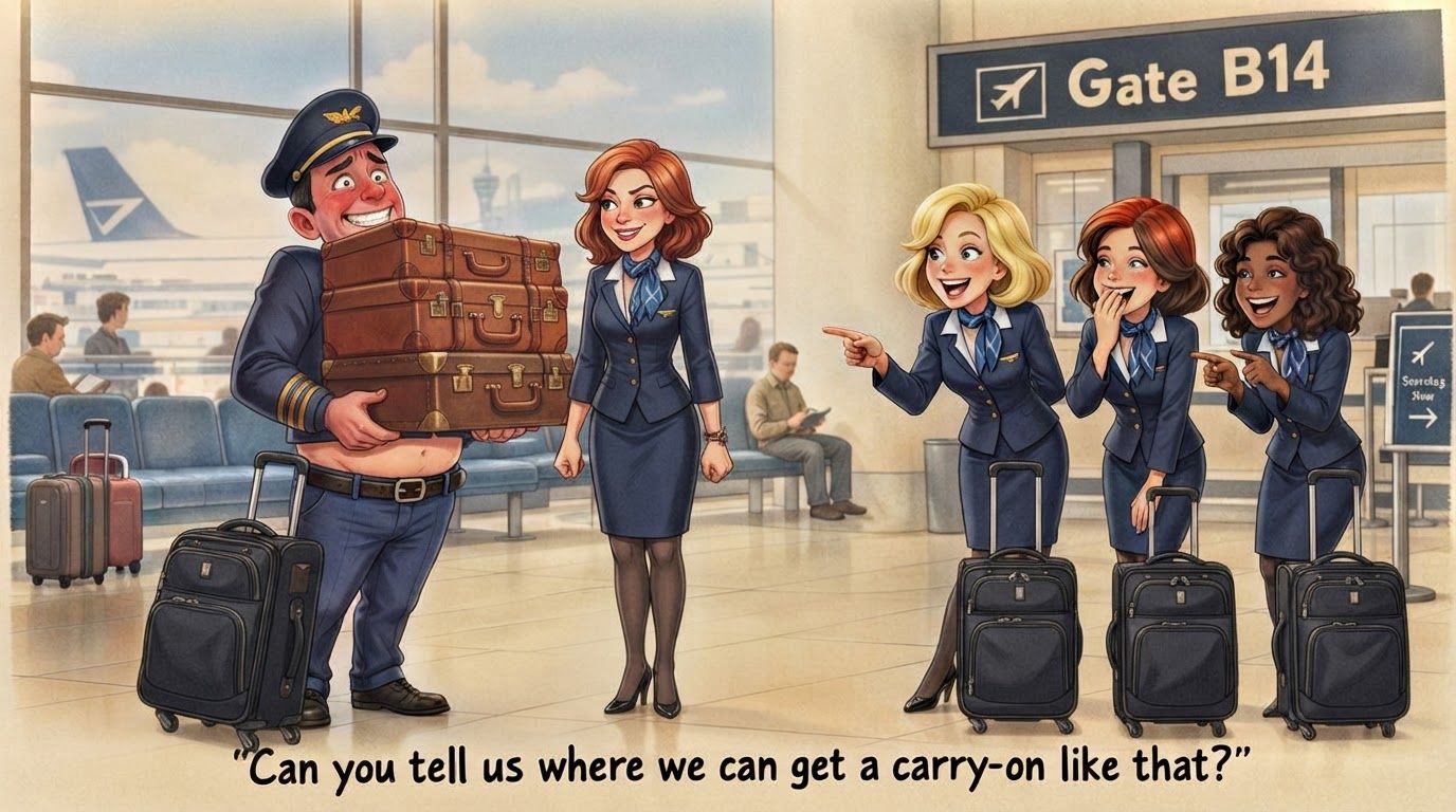
please revise the image accordaing to these adjustments. The pilot: Can to show him with his eyes opened? Keep his smile and red face but show him more nervous and embarrassed than looking like he's lifting something heavy. Also (I'll send you a picture of this too) can you have one of the bags he's hold be an actually black suitcase with wheels (check reference image)? It would make it look more modern. Show that black suitcase and maybe one or with other regular bags stacked up to his chest. Lastly about the pilot. Next the flight attendant by the pilot: Show her stand more upright with her arm straight still making a fist as it is Lastly the other three Flight Attendants: All you need to do is show all of them with their black suitcase with wheels stand by them. Let me know if you have any questions. Have their suitcases look like the second image
by @Elephant_3756952

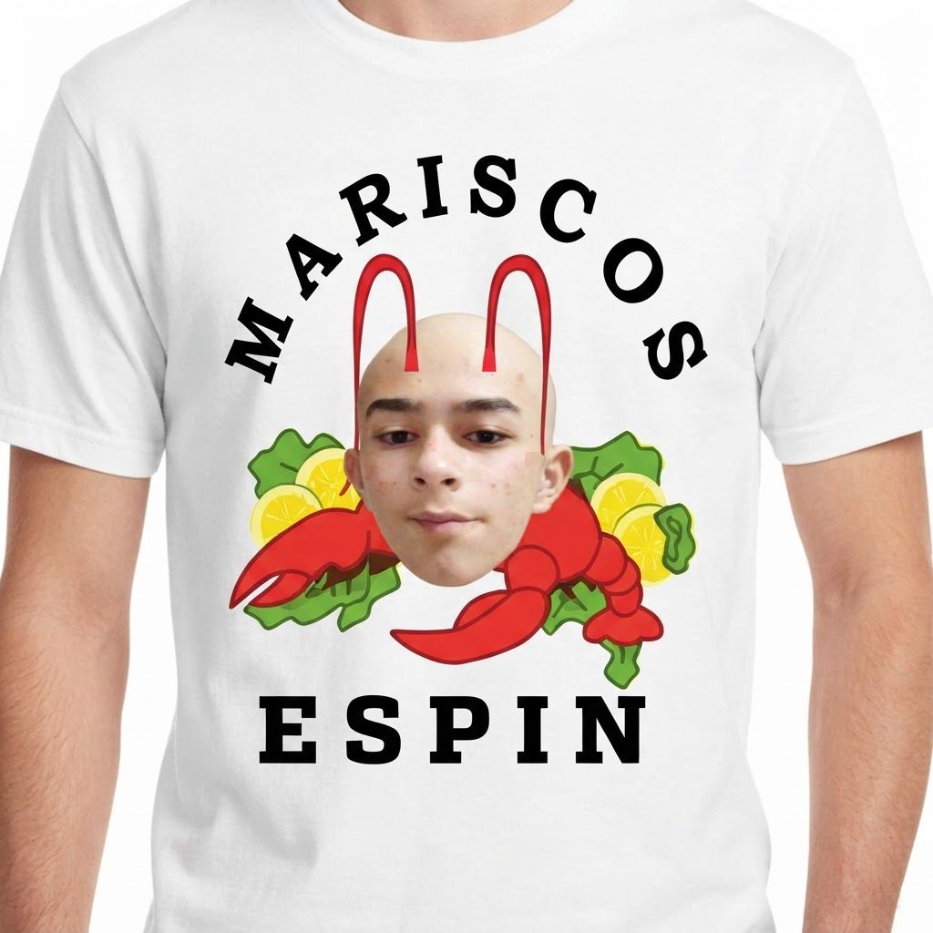
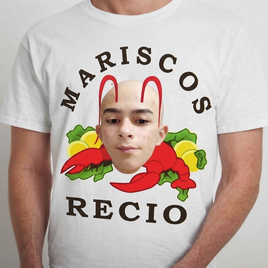
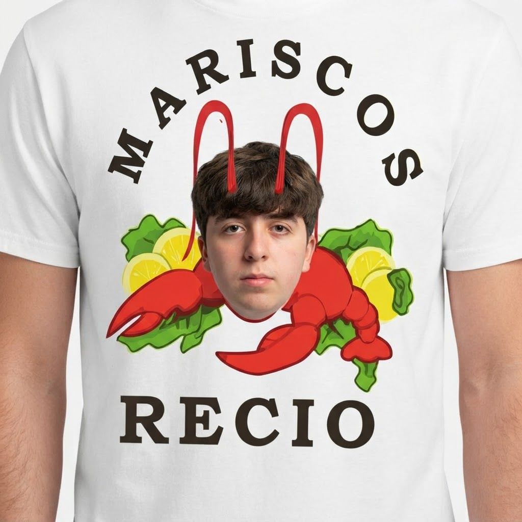
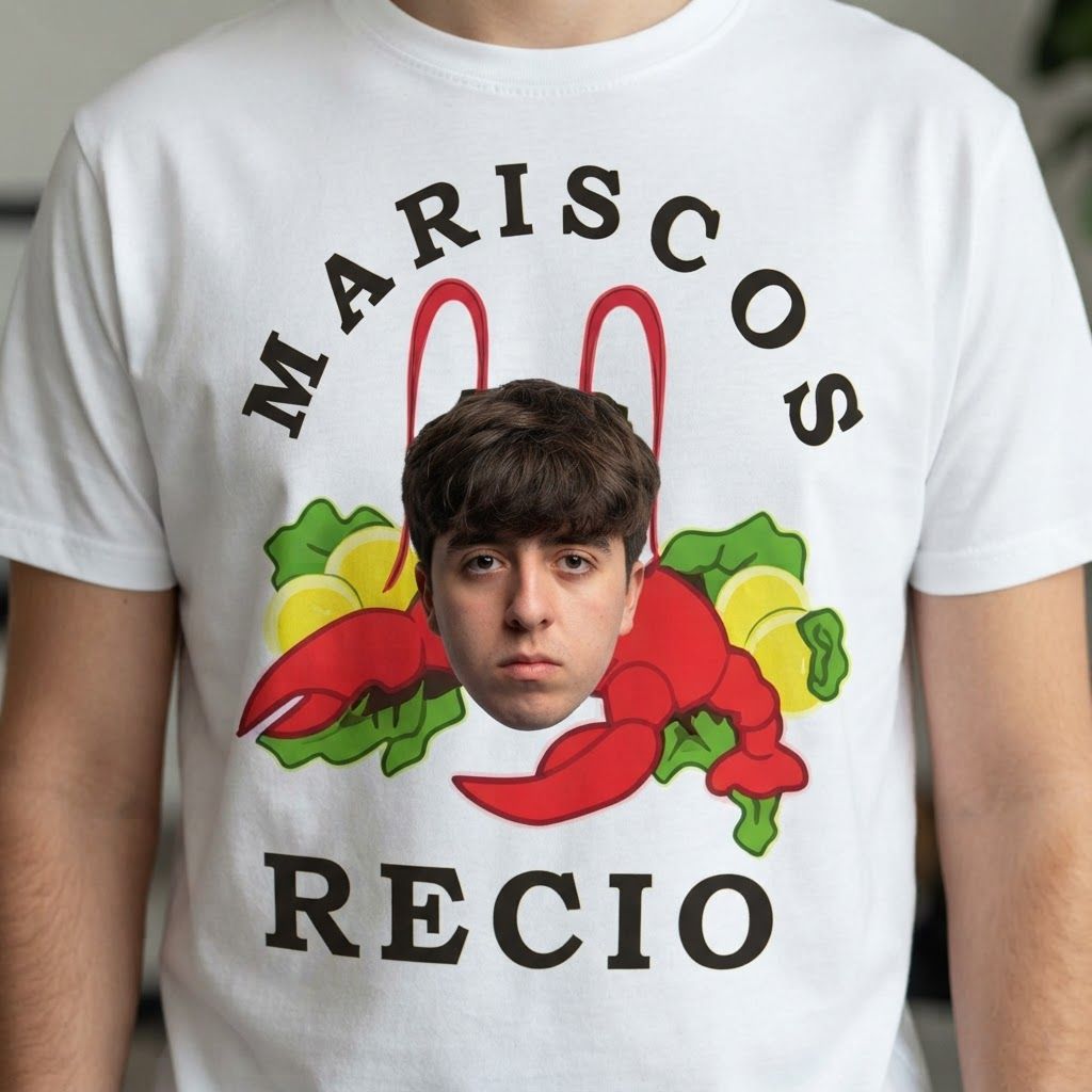
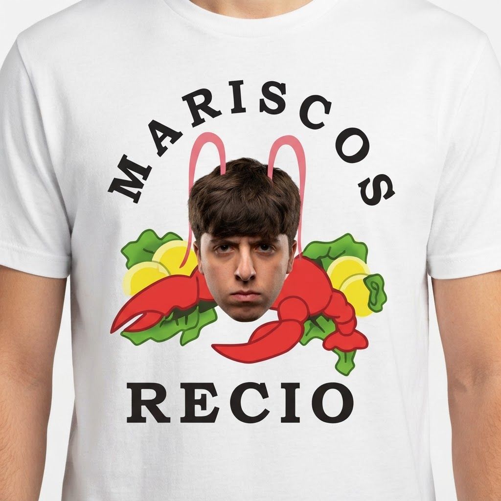
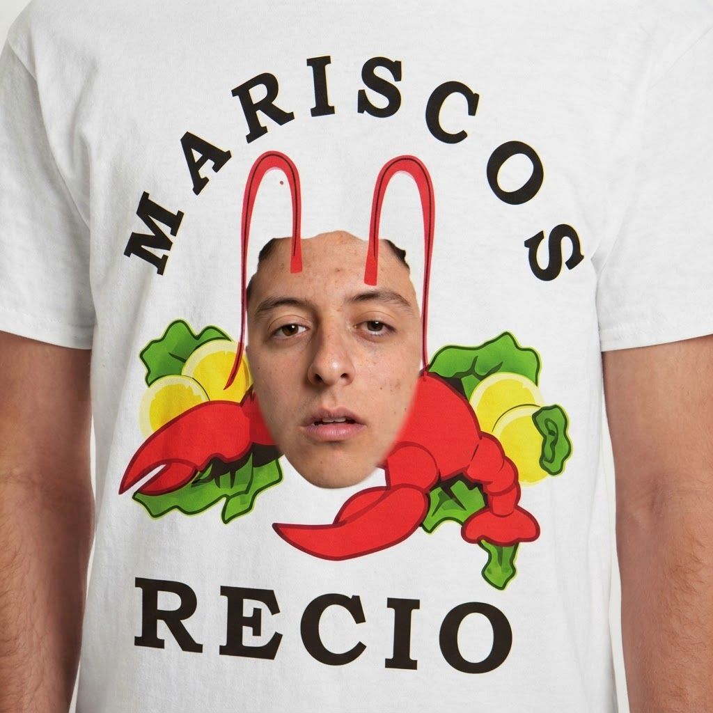
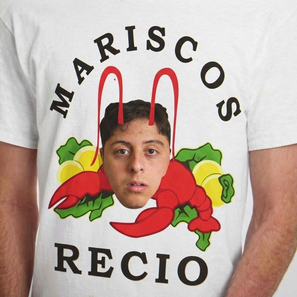
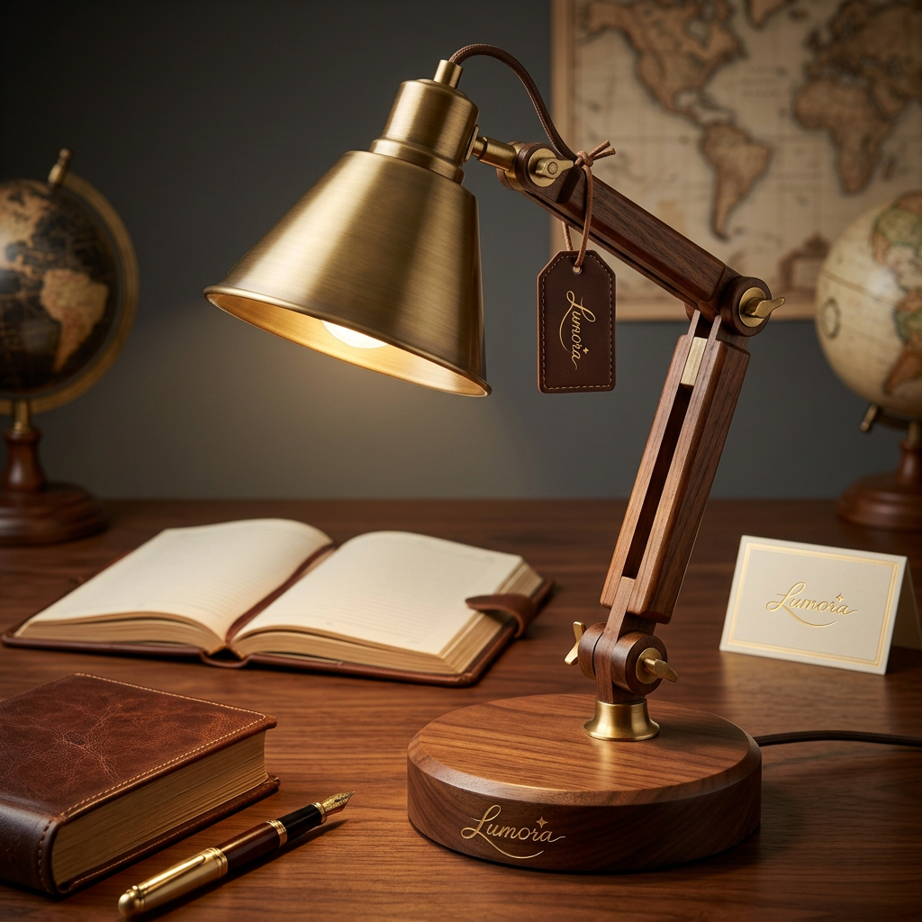
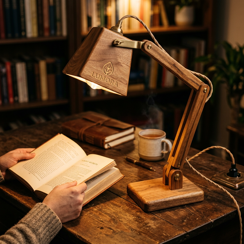
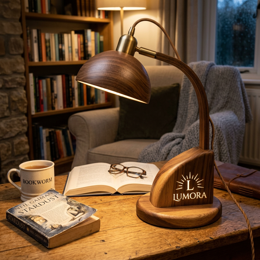
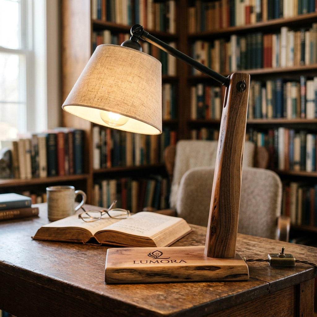
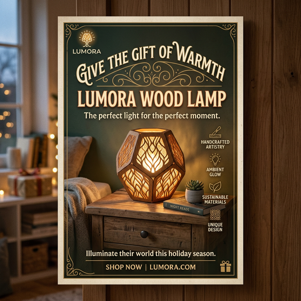
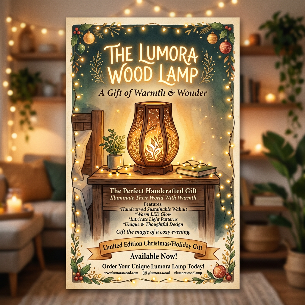
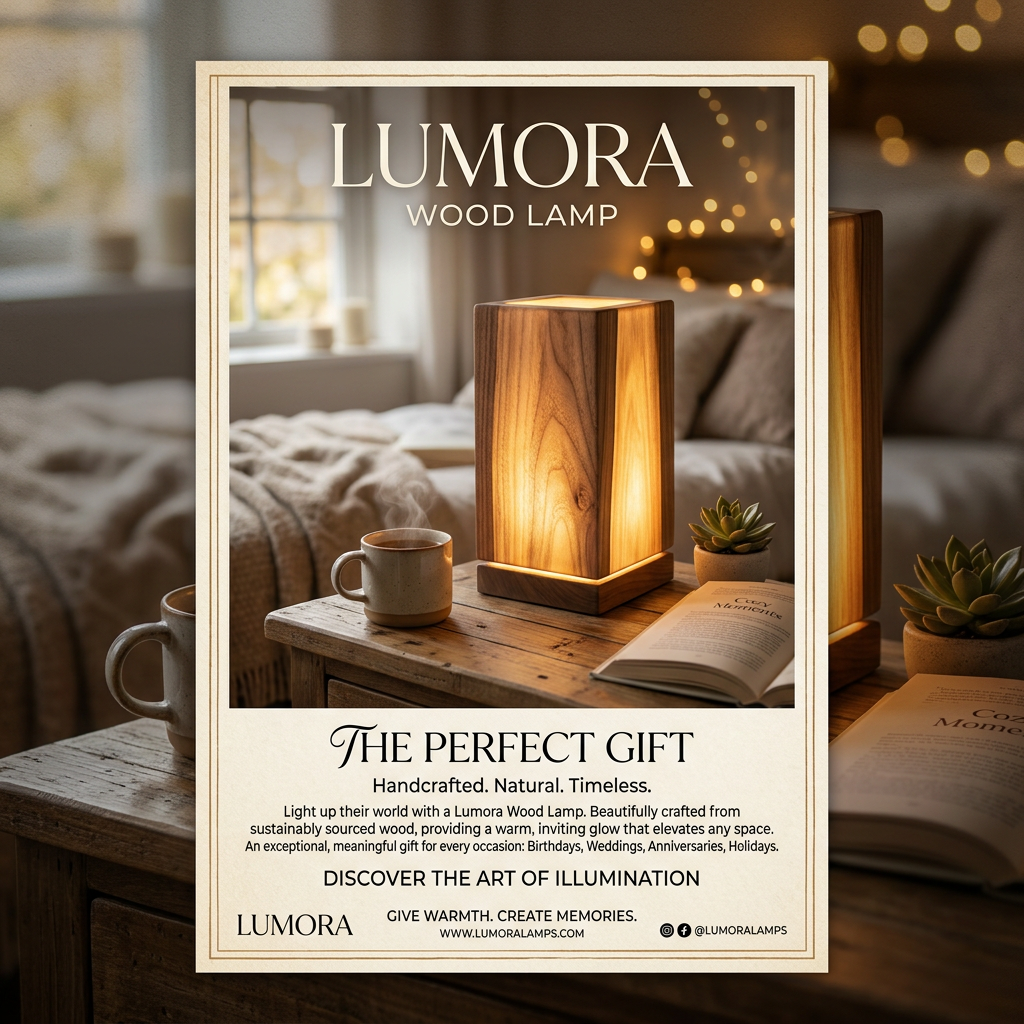
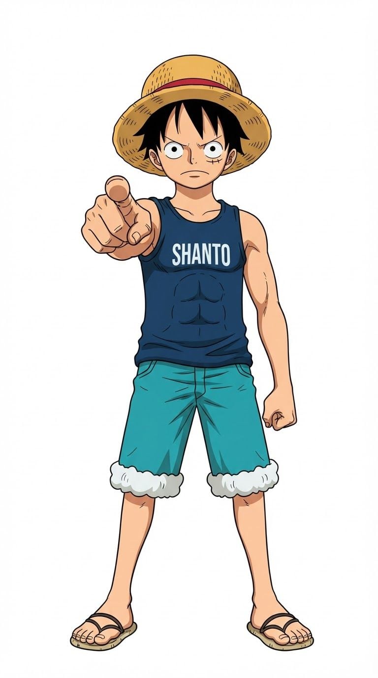
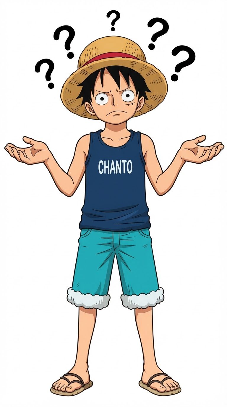
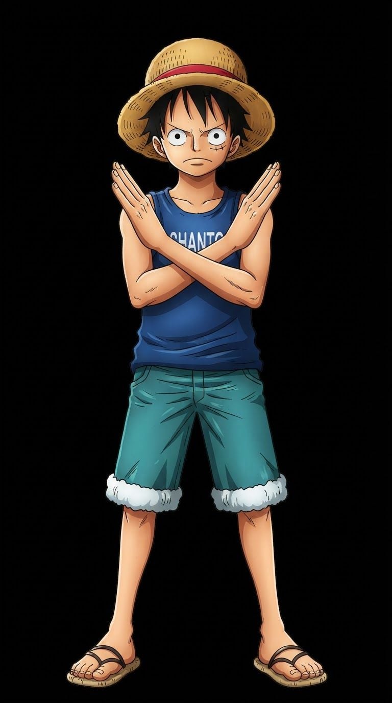
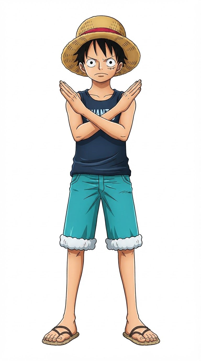
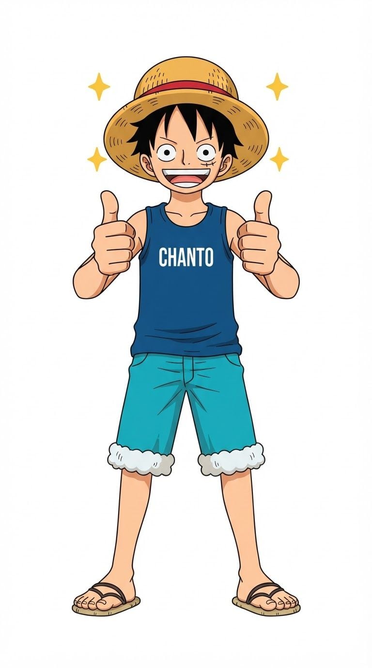
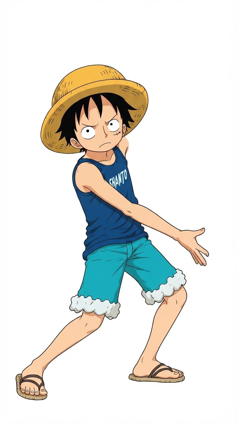
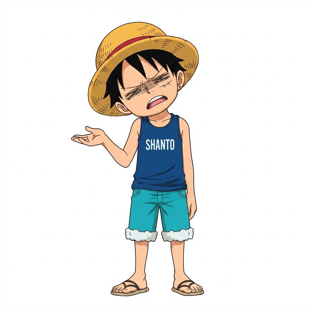
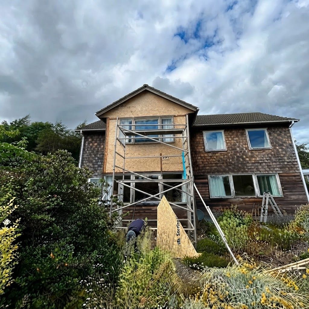
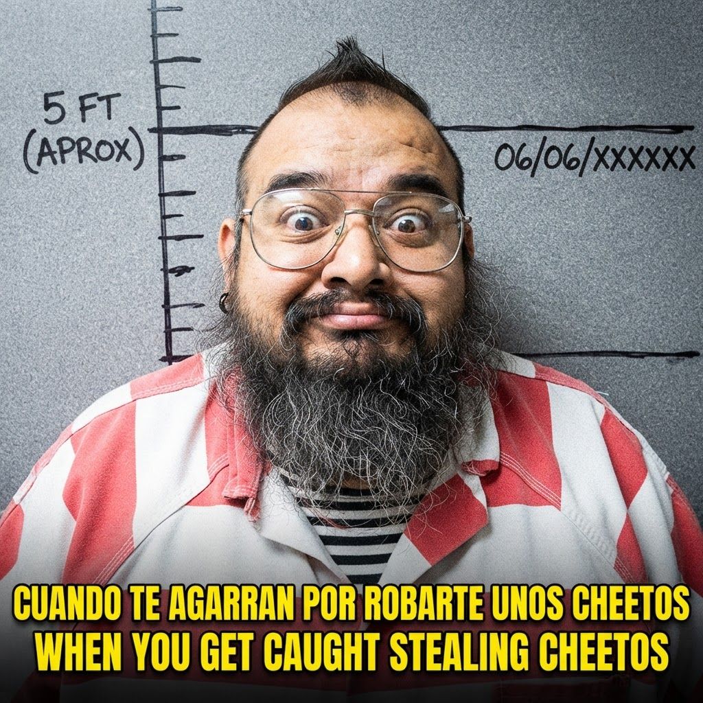
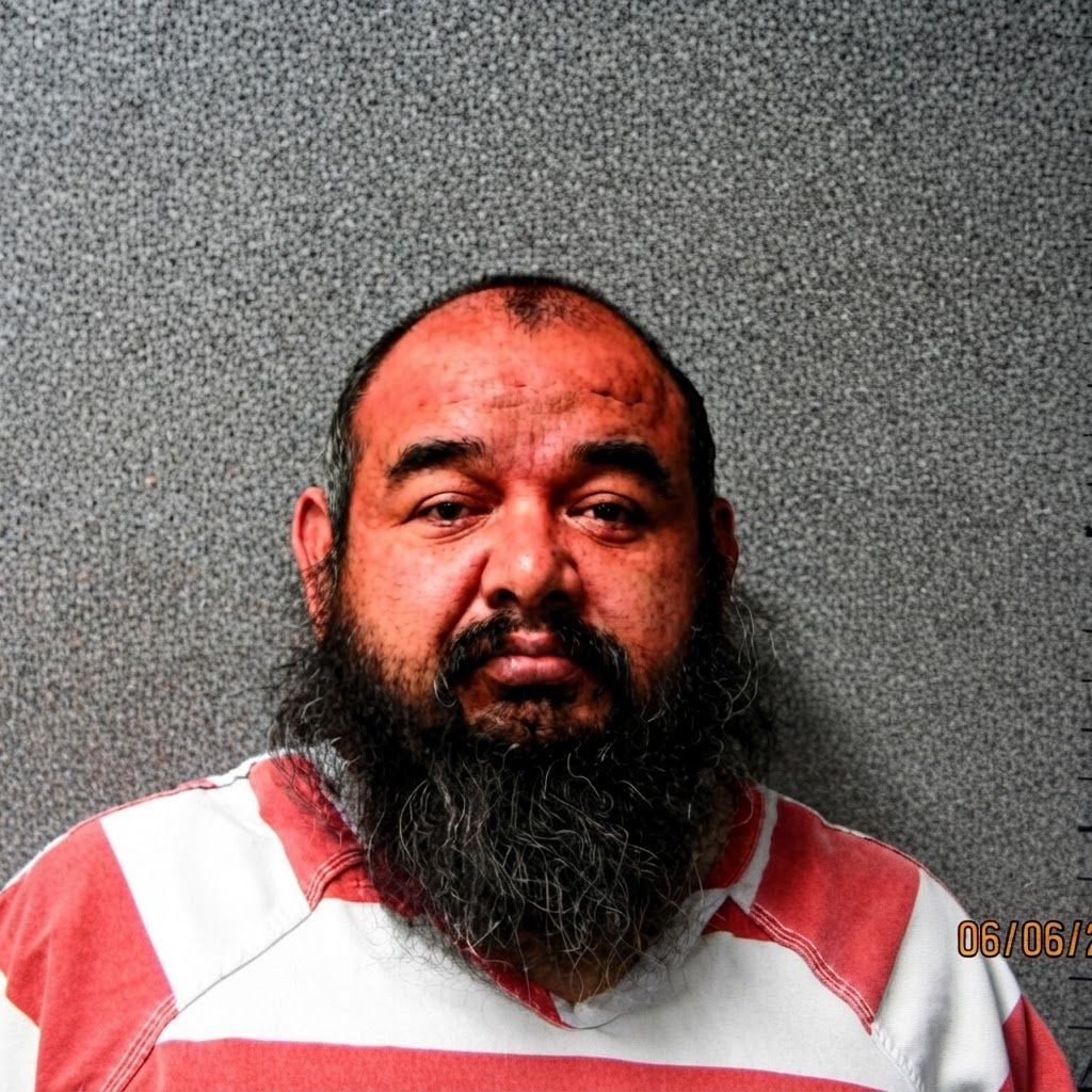
Change this image to 1:1 aspect ratio. Analyze what type of content this is and handle the transformation appropriately: - If it's a product photo: keep the product exactly the same, only extend or crop the background - If it has text, logos, or graphic elements: preserve all text and graphics exactly as they are - If it's a portrait or photo of people: keep the subject intact, extend or crop the surrounding environment - If it's a landscape or scenery: seamlessly extend or crop the natural environment - If it's artwork or illustration: maintain the artistic style consistently Apply the most appropriate transformation based on what you see in the image.
by @Elephant_3925697
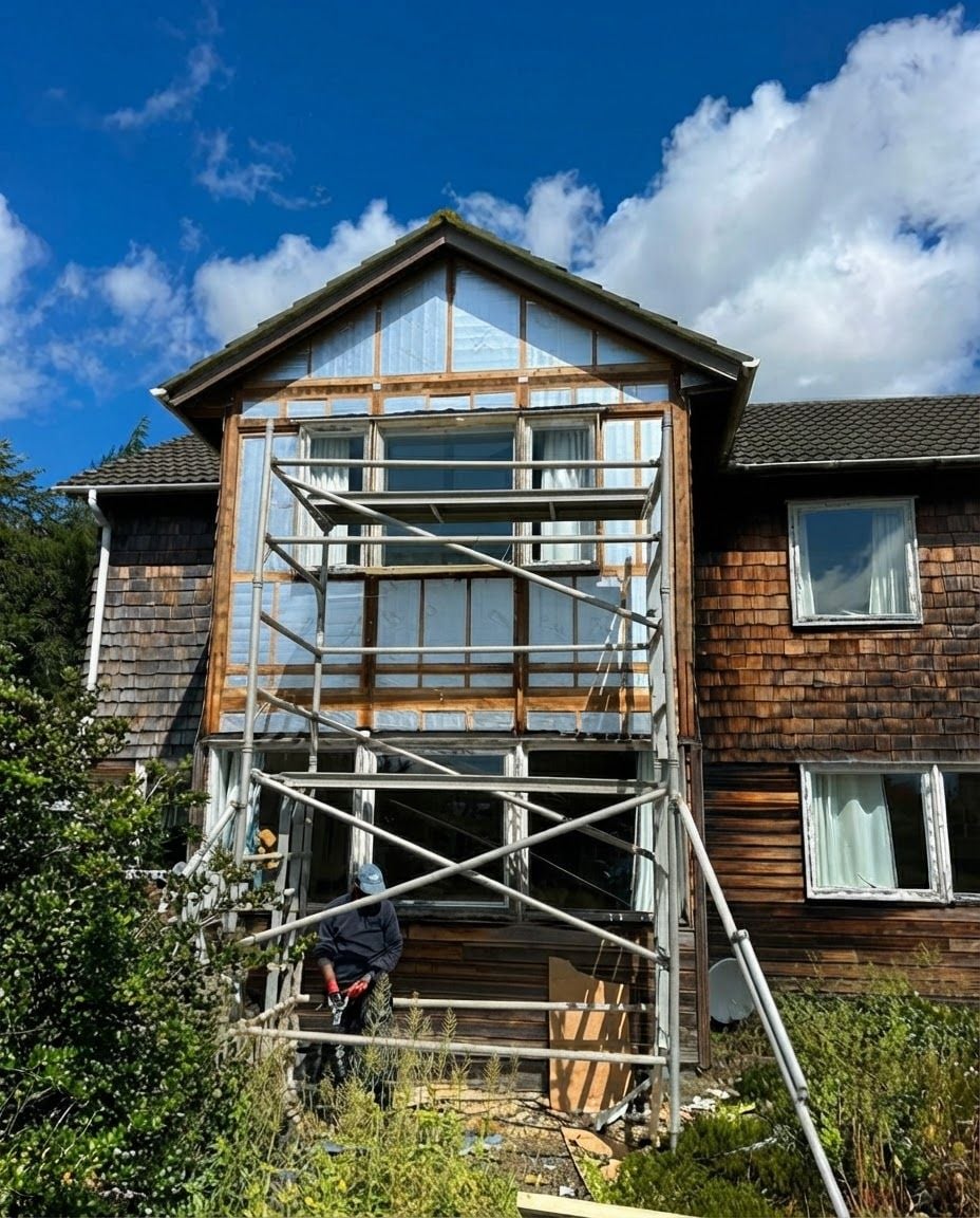
Change this image to 4:5 aspect ratio. Analyze what type of content this is and handle the transformation appropriately: - If it's a product photo: keep the product exactly the same, only extend or crop the background - If it has text, logos, or graphic elements: preserve all text and graphics exactly as they are - If it's a portrait or photo of people: keep the subject intact, extend or crop the surrounding environment - If it's a landscape or scenery: seamlessly extend or crop the natural environment - If it's artwork or illustration: maintain the artistic style consistently Apply the most appropriate transformation based on what you see in the image.
by @Elephant_3925697
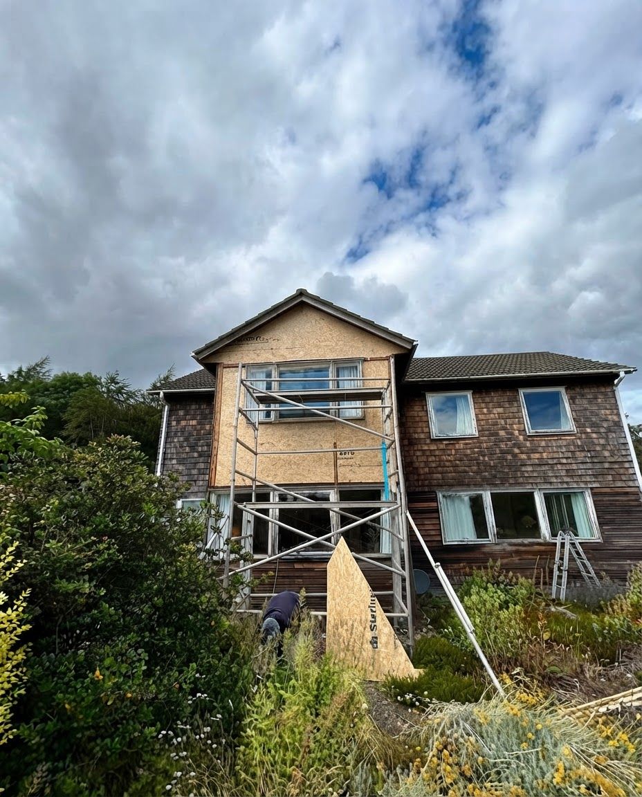
Change this image to 4:5 aspect ratio. Analyze what type of content this is and handle the transformation appropriately: - If it's a product photo: keep the product exactly the same, only extend or crop the background - If it has text, logos, or graphic elements: preserve all text and graphics exactly as they are - If it's a portrait or photo of people: keep the subject intact, extend or crop the surrounding environment - If it's a landscape or scenery: seamlessly extend or crop the natural environment - If it's artwork or illustration: maintain the artistic style consistently Apply the most appropriate transformation based on what you see in the image.
by @Elephant_3925697
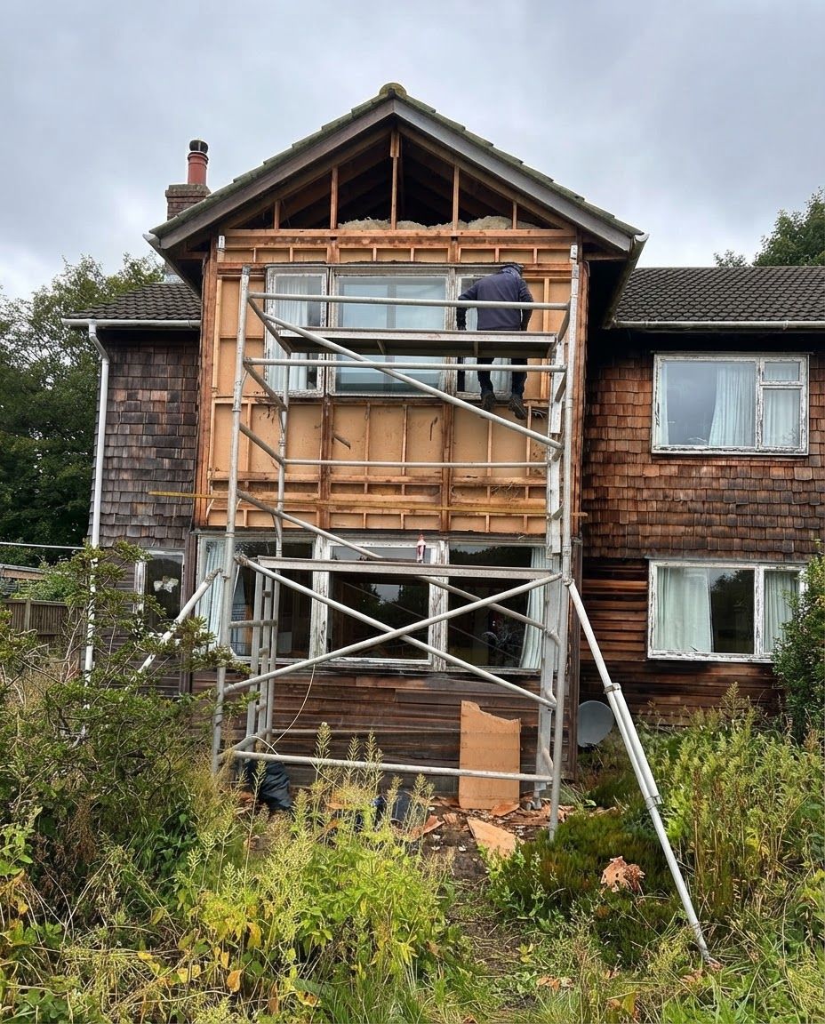
Change this image to 4:5 aspect ratio. Analyze what type of content this is and handle the transformation appropriately: - If it's a product photo: keep the product exactly the same, only extend or crop the background - If it has text, logos, or graphic elements: preserve all text and graphics exactly as they are - If it's a portrait or photo of people: keep the subject intact, extend or crop the surrounding environment - If it's a landscape or scenery: seamlessly extend or crop the natural environment - If it's artwork or illustration: maintain the artistic style consistently Apply the most appropriate transformation based on what you see in the image.
by @Elephant_3925697
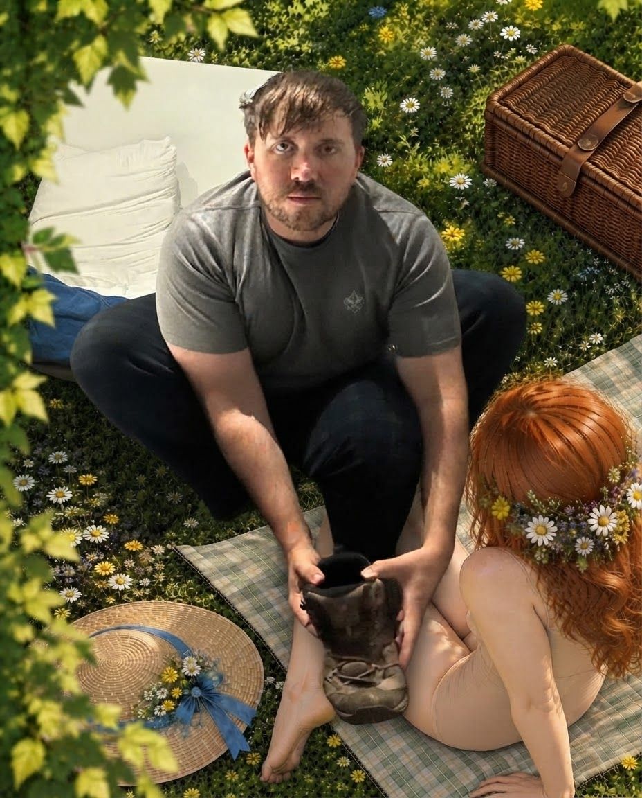
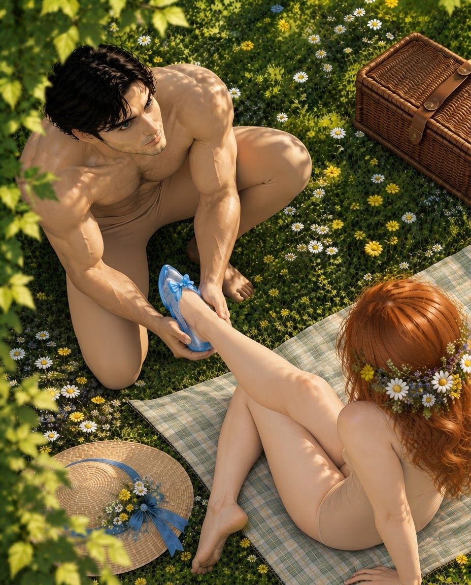
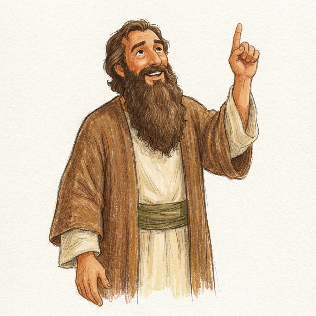
I have already generated the style I want. Now let’s create specific characters and illustrations in the exact style of this image. Illustration style: Traditional hand-drawn children’s storybook illustration with an expressive, slightly loose quality. Characters are first drawn with soft, organic pencil lines, with visible variation in line weight and occasional imperfect or sketch-like marks. Colour is applied in layered coloured-pencil and dry gouache-like textures, allowing subtle paper grain, pencil strokes, uneven pigment and overlapping marks to remain visible. Shapes and silhouettes are clear enough for very young children, but edges are not mechanically perfect or vector-clean. Character proportions are natural but gently simplified for children’s illustration, rather than exaggerated or chibi. Faces are warm, expressive and immediately readable, with simple natural features. Clothing has enough folds and texture to feel drawn and dimensional without becoming detailed or realistic. Shading is understated and created primarily through textured strokes and variations in colour rather than smooth digital gradients. The finished artwork should feel like an illustration made by a skilled children’s-book illustrator using traditional drawing materials: charming, tactile and slightly imperfect, while remaining clean, attractive and highly legible for preschool and early-primary children. Avoid: polished vector-art appearance, perfectly uniform outlines, perfectly smooth colour fills, glossy digital rendering, airbrushed gradients, CGI or 3D appearance, photorealism, anime features, oversized cartoon eyes, exaggerated baby proportions, sticker aesthetics, cinematic lighting, and the overly polished generic look of stock children’s clip-art. Using this style, make the same character pointing upwards, as if talking about God. Al so, make his beard longer
by @Elephant_5438659
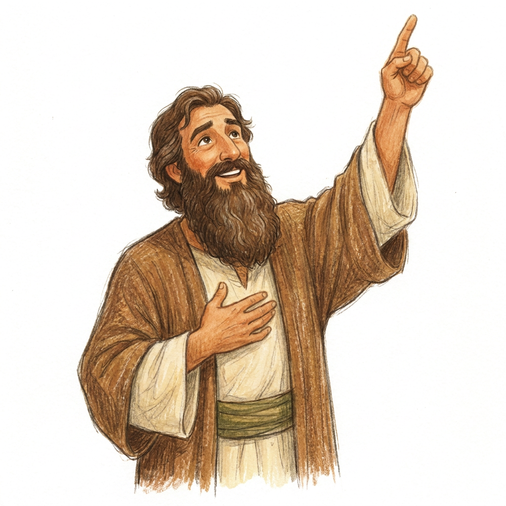
I have already generated the style I want. Now let’s create specific characters and illustrations in the exact style of this image. Illustration style: Traditional hand-drawn children’s storybook illustration with an expressive, slightly loose quality. Characters are first drawn with soft, organic pencil lines, with visible variation in line weight and occasional imperfect or sketch-like marks. Colour is applied in layered coloured-pencil and dry gouache-like textures, allowing subtle paper grain, pencil strokes, uneven pigment and overlapping marks to remain visible. Shapes and silhouettes are clear enough for very young children, but edges are not mechanically perfect or vector-clean. Character proportions are natural but gently simplified for children’s illustration, rather than exaggerated or chibi. Faces are warm, expressive and immediately readable, with simple natural features. Clothing has enough folds and texture to feel drawn and dimensional without becoming detailed or realistic. Shading is understated and created primarily through textured strokes and variations in colour rather than smooth digital gradients. The finished artwork should feel like an illustration made by a skilled children’s-book illustrator using traditional drawing materials: charming, tactile and slightly imperfect, while remaining clean, attractive and highly legible for preschool and early-primary children. Avoid: polished vector-art appearance, perfectly uniform outlines, perfectly smooth colour fills, glossy digital rendering, airbrushed gradients, CGI or 3D appearance, photorealism, anime features, oversized cartoon eyes, exaggerated baby proportions, sticker aesthetics, cinematic lighting, and the overly polished generic look of stock children’s clip-art. Using this style, make the same character pointing upwards, as if talking about God. Al so, make his beard longer
by @Elephant_5438659
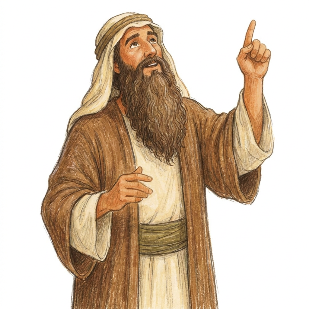
I have already generated the style I want. Now let’s create specific characters and illustrations in the exact style of this image. Illustration style: Traditional hand-drawn children’s storybook illustration with an expressive, slightly loose quality. Characters are first drawn with soft, organic pencil lines, with visible variation in line weight and occasional imperfect or sketch-like marks. Colour is applied in layered coloured-pencil and dry gouache-like textures, allowing subtle paper grain, pencil strokes, uneven pigment and overlapping marks to remain visible. Shapes and silhouettes are clear enough for very young children, but edges are not mechanically perfect or vector-clean. Character proportions are natural but gently simplified for children’s illustration, rather than exaggerated or chibi. Faces are warm, expressive and immediately readable, with simple natural features. Clothing has enough folds and texture to feel drawn and dimensional without becoming detailed or realistic. Shading is understated and created primarily through textured strokes and variations in colour rather than smooth digital gradients. The finished artwork should feel like an illustration made by a skilled children’s-book illustrator using traditional drawing materials: charming, tactile and slightly imperfect, while remaining clean, attractive and highly legible for preschool and early-primary children. Avoid: polished vector-art appearance, perfectly uniform outlines, perfectly smooth colour fills, glossy digital rendering, airbrushed gradients, CGI or 3D appearance, photorealism, anime features, oversized cartoon eyes, exaggerated baby proportions, sticker aesthetics, cinematic lighting, and the overly polished generic look of stock children’s clip-art. Using this style, make the same character pointing upwards, as if talking about God. Al so, make his beard longer
by @Elephant_5438659
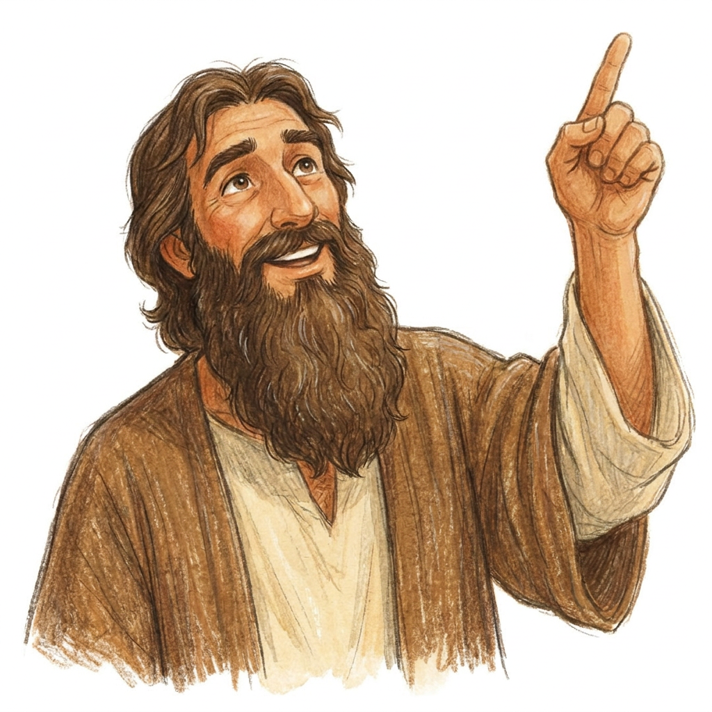
I have already generated the style I want. Now let’s create specific characters and illustrations in the exact style of this image. Illustration style: Traditional hand-drawn children’s storybook illustration with an expressive, slightly loose quality. Characters are first drawn with soft, organic pencil lines, with visible variation in line weight and occasional imperfect or sketch-like marks. Colour is applied in layered coloured-pencil and dry gouache-like textures, allowing subtle paper grain, pencil strokes, uneven pigment and overlapping marks to remain visible. Shapes and silhouettes are clear enough for very young children, but edges are not mechanically perfect or vector-clean. Character proportions are natural but gently simplified for children’s illustration, rather than exaggerated or chibi. Faces are warm, expressive and immediately readable, with simple natural features. Clothing has enough folds and texture to feel drawn and dimensional without becoming detailed or realistic. Shading is understated and created primarily through textured strokes and variations in colour rather than smooth digital gradients. The finished artwork should feel like an illustration made by a skilled children’s-book illustrator using traditional drawing materials: charming, tactile and slightly imperfect, while remaining clean, attractive and highly legible for preschool and early-primary children. Avoid: polished vector-art appearance, perfectly uniform outlines, perfectly smooth colour fills, glossy digital rendering, airbrushed gradients, CGI or 3D appearance, photorealism, anime features, oversized cartoon eyes, exaggerated baby proportions, sticker aesthetics, cinematic lighting, and the overly polished generic look of stock children’s clip-art. Using this style, make the same character pointing upwards, as if talking about God. Al so, make his beard longer
by @Elephant_5438659
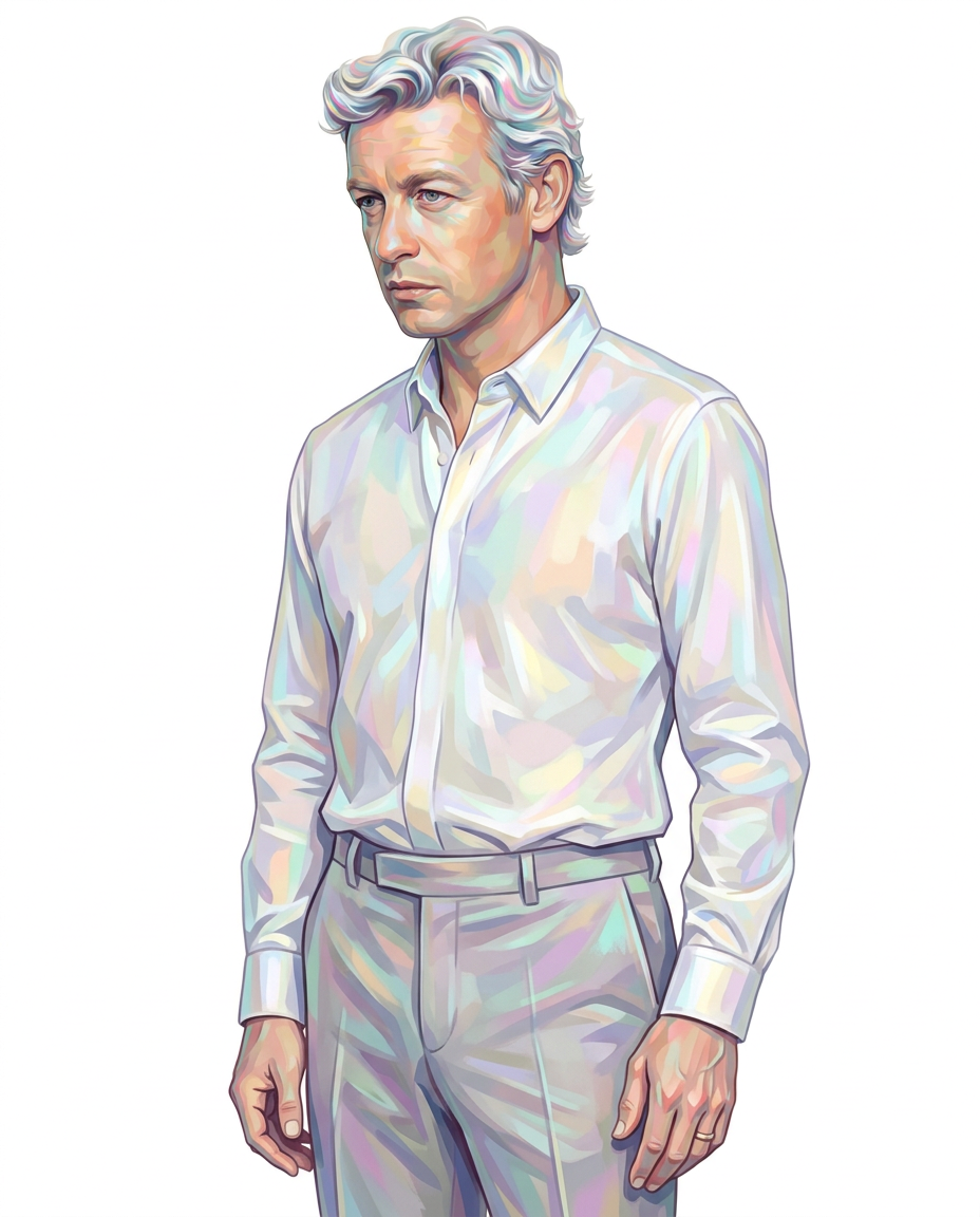
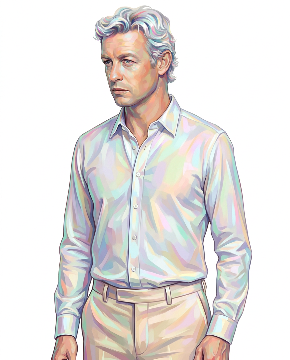
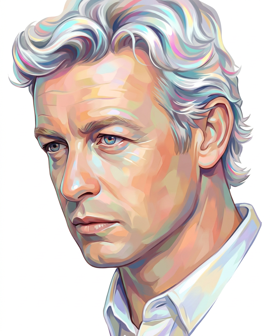
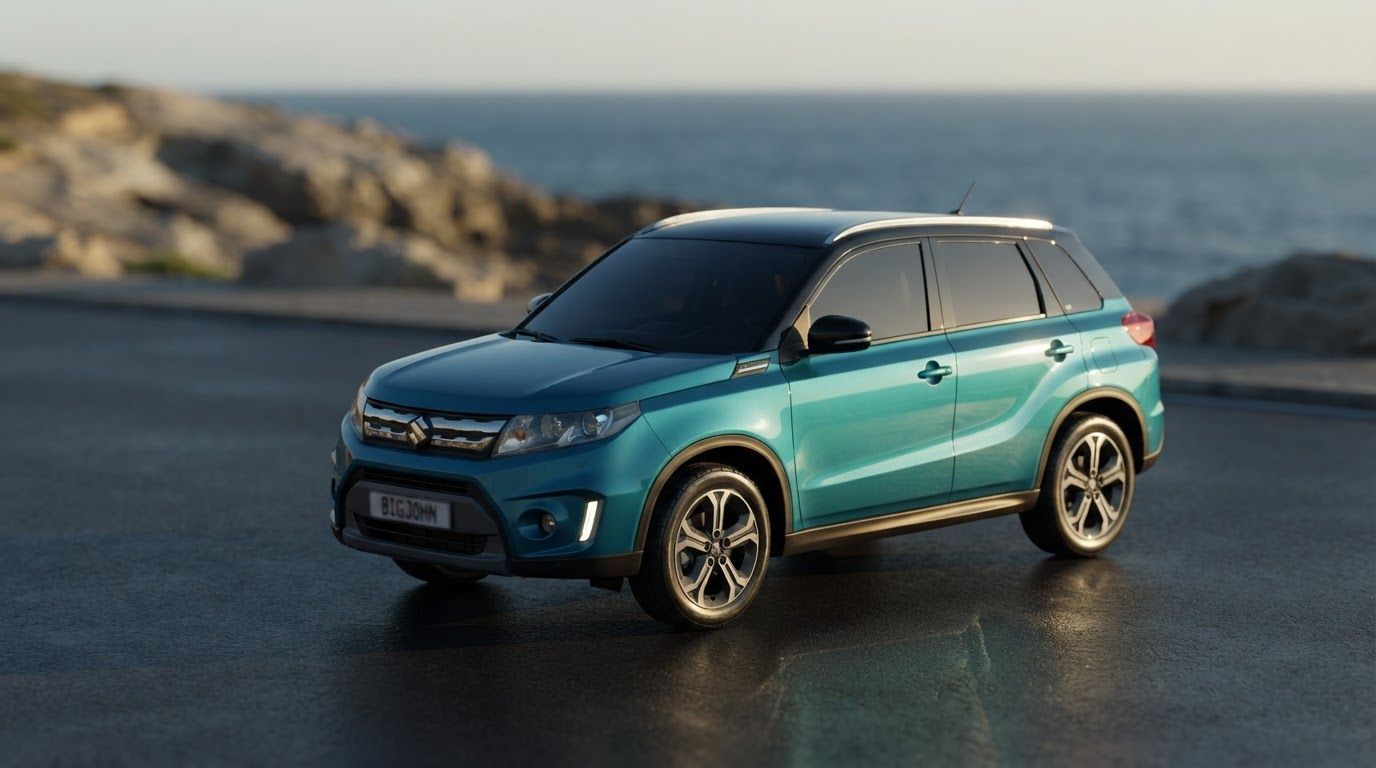
Main campaign hero visual for brand. Cinematic advertising image with a clear subject, memorable visual idea, strong depth and lighting, premium art direction, clean negative space for headline and CTA to be added later, no generated text. Incorporate the attached brand element reference image (Reference A: brand element "Teal SUV") into the composition where natural — preserve the depicted brand element's appearance.
by @Elephant_8717366
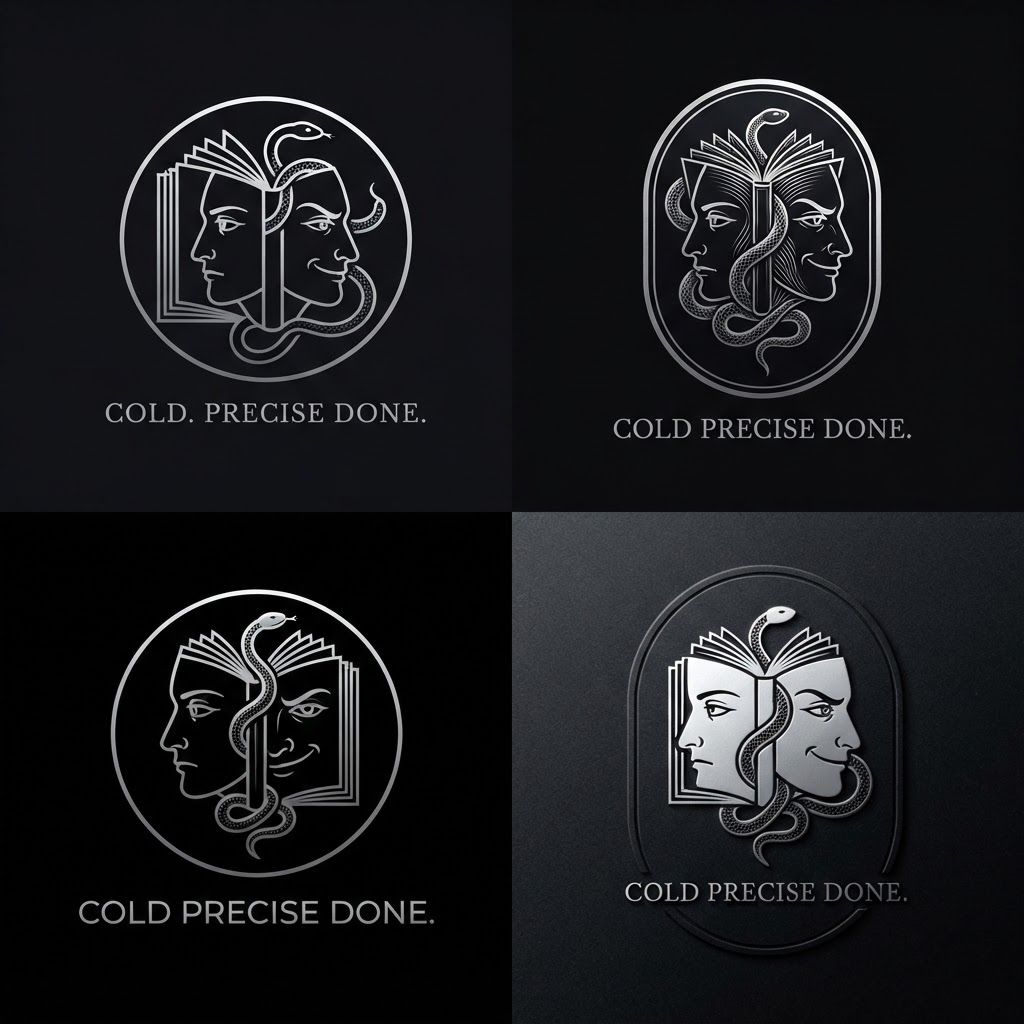
Create a minimalist logo for a personal brand. Style: strict, expensive, cold, restrained. Only black, white and silver colors. No bright shades. Central image: two-faced Janus — two faces looking in opposite directions. One face is calm and cold, the other is tough with a slight smirk. Faces are drawn with thin, clear lines, no extra details. One side of the face smoothly transitions into an open book — the pages are a continuation of the profile. The book symbolizes literature, knowledge, control. Second element: a thin snake coiling around the book or passing through the face. The snake is restrained, not aggressive — a symbol of coldness, greed and precision. Logo shape: circle or vertical oval. Suitable for a social media avatar and for printing on business cards. Replace the text. Use exactly: "Cold. Precise. Done." in a strict thin font below the logo. No other words. Background: transparent or deep black. сделай ее в разных стилях на свое усмотрение , чуть более детализированно , и чтобы я могла сохранить
by @Elephant_5050166
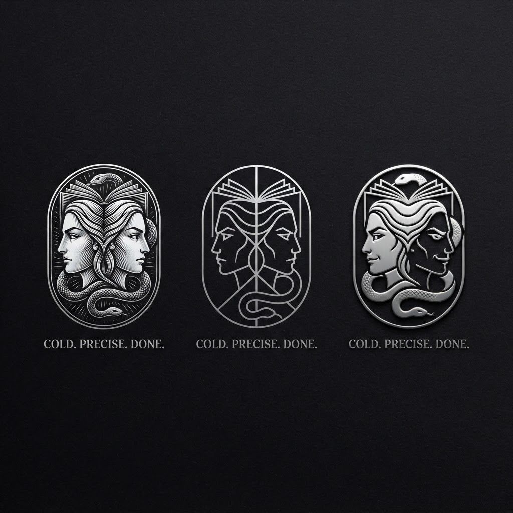
Create a minimalist logo for a personal brand. Style: strict, expensive, cold, restrained. Only black, white and silver colors. No bright shades. Central image: two-faced Janus — two faces looking in opposite directions. One face is calm and cold, the other is tough with a slight smirk. Faces are drawn with thin, clear lines, no extra details. One side of the face smoothly transitions into an open book — the pages are a continuation of the profile. The book symbolizes literature, knowledge, control. Second element: a thin snake coiling around the book or passing through the face. The snake is restrained, not aggressive — a symbol of coldness, greed and precision. Logo shape: circle or vertical oval. Suitable for a social media avatar and for printing on business cards. Replace the text. Use exactly: "Cold. Precise. Done." in a strict thin font below the logo. No other words. Background: transparent or deep black. сделай ее в разных стилях на свое усмотрение , чуть более детализированно , и чтобы я могла сохранить
by @Elephant_5050166
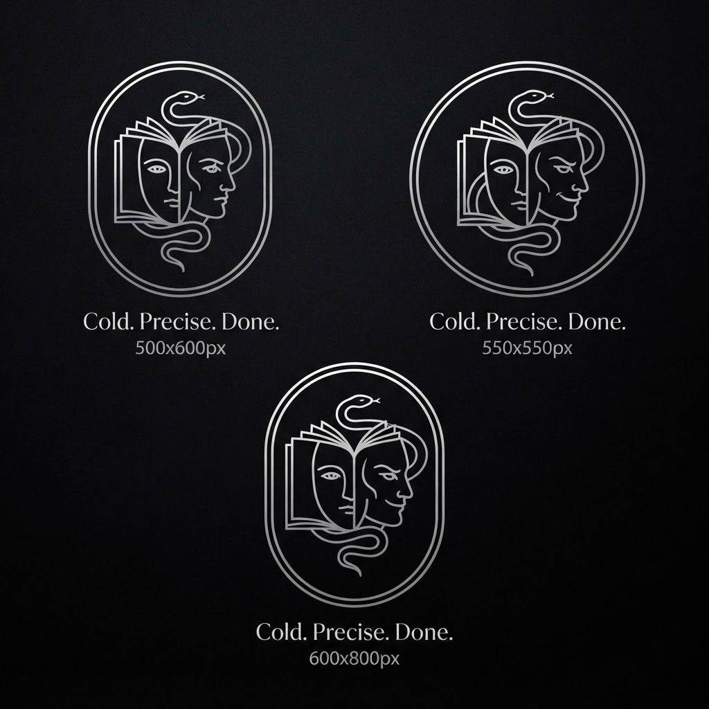
Create a minimalist logo for a personal brand. Style: strict, expensive, cold, restrained. Only black, white and silver colors. No bright shades. Central image: two-faced Janus — two faces looking in opposite directions. One face is calm and cold, the other is tough with a slight smirk. Faces are drawn with thin, clear lines, no extra details. One side of the face smoothly transitions into an open book — the pages are a continuation of the profile. The book symbolizes literature, knowledge, control. Second element: a thin snake coiling around the book or passing through the face. The snake is restrained, not aggressive — a symbol of coldness, greed and precision. Logo shape: circle or vertical oval. Suitable for a social media avatar and for printing on business cards. Replace the text. Use exactly: "Cold. Precise. Done." in a strict thin font below the logo. No other words. Background: transparent or deep black. сделай ее в разных стилях на свое усмотрение , чуть более детализированно , и чтобы я могла сохранить
by @Elephant_5050166
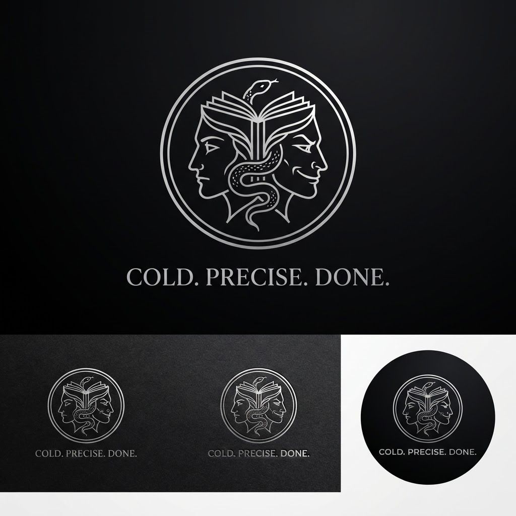
Create a minimalist logo for a personal brand. Style: strict, expensive, cold, restrained. Only black, white and silver colors. No bright shades. Central image: two-faced Janus — two faces looking in opposite directions. One face is calm and cold, the other is tough with a slight smirk. Faces are drawn with thin, clear lines, no extra details. One side of the face smoothly transitions into an open book — the pages are a continuation of the profile. The book symbolizes literature, knowledge, control. Second element: a thin snake coiling around the book or passing through the face. The snake is restrained, not aggressive — a symbol of coldness, greed and precision. Logo shape: circle or vertical oval. Suitable for a social media avatar and for printing on business cards. Replace the text. Use exactly: "Cold. Precise. Done." in a strict thin font below the logo. No other words. Background: transparent or deep black. сделай ее в разных стилях на свое усмотрение
by @Elephant_5050166
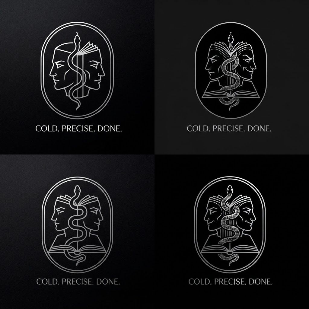
Create a minimalist logo for a personal brand. Style: strict, expensive, cold, restrained. Only black, white and silver colors. No bright shades. Central image: two-faced Janus — two faces looking in opposite directions. One face is calm and cold, the other is tough with a slight smirk. Faces are drawn with thin, clear lines, no extra details. One side of the face smoothly transitions into an open book — the pages are a continuation of the profile. The book symbolizes literature, knowledge, control. Second element: a thin snake coiling around the book or passing through the face. The snake is restrained, not aggressive — a symbol of coldness, greed and precision. Logo shape: circle or vertical oval. Suitable for a social media avatar and for printing on business cards. Replace the text. Use exactly: "Cold. Precise. Done." in a strict thin font below the logo. No other words. Background: transparent or deep black. сделай ее в разных стилях на свое усмотрение
by @Elephant_5050166
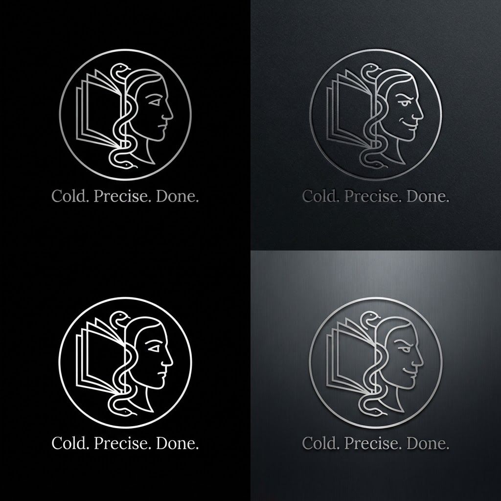
Create a minimalist logo for a personal brand. Style: strict, expensive, cold, restrained. Only black, white and silver colors. No bright shades. Central image: two-faced Janus — two faces looking in opposite directions. One face is calm and cold, the other is tough with a slight smirk. Faces are drawn with thin, clear lines, no extra details. One side of the face smoothly transitions into an open book — the pages are a continuation of the profile. The book symbolizes literature, knowledge, control. Second element: a thin snake coiling around the book or passing through the face. The snake is restrained, not aggressive — a symbol of coldness, greed and precision. Logo shape: circle or vertical oval. Suitable for a social media avatar and for printing on business cards. Replace the text. Use exactly: "Cold. Precise. Done." in a strict thin font below the logo. No other words. Background: transparent or deep black. сделай ее в разных стилях на свое усмотрение
by @Elephant_5050166
What's next?Explore more features
Go from browse to build