Designs made by our community
Explore unique graphic designs and images crafted by creators around the world using Hiding Elephant's AI design tools. Get inspired and start creating.

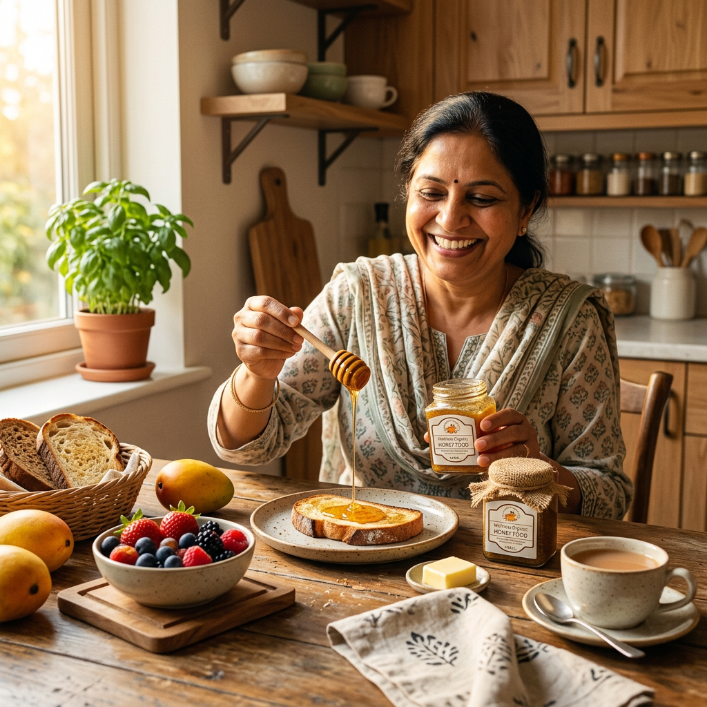
"A warm, sunny home kitchen scene in the morning. A smiling Indian woman at the breakfast table holding a wooden honey dipper, drizzling golden honey from a glass jar onto toast. Fresh fruits and healthy breakfast on the table. Natural organic lifestyle vibe, soft lighting, realistic photography style, square 1:1 format."
by @Elephant_8230725








Design a modern, premium, vector-style logo for the "Artificial Intelligence and Data Science Association" of an engineering college. The logo should be circular and suitable for official use on certificates, ID cards, T-shirts, websites, and banners. In the center, create a unique emblem that combines an AI brain, neural network, circuit lines, and data visualization elements, symbolizing Artificial Intelligence, Machine Learning, Deep Learning, Big Data, and innovation. Integrate subtle geometric connections, digital nodes, and futuristic technology patterns. Surround the emblem with a clean circular border containing the text "ARTIFICIAL INTELLIGENCE & DATA SCIENCE ASSOCIATION". Use a professional color palette of royal blue, navy blue, cyan, white, and silver. The design should be minimalist, symmetrical, and highly scalable with crisp vector lines, flat design, no gradients, no 3D effects, no mockup, transparent background, and an official university association appearance. The logo should look timeless, elegant, and internationally professional.
by @Elephant_6208805

Design a modern, premium, vector-style logo for the "Artificial Intelligence and Data Science Association" of an engineering college. The logo should be circular and suitable for official use on certificates, ID cards, T-shirts, websites, and banners. In the center, create a unique emblem that combines an AI brain, neural network, circuit lines, and data visualization elements, symbolizing Artificial Intelligence, Machine Learning, Deep Learning, Big Data, and innovation. Integrate subtle geometric connections, digital nodes, and futuristic technology patterns. Surround the emblem with a clean circular border containing the text "ARTIFICIAL INTELLIGENCE & DATA SCIENCE ASSOCIATION". Use a professional color palette of royal blue, navy blue, cyan, white, and silver. The design should be minimalist, symmetrical, and highly scalable with crisp vector lines, flat design, no gradients, no 3D effects, no mockup, transparent background, and an official university association appearance. The logo should look timeless, elegant, and internationally professional.
by @Elephant_6208805

Design a modern, premium, vector-style logo for the "Artificial Intelligence and Data Science Association" of an engineering college. The logo should be circular and suitable for official use on certificates, ID cards, T-shirts, websites, and banners. In the center, create a unique emblem that combines an AI brain, neural network, circuit lines, and data visualization elements, symbolizing Artificial Intelligence, Machine Learning, Deep Learning, Big Data, and innovation. Integrate subtle geometric connections, digital nodes, and futuristic technology patterns. Surround the emblem with a clean circular border containing the text "ARTIFICIAL INTELLIGENCE & DATA SCIENCE ASSOCIATION". Use a professional color palette of royal blue, navy blue, cyan, white, and silver. The design should be minimalist, symmetrical, and highly scalable with crisp vector lines, flat design, no gradients, no 3D effects, no mockup, transparent background, and an official university association appearance. The logo should look timeless, elegant, and internationally professional.
by @Elephant_6208805
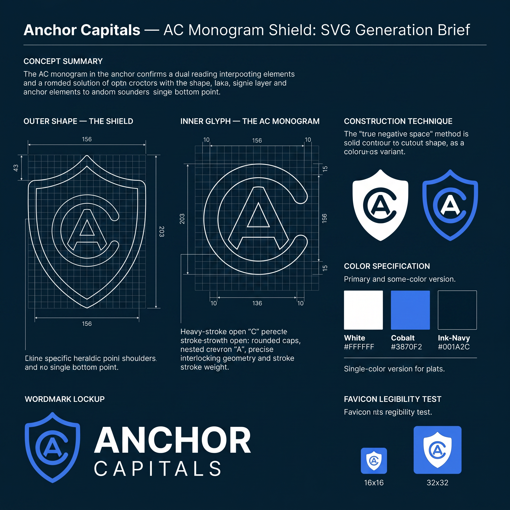
# Anchor Capitals — AC Monogram Shield: SVG Generation Brief Use this as a direct prompt for an SVG-generating tool, or as a creative brief for a designer. It fully specifies geometry, construction logic, and color so the result is reproducible, not left to interpretation. --- ## Concept summary Design a single emblem for the brand **Anchor Capitals** — a shield-shaped mark containing one continuous glyph that reads simultaneously as the letters **A** and **C**, and as an anchor's ring and crown. The technique: one shape, multiple readings — the same principle as a maritime crest where the inner icon doubles as a boat hull, an anchor, and a letterform depending on how you look at it. Here, the two readings that matter are the brand's initials (A, C) and the maritime/stability metaphor (anchor ring, anchor point). ## Outer shape — the shield - Heraldic crest silhouette: a "twin-peak" top edge — two shoulder peaks meeting at a shallow center dip (not a flat top, not a single point) — curving down through rounded shoulders, running in relatively straight sides, then tapering to a single sharp point at the bottom center. - Proportions: roughly 0.77 width-to-height (e.g. 156 wide × 203 tall in a 200-unit local grid). - Rendered as a solid silhouette fill — no outline stroke. This shield is a container, not a frame. ## Inner glyph — the AC monogram This is the part that has to be exact, not approximated: - **The "C"**: an open ring — roughly 280° of a circle, opening toward the right at about a 70–80° gap. Drawn as a single thick stroke with rounded caps at both open terminals (not a closed donut shape — it must read as an open letter C, terminals visible). - **The "A"**: a simple chevron / peak — a single upward-pointing "^" with two legs descending from the apex, no crossbar (matching a minimal, geometric "A" treatment, not a full architectural A). Rounded join at the apex, rounded caps at both leg ends. - **The fusion**: nest the chevron inside the C's open mouth so the chevron's two leg-ends sit close to — almost touching — the C's two open terminals. The two shapes should not simply sit side by side; they should share the same visual space, same stroke weight, same optical center, so the eye reads one interlocked mark, not two separate icons placed near each other. - Stroke weight: heavy — roughly 16 units on a 200-unit grid (≈8% of the shield's width). This isn't optional; thin strokes will not survive the favicon-scale legibility test below. - Center the whole glyph inside the shield's interior, with roughly equal margin on all sides. ## Construction technique Two acceptable methods, in order of preference: 1. **Preferred — true negative space**: One compound path using the even-odd fill rule, where the shield is the outer contour and the C+chevron strokes are cut as holes through it. This is what makes the mark work as a single flat color (a stamp, a favicon, an embossed seal) — critical, don't skip this if the deliverable needs to scale down or print in one color. 2. **Acceptable for a colored variant**: Solid shield fill in one color, with the C+chevron drawn on top in a second color (not cut out, just layered). Use this only for the full-color brand version, not for the single-color/stamp version. ## Color specification - **Primary full-color lockup**: shield fill white `#FFFFFF`; C+chevron glyph in cobalt `#3870F2`; presented on an ink-navy `#001A2C` background. - **Single-color variants required**: solid `#001A2C` (or pure black) version for light backgrounds; solid white version for dark backgrounds and for use as a favicon/stamp. These must use the true negative-space construction (method 1 above), not layered colors. - No gradients, no drop shadows, no glow effects, anywhere, in any variant. ## Wordmark lockup Pair the icon with the wordmark in a horizontal lockup (icon left, text right, vertically centered against the icon's height): - Line 1: **ANCHOR** — bold/heavy weight, tracked letter-spacing, larger size. - Line 2: **CAPITALS** — regular/medium weight, wider tracked letter-spacing, smaller size, positioned directly below line 1. - Typeface: geometric sans — Plus Jakarta Sans preferred (brand typeface), Arial/Helvetica acceptable as fallback. - All caps on both lines. ## Deliverable requirements - Format: SVG, vector paths only. No raster fills, no filters, no embedded images. - Must remain legible and distinguishable as both letters at 16×16px (browser favicon scale) — test this explicitly before finalizing stroke weights or the C's gap angle. - Required variants: icon-only (square, for app icons/favicons), horizontal lockup (icon + wordmark), and at minimum one single-color version per the color spec above. - Flat design throughout: no gradients, no shadows, no bevels, no glow. Rounded caps and joins on all glyph strokes; consistent corner treatment if any rectangles are used elsewhere in the lockup. ## Open variables (resolve before final production) - C's opening angle: currently specified facing right. An alternative is opening downward, which lets the A's apex point straight up through the gap rather than at a diagonal — test both before locking. - Stroke weight could be reduced for a more refined feel, at some cost to small-size legibility — only adjust after the favicon test passes at the heavier weight first.
by @Elephant_9259723
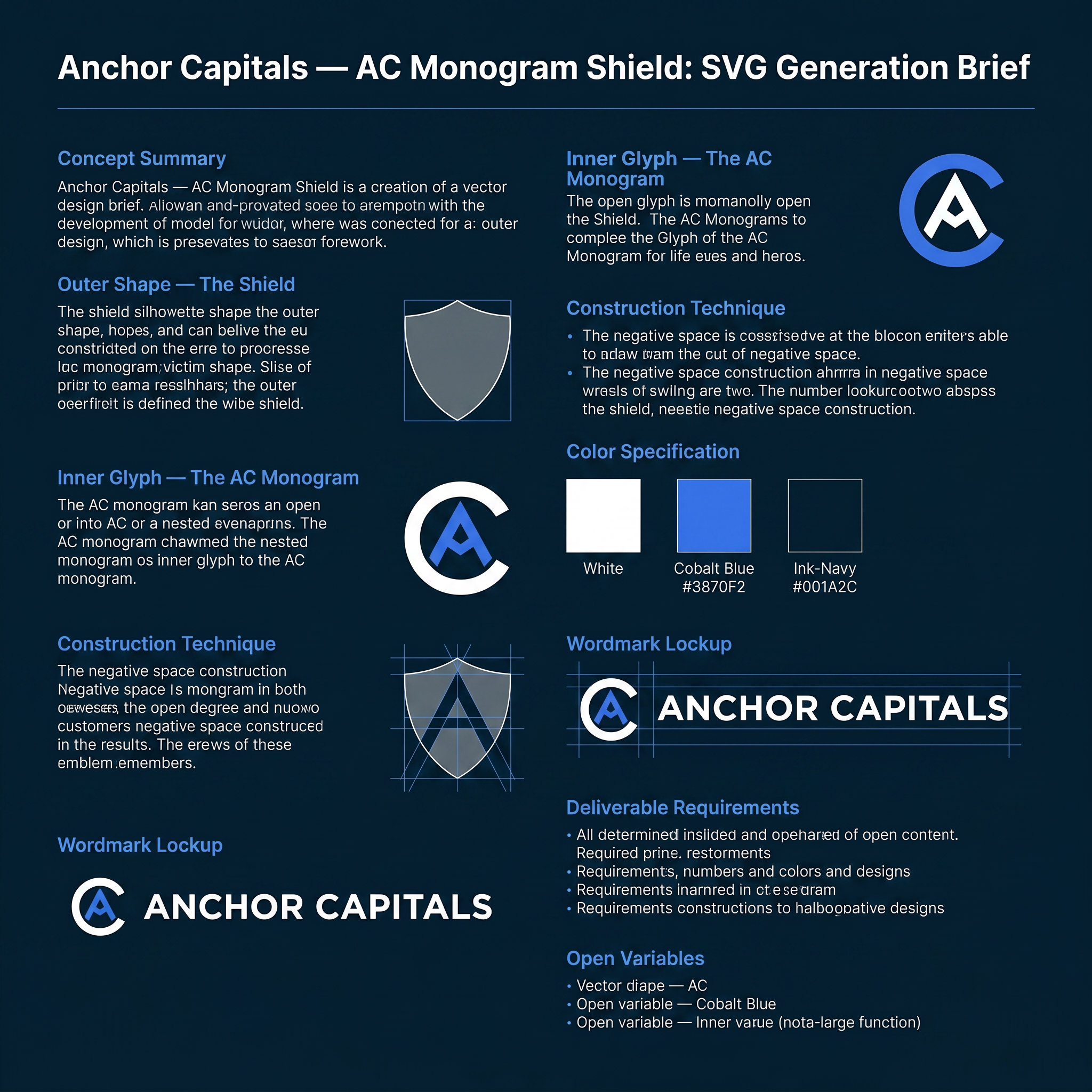
# Anchor Capitals — AC Monogram Shield: SVG Generation Brief Use this as a direct prompt for an SVG-generating tool, or as a creative brief for a designer. It fully specifies geometry, construction logic, and color so the result is reproducible, not left to interpretation. --- ## Concept summary Design a single emblem for the brand **Anchor Capitals** — a shield-shaped mark containing one continuous glyph that reads simultaneously as the letters **A** and **C**, and as an anchor's ring and crown. The technique: one shape, multiple readings — the same principle as a maritime crest where the inner icon doubles as a boat hull, an anchor, and a letterform depending on how you look at it. Here, the two readings that matter are the brand's initials (A, C) and the maritime/stability metaphor (anchor ring, anchor point). ## Outer shape — the shield - Heraldic crest silhouette: a "twin-peak" top edge — two shoulder peaks meeting at a shallow center dip (not a flat top, not a single point) — curving down through rounded shoulders, running in relatively straight sides, then tapering to a single sharp point at the bottom center. - Proportions: roughly 0.77 width-to-height (e.g. 156 wide × 203 tall in a 200-unit local grid). - Rendered as a solid silhouette fill — no outline stroke. This shield is a container, not a frame. ## Inner glyph — the AC monogram This is the part that has to be exact, not approximated: - **The "C"**: an open ring — roughly 280° of a circle, opening toward the right at about a 70–80° gap. Drawn as a single thick stroke with rounded caps at both open terminals (not a closed donut shape — it must read as an open letter C, terminals visible). - **The "A"**: a simple chevron / peak — a single upward-pointing "^" with two legs descending from the apex, no crossbar (matching a minimal, geometric "A" treatment, not a full architectural A). Rounded join at the apex, rounded caps at both leg ends. - **The fusion**: nest the chevron inside the C's open mouth so the chevron's two leg-ends sit close to — almost touching — the C's two open terminals. The two shapes should not simply sit side by side; they should share the same visual space, same stroke weight, same optical center, so the eye reads one interlocked mark, not two separate icons placed near each other. - Stroke weight: heavy — roughly 16 units on a 200-unit grid (≈8% of the shield's width). This isn't optional; thin strokes will not survive the favicon-scale legibility test below. - Center the whole glyph inside the shield's interior, with roughly equal margin on all sides. ## Construction technique Two acceptable methods, in order of preference: 1. **Preferred — true negative space**: One compound path using the even-odd fill rule, where the shield is the outer contour and the C+chevron strokes are cut as holes through it. This is what makes the mark work as a single flat color (a stamp, a favicon, an embossed seal) — critical, don't skip this if the deliverable needs to scale down or print in one color. 2. **Acceptable for a colored variant**: Solid shield fill in one color, with the C+chevron drawn on top in a second color (not cut out, just layered). Use this only for the full-color brand version, not for the single-color/stamp version. ## Color specification - **Primary full-color lockup**: shield fill white `#FFFFFF`; C+chevron glyph in cobalt `#3870F2`; presented on an ink-navy `#001A2C` background. - **Single-color variants required**: solid `#001A2C` (or pure black) version for light backgrounds; solid white version for dark backgrounds and for use as a favicon/stamp. These must use the true negative-space construction (method 1 above), not layered colors. - No gradients, no drop shadows, no glow effects, anywhere, in any variant. ## Wordmark lockup Pair the icon with the wordmark in a horizontal lockup (icon left, text right, vertically centered against the icon's height): - Line 1: **ANCHOR** — bold/heavy weight, tracked letter-spacing, larger size. - Line 2: **CAPITALS** — regular/medium weight, wider tracked letter-spacing, smaller size, positioned directly below line 1. - Typeface: geometric sans — Plus Jakarta Sans preferred (brand typeface), Arial/Helvetica acceptable as fallback. - All caps on both lines. ## Deliverable requirements - Format: SVG, vector paths only. No raster fills, no filters, no embedded images. - Must remain legible and distinguishable as both letters at 16×16px (browser favicon scale) — test this explicitly before finalizing stroke weights or the C's gap angle. - Required variants: icon-only (square, for app icons/favicons), horizontal lockup (icon + wordmark), and at minimum one single-color version per the color spec above. - Flat design throughout: no gradients, no shadows, no bevels, no glow. Rounded caps and joins on all glyph strokes; consistent corner treatment if any rectangles are used elsewhere in the lockup. ## Open variables (resolve before final production) - C's opening angle: currently specified facing right. An alternative is opening downward, which lets the A's apex point straight up through the gap rather than at a diagonal — test both before locking. - Stroke weight could be reduced for a more refined feel, at some cost to small-size legibility — only adjust after the favicon test passes at the heavier weight first.
by @Elephant_9259723
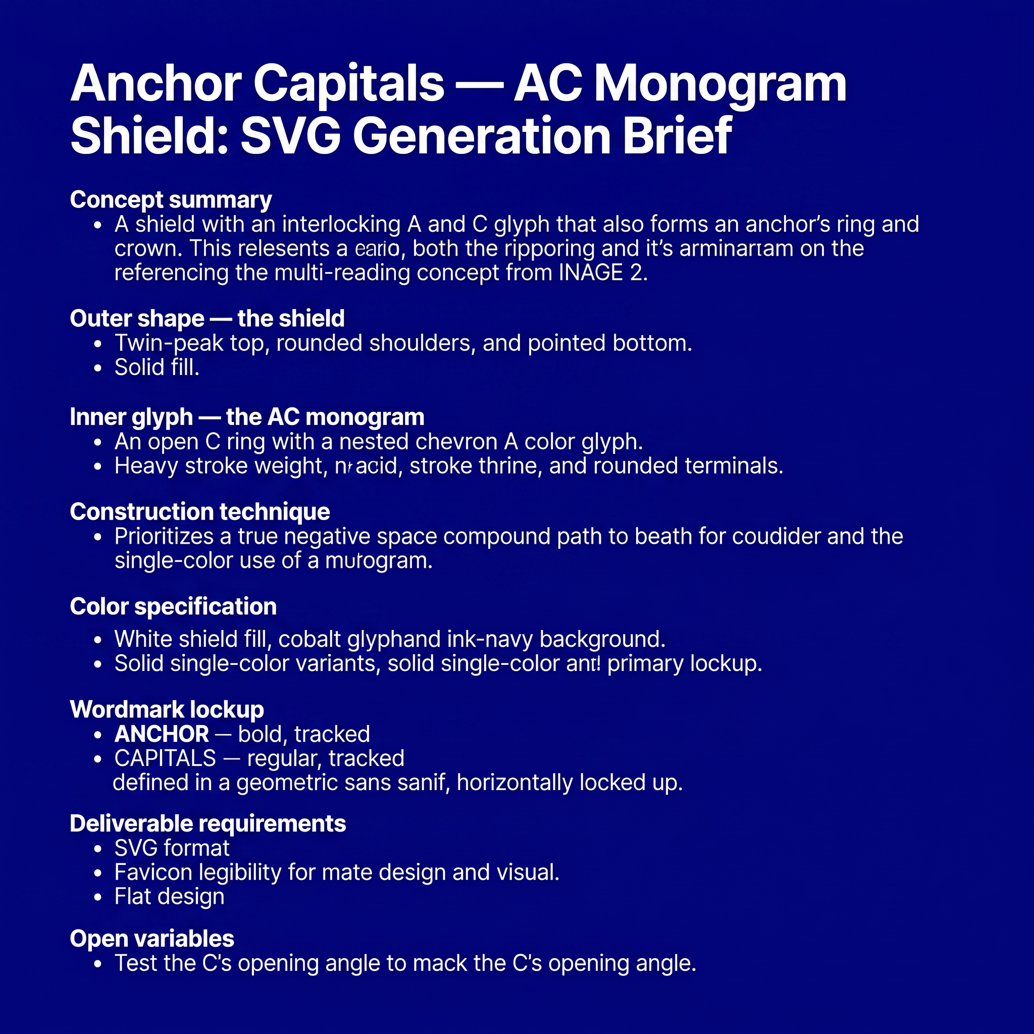
# Anchor Capitals — AC Monogram Shield: SVG Generation Brief Use this as a direct prompt for an SVG-generating tool, or as a creative brief for a designer. It fully specifies geometry, construction logic, and color so the result is reproducible, not left to interpretation. --- ## Concept summary Design a single emblem for the brand **Anchor Capitals** — a shield-shaped mark containing one continuous glyph that reads simultaneously as the letters **A** and **C**, and as an anchor's ring and crown. The technique: one shape, multiple readings — the same principle as a maritime crest where the inner icon doubles as a boat hull, an anchor, and a letterform depending on how you look at it. Here, the two readings that matter are the brand's initials (A, C) and the maritime/stability metaphor (anchor ring, anchor point). ## Outer shape — the shield - Heraldic crest silhouette: a "twin-peak" top edge — two shoulder peaks meeting at a shallow center dip (not a flat top, not a single point) — curving down through rounded shoulders, running in relatively straight sides, then tapering to a single sharp point at the bottom center. - Proportions: roughly 0.77 width-to-height (e.g. 156 wide × 203 tall in a 200-unit local grid). - Rendered as a solid silhouette fill — no outline stroke. This shield is a container, not a frame. ## Inner glyph — the AC monogram This is the part that has to be exact, not approximated: - **The "C"**: an open ring — roughly 280° of a circle, opening toward the right at about a 70–80° gap. Drawn as a single thick stroke with rounded caps at both open terminals (not a closed donut shape — it must read as an open letter C, terminals visible). - **The "A"**: a simple chevron / peak — a single upward-pointing "^" with two legs descending from the apex, no crossbar (matching a minimal, geometric "A" treatment, not a full architectural A). Rounded join at the apex, rounded caps at both leg ends. - **The fusion**: nest the chevron inside the C's open mouth so the chevron's two leg-ends sit close to — almost touching — the C's two open terminals. The two shapes should not simply sit side by side; they should share the same visual space, same stroke weight, same optical center, so the eye reads one interlocked mark, not two separate icons placed near each other. - Stroke weight: heavy — roughly 16 units on a 200-unit grid (≈8% of the shield's width). This isn't optional; thin strokes will not survive the favicon-scale legibility test below. - Center the whole glyph inside the shield's interior, with roughly equal margin on all sides. ## Construction technique Two acceptable methods, in order of preference: 1. **Preferred — true negative space**: One compound path using the even-odd fill rule, where the shield is the outer contour and the C+chevron strokes are cut as holes through it. This is what makes the mark work as a single flat color (a stamp, a favicon, an embossed seal) — critical, don't skip this if the deliverable needs to scale down or print in one color. 2. **Acceptable for a colored variant**: Solid shield fill in one color, with the C+chevron drawn on top in a second color (not cut out, just layered). Use this only for the full-color brand version, not for the single-color/stamp version. ## Color specification - **Primary full-color lockup**: shield fill white `#FFFFFF`; C+chevron glyph in cobalt `#3870F2`; presented on an ink-navy `#001A2C` background. - **Single-color variants required**: solid `#001A2C` (or pure black) version for light backgrounds; solid white version for dark backgrounds and for use as a favicon/stamp. These must use the true negative-space construction (method 1 above), not layered colors. - No gradients, no drop shadows, no glow effects, anywhere, in any variant. ## Wordmark lockup Pair the icon with the wordmark in a horizontal lockup (icon left, text right, vertically centered against the icon's height): - Line 1: **ANCHOR** — bold/heavy weight, tracked letter-spacing, larger size. - Line 2: **CAPITALS** — regular/medium weight, wider tracked letter-spacing, smaller size, positioned directly below line 1. - Typeface: geometric sans — Plus Jakarta Sans preferred (brand typeface), Arial/Helvetica acceptable as fallback. - All caps on both lines. ## Deliverable requirements - Format: SVG, vector paths only. No raster fills, no filters, no embedded images. - Must remain legible and distinguishable as both letters at 16×16px (browser favicon scale) — test this explicitly before finalizing stroke weights or the C's gap angle. - Required variants: icon-only (square, for app icons/favicons), horizontal lockup (icon + wordmark), and at minimum one single-color version per the color spec above. - Flat design throughout: no gradients, no shadows, no bevels, no glow. Rounded caps and joins on all glyph strokes; consistent corner treatment if any rectangles are used elsewhere in the lockup. ## Open variables (resolve before final production) - C's opening angle: currently specified facing right. An alternative is opening downward, which lets the A's apex point straight up through the gap rather than at a diagonal — test both before locking. - Stroke weight could be reduced for a more refined feel, at some cost to small-size legibility — only adjust after the favicon test passes at the heavier weight first.
by @Elephant_9259723
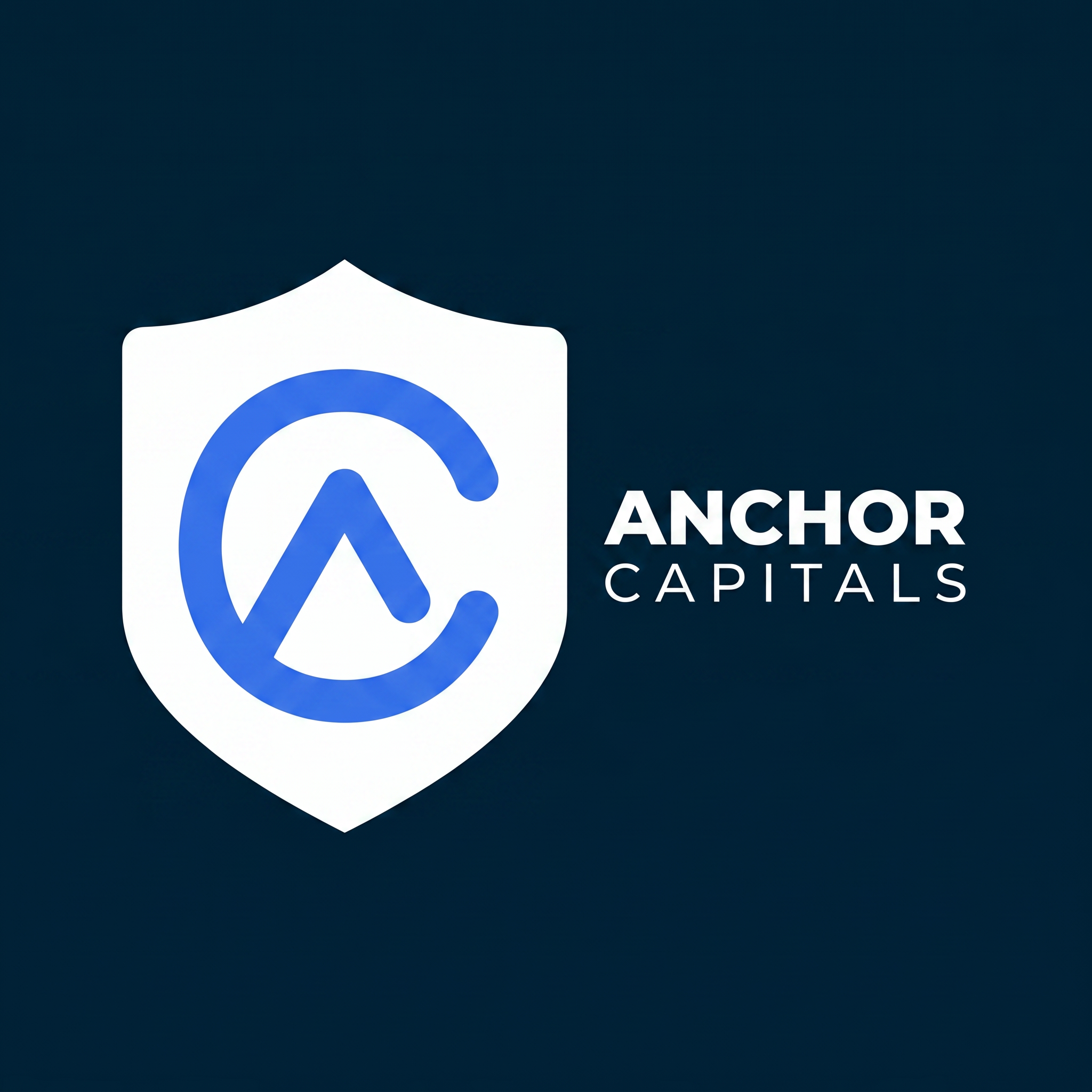
# Anchor Capitals — AC Monogram Shield: SVG Generation Brief Use this as a direct prompt for an SVG-generating tool, or as a creative brief for a designer. It fully specifies geometry, construction logic, and color so the result is reproducible, not left to interpretation. --- ## Concept summary Design a single emblem for the brand **Anchor Capitals** — a shield-shaped mark containing one continuous glyph that reads simultaneously as the letters **A** and **C**, and as an anchor's ring and crown. The technique: one shape, multiple readings — the same principle as a maritime crest where the inner icon doubles as a boat hull, an anchor, and a letterform depending on how you look at it. Here, the two readings that matter are the brand's initials (A, C) and the maritime/stability metaphor (anchor ring, anchor point). ## Outer shape — the shield - Heraldic crest silhouette: a "twin-peak" top edge — two shoulder peaks meeting at a shallow center dip (not a flat top, not a single point) — curving down through rounded shoulders, running in relatively straight sides, then tapering to a single sharp point at the bottom center. - Proportions: roughly 0.77 width-to-height (e.g. 156 wide × 203 tall in a 200-unit local grid). - Rendered as a solid silhouette fill — no outline stroke. This shield is a container, not a frame. ## Inner glyph — the AC monogram This is the part that has to be exact, not approximated: - **The "C"**: an open ring — roughly 280° of a circle, opening toward the right at about a 70–80° gap. Drawn as a single thick stroke with rounded caps at both open terminals (not a closed donut shape — it must read as an open letter C, terminals visible). - **The "A"**: a simple chevron / peak — a single upward-pointing "^" with two legs descending from the apex, no crossbar (matching a minimal, geometric "A" treatment, not a full architectural A). Rounded join at the apex, rounded caps at both leg ends. - **The fusion**: nest the chevron inside the C's open mouth so the chevron's two leg-ends sit close to — almost touching — the C's two open terminals. The two shapes should not simply sit side by side; they should share the same visual space, same stroke weight, same optical center, so the eye reads one interlocked mark, not two separate icons placed near each other. - Stroke weight: heavy — roughly 16 units on a 200-unit grid (≈8% of the shield's width). This isn't optional; thin strokes will not survive the favicon-scale legibility test below. - Center the whole glyph inside the shield's interior, with roughly equal margin on all sides. ## Construction technique Two acceptable methods, in order of preference: 1. **Preferred — true negative space**: One compound path using the even-odd fill rule, where the shield is the outer contour and the C+chevron strokes are cut as holes through it. This is what makes the mark work as a single flat color (a stamp, a favicon, an embossed seal) — critical, don't skip this if the deliverable needs to scale down or print in one color. 2. **Acceptable for a colored variant**: Solid shield fill in one color, with the C+chevron drawn on top in a second color (not cut out, just layered). Use this only for the full-color brand version, not for the single-color/stamp version. ## Color specification - **Primary full-color lockup**: shield fill white `#FFFFFF`; C+chevron glyph in cobalt `#3870F2`; presented on an ink-navy `#001A2C` background. - **Single-color variants required**: solid `#001A2C` (or pure black) version for light backgrounds; solid white version for dark backgrounds and for use as a favicon/stamp. These must use the true negative-space construction (method 1 above), not layered colors. - No gradients, no drop shadows, no glow effects, anywhere, in any variant. ## Wordmark lockup Pair the icon with the wordmark in a horizontal lockup (icon left, text right, vertically centered against the icon's height): - Line 1: **ANCHOR** — bold/heavy weight, tracked letter-spacing, larger size. - Line 2: **CAPITALS** — regular/medium weight, wider tracked letter-spacing, smaller size, positioned directly below line 1. - Typeface: geometric sans — Plus Jakarta Sans preferred (brand typeface), Arial/Helvetica acceptable as fallback. - All caps on both lines. ## Deliverable requirements - Format: SVG, vector paths only. No raster fills, no filters, no embedded images. - Must remain legible and distinguishable as both letters at 16×16px (browser favicon scale) — test this explicitly before finalizing stroke weights or the C's gap angle. - Required variants: icon-only (square, for app icons/favicons), horizontal lockup (icon + wordmark), and at minimum one single-color version per the color spec above. - Flat design throughout: no gradients, no shadows, no bevels, no glow. Rounded caps and joins on all glyph strokes; consistent corner treatment if any rectangles are used elsewhere in the lockup. ## Open variables (resolve before final production) - C's opening angle: currently specified facing right. An alternative is opening downward, which lets the A's apex point straight up through the gap rather than at a diagonal — test both before locking. - Stroke weight could be reduced for a more refined feel, at some cost to small-size legibility — only adjust after the favicon test passes at the heavier weight first.
by @Elephant_9259723
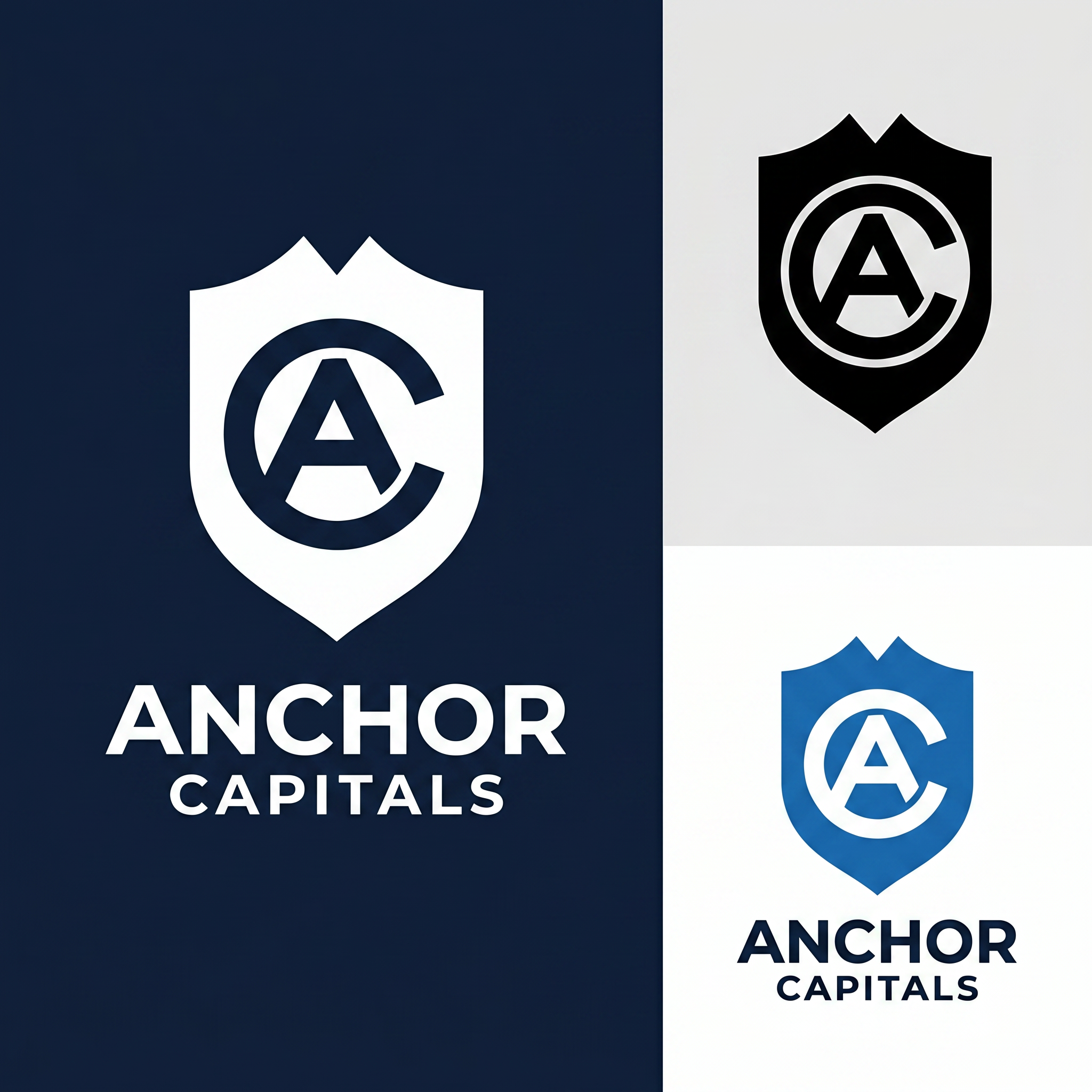
# Anchor Capitals — AC Monogram Shield: SVG Generation Brief Use this as a direct prompt for an SVG-generating tool, or as a creative brief for a designer. It fully specifies geometry, construction logic, and color so the result is reproducible, not left to interpretation. --- ## Concept summary Design a single emblem for the brand **Anchor Capitals** — a shield-shaped mark containing one continuous glyph that reads simultaneously as the letters **A** and **C**, and as an anchor's ring and crown. The technique: one shape, multiple readings — the same principle as a maritime crest where the inner icon doubles as a boat hull, an anchor, and a letterform depending on how you look at it. Here, the two readings that matter are the brand's initials (A, C) and the maritime/stability metaphor (anchor ring, anchor point). ## Outer shape — the shield - Heraldic crest silhouette: a "twin-peak" top edge — two shoulder peaks meeting at a shallow center dip (not a flat top, not a single point) — curving down through rounded shoulders, running in relatively straight sides, then tapering to a single sharp point at the bottom center. - Proportions: roughly 0.77 width-to-height (e.g. 156 wide × 203 tall in a 200-unit local grid). - Rendered as a solid silhouette fill — no outline stroke. This shield is a container, not a frame. ## Inner glyph — the AC monogram This is the part that has to be exact, not approximated: - **The "C"**: an open ring — roughly 280° of a circle, opening toward the right at about a 70–80° gap. Drawn as a single thick stroke with rounded caps at both open terminals (not a closed donut shape — it must read as an open letter C, terminals visible). - **The "A"**: a simple chevron / peak — a single upward-pointing "^" with two legs descending from the apex, no crossbar (matching a minimal, geometric "A" treatment, not a full architectural A). Rounded join at the apex, rounded caps at both leg ends. - **The fusion**: nest the chevron inside the C's open mouth so the chevron's two leg-ends sit close to — almost touching — the C's two open terminals. The two shapes should not simply sit side by side; they should share the same visual space, same stroke weight, same optical center, so the eye reads one interlocked mark, not two separate icons placed near each other. - Stroke weight: heavy — roughly 16 units on a 200-unit grid (≈8% of the shield's width). This isn't optional; thin strokes will not survive the favicon-scale legibility test below. - Center the whole glyph inside the shield's interior, with roughly equal margin on all sides. ## Construction technique Two acceptable methods, in order of preference: 1. **Preferred — true negative space**: One compound path using the even-odd fill rule, where the shield is the outer contour and the C+chevron strokes are cut as holes through it. This is what makes the mark work as a single flat color (a stamp, a favicon, an embossed seal) — critical, don't skip this if the deliverable needs to scale down or print in one color. 2. **Acceptable for a colored variant**: Solid shield fill in one color, with the C+chevron drawn on top in a second color (not cut out, just layered). Use this only for the full-color brand version, not for the single-color/stamp version. ## Color specification - **Primary full-color lockup**: shield fill white `#FFFFFF`; C+chevron glyph in cobalt `#3870F2`; presented on an ink-navy `#001A2C` background. - **Single-color variants required**: solid `#001A2C` (or pure black) version for light backgrounds; solid white version for dark backgrounds and for use as a favicon/stamp. These must use the true negative-space construction (method 1 above), not layered colors. - No gradients, no drop shadows, no glow effects, anywhere, in any variant. ## Wordmark lockup Pair the icon with the wordmark in a horizontal lockup (icon left, text right, vertically centered against the icon's height): - Line 1: **ANCHOR** — bold/heavy weight, tracked letter-spacing, larger size. - Line 2: **CAPITALS** — regular/medium weight, wider tracked letter-spacing, smaller size, positioned directly below line 1. - Typeface: geometric sans — Plus Jakarta Sans preferred (brand typeface), Arial/Helvetica acceptable as fallback. - All caps on both lines. ## Deliverable requirements - Format: SVG, vector paths only. No raster fills, no filters, no embedded images. - Must remain legible and distinguishable as both letters at 16×16px (browser favicon scale) — test this explicitly before finalizing stroke weights or the C's gap angle. - Required variants: icon-only (square, for app icons/favicons), horizontal lockup (icon + wordmark), and at minimum one single-color version per the color spec above. - Flat design throughout: no gradients, no shadows, no bevels, no glow. Rounded caps and joins on all glyph strokes; consistent corner treatment if any rectangles are used elsewhere in the lockup. ## Open variables (resolve before final production) - C's opening angle: currently specified facing right. An alternative is opening downward, which lets the A's apex point straight up through the gap rather than at a diagonal — test both before locking. - Stroke weight could be reduced for a more refined feel, at some cost to small-size legibility — only adjust after the favicon test passes at the heavier weight first.
by @Elephant_9259723

Create a world-class emblem logo for an Artificial Intelligence and Data Science Association. The central icon should creatively merge a human brain, artificial neural networks, microchip circuitry, digital nodes, binary patterns, and data analytics graphs into a single harmonious symbol. The logo must represent intelligence, innovation, research, machine learning, deep learning, robotics, automation, and data science. Use a circular badge with a clean academic style, balanced symmetry, and premium vector quality. Include the association name around the border in bold modern typography. Colors should be royal blue, electric blue, cyan, silver, and white. Flat vector illustration, transparent background, minimal, futuristic, official engineering college association logo, award-winning design, Adobe Illustrator style, high detail, SVG-quality.
by @Elephant_6208805

Create a world-class emblem logo for an Artificial Intelligence and Data Science Association. The central icon should creatively merge a human brain, artificial neural networks, microchip circuitry, digital nodes, binary patterns, and data analytics graphs into a single harmonious symbol. The logo must represent intelligence, innovation, research, machine learning, deep learning, robotics, automation, and data science. Use a circular badge with a clean academic style, balanced symmetry, and premium vector quality. Include the association name around the border in bold modern typography. Colors should be royal blue, electric blue, cyan, silver, and white. Flat vector illustration, transparent background, minimal, futuristic, official engineering college association logo, award-winning design, Adobe Illustrator style, high detail, SVG-quality.
by @Elephant_6208805

Create a world-class emblem logo for an Artificial Intelligence and Data Science Association. The central icon should creatively merge a human brain, artificial neural networks, microchip circuitry, digital nodes, binary patterns, and data analytics graphs into a single harmonious symbol. The logo must represent intelligence, innovation, research, machine learning, deep learning, robotics, automation, and data science. Use a circular badge with a clean academic style, balanced symmetry, and premium vector quality. Include the association name around the border in bold modern typography. Colors should be royal blue, electric blue, cyan, silver, and white. Flat vector illustration, transparent background, minimal, futuristic, official engineering college association logo, award-winning design, Adobe Illustrator style, high detail, SVG-quality.
by @Elephant_6208805
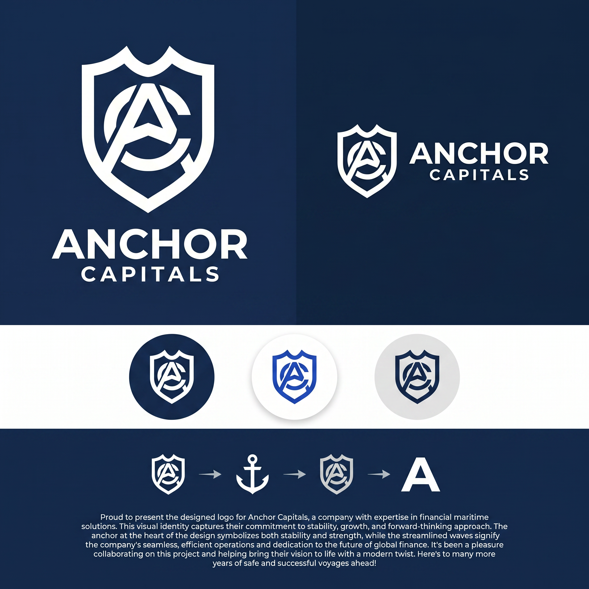
# Anchor Capitals — AC Monogram Shield: SVG Generation Brief Use this as a direct prompt for an SVG-generating tool, or as a creative brief for a designer. It fully specifies geometry, construction logic, and color so the result is reproducible, not left to interpretation. --- ## Concept summary Design a single emblem for the brand **Anchor Capitals** — a shield-shaped mark containing one continuous glyph that reads simultaneously as the letters **A** and **C**, and as an anchor's ring and crown. The technique: one shape, multiple readings — the same principle as a maritime crest where the inner icon doubles as a boat hull, an anchor, and a letterform depending on how you look at it. Here, the two readings that matter are the brand's initials (A, C) and the maritime/stability metaphor (anchor ring, anchor point). ## Outer shape — the shield - Heraldic crest silhouette: a "twin-peak" top edge — two shoulder peaks meeting at a shallow center dip (not a flat top, not a single point) — curving down through rounded shoulders, running in relatively straight sides, then tapering to a single sharp point at the bottom center. - Proportions: roughly 0.77 width-to-height (e.g. 156 wide × 203 tall in a 200-unit local grid). - Rendered as a solid silhouette fill — no outline stroke. This shield is a container, not a frame. ## Inner glyph — the AC monogram This is the part that has to be exact, not approximated: - **The "C"**: an open ring — roughly 280° of a circle, opening toward the right at about a 70–80° gap. Drawn as a single thick stroke with rounded caps at both open terminals (not a closed donut shape — it must read as an open letter C, terminals visible). - **The "A"**: a simple chevron / peak — a single upward-pointing "^" with two legs descending from the apex, no crossbar (matching a minimal, geometric "A" treatment, not a full architectural A). Rounded join at the apex, rounded caps at both leg ends. - **The fusion**: nest the chevron inside the C's open mouth so the chevron's two leg-ends sit close to — almost touching — the C's two open terminals. The two shapes should not simply sit side by side; they should share the same visual space, same stroke weight, same optical center, so the eye reads one interlocked mark, not two separate icons placed near each other. - Stroke weight: heavy — roughly 16 units on a 200-unit grid (≈8% of the shield's width). This isn't optional; thin strokes will not survive the favicon-scale legibility test below. - Center the whole glyph inside the shield's interior, with roughly equal margin on all sides. ## Construction technique Two acceptable methods, in order of preference: 1. **Preferred — true negative space**: One compound path using the even-odd fill rule, where the shield is the outer contour and the C+chevron strokes are cut as holes through it. This is what makes the mark work as a single flat color (a stamp, a favicon, an embossed seal) — critical, don't skip this if the deliverable needs to scale down or print in one color. 2. **Acceptable for a colored variant**: Solid shield fill in one color, with the C+chevron drawn on top in a second color (not cut out, just layered). Use this only for the full-color brand version, not for the single-color/stamp version. ## Color specification - **Primary full-color lockup**: shield fill white `#FFFFFF`; C+chevron glyph in cobalt `#3870F2`; presented on an ink-navy `#001A2C` background. - **Single-color variants required**: solid `#001A2C` (or pure black) version for light backgrounds; solid white version for dark backgrounds and for use as a favicon/stamp. These must use the true negative-space construction (method 1 above), not layered colors. - No gradients, no drop shadows, no glow effects, anywhere, in any variant. ## Wordmark lockup Pair the icon with the wordmark in a horizontal lockup (icon left, text right, vertically centered against the icon's height): - Line 1: **ANCHOR** — bold/heavy weight, tracked letter-spacing, larger size. - Line 2: **CAPITALS** — regular/medium weight, wider tracked letter-spacing, smaller size, positioned directly below line 1. - Typeface: geometric sans — Plus Jakarta Sans preferred (brand typeface), Arial/Helvetica acceptable as fallback. - All caps on both lines. ## Deliverable requirements - Format: SVG, vector paths only. No raster fills, no filters, no embedded images. - Must remain legible and distinguishable as both letters at 16×16px (browser favicon scale) — test this explicitly before finalizing stroke weights or the C's gap angle. - Required variants: icon-only (square, for app icons/favicons), horizontal lockup (icon + wordmark), and at minimum one single-color version per the color spec above. - Flat design throughout: no gradients, no shadows, no bevels, no glow. Rounded caps and joins on all glyph strokes; consistent corner treatment if any rectangles are used elsewhere in the lockup. ## Open variables (resolve before final production) - C's opening angle: currently specified facing right. An alternative is opening downward, which lets the A's apex point straight up through the gap rather than at a diagonal — test both before locking. - Stroke weight could be reduced for a more refined feel, at some cost to small-size legibility — only adjust after the favicon test passes at the heavier weight first.
by @Elephant_9259723
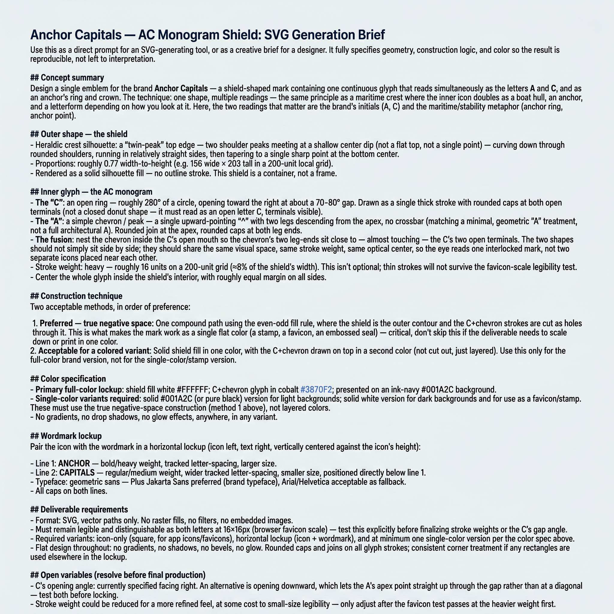
# Anchor Capitals — AC Monogram Shield: SVG Generation Brief Use this as a direct prompt for an SVG-generating tool, or as a creative brief for a designer. It fully specifies geometry, construction logic, and color so the result is reproducible, not left to interpretation. --- ## Concept summary Design a single emblem for the brand **Anchor Capitals** — a shield-shaped mark containing one continuous glyph that reads simultaneously as the letters **A** and **C**, and as an anchor's ring and crown. The technique: one shape, multiple readings — the same principle as a maritime crest where the inner icon doubles as a boat hull, an anchor, and a letterform depending on how you look at it. Here, the two readings that matter are the brand's initials (A, C) and the maritime/stability metaphor (anchor ring, anchor point). ## Outer shape — the shield - Heraldic crest silhouette: a "twin-peak" top edge — two shoulder peaks meeting at a shallow center dip (not a flat top, not a single point) — curving down through rounded shoulders, running in relatively straight sides, then tapering to a single sharp point at the bottom center. - Proportions: roughly 0.77 width-to-height (e.g. 156 wide × 203 tall in a 200-unit local grid). - Rendered as a solid silhouette fill — no outline stroke. This shield is a container, not a frame. ## Inner glyph — the AC monogram This is the part that has to be exact, not approximated: - **The "C"**: an open ring — roughly 280° of a circle, opening toward the right at about a 70–80° gap. Drawn as a single thick stroke with rounded caps at both open terminals (not a closed donut shape — it must read as an open letter C, terminals visible). - **The "A"**: a simple chevron / peak — a single upward-pointing "^" with two legs descending from the apex, no crossbar (matching a minimal, geometric "A" treatment, not a full architectural A). Rounded join at the apex, rounded caps at both leg ends. - **The fusion**: nest the chevron inside the C's open mouth so the chevron's two leg-ends sit close to — almost touching — the C's two open terminals. The two shapes should not simply sit side by side; they should share the same visual space, same stroke weight, same optical center, so the eye reads one interlocked mark, not two separate icons placed near each other. - Stroke weight: heavy — roughly 16 units on a 200-unit grid (≈8% of the shield's width). This isn't optional; thin strokes will not survive the favicon-scale legibility test below. - Center the whole glyph inside the shield's interior, with roughly equal margin on all sides. ## Construction technique Two acceptable methods, in order of preference: 1. **Preferred — true negative space**: One compound path using the even-odd fill rule, where the shield is the outer contour and the C+chevron strokes are cut as holes through it. This is what makes the mark work as a single flat color (a stamp, a favicon, an embossed seal) — critical, don't skip this if the deliverable needs to scale down or print in one color. 2. **Acceptable for a colored variant**: Solid shield fill in one color, with the C+chevron drawn on top in a second color (not cut out, just layered). Use this only for the full-color brand version, not for the single-color/stamp version. ## Color specification - **Primary full-color lockup**: shield fill white `#FFFFFF`; C+chevron glyph in cobalt `#3870F2`; presented on an ink-navy `#001A2C` background. - **Single-color variants required**: solid `#001A2C` (or pure black) version for light backgrounds; solid white version for dark backgrounds and for use as a favicon/stamp. These must use the true negative-space construction (method 1 above), not layered colors. - No gradients, no drop shadows, no glow effects, anywhere, in any variant. ## Wordmark lockup Pair the icon with the wordmark in a horizontal lockup (icon left, text right, vertically centered against the icon's height): - Line 1: **ANCHOR** — bold/heavy weight, tracked letter-spacing, larger size. - Line 2: **CAPITALS** — regular/medium weight, wider tracked letter-spacing, smaller size, positioned directly below line 1. - Typeface: geometric sans — Plus Jakarta Sans preferred (brand typeface), Arial/Helvetica acceptable as fallback. - All caps on both lines. ## Deliverable requirements - Format: SVG, vector paths only. No raster fills, no filters, no embedded images. - Must remain legible and distinguishable as both letters at 16×16px (browser favicon scale) — test this explicitly before finalizing stroke weights or the C's gap angle. - Required variants: icon-only (square, for app icons/favicons), horizontal lockup (icon + wordmark), and at minimum one single-color version per the color spec above. - Flat design throughout: no gradients, no shadows, no bevels, no glow. Rounded caps and joins on all glyph strokes; consistent corner treatment if any rectangles are used elsewhere in the lockup. ## Open variables (resolve before final production) - C's opening angle: currently specified facing right. An alternative is opening downward, which lets the A's apex point straight up through the gap rather than at a diagonal — test both before locking. - Stroke weight could be reduced for a more refined feel, at some cost to small-size legibility — only adjust after the favicon test passes at the heavier weight first.
by @Elephant_9259723



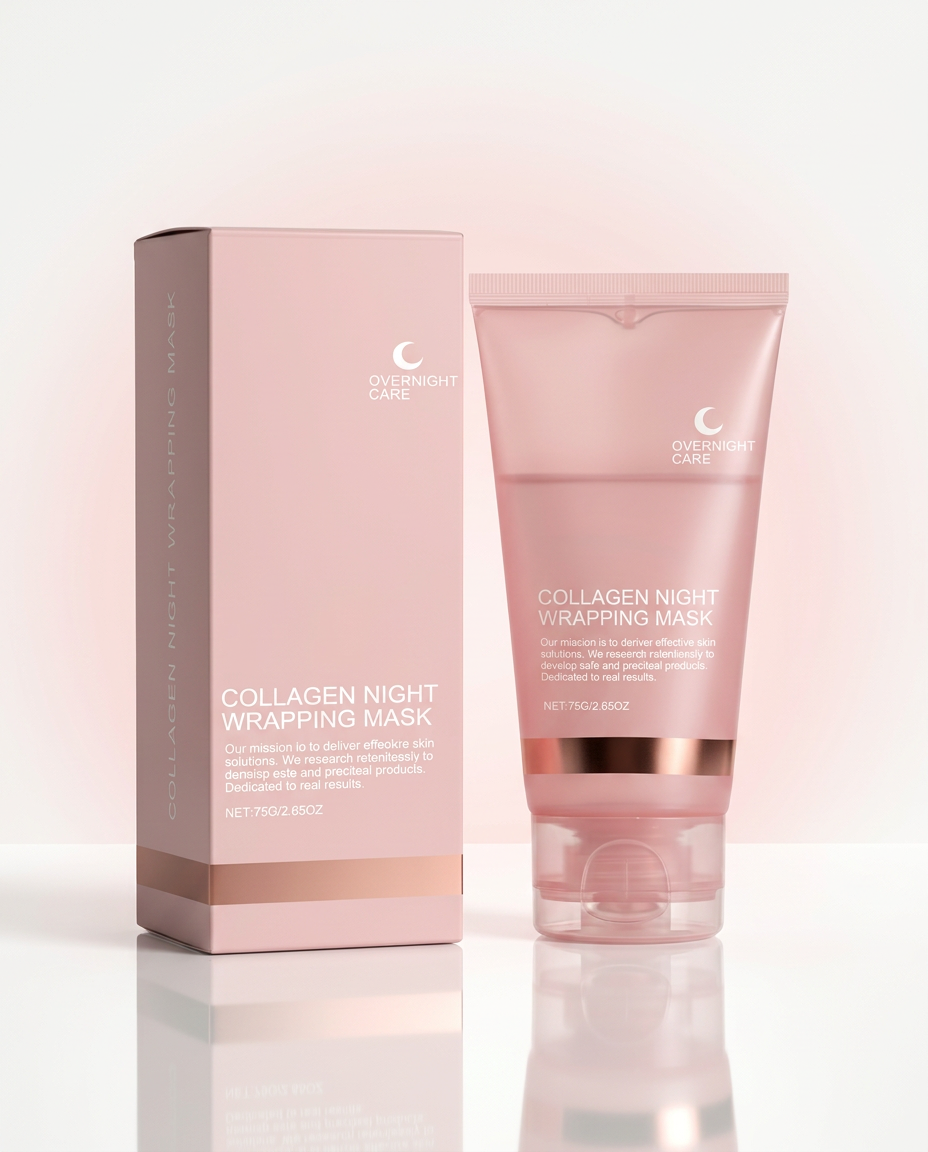
Create a premium e-commerce hero image of the exact Collagen Night Wrapping Mask tube and its matching box shown in the reference image. Keep the original packaging design, colors, branding, proportions, and text unchanged. Place both products on a glossy white acrylic surface with soft reflections. Background is clean ivory white with subtle blush pink gradient and luxury cosmetic studio lighting. Add elegant shadows and realistic reflections. Product positioned in the center with plenty of negative space. Ultra-realistic skincare product photography, luxury cosmetic advertising, premium beauty brand aesthetic, 8K, HDR, portrait mode, Flipkart hero image, no extra objects, no text overlays, no watermark.
by @Elephant_8759091
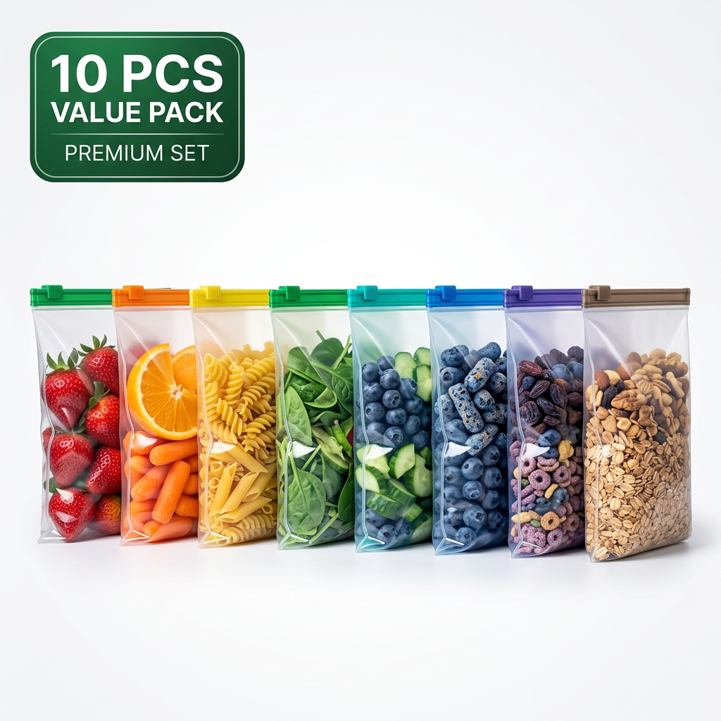
Hyper realistic Meesho hero image featuring identical reusable zipper bags arranged from left to right in rainbow color sequence using colorful foods such as strawberries, oranges, pasta, rice, spinach, blueberries, cereals and dry fruits. Same green zipper, white background, premium commercial lighting, bold "10 PCS VALUE PACK" badge, luxury e-commerce product presentation.
by @Elephant_9449229
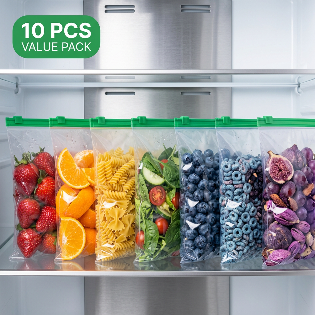
Hyper realistic Meesho hero image featuring identical reusable zipper bags arranged from left to right in rainbow color sequence using colorful foods such as strawberries, oranges, pasta, rice, spinach, blueberries, cereals and dry fruits. Same green zipper, white background, premium commercial lighting, bold "10 PCS VALUE PACK" badge, luxury e-commerce product presentation.
by @Elephant_9449229
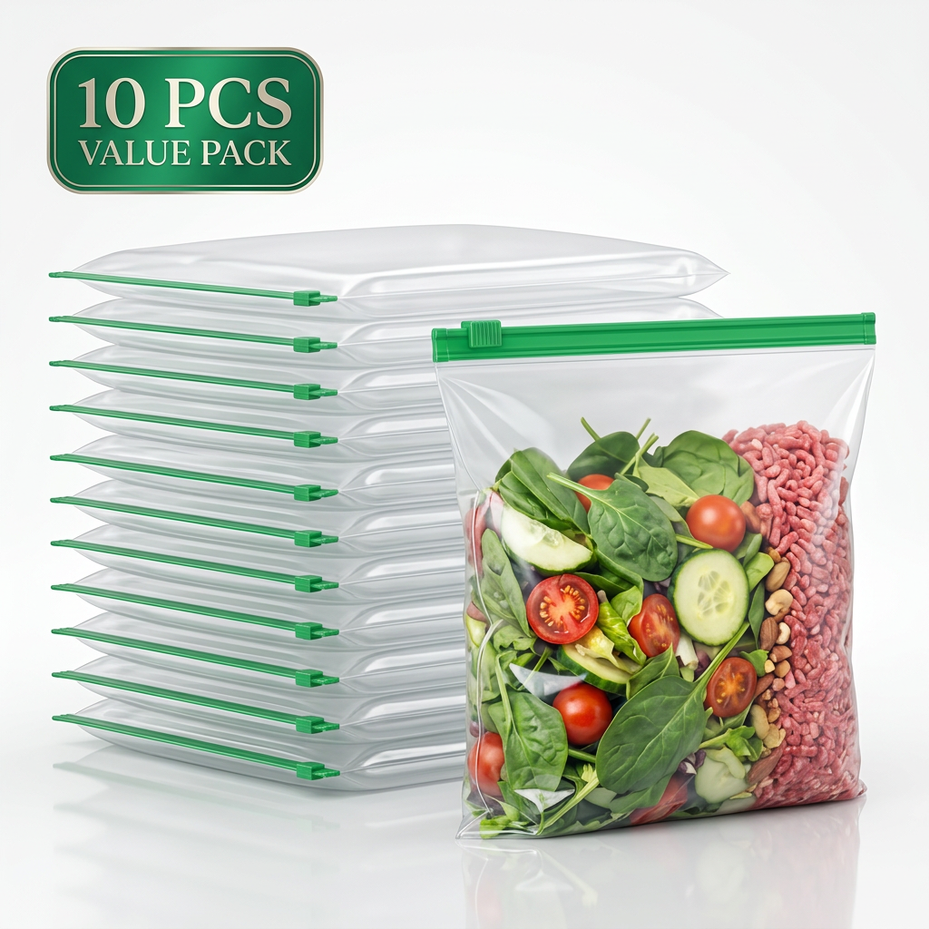
Create an ultra-premium e-commerce hero image showing a large stack of identical empty reusable storage bags at the back and one large filled hero bag standing in front at a slight angle. Same transparent plastic and green zipper. Bright white background, realistic reflections, premium studio lighting, elegant green "10 PCS VALUE PACK" badge, luxury advertising photography, maximum customer trust.
by @Elephant_9449229
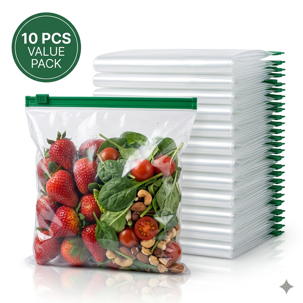
Create an ultra-premium e-commerce hero image showing a large stack of identical empty reusable storage bags at the back and one large filled hero bag standing in front at a slight angle. Same transparent plastic and green zipper. Bright white background, realistic reflections, premium studio lighting, elegant green "10 PCS VALUE PACK" badge, luxury advertising photography, maximum customer trust.
by @Elephant_9449229
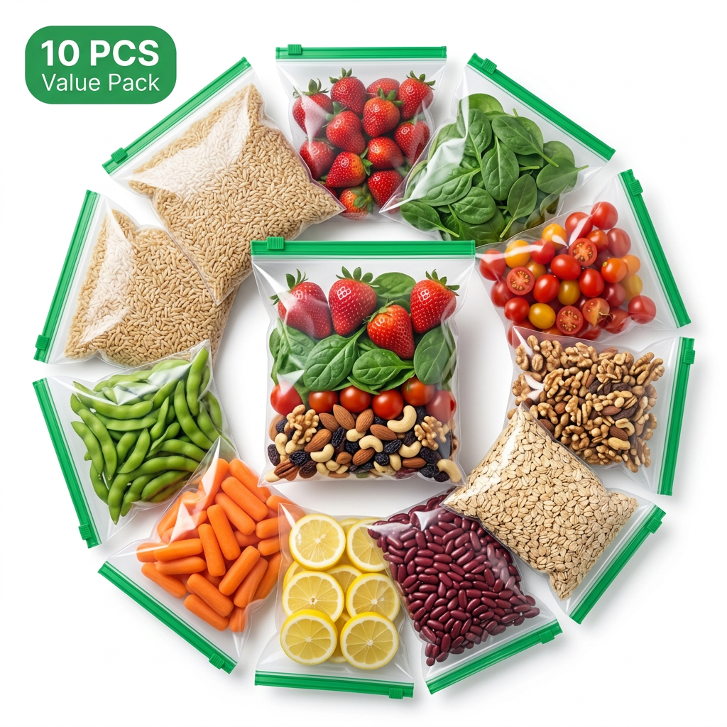
Ultra realistic commercial photography showing identical reusable storage bags arranged in a perfect circular layout around one center hero bag. Each bag contains different colorful food ingredients. Pure white background, soft premium shadows, crystal-clear plastic, vivid colors, luxury lighting, bold green "10 PCS VALUE PACK" badge, premium Meesho hero image, high conversion composition.
by @Elephant_9449229
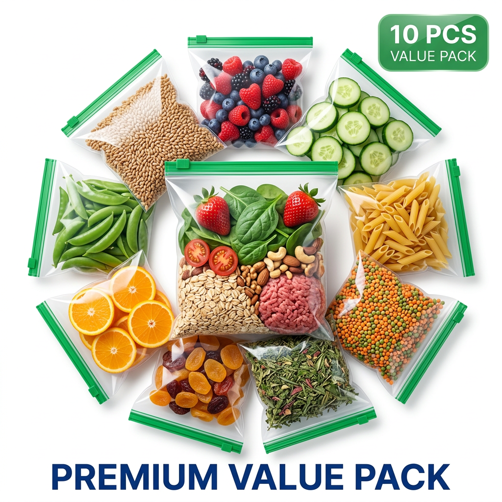
Ultra realistic commercial photography showing identical reusable storage bags arranged in a perfect circular layout around one center hero bag. Each bag contains different colorful food ingredients. Pure white background, soft premium shadows, crystal-clear plastic, vivid colors, luxury lighting, bold green "10 PCS VALUE PACK" badge, premium Meesho hero image, high conversion composition.
by @Elephant_9449229
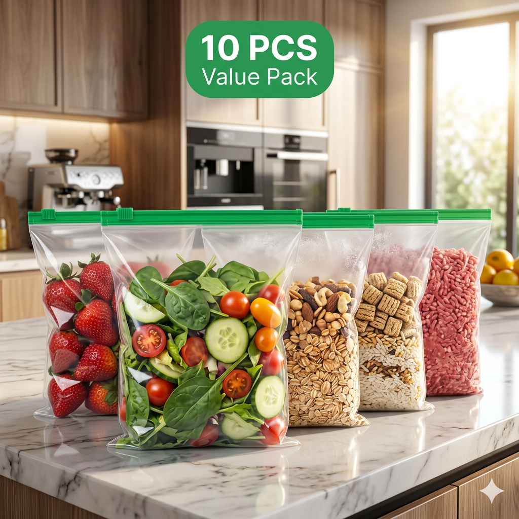
Modern luxury kitchen countertop scene with identical transparent storage bags featuring the same green zipper. One hero bag positioned closest to camera, remaining bags arranged naturally behind. Fresh vegetables, dry fruits, rice, cereal and frozen food inside. Bright morning sunlight, blurred premium kitchen background, bold green "10 PCS VALUE PACK" badge, commercial product photography, high CTR e-commerce style.
by @Elephant_9449229
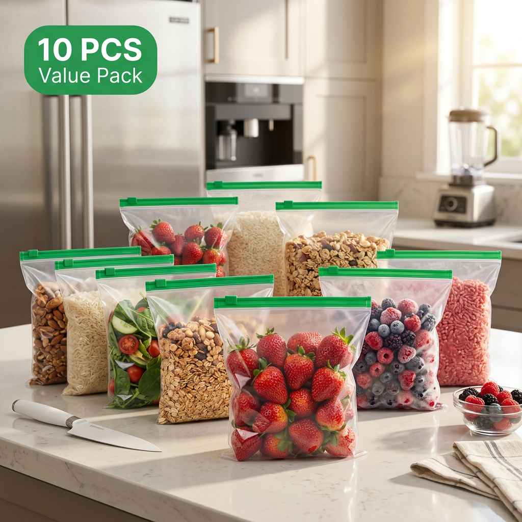
Modern luxury kitchen countertop scene with identical transparent storage bags featuring the same green zipper. One hero bag positioned closest to camera, remaining bags arranged naturally behind. Fresh vegetables, dry fruits, rice, cereal and frozen food inside. Bright morning sunlight, blurred premium kitchen background, bold green "10 PCS VALUE PACK" badge, commercial product photography, high CTR e-commerce style.
by @Elephant_9449229
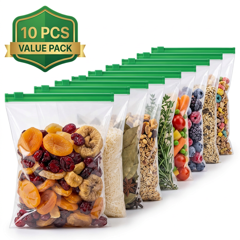
Award-winning commercial product photography of identical transparent reusable zip lock storage bags with same green zipper and exact dimensions. One hero bag facing camera at 30-degree angle while remaining 9 bags form a clean diagonal line behind. Filled with premium dry fruits, vegetables, fruits, cereals, spices and frozen foods. Pure white background, premium glossy reflections, ultra HD 8K quality, bold green "10 PCS VALUE PACK" badge, minimal composition, luxury packaging photography, Amazon and Meesho bestseller style, extremely high click-through rate, customer trust, premium retail advertising.
by @Elephant_9449229
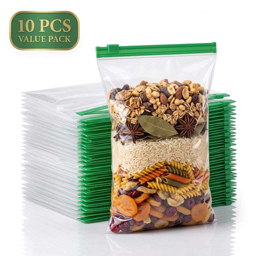
Create an ultra-premium e-commerce hero image showing a large stack of identical empty reusable storage bags at the back and one large filled hero bag standing in front at a slight angle. Same transparent plastic and green zipper. Bright white background, realistic reflections, premium studio lighting, elegant green "10 PCS VALUE PACK" badge, luxury advertising photography, maximum customer trust.
by @Elephant_9449229
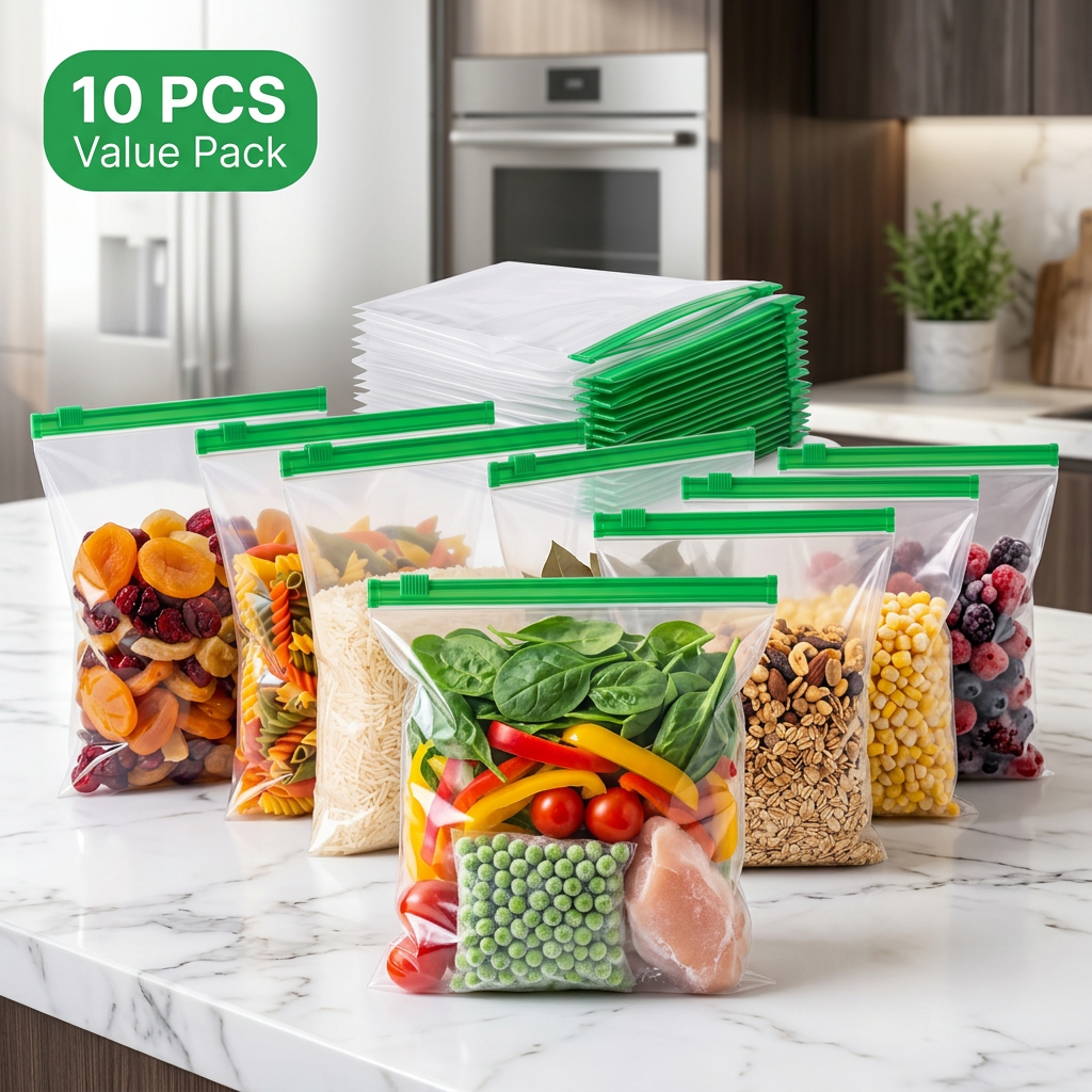
Modern luxury kitchen countertop scene with identical transparent storage bags featuring the same green zipper. One hero bag positioned closest to camera, remaining bags arranged naturally behind. Fresh vegetables, dry fruits, rice, cereal and frozen food inside. Bright morning sunlight, blurred premium kitchen background, bold green "10 PCS VALUE PACK" badge, commercial product photography, high CTR e-commerce style.
by @Elephant_9449229
What's next?Explore more features
Go from browse to build