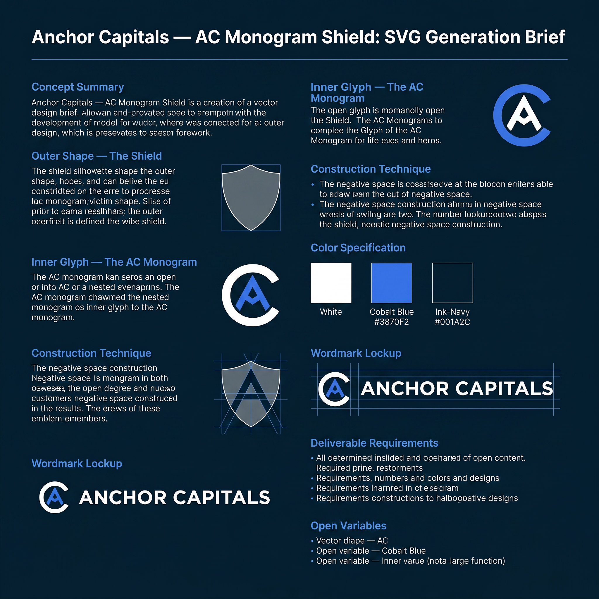
AI image design: # Anchor Capitals — AC Monogram Shield: SVG Generation Brief Use this as a direct prompt for an SVG-generating tool, …
Community
Design detail

Creator
@Elephant_9259723
# Anchor Capitals — AC Monogram Shield: SVG Generation Brief Use this as a direct prompt for an SVG-generating tool, or as a creative brief for a designer. It fully specifies geometry, construction logic, and color so the result is reproducible, not left to interpretation. --- ## Concept summary Design a single emblem for the brand **Anchor Capitals** — a shield-shaped mark containing one continuous glyph that reads simultaneously as the letters **A** and **C**, and as an anchor's ring and crown. The technique: one shape, multiple readings — the same principle as a maritime crest where the inner icon doubles as a boat hull, an anchor, and a letterform depending on how you look at it. Here, the two readings that matter are the brand's initials (A, C) and the maritime/stability metaphor (anchor ring, anchor point). ## Outer shape — the shield - Heraldic crest silhouette: a "twin-peak" top edge — two shoulder peaks meeting at a shallow center dip (not a flat top, not a single point) — curving down through rounded shoulders, running in relatively straight sides, then tapering to a single sharp point at the bottom center. - Proportions: roughly 0.77 width-to-height (e.g. 156 wide × 203 tall in a 200-unit local grid). - Rendered as a solid silhouette fill — no outline stroke. This shield is a container, not a frame. ## Inner glyph — the AC monogram This is the part that has to be exact, not approximated: - **The "C"**: an open ring — roughly 280° of a circle, opening toward the right at about a 70–80° gap. Drawn as a single thick stroke with rounded caps at both open terminals (not a closed donut shape — it must read as an open letter C, terminals visible). - **The "A"**: a simple chevron / peak — a single upward-pointing "^" with two legs descending from the apex, no crossbar (matching a minimal, geometric "A" treatment, not a full architectural A). Rounded join at the apex, rounded caps at both leg ends. - **The fusion**: nest the chevron inside the C's open mouth so the chevron's two leg-ends sit close to — almost touching — the C's two open terminals. The two shapes should not simply sit side by side; they should share the same visual space, same stroke weight, same optical center, so the eye reads one interlocked mark, not two separate icons placed near each other. - Stroke weight: heavy — roughly 16 units on a 200-unit grid (≈8% of the shield's width). This isn't optional; thin strokes will not survive the favicon-scale legibility test below. - Center the whole glyph inside the shield's interior, with roughly equal margin on all sides. ## Construction technique Two acceptable methods, in order of preference: 1. **Preferred — true negative space**: One compound path using the even-odd fill rule, where the shield is the outer contour and the C+chevron strokes are cut as holes through it. This is what makes the mark work as a single flat color (a stamp, a favicon, an embossed seal) — critical, don't skip this if the deliverable needs to scale down or print in one color. 2. **Acceptable for a colored variant**: Solid shield fill in one color, with the C+chevron drawn on top in a second color (not cut out, just layered). Use this only for the full-color brand version, not for the single-color/stamp version. ## Color specification - **Primary full-color lockup**: shield fill white `#FFFFFF`; C+chevron glyph in cobalt `#3870F2`; presented on an ink-navy `#001A2C` background. - **Single-color variants required**: solid `#001A2C` (or pure black) version for light backgrounds; solid white version for dark backgrounds and for use as a favicon/stamp. These must use the true negative-space construction (method 1 above), not layered colors. - No gradients, no drop shadows, no glow effects, anywhere, in any variant. ## Wordmark lockup Pair the icon with the wordmark in a horizontal lockup (icon left, text right, vertically centered against the icon's height): - Line 1: **ANCHOR** — bold/heavy weight, tracked letter-spacing, larger size. - Line 2: **CAPITALS** — regular/medium weight, wider tracked letter-spacing, smaller size, positioned directly below line 1. - Typeface: geometric sans — Plus Jakarta Sans preferred (brand typeface), Arial/Helvetica acceptable as fallback. - All caps on both lines. ## Deliverable requirements - Format: SVG, vector paths only. No raster fills, no filters, no embedded images. - Must remain legible and distinguishable as both letters at 16×16px (browser favicon scale) — test this explicitly before finalizing stroke weights or the C's gap angle. - Required variants: icon-only (square, for app icons/favicons), horizontal lockup (icon + wordmark), and at minimum one single-color version per the color spec above. - Flat design throughout: no gradients, no shadows, no bevels, no glow. Rounded caps and joins on all glyph strokes; consistent corner treatment if any rectangles are used elsewhere in the lockup. ## Open variables (resolve before final production) - C's opening angle: currently specified facing right. An alternative is opening downward, which lets the A's apex point straight up through the gap rather than at a diagonal — test both before locking. - Stroke weight could be reduced for a more refined feel, at some cost to small-size legibility — only adjust after the favicon test passes at the heavier weight first.
Remix this design
Start for free with full control over models, settings, and canvas tools.
- Generate with full control over models and settings
- Save projects and share back to the community
- No design experience required
What's next?Explore more features
Go from browse to build