Designs made by our community
Explore unique graphic designs and images crafted by creators around the world using Hiding Elephant's AI design tools. Get inspired and start creating.

a minimalist, modern vector logo for a non-profit community charity. Features abstract shapes of diverse people holding hands in a circular formation, forming a heart. Clean lines, friendly and warm tone. Colors: hopeful teal and warm orange. Flat design, solid white background, highly scalable, professional branding.
by @Elephant_3897575
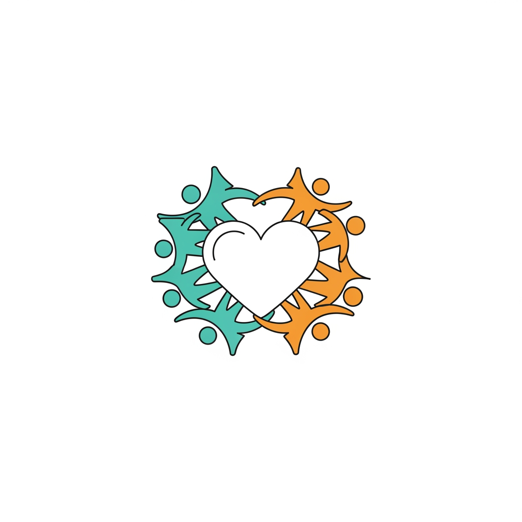
a minimalist, modern vector logo for a non-profit community charity. Features abstract shapes of diverse people holding hands in a circular formation, forming a heart. Clean lines, friendly and warm tone. Colors: hopeful teal and warm orange. Flat design, solid white background, highly scalable, professional branding.
by @Elephant_3897575

a minimalist, modern vector logo for a non-profit community charity. Features abstract shapes of diverse people holding hands in a circular formation, forming a heart. Clean lines, friendly and warm tone. Colors: hopeful teal and warm orange. Flat design, solid white background, highly scalable, professional branding.
by @Elephant_3897575
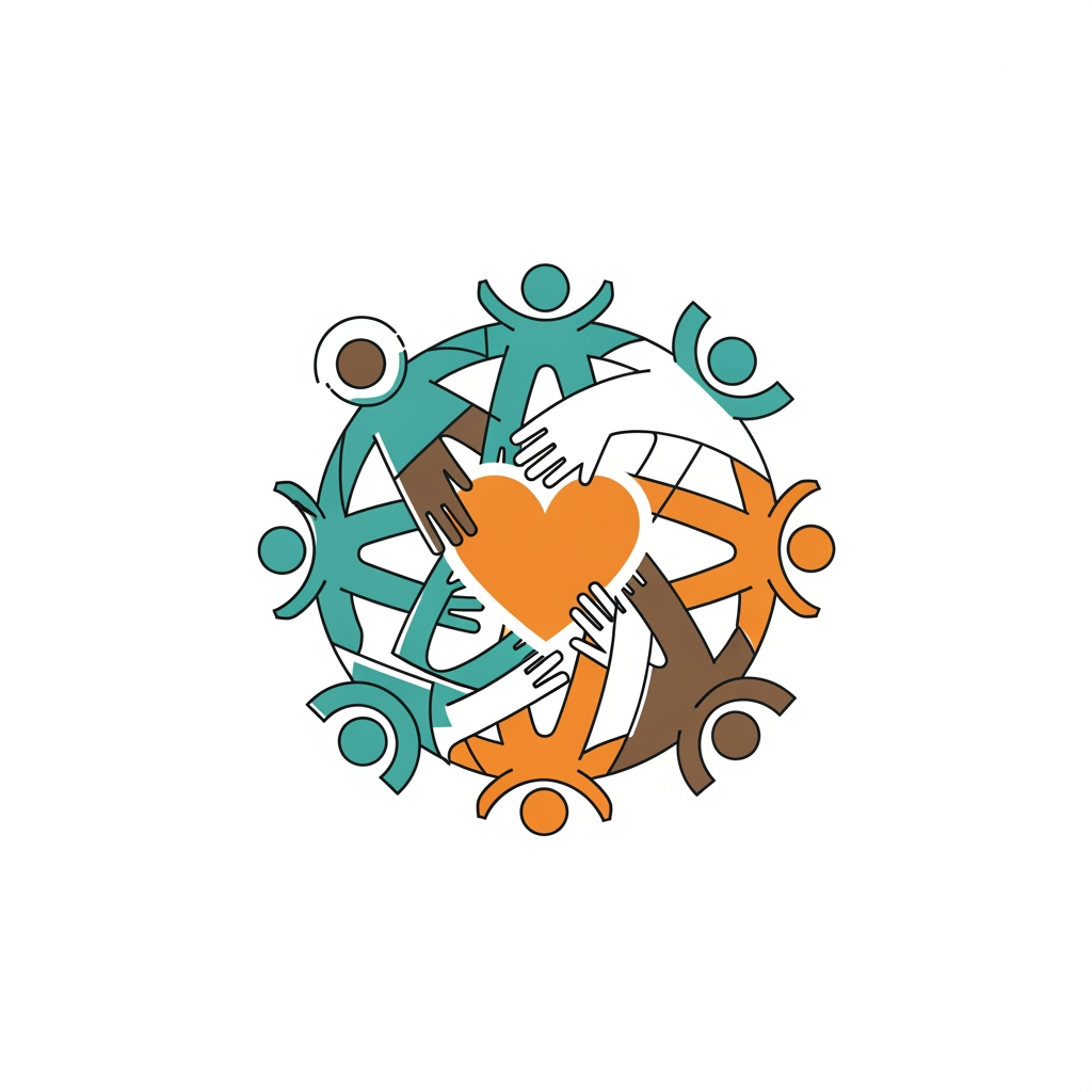
a minimalist, modern vector logo for a non-profit community charity. Features abstract shapes of diverse people holding hands in a circular formation, forming a heart. Clean lines, friendly and warm tone. Colors: hopeful teal and warm orange. Flat design, solid white background, highly scalable, professional branding.
by @Elephant_3897575
a minimalist, modern vector logo for a non-profit community charity. Features abstract shapes of diverse people holding hands in a circular formation, forming a heart. Clean lines, friendly and warm tone. Colors: hopeful teal and warm orange. Flat design, solid white background, highly scalable, professional branding.
by @Elephant_3897575

a minimalist, modern vector logo for a non-profit community charity. Features abstract shapes of diverse people holding hands in a circular formation, forming a heart. Clean lines, friendly and warm tone. Colors: hopeful teal and warm orange. Flat design, solid white background, highly scalable, professional branding.
by @Elephant_3897575
A highly stylized, professional QR code that seamlessly integrates {{asset:Logo}} into its design, maintaining full scannability for the magic shop website. The aesthetic should be mysterious and enchanting, featuring a dark, elegant color palette with subtle glowing magical particles, deep velvet textures, and intricate ornate patterns surrounding the functional QR matrix. High-contrast composition to ensure the code remains fully readable by any mobile scanner while reflecting the brand's identity as a premium magic and illusion shop.
by @Elephant_9209842
"Dry Fruit Mall " A pixel-perfect, purpose-driven logo — every element should mean something, not just decorate. We are not looking for a stock illustration of a bowl of nuts. We want a distinctive, ownable mark that can be foil-stamped on gift boxes, embossed on wax seals, used as a favicon, and printed large on storefront signage.
by @Elephant_1485827
"Dry Fruit Mall " A pixel-perfect, purpose-driven logo — every element should mean something, not just decorate. We are not looking for a stock illustration of a bowl of nuts. We want a distinctive, ownable mark that can be foil-stamped on gift boxes, embossed on wax seals, used as a favicon, and printed large on storefront signage.
by @Elephant_1485827
"Dry Fruit Mall " A pixel-perfect, purpose-driven logo — every element should mean something, not just decorate. We are not looking for a stock illustration of a bowl of nuts. We want a distinctive, ownable mark that can be foil-stamped on gift boxes, embossed on wax seals, used as a favicon, and printed large on storefront signage.
by @Elephant_1485827
A professional and mysterious QR code design for a magic shop, seamlessly integrating {{asset:logo}} into the center of the scannable pattern. The aesthetic features a dark, velvet-themed background with subtle golden ethereal sparkles, glowing magical elements, and a high-contrast finish to ensure perfect scanability. The composition is clean, sophisticated, and evokes a sense of wonder and illusion, suitable for a professional website landing page.
by @Elephant_9209842
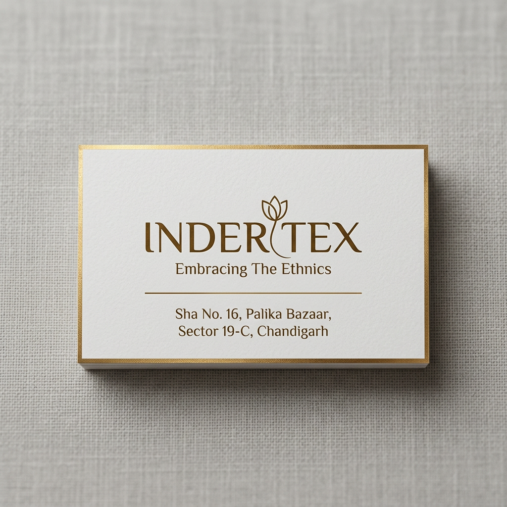
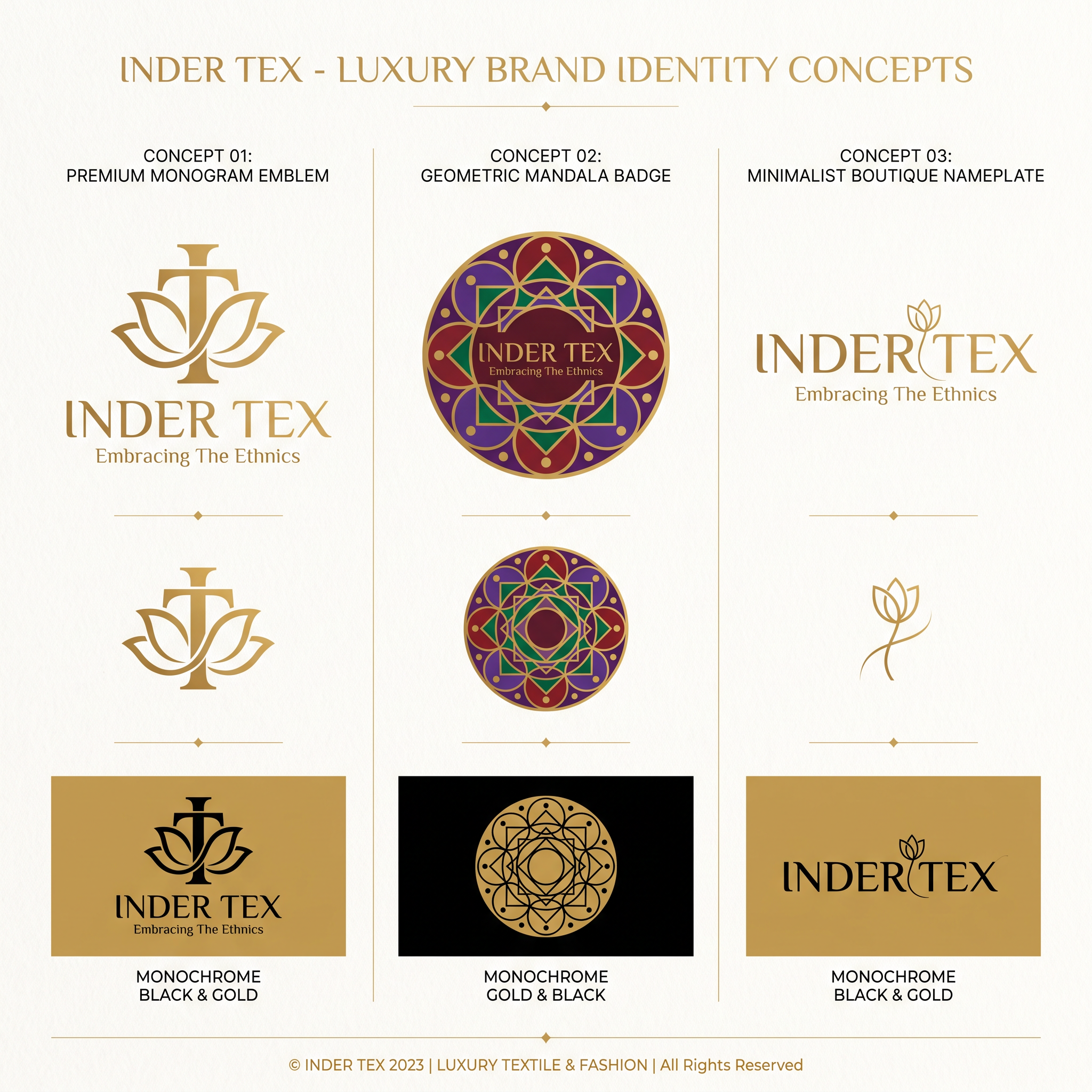
A professional brand identity sheet showcasing three distinct luxury logo concepts for 'INDER TEX'. The designs feature a premium monogram emblem merging 'I' and 'T' with subtle lotus-petal curves, a geometric mandala-inspired circular badge using deep maroon, royal purple, and emerald green with gold accents, and a minimalist wordmark-led boutique nameplate with refined serif typography. All designs are rendered in a clean, flat vector aesthetic on an ivory background, emphasizing negative space and high-end elegance without any gradients, shadows, or 3D effects. The presentation includes the primary logo lockup with the tagline 'Embracing The Ethnics', a standalone icon variation, and a black-and-gold monochrome version, styled as a high-fashion branding presentation.
by @Elephant_8071554
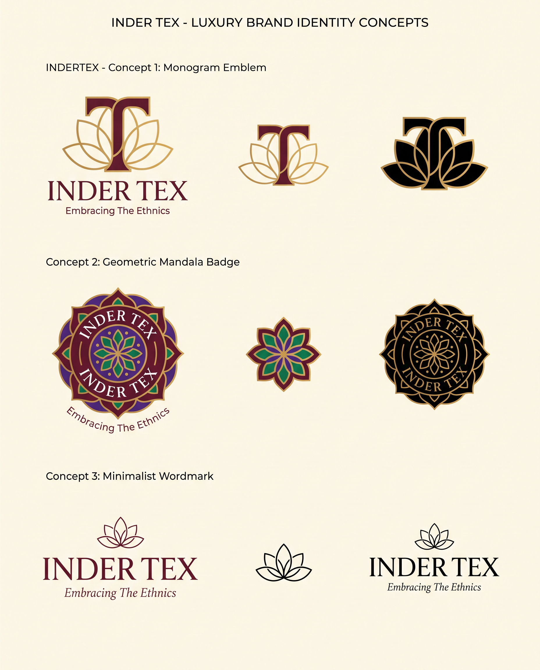
A professional brand identity sheet showcasing three distinct luxury logo concepts for 'INDER TEX'. The designs feature a premium monogram emblem merging 'I' and 'T' with subtle lotus-petal curves, a geometric mandala-inspired circular badge using deep maroon, royal purple, and emerald green with gold accents, and a minimalist wordmark-led boutique nameplate with refined serif typography. All designs are rendered in a clean, flat vector aesthetic on an ivory background, emphasizing negative space and high-end elegance without any gradients, shadows, or 3D effects. The presentation includes the primary logo lockup with the tagline 'Embracing The Ethnics', a standalone icon variation, and a black-and-gold monochrome version, styled as a high-fashion branding presentation.
by @Elephant_8071554
![AI Design for Premium, minimalistic luxury logo design for an Indian women's ethnic fashion
boutique. Flat vector design, no 3D, no gradients, no drop shadows, no glossy
effects. Clean geometric balance, generous negative space, scalable icon that
works as small as a clothing label and as large as a signboard.
Shop name: "INDER TEX"
Tagline: "Embracing The Ethnics"
Address line (small, for signage version only): Shop No. 106, Palika Bazar,
Sector 19-C, Chandigarh
Color palette: deep maroon #7B1E3A, royal purple #5B2C83, emerald green
#0F6B4D, gold #D4AF37 accents, on ivory/cream #FFF8F0 background. Provide
an alternate black-and-gold monochrome version.
Typography: elegant serif or refined luxury script for "INDER TEX", paired
with a thin modern sans-serif for the tagline. Balanced letter spacing,
readable from a distance. Optional subtle Devanagari accent, not dominant.
Mockup presentation: centered logo lockup on a plain white background,
professional branding-sheet style, showing the icon + wordmark + tagline
together, high-resolution vector aesthetic.
Avoid: clip-art look, generic shopping-bag icons, overly literal saree
drawings, cluttered detail, 3D effects, stock-logo clichés, AI "logo slop"
symmetry artifacts, excess ornamentation.
[Shared Style Block]
Concept: Luxury monogram logo built from the initials "I" and "T" (Inder Tex),
interlocked or nested into a single elegant emblem — similar in spirit to
high-fashion house monograms. Incorporate one subtle paisley or lotus-petal
curve into the negative space of the letterforms, not as a separate
decoration. Monogram sits above or beside the wordmark "INDER TEX" with
tagline beneath in smaller type. Gold monogram on maroon or purple circular
or hexagonal badge, with an ivory background version and a pure line-art
black version.
[Shared Style Block]
Concept: A refined circular emblem built from a stylized mandala or lotus
formed by 4–6 simplified paisley petals arranged with symmetrical balance —
modern and geometric, not busy or traditional-clipart style. Petals in
maroon, purple, and emerald with thin gold outlines, on an ivory circular
badge. "INDER TEX" wordmark curves along the top or sits centered below the
emblem, tagline in smaller letterspaced type beneath. Emblem should work as
a standalone icon (app icon, button) separate from the wordmark.
[Shared Style Block]
Concept: A wordmark-led logo — no icon, or only a single hairline accent
(one thin gold thread-like flourish or a minimal needle-and-thread stroke
beneath the last letter). "INDER TEX" set in a premium luxury serif or
refined script, wide letter spacing, small-caps feel. Tagline "Embracing
The Ethnics" in a thin uppercase sans-serif directly below, separated by a
slim gold rule line. Entire lockup should feel like a high-end boutique
nameplate — think minimal fashion-house signage rather than a logo mark.](https://images.hidingelephant.com/80087/84218/84218/7735a8a0-1239-450e-92f1-f98518061d18.png)
Premium, minimalistic luxury logo design for an Indian women's ethnic fashion boutique. Flat vector design, no 3D, no gradients, no drop shadows, no glossy effects. Clean geometric balance, generous negative space, scalable icon that works as small as a clothing label and as large as a signboard. Shop name: "INDER TEX" Tagline: "Embracing The Ethnics" Address line (small, for signage version only): Shop No. 106, Palika Bazar, Sector 19-C, Chandigarh Color palette: deep maroon #7B1E3A, royal purple #5B2C83, emerald green #0F6B4D, gold #D4AF37 accents, on ivory/cream #FFF8F0 background. Provide an alternate black-and-gold monochrome version. Typography: elegant serif or refined luxury script for "INDER TEX", paired with a thin modern sans-serif for the tagline. Balanced letter spacing, readable from a distance. Optional subtle Devanagari accent, not dominant. Mockup presentation: centered logo lockup on a plain white background, professional branding-sheet style, showing the icon + wordmark + tagline together, high-resolution vector aesthetic. Avoid: clip-art look, generic shopping-bag icons, overly literal saree drawings, cluttered detail, 3D effects, stock-logo clichés, AI "logo slop" symmetry artifacts, excess ornamentation. [Shared Style Block] Concept: Luxury monogram logo built from the initials "I" and "T" (Inder Tex), interlocked or nested into a single elegant emblem — similar in spirit to high-fashion house monograms. Incorporate one subtle paisley or lotus-petal curve into the negative space of the letterforms, not as a separate decoration. Monogram sits above or beside the wordmark "INDER TEX" with tagline beneath in smaller type. Gold monogram on maroon or purple circular or hexagonal badge, with an ivory background version and a pure line-art black version. [Shared Style Block] Concept: A refined circular emblem built from a stylized mandala or lotus formed by 4–6 simplified paisley petals arranged with symmetrical balance — modern and geometric, not busy or traditional-clipart style. Petals in maroon, purple, and emerald with thin gold outlines, on an ivory circular badge. "INDER TEX" wordmark curves along the top or sits centered below the emblem, tagline in smaller letterspaced type beneath. Emblem should work as a standalone icon (app icon, button) separate from the wordmark. [Shared Style Block] Concept: A wordmark-led logo — no icon, or only a single hairline accent (one thin gold thread-like flourish or a minimal needle-and-thread stroke beneath the last letter). "INDER TEX" set in a premium luxury serif or refined script, wide letter spacing, small-caps feel. Tagline "Embracing The Ethnics" in a thin uppercase sans-serif directly below, separated by a slim gold rule line. Entire lockup should feel like a high-end boutique nameplate — think minimal fashion-house signage rather than a logo mark.
by @Elephant_8071554
![AI Design for Premium, minimalistic luxury logo design for an Indian women's ethnic fashion
boutique. Flat vector design, no 3D, no gradients, no drop shadows, no glossy
effects. Clean geometric balance, generous negative space, scalable icon that
works as small as a clothing label and as large as a signboard.
Shop name: "INDER TEX"
Tagline: "Embracing The Ethnics"
Address line (small, for signage version only): Shop No. 106, Palika Bazar,
Sector 19-C, Chandigarh
Color palette: deep maroon #7B1E3A, royal purple #5B2C83, emerald green
#0F6B4D, gold #D4AF37 accents, on ivory/cream #FFF8F0 background. Provide
an alternate black-and-gold monochrome version.
Typography: elegant serif or refined luxury script for "INDER TEX", paired
with a thin modern sans-serif for the tagline. Balanced letter spacing,
readable from a distance. Optional subtle Devanagari accent, not dominant.
Mockup presentation: centered logo lockup on a plain white background,
professional branding-sheet style, showing the icon + wordmark + tagline
together, high-resolution vector aesthetic.
Avoid: clip-art look, generic shopping-bag icons, overly literal saree
drawings, cluttered detail, 3D effects, stock-logo clichés, AI "logo slop"
symmetry artifacts, excess ornamentation.
[Shared Style Block]
Concept: Luxury monogram logo built from the initials "I" and "T" (Inder Tex),
interlocked or nested into a single elegant emblem — similar in spirit to
high-fashion house monograms. Incorporate one subtle paisley or lotus-petal
curve into the negative space of the letterforms, not as a separate
decoration. Monogram sits above or beside the wordmark "INDER TEX" with
tagline beneath in smaller type. Gold monogram on maroon or purple circular
or hexagonal badge, with an ivory background version and a pure line-art
black version.
[Shared Style Block]
Concept: A refined circular emblem built from a stylized mandala or lotus
formed by 4–6 simplified paisley petals arranged with symmetrical balance —
modern and geometric, not busy or traditional-clipart style. Petals in
maroon, purple, and emerald with thin gold outlines, on an ivory circular
badge. "INDER TEX" wordmark curves along the top or sits centered below the
emblem, tagline in smaller letterspaced type beneath. Emblem should work as
a standalone icon (app icon, button) separate from the wordmark.
[Shared Style Block]
Concept: A wordmark-led logo — no icon, or only a single hairline accent
(one thin gold thread-like flourish or a minimal needle-and-thread stroke
beneath the last letter). "INDER TEX" set in a premium luxury serif or
refined script, wide letter spacing, small-caps feel. Tagline "Embracing
The Ethnics" in a thin uppercase sans-serif directly below, separated by a
slim gold rule line. Entire lockup should feel like a high-end boutique
nameplate — think minimal fashion-house signage rather than a logo mark.](https://images.hidingelephant.com/80087/84218/84218/77542bda-3aa6-45a8-9247-a7e4c2ef6f9b.png)
Premium, minimalistic luxury logo design for an Indian women's ethnic fashion boutique. Flat vector design, no 3D, no gradients, no drop shadows, no glossy effects. Clean geometric balance, generous negative space, scalable icon that works as small as a clothing label and as large as a signboard. Shop name: "INDER TEX" Tagline: "Embracing The Ethnics" Address line (small, for signage version only): Shop No. 106, Palika Bazar, Sector 19-C, Chandigarh Color palette: deep maroon #7B1E3A, royal purple #5B2C83, emerald green #0F6B4D, gold #D4AF37 accents, on ivory/cream #FFF8F0 background. Provide an alternate black-and-gold monochrome version. Typography: elegant serif or refined luxury script for "INDER TEX", paired with a thin modern sans-serif for the tagline. Balanced letter spacing, readable from a distance. Optional subtle Devanagari accent, not dominant. Mockup presentation: centered logo lockup on a plain white background, professional branding-sheet style, showing the icon + wordmark + tagline together, high-resolution vector aesthetic. Avoid: clip-art look, generic shopping-bag icons, overly literal saree drawings, cluttered detail, 3D effects, stock-logo clichés, AI "logo slop" symmetry artifacts, excess ornamentation. [Shared Style Block] Concept: Luxury monogram logo built from the initials "I" and "T" (Inder Tex), interlocked or nested into a single elegant emblem — similar in spirit to high-fashion house monograms. Incorporate one subtle paisley or lotus-petal curve into the negative space of the letterforms, not as a separate decoration. Monogram sits above or beside the wordmark "INDER TEX" with tagline beneath in smaller type. Gold monogram on maroon or purple circular or hexagonal badge, with an ivory background version and a pure line-art black version. [Shared Style Block] Concept: A refined circular emblem built from a stylized mandala or lotus formed by 4–6 simplified paisley petals arranged with symmetrical balance — modern and geometric, not busy or traditional-clipart style. Petals in maroon, purple, and emerald with thin gold outlines, on an ivory circular badge. "INDER TEX" wordmark curves along the top or sits centered below the emblem, tagline in smaller letterspaced type beneath. Emblem should work as a standalone icon (app icon, button) separate from the wordmark. [Shared Style Block] Concept: A wordmark-led logo — no icon, or only a single hairline accent (one thin gold thread-like flourish or a minimal needle-and-thread stroke beneath the last letter). "INDER TEX" set in a premium luxury serif or refined script, wide letter spacing, small-caps feel. Tagline "Embracing The Ethnics" in a thin uppercase sans-serif directly below, separated by a slim gold rule line. Entire lockup should feel like a high-end boutique nameplate — think minimal fashion-house signage rather than a logo mark.
by @Elephant_8071554
![AI Design for Premium, minimalistic luxury logo design for an Indian women's ethnic fashion
boutique. Flat vector design, no 3D, no gradients, no drop shadows, no glossy
effects. Clean geometric balance, generous negative space, scalable icon that
works as small as a clothing label and as large as a signboard.
Shop name: "INDER TEX"
Tagline: "Embracing The Ethnics"
Address line (small, for signage version only): Shop No. 106, Palika Bazar,
Sector 19-C, Chandigarh
Color palette: deep maroon #7B1E3A, royal purple #5B2C83, emerald green
#0F6B4D, gold #D4AF37 accents, on ivory/cream #FFF8F0 background. Provide
an alternate black-and-gold monochrome version.
Typography: elegant serif or refined luxury script for "INDER TEX", paired
with a thin modern sans-serif for the tagline. Balanced letter spacing,
readable from a distance. Optional subtle Devanagari accent, not dominant.
Mockup presentation: centered logo lockup on a plain white background,
professional branding-sheet style, showing the icon + wordmark + tagline
together, high-resolution vector aesthetic.
Avoid: clip-art look, generic shopping-bag icons, overly literal saree
drawings, cluttered detail, 3D effects, stock-logo clichés, AI "logo slop"
symmetry artifacts, excess ornamentation.
[Shared Style Block]
Concept: Luxury monogram logo built from the initials "I" and "T" (Inder Tex),
interlocked or nested into a single elegant emblem — similar in spirit to
high-fashion house monograms. Incorporate one subtle paisley or lotus-petal
curve into the negative space of the letterforms, not as a separate
decoration. Monogram sits above or beside the wordmark "INDER TEX" with
tagline beneath in smaller type. Gold monogram on maroon or purple circular
or hexagonal badge, with an ivory background version and a pure line-art
black version.
[Shared Style Block]
Concept: A refined circular emblem built from a stylized mandala or lotus
formed by 4–6 simplified paisley petals arranged with symmetrical balance —
modern and geometric, not busy or traditional-clipart style. Petals in
maroon, purple, and emerald with thin gold outlines, on an ivory circular
badge. "INDER TEX" wordmark curves along the top or sits centered below the
emblem, tagline in smaller letterspaced type beneath. Emblem should work as
a standalone icon (app icon, button) separate from the wordmark.
[Shared Style Block]
Concept: A wordmark-led logo — no icon, or only a single hairline accent
(one thin gold thread-like flourish or a minimal needle-and-thread stroke
beneath the last letter). "INDER TEX" set in a premium luxury serif or
refined script, wide letter spacing, small-caps feel. Tagline "Embracing
The Ethnics" in a thin uppercase sans-serif directly below, separated by a
slim gold rule line. Entire lockup should feel like a high-end boutique
nameplate — think minimal fashion-house signage rather than a logo mark.](https://images.hidingelephant.com/80087/84218/84218/dacb4924-65e0-44f4-bf34-7c7da501321f.png)
Premium, minimalistic luxury logo design for an Indian women's ethnic fashion boutique. Flat vector design, no 3D, no gradients, no drop shadows, no glossy effects. Clean geometric balance, generous negative space, scalable icon that works as small as a clothing label and as large as a signboard. Shop name: "INDER TEX" Tagline: "Embracing The Ethnics" Address line (small, for signage version only): Shop No. 106, Palika Bazar, Sector 19-C, Chandigarh Color palette: deep maroon #7B1E3A, royal purple #5B2C83, emerald green #0F6B4D, gold #D4AF37 accents, on ivory/cream #FFF8F0 background. Provide an alternate black-and-gold monochrome version. Typography: elegant serif or refined luxury script for "INDER TEX", paired with a thin modern sans-serif for the tagline. Balanced letter spacing, readable from a distance. Optional subtle Devanagari accent, not dominant. Mockup presentation: centered logo lockup on a plain white background, professional branding-sheet style, showing the icon + wordmark + tagline together, high-resolution vector aesthetic. Avoid: clip-art look, generic shopping-bag icons, overly literal saree drawings, cluttered detail, 3D effects, stock-logo clichés, AI "logo slop" symmetry artifacts, excess ornamentation. [Shared Style Block] Concept: Luxury monogram logo built from the initials "I" and "T" (Inder Tex), interlocked or nested into a single elegant emblem — similar in spirit to high-fashion house monograms. Incorporate one subtle paisley or lotus-petal curve into the negative space of the letterforms, not as a separate decoration. Monogram sits above or beside the wordmark "INDER TEX" with tagline beneath in smaller type. Gold monogram on maroon or purple circular or hexagonal badge, with an ivory background version and a pure line-art black version. [Shared Style Block] Concept: A refined circular emblem built from a stylized mandala or lotus formed by 4–6 simplified paisley petals arranged with symmetrical balance — modern and geometric, not busy or traditional-clipart style. Petals in maroon, purple, and emerald with thin gold outlines, on an ivory circular badge. "INDER TEX" wordmark curves along the top or sits centered below the emblem, tagline in smaller letterspaced type beneath. Emblem should work as a standalone icon (app icon, button) separate from the wordmark. [Shared Style Block] Concept: A wordmark-led logo — no icon, or only a single hairline accent (one thin gold thread-like flourish or a minimal needle-and-thread stroke beneath the last letter). "INDER TEX" set in a premium luxury serif or refined script, wide letter spacing, small-caps feel. Tagline "Embracing The Ethnics" in a thin uppercase sans-serif directly below, separated by a slim gold rule line. Entire lockup should feel like a high-end boutique nameplate — think minimal fashion-house signage rather than a logo mark.
by @Elephant_8071554
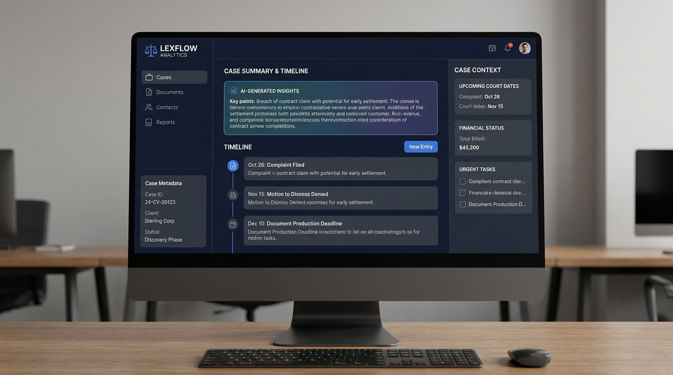
A high-fidelity UI/UX design for a professional legal case management dashboard, styled like a premium Enterprise SaaS application. The layout features a clean, modern sidebar with case metadata, a central main area showcasing an AI-generated case summary, a comprehensive chronological timeline of legal events, and a persistent right-hand context panel displaying upcoming court dates, financial status, and urgent tasks. Use a professional color palette of deep navy, slate gray, and crisp white with subtle blue accents for action buttons. The design should emphasize clarity, hierarchy, and a 'command center' feel, presented on a high-resolution desktop monitor display.
by @Elephant_6209782
![AI Design for خب بین این سی ار ام نیست این پرونده حقوقی تو پنل حقوقیه من این ساختار به دهنم رسید برای معمای تو چی میگی
به نظرم باید از CRM الهام بگیری، نه اینکه دقیقاً CRM رو کپی کنی. چون Entity اصلی اینجا "پرونده" است، نه "مشتری". رفتار کاربر حقوقی هم با کاربر CRM فرق داره.
من اگر این محصول رو طراحی میکردم، اول از خودم میپرسیدم کاربر ۹۰٪ زمانش داخل پرونده دنبال چیه؟
* وضعیت پرونده
* آخرین اتفاقات
* اقدام بعدی
* اسناد
* افراد درگیر
* مهلتهای قانونی
نه اینکه "بره تب مالی"، "بره تب تقویم"، "بره تب وظایف". اینا ابزار پرونده هستن، نه موجودیت مستقل.
من معماری رو اینطوری میچینم
Header
```
دعوای نقض قرارداد — شرکت آرمان سازه
شماره پرونده
وضعیت
مرحله
دادگاه
[ویرایش]
[تغییر وضعیت]
```
Navigation
فقط ۴ تب
```
خلاصه
جریان پرونده
اسناد
اشخاص
```
همین.
صفحه خلاصه
این صفحه مثل Dashboard پرونده است.
وسط صفحه:
* خلاصه AI
* وضعیت پرونده
* ریسکها
* اقدام بعدی
* Timeline کوتاه
ستون راست:
* جلسه بعدی
* مهلتهای قانونی
* وظایف باز
ستون چپ:
* اعضای پرونده
* آخرین اسناد
* اطلاعات مالی
* برچسبها
یعنی کاربر با ورود، تقریباً همه چیز را ببیند.
صفحه جریان پرونده (بهنظر من مهمترین صفحه)
به جای تبهای
* گفتگو
* اقدامات
* رویدادها
* تقویم
* وظایف
همه در یک Timeline باشند.
مثل:
```
امروز
📄 لایحه ثبت شد
⚖️ جلسه برگزار شد
📞 تماس با موکل
🤖 AI خلاصه جلسه را تولید کرد
💰 هزینه دادرسی پرداخت شد
📌 وظیفه ایجاد شد
────────────
دیروز
...
```
این خیلی طبیعیتره، چون وکیل اتفاقات پرونده رو به ترتیب زمان دنبال میکنه، نه بر اساس نوع داده.
اسناد
همه فایلها.
فیلتر:
* قرارداد
* دادخواست
* لایحه
* رأی
* نامه
* ضمیمه
اشخاص
همه افراد مرتبط:
* موکل
* وکیل
* طرف دعوا
* نماینده
* قاضی
* کارشناسان
* سازمانها
صفحات مستقل (از داخل کارتها باز شوند)
اینها را من تب بالا نمیکنم:
* مالی
* وظایف
* تقویم
* گزارش دسترسی
* گزارش فعالیت
* نسخهها
* تاریخچه تغییرات
اینها از کارت مربوطه یا از منوی سهنقطه باز شوند.
مثلاً روی کارت مالی کلیک میکنی و وارد صفحه مالی همان پرونده میشوی.
چیزی که به نظرم کم داری
به جای زیاد کردن تبها، باید Context Panel داشته باشی.
مثلاً سمت راست همیشه ثابت باشد:
```
جلسه بعدی
مهلت بعدی
آخرین فعالیت
وضعیت پرونده
AI پیشنهاد اقدام بعدی
```
فرقی ندارد داخل اسناد باشی یا Timeline یا اشخاص؛ این اطلاعات همیشه جلوی چشم کاربر باشد.
اگر بخواهم این صفحه را در حد یک محصول Enterprise مثل Clio، Litify یا Filevine بازطراحی کنم، ساختارش این میشود:
```
Header
──────────────────────────
Overview | Timeline | Documents | People
──────────────────────────
Sidebar
- مشخصات پرونده
- اعضا
- برچسبها
Main
- AI Summary
- Timeline
- Quick Actions
Right Context
- وضعیت پرونده
- جلسه بعدی
- مهلتها
- وظایف
- مالی
```
به نظرم این معماری از ساختار فعلی خیلی مقیاسپذیرتره؛ چون با بزرگتر شدن سیستم مجبور نیستی برای هر قابلیت یک تب جدید اضافه کنی. پرونده به یک «مرکز فرمان» تبدیل میشود و صفحات تخصصی فقط وقتی باز میشوند که کاربر واقعاً بخواهد روی آن بخش عمیقتر کار کند. این رویکرد برای پنل حقوقی منطقیتر از تقلید مستقیم از CRM است.
طبق توضیح باز طراجی کن یه تصویر بساز
نزدیک به این](https://images.hidingelephant.com/77791/81563/81563/2afb34fb-c77b-407c-8d89-aac2ed2b7971/f5f2ef4e-6a9b-438f-881b-685db5f91bf9.png)
خب بین این سی ار ام نیست این پرونده حقوقی تو پنل حقوقیه من این ساختار به دهنم رسید برای معمای تو چی میگی به نظرم باید از CRM الهام بگیری، نه اینکه دقیقاً CRM رو کپی کنی. چون Entity اصلی اینجا "پرونده" است، نه "مشتری". رفتار کاربر حقوقی هم با کاربر CRM فرق داره. من اگر این محصول رو طراحی میکردم، اول از خودم میپرسیدم کاربر ۹۰٪ زمانش داخل پرونده دنبال چیه؟ * وضعیت پرونده * آخرین اتفاقات * اقدام بعدی * اسناد * افراد درگیر * مهلتهای قانونی نه اینکه "بره تب مالی"، "بره تب تقویم"، "بره تب وظایف". اینا ابزار پرونده هستن، نه موجودیت مستقل. من معماری رو اینطوری میچینم Header ``` دعوای نقض قرارداد — شرکت آرمان سازه شماره پرونده وضعیت مرحله دادگاه [ویرایش] [تغییر وضعیت] ``` Navigation فقط ۴ تب ``` خلاصه جریان پرونده اسناد اشخاص ``` همین. صفحه خلاصه این صفحه مثل Dashboard پرونده است. وسط صفحه: * خلاصه AI * وضعیت پرونده * ریسکها * اقدام بعدی * Timeline کوتاه ستون راست: * جلسه بعدی * مهلتهای قانونی * وظایف باز ستون چپ: * اعضای پرونده * آخرین اسناد * اطلاعات مالی * برچسبها یعنی کاربر با ورود، تقریباً همه چیز را ببیند. صفحه جریان پرونده (بهنظر من مهمترین صفحه) به جای تبهای * گفتگو * اقدامات * رویدادها * تقویم * وظایف همه در یک Timeline باشند. مثل: ``` امروز 📄 لایحه ثبت شد ⚖️ جلسه برگزار شد 📞 تماس با موکل 🤖 AI خلاصه جلسه را تولید کرد 💰 هزینه دادرسی پرداخت شد 📌 وظیفه ایجاد شد ──────────── دیروز ... ``` این خیلی طبیعیتره، چون وکیل اتفاقات پرونده رو به ترتیب زمان دنبال میکنه، نه بر اساس نوع داده. اسناد همه فایلها. فیلتر: * قرارداد * دادخواست * لایحه * رأی * نامه * ضمیمه اشخاص همه افراد مرتبط: * موکل * وکیل * طرف دعوا * نماینده * قاضی * کارشناسان * سازمانها صفحات مستقل (از داخل کارتها باز شوند) اینها را من تب بالا نمیکنم: * مالی * وظایف * تقویم * گزارش دسترسی * گزارش فعالیت * نسخهها * تاریخچه تغییرات اینها از کارت مربوطه یا از منوی سهنقطه باز شوند. مثلاً روی کارت مالی کلیک میکنی و وارد صفحه مالی همان پرونده میشوی. چیزی که به نظرم کم داری به جای زیاد کردن تبها، باید Context Panel داشته باشی. مثلاً سمت راست همیشه ثابت باشد: ``` جلسه بعدی مهلت بعدی آخرین فعالیت وضعیت پرونده AI پیشنهاد اقدام بعدی ``` فرقی ندارد داخل اسناد باشی یا Timeline یا اشخاص؛ این اطلاعات همیشه جلوی چشم کاربر باشد. اگر بخواهم این صفحه را در حد یک محصول Enterprise مثل Clio، Litify یا Filevine بازطراحی کنم، ساختارش این میشود: ``` Header ────────────────────────── Overview | Timeline | Documents | People ────────────────────────── Sidebar - مشخصات پرونده - اعضا - برچسبها Main - AI Summary - Timeline - Quick Actions Right Context - وضعیت پرونده - جلسه بعدی - مهلتها - وظایف - مالی ``` به نظرم این معماری از ساختار فعلی خیلی مقیاسپذیرتره؛ چون با بزرگتر شدن سیستم مجبور نیستی برای هر قابلیت یک تب جدید اضافه کنی. پرونده به یک «مرکز فرمان» تبدیل میشود و صفحات تخصصی فقط وقتی باز میشوند که کاربر واقعاً بخواهد روی آن بخش عمیقتر کار کند. این رویکرد برای پنل حقوقی منطقیتر از تقلید مستقیم از CRM است. طبق توضیح باز طراجی کن یه تصویر بساز نزدیک به این
by @Elephant_6209782
Create a logo for "Cable Connect" which is a B2B saas platform in cables and wire industry, here users can sell, buy, connect with others related to wire industry so act as an award winning logo designer and create a logo for the same. what i want is letter "C" made of wire and show some connection as here in this platform users can connect through each other
by @Elephant_2702115

Create a logo for "Cable Connect" which is a B2B saas platform in cables and wire industry, here users can sell, buy, connect with others related to wire industry so act as an award winning logo designer and create a logo for the same. what i want is letter "C" made of wire and show some connection as here in this platform users can connect through each other
by @Elephant_2702115
Create a logo for "Cable Connect" which is a B2B saas platform in cables and wire industry, here users can sell, buy, connect with others related to wire industry so act as an award winning logo designer and create a logo for the same. what i want is letter "C" made of wire and show some connection as here in this platform users can connect through each other
by @Elephant_2702115
Create a premium set of 8 minimalist thick-line vector icons for a corporate brand brochure. Design all icons using only rounded rectangles, circles, squares, and simple geometric forms. Maintain a consistent bold monoline stroke weight, rounded line caps, rounded corners, perfect geometric balance, and a strict grid-based construction system. Style should feel modern Swiss-inspired, corporate, luxury, and highly scalable, with strong negative space and instant recognition at small sizes. Use black outlines only on a pure white background, no fills, no gradients, no shadows, no textures, no color. Icon 1 — Brand Strategy & Design: Abstract chess knight seamlessly merged with a compass and grid framework, representing strategy, planning, and design systems. Minimal geometric construction with balanced circular and square elements. Icon 2 — Production & Large Format: Large-format printer created from rounded rectangles and circles, featuring a paper roll and a clean output sheet. Simplified industrial form with strong visual clarity. Icon 3 — Exhibition & Event Production: Modern exhibition booth structure composed of geometric display panels, stage truss elements, and circular spotlight indicators. Minimal architectural silhouette. Icon 4 — AI Powered Marketing: Rounded-square AI microchip connected to evenly spaced circular nodes through thick geometric pathways, forming a balanced intelligent network system. Icon 5 — Digital Signage & Smart Displays: Freestanding digital display kiosk with a rounded rectangular screen, stable base, and subtle connectivity signal element integrated into the design. Icon 6 — Interior Environmental Branding Solutions: Architectural interior branding system featuring wall panels, suspended signage, spatial dividers, and environmental graphics represented through simple geometric forms. Icon 7 — 3D & Architectural Signage: Dimensional signboard created using layered rounded rectangles and offset geometric planes to suggest depth and architectural fabrication while remaining purely line-based. Icon 8 — Luxury Packaging & Corporate Kits: Premium rigid gift box constructed from clean geometric shapes with a minimal ribbon band and refined proportions, conveying luxury and corporate gifting. Art Direction: ultra-clean vector iconography, award-winning corporate identity design, thick rounded monoline strokes, perfect visual consistency, equal optical weight across all eight icons, precise alignment, modular grid system, geometric minimalism, professional B2B branding aesthetic, SVG-ready, monochrome black line art, isolated on white background, icon design system presentation
by @Elephant_6298120
Create a premium set of 8 minimalist thick-line vector icons for a corporate brand brochure. Design all icons using only rounded rectangles, circles, squares, and simple geometric forms. Maintain a consistent bold monoline stroke weight, rounded line caps, rounded corners, perfect geometric balance, and a strict grid-based construction system. Style should feel modern Swiss-inspired, corporate, luxury, and highly scalable, with strong negative space and instant recognition at small sizes. Use black outlines only on a pure white background, no fills, no gradients, no shadows, no textures, no color. Icon 1 — Brand Strategy & Design: Abstract chess knight seamlessly merged with a compass and grid framework, representing strategy, planning, and design systems. Minimal geometric construction with balanced circular and square elements. Icon 2 — Production & Large Format: Large-format printer created from rounded rectangles and circles, featuring a paper roll and a clean output sheet. Simplified industrial form with strong visual clarity. Icon 3 — Exhibition & Event Production: Modern exhibition booth structure composed of geometric display panels, stage truss elements, and circular spotlight indicators. Minimal architectural silhouette. Icon 4 — AI Powered Marketing: Rounded-square AI microchip connected to evenly spaced circular nodes through thick geometric pathways, forming a balanced intelligent network system. Icon 5 — Digital Signage & Smart Displays: Freestanding digital display kiosk with a rounded rectangular screen, stable base, and subtle connectivity signal element integrated into the design. Icon 6 — Interior Environmental Branding Solutions: Architectural interior branding system featuring wall panels, suspended signage, spatial dividers, and environmental graphics represented through simple geometric forms. Icon 7 — 3D & Architectural Signage: Dimensional signboard created using layered rounded rectangles and offset geometric planes to suggest depth and architectural fabrication while remaining purely line-based. Icon 8 — Luxury Packaging & Corporate Kits: Premium rigid gift box constructed from clean geometric shapes with a minimal ribbon band and refined proportions, conveying luxury and corporate gifting. Art Direction: ultra-clean vector iconography, award-winning corporate identity design, thick rounded monoline strokes, perfect visual consistency, equal optical weight across all eight icons, precise alignment, modular grid system, geometric minimalism, professional B2B branding aesthetic, SVG-ready, monochrome black line art, isolated on white background, icon design system presentation
by @Elephant_6298120
Create a premium set of 8 minimalist thick-line vector icons for a corporate brand brochure. Design all icons using only rounded rectangles, circles, squares, and simple geometric forms. Maintain a consistent bold monoline stroke weight, rounded line caps, rounded corners, perfect geometric balance, and a strict grid-based construction system. Style should feel modern Swiss-inspired, corporate, luxury, and highly scalable, with strong negative space and instant recognition at small sizes. Use black outlines only on a pure white background, no fills, no gradients, no shadows, no textures, no color. Icon 1 — Brand Strategy & Design: Abstract chess knight seamlessly merged with a compass and grid framework, representing strategy, planning, and design systems. Minimal geometric construction with balanced circular and square elements. Icon 2 — Production & Large Format: Large-format printer created from rounded rectangles and circles, featuring a paper roll and a clean output sheet. Simplified industrial form with strong visual clarity. Icon 3 — Exhibition & Event Production: Modern exhibition booth structure composed of geometric display panels, stage truss elements, and circular spotlight indicators. Minimal architectural silhouette. Icon 4 — AI Powered Marketing: Rounded-square AI microchip connected to evenly spaced circular nodes through thick geometric pathways, forming a balanced intelligent network system. Icon 5 — Digital Signage & Smart Displays: Freestanding digital display kiosk with a rounded rectangular screen, stable base, and subtle connectivity signal element integrated into the design. Icon 6 — Interior Environmental Branding Solutions: Architectural interior branding system featuring wall panels, suspended signage, spatial dividers, and environmental graphics represented through simple geometric forms. Icon 7 — 3D & Architectural Signage: Dimensional signboard created using layered rounded rectangles and offset geometric planes to suggest depth and architectural fabrication while remaining purely line-based. Icon 8 — Luxury Packaging & Corporate Kits: Premium rigid gift box constructed from clean geometric shapes with a minimal ribbon band and refined proportions, conveying luxury and corporate gifting. Art Direction: ultra-clean vector iconography, award-winning corporate identity design, thick rounded monoline strokes, perfect visual consistency, equal optical weight across all eight icons, precise alignment, modular grid system, geometric minimalism, professional B2B branding aesthetic, SVG-ready, monochrome black line art, isolated on white background, icon design system presentation
by @Elephant_6298120
A clean, luxurious, minimalist logo that combines intelligence, creativity, and precision. The mark should be geometric yet fluid, featuring smooth curves blended with sharp architectural lines to symbolize AI and human creativity working together. It should feel premium, timeless, and memorable rather than trendy. The design should be simple enough to be recognized instantly at favicon size, while elegant enough to represent a high-end digital agency handling ₹10 lakh+ projects. Avoid obvious AI symbols like robot heads, brains, circuit boards, or chat bubbles. Instead, create an abstract icon inspired by motion, growth, infinity, connection, and innovation. The typography should be modern with generous spacing, refined proportions, and a custom feel. The overall identity should communicate trust, sophistication, innovation, luxury, and world-class craftsmanship. and it should have cruves not sharp edges and make it look creative
by @Elephant_1167731
A clean, luxurious, minimalist logo that combines intelligence, creativity, and precision. The mark should be geometric yet fluid, featuring smooth curves blended with sharp architectural lines to symbolize AI and human creativity working together. It should feel premium, timeless, and memorable rather than trendy. The design should be simple enough to be recognized instantly at favicon size, while elegant enough to represent a high-end digital agency handling ₹10 lakh+ projects. Avoid obvious AI symbols like robot heads, brains, circuit boards, or chat bubbles. Instead, create an abstract icon inspired by motion, growth, infinity, connection, and innovation. The typography should be modern with generous spacing, refined proportions, and a custom feel. The overall identity should communicate trust, sophistication, innovation, luxury, and world-class craftsmanship. and it should have cruves not sharp edges and make it look creative
by @Elephant_1167731
A clean, luxurious, minimalist logo that combines intelligence, creativity, and precision. The mark should be geometric yet fluid, featuring smooth curves blended with sharp architectural lines to symbolize AI and human creativity working together. It should feel premium, timeless, and memorable rather than trendy. The design should be simple enough to be recognized instantly at favicon size, while elegant enough to represent a high-end digital agency handling ₹10 lakh+ projects. Avoid obvious AI symbols like robot heads, brains, circuit boards, or chat bubbles. Instead, create an abstract icon inspired by motion, growth, infinity, connection, and innovation. The typography should be modern with generous spacing, refined proportions, and a custom feel. The overall identity should communicate trust, sophistication, innovation, luxury, and world-class craftsmanship. and it should have cruves not sharp edges and make it look creative
by @Elephant_1167731
A clean, luxurious, minimalist logo that combines intelligence, creativity, and precision. The mark should be geometric yet fluid, featuring smooth curves blended with sharp architectural lines to symbolize AI and human creativity working together. It should feel premium, timeless, and memorable rather than trendy. The design should be simple enough to be recognized instantly at favicon size, while elegant enough to represent a high-end digital agency handling ₹10 lakh+ projects. Avoid obvious AI symbols like robot heads, brains, circuit boards, or chat bubbles. Instead, create an abstract icon inspired by motion, growth, infinity, connection, and innovation. The typography should be modern with generous spacing, refined proportions, and a custom feel. The overall identity should communicate trust, sophistication, innovation, luxury, and world-class craftsmanship. and it should have cruves not sharp edges and make it look creative
by @Elephant_1167731
A clean, luxurious, minimalist logo that combines intelligence, creativity, and precision. The mark should be geometric yet fluid, featuring smooth curves blended with sharp architectural lines to symbolize AI and human creativity working together. It should feel premium, timeless, and memorable rather than trendy. The design should be simple enough to be recognized instantly at favicon size, while elegant enough to represent a high-end digital agency handling ₹10 lakh+ projects. Avoid obvious AI symbols like robot heads, brains, circuit boards, or chat bubbles. Instead, create an abstract icon inspired by motion, growth, infinity, connection, and innovation. The typography should be modern with generous spacing, refined proportions, and a custom feel. The overall identity should communicate trust, sophistication, innovation, luxury, and world-class craftsmanship. and it should have cruves not sharp edges and make it look creative
by @Elephant_1167731
A clean, luxurious, minimalist logo that combines intelligence, creativity, and precision. The mark should be geometric yet fluid, featuring smooth curves blended with sharp architectural lines to symbolize AI and human creativity working together. It should feel premium, timeless, and memorable rather than trendy. The design should be simple enough to be recognized instantly at favicon size, while elegant enough to represent a high-end digital agency handling ₹10 lakh+ projects. Avoid obvious AI symbols like robot heads, brains, circuit boards, or chat bubbles. Instead, create an abstract icon inspired by motion, growth, infinity, connection, and innovation. The typography should be modern with generous spacing, refined proportions, and a custom feel. The overall identity should communicate trust, sophistication, innovation, luxury, and world-class craftsmanship. and it should have cruves not sharp edges and make it look creative
by @Elephant_1167731
A clean, luxurious, minimalist logo that combines intelligence, creativity, and precision. The mark should be geometric yet fluid, featuring smooth curves blended with sharp architectural lines to symbolize AI and human creativity working together. It should feel premium, timeless, and memorable rather than trendy. The design should be simple enough to be recognized instantly at favicon size, while elegant enough to represent a high-end digital agency handling ₹10 lakh+ projects. Avoid obvious AI symbols like robot heads, brains, circuit boards, or chat bubbles. Instead, create an abstract icon inspired by motion, growth, infinity, connection, and innovation. The typography should be modern with generous spacing, refined proportions, and a custom feel. The overall identity should communicate trust, sophistication, innovation, luxury, and world-class craftsmanship. and it should have cruves not sharp edges and make it look creative
by @Elephant_1167731
A clean, luxurious, minimalist logo that combines intelligence, creativity, and precision. The mark should be geometric yet fluid, featuring smooth curves blended with sharp architectural lines to symbolize AI and human creativity working together. It should feel premium, timeless, and memorable rather than trendy. The design should be simple enough to be recognized instantly at favicon size, while elegant enough to represent a high-end digital agency handling ₹10 lakh+ projects. Avoid obvious AI symbols like robot heads, brains, circuit boards, or chat bubbles. Instead, create an abstract icon inspired by motion, growth, infinity, connection, and innovation. The typography should be modern with generous spacing, refined proportions, and a custom feel. The overall identity should communicate trust, sophistication, innovation, luxury, and world-class craftsmanship. and it should have cruves not sharp edges and make it look creative
by @Elephant_1167731
A clean, luxurious, minimalist logo that combines intelligence, creativity, and precision. The mark should be geometric yet fluid, featuring smooth curves blended with sharp architectural lines to symbolize AI and human creativity working together. It should feel premium, timeless, and memorable rather than trendy. The design should be simple enough to be recognized instantly at favicon size, while elegant enough to represent a high-end digital agency handling ₹10 lakh+ projects. Avoid obvious AI symbols like robot heads, brains, circuit boards, or chat bubbles. Instead, create an abstract icon inspired by motion, growth, infinity, connection, and innovation. The typography should be modern with generous spacing, refined proportions, and a custom feel. The overall identity should communicate trust, sophistication, innovation, luxury, and world-class craftsmanship. and it should have cruves not sharp edges and make it look creative
by @Elephant_1167731
A clean, luxurious, minimalist logo that combines intelligence, creativity, and precision. The mark should be geometric yet fluid, featuring smooth curves blended with sharp architectural lines to symbolize AI and human creativity working together. It should feel premium, timeless, and memorable rather than trendy. The design should be simple enough to be recognized instantly at favicon size, while elegant enough to represent a high-end digital agency handling ₹10 lakh+ projects. Avoid obvious AI symbols like robot heads, brains, circuit boards, or chat bubbles. Instead, create an abstract icon inspired by motion, growth, infinity, connection, and innovation. The typography should be modern with generous spacing, refined proportions, and a custom feel. The overall identity should communicate trust, sophistication, innovation, luxury, and world-class craftsmanship. and it should have cruves not sharp edges and make it look creative
by @Elephant_1167731
A clean, luxurious, minimalist logo that combines intelligence, creativity, and precision. The mark should be geometric yet fluid, featuring smooth curves blended with sharp architectural lines to symbolize AI and human creativity working together. It should feel premium, timeless, and memorable rather than trendy. The design should be simple enough to be recognized instantly at favicon size, while elegant enough to represent a high-end digital agency handling ₹10 lakh+ projects. Avoid obvious AI symbols like robot heads, brains, circuit boards, or chat bubbles. Instead, create an abstract icon inspired by motion, growth, infinity, connection, and innovation. The typography should be modern with generous spacing, refined proportions, and a custom feel. The overall identity should communicate trust, sophistication, innovation, luxury, and world-class craftsmanship. and it should have cruves not sharp edges and make it look creative
by @Elephant_1167731
A clean, luxurious, minimalist logo that combines intelligence, creativity, and precision. The mark should be geometric yet fluid, featuring smooth curves blended with sharp architectural lines to symbolize AI and human creativity working together. It should feel premium, timeless, and memorable rather than trendy. The design should be simple enough to be recognized instantly at favicon size, while elegant enough to represent a high-end digital agency handling ₹10 lakh+ projects. Avoid obvious AI symbols like robot heads, brains, circuit boards, or chat bubbles. Instead, create an abstract icon inspired by motion, growth, infinity, connection, and innovation. The typography should be modern with generous spacing, refined proportions, and a custom feel. The overall identity should communicate trust, sophistication, innovation, luxury, and world-class craftsmanship. and it should have cruves not sharp edges and make it look creative
by @Elephant_1167731
**A modern logo for the TrustNet platform, sleek and minimalist design with interlocking network nodes symbolizing connectivity, digital vector graphic style, set against a clean white background with subtle geometric patterns, bright and vibrant colors highlighting innovation and trust, balanced composition with a central emblem surrounded by dynamic lines and shapes, conveying a sense of reliability and forward-thinking with a fresh and optimistic color palette of blue, green, and silver.**
by @Elephant_9292136
What's next?Explore more features
Go from browse to build