Designs made by our community
Explore unique graphic designs and images crafted by creators around the world using Hiding Elephant's AI design tools. Get inspired and start creating.
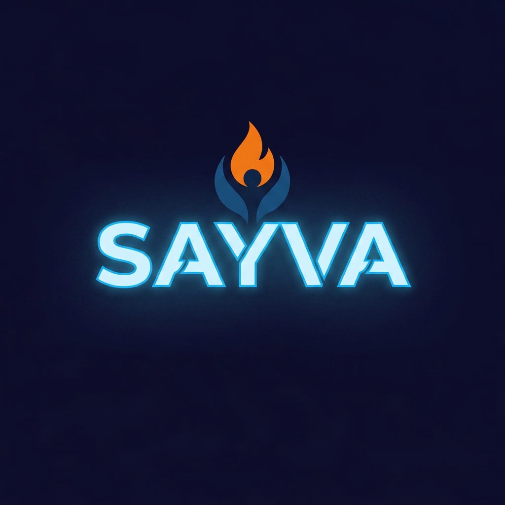
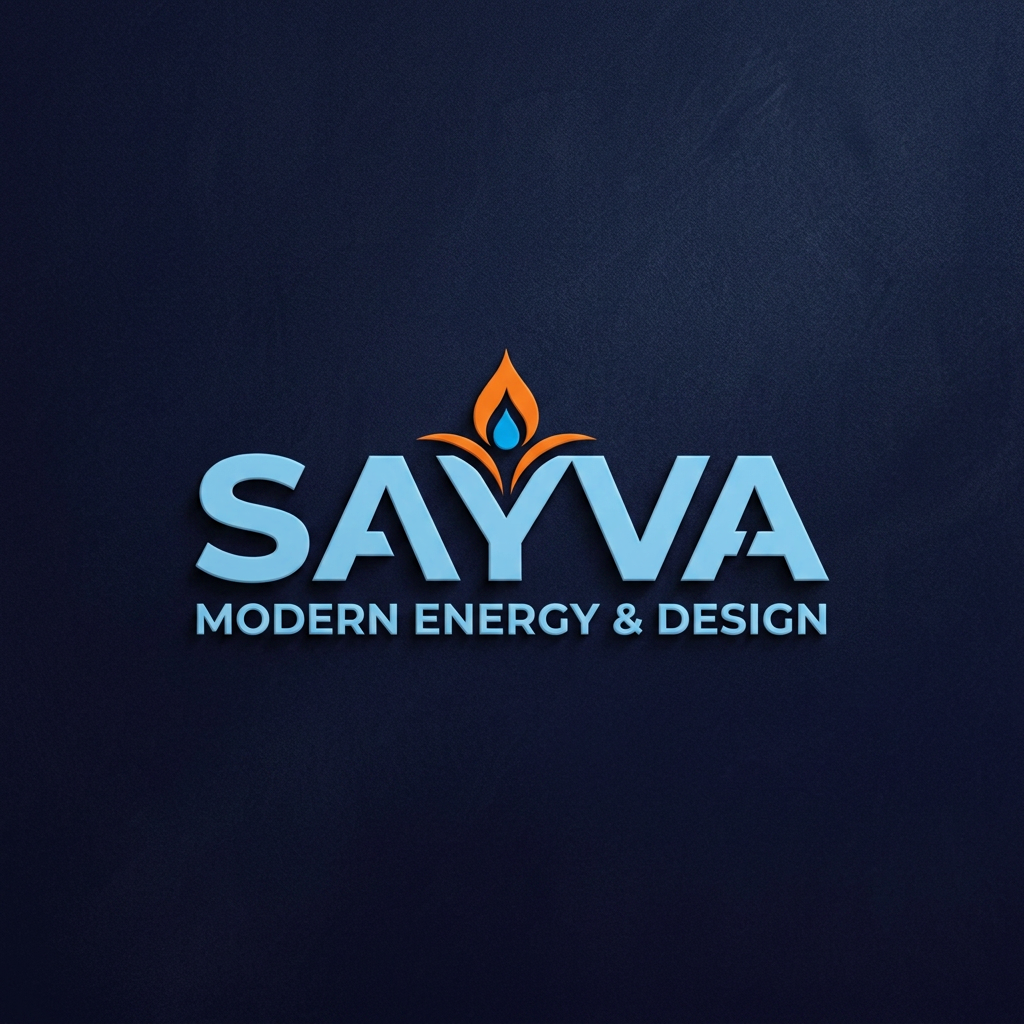
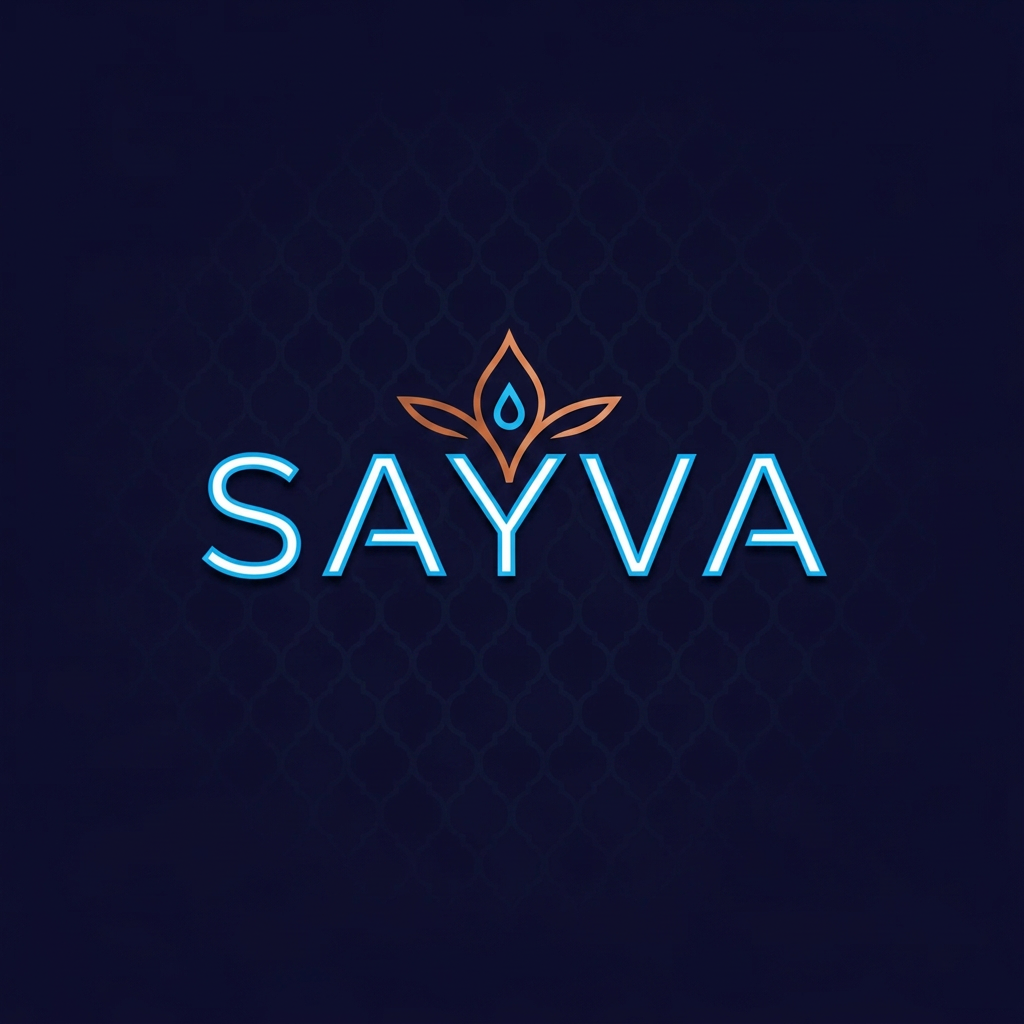
generate me a loGo in which a very small amount of South Asian motif - it should be very very subtle We don’t need a rainbow of colors. Professional, modern, so it pops. Font should be super easy to read when it’s tiny as well as large We also don’t need the word “teens” in the logo. Just "SAYVA". ME A CLEAN LOGO ACC TO CLIENT INSTRUCTIONS I NEED MORE MODERN TEXT AND LAYOUT
by @Elephant_1211352
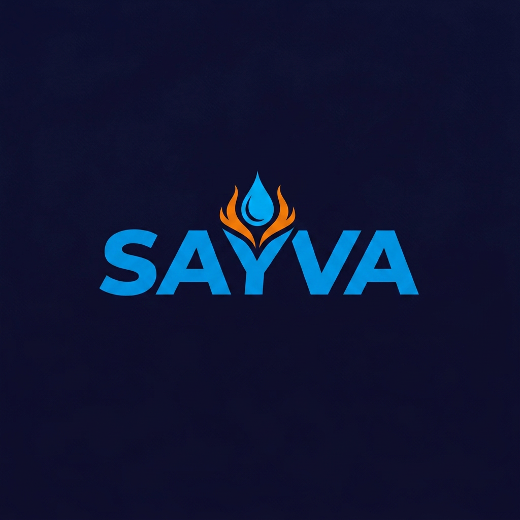
generate me a loGo in which a very small amount of South Asian motif - it should be very very subtle We don’t need a rainbow of colors. Professional, modern, so it pops. Font should be super easy to read when it’s tiny as well as large We also don’t need the word “teens” in the logo. Just "SAYVA". ME A CLEAN LOGO ACC TO CLIENT INSTRUCTIONS i NEED DARK ORANGE, NEON AND WHITE AND SKY BLUE COLOR LOGO PLACED ON A DARK BLUE BG, SOMETHING CREATIBE=VE AND FUNMKY
by @Elephant_1211352
generate me a loGo in which a very small amount of South Asian motif - it should be very very subtle We don’t need a rainbow of colors. Professional, modern, so it pops. Font should be super easy to read when it’s tiny as well as large We also don’t need the word “teens” in the logo. Just "SAYVA". ME A CLEAN LOGO ACC TO CLIENT INSTRUCTIONS i NEED DARK ORANGE, NEON AND WHITE AND SKY BLUE COLOR LOGO PLACED ON A DARK BLUE BG, SOMETHING CREATIBE=VE AND FUNMKY
by @Elephant_1211352
generate me a loGo in which a very small amount of South Asian motif - it should be very very subtle We don’t need a rainbow of colors. Professional, modern, so it pops. Font should be super easy to read when it’s tiny as well as large We also don’t need the word “teens” in the logo. Just "SAYVA". ME A CLEAN LOGO ACC TO CLIENT INSTRUCTIONS i NEED DARK ORANGE, NEON AND WHITE AND SKY BLUE COLOR LOGO PLACED ON A DARK BLUE BG, SOMETHING CREATIBE=VE AND FUNMKY
by @Elephant_1211352
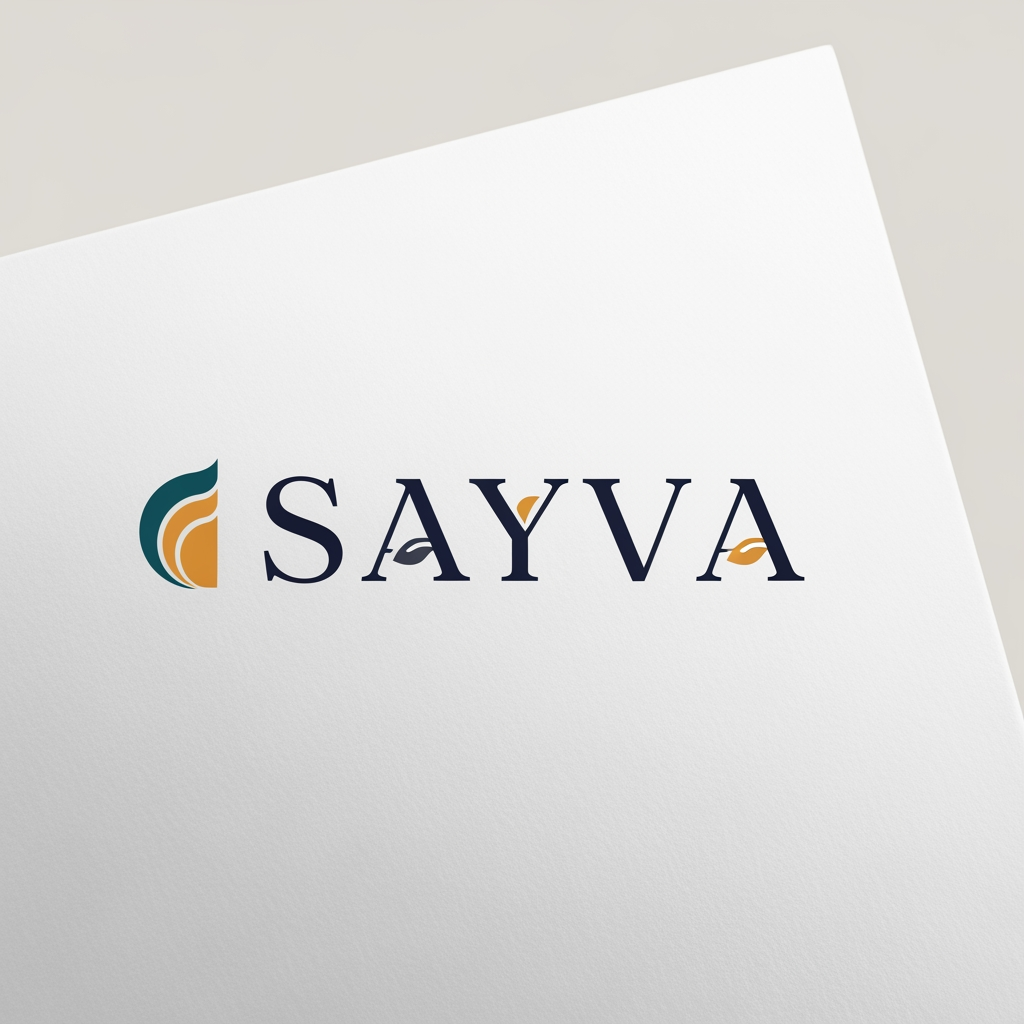
generate me a loho in which a very small amount of South Asian motif - it should be very very subtle We don’t need a rainbow of colors. Professional, modern, so it pops. Font should be super easy to read when it’s tiny as well as large We also don’t need the word “teens” in the logo. Just "SAYVA". gENERATE ME A CLEAN LOGO ACC TO CLIENT INSTRUCTIONS
by @Elephant_1211352
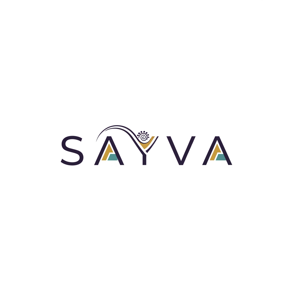
generate me a loho in which a very small amount of South Asian motif - it should be very very subtle We don’t need a rainbow of colors. Professional, modern, so it pops. Font should be super easy to read when it’s tiny as well as large We also don’t need the word “teens” in the logo. Just "SAYVA". gENERATE ME A CLEAN LOGO ACC TO CLIENT INSTRUCTIONS
by @Elephant_1211352
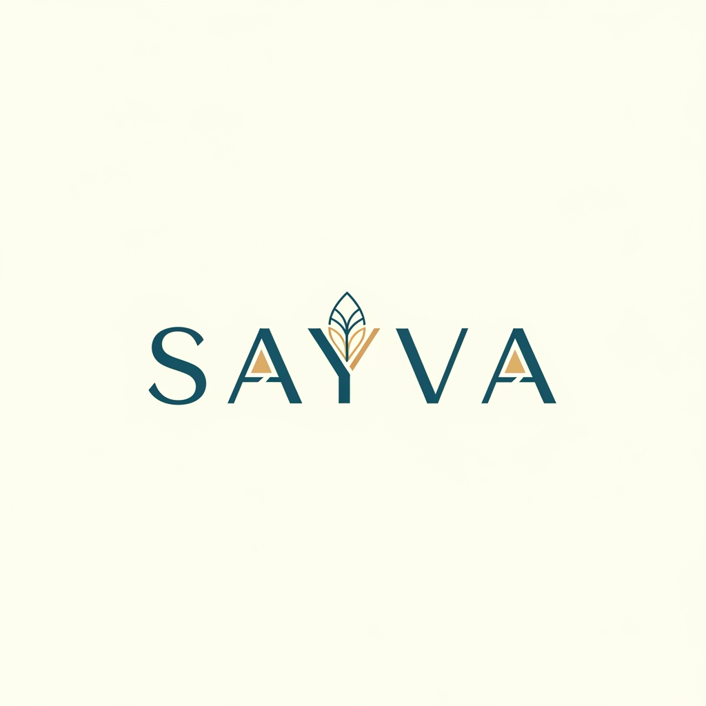
generate me a loho in which a very small amount of South Asian motif - it should be very very subtle We don’t need a rainbow of colors. Professional, modern, so it pops. Font should be super easy to read when it’s tiny as well as large We also don’t need the word “teens” in the logo. Just "SAYVA". gENERATE ME A CLEAN LOGO ACC TO CLIENT INSTRUCTIONS
by @Elephant_1211352




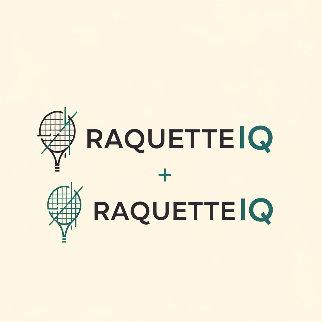
Design a minimalist logo for RaquetteIQ, a tennis and racket-sports coaching & education brand based in İzmir. The brand voice is analytical, precise, and editorial — like a technical knowledge base, not a sporty or playful club. Restraint over energy. Concept direction A clean combination mark (icon + wordmark) that also works as wordmark-only. If using an icon, reference racket sports through abstract geometry rather than literal objects — e.g. the arc of a ball's trajectory/bounce, a minimal court or net line structure, or the grid of a string bed abstracted to a few precise lines. Geometry should feel measured and intentional (suggesting analysis). Avoid: cartoon rackets, tennis balls, victory fists, brains, circuit boards, lightbulbs, or any literal "smart/AI" cliché. Typography Modern geometric/grotesque sans-serif, harmonizing with Public Sans. Set "Raquette" in a medium-to-semibold weight; render "IQ" as the brand signal — same family, but distinguished by the accent color and/or heavier weight (optionally slightly raised). Tight, confident letter-spacing. Color palette (max 2–3, flat — no gradients, no shadows) Primary: charcoal ink #1c1917 Accent: deep teal #0f4c45 (used on "IQ" and/or the icon) Neutral: warm off-white #faf9f7 / light gray for contrast (Optional alternative accent to explore in one variant: muted gold #C9A84C.) Style Flat, vector, crisp. Must read clearly at favicon size (16–32px) and as a social avatar. Must work on both light and dark backgrounds. Generous, consistent clear space around the mark. Deliverables (vector/SVG + transparent PNG) Horizontal lockup (icon left, wordmark right) Stacked lockup (icon above wordmark) Icon/monogram only (favicon + avatar) — consider an "R" or "IQ" monogram Light-background (dark) version Dark-background (light) version Style: Flat design, no gradients, no shadows. Should work on both white background and dark background. Should be legible at small sizes (favicon, social media avatar). Output: Provide multiple variations: Full horizontal lockup (icon left, wordmark right) Stacked lockup (icon above wordmark) Icon only (for favicon/avatar use) Light version (dark background) Dark version (white background)"
by @Elephant_4429476
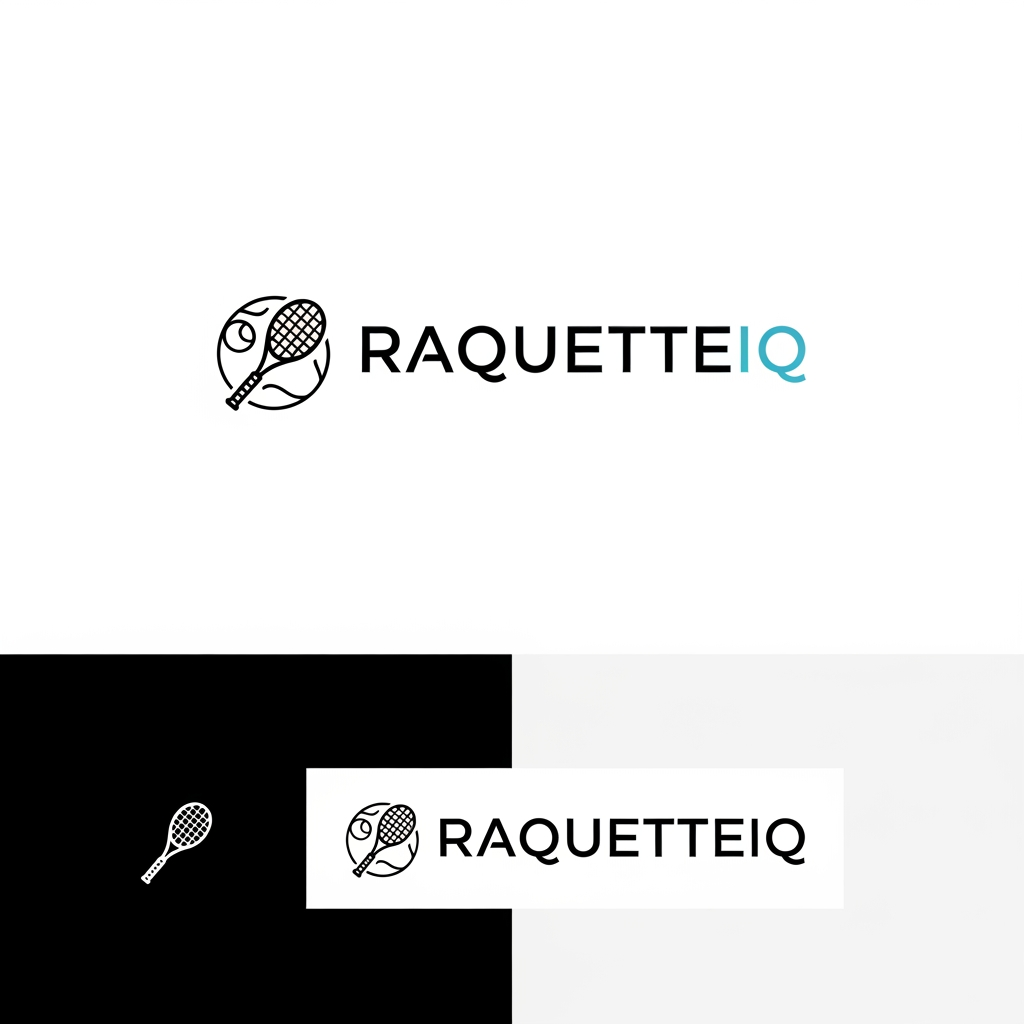
Design a minimalist logo for RaquetteIQ, a tennis and racket-sports coaching & education brand based in İzmir. The brand voice is analytical, precise, and editorial — like a technical knowledge base, not a sporty or playful club. Restraint over energy. Concept direction A clean combination mark (icon + wordmark) that also works as wordmark-only. If using an icon, reference racket sports through abstract geometry rather than literal objects — e.g. the arc of a ball's trajectory/bounce, a minimal court or net line structure, or the grid of a string bed abstracted to a few precise lines. Geometry should feel measured and intentional (suggesting analysis). Avoid: cartoon rackets, tennis balls, victory fists, brains, circuit boards, lightbulbs, or any literal "smart/AI" cliché. Typography Modern geometric/grotesque sans-serif, harmonizing with Public Sans. Set "Raquette" in a medium-to-semibold weight; render "IQ" as the brand signal — same family, but distinguished by the accent color and/or heavier weight (optionally slightly raised). Tight, confident letter-spacing. Color palette (max 2–3, flat — no gradients, no shadows) Primary: charcoal ink #1c1917 Accent: deep teal #0f4c45 (used on "IQ" and/or the icon) Neutral: warm off-white #faf9f7 / light gray for contrast (Optional alternative accent to explore in one variant: muted gold #C9A84C.) Style Flat, vector, crisp. Must read clearly at favicon size (16–32px) and as a social avatar. Must work on both light and dark backgrounds. Generous, consistent clear space around the mark. Deliverables (vector/SVG + transparent PNG) Horizontal lockup (icon left, wordmark right) Stacked lockup (icon above wordmark) Icon/monogram only (favicon + avatar) — consider an "R" or "IQ" monogram Light-background (dark) version Dark-background (light) version Style: Flat design, no gradients, no shadows. Should work on both white background and dark background. Should be legible at small sizes (favicon, social media avatar). Output: Provide multiple variations: Full horizontal lockup (icon left, wordmark right) Stacked lockup (icon above wordmark) Icon only (for favicon/avatar use) Light version (dark background) Dark version (white background)"
by @Elephant_4429476
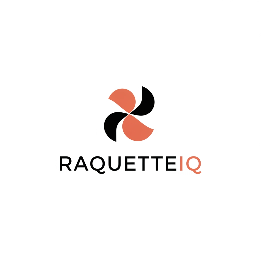
Design a minimalist logo for RaquetteIQ, a tennis and racket-sports coaching & education brand based in İzmir. The brand voice is analytical, precise, and editorial — like a technical knowledge base, not a sporty or playful club. Restraint over energy. Concept direction A clean combination mark (icon + wordmark) that also works as wordmark-only. If using an icon, reference racket sports through abstract geometry rather than literal objects — e.g. the arc of a ball's trajectory/bounce, a minimal court or net line structure, or the grid of a string bed abstracted to a few precise lines. Geometry should feel measured and intentional (suggesting analysis). Avoid: cartoon rackets, tennis balls, victory fists, brains, circuit boards, lightbulbs, or any literal "smart/AI" cliché. Typography Modern geometric/grotesque sans-serif, harmonizing with Public Sans. Set "Raquette" in a medium-to-semibold weight; render "IQ" as the brand signal — same family, but distinguished by the accent color and/or heavier weight (optionally slightly raised). Tight, confident letter-spacing. Color palette (max 2–3, flat — no gradients, no shadows) Primary: charcoal ink #1c1917 Accent: deep teal #0f4c45 (used on "IQ" and/or the icon) Neutral: warm off-white #faf9f7 / light gray for contrast (Optional alternative accent to explore in one variant: muted gold #C9A84C.) Style Flat, vector, crisp. Must read clearly at favicon size (16–32px) and as a social avatar. Must work on both light and dark backgrounds. Generous, consistent clear space around the mark. Deliverables (vector/SVG + transparent PNG) Horizontal lockup (icon left, wordmark right) Stacked lockup (icon above wordmark) Icon/monogram only (favicon + avatar) — consider an "R" or "IQ" monogram Light-background (dark) version Dark-background (light) version Style: Flat design, no gradients, no shadows. Should work on both white background and dark background. Should be legible at small sizes (favicon, social media avatar). Output: Provide multiple variations: Full horizontal lockup (icon left, wordmark right) Stacked lockup (icon above wordmark) Icon only (for favicon/avatar use) Light version (dark background) Dark version (white background)"
by @Elephant_4429476
What's next?Explore more features
Go from browse to build