Designs made by our community
Explore unique graphic designs and images crafted by creators around the world using Hiding Elephant's AI design tools. Get inspired and start creating.
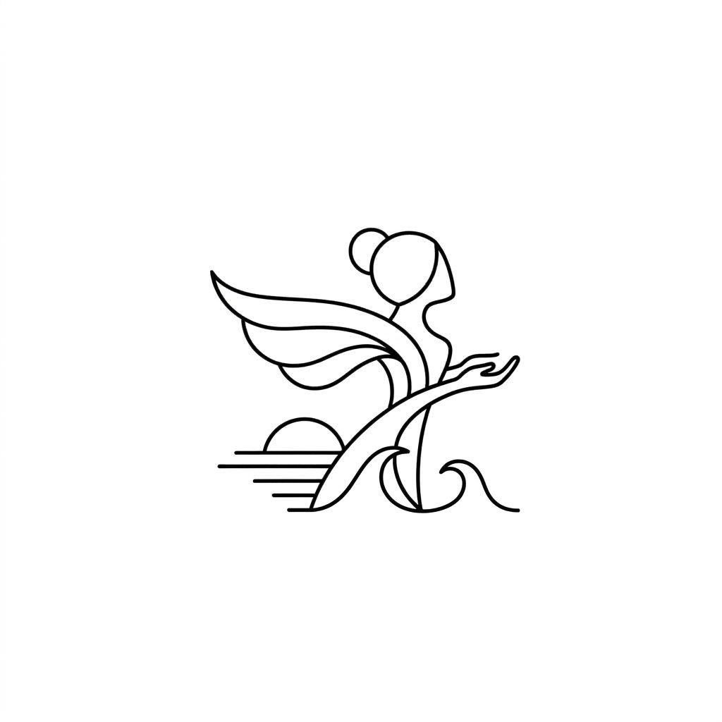
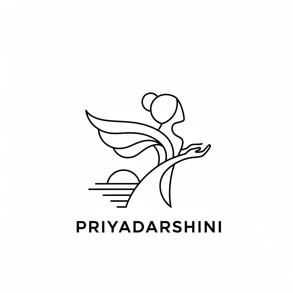
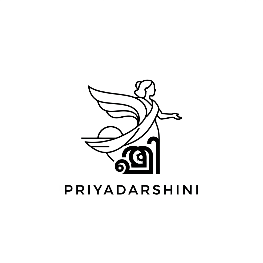
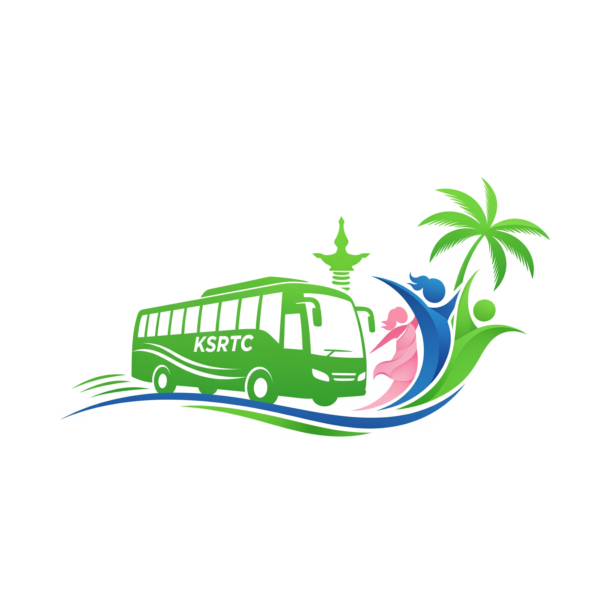
Design an award winning minimalist logo for **പ്രിയദർശിനി (Priyadarshini)**, a Kerala women empowerment and public mobility initiative. The logo should be deeply rooted in the meaning of the word *Priyadarshini* — The word Priyadarshini (പ്രിയദർശിനി) comes from Sanskrit: Priya (प्रिया) = beloved, dear, cherished Darshini (दर्शिनी) = one who is seen, one who beholds, one with a pleasing presence Combined meanings include: "Beloved and admired" "Pleasant to behold" "One who looks upon others with kindness" "A gracious and inspiring presence" "Dear to all who see her" Create a sophisticated geometric symbol where the silhouette of a woman is seamlessly integrated through negative space. The woman should appear confident, welcoming, and moving forward, symbolizing freedom, dignity, opportunity, accessibility, and progress. The form should subtly evoke a gentle gaze, open arms, a rising path, and a brighter future without using literal transportation elements. The logo icon should cleverly combine: • A graceful feminine form • A forward moving curve representing life's journey • An uplifting wing or flowing fabric symbolizing freedom • A subtle sunrise or horizon representing new opportunities • Hidden Malayalam character "പ്ര" integrated through negative space Color palette inspired by Kerala KSRTC ordinary buses: • KSRTC Sky Blue #3E8ED0 • Clean White #FFFFFF • Deep Navy Accent #1F3B5C The blue should represent trust, public service, mobility, safety, and reliability. White should symbolize inclusivity, transparency, dignity, and hope. Design style: • Scandinavian minimalism • Flat vector design • Strong geometric construction • Clean monoline curves • Timeless public service branding • Memorable at small sizes • Perfect balance of emotion and authority • Premium government initiative aesthetic Avoid: • Bus icons • Wheels • Roads • Maps • Generic female clipart • Complex illustrations • Gradients • Shadows • 3D effects Typography: • Modern sans serif with excellent readability • Malayalam wordmark only: "പ്രിയദർശിനി" • Elegant spacing and clean alignment Presentation: • Main logo on white background • Horizontal and stacked versions • Monochrome version • Brand identity showcase • Vector precision • International design award quality • Similar sophistication to Olympic branding, Airbnb symbol design, and modern public infrastructure identities Aspect ratio 1:1, ultra high resolution, professional logo presentation board.
by @Elephant_3410178

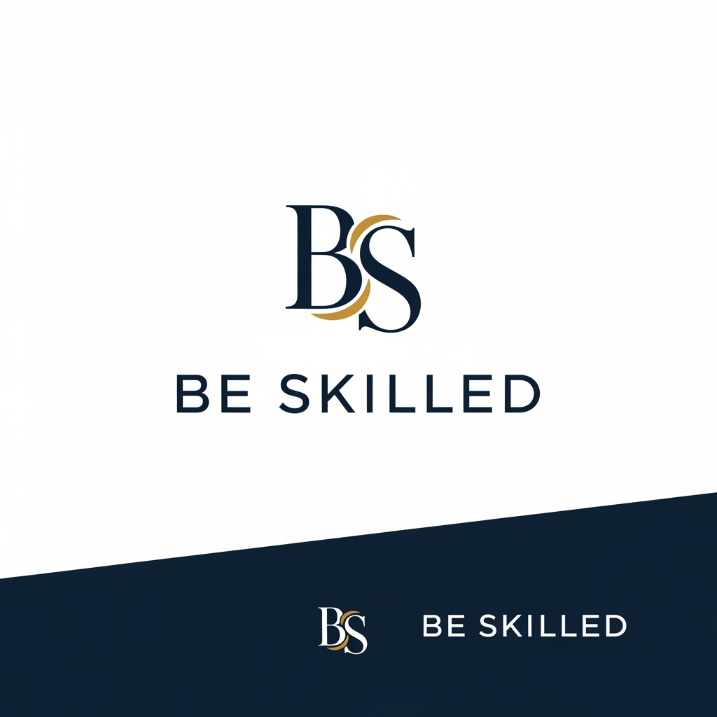
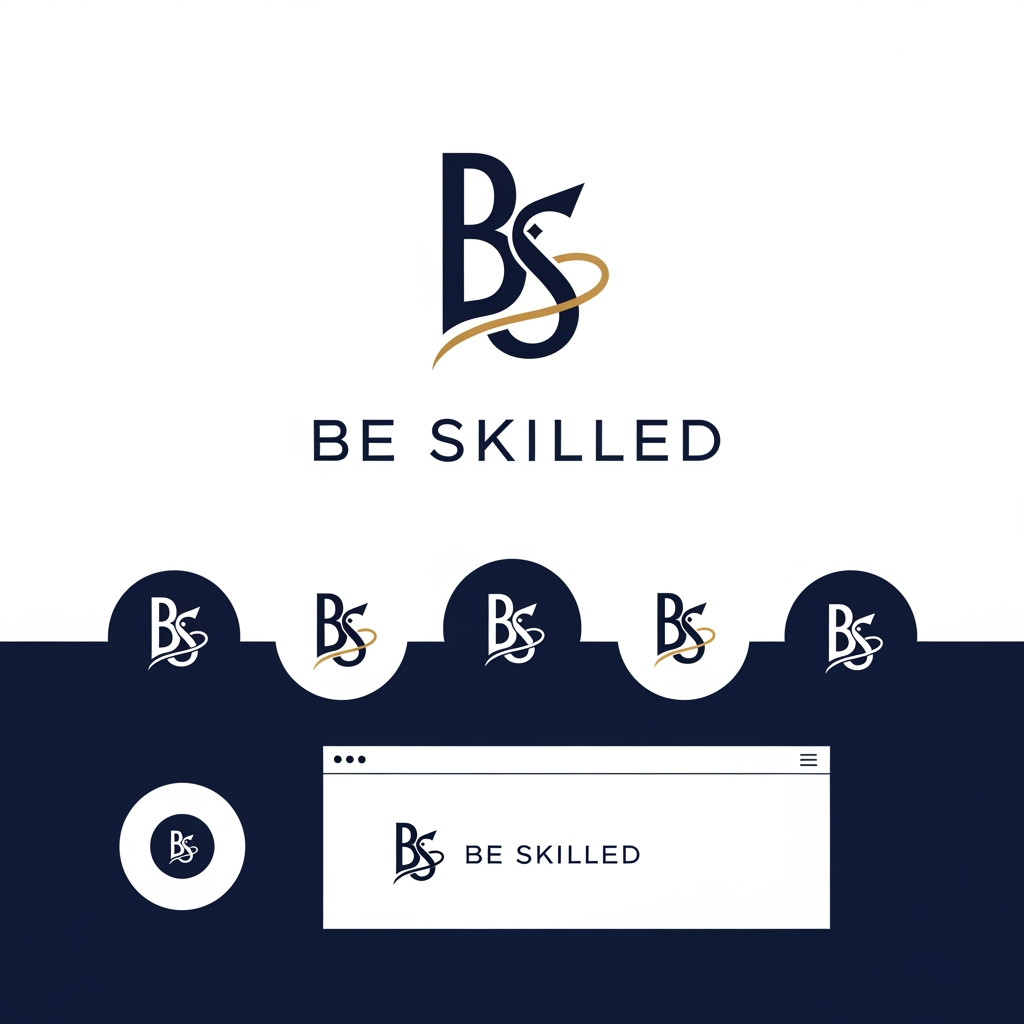
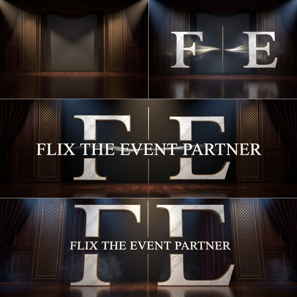
Design a luxury corporate brand identity for "BE SKILLED", a leadership development, communication training, and executive learning company. The logo should feel as premium as Harvard Business Review, McKinsey, TED, and Forbes. Avoid all educational clichés, speech bubbles, books, graduation caps, growth arrows, and people icons. Focus on sophisticated typography, executive presence, timeless elegance, trust, authority, and transformation. Use a minimalist wordmark or subtle monogram with hidden meaning. The logo should look equally impressive on a keynote stage, a CEO training deck, a LinkedIn banner, and a corporate proposal. Use charcoal black and ivory or midnight blue and platinum. The overall impression should be premium, intelligent, powerful, and globally credible. Use the uploaded logo as inspiration, but redesign it into a premium corporate brand identity. Brand Name: Be Skilled Keep: * The BS monogram concept * Premium navy blue brand color Improve: * Modernize the typography * Make the logo suitable for corporate learning, leadership development, communication training, and professional coaching * Increase readability at small sizes * Create a stronger visual balance between B and S * Make the logo feel global, premium, and trustworthy Design Style: * Minimalist * Luxury corporate * Clean geometric forms * High-end consulting firm aesthetics * Timeless and scalable Visual Concepts: * Communication * Leadership * Growth * Learning * Human development * Transformation Typography: * Modern sans-serif * Premium corporate feel * Similar quality to Deloitte, LinkedIn Learning, TED, McKinsey, Harvard Business Review Color Palette: * Deep Navy Blue (#071B4A) * Gold Accent (#D4A017) * White Deliver: 1. Premium monogram logo 2. Full logo with company name 3. Watermark version 4. LinkedIn profile version 5. Website header version 6. Black and white version Avoid: * Script fonts * Graduation caps * Generic handshake icons * Cartoon elements * Stock training symbols I am into category of Ed tech soft skill make it accordingly strong catchy logo design The final logo should instantly communicate: Leadership. Communication. Growth.- dont need to mention these 3 words in the logo, it should be evident with the logo itself
by @Elephant_2911007
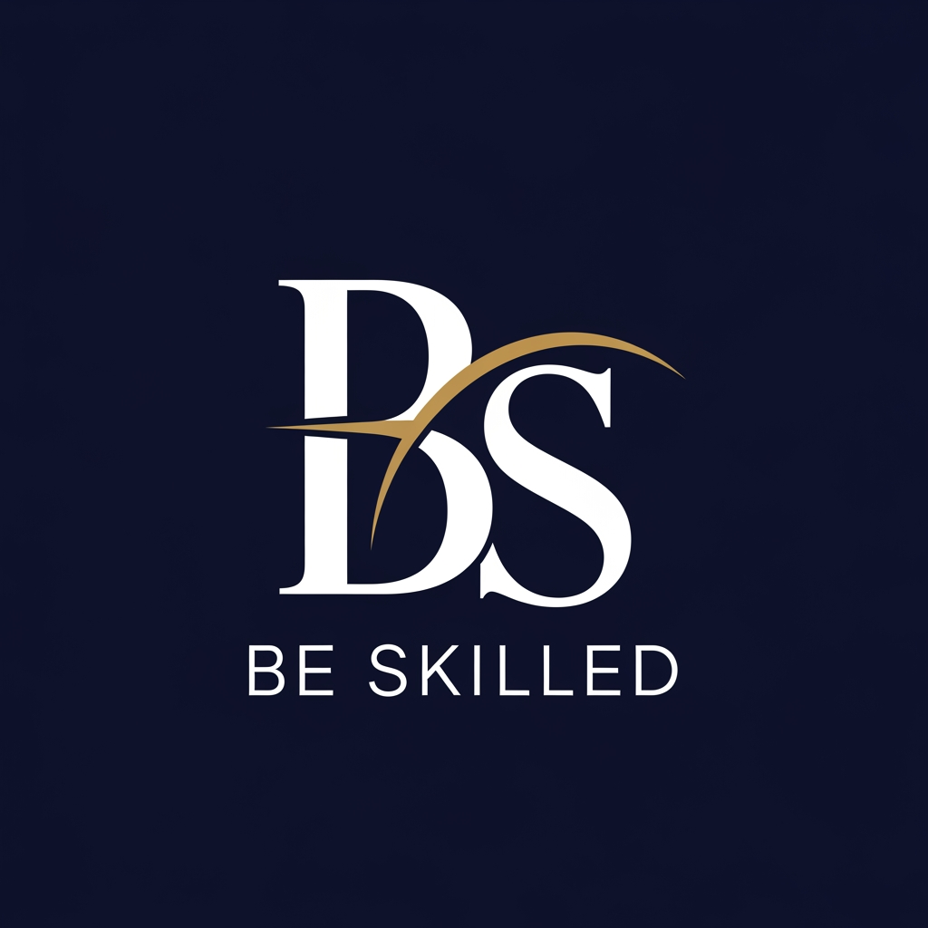

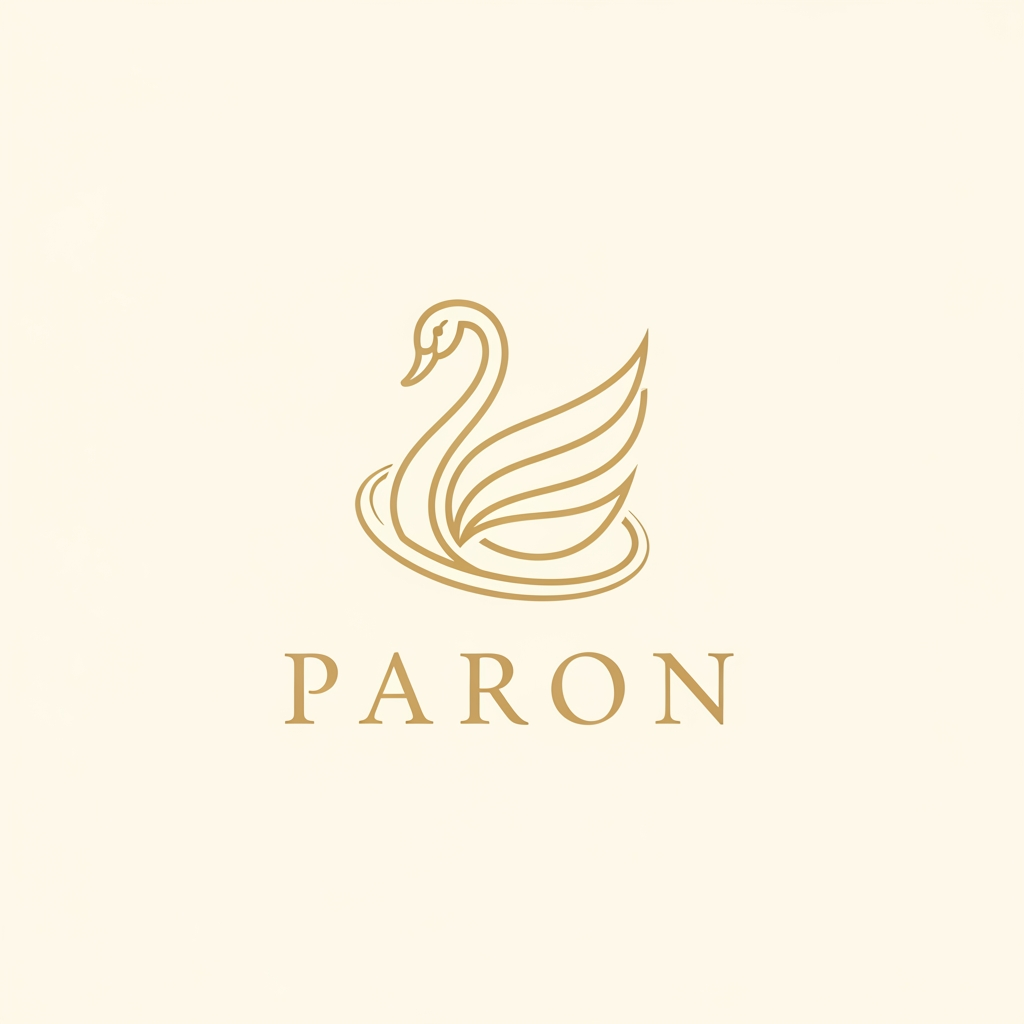
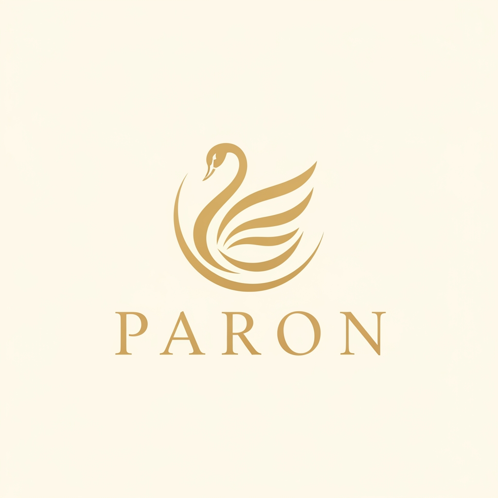
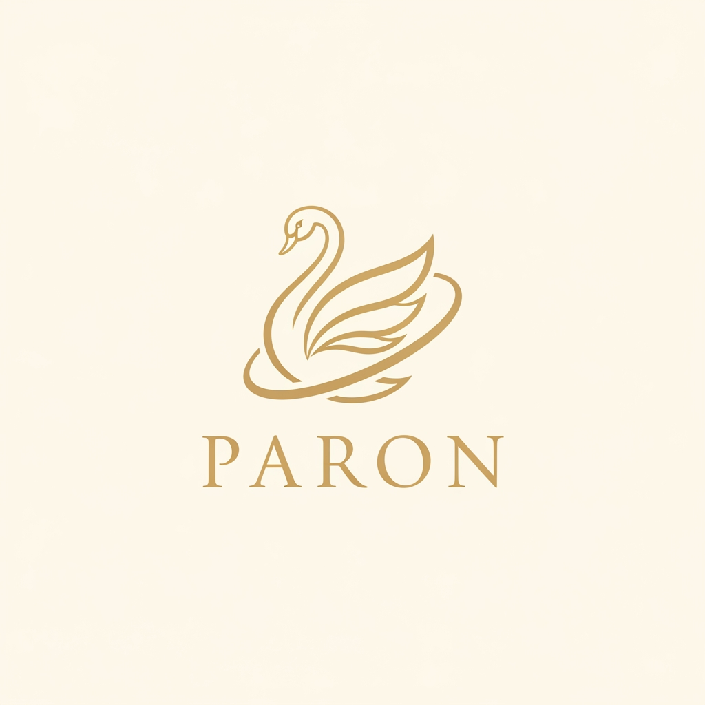
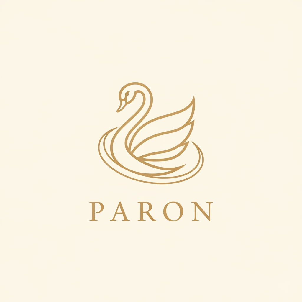
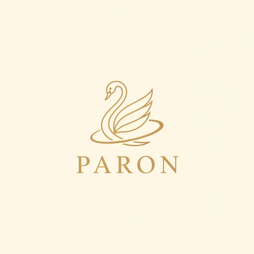
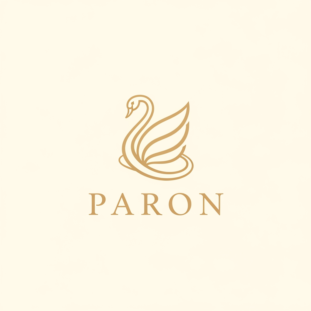
Design a premium, minimalist luxury jewellery logo for a brand named PARON. Place an elegant abstract swan symbol above the wordmark. The swan should be inspired by a Rajhans (Hamsa) and constructed using clean, flowing curves with balanced symmetry. Reduce the overall size and visual weight of the swan symbol by 20% compared to a typical luxury logo, making it feel refined, understated, and sophisticated rather than dominant. The swan should be enclosed within a subtle circular flow, creating a sense of completeness, harmony, and timeless mastery. Avoid excessive feathers, facets, stars, gemstones, ornaments, gradients, shadows, glows, 3D effects, metallic textures, or decorative embellishments. The logo must feel: Timeless Noble Premium Effortlessly elegant Inspired by heritage craftsmanship Suitable for a high-end jewellery house Use a flat 2D vector style with crisp lines and perfect proportions. Maintain generous negative space and a strong luxury aesthetic similar to world-class jewellery maisons. The brand name PARON should appear below the symbol in Erial font (exact font), with refined letter spacing and balanced proportions. The typography should be clean, minimal, and luxurious. Colour palette: Soft royal gold symbol Warm champagne gold typography Ivory or off-white background No mockups, no business cards, no packaging, no watermark, no textures. Present only the logo on a clean background. Style Keywords: Minimal luxury, fine jewellery, royal elegance, Rajhans symbolism, noble mastery, heritage craftsmanship, premium branding, flat vector logo, understated sophistication.
by @Elephant_5829803
smarttaau smarttaau is a blogging company which provides creative and reliable digital services designed to help brands grow online, improve visibility, and achieve long-term business success. Please deliver a wordmark logo and a submark for app icons and social profile pictures. COLOUR PALETTE green #25d366 white #ffffff similar companies : seo jonural search engine land search engine jonural semrush NPdigital give me few ideas for their logo design
by @Elephant_8588337
Design a premium, minimalist luxury jewellery logo for a brand named PARON. Place an elegant abstract swan symbol above the wordmark. The swan should be inspired by a Rajhans (Hamsa) and constructed using clean, flowing curves with balanced symmetry. Reduce the overall size and visual weight of the swan symbol by 20% compared to a typical luxury logo, making it feel refined, understated, and sophisticated rather than dominant. The swan should be enclosed within a subtle circular flow, creating a sense of completeness, harmony, and timeless mastery. Avoid excessive feathers, facets, stars, gemstones, ornaments, gradients, shadows, glows, 3D effects, metallic textures, or decorative embellishments. The logo must feel: Timeless Noble Premium Effortlessly elegant Inspired by heritage craftsmanship Suitable for a high-end jewellery house Use a flat 2D vector style with crisp lines and perfect proportions. Maintain generous negative space and a strong luxury aesthetic similar to world-class jewellery maisons. The brand name PARON should appear below the symbol in Erial font (exact font), with refined letter spacing and balanced proportions. The typography should be clean, minimal, and luxurious. Colour palette: Soft royal gold symbol Warm champagne gold typography Ivory or off-white background No mockups, no business cards, no packaging, no watermark, no textures. Present only the logo on a clean background. Style Keywords: Minimal luxury, fine jewellery, royal elegance, Rajhans symbolism, noble mastery, heritage craftsmanship, premium branding, flat vector logo, understated sophistication.
by @Elephant_5829803
mi crei un logo, per un azienda informatia, in stile futuristico, l'azienda si chiama T4S, e mi hanno chiesto il rebranding, loro volvano per il logo la base nea dello sfondo e il logo giallo fluo. Un idea mantenendo sempre questo stile, era quelli di creare un logo dove la T-S si sovrapponevano un pochino e in negativo si leggeva il 4. Poi fai tu e dammi diverse opzioni.
by @Elephant_4462559
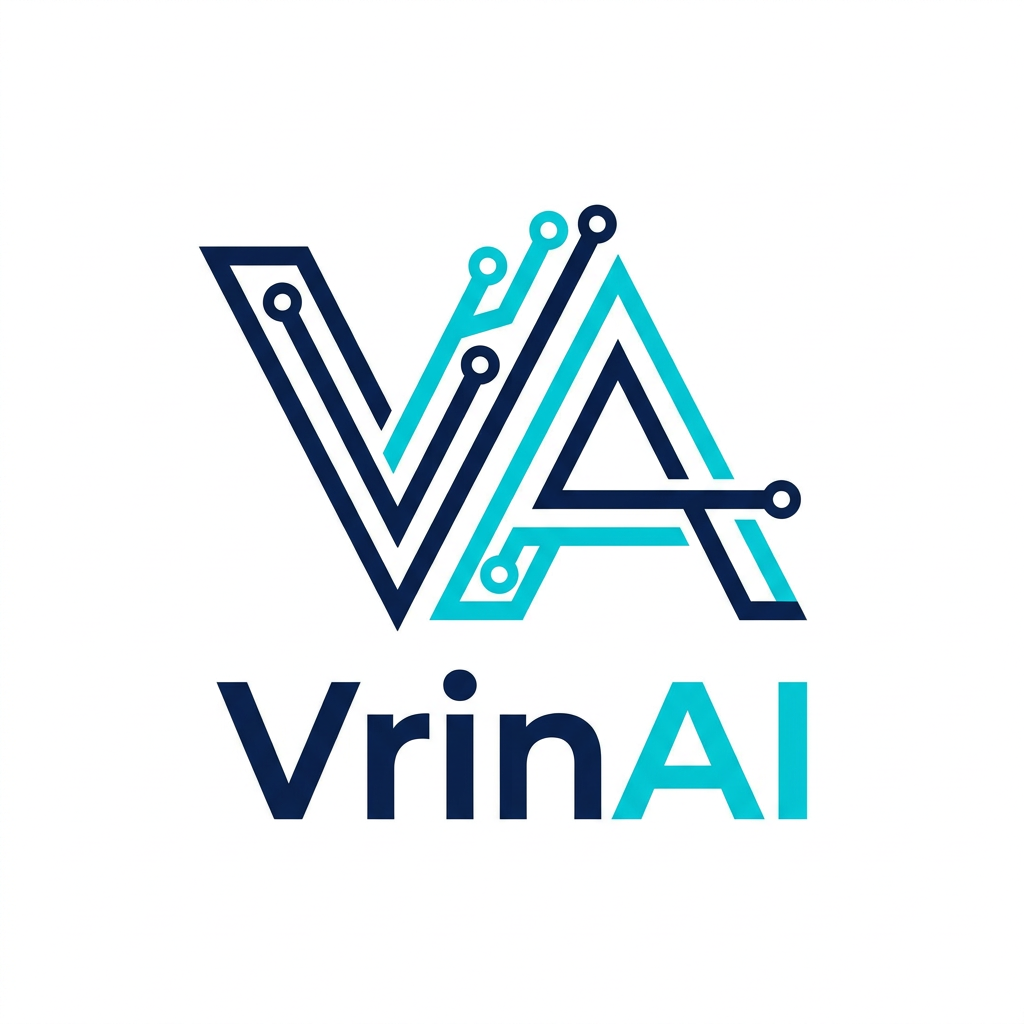
A sleek, modern minimalist logo design for a brand named VrinAI, featuring abstract geometric shapes that suggest innovation and connectivity. Use a sophisticated color palette of deep navy blue and vibrant cyan, with clean lines, balanced symmetry, and a professional vector-style aesthetic on a stark white background.
by @Elephant_2557542
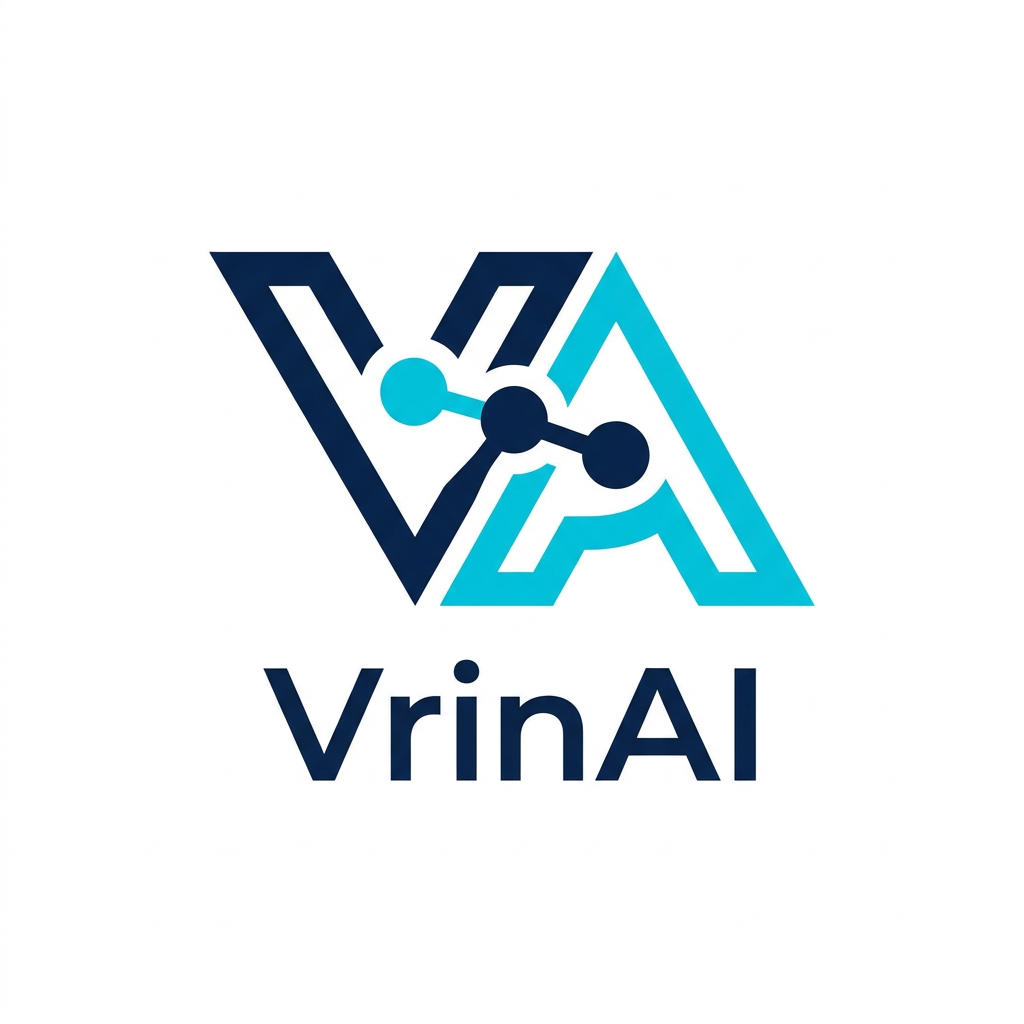
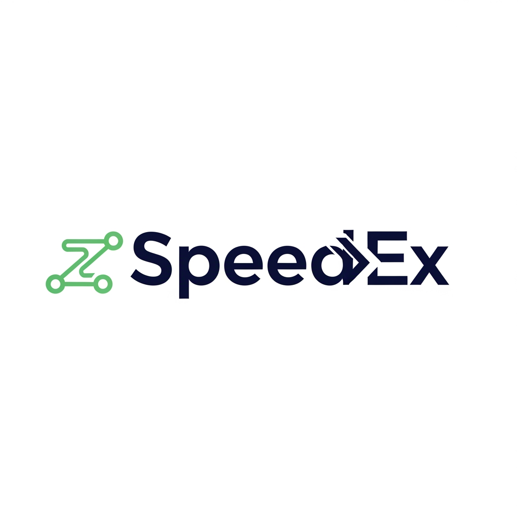
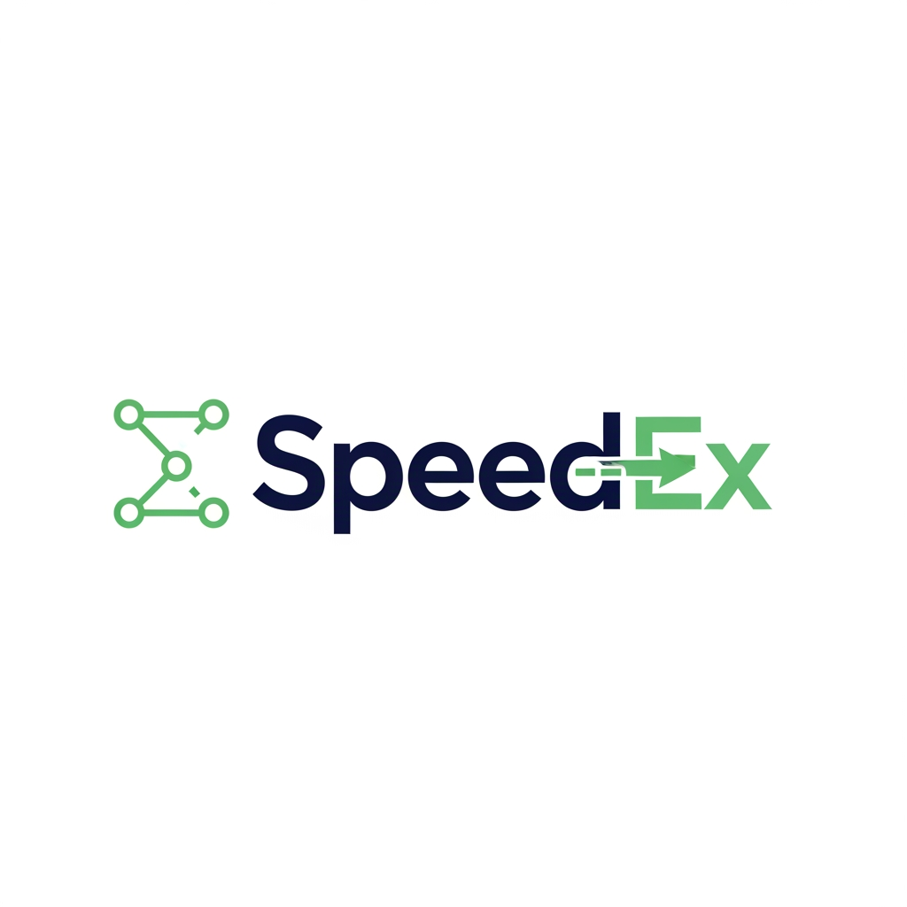
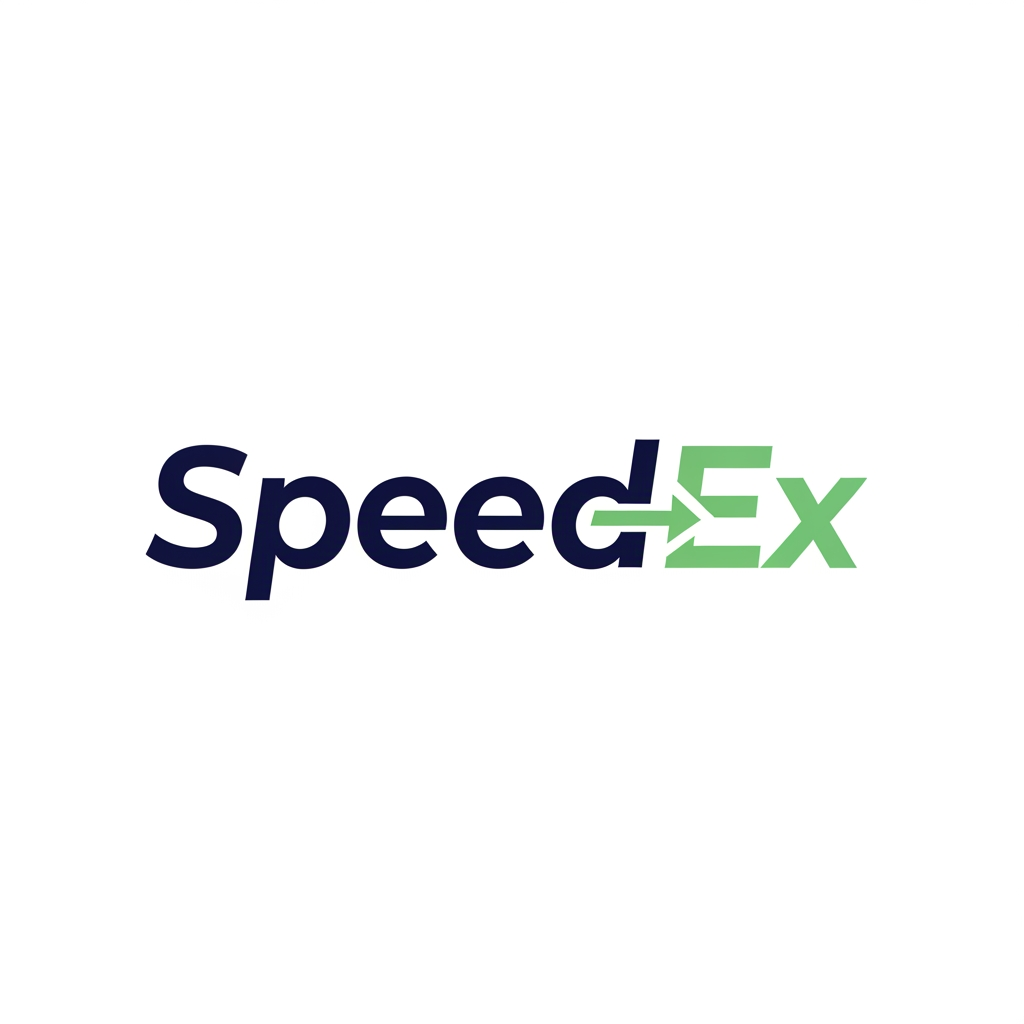
Professional vector logo design for a logistics and freight forwarding brand named “SpeedEx”. Use only the brand name: SpeedEx. Brand personality: reliable, transparent, modern, professional, calm, fast, digital-first, B2B logistics, practical, trustworthy. Industry: logistics, freight forwarding, import/export, shipment visibility, documentation, route tracking, integrated 3PL. Create a clean, modern, premium logo with a symbol + wordmark. The logo should feel fast and reliable, but not flashy. The wordmark should have a slight right-leaning motion feel, suggesting speed and forward movement. Design direction: A modern logistics logo using a simple forward arrow, route line, connected node, or directional mark integrated into the “E” or “X” of SpeedEx. The symbol should suggest movement, trade lanes, shipment tracking, and global logistics corridors without using literal trucks, ships, or airplanes. Style: Minimalist, flat vector, geometric, clean, scalable, professional B2B, balanced spacing, strong readability, suitable for website header, business card, invoice, social media icon, vehicle branding, and favicon. Typography: Modern sans-serif wordmark, geometric or humanist style, slightly customized, similar to Inter, Sora, Manrope, Montserrat, Plus Jakarta Sans, Avenir Next, or Gilroy. No script fonts, no serif fonts, no decorative fonts. Color palette: Deep navy blue as the primary color for trust and reliability. Use one accent color from the following: * light ocean green for sustainability and modern logistics * teal for digital visibility * orange for speed and energy Preferred color version: Deep navy + light ocean green + white/off-white. Logo variations to explore: 1. Forward motion wordmark with a hidden arrow in the “X” 2. Route-tracking icon with connected nodes 3. Minimal global corridor line mark 4. Speed-cut typography with subtle angled letter cuts 5. Ocean-green sustainability logistics mark Avoid: literal truck icon, ship icon, airplane icon, complex globe, generic courier swoosh, messy blur, 3D effects, shadows, gradients, clipart, cartoon style, overly detailed illustration, too many colors. Output should look like a professional vector logo concept, clean white background, centered composition, high contrast, simple shapes, brand-ready, easy to refine in Adobe Illustrator.
by @Elephant_8409168
What's next?Explore more features
Go from browse to build