Designs made by our community
Explore unique graphic designs and images crafted by creators around the world using Hiding Elephant's AI design tools. Get inspired and start creating.
Create an elegant and premium logo for "Hirva Creation", a women's purse and handbag brand. Use a soft pastel luxury aesthetic with a warm cream background, blush pink watercolor accents, sage/emerald green typography, and subtle gold details. Feature a stylish handbag icon integrated with the initials HC. Include delicate botanical leaf elements for a sophisticated feminine touch. Minimalist, clean, upscale boutique branding. No clothing, no dress, no mannequin, no apparel elements. Focus only on handbags and purses. Luxury fashion boutique style, vector logo, professional branding, soft pastel color palette, high-end packaging ready, Instagram-ready, elegant serif typography, premium and memorable design.
by @Elephant_9115398
Create an elegant and premium logo for "Hirva Creation", a women's purse and handbag brand. Use a soft pastel luxury aesthetic with a warm cream background, blush pink watercolor accents, sage/emerald green typography, and subtle gold details. Feature a stylish handbag icon integrated with the initials HC. Include delicate botanical leaf elements for a sophisticated feminine touch. Minimalist, clean, upscale boutique branding. No clothing, no dress, no mannequin, no apparel elements. Focus only on handbags and purses. Luxury fashion boutique style, vector logo, professional branding, soft pastel color palette, high-end packaging ready, Instagram-ready, elegant serif typography, premium and memorable design.
by @Elephant_9115398
Create an elegant and premium logo for "Hirva Creation", a women's purse and handbag brand. Use a soft pastel luxury aesthetic with a warm cream background, blush pink watercolor accents, sage/emerald green typography, and subtle gold details. Feature a stylish handbag icon integrated with the initials HC. Include delicate botanical leaf elements for a sophisticated feminine touch. Minimalist, clean, upscale boutique branding. No clothing, no dress, no mannequin, no apparel elements. Focus only on handbags and purses. Luxury fashion boutique style, vector logo, professional branding, soft pastel color palette, high-end packaging ready, Instagram-ready, elegant serif typography, premium and memorable design.
by @Elephant_9115398
Design a premium luxury logo for a handbag and purse brand named "Hirva Creation". Create an elegant monogram using the letters H and C. Minimalist, high-end fashion brand style similar to luxury designer brands. Gold metallic details on a black background, clean lines, sophisticated typography, luxury packaging ready, vector logo, professional branding, modern and timeless.
by @Elephant_9115398
Design a premium luxury logo for a handbag and purse brand named "Hirva Creation". Create an elegant monogram using the letters H and C. Minimalist, high-end fashion brand style similar to luxury designer brands. Gold metallic details on a black background, clean lines, sophisticated typography, luxury packaging ready, vector logo, professional branding, modern and timeless.
by @Elephant_9115398
Design a premium luxury logo for a handbag and purse brand named "Hirva Creation". Create an elegant monogram using the letters H and C. Minimalist, high-end fashion brand style similar to luxury designer brands. Gold metallic details on a black background, clean lines, sophisticated typography, luxury packaging ready, vector logo, professional branding, modern and timeless.
by @Elephant_9115398

I want to create a logo for a fashion brand which is in traditional wear clothes for both men and women. Brand name : KALKI Fashion https://in.kalkifashion.com/pages/our-stores/kalki-fashion-designer-clothing-store-ahmedabad Above is the brand website link for your reference and for current logo design. Have a look at it and give me a new logo designs which looks premium and does not take away the current logo authenticity also. According to their services provided give me a good designed logo with good fonts used. Below is the company details to get a better idea of it and design the logo according to it.- Born in Mumbai, India in 2007, KALKI evokes the very spirit of the city it was founded in. An upstart, innovative, and dynamic brand – KALKI – offers the best of contemporary, ethnic Indian fashion and fusion-wear styles. Staying true to the brand’s unique promise of premium and wearable fashion, KALKI unveils fresh collections and all-new designs throughout the fashion calendar. KALKI’s design and aesthetic sensibility seek inspiration from all walks of life- be it the beauty of nature and heritage in art, architecture and culture, intricate creations, and the modern world to the home-bound handloom traditions of India. Vision To be a company that is a benchmark in the Indian fashion industry for its offerings and experiences. Mission To be a preferred company of choice in Indian fashion globally for its delightful customer service, and quality product offerings by constantly evolving using innovation and design.
by @Elephant_7771464
I want to create a logo for a fashion brand which is in traditional wear clothes for both men and women. Brand name : KALKI Fashion https://in.kalkifashion.com/pages/our-stores/kalki-fashion-designer-clothing-store-ahmedabad Above is the brand website link for your reference and for current logo design. Have a look at it and give me a new logo designs which looks premium and does not take away the current logo authenticity also. According to their services provided give me a good designed logo with good fonts used. Below is the company details to get a better idea of it and design the logo according to it.- Born in Mumbai, India in 2007, KALKI evokes the very spirit of the city it was founded in. An upstart, innovative, and dynamic brand – KALKI – offers the best of contemporary, ethnic Indian fashion and fusion-wear styles. Staying true to the brand’s unique promise of premium and wearable fashion, KALKI unveils fresh collections and all-new designs throughout the fashion calendar. KALKI’s design and aesthetic sensibility seek inspiration from all walks of life- be it the beauty of nature and heritage in art, architecture and culture, intricate creations, and the modern world to the home-bound handloom traditions of India. Vision To be a company that is a benchmark in the Indian fashion industry for its offerings and experiences. Mission To be a preferred company of choice in Indian fashion globally for its delightful customer service, and quality product offerings by constantly evolving using innovation and design.
by @Elephant_7771464
I want to create a logo for a fashion brand which is in traditional wear clothes for both men and women. Brand name : KALKI Fashion https://in.kalkifashion.com/pages/our-stores/kalki-fashion-designer-clothing-store-ahmedabad Above is the brand website link for your reference and for current logo design. Have a look at it and give me a new logo designs which looks premium and does not take away the current logo authenticity also. According to their services provided give me a good designed logo with good fonts used. Below is the company details to get a better idea of it and design the logo according to it.- Born in Mumbai, India in 2007, KALKI evokes the very spirit of the city it was founded in. An upstart, innovative, and dynamic brand – KALKI – offers the best of contemporary, ethnic Indian fashion and fusion-wear styles. Staying true to the brand’s unique promise of premium and wearable fashion, KALKI unveils fresh collections and all-new designs throughout the fashion calendar. KALKI’s design and aesthetic sensibility seek inspiration from all walks of life- be it the beauty of nature and heritage in art, architecture and culture, intricate creations, and the modern world to the home-bound handloom traditions of India. Vision To be a company that is a benchmark in the Indian fashion industry for its offerings and experiences. Mission To be a preferred company of choice in Indian fashion globally for its delightful customer service, and quality product offerings by constantly evolving using innovation and design.
by @Elephant_7771464
PROMPT You are a world-class brand identity designer specializing in premium outdoor, surf, and lifestyle brands. Your task is to create a complete visual identity for a new brand called: DREN Tagline: THE POST-SESSION RITUAL ABOUT THE BRAND DREN is not a surf brand. DREN is a premium post-session lifestyle brand. The first product is a portable pressurized shower used after surfing, beach sessions, camping, MTB rides, fishing trips, and outdoor adventures. The brand represents the transition from the ocean back to everyday life. The ritual after the session. Rinsing off salt, sand, sweat and returning clean, comfortable and refreshed. BRAND PERSONALITY Premium Authentic Minimal Timeless Outdoor Surf Heritage Rugged Masculine Functional Trustworthy Not trendy. Not playful. Not tech startup. Not futuristic. TARGET AUDIENCE Men and women 30-55 Surfers Outdoor enthusiasts Campers Fishermen Mountain bikers People who appreciate quality gear Fans of YETI, Patagonia, Album Surfboards, Roark, Finisterre DESIGN DIRECTION The logo should feel like: YETI meets Patagonia meets Album Surfboards. Not like: Generic surf shop Cheap AliExpress product Beach souvenir brand Tech startup Crypto company AI company LOGO REQUIREMENTS Create: 1. Main Logo DREN THE POST-SESSION RITUAL Clean typography Premium spacing Strong and timeless 2. Brand Icon Create a standalone icon that can be used: on the shower on straps on hats on apparel on packaging Requirements: Based on the letter D Strong silhouette Easy to recognize from far away Works at very small sizes More heritage than technology More outdoor than digital Simple enough to become iconic Important: The icon should be approximately: 80% letter D 20% subtle ocean reference Avoid obvious wave illustrations. Avoid generic surf symbols. Avoid surfboard fins. Avoid complex wave graphics. VISUAL STYLE Color palette: Matte Black Sand Beige Warm Cream Off White Charcoal No bright colors. No gradients. No shiny effects. No chrome. No neon. MOCKUP REQUIREMENTS Create realistic premium product mockups. Use a black neoprene cover portable shower. Show: Mockup 1 Front view of the shower Main logo centered Small icon bottom-right Premium cream print Mockup 2 Close-up of the icon printed on black neoprene No patch Printed directly on the material Premium outdoor gear feel Mockup 3 Product sitting on a wooden beach chair Warm golden sunlight Premium lifestyle photography YETI-level product photography Mockup 4 Brand presentation board showing: Main logo Brand icon Icon construction Packaging application Hat application Strap application COMPOSITION Minimal Clean High-end Strong negative space Professional brand presentation Luxury outdoor gear aesthetic Make the viewer immediately think: "This is a real premium brand." Not: "This is a generic imported product." REFERENCE BRANDS YETI Patagonia Album Surfboards Finisterre Roark Outerknown OUTPUT Create: Main logo Brand icon Brand identity board Product mockup on portable shower Premium outdoor lifestyle presentation Ultra realistic Premium Award-winning branding quality
by @Elephant_1957693
PROMPT You are a world-class brand identity designer specializing in premium outdoor, surf, and lifestyle brands. Your task is to create a complete visual identity for a new brand called: DREN Tagline: THE POST-SESSION RITUAL ABOUT THE BRAND DREN is not a surf brand. DREN is a premium post-session lifestyle brand. The first product is a portable pressurized shower used after surfing, beach sessions, camping, MTB rides, fishing trips, and outdoor adventures. The brand represents the transition from the ocean back to everyday life. The ritual after the session. Rinsing off salt, sand, sweat and returning clean, comfortable and refreshed. BRAND PERSONALITY Premium Authentic Minimal Timeless Outdoor Surf Heritage Rugged Masculine Functional Trustworthy Not trendy. Not playful. Not tech startup. Not futuristic. TARGET AUDIENCE Men and women 30-55 Surfers Outdoor enthusiasts Campers Fishermen Mountain bikers People who appreciate quality gear Fans of YETI, Patagonia, Album Surfboards, Roark, Finisterre DESIGN DIRECTION The logo should feel like: YETI meets Patagonia meets Album Surfboards. Not like: Generic surf shop Cheap AliExpress product Beach souvenir brand Tech startup Crypto company AI company LOGO REQUIREMENTS Create: 1. Main Logo DREN THE POST-SESSION RITUAL Clean typography Premium spacing Strong and timeless 2. Brand Icon Create a standalone icon that can be used: on the shower on straps on hats on apparel on packaging Requirements: Based on the letter D Strong silhouette Easy to recognize from far away Works at very small sizes More heritage than technology More outdoor than digital Simple enough to become iconic Important: The icon should be approximately: 80% letter D 20% subtle ocean reference Avoid obvious wave illustrations. Avoid generic surf symbols. Avoid surfboard fins. Avoid complex wave graphics. VISUAL STYLE Color palette: Matte Black Sand Beige Warm Cream Off White Charcoal No bright colors. No gradients. No shiny effects. No chrome. No neon. MOCKUP REQUIREMENTS Create realistic premium product mockups. Use a black neoprene cover portable shower. Show: Mockup 1 Front view of the shower Main logo centered Small icon bottom-right Premium cream print Mockup 2 Close-up of the icon printed on black neoprene No patch Printed directly on the material Premium outdoor gear feel Mockup 3 Product sitting on a wooden beach chair Warm golden sunlight Premium lifestyle photography YETI-level product photography Mockup 4 Brand presentation board showing: Main logo Brand icon Icon construction Packaging application Hat application Strap application COMPOSITION Minimal Clean High-end Strong negative space Professional brand presentation Luxury outdoor gear aesthetic Make the viewer immediately think: "This is a real premium brand." Not: "This is a generic imported product." REFERENCE BRANDS YETI Patagonia Album Surfboards Finisterre Roark Outerknown OUTPUT Create: Main logo Brand icon Brand identity board Product mockup on portable shower Premium outdoor lifestyle presentation Ultra realistic Premium Award-winning branding quality
by @Elephant_1957693
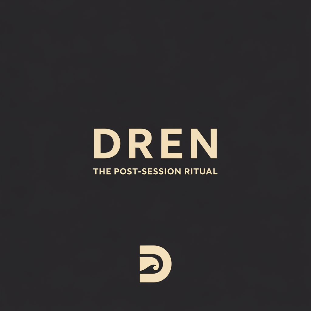
PROMPT You are a world-class brand identity designer specializing in premium outdoor, surf, and lifestyle brands. Your task is to create a complete visual identity for a new brand called: DREN Tagline: THE POST-SESSION RITUAL ABOUT THE BRAND DREN is not a surf brand. DREN is a premium post-session lifestyle brand. The first product is a portable pressurized shower used after surfing, beach sessions, camping, MTB rides, fishing trips, and outdoor adventures. The brand represents the transition from the ocean back to everyday life. The ritual after the session. Rinsing off salt, sand, sweat and returning clean, comfortable and refreshed. BRAND PERSONALITY Premium Authentic Minimal Timeless Outdoor Surf Heritage Rugged Masculine Functional Trustworthy Not trendy. Not playful. Not tech startup. Not futuristic. TARGET AUDIENCE Men and women 30-55 Surfers Outdoor enthusiasts Campers Fishermen Mountain bikers People who appreciate quality gear Fans of YETI, Patagonia, Album Surfboards, Roark, Finisterre DESIGN DIRECTION The logo should feel like: YETI meets Patagonia meets Album Surfboards. Not like: Generic surf shop Cheap AliExpress product Beach souvenir brand Tech startup Crypto company AI company LOGO REQUIREMENTS Create: 1. Main Logo DREN THE POST-SESSION RITUAL Clean typography Premium spacing Strong and timeless 2. Brand Icon Create a standalone icon that can be used: on the shower on straps on hats on apparel on packaging Requirements: Based on the letter D Strong silhouette Easy to recognize from far away Works at very small sizes More heritage than technology More outdoor than digital Simple enough to become iconic Important: The icon should be approximately: 80% letter D 20% subtle ocean reference Avoid obvious wave illustrations. Avoid generic surf symbols. Avoid surfboard fins. Avoid complex wave graphics. VISUAL STYLE Color palette: Matte Black Sand Beige Warm Cream Off White Charcoal No bright colors. No gradients. No shiny effects. No chrome. No neon. MOCKUP REQUIREMENTS Create realistic premium product mockups. Use a black neoprene cover portable shower. Show: Mockup 1 Front view of the shower Main logo centered Small icon bottom-right Premium cream print Mockup 2 Close-up of the icon printed on black neoprene No patch Printed directly on the material Premium outdoor gear feel Mockup 3 Product sitting on a wooden beach chair Warm golden sunlight Premium lifestyle photography YETI-level product photography Mockup 4 Brand presentation board showing: Main logo Brand icon Icon construction Packaging application Hat application Strap application COMPOSITION Minimal Clean High-end Strong negative space Professional brand presentation Luxury outdoor gear aesthetic Make the viewer immediately think: "This is a real premium brand." Not: "This is a generic imported product." REFERENCE BRANDS YETI Patagonia Album Surfboards Finisterre Roark Outerknown OUTPUT Create: Main logo Brand icon Brand identity board Product mockup on portable shower Premium outdoor lifestyle presentation Ultra realistic Premium Award-winning branding quality
by @Elephant_1957693
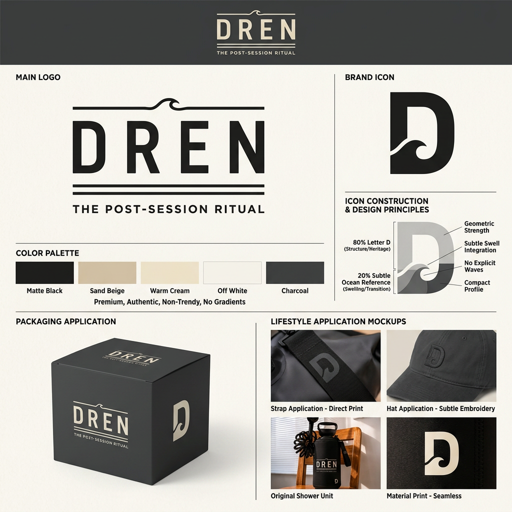
PROMPT You are a world-class brand identity designer specializing in premium outdoor, surf, and lifestyle brands. Your task is to create a complete visual identity for a new brand called: DREN Tagline: THE POST-SESSION RITUAL ABOUT THE BRAND DREN is not a surf brand. DREN is a premium post-session lifestyle brand. The first product is a portable pressurized shower used after surfing, beach sessions, camping, MTB rides, fishing trips, and outdoor adventures. The brand represents the transition from the ocean back to everyday life. The ritual after the session. Rinsing off salt, sand, sweat and returning clean, comfortable and refreshed. BRAND PERSONALITY Premium Authentic Minimal Timeless Outdoor Surf Heritage Rugged Masculine Functional Trustworthy Not trendy. Not playful. Not tech startup. Not futuristic. TARGET AUDIENCE Men and women 30-55 Surfers Outdoor enthusiasts Campers Fishermen Mountain bikers People who appreciate quality gear Fans of YETI, Patagonia, Album Surfboards, Roark, Finisterre DESIGN DIRECTION The logo should feel like: YETI meets Patagonia meets Album Surfboards. Not like: Generic surf shop Cheap AliExpress product Beach souvenir brand Tech startup Crypto company AI company LOGO REQUIREMENTS Create: 1. Main Logo DREN THE POST-SESSION RITUAL Clean typography Premium spacing Strong and timeless 2. Brand Icon Create a standalone icon that can be used: on the shower on straps on hats on apparel on packaging Requirements: Based on the letter D Strong silhouette Easy to recognize from far away Works at very small sizes More heritage than technology More outdoor than digital Simple enough to become iconic Important: The icon should be approximately: 80% letter D 20% subtle ocean reference Avoid obvious wave illustrations. Avoid generic surf symbols. Avoid surfboard fins. Avoid complex wave graphics. VISUAL STYLE Color palette: Matte Black Sand Beige Warm Cream Off White Charcoal No bright colors. No gradients. No shiny effects. No chrome. No neon. MOCKUP REQUIREMENTS Create realistic premium product mockups. Use a black neoprene cover portable shower. Show: Mockup 1 Front view of the shower Main logo centered Small icon bottom-right Premium cream print Mockup 2 Close-up of the icon printed on black neoprene No patch Printed directly on the material Premium outdoor gear feel Mockup 3 Product sitting on a wooden beach chair Warm golden sunlight Premium lifestyle photography YETI-level product photography Mockup 4 Brand presentation board showing: Main logo Brand icon Icon construction Packaging application Hat application Strap application COMPOSITION Minimal Clean High-end Strong negative space Professional brand presentation Luxury outdoor gear aesthetic Make the viewer immediately think: "This is a real premium brand." Not: "This is a generic imported product." REFERENCE BRANDS YETI Patagonia Album Surfboards Finisterre Roark Outerknown OUTPUT Create: Main logo Brand icon Brand identity board Product mockup on portable shower Premium outdoor lifestyle presentation Ultra realistic Premium Award-winning branding quality מקלחת להדמיה
by @Elephant_1957693
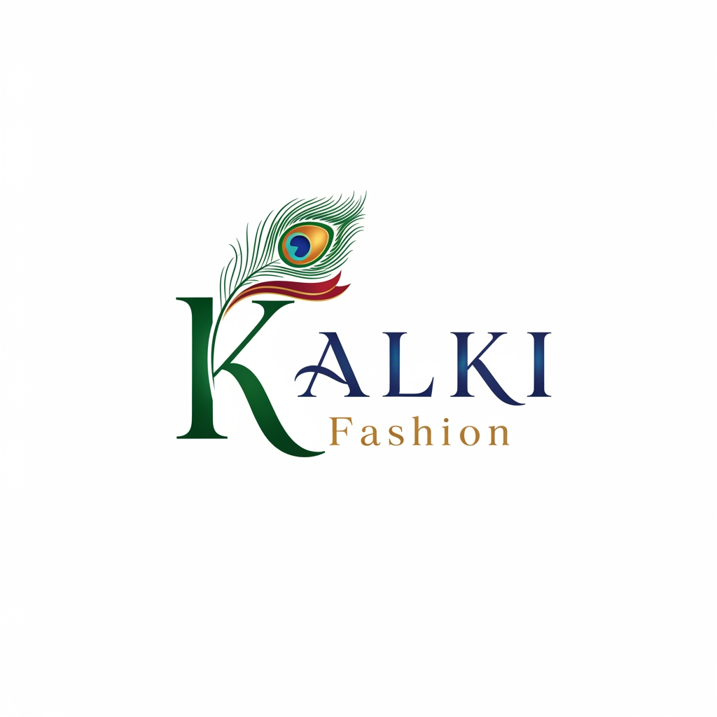
I want to create a logo for a fashion brand which is in traditional wear clothes for both men and women. Brand name : KALKI Fashion https://in.kalkifashion.com/pages/our-stores/kalki-fashion-designer-clothing-store-ahmedabad Above is the brand website link for your reference and for current logo design. Have a look at it and give me a new logo designs which looks premium and does not take away the current logo authenticity also. According to their services provided give me a good designed logo with good fonts used.
by @Elephant_7771464
What's next?Explore more features
Go from browse to build