Product
Use Cases
How it Works
Pricing
Login
Community showcase

Designs made by our community

Explore unique graphic designs and images crafted by creators around the world using Hiding Elephant's AI design tools. Get inspired and start creating.

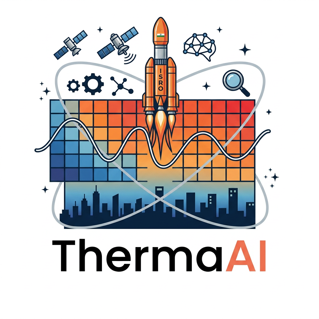
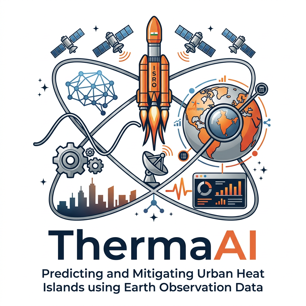
AI Design for i want logo for the isro hackathon where the title is  Predicting and Mitigating Urban Heat Islands using Earth Observation Data, it must contain space related designs.
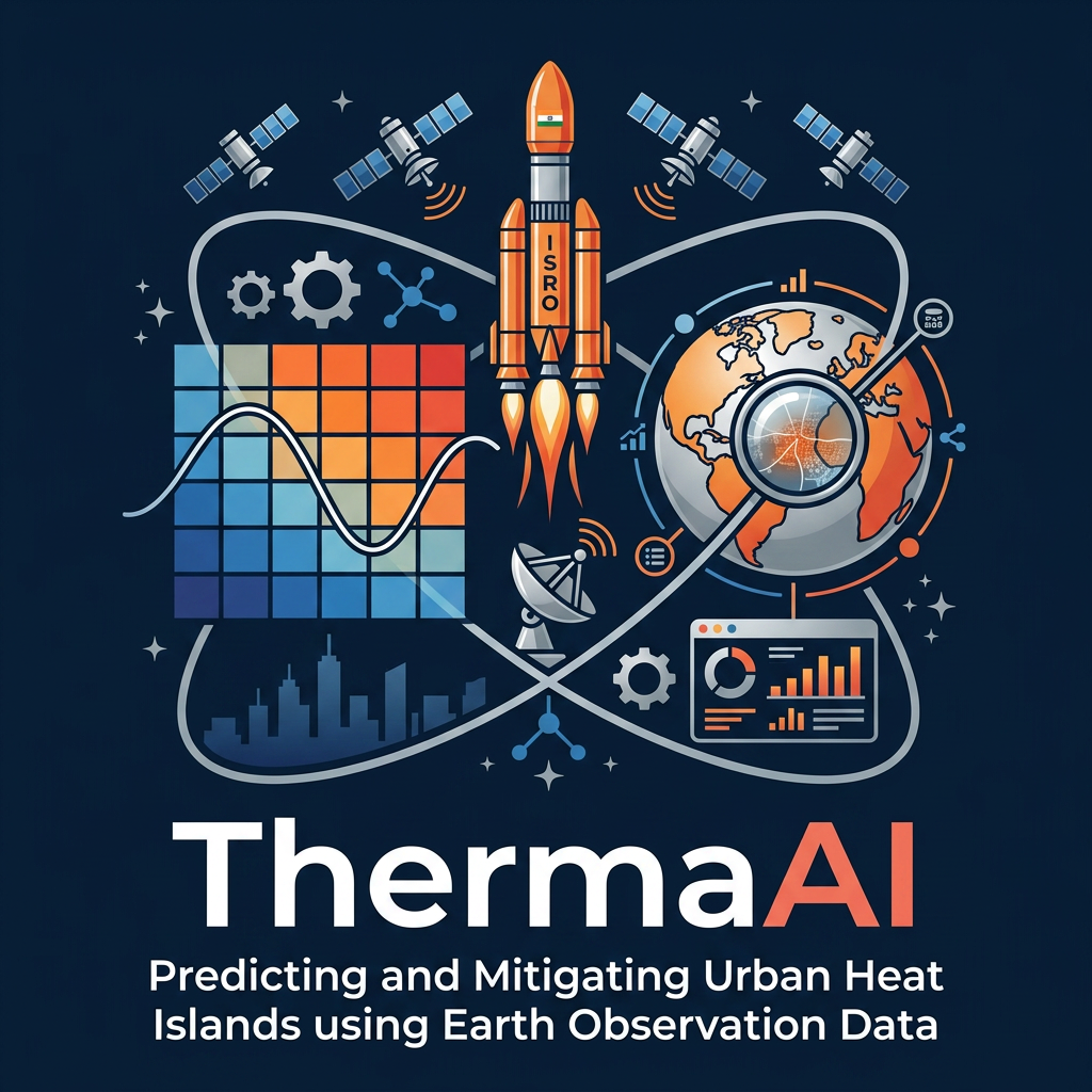
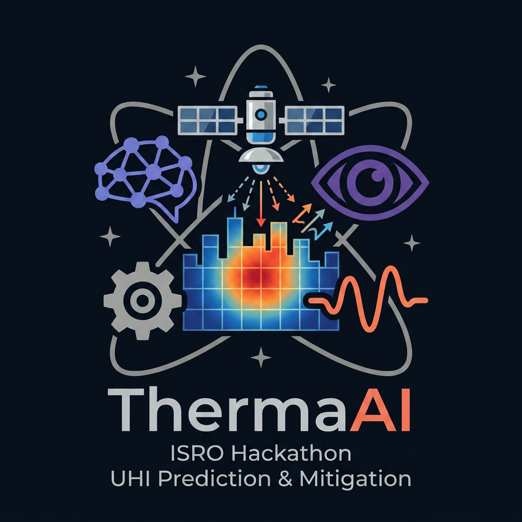
A square grid of small cells (4×4 or 5×5, like ward/pixel tiles), rendered in a gradient from deep blue (cool) through orange to red (hot), evoking the LST heatmap on your dashboard. Overlaid on the grid is a single thin white sine-wave / Kalman-filter-style oscillating line passing through the cells left to right, smoothing out as it crosses — representing the state estimate "correcting" noisy observations. The city skyline silhouette (minimal, 3–4 simple building shapes) sits along the bottom edge, dark navy against the gradient. Wordmark "ThermaAI" in a clean geometric sans-serif (e.g., similar to Inter or Poppins, medium weight) beneath, with "AI" in a contrasting accent color (orange or coral) to tie back to the heat theme.

example: i have attached an image for the team name  TRI-Q-AI, it covers all the concepts with respect to title as well as space and the ai field 
note: white background 

dont keep the title and team name in the logo 
dont keep the satellite path like rings instead use india map rocket satellite heat based something regarding to the concept

i want logo for the isro hackathon where the title is Predicting and Mitigating Urban Heat Islands using Earth Observation Data, it must contain space related designs. A square grid of small cells (4×4 or 5×5, like ward/pixel tiles), rendered in a gradient from deep blue (cool) through orange to red (hot), evoking the LST heatmap on your dashboard. Overlaid on the grid is a single thin white sine-wave / Kalman-filter-style oscillating line passing through the cells left to right, smoothing out as it crosses — representing the state estimate "correcting" noisy observations. The city skyline silhouette (minimal, 3–4 simple building shapes) sits along the bottom edge, dark navy against the gradient. Wordmark "ThermaAI" in a clean geometric sans-serif (e.g., similar to Inter or Poppins, medium weight) beneath, with "AI" in a contrasting accent color (orange or coral) to tie back to the heat theme. example: i have attached an image for the team name TRI-Q-AI, it covers all the concepts with respect to title as well as space and the ai field note: white background dont keep the title and team name in the logo dont keep the satellite path like rings instead use india map rocket satellite heat based something regarding to the concept

by @Elephant_7638327
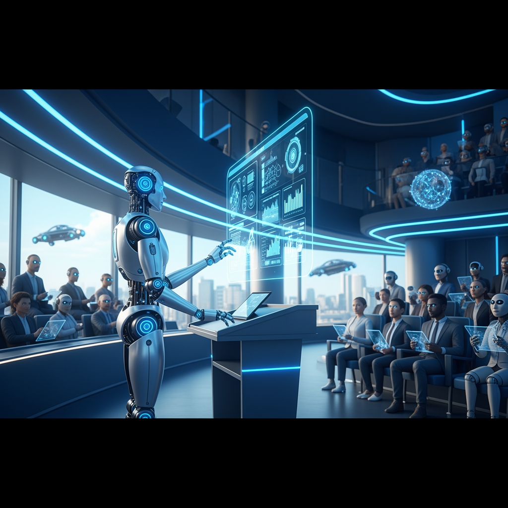
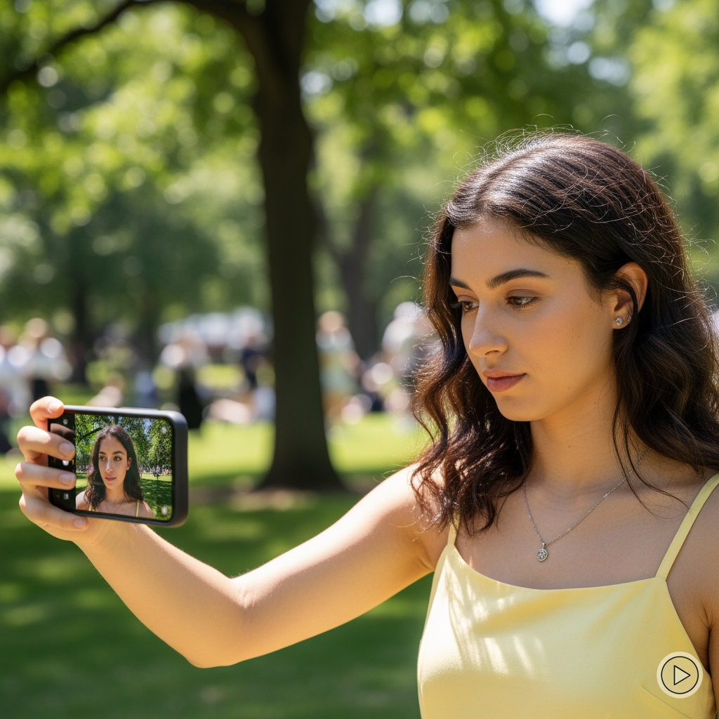
AI Design for can you create a video

can you create a video

by @DEXTER THE MAKER

AI Design for can you create a video

can you create a video

by @DEXTER THE MAKER

AI Design for can you create a video

can you create a video

by @DEXTER THE MAKER

AI Design for i want logo for the isro hackathon where the title is  Predicting and Mitigating Urban Heat Islands using Earth Observation Data, it must contain space related designs.
A square grid of small cells (4×4 or 5×5, like ward/pixel tiles), rendered in a gradient from deep blue (cool) through orange to red (hot), evoking the LST heatmap on your dashboard. Overlaid on the grid is a single thin white sine-wave / Kalman-filter-style oscillating line passing through the cells left to right, smoothing out as it crosses — representing the state estimate "correcting" noisy observations. The city skyline silhouette (minimal, 3–4 simple building shapes) sits along the bottom edge, dark navy against the gradient. Wordmark "ThermaAI" in a clean geometric sans-serif (e.g., similar to Inter or Poppins, medium weight) beneath, with "AI" in a contrasting accent color (orange or coral) to tie back to the heat theme.

example: i have attached an image for the team name  TRI-Q-AI, it covers all the concepts with respect to title as well as space and the ai field 
note: white background 

dont keep the title and team name in the logo

i want logo for the isro hackathon where the title is Predicting and Mitigating Urban Heat Islands using Earth Observation Data, it must contain space related designs. A square grid of small cells (4×4 or 5×5, like ward/pixel tiles), rendered in a gradient from deep blue (cool) through orange to red (hot), evoking the LST heatmap on your dashboard. Overlaid on the grid is a single thin white sine-wave / Kalman-filter-style oscillating line passing through the cells left to right, smoothing out as it crosses — representing the state estimate "correcting" noisy observations. The city skyline silhouette (minimal, 3–4 simple building shapes) sits along the bottom edge, dark navy against the gradient. Wordmark "ThermaAI" in a clean geometric sans-serif (e.g., similar to Inter or Poppins, medium weight) beneath, with "AI" in a contrasting accent color (orange or coral) to tie back to the heat theme. example: i have attached an image for the team name TRI-Q-AI, it covers all the concepts with respect to title as well as space and the ai field note: white background dont keep the title and team name in the logo

by @Elephant_7638327
AI Design for i want logo for the isro hackathon where the title is  Predicting and Mitigating Urban Heat Islands using Earth Observation Data, it must contain space related designs.
A square grid of small cells (4×4 or 5×5, like ward/pixel tiles), rendered in a gradient from deep blue (cool) through orange to red (hot), evoking the LST heatmap on your dashboard. Overlaid on the grid is a single thin white sine-wave / Kalman-filter-style oscillating line passing through the cells left to right, smoothing out as it crosses — representing the state estimate "correcting" noisy observations. The city skyline silhouette (minimal, 3–4 simple building shapes) sits along the bottom edge, dark navy against the gradient. Wordmark "ThermaAI" in a clean geometric sans-serif (e.g., similar to Inter or Poppins, medium weight) beneath, with "AI" in a contrasting accent color (orange or coral) to tie back to the heat theme.

example: i have attached an image for the team name  TRI-Q-AI, it covers all the concepts with respect to title as well as space and the ai field 
note: white background

i want logo for the isro hackathon where the title is Predicting and Mitigating Urban Heat Islands using Earth Observation Data, it must contain space related designs. A square grid of small cells (4×4 or 5×5, like ward/pixel tiles), rendered in a gradient from deep blue (cool) through orange to red (hot), evoking the LST heatmap on your dashboard. Overlaid on the grid is a single thin white sine-wave / Kalman-filter-style oscillating line passing through the cells left to right, smoothing out as it crosses — representing the state estimate "correcting" noisy observations. The city skyline silhouette (minimal, 3–4 simple building shapes) sits along the bottom edge, dark navy against the gradient. Wordmark "ThermaAI" in a clean geometric sans-serif (e.g., similar to Inter or Poppins, medium weight) beneath, with "AI" in a contrasting accent color (orange or coral) to tie back to the heat theme. example: i have attached an image for the team name TRI-Q-AI, it covers all the concepts with respect to title as well as space and the ai field note: white background

by @Elephant_7638327
AI Design for i want logo for the isro hackathon where the title is  Predicting and Mitigating Urban Heat Islands using Earth Observation Data, it must contain space related designs.
A square grid of small cells (4×4 or 5×5, like ward/pixel tiles), rendered in a gradient from deep blue (cool) through orange to red (hot), evoking the LST heatmap on your dashboard. Overlaid on the grid is a single thin white sine-wave / Kalman-filter-style oscillating line passing through the cells left to right, smoothing out as it crosses — representing the state estimate "correcting" noisy observations. The city skyline silhouette (minimal, 3–4 simple building shapes) sits along the bottom edge, dark navy against the gradient. Wordmark "ThermaAI" in a clean geometric sans-serif (e.g., similar to Inter or Poppins, medium weight) beneath, with "AI" in a contrasting accent color (orange or coral) to tie back to the heat theme.

example: i have attached an image for the team name  TRI-Q-AI, it covers all the concepts with respect to title as well as space and the ai field

i want logo for the isro hackathon where the title is Predicting and Mitigating Urban Heat Islands using Earth Observation Data, it must contain space related designs. A square grid of small cells (4×4 or 5×5, like ward/pixel tiles), rendered in a gradient from deep blue (cool) through orange to red (hot), evoking the LST heatmap on your dashboard. Overlaid on the grid is a single thin white sine-wave / Kalman-filter-style oscillating line passing through the cells left to right, smoothing out as it crosses — representing the state estimate "correcting" noisy observations. The city skyline silhouette (minimal, 3–4 simple building shapes) sits along the bottom edge, dark navy against the gradient. Wordmark "ThermaAI" in a clean geometric sans-serif (e.g., similar to Inter or Poppins, medium weight) beneath, with "AI" in a contrasting accent color (orange or coral) to tie back to the heat theme. example: i have attached an image for the team name TRI-Q-AI, it covers all the concepts with respect to title as well as space and the ai field

by @Elephant_7638327
AI Design for i want logo for the isro hackathon where the title is  Predicting and Mitigating Urban Heat Islands using Earth Observation Data, it must contain space related designs.
A square grid of small cells (4×4 or 5×5, like ward/pixel tiles), rendered in a gradient from deep blue (cool) through orange to red (hot), evoking the LST heatmap on your dashboard. Overlaid on the grid is a single thin white sine-wave / Kalman-filter-style oscillating line passing through the cells left to right, smoothing out as it crosses — representing the state estimate "correcting" noisy observations. The city skyline silhouette (minimal, 3–4 simple building shapes) sits along the bottom edge, dark navy against the gradient. Wordmark "ThermaAI" in a clean geometric sans-serif (e.g., similar to Inter or Poppins, medium weight) beneath, with "AI" in a contrasting accent color (orange or coral) to tie back to the heat theme.

example: i have attached an image for the team name  TRI-Q-AI, it covers all the concepts with respect to title as well as space and the ai field

i want logo for the isro hackathon where the title is Predicting and Mitigating Urban Heat Islands using Earth Observation Data, it must contain space related designs. A square grid of small cells (4×4 or 5×5, like ward/pixel tiles), rendered in a gradient from deep blue (cool) through orange to red (hot), evoking the LST heatmap on your dashboard. Overlaid on the grid is a single thin white sine-wave / Kalman-filter-style oscillating line passing through the cells left to right, smoothing out as it crosses — representing the state estimate "correcting" noisy observations. The city skyline silhouette (minimal, 3–4 simple building shapes) sits along the bottom edge, dark navy against the gradient. Wordmark "ThermaAI" in a clean geometric sans-serif (e.g., similar to Inter or Poppins, medium weight) beneath, with "AI" in a contrasting accent color (orange or coral) to tie back to the heat theme. example: i have attached an image for the team name TRI-Q-AI, it covers all the concepts with respect to title as well as space and the ai field

by @Elephant_7638327
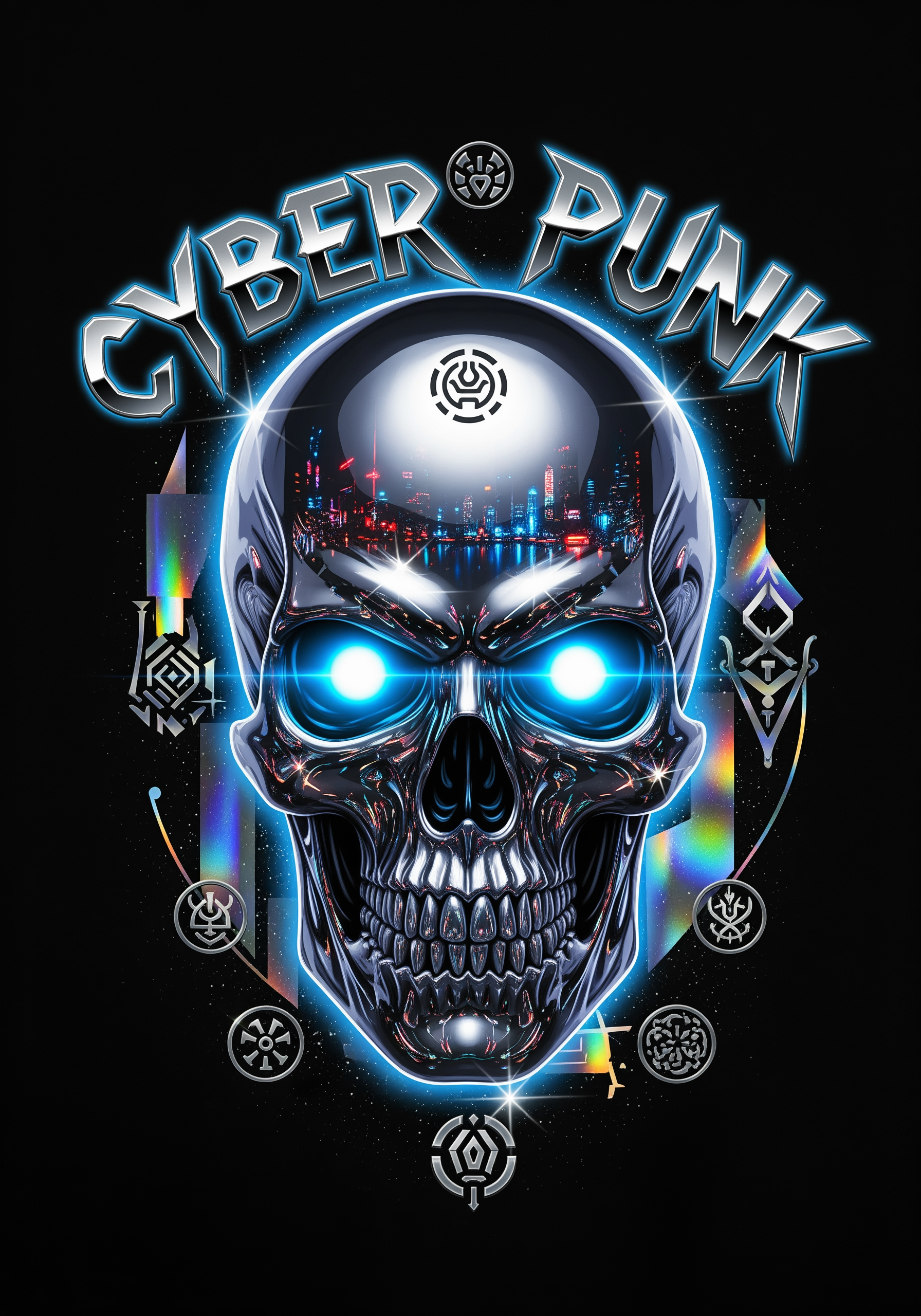
AI Design for Y2K futuristic streetwear graphic, chrome skull with glowing eyes, metallic typography, cyber sigils, holographic effects, futuristic fashion aesthetic, edgy underground vibe, centered t-shirt composition, high detail reflections, neon blue and silver colors, ultra detailed 4K print artwork

Y2K futuristic streetwear graphic, chrome skull with glowing eyes, metallic typography, cyber sigils, holographic effects, futuristic fashion aesthetic, edgy underground vibe, centered t-shirt composition, high detail reflections, neon blue and silver colors, ultra detailed 4K print artwork

by @Elephant_8626955
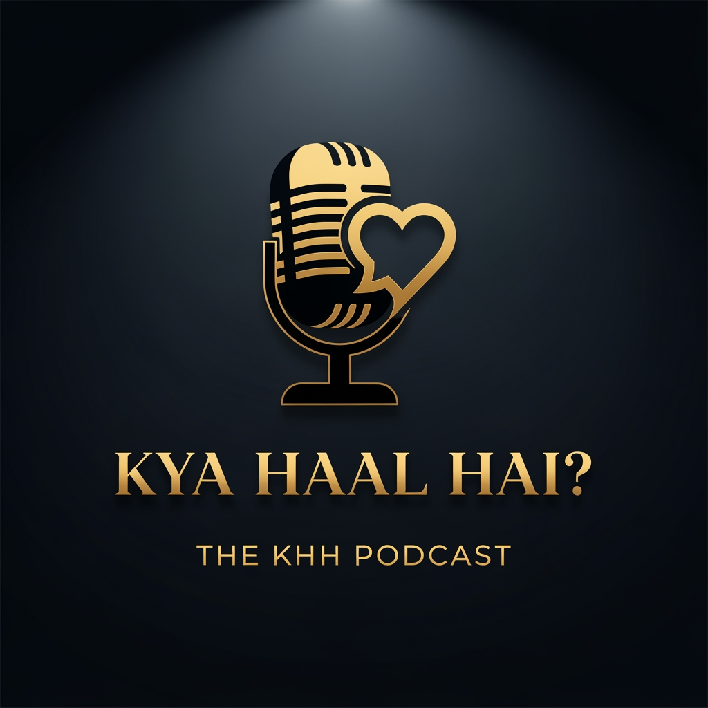
AI Design for A sophisticated professional podcast logo featuring a dramatic black and gold color scheme. The central graphic is a strong silhouette of a retro microphone intertwined with an abstract icon that merges a speech bubble and a heart (symbolizing storytelling and nostalgia). Below the graphic, the title "KYA HAAL HAI?" is displayed in a clean, elegant, capital serif font with a matte gold finish. Directly underneath, "THE KHH PODCAST" is set in a simple, high-visibility gold sans-serif font. The background is a dark, moody deep charcoal with a subtle gradient spotlight effect behind the logo. Flat 3D effect, clean lines, premium feel, high contrast, elegant typography.
aspect ratio 1:1

A sophisticated professional podcast logo featuring a dramatic black and gold color scheme. The central graphic is a strong silhouette of a retro microphone intertwined with an abstract icon that merges a speech bubble and a heart (symbolizing storytelling and nostalgia). Below the graphic, the title "KYA HAAL HAI?" is displayed in a clean, elegant, capital serif font with a matte gold finish. Directly underneath, "THE KHH PODCAST" is set in a simple, high-visibility gold sans-serif font. The background is a dark, moody deep charcoal with a subtle gradient spotlight effect behind the logo. Flat 3D effect, clean lines, premium feel, high contrast, elegant typography. aspect ratio 1:1

by @Elephant_8133382
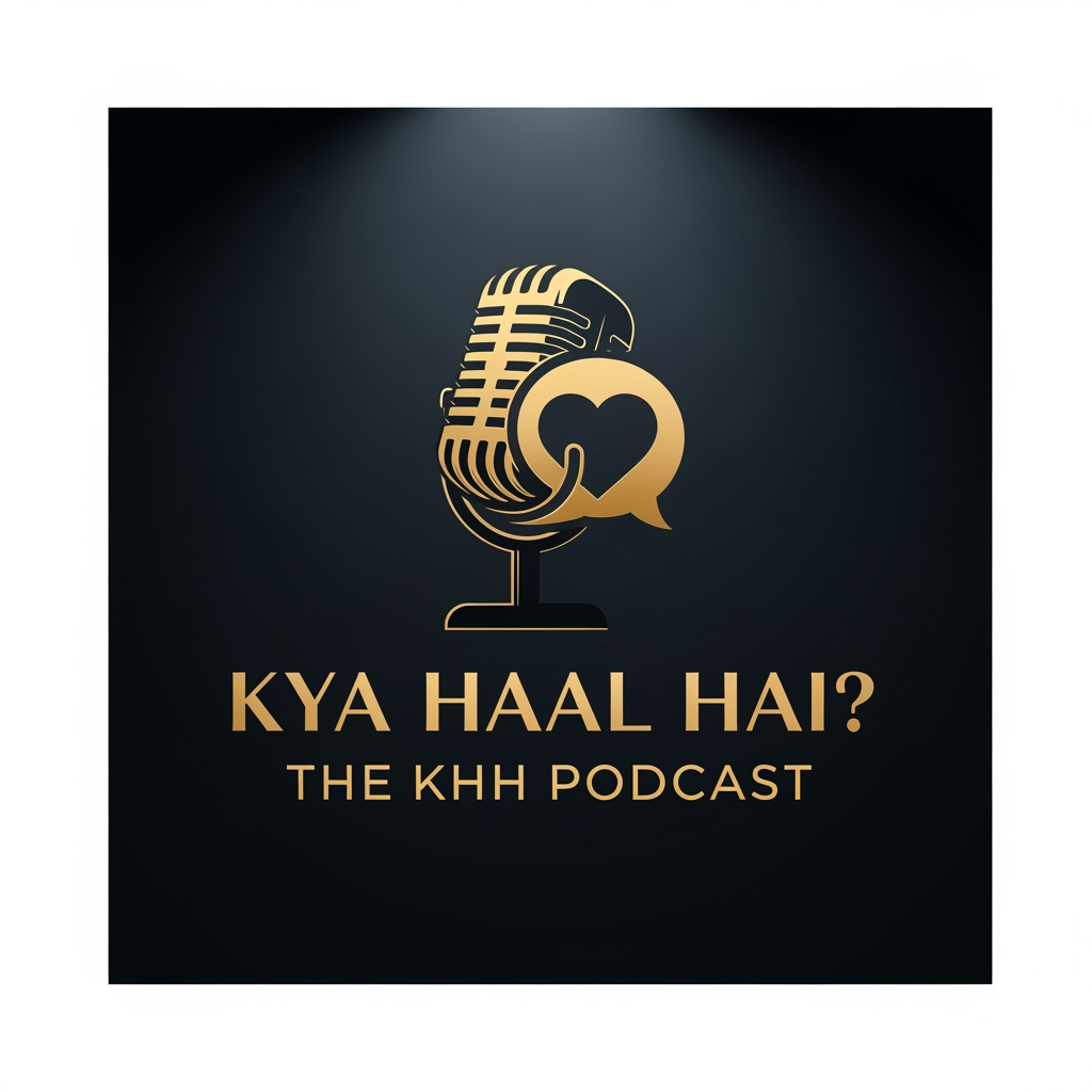
AI Design for A sophisticated professional podcast logo featuring a dramatic black and gold color scheme. The central graphic is a strong silhouette of a retro microphone intertwined with an abstract icon that merges a speech bubble and a heart (symbolizing storytelling and nostalgia). Below the graphic, the title "KYA HAAL HAI?" is displayed in a clean, elegant, capital serif font with a matte gold finish. Directly underneath, "THE KHH PODCAST" is set in a simple, high-visibility gold sans-serif font. The background is a dark, moody deep charcoal with a subtle gradient spotlight effect behind the logo. Flat 3D effect, clean lines, premium feel, high contrast, elegant typography.
aspect ratio 1:1

A sophisticated professional podcast logo featuring a dramatic black and gold color scheme. The central graphic is a strong silhouette of a retro microphone intertwined with an abstract icon that merges a speech bubble and a heart (symbolizing storytelling and nostalgia). Below the graphic, the title "KYA HAAL HAI?" is displayed in a clean, elegant, capital serif font with a matte gold finish. Directly underneath, "THE KHH PODCAST" is set in a simple, high-visibility gold sans-serif font. The background is a dark, moody deep charcoal with a subtle gradient spotlight effect behind the logo. Flat 3D effect, clean lines, premium feel, high contrast, elegant typography. aspect ratio 1:1

by @Elephant_8133382
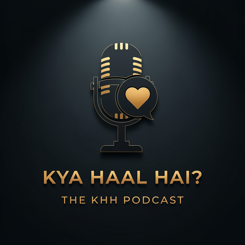
AI Design for A sophisticated professional podcast logo featuring a dramatic black and gold color scheme. The central graphic is a strong silhouette of a retro microphone intertwined with an abstract icon that merges a speech bubble and a heart (symbolizing storytelling and nostalgia). Below the graphic, the title "KYA HAAL HAI?" is displayed in a clean, elegant, capital serif font with a matte gold finish. Directly underneath, "THE KHH PODCAST" is set in a simple, high-visibility gold sans-serif font. The background is a dark, moody deep charcoal with a subtle gradient spotlight effect behind the logo. Flat 3D effect, clean lines, premium feel, high contrast, elegant typography.
aspect ratio 1:1

A sophisticated professional podcast logo featuring a dramatic black and gold color scheme. The central graphic is a strong silhouette of a retro microphone intertwined with an abstract icon that merges a speech bubble and a heart (symbolizing storytelling and nostalgia). Below the graphic, the title "KYA HAAL HAI?" is displayed in a clean, elegant, capital serif font with a matte gold finish. Directly underneath, "THE KHH PODCAST" is set in a simple, high-visibility gold sans-serif font. The background is a dark, moody deep charcoal with a subtle gradient spotlight effect behind the logo. Flat 3D effect, clean lines, premium feel, high contrast, elegant typography. aspect ratio 1:1

by @Elephant_8133382
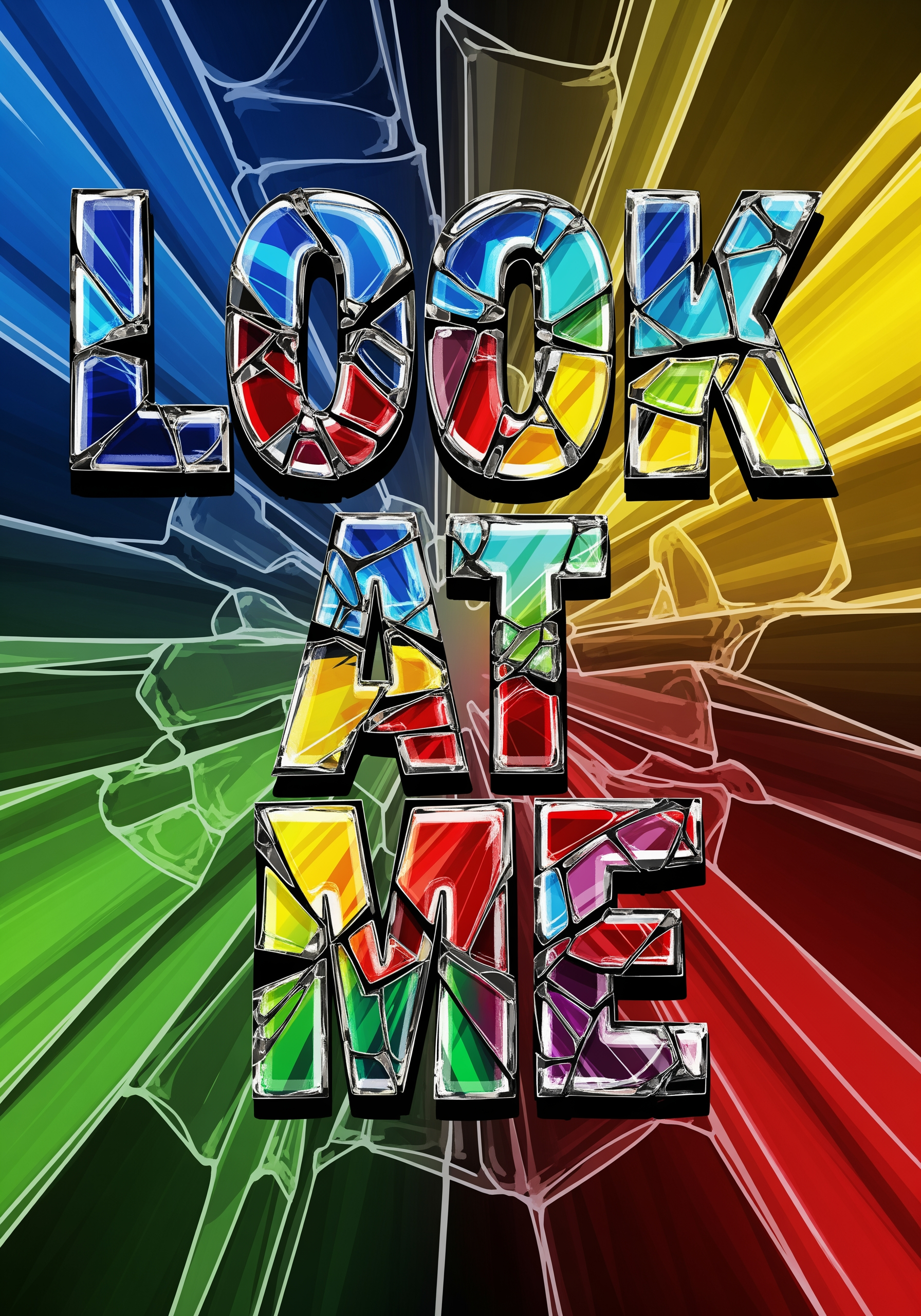
AI Design for a broken bold colourfull text ' Look At Me 'in broken glass transparent for t shirts printing design look high pixsel

a broken bold colourfull text ' Look At Me 'in broken glass transparent for t shirts printing design look high pixsel

by @Elephant_8626955

AI Design for A sophisticated professional podcast logo featuring a dramatic black and gold color scheme. The central graphic is a strong silhouette of a retro microphone intertwined with an abstract icon that merges a speech bubble and a heart (symbolizing storytelling and nostalgia). Below the graphic, the title "KYA HAAL HAI?" is displayed in a clean, elegant, capital serif font with a matte gold finish. Directly underneath, "THE KHH PODCAST" is set in a simple, high-visibility gold sans-serif font. The background is a dark, moody deep charcoal with a subtle gradient spotlight effect behind the logo. Flat 3D effect, clean lines, premium feel, high contrast, elegant typography.
aspect ratio 1:1

A sophisticated professional podcast logo featuring a dramatic black and gold color scheme. The central graphic is a strong silhouette of a retro microphone intertwined with an abstract icon that merges a speech bubble and a heart (symbolizing storytelling and nostalgia). Below the graphic, the title "KYA HAAL HAI?" is displayed in a clean, elegant, capital serif font with a matte gold finish. Directly underneath, "THE KHH PODCAST" is set in a simple, high-visibility gold sans-serif font. The background is a dark, moody deep charcoal with a subtle gradient spotlight effect behind the logo. Flat 3D effect, clean lines, premium feel, high contrast, elegant typography. aspect ratio 1:1

by @Elephant_8133382
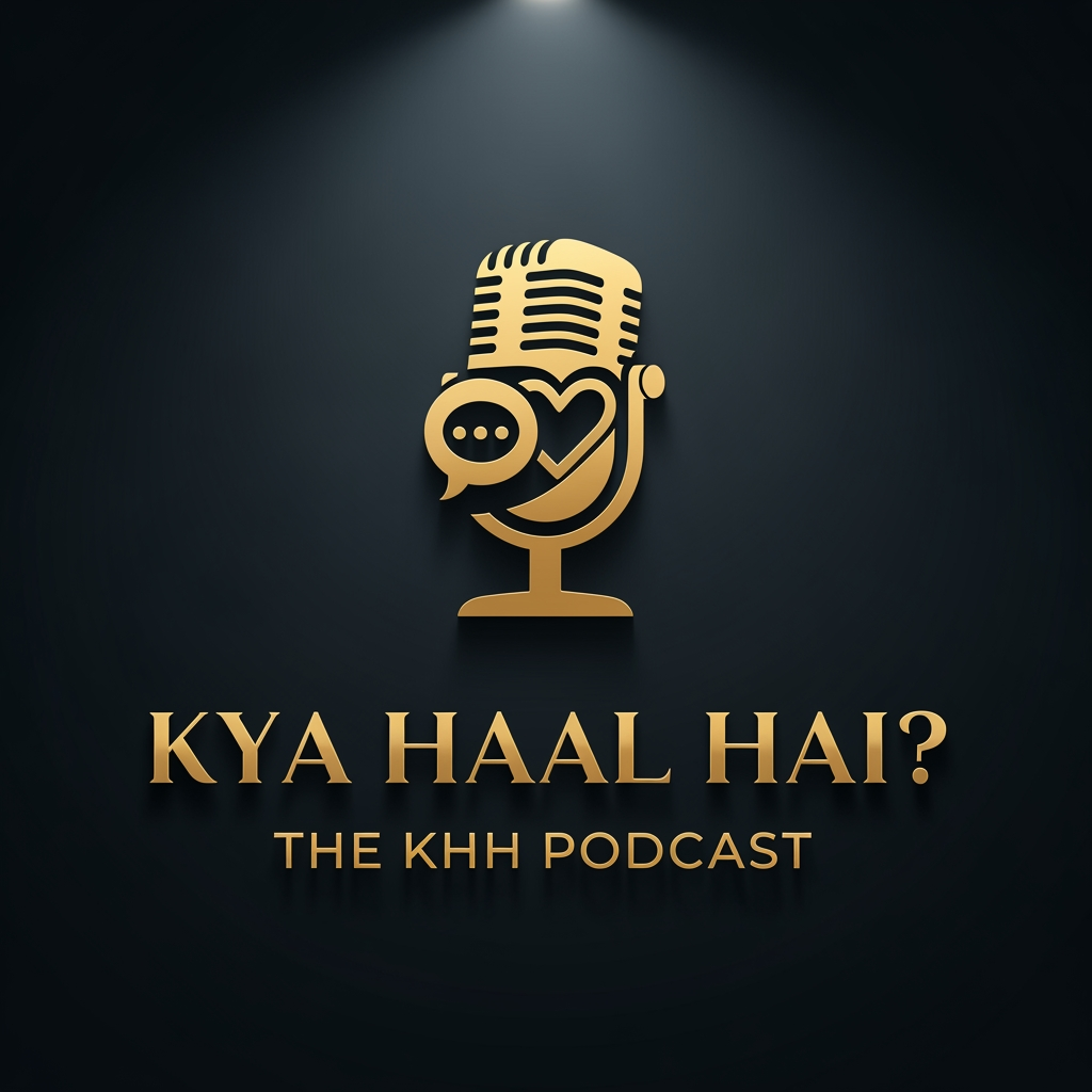
AI Design for A sophisticated professional podcast logo featuring a dramatic black and gold color scheme. The central graphic is a strong silhouette of a retro microphone intertwined with an abstract icon that merges a speech bubble and a heart (symbolizing storytelling and nostalgia). Below the graphic, the title "KYA HAAL HAI?" is displayed in a clean, elegant, capital serif font with a matte gold finish. Directly underneath, "THE KHH PODCAST" is set in a simple, high-visibility gold sans-serif font. The background is a dark, moody deep charcoal with a subtle gradient spotlight effect behind the logo. Flat 3D effect, clean lines, premium feel, high contrast, elegant typography.
aspect ratio 1:1

A sophisticated professional podcast logo featuring a dramatic black and gold color scheme. The central graphic is a strong silhouette of a retro microphone intertwined with an abstract icon that merges a speech bubble and a heart (symbolizing storytelling and nostalgia). Below the graphic, the title "KYA HAAL HAI?" is displayed in a clean, elegant, capital serif font with a matte gold finish. Directly underneath, "THE KHH PODCAST" is set in a simple, high-visibility gold sans-serif font. The background is a dark, moody deep charcoal with a subtle gradient spotlight effect behind the logo. Flat 3D effect, clean lines, premium feel, high contrast, elegant typography. aspect ratio 1:1

by @Elephant_8133382
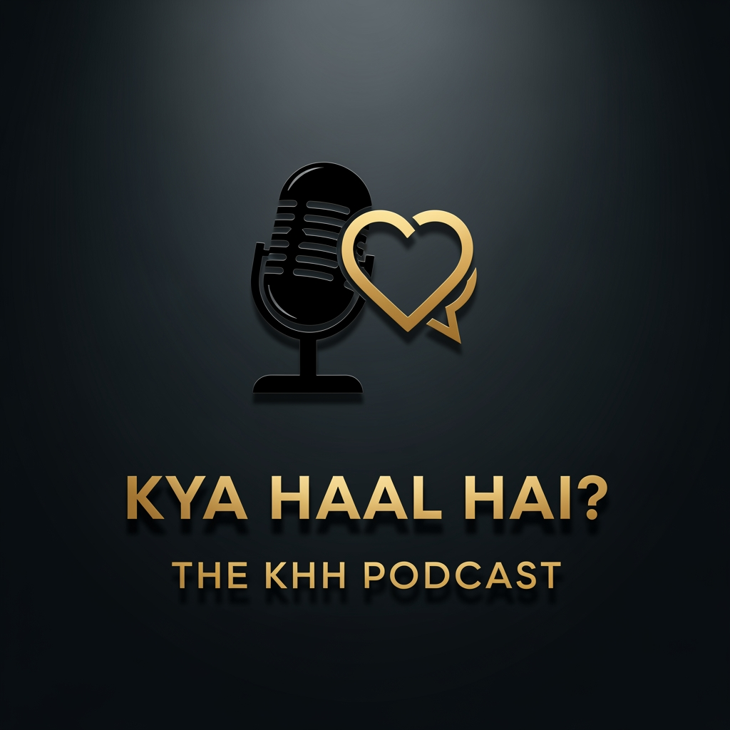
AI Design for A sophisticated professional podcast logo featuring a dramatic black and gold color scheme. The central graphic is a strong silhouette of a retro microphone intertwined with an abstract icon that merges a speech bubble and a heart (symbolizing storytelling and nostalgia). Below the graphic, the title "KYA HAAL HAI?" is displayed in a clean, elegant, capital serif font with a matte gold finish. Directly underneath, "THE KHH PODCAST" is set in a simple, high-visibility gold sans-serif font. The background is a dark, moody deep charcoal with a subtle gradient spotlight effect behind the logo. Flat 3D effect, clean lines, premium feel, high contrast, elegant typography.
aspect ratio 1:1

A sophisticated professional podcast logo featuring a dramatic black and gold color scheme. The central graphic is a strong silhouette of a retro microphone intertwined with an abstract icon that merges a speech bubble and a heart (symbolizing storytelling and nostalgia). Below the graphic, the title "KYA HAAL HAI?" is displayed in a clean, elegant, capital serif font with a matte gold finish. Directly underneath, "THE KHH PODCAST" is set in a simple, high-visibility gold sans-serif font. The background is a dark, moody deep charcoal with a subtle gradient spotlight effect behind the logo. Flat 3D effect, clean lines, premium feel, high contrast, elegant typography. aspect ratio 1:1

by @Elephant_8133382
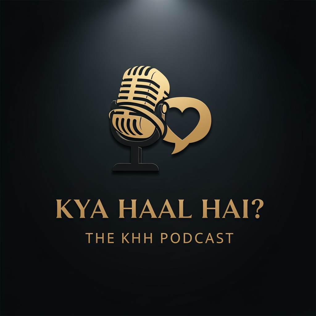
AI Design for A professional 3D media logo for "KYA HAAL HAI?". The primary focus is bold, dynamic stacked text: "KYA HAAL HAI?" utilizing a modern gradient of warm orange to deep red with soft beveled edges, making it pop. Behind the text is a sleek, stylized silver audio waveform and an integrated glowing speech bubble icon to represent conversation. Below the main title, "THE KHH PODCAST" is written in a clean, minimalist white font within a darker charcoal grey container bar. Studio lighting, high-resolution rendering, photorealistic textures, subtle reflections, professional branding, grey and orange color palette.
aspect ratio 1:1

A professional 3D media logo for "KYA HAAL HAI?". The primary focus is bold, dynamic stacked text: "KYA HAAL HAI?" utilizing a modern gradient of warm orange to deep red with soft beveled edges, making it pop. Behind the text is a sleek, stylized silver audio waveform and an integrated glowing speech bubble icon to represent conversation. Below the main title, "THE KHH PODCAST" is written in a clean, minimalist white font within a darker charcoal grey container bar. Studio lighting, high-resolution rendering, photorealistic textures, subtle reflections, professional branding, grey and orange color palette. aspect ratio 1:1

by @Elephant_8133382
AI Design for A professional 3D media logo for "KYA HAAL HAI?". The primary focus is bold, dynamic stacked text: "KYA HAAL HAI?" utilizing a modern gradient of warm orange to deep red with soft beveled edges, making it pop. Behind the text is a sleek, stylized silver audio waveform and an integrated glowing speech bubble icon to represent conversation. Below the main title, "THE KHH PODCAST" is written in a clean, minimalist white font within a darker charcoal grey container bar. Studio lighting, high-resolution rendering, photorealistic textures, subtle reflections, professional branding, grey and orange color palette.
aspect ratio 1:1

A professional 3D media logo for "KYA HAAL HAI?". The primary focus is bold, dynamic stacked text: "KYA HAAL HAI?" utilizing a modern gradient of warm orange to deep red with soft beveled edges, making it pop. Behind the text is a sleek, stylized silver audio waveform and an integrated glowing speech bubble icon to represent conversation. Below the main title, "THE KHH PODCAST" is written in a clean, minimalist white font within a darker charcoal grey container bar. Studio lighting, high-resolution rendering, photorealistic textures, subtle reflections, professional branding, grey and orange color palette. aspect ratio 1:1

by @Elephant_8133382
AI Design for A professional 3D media logo for "KYA HAAL HAI?". The primary focus is bold, dynamic stacked text: "KYA HAAL HAI?" utilizing a modern gradient of warm orange to deep red with soft beveled edges, making it pop. Behind the text is a sleek, stylized silver audio waveform and an integrated glowing speech bubble icon to represent conversation. Below the main title, "THE KHH PODCAST" is written in a clean, minimalist white font within a darker charcoal grey container bar. Studio lighting, high-resolution rendering, photorealistic textures, subtle reflections, professional branding, grey and orange color palette.
aspect ratio 1:1

A professional 3D media logo for "KYA HAAL HAI?". The primary focus is bold, dynamic stacked text: "KYA HAAL HAI?" utilizing a modern gradient of warm orange to deep red with soft beveled edges, making it pop. Behind the text is a sleek, stylized silver audio waveform and an integrated glowing speech bubble icon to represent conversation. Below the main title, "THE KHH PODCAST" is written in a clean, minimalist white font within a darker charcoal grey container bar. Studio lighting, high-resolution rendering, photorealistic textures, subtle reflections, professional branding, grey and orange color palette. aspect ratio 1:1

by @Elephant_8133382
AI Design for A premium, professional circular podcast logo with a dark brushed metal texture and polished gold accents. In the center is a highly detailed vintage studio microphone. Below the mic, the text "KYA HAAL HAI?" is rendered in bold, beveled 3D gold lettering with a subtle metallic sheen. Wrapped around the bottom of the circle is a clean ribbon banner reading "THE KHH PODCAST" in sharp, white sans-serif font. The emblem is flanked by subtle gold laurel leaves. Deep navy blue background, volumetric lighting, high-contrast, sharp details, cinematic composition.
aspect ratio 1:1

A premium, professional circular podcast logo with a dark brushed metal texture and polished gold accents. In the center is a highly detailed vintage studio microphone. Below the mic, the text "KYA HAAL HAI?" is rendered in bold, beveled 3D gold lettering with a subtle metallic sheen. Wrapped around the bottom of the circle is a clean ribbon banner reading "THE KHH PODCAST" in sharp, white sans-serif font. The emblem is flanked by subtle gold laurel leaves. Deep navy blue background, volumetric lighting, high-contrast, sharp details, cinematic composition. aspect ratio 1:1

by @Elephant_8133382
AI Design for A premium, professional circular podcast logo with a dark brushed metal texture and polished gold accents. In the center is a highly detailed vintage studio microphone. Below the mic, the text "KYA HAAL HAI?" is rendered in bold, beveled 3D gold lettering with a subtle metallic sheen. Wrapped around the bottom of the circle is a clean ribbon banner reading "THE KHH PODCAST" in sharp, white sans-serif font. The emblem is flanked by subtle gold laurel leaves. Deep navy blue background, volumetric lighting, high-contrast, sharp details, cinematic composition.
aspect ratio 1:1

A premium, professional circular podcast logo with a dark brushed metal texture and polished gold accents. In the center is a highly detailed vintage studio microphone. Below the mic, the text "KYA HAAL HAI?" is rendered in bold, beveled 3D gold lettering with a subtle metallic sheen. Wrapped around the bottom of the circle is a clean ribbon banner reading "THE KHH PODCAST" in sharp, white sans-serif font. The emblem is flanked by subtle gold laurel leaves. Deep navy blue background, volumetric lighting, high-contrast, sharp details, cinematic composition. aspect ratio 1:1

by @Elephant_8133382
AI Design for A premium, professional circular podcast logo with a dark brushed metal texture and polished gold accents. In the center is a highly detailed vintage studio microphone. Below the mic, the text "KYA HAAL HAI?" is rendered in bold, beveled 3D gold lettering with a subtle metallic sheen. Wrapped around the bottom of the circle is a clean ribbon banner reading "THE KHH PODCAST" in sharp, white sans-serif font. The emblem is flanked by subtle gold laurel leaves. Deep navy blue background, volumetric lighting, high-contrast, sharp details, cinematic composition.
aspect ratio 1:1

A premium, professional circular podcast logo with a dark brushed metal texture and polished gold accents. In the center is a highly detailed vintage studio microphone. Below the mic, the text "KYA HAAL HAI?" is rendered in bold, beveled 3D gold lettering with a subtle metallic sheen. Wrapped around the bottom of the circle is a clean ribbon banner reading "THE KHH PODCAST" in sharp, white sans-serif font. The emblem is flanked by subtle gold laurel leaves. Deep navy blue background, volumetric lighting, high-contrast, sharp details, cinematic composition. aspect ratio 1:1

by @Elephant_8133382
AI Design for An ultra-minimal vector logo for a storytelling podcast. In the center, a bold and stylized acronym icon "KHH" designed inside a smooth speech bubble silhouette. Below the icon, the clean text reads "KYA HAAL HAI? THE KHH PODCAST". Monochromatic color scheme: sharp white graphics and crisp text on a solid matte black background. Sophisticated, sleek, contemporary branding, flat vector, high contrast, perfect typography.

aspect ratio 1:1

An ultra-minimal vector logo for a storytelling podcast. In the center, a bold and stylized acronym icon "KHH" designed inside a smooth speech bubble silhouette. Below the icon, the clean text reads "KYA HAAL HAI? THE KHH PODCAST". Monochromatic color scheme: sharp white graphics and crisp text on a solid matte black background. Sophisticated, sleek, contemporary branding, flat vector, high contrast, perfect typography. aspect ratio 1:1

by @Elephant_8133382
AI Design for An ultra-minimal vector logo for a storytelling podcast. In the center, a bold and stylized acronym icon "KHH" designed inside a smooth speech bubble silhouette. Below the icon, the clean text reads "KYA HAAL HAI? THE KHH PODCAST". Monochromatic color scheme: sharp white graphics and crisp text on a solid matte black background. Sophisticated, sleek, contemporary branding, flat vector, high contrast, perfect typography.

aspect ratio 1:1

An ultra-minimal vector logo for a storytelling podcast. In the center, a bold and stylized acronym icon "KHH" designed inside a smooth speech bubble silhouette. Below the icon, the clean text reads "KYA HAAL HAI? THE KHH PODCAST". Monochromatic color scheme: sharp white graphics and crisp text on a solid matte black background. Sophisticated, sleek, contemporary branding, flat vector, high contrast, perfect typography. aspect ratio 1:1

by @Elephant_8133382
AI Design for An ultra-minimal vector logo for a storytelling podcast. In the center, a bold and stylized acronym icon "KHH" designed inside a smooth speech bubble silhouette. Below the icon, the clean text reads "KYA HAAL HAI? THE KHH PODCAST". Monochromatic color scheme: sharp white graphics and crisp text on a solid matte black background. Sophisticated, sleek, contemporary branding, flat vector, high contrast, perfect typography.

aspect ratio 1:1

An ultra-minimal vector logo for a storytelling podcast. In the center, a bold and stylized acronym icon "KHH" designed inside a smooth speech bubble silhouette. Below the icon, the clean text reads "KYA HAAL HAI? THE KHH PODCAST". Monochromatic color scheme: sharp white graphics and crisp text on a solid matte black background. Sophisticated, sleek, contemporary branding, flat vector, high contrast, perfect typography. aspect ratio 1:1

by @Elephant_8133382
AI Design for A minimalist typographic logo for a casual podcast. The main text reads "KYA HAAL HAI?" in a friendly, bold, rounded sans-serif font. Below it, the text "THE KHH PODCAST" is written in a clean, smaller font. A simple vector graphic of two intersecting speech bubbles or a stylized coffee mug is placed subtly next to the text. Color palette: Pastel terracotta orange and cream white text on a solid charcoal grey background. Modern minimalist style, clean lines, high-contrast, perfectly spelled text.

aspect ratio 1:1

A minimalist typographic logo for a casual podcast. The main text reads "KYA HAAL HAI?" in a friendly, bold, rounded sans-serif font. Below it, the text "THE KHH PODCAST" is written in a clean, smaller font. A simple vector graphic of two intersecting speech bubbles or a stylized coffee mug is placed subtly next to the text. Color palette: Pastel terracotta orange and cream white text on a solid charcoal grey background. Modern minimalist style, clean lines, high-contrast, perfectly spelled text. aspect ratio 1:1

by @Elephant_8133382
AI Design for A minimalist typographic logo for a casual podcast. The main text reads "KYA HAAL HAI?" in a friendly, bold, rounded sans-serif font. Below it, the text "THE KHH PODCAST" is written in a clean, smaller font. A simple vector graphic of two intersecting speech bubbles or a stylized coffee mug is placed subtly next to the text. Color palette: Pastel terracotta orange and cream white text on a solid charcoal grey background. Modern minimalist style, clean lines, high-contrast, perfectly spelled text.

aspect ratio 1:1

A minimalist typographic logo for a casual podcast. The main text reads "KYA HAAL HAI?" in a friendly, bold, rounded sans-serif font. Below it, the text "THE KHH PODCAST" is written in a clean, smaller font. A simple vector graphic of two intersecting speech bubbles or a stylized coffee mug is placed subtly next to the text. Color palette: Pastel terracotta orange and cream white text on a solid charcoal grey background. Modern minimalist style, clean lines, high-contrast, perfectly spelled text. aspect ratio 1:1

by @Elephant_8133382
AI Design for A minimalist typographic logo for a casual podcast. The main text reads "KYA HAAL HAI?" in a friendly, bold, rounded sans-serif font. Below it, the text "THE KHH PODCAST" is written in a clean, smaller font. A simple vector graphic of two intersecting speech bubbles or a stylized coffee mug is placed subtly next to the text. Color palette: Pastel terracotta orange and cream white text on a solid charcoal grey background. Modern minimalist style, clean lines, high-contrast, perfectly spelled text.

aspect ratio 1:1

A minimalist typographic logo for a casual podcast. The main text reads "KYA HAAL HAI?" in a friendly, bold, rounded sans-serif font. Below it, the text "THE KHH PODCAST" is written in a clean, smaller font. A simple vector graphic of two intersecting speech bubbles or a stylized coffee mug is placed subtly next to the text. Color palette: Pastel terracotta orange and cream white text on a solid charcoal grey background. Modern minimalist style, clean lines, high-contrast, perfectly spelled text. aspect ratio 1:1

by @Elephant_8133382
AI Design for A minimalistic and cool podcast logo featuring the bold text "KYA HAAL HAI?" with a smaller subtitle underneath reading "THE KHH PODCAST". The design uses clean, bold typography with a subtle retro-modern vibe. A simple, elegant line-art icon of a vintage microphone or a speech bubble is seamlessly integrated into the background. Solid deep navy blue background with vibrant neon mint green and crisp white text. Graphic design, vector art, flat design, trending on Dribbble, highly detailed text rendering.

aspect ratio 1:1

A minimalistic and cool podcast logo featuring the bold text "KYA HAAL HAI?" with a smaller subtitle underneath reading "THE KHH PODCAST". The design uses clean, bold typography with a subtle retro-modern vibe. A simple, elegant line-art icon of a vintage microphone or a speech bubble is seamlessly integrated into the background. Solid deep navy blue background with vibrant neon mint green and crisp white text. Graphic design, vector art, flat design, trending on Dribbble, highly detailed text rendering. aspect ratio 1:1

by @Elephant_8133382
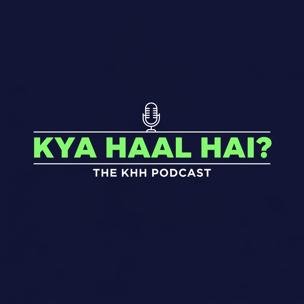
AI Design for A minimalistic and cool podcast logo featuring the bold text "KYA HAAL HAI?" with a smaller subtitle underneath reading "THE KHH PODCAST". The design uses clean, bold typography with a subtle retro-modern vibe. A simple, elegant line-art icon of a vintage microphone or a speech bubble is seamlessly integrated into the background. Solid deep navy blue background with vibrant neon mint green and crisp white text. Graphic design, vector art, flat design, trending on Dribbble, highly detailed text rendering.

aspect ratio 1:1

A minimalistic and cool podcast logo featuring the bold text "KYA HAAL HAI?" with a smaller subtitle underneath reading "THE KHH PODCAST". The design uses clean, bold typography with a subtle retro-modern vibe. A simple, elegant line-art icon of a vintage microphone or a speech bubble is seamlessly integrated into the background. Solid deep navy blue background with vibrant neon mint green and crisp white text. Graphic design, vector art, flat design, trending on Dribbble, highly detailed text rendering. aspect ratio 1:1

by @Elephant_8133382
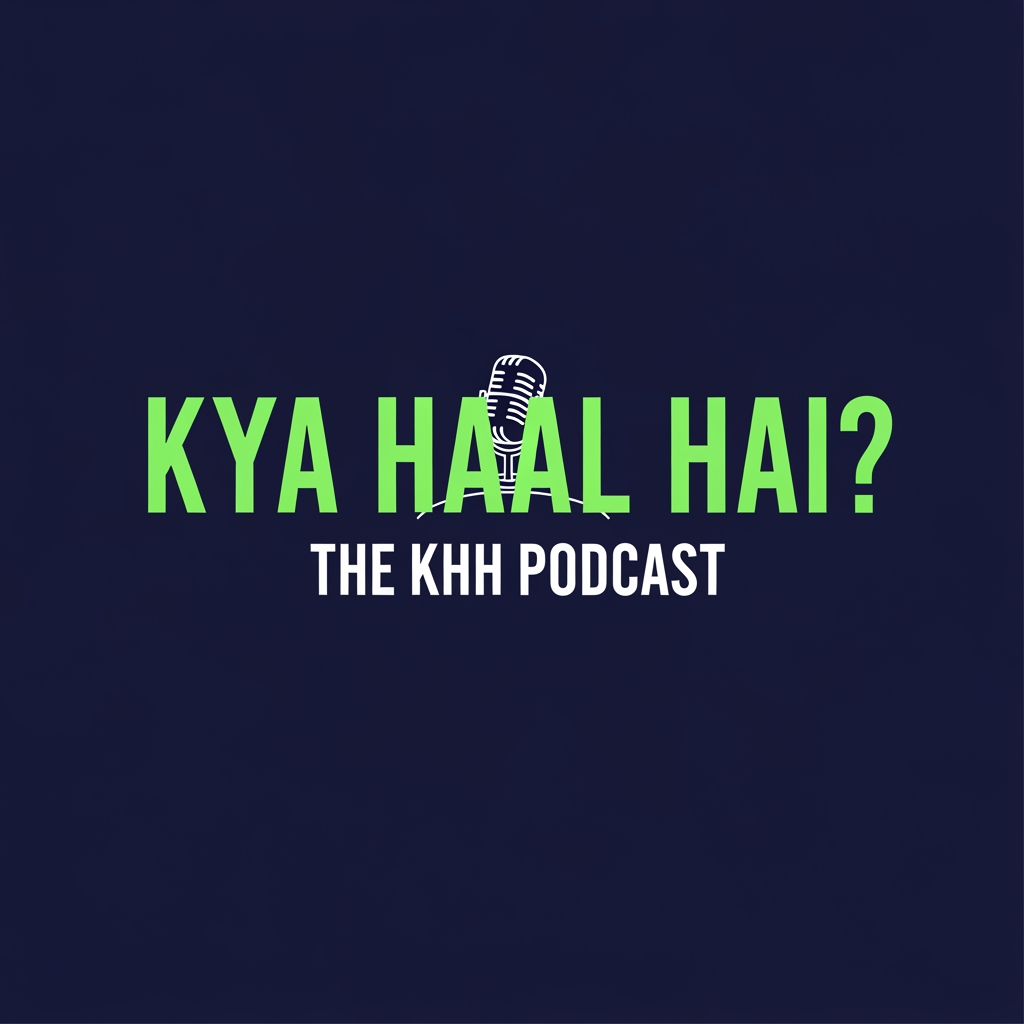
AI Design for A minimalistic and cool podcast logo featuring the bold text "KYA HAAL HAI?" with a smaller subtitle underneath reading "THE KHH PODCAST". The design uses clean, bold typography with a subtle retro-modern vibe. A simple, elegant line-art icon of a vintage microphone or a speech bubble is seamlessly integrated into the background. Solid deep navy blue background with vibrant neon mint green and crisp white text. Graphic design, vector art, flat design, trending on Dribbble, highly detailed text rendering.

aspect ratio 1:1

A minimalistic and cool podcast logo featuring the bold text "KYA HAAL HAI?" with a smaller subtitle underneath reading "THE KHH PODCAST". The design uses clean, bold typography with a subtle retro-modern vibe. A simple, elegant line-art icon of a vintage microphone or a speech bubble is seamlessly integrated into the background. Solid deep navy blue background with vibrant neon mint green and crisp white text. Graphic design, vector art, flat design, trending on Dribbble, highly detailed text rendering. aspect ratio 1:1

by @Elephant_8133382
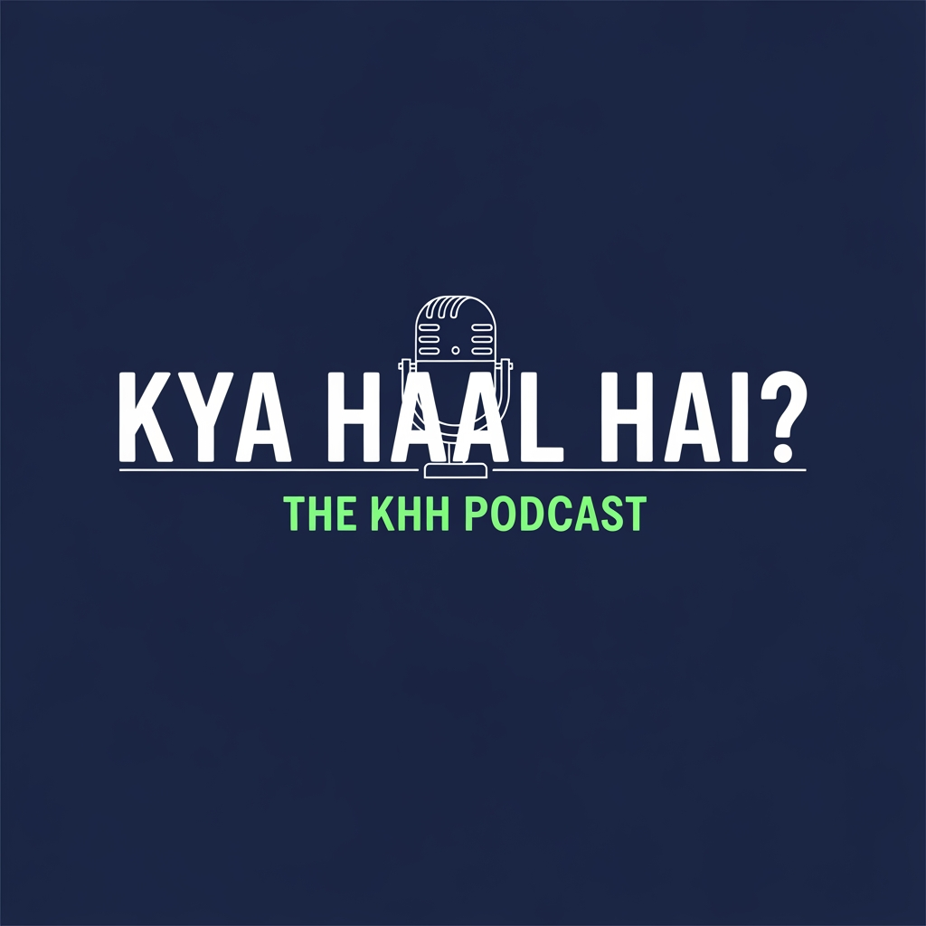
AI Design for make this guy dance

make this guy dance

by @Elephant_4546887

AI Design for "Minimalist logo for 'NexusBee', a web development brand. A single continuous line forming a simple hexagon outline with one corner subtly opening into a code bracket shape. One color only (deep navy or amber gold), thin even line weight, flat vector, generous white space, no gradients, no extra details, white background."

"Minimalist logo for 'NexusBee', a web development brand. A single continuous line forming a simple hexagon outline with one corner subtly opening into a code bracket shape. One color only (deep navy or amber gold), thin even line weight, flat vector, generous white space, no gradients, no extra details, white background."

by @Elephant_5998901
AI Design for "Minimalist logo for 'NexusBee', a web development brand. A single continuous line forming a simple hexagon outline with one corner subtly opening into a code bracket shape. One color only (deep navy or amber gold), thin even line weight, flat vector, generous white space, no gradients, no extra details, white background."

"Minimalist logo for 'NexusBee', a web development brand. A single continuous line forming a simple hexagon outline with one corner subtly opening into a code bracket shape. One color only (deep navy or amber gold), thin even line weight, flat vector, generous white space, no gradients, no extra details, white background."

by @Elephant_5998901

AI Design for "Clean modern wordmark logo: 'NexusBee' in a simple geometric sans-serif font, one letter (the 'B' or 'N') subtly modified with a thin bracket or hexagon cut, single color, flat design, generous letter spacing, white background, no icon, no decoration."

"Clean modern wordmark logo: 'NexusBee' in a simple geometric sans-serif font, one letter (the 'B' or 'N') subtly modified with a thin bracket or hexagon cut, single color, flat design, generous letter spacing, white background, no icon, no decoration."

by @Elephant_5998901

AI Design for "Clean modern wordmark logo: 'NexusBee' in a simple geometric sans-serif font, one letter (the 'B' or 'N') subtly modified with a thin bracket or hexagon cut, single color, flat design, generous letter spacing, white background, no icon, no decoration."

"Clean modern wordmark logo: 'NexusBee' in a simple geometric sans-serif font, one letter (the 'B' or 'N') subtly modified with a thin bracket or hexagon cut, single color, flat design, generous letter spacing, white background, no icon, no decoration."

by @Elephant_5998901

AI Design for logo for nexusbee

logo for nexusbee

by @Elephant_5998901

AI Design for logo for nexusbee

logo for nexusbee

by @Elephant_5998901

AI Design for logo for nexusbee

logo for nexusbee

by @Elephant_5998901

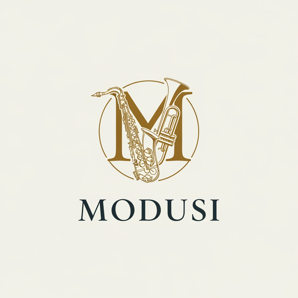
AI Design for make me a modern logo of a music jazz band thats named "modusi" with music elements

make me a modern logo of a music jazz band thats named "modusi" with music elements

by @Elephant_7777782

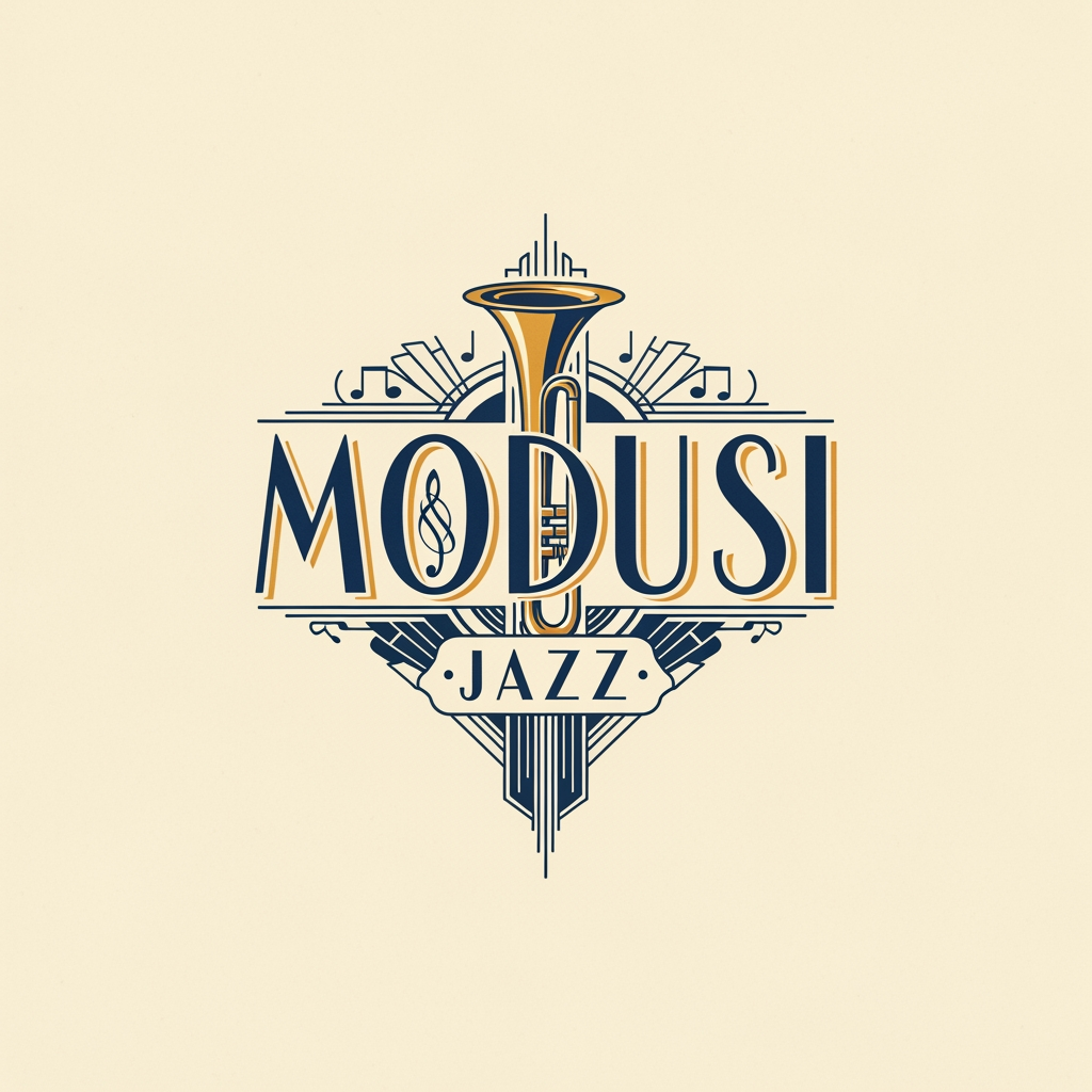
AI Design for make me a logo of a music jazz band thats named "modusi"

make me a logo of a music jazz band thats named "modusi"

by @Elephant_7777782

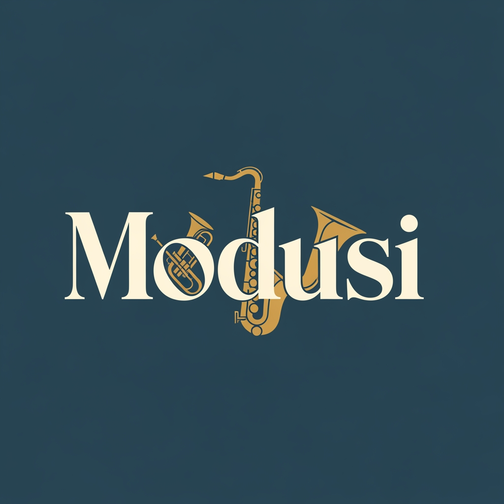
AI Design for make me a logo of a music jazz band thats named "modusi"

make me a logo of a music jazz band thats named "modusi"

by @Elephant_7777782

AI Design for make me a logo of a music jazz band thats named "modusi"

make me a logo of a music jazz band thats named "modusi"

by @Elephant_7777782

AI Design for make me a logo of a music jazz band thats named "modusi"

make me a logo of a music jazz band thats named "modusi"

by @Elephant_7777782

AI Design for make me a logo of a music jazz band thats named "modusi"

make me a logo of a music jazz band thats named "modusi"

by @Elephant_7777782

AI Design for make me a logo of a music jazz band thats named "modusi"

make me a logo of a music jazz band thats named "modusi"

by @Elephant_7777782

AI Design for A high-resolutionThe image should feature sharp focus, neutral soft-box lighting to minimize shadows, and high contrast to ensure clear separation of elements for easy post-processing.

A high-resolutionThe image should feature sharp focus, neutral soft-box lighting to minimize shadows, and high contrast to ensure clear separation of elements for easy post-processing.

by @Elephant_3316761

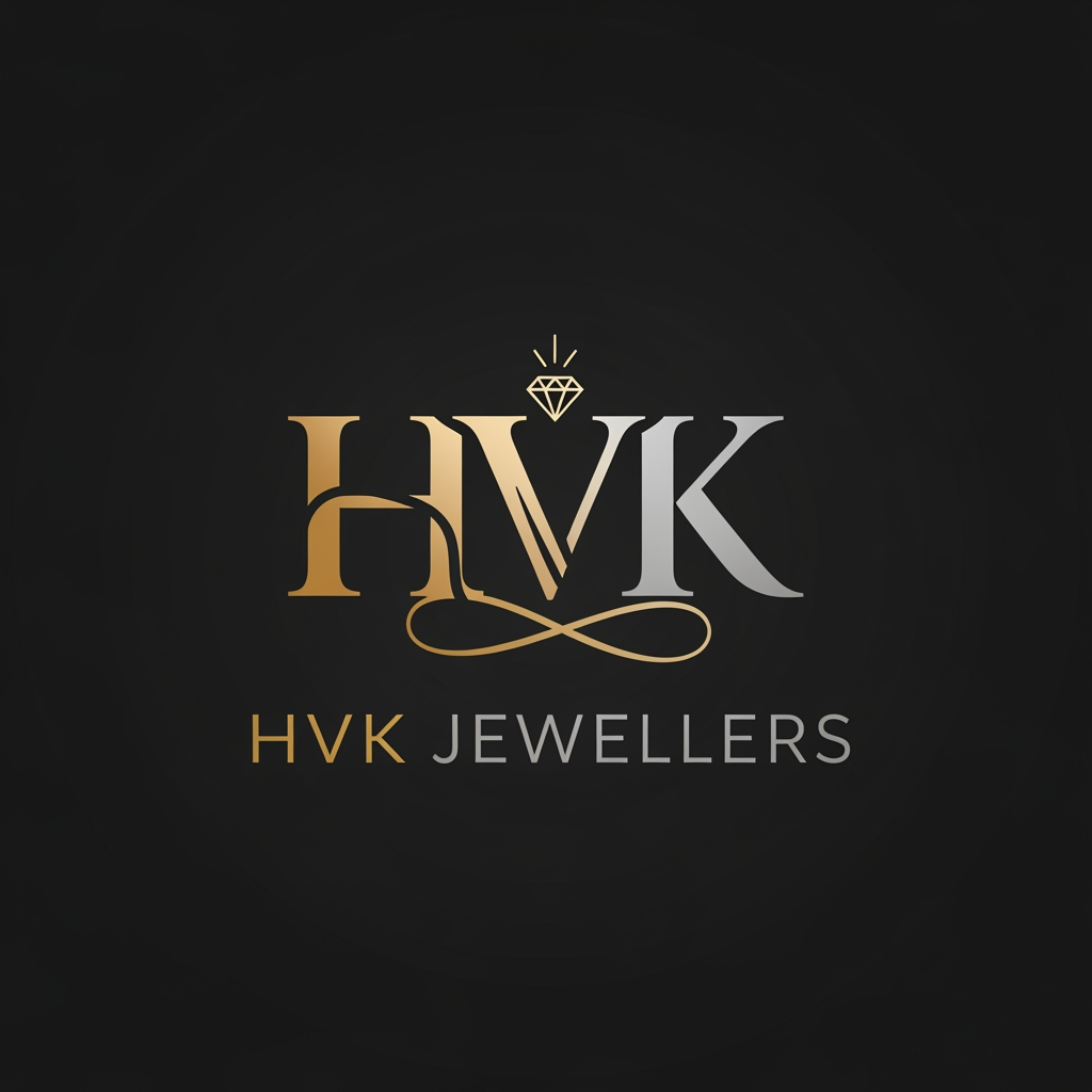
AI Design for CREATE A LOGO NAMED HVK JEWELLERS

CREATE A LOGO NAMED HVK JEWELLERS

by @Elephant_5375795

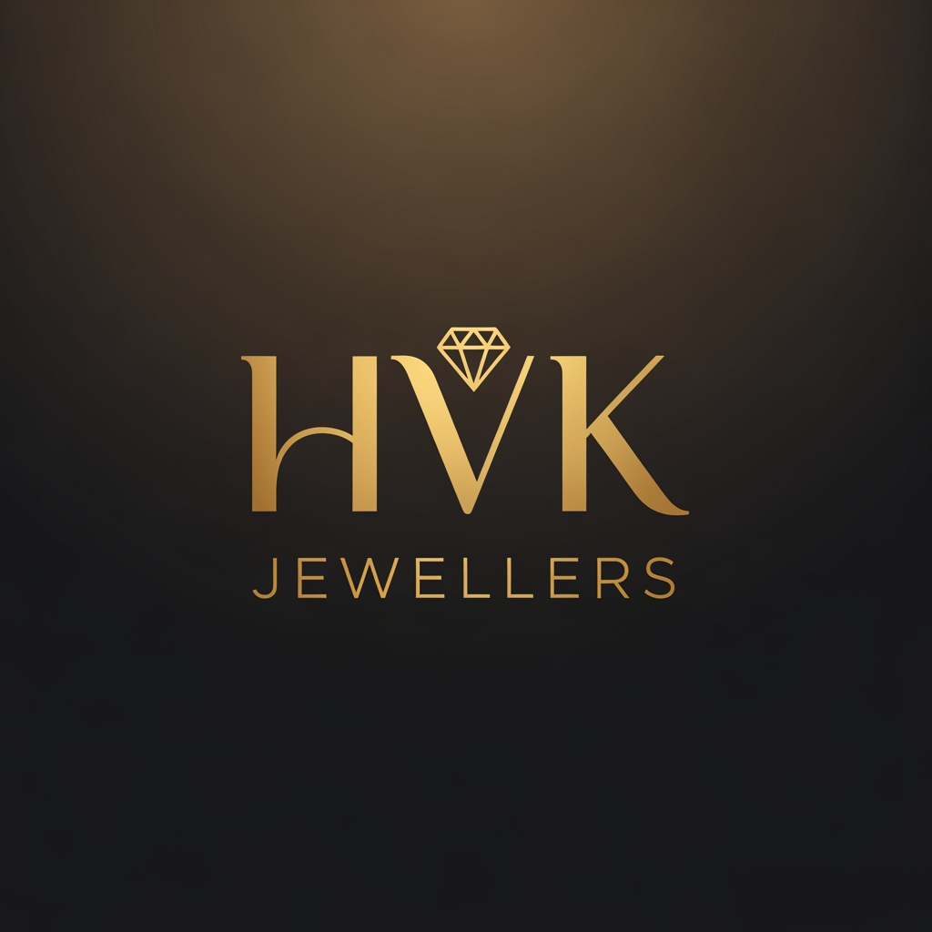
AI Design for CREATE A LOGO NAMED HVK JEWELLERS

CREATE A LOGO NAMED HVK JEWELLERS

by @Elephant_5375795

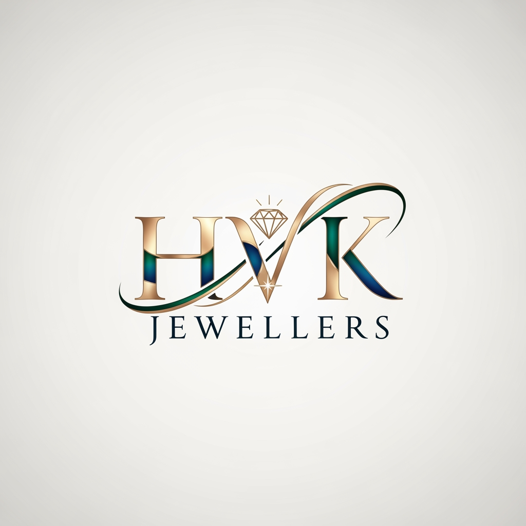
AI Design for CREATE A LOGO NAMED HVK JEWELLERS

CREATE A LOGO NAMED HVK JEWELLERS

by @Elephant_5375795

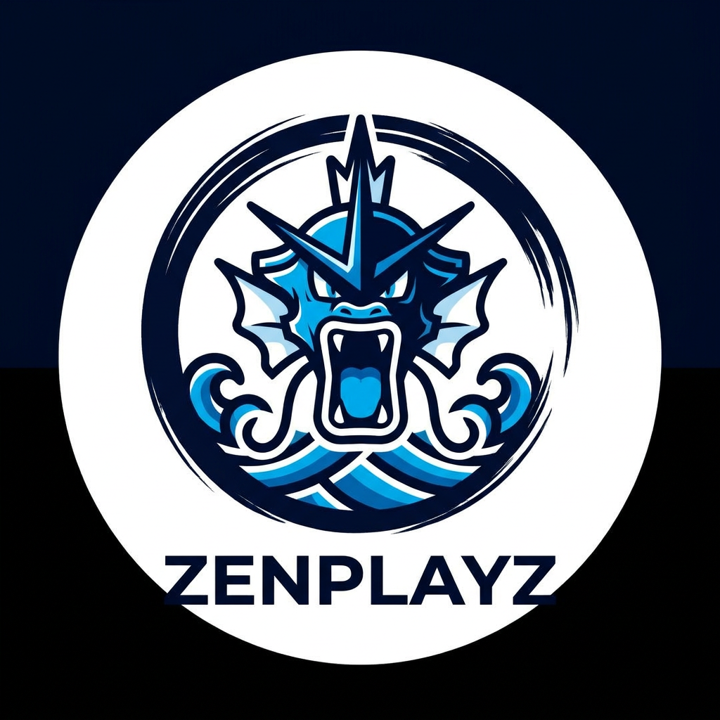
AI Design for A professional minimalist circular gaming logo featuring a stylized, modern interpretation of a water-type creature with fluid, elegant lines. The design utilizes high-contrast flat shading, a vibrant cyan and deep navy blue color palette, and a bold aesthetic perfectly suited for a high-impact profile avatar.

A professional minimalist circular gaming logo featuring a stylized, modern interpretation of a water-type creature with fluid, elegant lines. The design utilizes high-contrast flat shading, a vibrant cyan and deep navy blue color palette, and a bold aesthetic perfectly suited for a high-impact profile avatar.

by @Elephant_8099114

AI Design for A professional minimalist circular gaming logo featuring a stylized, modern interpretation of a water-type creature with fluid, elegant lines. The design utilizes high-contrast flat shading, a vibrant cyan and deep navy blue color palette, and a bold aesthetic perfectly suited for a high-impact profile avatar.

A professional minimalist circular gaming logo featuring a stylized, modern interpretation of a water-type creature with fluid, elegant lines. The design utilizes high-contrast flat shading, a vibrant cyan and deep navy blue color palette, and a bold aesthetic perfectly suited for a high-impact profile avatar.

by @Elephant_8099114
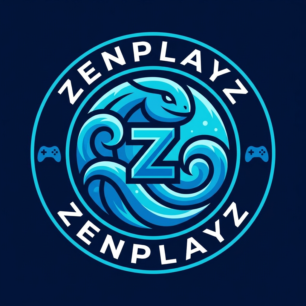
AI Design for A professional, minimalist circular gaming logo for the YouTube channel Zenplayz, featuring a stylized, modern interpretation of a water type pokemon  high-contrast flat shading, and a sleek, bold aesthetic suitable for a profile avatar.

A professional, minimalist circular gaming logo for the YouTube channel Zenplayz, featuring a stylized, modern interpretation of a water type pokemon high-contrast flat shading, and a sleek, bold aesthetic suitable for a profile avatar.

by @Elephant_8099114
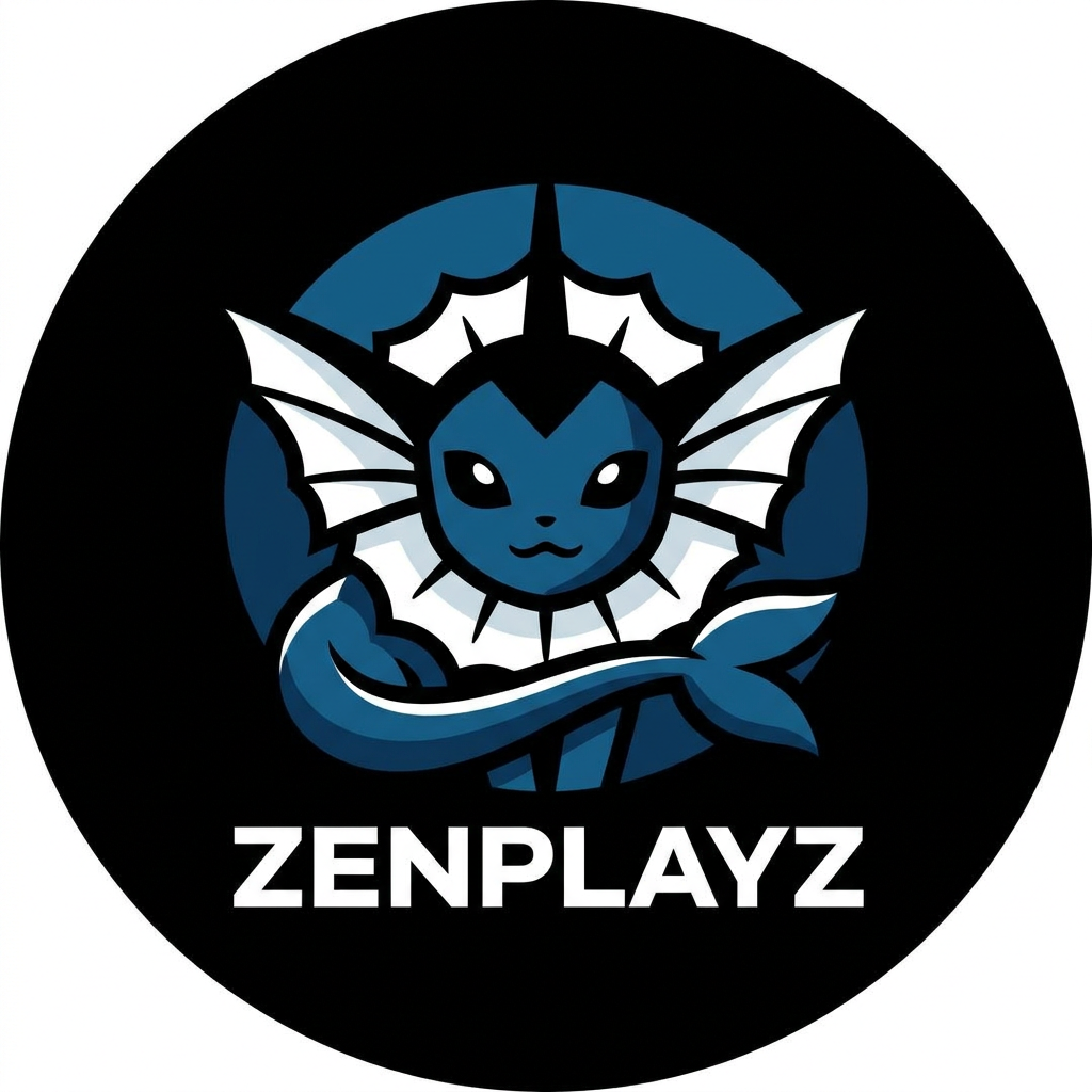
AI Design for A professional, minimalist circular gaming logo for the YouTube channel Zenplayz, featuring a stylized, modern interpretation of a water type pokemon  high-contrast flat shading, and a sleek, bold aesthetic suitable for a profile avatar.

A professional, minimalist circular gaming logo for the YouTube channel Zenplayz, featuring a stylized, modern interpretation of a water type pokemon high-contrast flat shading, and a sleek, bold aesthetic suitable for a profile avatar.

by @Elephant_8099114
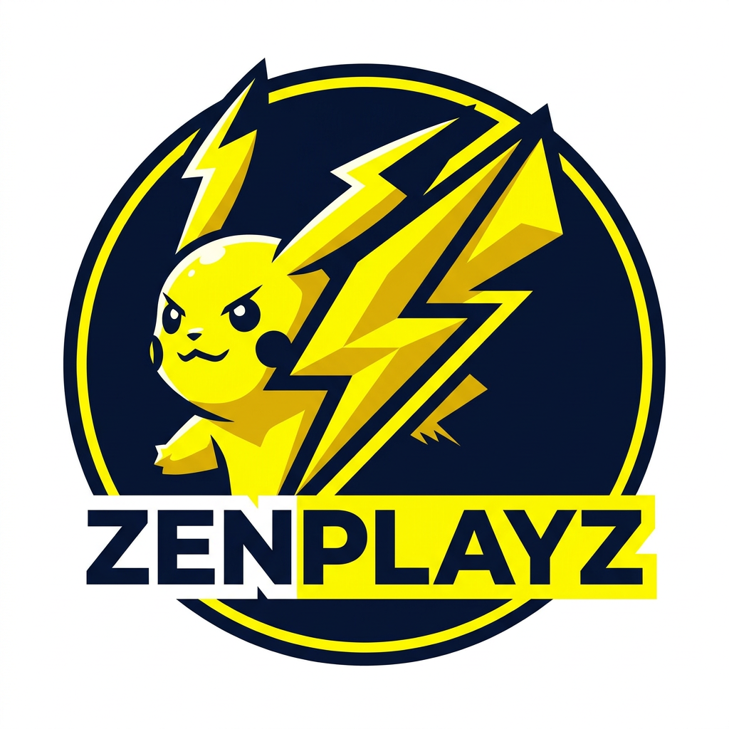
AI Design for A professional, minimalist circular gaming logo for the YouTube channel Zenplayz, featuring a stylized, modern interpretation of a water type pokemon  high-contrast flat shading, and a sleek, bold aesthetic suitable for a profile avatar.

A professional, minimalist circular gaming logo for the YouTube channel Zenplayz, featuring a stylized, modern interpretation of a water type pokemon high-contrast flat shading, and a sleek, bold aesthetic suitable for a profile avatar.

by @Elephant_8099114
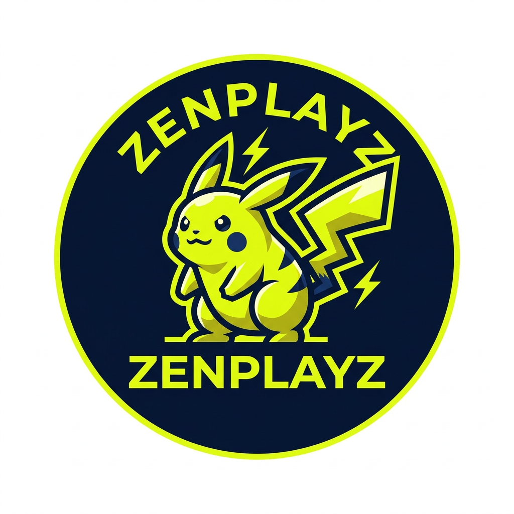
AI Design for A professional, minimalist circular gaming logo for the YouTube channel Zenplayz, featuring a stylized, modern interpretation of a iconic electric mouse creature. The design should utilize a vibrant electric yellow and deep navy blue color palette with clean vector lines, high-contrast flat shading, and a sleek, bold aesthetic suitable for a profile avatar.

A professional, minimalist circular gaming logo for the YouTube channel Zenplayz, featuring a stylized, modern interpretation of a iconic electric mouse creature. The design should utilize a vibrant electric yellow and deep navy blue color palette with clean vector lines, high-contrast flat shading, and a sleek, bold aesthetic suitable for a profile avatar.

by @Elephant_8099114
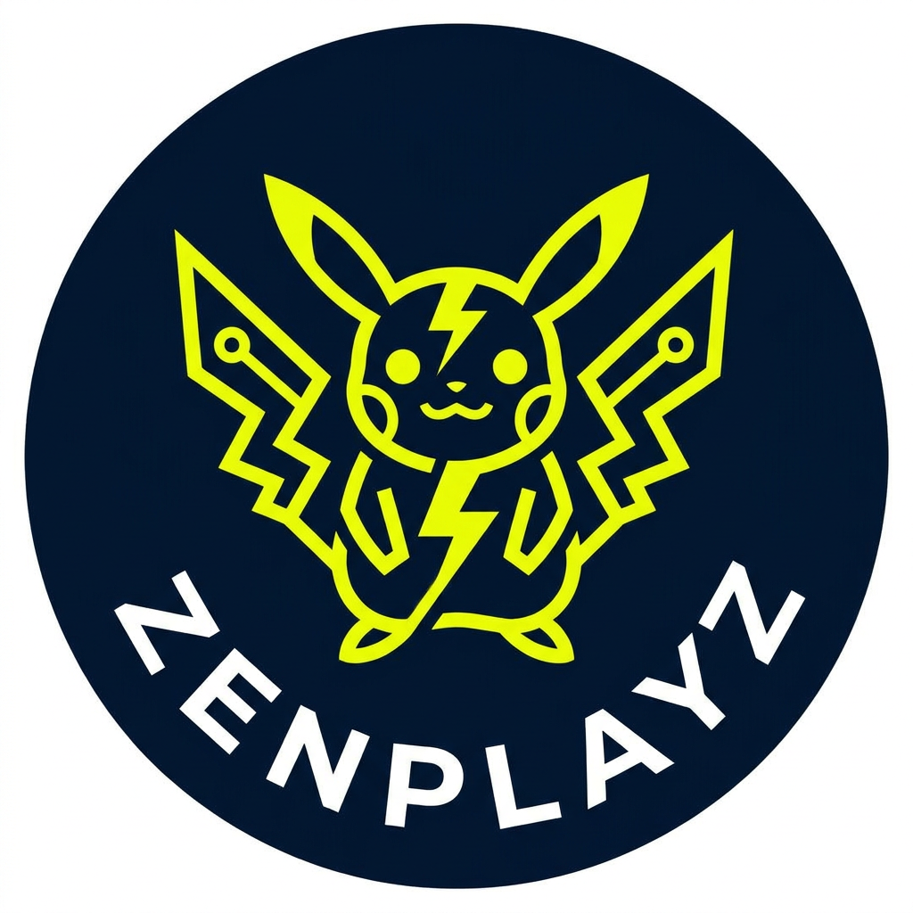
AI Design for A professional, minimalist circular gaming logo for the YouTube channel Zenplayz, featuring a stylized, modern interpretation of a iconic electric mouse creature. The design should utilize a vibrant electric yellow and deep navy blue color palette with clean vector lines, high-contrast flat shading, and a sleek, bold aesthetic suitable for a profile avatar.

A professional, minimalist circular gaming logo for the YouTube channel Zenplayz, featuring a stylized, modern interpretation of a iconic electric mouse creature. The design should utilize a vibrant electric yellow and deep navy blue color palette with clean vector lines, high-contrast flat shading, and a sleek, bold aesthetic suitable for a profile avatar.

by @Elephant_8099114
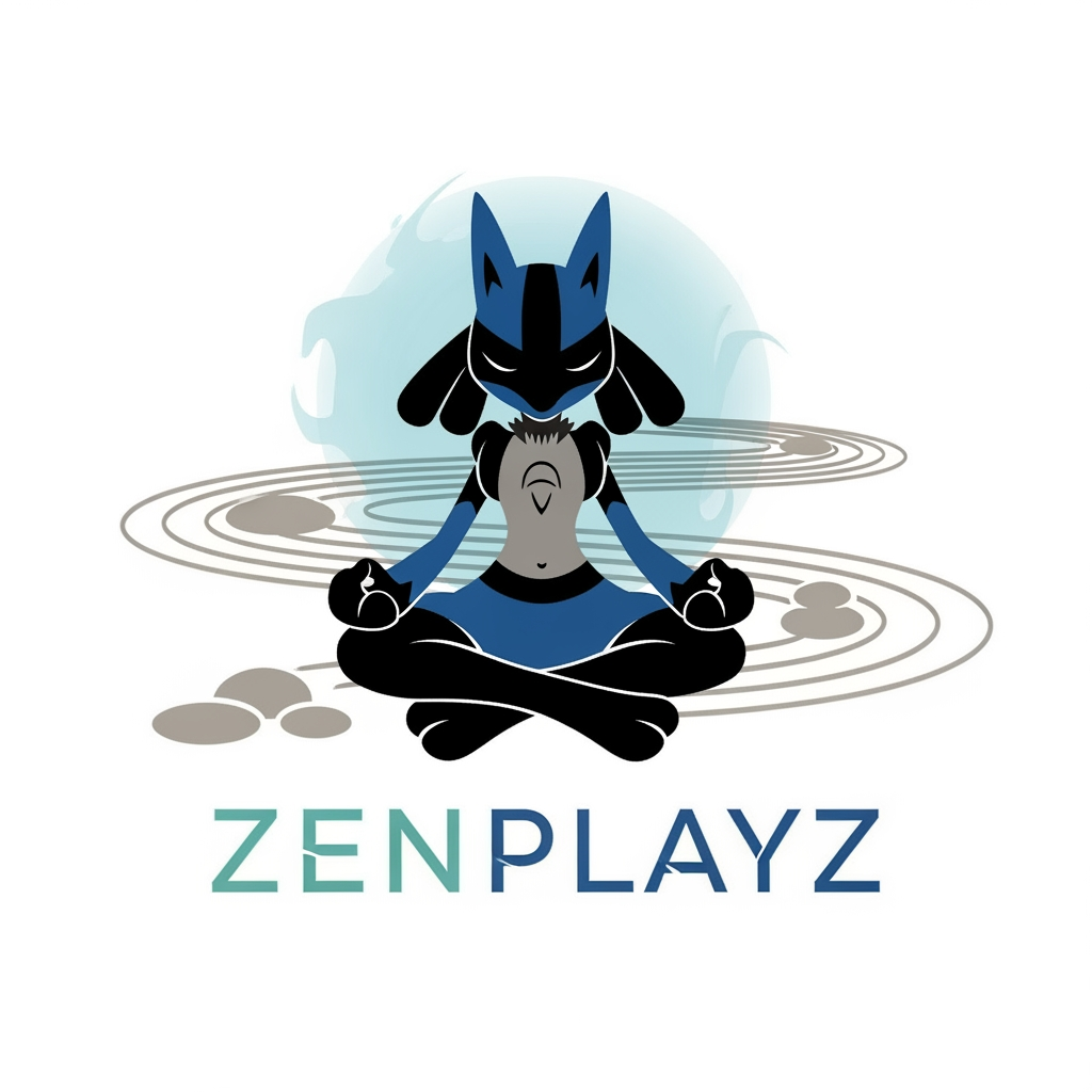
AI Design for A professional, minimalist circular gaming logo for the YouTube channel Zenplayz, featuring a stylized, modern interpretation of a iconic electric mouse creature. The design should utilize a vibrant electric yellow and deep navy blue color palette with clean vector lines, high-contrast flat shading, and a sleek, bold aesthetic suitable for a profile avatar.

A professional, minimalist circular gaming logo for the YouTube channel Zenplayz, featuring a stylized, modern interpretation of a iconic electric mouse creature. The design should utilize a vibrant electric yellow and deep navy blue color palette with clean vector lines, high-contrast flat shading, and a sleek, bold aesthetic suitable for a profile avatar.

by @Elephant_8099114
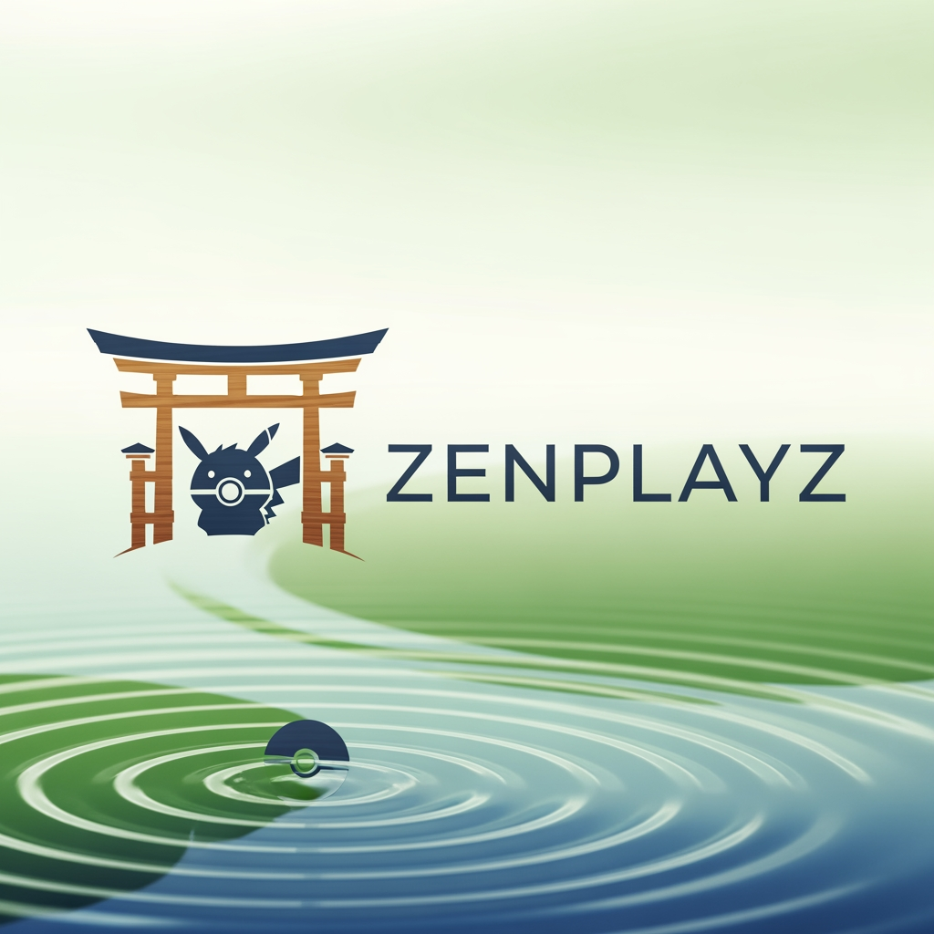
AI Design for Zenplayz is my youtube channel name and i play pokemon so i need a logo

Zenplayz is my youtube channel name and i play pokemon so i need a logo

by @Elephant_8099114

AI Design for Zenplayz is my youtube channel name and i play pokemon so i need a logo

Zenplayz is my youtube channel name and i play pokemon so i need a logo

by @Elephant_8099114

  • 1
  • 2
  • 3
  • ...
  • 249
  • 250
  • 251
  • 252
  • 253
  • ...
  • 6698
  • 6699
  • 6700

What's next?Explore more features

Hiding Elephant product features overview

Explore features

AI generation, vector tools, workflows, catalogs, and collaboration in one workspace.

How Hiding Elephant works

How it works

See how the AI canvas, automation, and teamwork fit together end to end.

Get started with Hiding Elephant

Try it free

Sign in and turn inspiration into projects you can edit, export, and share.

Go from browse to build

Explore what else the Elephant can do.You'll love it

AI image generation

AI Generation

Image tools

Image Tools

Workflow builder

Workflows

Brand and style templates

Brand Management

Product catalog

Product Catalog

Collaboration

Collaboration

Batch image generation

Batch generation

Explore community

Community workflows

The AI designworkspace forfast-moving ideas.

Product

  • AI Generation
  • Vector Canvas
  • Image Tools
  • Workflows
  • Brand Management
  • Product Catalog
  • My Assets
  • Collaboration

Use Cases

  • E-commerce teams
  • Design agencies
  • Marketing teams
  • Content creators

Quick tools

  • All quick tools
  • Background Remover
  • Image Upscaler
  • Image Vectorizer
  • Image Optimizer
  • Image Reframer

Resources

  • About
  • Pricing
  • FAQ
  • Compare
  • Enterprise
  • Explore
  • Blog
  • Contact Us
  • Book a Demo
  • Affiliates

© 2026 Hiding Elephant. All rights reserved

Cookie PolicyPrivacy PolicyTerms of Service
Hiding Elephant