Designs made by our community
Explore unique graphic designs and images crafted by creators around the world using Hiding Elephant's AI design tools. Get inspired and start creating.












Design a premium enterprise symbol for a cybersecurity learning platform using only three identical geometric modules. The logo should communicate learning, awareness, pattern recognition, and intelligent decision-making rather than protection or defense. Build the symbol from three rounded capsules or folded ribbon-like shapes placed on a strict geometric grid with identical dimensions, corner radii, and spacing. Through rotation, offset, overlap, and negative space, the modules should create a distinctive, memorable silhouette without forming a literal object, letter, shield, arrow, book, eye, or lock. The composition should suggest information aligning into clarity, representing the journey from uncertainty to understanding. The mark should feel timeless, minimal, highly scalable, and instantly recognizable, inspired by the design philosophy of Allocate, Linear, Arc, Ramp, Anthropic, and modern AI startups. Use flat vector shapes with orange (#F58220) and neutral gray (#5C6168) on a white background. No gradients, shadows, outlines, textures, or typography. The final symbol should be simple enough to sketch from memory yet sophisticated enough to serve as the identity of a global technology company.
by @Elephant_9902675
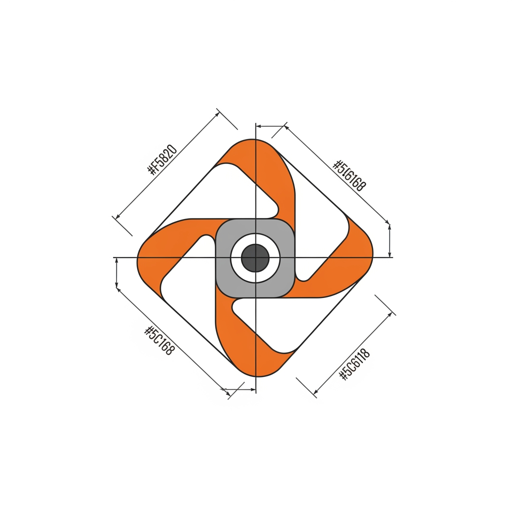
Design a premium enterprise symbol for a cybersecurity learning platform using only three identical geometric modules. The logo should communicate learning, awareness, pattern recognition, and intelligent decision-making rather than protection or defense. Build the symbol from three rounded capsules or folded ribbon-like shapes placed on a strict geometric grid with identical dimensions, corner radii, and spacing. Through rotation, offset, overlap, and negative space, the modules should create a distinctive, memorable silhouette without forming a literal object, letter, shield, arrow, book, eye, or lock. The composition should suggest information aligning into clarity, representing the journey from uncertainty to understanding. The mark should feel timeless, minimal, highly scalable, and instantly recognizable, inspired by the design philosophy of Allocate, Linear, Arc, Ramp, Anthropic, and modern AI startups. Use flat vector shapes with orange (#F58220) and neutral gray (#5C6168) on a white background. No gradients, shadows, outlines, textures, or typography. The final symbol should be simple enough to sketch from memory yet sophisticated enough to serve as the identity of a global technology company.
by @Elephant_9902675
Design a premium enterprise symbol for a cybersecurity learning platform using only three identical geometric modules. The logo should communicate learning, awareness, pattern recognition, and intelligent decision-making rather than protection or defense. Build the symbol from three rounded capsules or folded ribbon-like shapes placed on a strict geometric grid with identical dimensions, corner radii, and spacing. Through rotation, offset, overlap, and negative space, the modules should create a distinctive, memorable silhouette without forming a literal object, letter, shield, arrow, book, eye, or lock. The composition should suggest information aligning into clarity, representing the journey from uncertainty to understanding. The mark should feel timeless, minimal, highly scalable, and instantly recognizable, inspired by the design philosophy of Allocate, Linear, Arc, Ramp, Anthropic, and modern AI startups. Use flat vector shapes with orange (#F58220) and neutral gray (#5C6168) on a white background. No gradients, shadows, outlines, textures, or typography. The final symbol should be simple enough to sketch from memory yet sophisticated enough to serve as the identity of a global technology company.
by @Elephant_9902675
Design a premium enterprise symbol for a cybersecurity learning platform using only three identical geometric modules. The logo should communicate learning, awareness, pattern recognition, and intelligent decision-making rather than protection or defense. Build the symbol from three rounded capsules or folded ribbon-like shapes placed on a strict geometric grid with identical dimensions, corner radii, and spacing. Through rotation, offset, overlap, and negative space, the modules should create a distinctive, memorable silhouette without forming a literal object, letter, shield, arrow, book, eye, or lock. The composition should suggest information aligning into clarity, representing the journey from uncertainty to understanding. The mark should feel timeless, minimal, highly scalable, and instantly recognizable, inspired by the design philosophy of Allocate, Linear, Arc, Ramp, Anthropic, and modern AI startups. Use flat vector shapes with orange (#F58220) and neutral gray (#5C6168) on a white background. No gradients, shadows, outlines, textures, or typography. The final symbol should be simple enough to sketch from memory yet sophisticated enough to serve as the identity of a global technology company. One more suggestion
by @Elephant_9902675
Design a premium enterprise symbol for a cybersecurity learning platform using only three identical geometric modules. The logo should communicate learning, awareness, pattern recognition, and intelligent decision-making rather than protection or defense. Build the symbol from three rounded capsules or folded ribbon-like shapes placed on a strict geometric grid with identical dimensions, corner radii, and spacing. Through rotation, offset, overlap, and negative space, the modules should create a distinctive, memorable silhouette without forming a literal object, letter, shield, arrow, book, eye, or lock. The composition should suggest information aligning into clarity, representing the journey from uncertainty to understanding. The mark should feel timeless, minimal, highly scalable, and instantly recognizable, inspired by the design philosophy of Allocate, Linear, Arc, Ramp, Anthropic, and modern AI startups. Use flat vector shapes with orange (#F58220) and neutral gray (#5C6168) on a white background. No gradients, shadows, outlines, textures, or typography. The final symbol should be simple enough to sketch from memory yet sophisticated enough to serve as the identity of a global technology company. One more suggestion
by @Elephant_9902675
Design a premium enterprise symbol for a cybersecurity learning platform using only three identical geometric modules. The logo should communicate learning, awareness, pattern recognition, and intelligent decision-making rather than protection or defense. Build the symbol from three rounded capsules or folded ribbon-like shapes placed on a strict geometric grid with identical dimensions, corner radii, and spacing. Through rotation, offset, overlap, and negative space, the modules should create a distinctive, memorable silhouette without forming a literal object, letter, shield, arrow, book, eye, or lock. The composition should suggest information aligning into clarity, representing the journey from uncertainty to understanding. The mark should feel timeless, minimal, highly scalable, and instantly recognizable, inspired by the design philosophy of Allocate, Linear, Arc, Ramp, Anthropic, and modern AI startups. Use flat vector shapes with orange (#F58220) and neutral gray (#5C6168) on a white background. No gradients, shadows, outlines, textures, or typography. The final symbol should be simple enough to sketch from memory yet sophisticated enough to serve as the identity of a global technology company. One more suggestion
by @Elephant_9902675
Design a world-class, enterprise-grade logo for a cybersecurity learning platform whose purpose is to educate users to recognize malware, phishing, scams, ransomware, and online threats before they become victims. The logo should **not represent cybersecurity**. It should represent **learning, awareness, recognition, transformation, and intelligent decision making.** The design philosophy should feel comparable to the visual identities of OpenAI, Anthropic Claude, Gemini, Axon, Pandora, Sync, and modern AI startups. This should look like it belongs to a billion-dollar technology company. --- # Core Story Every cyberattack begins with information. Information reaches a person. That person makes a decision. Knowledge changes that decision. The platform teaches people to recognize patterns that others overlook. The logo captures **the exact instant where confusion becomes understanding.** Not protection. Not defense. Understanding. It symbolizes the transformation from uncertainty into clarity. --- # Hidden Meaning The logo should reveal more than one interpretation. From different perspectives it should resemble • converging knowledge • an expanding mind • signal becoming clear • information alignment • awareness • intelligent filtering • pattern recognition • decision making • guidance • adaptive intelligence People should discover new meanings after looking longer. Exactly like the OpenAI mark. --- # Visual Language Do NOT create ❌ shield ❌ padlock ❌ bug ❌ malware ❌ hacker ❌ eye ❌ graduation cap ❌ book ❌ target ❌ compass ❌ globe ❌ checkmark ❌ circuit board ❌ fingerprint ❌ brain ❌ light bulb Avoid every cliché. --- # Geometry Create one abstract geometric mark. Use only rounded rectangles capsules circular arcs simple circles continuous curves consistent corner radius equal stroke widths perfect mathematical spacing modular construction strong negative space The logo should feel generated from one geometric system. No decorative pieces. No unnecessary complexity. --- # Form Exploration The symbol should feel like knowledge flowing signals converging multiple paths becoming one information organizing itself learning unfolding ideas synchronizing a pattern revealing itself an adaptive system continuous improvement visual intelligence The motion should appear frozen in time. Almost like a frame taken from an elegant animation. --- # Style References Take inspiration from the design philosophy of Anthropic Claude OpenAI Gemini Axon Pandora Sync Visual AI Radeos Labs Linear Stripe Not their shapes. Only their simplicity, proportion, abstraction, confidence, and timelessness. --- # Construction The logo should be constructed using 3–5 geometric components or one continuous modular ribbon or one repeating capsule system or rotational symmetry or radial construction or parametric geometry The silhouette should be instantly recognizable. --- # Motion Imagine the logo animating. Individual components begin separated. They gradually rotate. Align. Lock together. Reveal one unified symbol. The final static logo should capture that exact moment. --- # Color Primary Orange #F58220 Secondary Neutral Gray #5C6168 Monochrome versions must work perfectly. No gradients. No glass effects. No shadows. Flat vector only. --- # Personality The logo should feel calm precise intelligent curious approachable future-ready confident minimal premium timeless enterprise --- # Scalability The logo must remain iconic at 16 px 32 px favicon mobile app icon course certificate website PowerPoint T-shirt embroidery favicon laser engraving --- # Deliverables Generate **12 completely different concepts**. Each concept must explore a unique visual metaphor instead of small variations of the same icon. Examples of conceptual directions: 1. Converging Signals – several rounded bars gradually align into a unified direction, symbolizing scattered information becoming clear understanding. 2. Knowledge Aperture – rotating geometric segments forming an open center, representing awareness expanding rather than closing. 3. Decision Flow – a modular path that branches and then resolves into a single clean trajectory, expressing informed choices. 4. Pattern Recognition – evenly spaced capsules that subtly organize into a hidden geometric figure visible only as a whole. 5. Adaptive Core – independent modules orbiting a central void, suggesting continuous learning and adaptation. 6. Synchronization – repeated rounded strokes that phase into perfect alignment, inspired by resonance and coordinated systems. 7. Signal Refinement – abstract wave segments compressing into a balanced icon, representing noise becoming meaningful information. 8. Guided Motion – directional forms that imply forward movement without using arrows, symbolizing progress through knowledge. 9. Modular Intelligence – identical geometric units arranged through mathematical proportion to create an unexpected unified mark. 10. Insight Bloom – a restrained radial composition where each element contributes to a central moment of realization, without resembling a sun or star. 11. Unified Perspective – separate forms viewed together reveal a hidden continuous path through negative space. 12. Learning Loop – a continuous geometric ribbon interrupted at one intentional gap, representing that learning is an ongoing process rather than a closed cycle. --- ## One final design recommendation Based on your references and the style you've consistently liked, I would **avoid logos that rely on circles with radial spokes** (they're becoming common in AI branding). Instead, I'd pursue a **modular ribbon or capsule-based system** where **3–4 rounded geometric elements interlock to create a distinctive abstract symbol**. That direction is more ownable, highly scalable, and fits the premium enterprise aesthetic you're targeting for a cybersecurity learning brand.
by @Elephant_9902675
Design a world-class, enterprise-grade logo for a cybersecurity learning platform whose purpose is to educate users to recognize malware, phishing, scams, ransomware, and online threats before they become victims. The logo should **not represent cybersecurity**. It should represent **learning, awareness, recognition, transformation, and intelligent decision making.** The design philosophy should feel comparable to the visual identities of OpenAI, Anthropic Claude, Gemini, Axon, Pandora, Sync, and modern AI startups. This should look like it belongs to a billion-dollar technology company. --- # Core Story Every cyberattack begins with information. Information reaches a person. That person makes a decision. Knowledge changes that decision. The platform teaches people to recognize patterns that others overlook. The logo captures **the exact instant where confusion becomes understanding.** Not protection. Not defense. Understanding. It symbolizes the transformation from uncertainty into clarity. --- # Hidden Meaning The logo should reveal more than one interpretation. From different perspectives it should resemble • converging knowledge • an expanding mind • signal becoming clear • information alignment • awareness • intelligent filtering • pattern recognition • decision making • guidance • adaptive intelligence People should discover new meanings after looking longer. Exactly like the OpenAI mark. --- # Visual Language Do NOT create ❌ shield ❌ padlock ❌ bug ❌ malware ❌ hacker ❌ eye ❌ graduation cap ❌ book ❌ target ❌ compass ❌ globe ❌ checkmark ❌ circuit board ❌ fingerprint ❌ brain ❌ light bulb Avoid every cliché. --- # Geometry Create one abstract geometric mark. Use only rounded rectangles capsules circular arcs simple circles continuous curves consistent corner radius equal stroke widths perfect mathematical spacing modular construction strong negative space The logo should feel generated from one geometric system. No decorative pieces. No unnecessary complexity. --- # Form Exploration The symbol should feel like knowledge flowing signals converging multiple paths becoming one information organizing itself learning unfolding ideas synchronizing a pattern revealing itself an adaptive system continuous improvement visual intelligence The motion should appear frozen in time. Almost like a frame taken from an elegant animation. --- # Style References Take inspiration from the design philosophy of Anthropic Claude OpenAI Gemini Axon Pandora Sync Visual AI Radeos Labs Linear Stripe Not their shapes. Only their simplicity, proportion, abstraction, confidence, and timelessness. --- # Construction The logo should be constructed using 3–5 geometric components or one continuous modular ribbon or one repeating capsule system or rotational symmetry or radial construction or parametric geometry The silhouette should be instantly recognizable. --- # Motion Imagine the logo animating. Individual components begin separated. They gradually rotate. Align. Lock together. Reveal one unified symbol. The final static logo should capture that exact moment. --- # Color Primary Orange #F58220 Secondary Neutral Gray #5C6168 Monochrome versions must work perfectly. No gradients. No glass effects. No shadows. Flat vector only. --- # Personality The logo should feel calm precise intelligent curious approachable future-ready confident minimal premium timeless enterprise --- # Scalability The logo must remain iconic at 16 px 32 px favicon mobile app icon course certificate website PowerPoint T-shirt embroidery favicon laser engraving --- # Deliverables Generate **12 completely different concepts**. Each concept must explore a unique visual metaphor instead of small variations of the same icon. Examples of conceptual directions: 1. Converging Signals – several rounded bars gradually align into a unified direction, symbolizing scattered information becoming clear understanding. 2. Knowledge Aperture – rotating geometric segments forming an open center, representing awareness expanding rather than closing. 3. Decision Flow – a modular path that branches and then resolves into a single clean trajectory, expressing informed choices. 4. Pattern Recognition – evenly spaced capsules that subtly organize into a hidden geometric figure visible only as a whole. 5. Adaptive Core – independent modules orbiting a central void, suggesting continuous learning and adaptation. 6. Synchronization – repeated rounded strokes that phase into perfect alignment, inspired by resonance and coordinated systems. 7. Signal Refinement – abstract wave segments compressing into a balanced icon, representing noise becoming meaningful information. 8. Guided Motion – directional forms that imply forward movement without using arrows, symbolizing progress through knowledge. 9. Modular Intelligence – identical geometric units arranged through mathematical proportion to create an unexpected unified mark. 10. Insight Bloom – a restrained radial composition where each element contributes to a central moment of realization, without resembling a sun or star. 11. Unified Perspective – separate forms viewed together reveal a hidden continuous path through negative space. 12. Learning Loop – a continuous geometric ribbon interrupted at one intentional gap, representing that learning is an ongoing process rather than a closed cycle. --- ## One final design recommendation Based on your references and the style you've consistently liked, I would **avoid logos that rely on circles with radial spokes** (they're becoming common in AI branding). Instead, I'd pursue a **modular ribbon or capsule-based system** where **3–4 rounded geometric elements interlock to create a distinctive abstract symbol**. That direction is more ownable, highly scalable, and fits the premium enterprise aesthetic you're targeting for a cybersecurity learning brand.
by @Elephant_9902675
Design a world-class, enterprise-grade logo for a cybersecurity learning platform whose purpose is to educate users to recognize malware, phishing, scams, ransomware, and online threats before they become victims. The logo should **not represent cybersecurity**. It should represent **learning, awareness, recognition, transformation, and intelligent decision making.** The design philosophy should feel comparable to the visual identities of OpenAI, Anthropic Claude, Gemini, Axon, Pandora, Sync, and modern AI startups. This should look like it belongs to a billion-dollar technology company. --- # Core Story Every cyberattack begins with information. Information reaches a person. That person makes a decision. Knowledge changes that decision. The platform teaches people to recognize patterns that others overlook. The logo captures **the exact instant where confusion becomes understanding.** Not protection. Not defense. Understanding. It symbolizes the transformation from uncertainty into clarity. --- # Hidden Meaning The logo should reveal more than one interpretation. From different perspectives it should resemble • converging knowledge • an expanding mind • signal becoming clear • information alignment • awareness • intelligent filtering • pattern recognition • decision making • guidance • adaptive intelligence People should discover new meanings after looking longer. Exactly like the OpenAI mark. --- # Visual Language Do NOT create ❌ shield ❌ padlock ❌ bug ❌ malware ❌ hacker ❌ eye ❌ graduation cap ❌ book ❌ target ❌ compass ❌ globe ❌ checkmark ❌ circuit board ❌ fingerprint ❌ brain ❌ light bulb Avoid every cliché. --- # Geometry Create one abstract geometric mark. Use only rounded rectangles capsules circular arcs simple circles continuous curves consistent corner radius equal stroke widths perfect mathematical spacing modular construction strong negative space The logo should feel generated from one geometric system. No decorative pieces. No unnecessary complexity. --- # Form Exploration The symbol should feel like knowledge flowing signals converging multiple paths becoming one information organizing itself learning unfolding ideas synchronizing a pattern revealing itself an adaptive system continuous improvement visual intelligence The motion should appear frozen in time. Almost like a frame taken from an elegant animation. --- # Style References Take inspiration from the design philosophy of Anthropic Claude OpenAI Gemini Axon Pandora Sync Visual AI Radeos Labs Linear Stripe Not their shapes. Only their simplicity, proportion, abstraction, confidence, and timelessness. --- # Construction The logo should be constructed using 3–5 geometric components or one continuous modular ribbon or one repeating capsule system or rotational symmetry or radial construction or parametric geometry The silhouette should be instantly recognizable. --- # Motion Imagine the logo animating. Individual components begin separated. They gradually rotate. Align. Lock together. Reveal one unified symbol. The final static logo should capture that exact moment. --- # Color Primary Orange #F58220 Secondary Neutral Gray #5C6168 Monochrome versions must work perfectly. No gradients. No glass effects. No shadows. Flat vector only. --- # Personality The logo should feel calm precise intelligent curious approachable future-ready confident minimal premium timeless enterprise --- # Scalability The logo must remain iconic at 16 px 32 px favicon mobile app icon course certificate website PowerPoint T-shirt embroidery favicon laser engraving --- # Deliverables Generate **12 completely different concepts**. Each concept must explore a unique visual metaphor instead of small variations of the same icon. Examples of conceptual directions: 1. Converging Signals – several rounded bars gradually align into a unified direction, symbolizing scattered information becoming clear understanding. 2. Knowledge Aperture – rotating geometric segments forming an open center, representing awareness expanding rather than closing. 3. Decision Flow – a modular path that branches and then resolves into a single clean trajectory, expressing informed choices. 4. Pattern Recognition – evenly spaced capsules that subtly organize into a hidden geometric figure visible only as a whole. 5. Adaptive Core – independent modules orbiting a central void, suggesting continuous learning and adaptation. 6. Synchronization – repeated rounded strokes that phase into perfect alignment, inspired by resonance and coordinated systems. 7. Signal Refinement – abstract wave segments compressing into a balanced icon, representing noise becoming meaningful information. 8. Guided Motion – directional forms that imply forward movement without using arrows, symbolizing progress through knowledge. 9. Modular Intelligence – identical geometric units arranged through mathematical proportion to create an unexpected unified mark. 10. Insight Bloom – a restrained radial composition where each element contributes to a central moment of realization, without resembling a sun or star. 11. Unified Perspective – separate forms viewed together reveal a hidden continuous path through negative space. 12. Learning Loop – a continuous geometric ribbon interrupted at one intentional gap, representing that learning is an ongoing process rather than a closed cycle. --- ## One final design recommendation Based on your references and the style you've consistently liked, I would **avoid logos that rely on circles with radial spokes** (they're becoming common in AI branding). Instead, I'd pursue a **modular ribbon or capsule-based system** where **3–4 rounded geometric elements interlock to create a distinctive abstract symbol**. That direction is more ownable, highly scalable, and fits the premium enterprise aesthetic you're targeting for a cybersecurity learning brand.
by @Elephant_9902675
Design a world-class, enterprise-grade logo for a cybersecurity learning platform whose purpose is to educate users to recognize malware, phishing, scams, ransomware, and online threats before they become victims. The logo should **not represent cybersecurity**. It should represent **learning, awareness, recognition, transformation, and intelligent decision making.** The design philosophy should feel comparable to the visual identities of OpenAI, Anthropic Claude, Gemini, Axon, Pandora, Sync, and modern AI startups. This should look like it belongs to a billion-dollar technology company. --- # Core Story Every cyberattack begins with information. Information reaches a person. That person makes a decision. Knowledge changes that decision. The platform teaches people to recognize patterns that others overlook. The logo captures **the exact instant where confusion becomes understanding.** Not protection. Not defense. Understanding. It symbolizes the transformation from uncertainty into clarity. --- # Hidden Meaning The logo should reveal more than one interpretation. From different perspectives it should resemble • converging knowledge • an expanding mind • signal becoming clear • information alignment • awareness • intelligent filtering • pattern recognition • decision making • guidance • adaptive intelligence People should discover new meanings after looking longer. Exactly like the OpenAI mark. --- # Visual Language Do NOT create ❌ shield ❌ padlock ❌ bug ❌ malware ❌ hacker ❌ eye ❌ graduation cap ❌ book ❌ target ❌ compass ❌ globe ❌ checkmark ❌ circuit board ❌ fingerprint ❌ brain ❌ light bulb Avoid every cliché. --- # Geometry Create one abstract geometric mark. Use only rounded rectangles capsules circular arcs simple circles continuous curves consistent corner radius equal stroke widths perfect mathematical spacing modular construction strong negative space The logo should feel generated from one geometric system. No decorative pieces. No unnecessary complexity. --- # Form Exploration The symbol should feel like knowledge flowing signals converging multiple paths becoming one information organizing itself learning unfolding ideas synchronizing a pattern revealing itself an adaptive system continuous improvement visual intelligence The motion should appear frozen in time. Almost like a frame taken from an elegant animation. --- # Style References Take inspiration from the design philosophy of Anthropic Claude OpenAI Gemini Axon Pandora Sync Visual AI Radeos Labs Linear Stripe Not their shapes. Only their simplicity, proportion, abstraction, confidence, and timelessness. --- # Construction The logo should be constructed using 3–5 geometric components or one continuous modular ribbon or one repeating capsule system or rotational symmetry or radial construction or parametric geometry The silhouette should be instantly recognizable. --- # Motion Imagine the logo animating. Individual components begin separated. They gradually rotate. Align. Lock together. Reveal one unified symbol. The final static logo should capture that exact moment. --- # Color Primary Orange #F58220 Secondary Neutral Gray #5C6168 Monochrome versions must work perfectly. No gradients. No glass effects. No shadows. Flat vector only. --- # Personality The logo should feel calm precise intelligent curious approachable future-ready confident minimal premium timeless enterprise --- # Scalability The logo must remain iconic at 16 px 32 px favicon mobile app icon course certificate website PowerPoint T-shirt embroidery favicon laser engraving --- # Deliverables Generate **12 completely different concepts**. Each concept must explore a unique visual metaphor instead of small variations of the same icon. Examples of conceptual directions: 1. Converging Signals – several rounded bars gradually align into a unified direction, symbolizing scattered information becoming clear understanding. 2. Knowledge Aperture – rotating geometric segments forming an open center, representing awareness expanding rather than closing. 3. Decision Flow – a modular path that branches and then resolves into a single clean trajectory, expressing informed choices. 4. Pattern Recognition – evenly spaced capsules that subtly organize into a hidden geometric figure visible only as a whole. 5. Adaptive Core – independent modules orbiting a central void, suggesting continuous learning and adaptation. 6. Synchronization – repeated rounded strokes that phase into perfect alignment, inspired by resonance and coordinated systems. 7. Signal Refinement – abstract wave segments compressing into a balanced icon, representing noise becoming meaningful information. 8. Guided Motion – directional forms that imply forward movement without using arrows, symbolizing progress through knowledge. 9. Modular Intelligence – identical geometric units arranged through mathematical proportion to create an unexpected unified mark. 10. Insight Bloom – a restrained radial composition where each element contributes to a central moment of realization, without resembling a sun or star. 11. Unified Perspective – separate forms viewed together reveal a hidden continuous path through negative space. 12. Learning Loop – a continuous geometric ribbon interrupted at one intentional gap, representing that learning is an ongoing process rather than a closed cycle. --- ## One final design recommendation Based on your references and the style you've consistently liked, I would **avoid logos that rely on circles with radial spokes** (they're becoming common in AI branding). Instead, I'd pursue a **modular ribbon or capsule-based system** where **3–4 rounded geometric elements interlock to create a distinctive abstract symbol**. That direction is more ownable, highly scalable, and fits the premium enterprise aesthetic you're targeting for a cybersecurity learning brand.
by @Elephant_9902675
Design a world-class, enterprise-grade logo for a cybersecurity learning platform whose purpose is to educate users to recognize malware, phishing, scams, ransomware, and online threats before they become victims. The logo should **not represent cybersecurity**. It should represent **learning, awareness, recognition, transformation, and intelligent decision making.** The design philosophy should feel comparable to the visual identities of OpenAI, Anthropic Claude, Gemini, Axon, Pandora, Sync, and modern AI startups. This should look like it belongs to a billion-dollar technology company. --- # Core Story Every cyberattack begins with information. Information reaches a person. That person makes a decision. Knowledge changes that decision. The platform teaches people to recognize patterns that others overlook. The logo captures **the exact instant where confusion becomes understanding.** Not protection. Not defense. Understanding. It symbolizes the transformation from uncertainty into clarity. --- # Hidden Meaning The logo should reveal more than one interpretation. From different perspectives it should resemble • converging knowledge • an expanding mind • signal becoming clear • information alignment • awareness • intelligent filtering • pattern recognition • decision making • guidance • adaptive intelligence People should discover new meanings after looking longer. Exactly like the OpenAI mark. --- # Visual Language Do NOT create ❌ shield ❌ padlock ❌ bug ❌ malware ❌ hacker ❌ eye ❌ graduation cap ❌ book ❌ target ❌ compass ❌ globe ❌ checkmark ❌ circuit board ❌ fingerprint ❌ brain ❌ light bulb Avoid every cliché. --- # Geometry Create one abstract geometric mark. Use only rounded rectangles capsules circular arcs simple circles continuous curves consistent corner radius equal stroke widths perfect mathematical spacing modular construction strong negative space The logo should feel generated from one geometric system. No decorative pieces. No unnecessary complexity. --- # Form Exploration The symbol should feel like knowledge flowing signals converging multiple paths becoming one information organizing itself learning unfolding ideas synchronizing a pattern revealing itself an adaptive system continuous improvement visual intelligence The motion should appear frozen in time. Almost like a frame taken from an elegant animation. --- # Style References Take inspiration from the design philosophy of Anthropic Claude OpenAI Gemini Axon Pandora Sync Visual AI Radeos Labs Linear Stripe Not their shapes. Only their simplicity, proportion, abstraction, confidence, and timelessness. --- # Construction The logo should be constructed using 3–5 geometric components or one continuous modular ribbon or one repeating capsule system or rotational symmetry or radial construction or parametric geometry The silhouette should be instantly recognizable. --- # Motion Imagine the logo animating. Individual components begin separated. They gradually rotate. Align. Lock together. Reveal one unified symbol. The final static logo should capture that exact moment. --- # Color Primary Orange #F58220 Secondary Neutral Gray #5C6168 Monochrome versions must work perfectly. No gradients. No glass effects. No shadows. Flat vector only. --- # Personality The logo should feel calm precise intelligent curious approachable future-ready confident minimal premium timeless enterprise --- # Scalability The logo must remain iconic at 16 px 32 px favicon mobile app icon course certificate website PowerPoint T-shirt embroidery favicon laser engraving --- # Deliverables Generate **12 completely different concepts**. Each concept must explore a unique visual metaphor instead of small variations of the same icon. Examples of conceptual directions: 1. Converging Signals – several rounded bars gradually align into a unified direction, symbolizing scattered information becoming clear understanding. 2. Knowledge Aperture – rotating geometric segments forming an open center, representing awareness expanding rather than closing. 3. Decision Flow – a modular path that branches and then resolves into a single clean trajectory, expressing informed choices. 4. Pattern Recognition – evenly spaced capsules that subtly organize into a hidden geometric figure visible only as a whole. 5. Adaptive Core – independent modules orbiting a central void, suggesting continuous learning and adaptation. 6. Synchronization – repeated rounded strokes that phase into perfect alignment, inspired by resonance and coordinated systems. 7. Signal Refinement – abstract wave segments compressing into a balanced icon, representing noise becoming meaningful information. 8. Guided Motion – directional forms that imply forward movement without using arrows, symbolizing progress through knowledge. 9. Modular Intelligence – identical geometric units arranged through mathematical proportion to create an unexpected unified mark. 10. Insight Bloom – a restrained radial composition where each element contributes to a central moment of realization, without resembling a sun or star. 11. Unified Perspective – separate forms viewed together reveal a hidden continuous path through negative space. 12. Learning Loop – a continuous geometric ribbon interrupted at one intentional gap, representing that learning is an ongoing process rather than a closed cycle. --- ## One final design recommendation Based on your references and the style you've consistently liked, I would **avoid logos that rely on circles with radial spokes** (they're becoming common in AI branding). Instead, I'd pursue a **modular ribbon or capsule-based system** where **3–4 rounded geometric elements interlock to create a distinctive abstract symbol**. That direction is more ownable, highly scalable, and fits the premium enterprise aesthetic you're targeting for a cybersecurity learning brand.
by @Elephant_9902675
Design a world-class, enterprise-grade logo for a cybersecurity learning platform whose purpose is to educate users to recognize malware, phishing, scams, ransomware, and online threats before they become victims. The logo should **not represent cybersecurity**. It should represent **learning, awareness, recognition, transformation, and intelligent decision making.** The design philosophy should feel comparable to the visual identities of OpenAI, Anthropic Claude, Gemini, Axon, Pandora, Sync, and modern AI startups. This should look like it belongs to a billion-dollar technology company. --- # Core Story Every cyberattack begins with information. Information reaches a person. That person makes a decision. Knowledge changes that decision. The platform teaches people to recognize patterns that others overlook. The logo captures **the exact instant where confusion becomes understanding.** Not protection. Not defense. Understanding. It symbolizes the transformation from uncertainty into clarity. --- # Hidden Meaning The logo should reveal more than one interpretation. From different perspectives it should resemble • converging knowledge • an expanding mind • signal becoming clear • information alignment • awareness • intelligent filtering • pattern recognition • decision making • guidance • adaptive intelligence People should discover new meanings after looking longer. Exactly like the OpenAI mark. --- # Visual Language Do NOT create ❌ shield ❌ padlock ❌ bug ❌ malware ❌ hacker ❌ eye ❌ graduation cap ❌ book ❌ target ❌ compass ❌ globe ❌ checkmark ❌ circuit board ❌ fingerprint ❌ brain ❌ light bulb Avoid every cliché. --- # Geometry Create one abstract geometric mark. Use only rounded rectangles capsules circular arcs simple circles continuous curves consistent corner radius equal stroke widths perfect mathematical spacing modular construction strong negative space The logo should feel generated from one geometric system. No decorative pieces. No unnecessary complexity. --- # Form Exploration The symbol should feel like knowledge flowing signals converging multiple paths becoming one information organizing itself learning unfolding ideas synchronizing a pattern revealing itself an adaptive system continuous improvement visual intelligence The motion should appear frozen in time. Almost like a frame taken from an elegant animation. --- # Style References Take inspiration from the design philosophy of Anthropic Claude OpenAI Gemini Axon Pandora Sync Visual AI Radeos Labs Linear Stripe Not their shapes. Only their simplicity, proportion, abstraction, confidence, and timelessness. --- # Construction The logo should be constructed using 3–5 geometric components or one continuous modular ribbon or one repeating capsule system or rotational symmetry or radial construction or parametric geometry The silhouette should be instantly recognizable. --- # Motion Imagine the logo animating. Individual components begin separated. They gradually rotate. Align. Lock together. Reveal one unified symbol. The final static logo should capture that exact moment. --- # Color Primary Orange #F58220 Secondary Neutral Gray #5C6168 Monochrome versions must work perfectly. No gradients. No glass effects. No shadows. Flat vector only. --- # Personality The logo should feel calm precise intelligent curious approachable future-ready confident minimal premium timeless enterprise --- # Scalability The logo must remain iconic at 16 px 32 px favicon mobile app icon course certificate website PowerPoint T-shirt embroidery favicon laser engraving --- # Deliverables Generate **12 completely different concepts**. Each concept must explore a unique visual metaphor instead of small variations of the same icon. Examples of conceptual directions: 1. Converging Signals – several rounded bars gradually align into a unified direction, symbolizing scattered information becoming clear understanding. 2. Knowledge Aperture – rotating geometric segments forming an open center, representing awareness expanding rather than closing. 3. Decision Flow – a modular path that branches and then resolves into a single clean trajectory, expressing informed choices. 4. Pattern Recognition – evenly spaced capsules that subtly organize into a hidden geometric figure visible only as a whole. 5. Adaptive Core – independent modules orbiting a central void, suggesting continuous learning and adaptation. 6. Synchronization – repeated rounded strokes that phase into perfect alignment, inspired by resonance and coordinated systems. 7. Signal Refinement – abstract wave segments compressing into a balanced icon, representing noise becoming meaningful information. 8. Guided Motion – directional forms that imply forward movement without using arrows, symbolizing progress through knowledge. 9. Modular Intelligence – identical geometric units arranged through mathematical proportion to create an unexpected unified mark. 10. Insight Bloom – a restrained radial composition where each element contributes to a central moment of realization, without resembling a sun or star. 11. Unified Perspective – separate forms viewed together reveal a hidden continuous path through negative space. 12. Learning Loop – a continuous geometric ribbon interrupted at one intentional gap, representing that learning is an ongoing process rather than a closed cycle. --- ## One final design recommendation Based on your references and the style you've consistently liked, I would **avoid logos that rely on circles with radial spokes** (they're becoming common in AI branding). Instead, I'd pursue a **modular ribbon or capsule-based system** where **3–4 rounded geometric elements interlock to create a distinctive abstract symbol**. That direction is more ownable, highly scalable, and fits the premium enterprise aesthetic you're targeting for a cybersecurity learning brand.
by @Elephant_9902675
Design a unique, premium logo for "GreatScout". Freestyle the concept and create an original symbol that represents intelligence, innovation, discovery, growth, and technology. Avoid cliché AI icons like brains, robots, or generic magnifying glasses unless they naturally fit. Use a modern minimalist style with bold geometric shapes, an emerald green and teal color palette, and a clean sans-serif wordmark. Include the tagline: "SCOUT SMART. BUILD BETTER." The logo should feel iconic, memorable, scalable, and suitable for a world-class SaaS startup.
by @Elephant_6115030
Design a unique, premium logo for "GreatScout". Freestyle the concept and create an original symbol that represents intelligence, innovation, discovery, growth, and technology. Avoid cliché AI icons like brains, robots, or generic magnifying glasses unless they naturally fit. Use a modern minimalist style with bold geometric shapes, an emerald green and teal color palette, and a clean sans-serif wordmark. Include the tagline: "SCOUT SMART. BUILD BETTER." The logo should feel iconic, memorable, scalable, and suitable for a world-class SaaS startup.
by @Elephant_6115030
Design a unique, premium logo for "GreatScout". Freestyle the concept and create an original symbol that represents intelligence, innovation, discovery, growth, and technology. Avoid cliché AI icons like brains, robots, or generic magnifying glasses unless they naturally fit. Use a modern minimalist style with bold geometric shapes, an emerald green and teal color palette, and a clean sans-serif wordmark. Include the tagline: "SCOUT SMART. BUILD BETTER." The logo should feel iconic, memorable, scalable, and suitable for a world-class SaaS startup.
by @Elephant_6115030
What's next?Explore more features
Go from browse to build