Designs made by our community
Explore unique graphic designs and images crafted by creators around the world using Hiding Elephant's AI design tools. Get inspired and start creating.
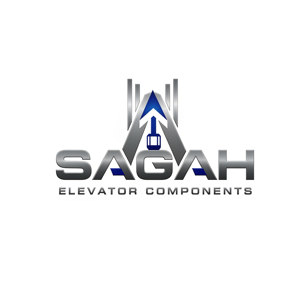
Create a sleek, modern, industrial logo for SAGAH, a company specializing in elevator parts and lift components. The logo should visually communicate innovation, precision engineering, durability, safety, and upward mobility. Incorporate a smart, minimal symbol inspired by elevator rails, gears, pulleys, shafts, lift cabins, or vertical movement, blended into a clean geometric mark. The brand name SAGAH should appear in bold, custom sans-serif typography with a strong mechanical and corporate feel. Use a refined metallic and industrial palette with silver, graphite grey, black, and deep blue accents. The final logo should feel premium, technical, powerful, and internationally professional, suitable for a website header, signage, packaging, catalogs, and B2B branding. Keep the design minimal, memorable, scalable, and vector-friendly on a plain white background.is type s kuch chahti hu m b ki name hi aae alg s nhi like lifts components name k andr hi describe krde are meri website sagah ko jo ki niche likha ho elevator components or favicon icon kya rkhe iska kuch acha or unique btana is type s use kre to isi s related something unique sirf favicon icon it describes the gear actuatlly anfd our business is not for gear
by @Elephant_9847588
behave like a professional designer i want a logo for digital markeitng company name - DigiGenes i wnat minimal good conceptual logo deisgn i want D and G creatively in the logo the logo shoudl be minimal.. no exatra grpahical element needed.. onyl these two lette rin the logo no words needed onyl - D and g
by @Elephant_1901336

Design a world-class minimalist logo for "Dadekavan" (دادهکاوان), a technology company specializing in digital transformation of laboratory operations, healthcare software, laboratory information systems, data intelligence, quality management, business intelligence, and paperless workflows. The logo must be built primarily from the letter "D" and represent the company's core mission: Transforming paper-based laboratory processes into intelligent digital ecosystems. The design should follow a layered discovery approach: At first glance, the viewer should only recognize a strong, elegant, geometric letter "D". At second glance, subtle visual cues should reveal a digital document or paper sheet integrated within the structure. At third glance, the document should appear to transform into connected data nodes, information flow, or intelligent data structures. At the deepest level, a minimal leaf should emerge naturally through negative space, symbolizing sustainability, environmental responsibility, and the reduction of paper consumption. The leaf must NEVER be obvious or decorative. It should function as a hidden detail that is discovered gradually, creating a memorable and intelligent visual experience. The symbol must seamlessly communicate: • Data Intelligence • Digital Transformation • Paperless Laboratories • Innovation • Trust • Sustainability • Scientific Accuracy • Knowledge and Analytics Visual hierarchy is extremely important: Level 1 → Letter D Level 2 → Digital Document Level 3 → Data Transformation Level 4 → Hidden Sustainability Symbol Avoid all clichés: * No microscope * No DNA helix * No test tube * No blood drop * No healthcare cross * No AI brain * No circuit board graphics * No obvious leaf icon * No recycling symbol Design characteristics: * Ultra minimal * Geometric construction * Soft and slightly rounded corners * Clean negative space * Swiss-inspired design * Timeless corporate identity * Premium technology aesthetic * Modern but not trendy * Highly scalable * Distinctive in small sizes * Perfect balance and proportions * Monochrome black and white only The logo should feel suitable for a company that develops software, hardware, educational platforms, artificial intelligence solutions, laboratory management systems, and future technology products. Create a professional identity presentation including: 1. Symbol only 2. Vertical logo 3. Horizontal logo 4. English logotype: Dadekavan 5. Persian logotype: دادهکاوان 6. Construction grid 7. Negative space explanation 8. Concept breakdown layers 9. Black version 10. White version 11. Business card mockup 12. Software dashboard mockup 13. Laboratory environment mockup 14. Academy branding mockup 15. Corporate stationery mockup The final result should look like a premium international branding project created by Pentagram, DesignStudio, Collins, or Wolff Olins. The symbol must prioritize strategic meaning, visual intelligence, and memorability over decoration. The hidden meanings should be discovered progressively rather than revealed immediately.
by @Elephant_6951338
Design a premium minimal logo for "PulseVeda". ICON: A clean infinity symbol (∞) where the LEFT loop interior contains a fingerprint whorl pattern — integrated smoothly, not pasted inside a circle. NO separate circle border around the fingerprint. The fingerprint lines should follow the natural curve of the infinity loop itself. The RIGHT loop should be completely EMPTY — clean negative space only. No dot, no eye, no ECG wave added. The entire icon = ONE continuous monoline stroke. Uniform line weight throughout — no thick/thin variation. STRICTLY NO: - No separate circle frames - No ECG/heartbeat wave - No dot or eye shape on right side - No gold border rings - No dual outlines COLORS: - Single color: Deep Navy #0A1F5C only - White background TYPOGRAPHY: - PULSE bold, VEDA regular weight - Wide letter spacing on VEDA - Clean modern font, centered below icon Style: luxury, minimal, flat vector, single color icon
by @Elephant_7291645
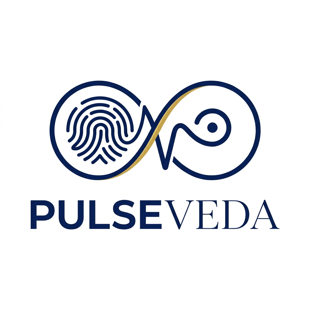
Design a premium, luxury logo for "PulseVeda" — an Ayurvedic pulse diagnosis brand. UNIQUE ICON CONCEPT: A single unbroken continuous line that forms both the shape of an "infinity symbol (∞)" and hidden within it — one side resembles a human fingerprint whorl, the other side forms an abstract Bindu (the sacred Ayurvedic dot of origin/energy). The line itself IS the pulse — its thickness varies like a real pulse rhythm, thin to thick to thin — but NO traditional ECG wave shape at all. This is NOT a medical logo. This is a high-end wellness technology brand logo. DESIGN RULES: - Strictly flat — absolutely zero gradients, shadows, glow, 3D, texture, lighting - Monoline or variable-width single continuous line icon - Negative space used intelligently — the icon should reveal meaning only on close inspection - Transparent background, scalable vector - No human body parts shown literally - No lotus, no leaf, no ECG line, no heartbeat wave COLORS: - Deep Royal Blue: #0A1F5C - Warm Gold: #C9A84C (line accent or thin stroke only) - Clean white negative space TYPOGRAPHY: - "PulseVeda" as wordmark below icon - "Pulse" — sharp, modern, geometric uppercase - "Veda" — same size but with micro-thin serif strokes on terminals only — luxury contrast - Letter spacing: wide tracking on "VEDA" (+80 to +120) FEELING: Think Rolex meets Ayurveda. Not a hospital. Not a startup. A premium ancient-modern brand. OUTPUT: - Flat logo mark only - No mockups, no devices, no packaging shown - Transparent or pure white background - Client-ready vector-clean result flat vector, monoline, luxury brand, negative space logo, premium minimal, no shadow, no gradient, no mockup, no ECG wave, no lotus, no body parts
by @Elephant_7291645
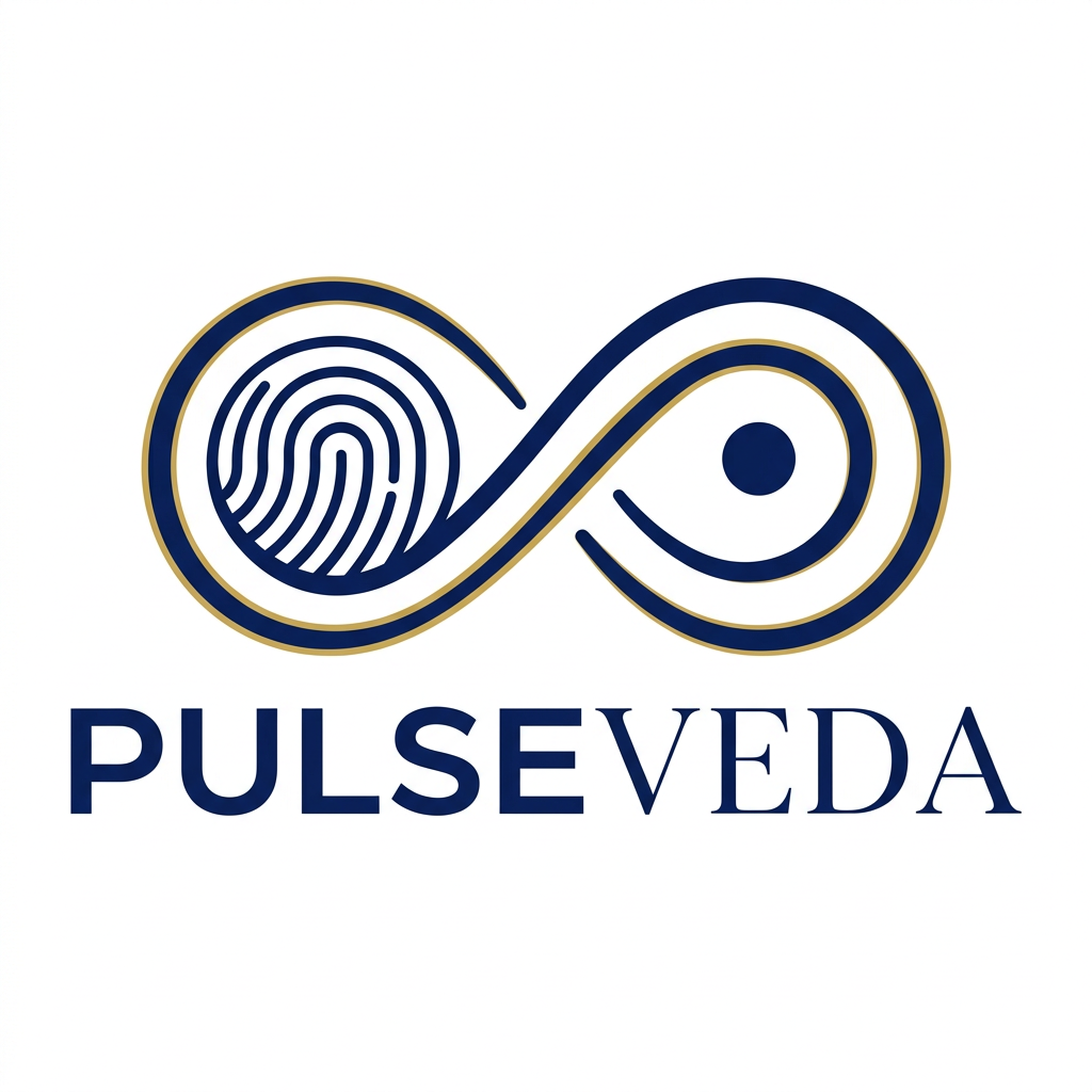
Design a premium, luxury logo for "PulseVeda" — an Ayurvedic pulse diagnosis brand. UNIQUE ICON CONCEPT: A single unbroken continuous line that forms both the shape of an "infinity symbol (∞)" and hidden within it — one side resembles a human fingerprint whorl, the other side forms an abstract Bindu (the sacred Ayurvedic dot of origin/energy). The line itself IS the pulse — its thickness varies like a real pulse rhythm, thin to thick to thin — but NO traditional ECG wave shape at all. This is NOT a medical logo. This is a high-end wellness technology brand logo. DESIGN RULES: - Strictly flat — absolutely zero gradients, shadows, glow, 3D, texture, lighting - Monoline or variable-width single continuous line icon - Negative space used intelligently — the icon should reveal meaning only on close inspection - Transparent background, scalable vector - No human body parts shown literally - No lotus, no leaf, no ECG line, no heartbeat wave COLORS: - Deep Royal Blue: #0A1F5C - Warm Gold: #C9A84C (line accent or thin stroke only) - Clean white negative space TYPOGRAPHY: - "PulseVeda" as wordmark below icon - "Pulse" — sharp, modern, geometric uppercase - "Veda" — same size but with micro-thin serif strokes on terminals only — luxury contrast - Letter spacing: wide tracking on "VEDA" (+80 to +120) FEELING: Think Rolex meets Ayurveda. Not a hospital. Not a startup. A premium ancient-modern brand. OUTPUT: - Flat logo mark only - No mockups, no devices, no packaging shown - Transparent or pure white background - Client-ready vector-clean result flat vector, monoline, luxury brand, negative space logo, premium minimal, no shadow, no gradient, no mockup, no ECG wave, no lotus, no body parts
by @Elephant_7291645
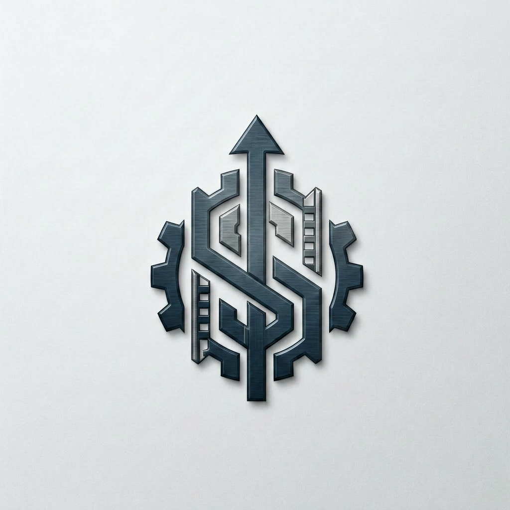
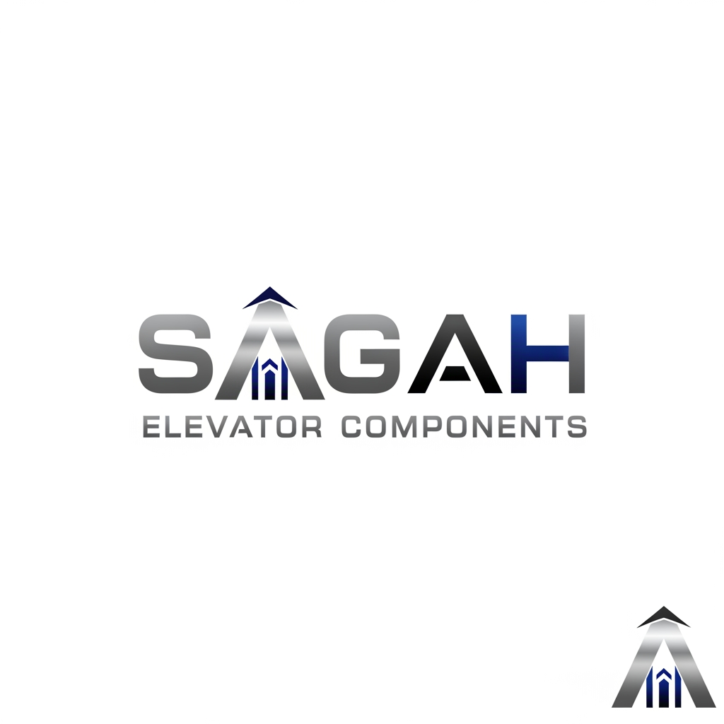
Create a sleek, modern, industrial logo for SAGAH, a company specializing in elevator parts and lift components. The logo should visually communicate innovation, precision engineering, durability, safety, and upward mobility. Incorporate a smart, minimal symbol inspired by elevator rails, gears, pulleys, shafts, lift cabins, or vertical movement, blended into a clean geometric mark. The brand name SAGAH should appear in bold, custom sans-serif typography with a strong mechanical and corporate feel. Use a refined metallic and industrial palette with silver, graphite grey, black, and deep blue accents. The final logo should feel premium, technical, powerful, and internationally professional, suitable for a website header, signage, packaging, catalogs, and B2B branding. Keep the design minimal, memorable, scalable, and vector-friendly on a plain white background.is type s kuch chahti hu m b ki name hi aae alg s nhi like lifts components name k andr hi describe krde are meri website sagah ko jo ki niche likha ho elevator components or favicon icon kya rkhe iska kuch acha or unique btana is type s use kre to isi s related something unique sirf favicon icon do y wala only design favvicon icon
by @Elephant_9847588
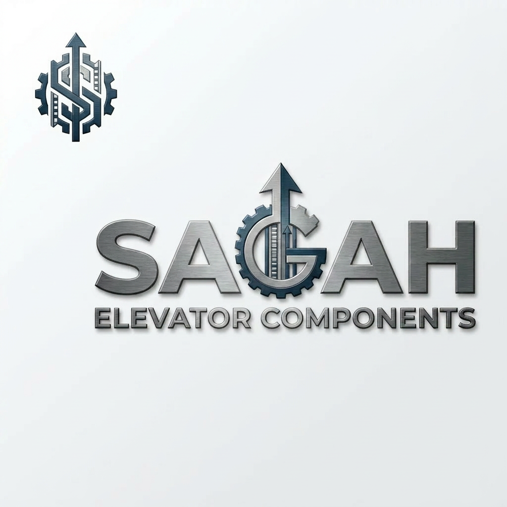
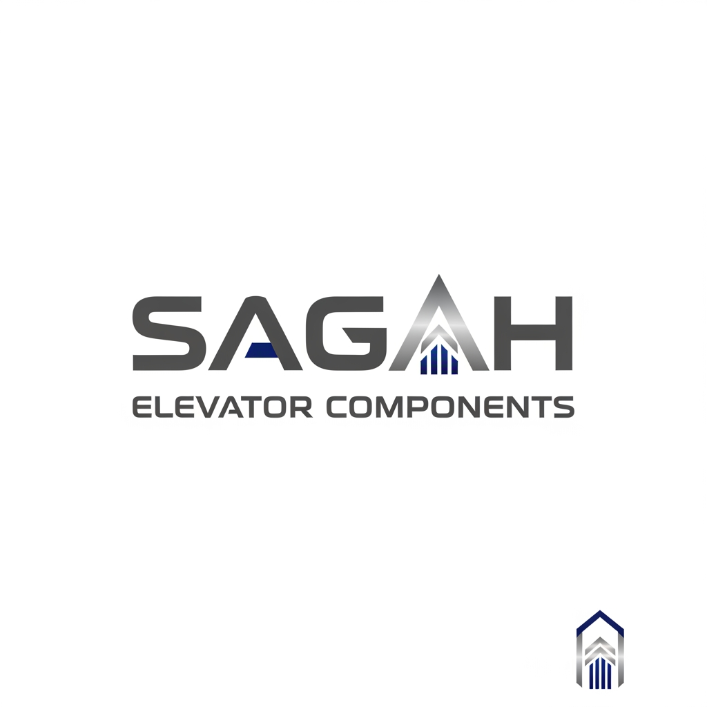
Create a sleek, modern, industrial logo for SAGAH, a company specializing in elevator parts and lift components. The logo should visually communicate innovation, precision engineering, durability, safety, and upward mobility. Incorporate a smart, minimal symbol inspired by elevator rails, gears, pulleys, shafts, lift cabins, or vertical movement, blended into a clean geometric mark. The brand name SAGAH should appear in bold, custom sans-serif typography with a strong mechanical and corporate feel. Use a refined metallic and industrial palette with silver, graphite grey, black, and deep blue accents. The final logo should feel premium, technical, powerful, and internationally professional, suitable for a website header, signage, packaging, catalogs, and B2B branding. Keep the design minimal, memorable, scalable, and vector-friendly on a plain white background.is type s kuch chahti hu m b ki name hi aae alg s nhi like lifts components name k andr hi describe krde are meri website sagah ko jo ki niche likha ho elevator components or favicon icon kya rkhe iska kuch acha or unique btana is type s use kre to isi s related something unique sirf favicon icon do y wala
by @Elephant_9847588
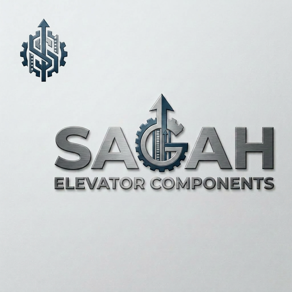
Create a sleek, modern, industrial logo for SAGAH, a company specializing in elevator parts and lift components. The logo should visually communicate innovation, precision engineering, durability, safety, and upward mobility. Incorporate a smart, minimal symbol inspired by elevator rails, gears, pulleys, shafts, lift cabins, or vertical movement, blended into a clean geometric mark. The brand name SAGAH should appear in bold, custom sans-serif typography with a strong mechanical and corporate feel. Use a refined metallic and industrial palette with silver, graphite grey, black, and deep blue accents. The final logo should feel premium, technical, powerful, and internationally professional, suitable for a website header, signage, packaging, catalogs, and B2B branding. Keep the design minimal, memorable, scalable, and vector-friendly on a plain white background.is type s kuch chahti hu m b ki name hi aae alg s nhi like lifts components name k andr hi describe krde are meri website sagah ko jo ki niche likha ho elevator components or favicon icon kya rkhe iska kuch acha or unique btana is type s use kre to isi s related something unique
by @Elephant_9847588
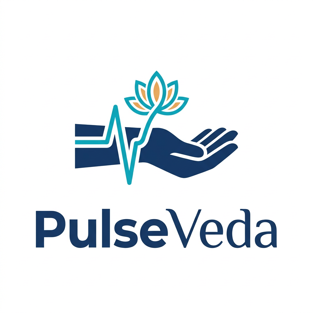
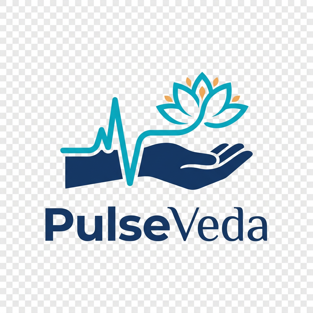
Create a flat vector logo for a brand called "PulseVeda". This is an Ayurvedic pulse diagnosis machine brand. ICON CONCEPT: A stylized human wrist/hand with a clean ECG pulse wave running across it. The pulse wave should subtly form or connect into a lotus flower at its peak — symbolizing the meeting of modern pulse technology and Ayurvedic healing. DESIGN RULES: - Strictly flat design — zero gradients, zero shadows, zero 3D effects - No glow, no lighting, no bevel, no texture - Clean crisp vector shapes only - Transparent background - Logo must look great on both white and dark backgrounds COLORS: - Deep Navy Blue: #1A3A6B (main icon and text) - Teal/Cyan: #00B4D8 (pulse wave line) - Amber Gold: #F4A261 (lotus accent only — minimal use) - White space as breathing room TYPOGRAPHY: - Brand name: PulseVeda - "Pulse" — bold, modern geometric sans-serif - "Veda" — slightly lighter weight, subtle classic feel - Text placed below or beside the icon OUTPUT REQUIREMENTS: - Pure logo only — no mockups, no devices, no backgrounds - No packaging, no phone screens, no business cards shown - Transparent or white background only - Final result should be client-ready flat logo
by @Elephant_7291645


What's next?Explore more features
Go from browse to build