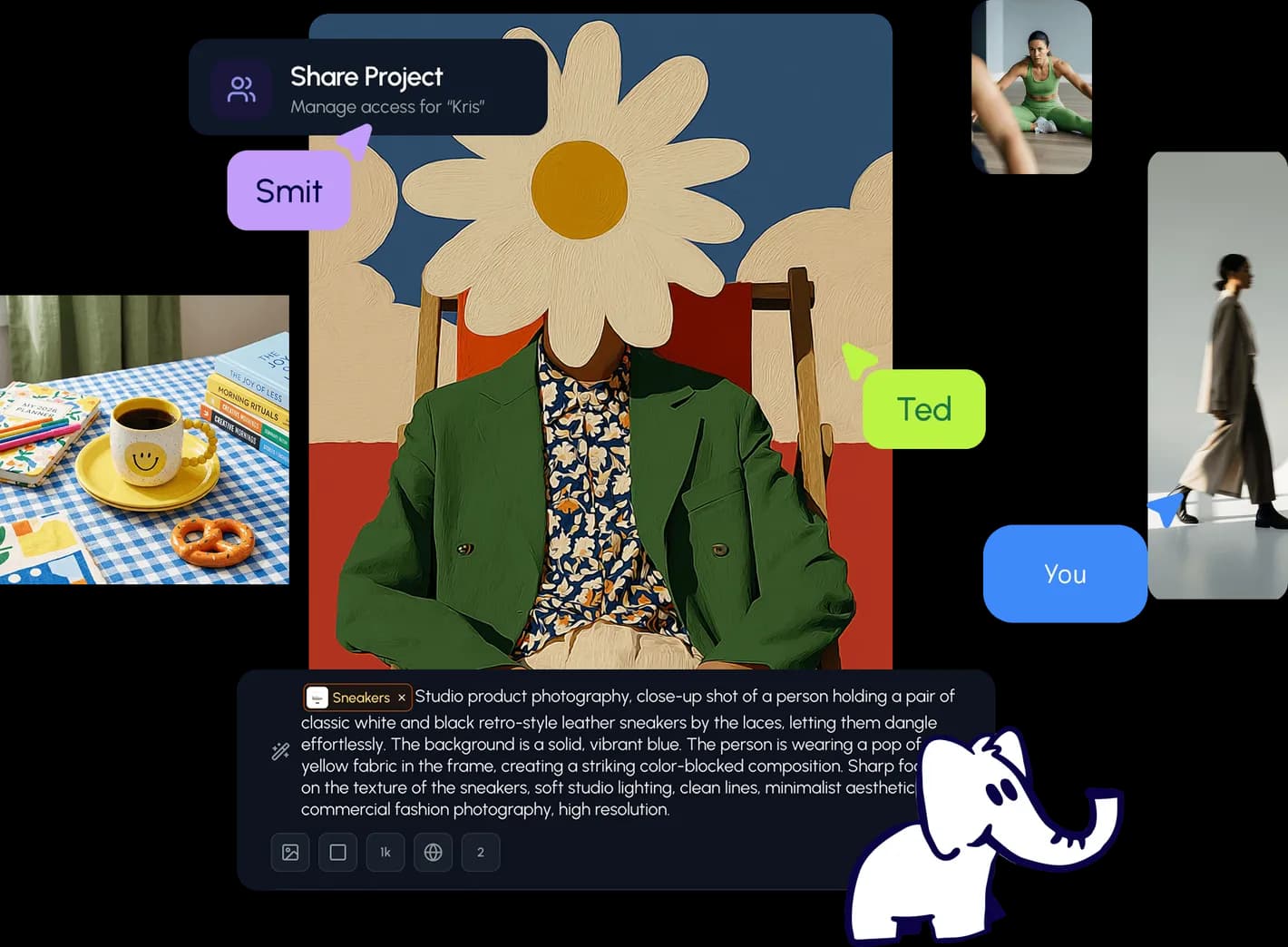
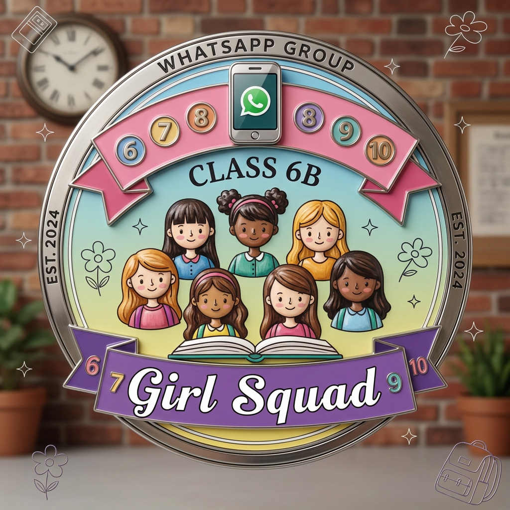
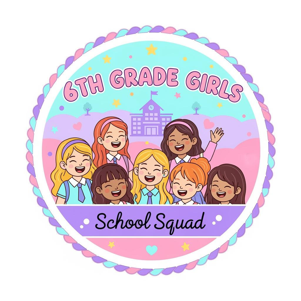
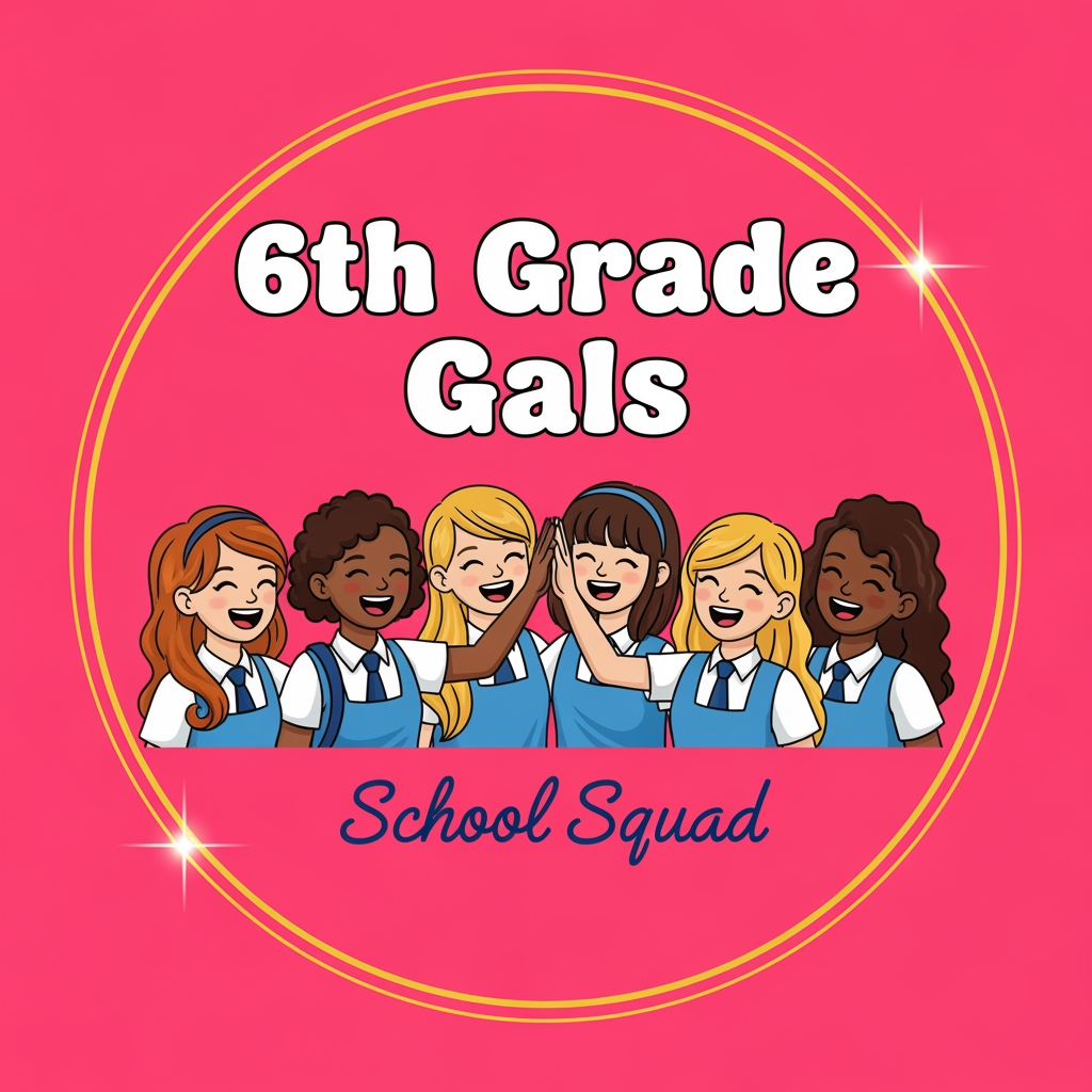
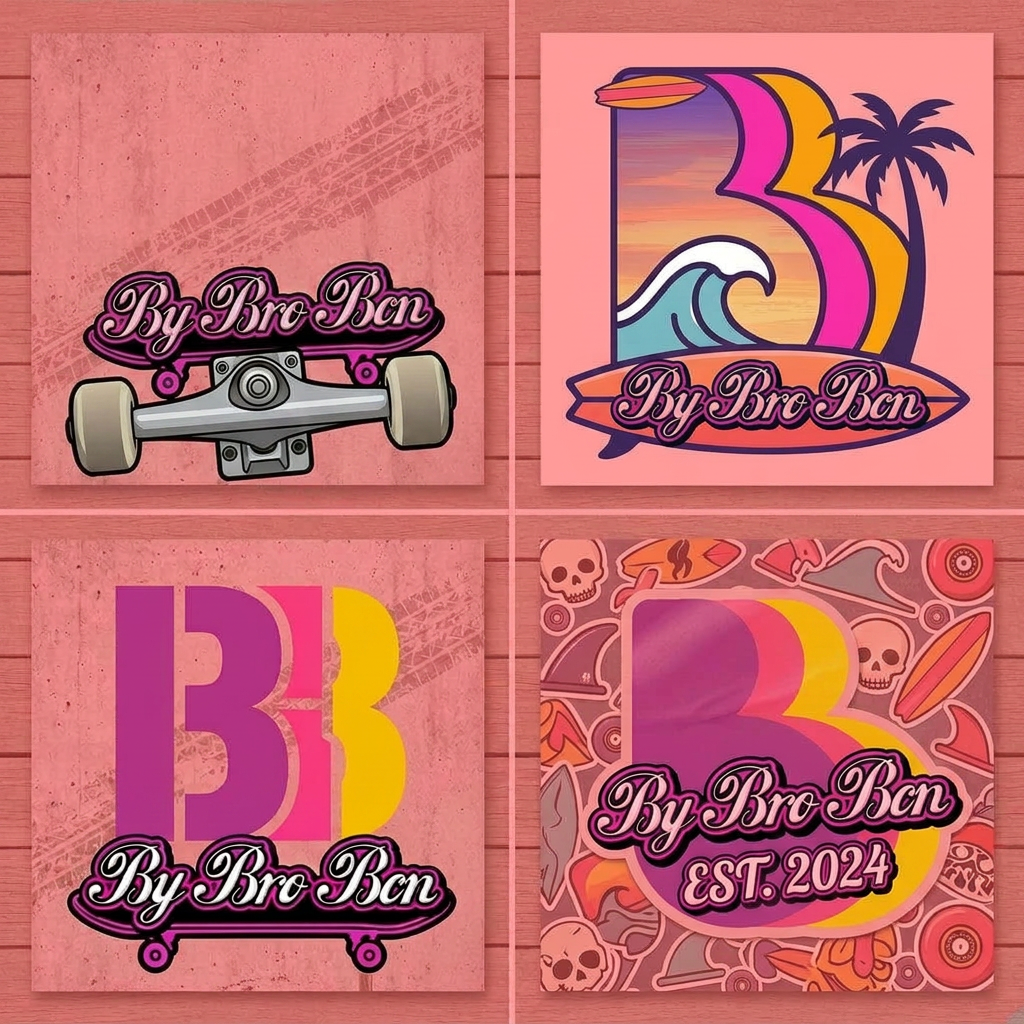
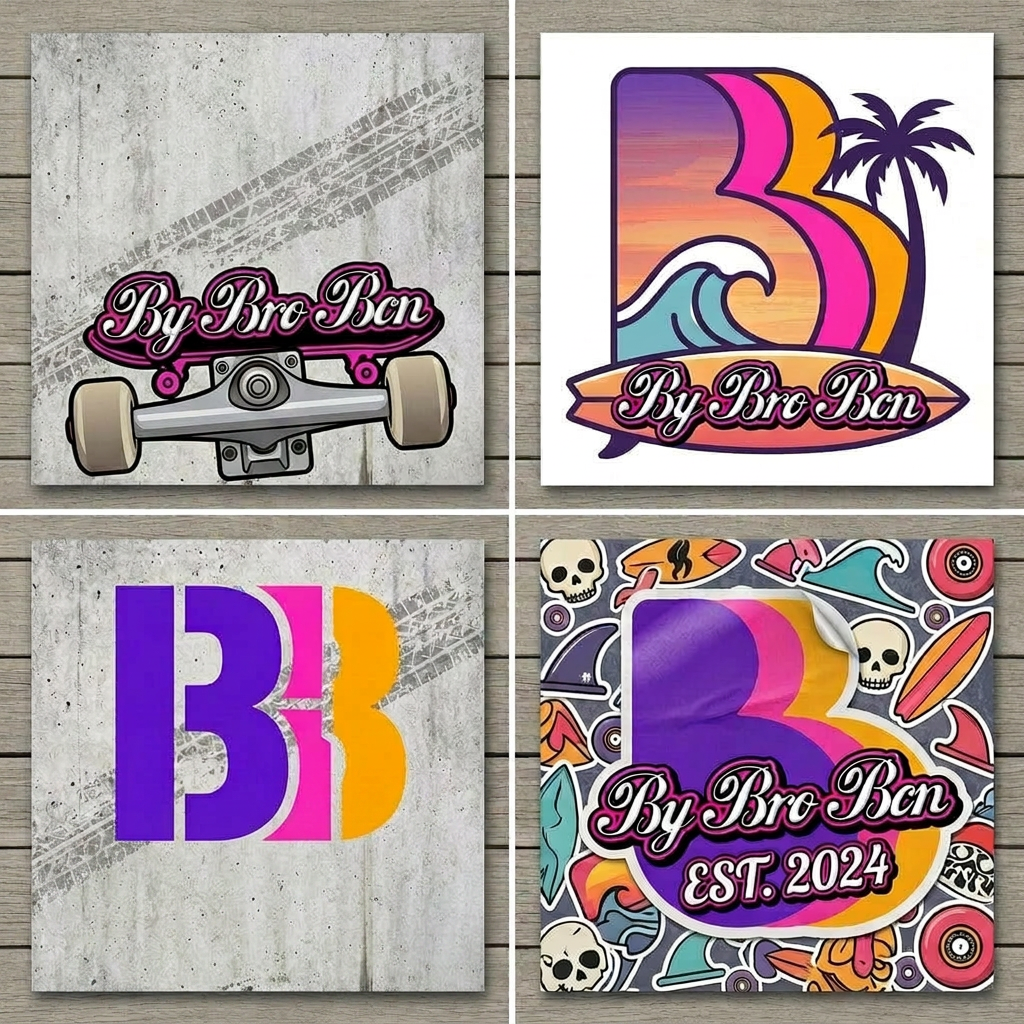
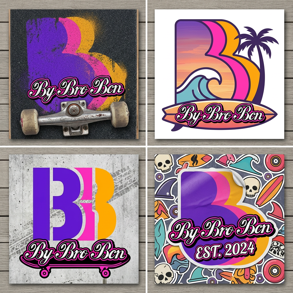
Community showcase
Designs made by our community
Explore unique graphic designs and images crafted by creators around the world using Hiding Elephant's AI design tools. Get inspired and start creating.


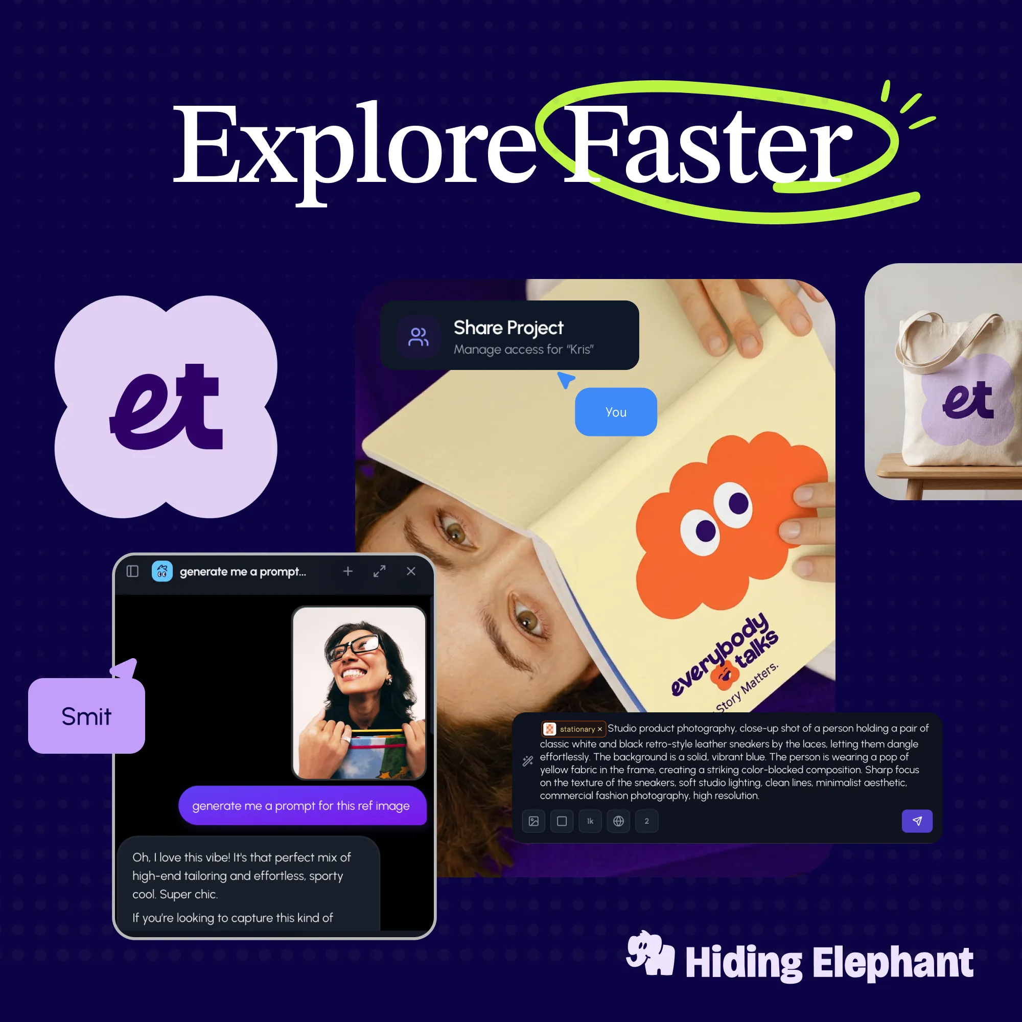
What's next?Explore more features
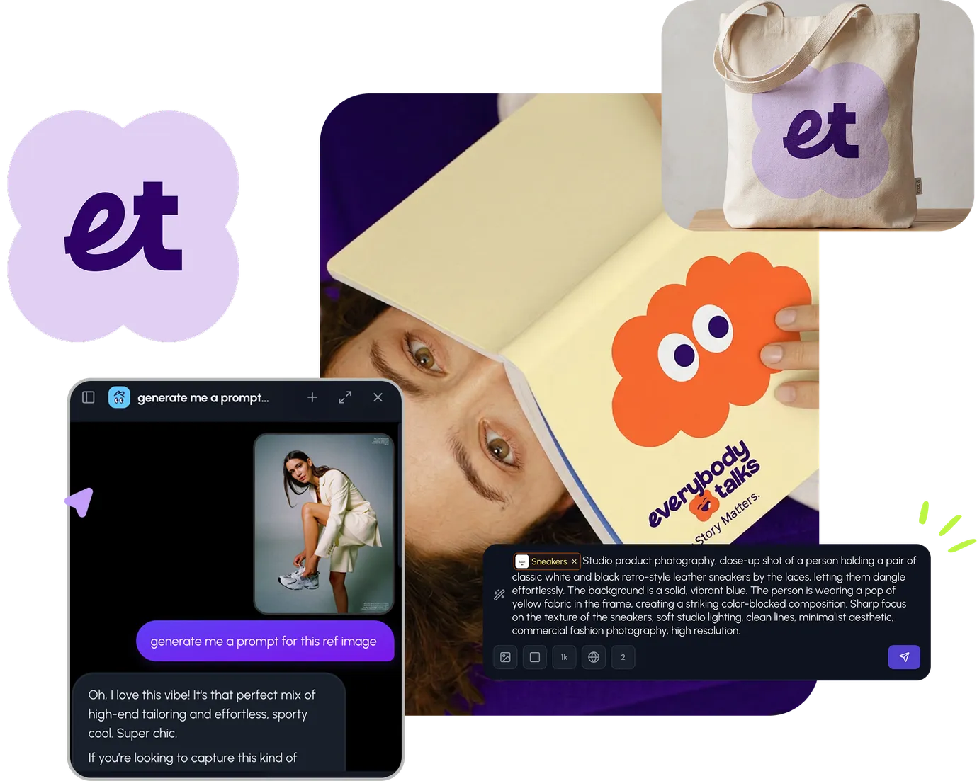
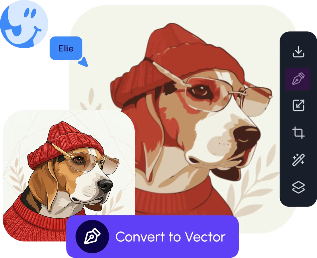
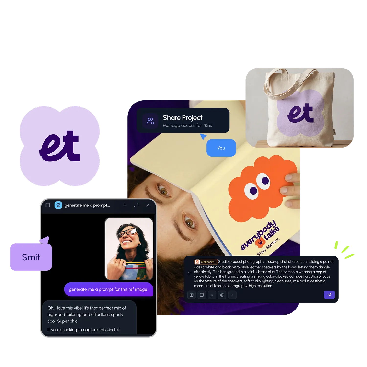
Go from browse to build