Designs made by our community
Explore unique graphic designs and images crafted by creators around the world using Hiding Elephant's AI design tools. Get inspired and start creating.

A minimalist and elegant logo design for a crochet business featuring a delicate, stylized yarn ball intertwined with a tiny crescent moon. The aesthetic uses a soft pastel color palette with warm, inviting tones, clean vector lines, and a professional serif typography style. The overall composition is balanced and centered, conveying warmth, creativity, and handcrafted quality.
by @Elephant_1425434


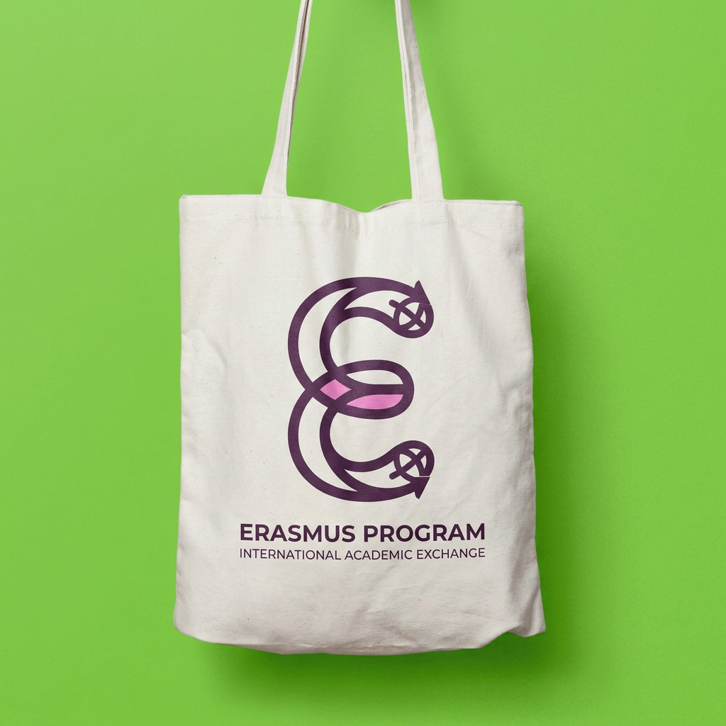
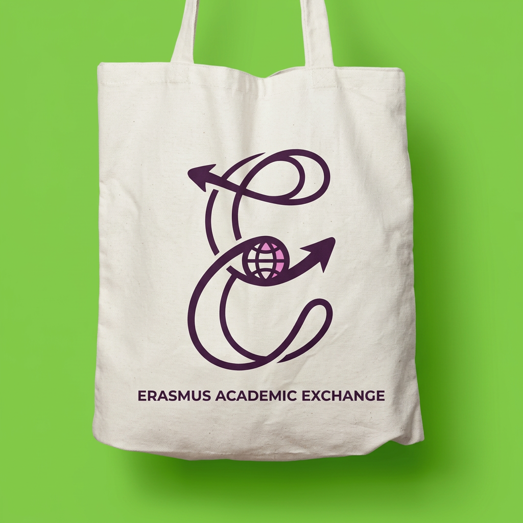
A minimalist and professional pictogram logo design for an academic program. The central element is the letter "E" (representing Erasmus), creatively stylized to symbolize union, connection, and international student exchange. The "E" should be formed by interlocking shapes, continuous fluid lines, or two elements embracing each other to represent different cultures coming together.
by @Elephant_9791845

A minimalist and professional pictogram logo design for an academic program. The central element is the letter "E" (representing Erasmus), creatively stylized to symbolize union, connection, and international student exchange. The "E" should be formed by interlocking shapes, continuous fluid lines, or two elements embracing each other to represent different cultures coming together. Subtle curves referencing the sea waves of Pescara. Clean vector graphics, flat design, modern corporate identity, negative space. Colors: institutional deep blue and vibrant energetic orange. White background, high resolution, Dribbble style, UI/UX logo design, symmetrical balance, vector art --no text, typography, letters other than E, realistic details, 3D --v 6.0
by @Elephant_9791845

A minimalist and quirky symbolic logo for a digital media brand, featuring an abstract geometric icon that represents connection, discourse, and growth. Use a vibrant, modern Gen-Z inspired color palette with electric violet and acid lime accents against a clean, matte background. The design should feel bold, energetic, and professional, suitable for both a YouTube channel and a marketing agency, emphasizing clean vector lines and a high-contrast, memorable silhouette.
by @Elephant_8681920


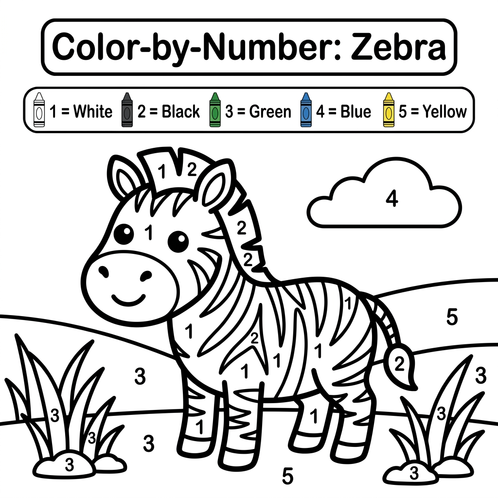
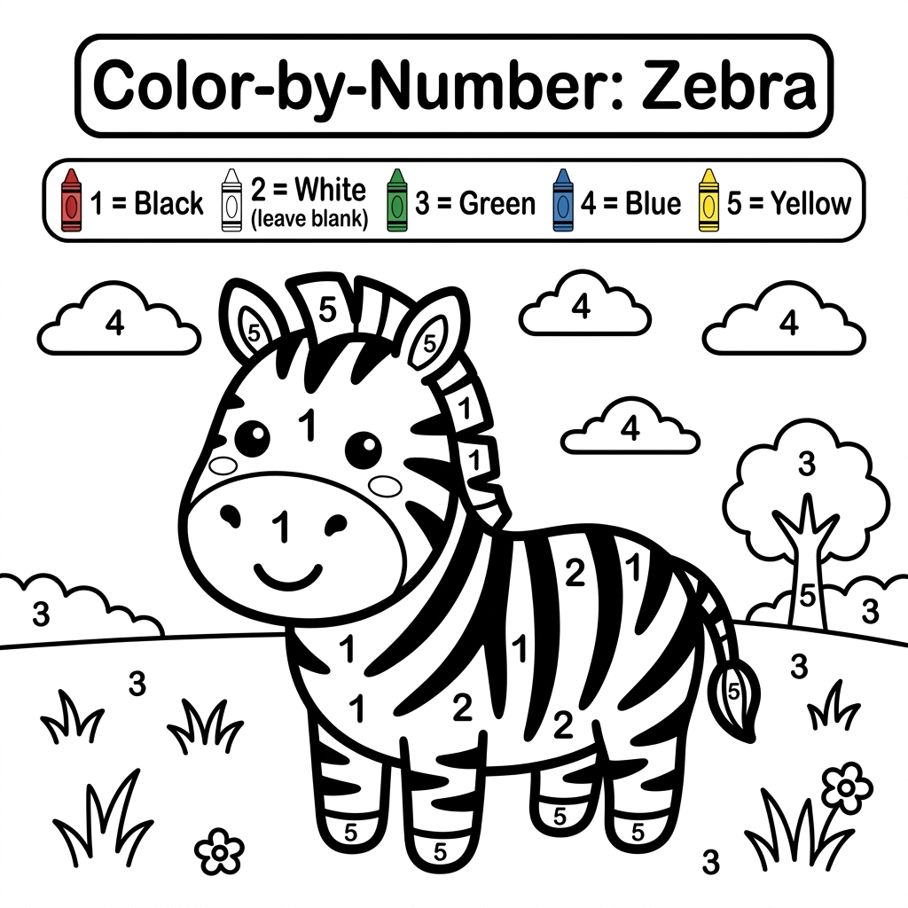
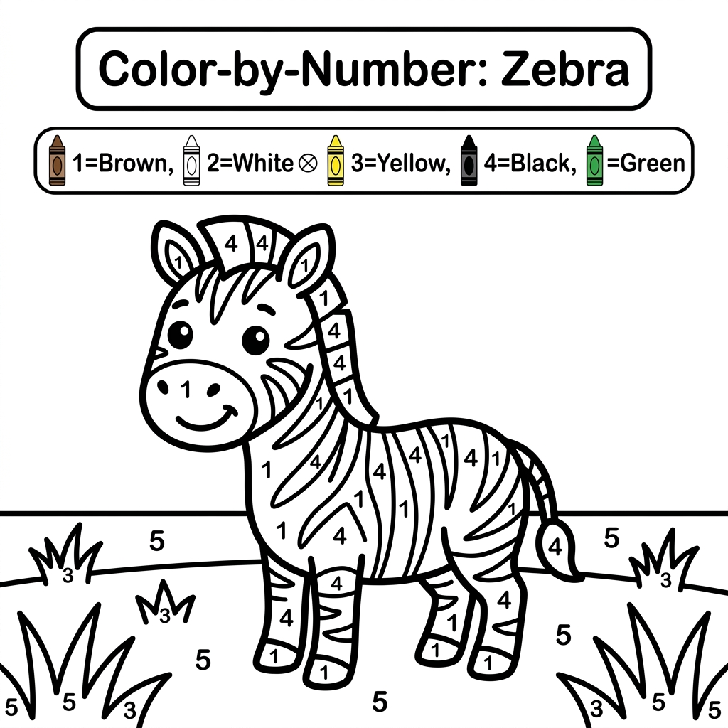
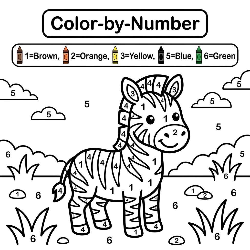
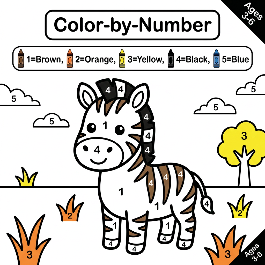
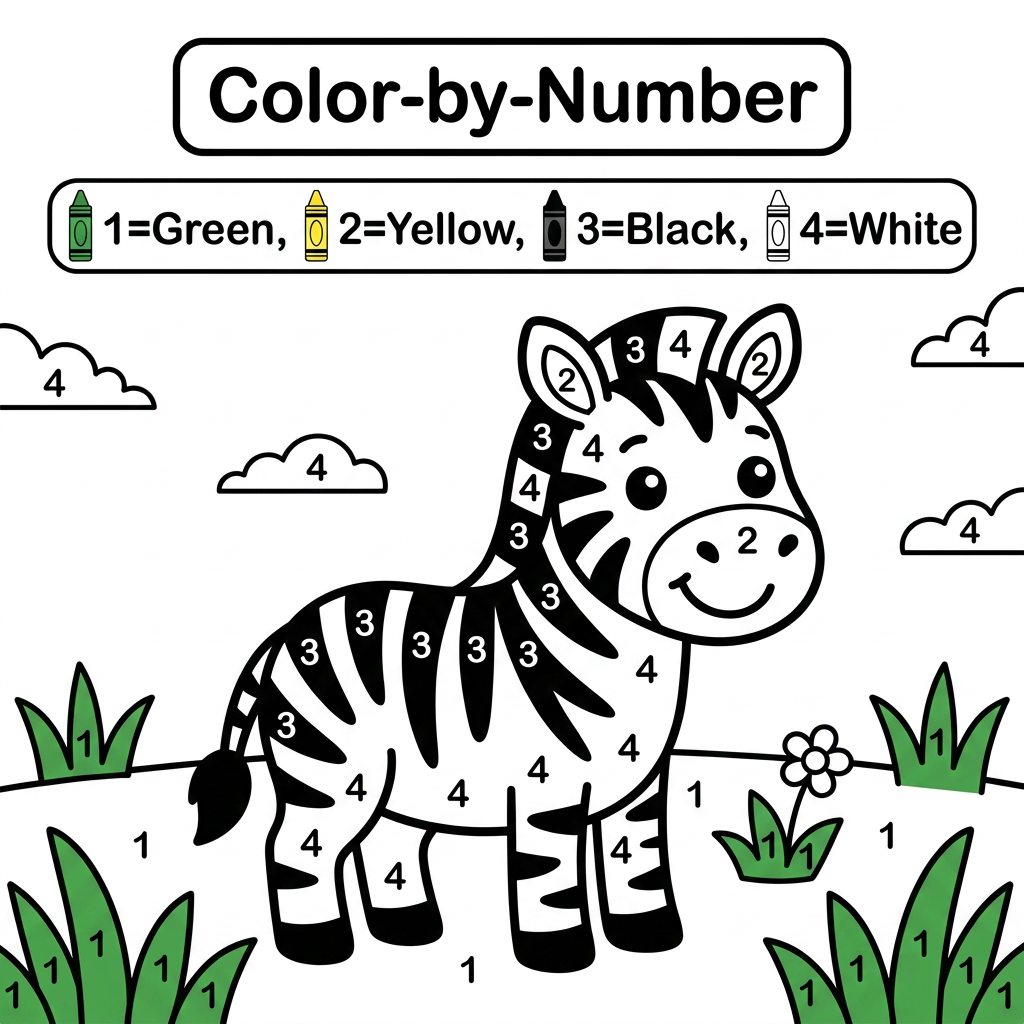
Create a black and white Color-by-Number activity page for children ages 3–6 featuring a cute smiling zebra standing in a simple grass field. The zebra should have large simple coloring sections labeled with numbers . Include a color key with crayon colors. Use thick bold outlines, large easy-to-color spaces, simple preschool-friendly cartoon style, educational worksheet design, white background, no shading, high contrast, printable 8.5 x 11 inch page, suitable for an Amazon KDP activity book.
by @Elephant_9191914


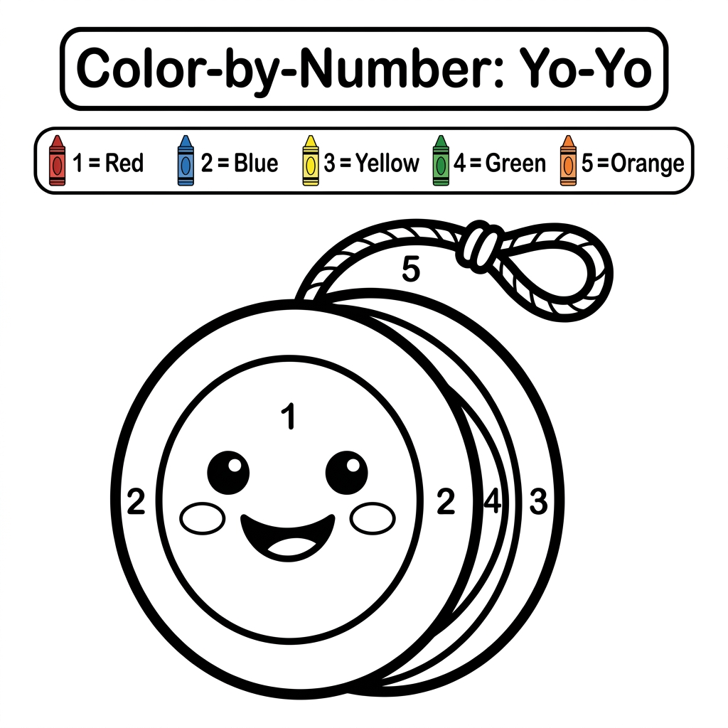
Create a black and white Color-by-Number activity page for children ages 3–6 featuring a cute colorful yo-yo with a smiling face and string. The illustration should have large simple coloring sections labeled with numbers . Include a color key with crayon colors. Use thick bold outlines, large easy-to-color spaces, simple preschool-friendly cartoon style, educational worksheet design, white background, no shading, high contrast, printable 8.5 x 11 inch page, suitable for an Amazon KDP activity book.
by @Elephant_9191914
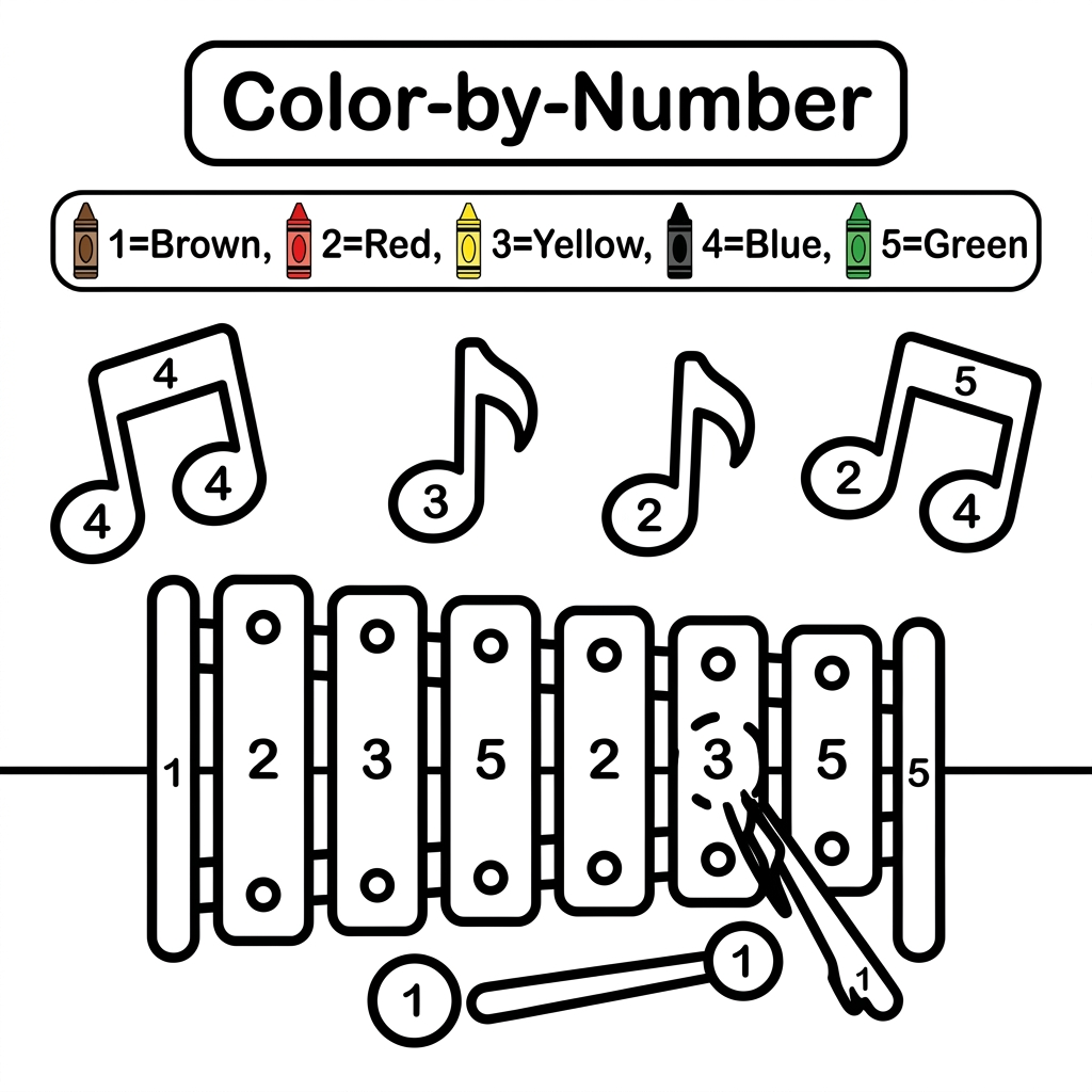
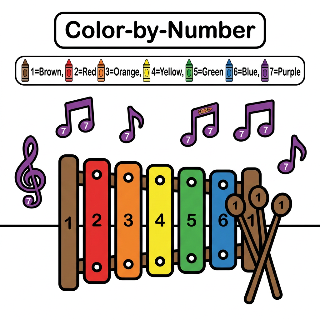
Create a black and white Color-by-Number activity page for children ages 3–6 featuring a cute xylophone with colorful music notes around it. The illustration should have large simple coloring sections labeled with numbers . Include a color key with crayon colors. Use thick bold outlines, large easy-to-color spaces, simple preschool-friendly cartoon style, educational worksheet design, white background, no shading, high contrast, printable 8.5 x 11 inch page, suitable for an Amazon KDP activity book.
by @Elephant_9191914
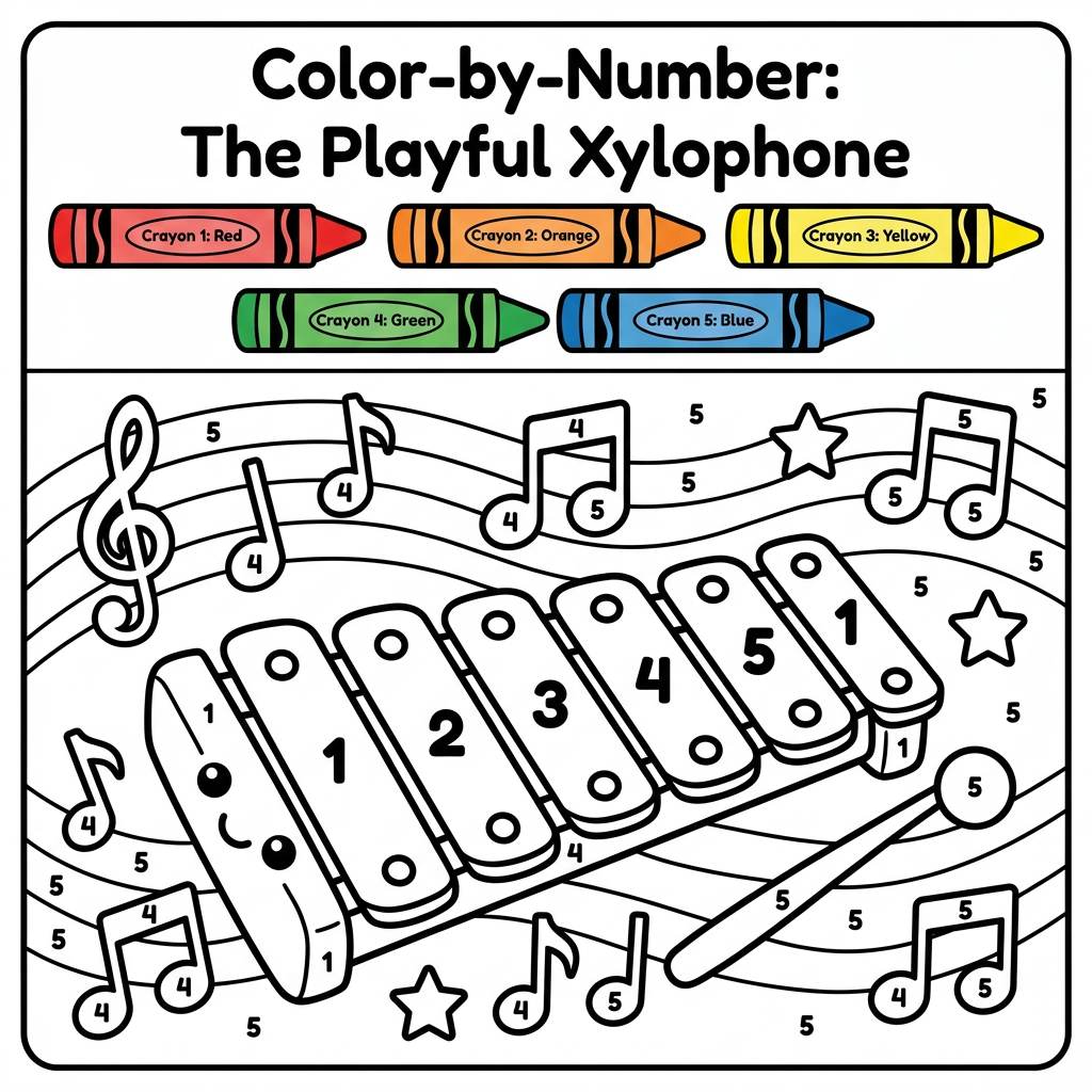
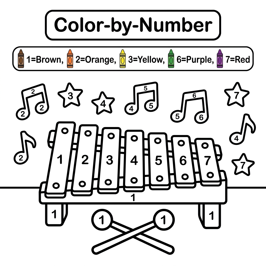
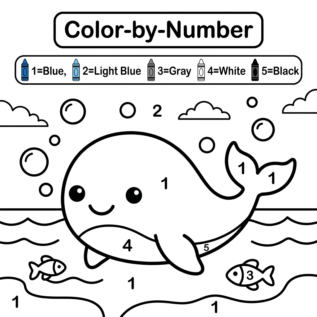
Create a black and white Color-by-Number activity page for children ages 3–6 featuring a cute smiling whale swimming in the ocean with simple bubbles. The illustration should have large simple coloring sections labeled with numbers . Include a color key with crayon colors. Use thick bold outlines, large easy-to-color spaces, simple preschool-friendly cartoon style, educational worksheet design, white background, no shading, high contrast, printable 8.5 x 11 inch page, suitable for an Amazon KDP activity book.
by @Elephant_9191914
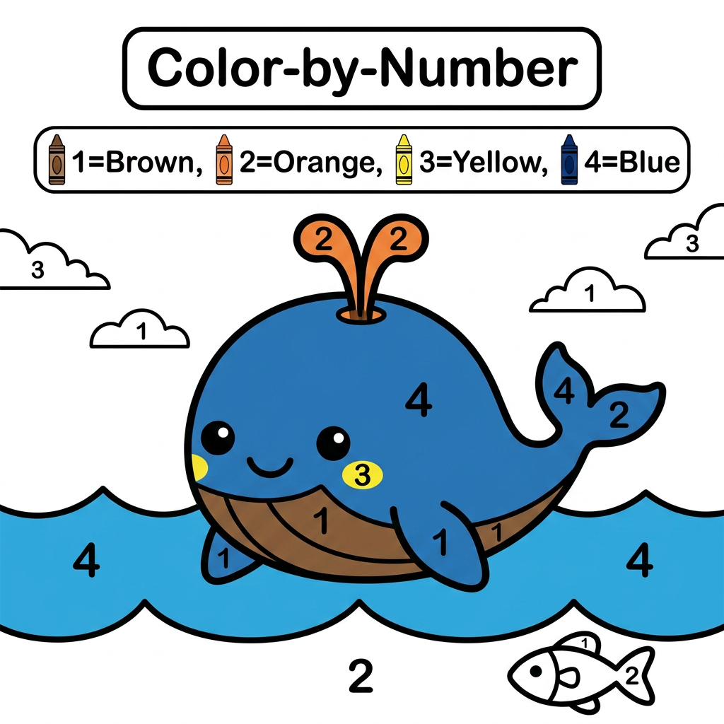
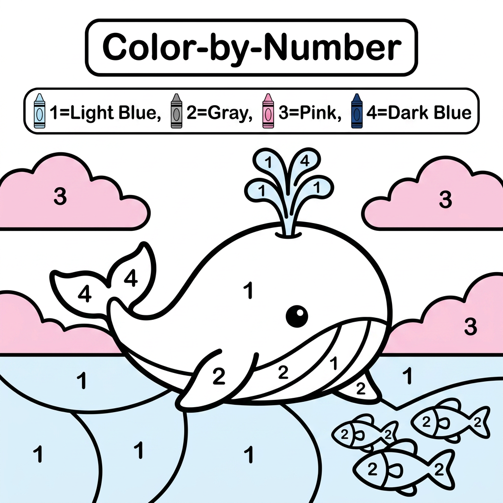
Create a black and white Color-by-Number activity page for children ages 3–6 featuring a cute whale. The illustration should have large simple coloring sections labeled with numbers . Include a color key with crayon colors. Use thick bold outlines, large easy-to-color spaces, simple preschool-friendly cartoon style, educational worksheet design, white background, no shading, high contrast, printable 8.5 x 11 inch page, suitable for an Amazon KDP activity book.
by @Elephant_9191914
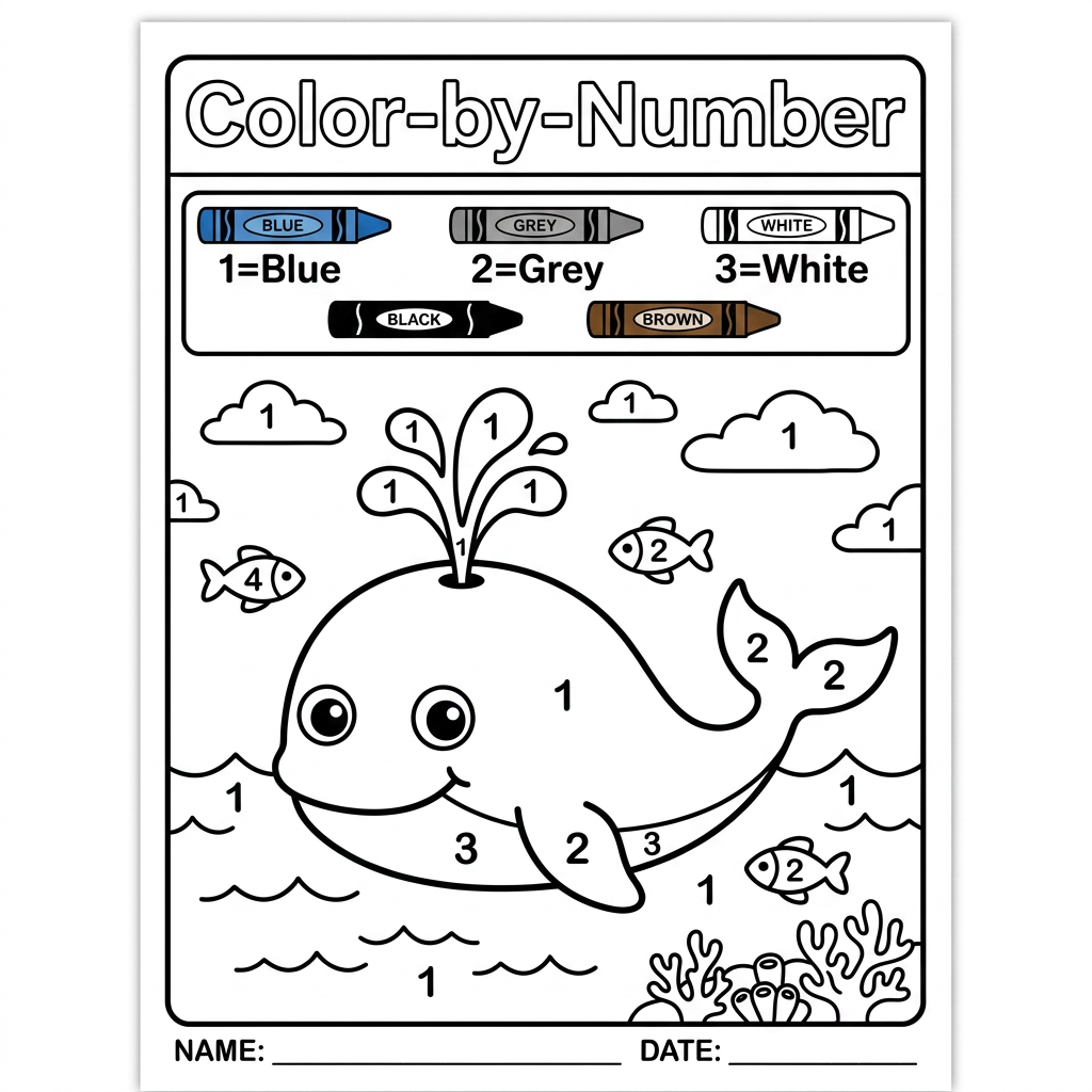
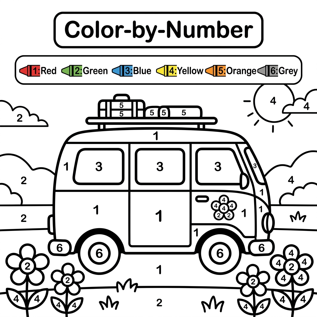
Create a black and white Color-by-Number activity page for children ages 3–6 featuring a cute van. The illustration should have large simple coloring sections labeled with numbers . Include a color key with crayon colors. Use thick bold outlines, large easy-to-color spaces, simple preschool-friendly cartoon style, educational worksheet design, white background, no shading, high contrast, printable 8.5 x 11 inch page, suitable for an Amazon KDP activity book.
by @Elephant_9191914
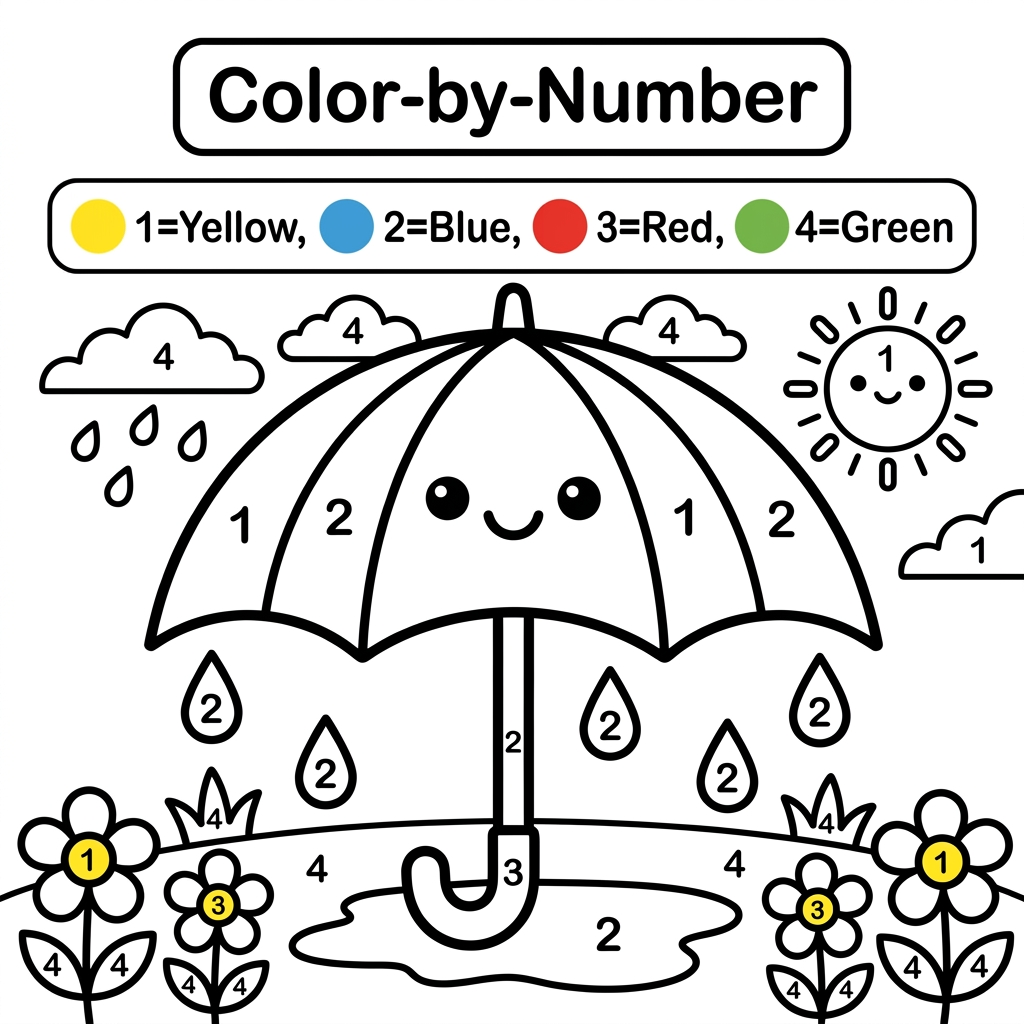
Create a black and white Color-by-Number activity page for children ages 3–6 featuring a cute umbrella. The illustration should have large simple coloring sections labeled with numbers . Include a color key with crayon colors. Use thick bold outlines, large easy-to-color spaces, simple preschool-friendly cartoon style, educational worksheet design, white background, no shading, high contrast, printable 8.5 x 11 inch page, suitable for an Amazon KDP activity book.
by @Elephant_9191914
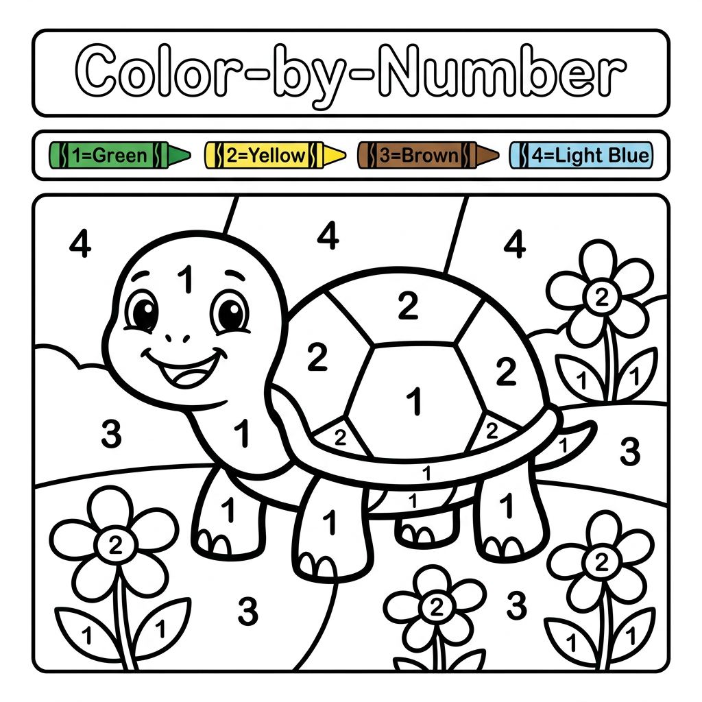
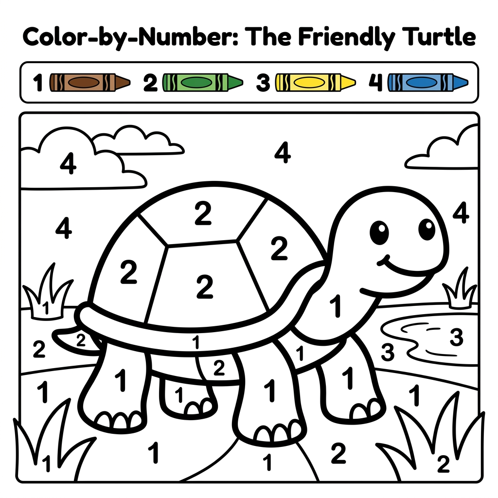
Create a black and white Color-by-Number activity page for children ages 3–6 featuring a cute turtle. The illustration should have large simple coloring sections labeled with numbers . Include a color key with crayon colors. Use thick bold outlines, large easy-to-color spaces, simple preschool-friendly cartoon style, educational worksheet design, white background, no shading, high contrast, printable 8.5 x 11 inch page, suitable for an Amazon KDP activity book.
by @Elephant_9191914
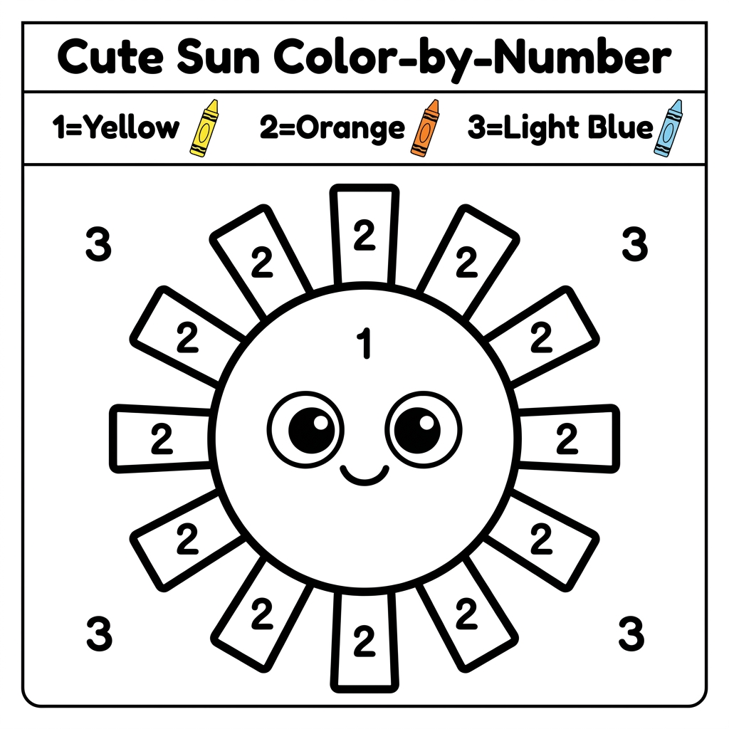
Create a black and white Color-by-Number activity page for children ages 3–6 featuring a cute sun. The illustration should have large simple coloring sections labeled with numbers . Include a color key with crayon colors. Use thick bold outlines, large easy-to-color spaces, simple preschool-friendly cartoon style, educational worksheet design, white background, no shading, high contrast, printable 8.5 x 11 inch page, suitable for an Amazon KDP activity book.
by @Elephant_9191914
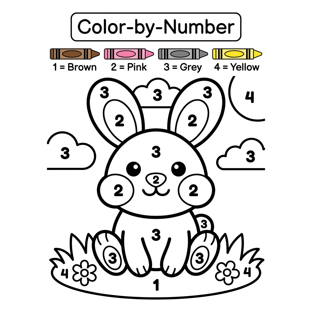
Create a black and white Color-by-Number activity page for children ages 3–6 featuring a cute rabbit. Large simple coloring sections with numbers. Include a color key with crayon colors. Thick bold outlines, large coloring spaces, simple preschool-friendly design, educational worksheet style, white background, printable 8.5 x 11 inch page, no shading, high contrast, suitable for Amazon KDP.
by @Elephant_9191914
What's next?Explore more features
Go from browse to build