Designs made by our community
Explore unique graphic designs and images crafted by creators around the world using Hiding Elephant's AI design tools. Get inspired and start creating.

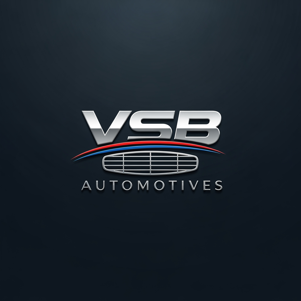





The best color combinations for a drug abuse logo depend entirely on the organization's core message: healing and recovery require calm, supportive tones, while awareness and prevention demand urgent, high-contrast colors.Here are the top color combinations grouped by their psychological impact:🏥 1. Healing, Hope & Recovery (Support Groups & Rehabs)These combinations focus on tranquility, health, renewal, and building a safe environment.Teal & Soft Grey: Represents emotional balance, clarity, and a modern, professional clinical approach.Deep Blue & Mint Green: Blue establishes deep trust and stability, while mint green symbolizes fresh starts, growth, and physical renewal.Sage Green & Warm Taupe: Earthy tones that promote grounding, nature-based healing, comfort, and restoration.⚠️ 2. Awareness, Prevention & Crisis Intervention (Charities & Helplines)These combinations use high contrast to grab attention, communicate urgency, and signify strength.Navy Blue & Bright Orange: Navy blue provides a stable, corporate foundation of trust, while vibrant orange injects energy, hope, and immediate visibility.Charcoal Grey & Citron Yellow: A serious, industrial dark grey represents the harsh reality, while a sharp yellow accent breaks through to symbolize hope and warning.Deep Purple & White: Purple is the official international awareness color for overdose awareness and recovery, representing dignity, solidarity, and respect.🚫 Colors to AvoidNeon Red & Pitch Black: This pairing creates extreme anxiety, feels overly punitive, and carries a heavy stigma rather than offering a path to help.Muddy Browns & Dull Greens: These tones can inadvertently trigger feelings of depression, stagnation, or decay.To help narrow down the perfect palette for your brand, tell me a bit more:What is the exact name or tagline of the organization?Who is the primary audience? (e.g., youth, worried parents, medical professionals, or individuals seeking help)What is the overall vibe you want to achieve? (e.g., authoritative and clinical, or warm and community-driven)
by @Elephant_7799343
The best color combinations for a drug abuse logo depend entirely on the organization's core message: healing and recovery require calm, supportive tones, while awareness and prevention demand urgent, high-contrast colors.Here are the top color combinations grouped by their psychological impact:🏥 1. Healing, Hope & Recovery (Support Groups & Rehabs)These combinations focus on tranquility, health, renewal, and building a safe environment.Teal & Soft Grey: Represents emotional balance, clarity, and a modern, professional clinical approach.Deep Blue & Mint Green: Blue establishes deep trust and stability, while mint green symbolizes fresh starts, growth, and physical renewal.Sage Green & Warm Taupe: Earthy tones that promote grounding, nature-based healing, comfort, and restoration.⚠️ 2. Awareness, Prevention & Crisis Intervention (Charities & Helplines)These combinations use high contrast to grab attention, communicate urgency, and signify strength.Navy Blue & Bright Orange: Navy blue provides a stable, corporate foundation of trust, while vibrant orange injects energy, hope, and immediate visibility.Charcoal Grey & Citron Yellow: A serious, industrial dark grey represents the harsh reality, while a sharp yellow accent breaks through to symbolize hope and warning.Deep Purple & White: Purple is the official international awareness color for overdose awareness and recovery, representing dignity, solidarity, and respect.🚫 Colors to AvoidNeon Red & Pitch Black: This pairing creates extreme anxiety, feels overly punitive, and carries a heavy stigma rather than offering a path to help.Muddy Browns & Dull Greens: These tones can inadvertently trigger feelings of depression, stagnation, or decay.To help narrow down the perfect palette for your brand, tell me a bit more:What is the exact name or tagline of the organization?Who is the primary audience? (e.g., youth, worried parents, medical professionals, or individuals seeking help)What is the overall vibe you want to achieve? (e.g., authoritative and clinical, or warm and community-driven)
by @Elephant_7799343
The best color combinations for a drug abuse logo depend entirely on the organization's core message: healing and recovery require calm, supportive tones, while awareness and prevention demand urgent, high-contrast colors.Here are the top color combinations grouped by their psychological impact:🏥 1. Healing, Hope & Recovery (Support Groups & Rehabs)These combinations focus on tranquility, health, renewal, and building a safe environment.Teal & Soft Grey: Represents emotional balance, clarity, and a modern, professional clinical approach.Deep Blue & Mint Green: Blue establishes deep trust and stability, while mint green symbolizes fresh starts, growth, and physical renewal.Sage Green & Warm Taupe: Earthy tones that promote grounding, nature-based healing, comfort, and restoration.⚠️ 2. Awareness, Prevention & Crisis Intervention (Charities & Helplines)These combinations use high contrast to grab attention, communicate urgency, and signify strength.Navy Blue & Bright Orange: Navy blue provides a stable, corporate foundation of trust, while vibrant orange injects energy, hope, and immediate visibility.Charcoal Grey & Citron Yellow: A serious, industrial dark grey represents the harsh reality, while a sharp yellow accent breaks through to symbolize hope and warning.Deep Purple & White: Purple is the official international awareness color for overdose awareness and recovery, representing dignity, solidarity, and respect.🚫 Colors to AvoidNeon Red & Pitch Black: This pairing creates extreme anxiety, feels overly punitive, and carries a heavy stigma rather than offering a path to help.Muddy Browns & Dull Greens: These tones can inadvertently trigger feelings of depression, stagnation, or decay.To help narrow down the perfect palette for your brand, tell me a bit more:What is the exact name or tagline of the organization?Who is the primary audience? (e.g., youth, worried parents, medical professionals, or individuals seeking help)What is the overall vibe you want to achieve? (e.g., authoritative and clinical, or warm and community-driven)
by @Elephant_7799343
The best color combinations for a drug abuse or recovery logo depend entirely on the organization's core message: healing and recovery require calm, supportive tones, while awareness and prevention demand urgent, high-contrast colors.Here are the top color combinations grouped by their psychological impact:🏥 1. Healing, Hope & Recovery (Support Groups & Rehabs)These combinations focus on tranquility, health, renewal, and building a safe environment.Teal & Soft Grey: Represents emotional balance, clarity, and a modern, professional clinical approach.Deep Blue & Mint Green: Blue establishes deep trust and stability, while mint green symbolizes fresh starts, growth, and physical renewal.Sage Green & Warm Taupe: Earthy tones that promote grounding, nature-based healing, comfort, and restoration.⚠️ 2. Awareness, Prevention & Crisis Intervention (Charities & Helplines)These combinations use high contrast to grab attention, communicate urgency, and signify strength.Navy Blue & Bright Orange: Navy blue provides a stable, corporate foundation of trust, while vibrant orange injects energy, hope, and immediate visibility.Charcoal Grey & Citron Yellow: A serious, industrial dark grey represents the harsh reality, while a sharp yellow accent breaks through to symbolize hope and warning.Deep Purple & White: Purple is the official international awareness color for overdose awareness and recovery, representing dignity, solidarity, and respect.🚫 Colors to AvoidNeon Red & Pitch Black: This pairing creates extreme anxiety, feels overly punitive, and carries a heavy stigma rather than offering a path to help.Muddy Browns & Dull Greens: These tones can inadvertently trigger feelings of depression, stagnation, or decay.To help narrow down the perfect palette for your brand, tell me a bit more:What is the exact name or tagline of the organization?Who is the primary audience? (e.g., youth, worried parents, medical professionals, or individuals seeking help)What is the overall vibe you want to achieve? (e.g., authoritative and clinical, or warm and community-driven)
by @Elephant_7799343
The best color combinations for a drug abuse or recovery logo depend entirely on the organization's core message: healing and recovery require calm, supportive tones, while awareness and prevention demand urgent, high-contrast colors.Here are the top color combinations grouped by their psychological impact:🏥 1. Healing, Hope & Recovery (Support Groups & Rehabs)These combinations focus on tranquility, health, renewal, and building a safe environment.Teal & Soft Grey: Represents emotional balance, clarity, and a modern, professional clinical approach.Deep Blue & Mint Green: Blue establishes deep trust and stability, while mint green symbolizes fresh starts, growth, and physical renewal.Sage Green & Warm Taupe: Earthy tones that promote grounding, nature-based healing, comfort, and restoration.⚠️ 2. Awareness, Prevention & Crisis Intervention (Charities & Helplines)These combinations use high contrast to grab attention, communicate urgency, and signify strength.Navy Blue & Bright Orange: Navy blue provides a stable, corporate foundation of trust, while vibrant orange injects energy, hope, and immediate visibility.Charcoal Grey & Citron Yellow: A serious, industrial dark grey represents the harsh reality, while a sharp yellow accent breaks through to symbolize hope and warning.Deep Purple & White: Purple is the official international awareness color for overdose awareness and recovery, representing dignity, solidarity, and respect.🚫 Colors to AvoidNeon Red & Pitch Black: This pairing creates extreme anxiety, feels overly punitive, and carries a heavy stigma rather than offering a path to help.Muddy Browns & Dull Greens: These tones can inadvertently trigger feelings of depression, stagnation, or decay.To help narrow down the perfect palette for your brand, tell me a bit more:What is the exact name or tagline of the organization?Who is the primary audience? (e.g., youth, worried parents, medical professionals, or individuals seeking help)What is the overall vibe you want to achieve? (e.g., authoritative and clinical, or warm and community-driven)
by @Elephant_7799343
The best color combinations for a drug abuse or recovery logo depend entirely on the organization's core message: healing and recovery require calm, supportive tones, while awareness and prevention demand urgent, high-contrast colors.Here are the top color combinations grouped by their psychological impact:🏥 1. Healing, Hope & Recovery (Support Groups & Rehabs)These combinations focus on tranquility, health, renewal, and building a safe environment.Teal & Soft Grey: Represents emotional balance, clarity, and a modern, professional clinical approach.Deep Blue & Mint Green: Blue establishes deep trust and stability, while mint green symbolizes fresh starts, growth, and physical renewal.Sage Green & Warm Taupe: Earthy tones that promote grounding, nature-based healing, comfort, and restoration.⚠️ 2. Awareness, Prevention & Crisis Intervention (Charities & Helplines)These combinations use high contrast to grab attention, communicate urgency, and signify strength.Navy Blue & Bright Orange: Navy blue provides a stable, corporate foundation of trust, while vibrant orange injects energy, hope, and immediate visibility.Charcoal Grey & Citron Yellow: A serious, industrial dark grey represents the harsh reality, while a sharp yellow accent breaks through to symbolize hope and warning.Deep Purple & White: Purple is the official international awareness color for overdose awareness and recovery, representing dignity, solidarity, and respect.🚫 Colors to AvoidNeon Red & Pitch Black: This pairing creates extreme anxiety, feels overly punitive, and carries a heavy stigma rather than offering a path to help.Muddy Browns & Dull Greens: These tones can inadvertently trigger feelings of depression, stagnation, or decay.To help narrow down the perfect palette for your brand, tell me a bit more:What is the exact name or tagline of the organization?Who is the primary audience? (e.g., youth, worried parents, medical professionals, or individuals seeking help)What is the overall vibe you want to achieve? (e.g., authoritative and clinical, or warm and community-driven)
by @Elephant_7799343
The best color combinations for a drug abuse or recovery logo depend entirely on the organization's core message: healing and recovery require calm, supportive tones, while awareness and prevention demand urgent, high-contrast colors.Here are the top color combinations grouped by their psychological impact:🏥 1. Healing, Hope & Recovery (Support Groups & Rehabs)These combinations focus on tranquility, health, renewal, and building a safe environment.Teal & Soft Grey: Represents emotional balance, clarity, and a modern, professional clinical approach.Deep Blue & Mint Green: Blue establishes deep trust and stability, while mint green symbolizes fresh starts, growth, and physical renewal.Sage Green & Warm Taupe: Earthy tones that promote grounding, nature-based healing, comfort, and restoration.⚠️ 2. Awareness, Prevention & Crisis Intervention (Charities & Helplines)These combinations use high contrast to grab attention, communicate urgency, and signify strength.Navy Blue & Bright Orange: Navy blue provides a stable, corporate foundation of trust, while vibrant orange injects energy, hope, and immediate visibility.Charcoal Grey & Citron Yellow: A serious, industrial dark grey represents the harsh reality, while a sharp yellow accent breaks through to symbolize hope and warning.Deep Purple & White: Purple is the official international awareness color for overdose awareness and recovery, representing dignity, solidarity, and respect.🚫 Colors to AvoidNeon Red & Pitch Black: This pairing creates extreme anxiety, feels overly punitive, and carries a heavy stigma rather than offering a path to help.Muddy Browns & Dull Greens: These tones can inadvertently trigger feelings of depression, stagnation, or decay.To help narrow down the perfect palette for your brand, tell me a bit more:What is the exact name or tagline of the organization?Who is the primary audience? (e.g., youth, worried parents, medical professionals, or individuals seeking help)What is the overall vibe you want to achieve? (e.g., authoritative and clinical, or warm and community-driven)
by @Elephant_7799343
The best color combinations for a drug abuse or recovery logo depend entirely on the organization's core message: healing and recovery require calm, supportive tones, while awareness and prevention demand urgent, high-contrast colors.Here are the top color combinations grouped by their psychological impact:🏥 1. Healing, Hope & Recovery (Support Groups & Rehabs)These combinations focus on tranquility, health, renewal, and building a safe environment.Teal & Soft Grey: Represents emotional balance, clarity, and a modern, professional clinical approach.Deep Blue & Mint Green: Blue establishes deep trust and stability, while mint green symbolizes fresh starts, growth, and physical renewal.Sage Green & Warm Taupe: Earthy tones that promote grounding, nature-based healing, comfort, and restoration.⚠️ 2. Awareness, Prevention & Crisis Intervention (Charities & Helplines)These combinations use high contrast to grab attention, communicate urgency, and signify strength.Navy Blue & Bright Orange: Navy blue provides a stable, corporate foundation of trust, while vibrant orange injects energy, hope, and immediate visibility.Charcoal Grey & Citron Yellow: A serious, industrial dark grey represents the harsh reality, while a sharp yellow accent breaks through to symbolize hope and warning.Deep Purple & White: Purple is the official international awareness color for overdose awareness and recovery, representing dignity, solidarity, and respect.🚫 Colors to AvoidNeon Red & Pitch Black: This pairing creates extreme anxiety, feels overly punitive, and carries a heavy stigma rather than offering a path to help.Muddy Browns & Dull Greens: These tones can inadvertently trigger feelings of depression, stagnation, or decay.To help narrow down the perfect palette for your brand, tell me a bit more:What is the exact name or tagline of the organization?Who is the primary audience? (e.g., youth, worried parents, medical professionals, or individuals seeking help)What is the overall vibe you want to achieve? (e.g., authoritative and clinical, or warm and community-driven)
by @Elephant_7799343
The best color combinations for a drug abuse or recovery logo depend entirely on the organization's core message: healing and recovery require calm, supportive tones, while awareness and prevention demand urgent, high-contrast colors.Here are the top color combinations grouped by their psychological impact:🏥 1. Healing, Hope & Recovery (Support Groups & Rehabs)These combinations focus on tranquility, health, renewal, and building a safe environment.Teal & Soft Grey: Represents emotional balance, clarity, and a modern, professional clinical approach.Deep Blue & Mint Green: Blue establishes deep trust and stability, while mint green symbolizes fresh starts, growth, and physical renewal.Sage Green & Warm Taupe: Earthy tones that promote grounding, nature-based healing, comfort, and restoration.⚠️ 2. Awareness, Prevention & Crisis Intervention (Charities & Helplines)These combinations use high contrast to grab attention, communicate urgency, and signify strength.Navy Blue & Bright Orange: Navy blue provides a stable, corporate foundation of trust, while vibrant orange injects energy, hope, and immediate visibility.Charcoal Grey & Citron Yellow: A serious, industrial dark grey represents the harsh reality, while a sharp yellow accent breaks through to symbolize hope and warning.Deep Purple & White: Purple is the official international awareness color for overdose awareness and recovery, representing dignity, solidarity, and respect.🚫 Colors to AvoidNeon Red & Pitch Black: This pairing creates extreme anxiety, feels overly punitive, and carries a heavy stigma rather than offering a path to help.Muddy Browns & Dull Greens: These tones can inadvertently trigger feelings of depression, stagnation, or decay.To help narrow down the perfect palette for your brand, tell me a bit more:What is the exact name or tagline of the organization?Who is the primary audience? (e.g., youth, worried parents, medical professionals, or individuals seeking help)What is the overall vibe you want to achieve? (e.g., authoritative and clinical, or warm and community-driven)
by @Elephant_7799343
The best color combinations for a drug abuse or recovery logo depend entirely on the organization's core message: healing and recovery require calm, supportive tones, while awareness and prevention demand urgent, high-contrast colors.Here are the top color combinations grouped by their psychological impact:🏥 1. Healing, Hope & Recovery (Support Groups & Rehabs)These combinations focus on tranquility, health, renewal, and building a safe environment.Teal & Soft Grey: Represents emotional balance, clarity, and a modern, professional clinical approach.Deep Blue & Mint Green: Blue establishes deep trust and stability, while mint green symbolizes fresh starts, growth, and physical renewal.Sage Green & Warm Taupe: Earthy tones that promote grounding, nature-based healing, comfort, and restoration.⚠️ 2. Awareness, Prevention & Crisis Intervention (Charities & Helplines)These combinations use high contrast to grab attention, communicate urgency, and signify strength.Navy Blue & Bright Orange: Navy blue provides a stable, corporate foundation of trust, while vibrant orange injects energy, hope, and immediate visibility.Charcoal Grey & Citron Yellow: A serious, industrial dark grey represents the harsh reality, while a sharp yellow accent breaks through to symbolize hope and warning.Deep Purple & White: Purple is the official international awareness color for overdose awareness and recovery, representing dignity, solidarity, and respect.🚫 Colors to AvoidNeon Red & Pitch Black: This pairing creates extreme anxiety, feels overly punitive, and carries a heavy stigma rather than offering a path to help.Muddy Browns & Dull Greens: These tones can inadvertently trigger feelings of depression, stagnation, or decay.To help narrow down the perfect palette for your brand, tell me a bit more:What is the exact name or tagline of the organization?Who is the primary audience? (e.g., youth, worried parents, medical professionals, or individuals seeking help)What is the overall vibe you want to achieve? (e.g., authoritative and clinical, or warm and community-driven)
by @Elephant_7799343
The best color combinations for a drug abuse or recovery logo depend entirely on the organization's core message: healing and recovery require calm, supportive tones, while awareness and prevention demand urgent, high-contrast colors.Here are the top color combinations grouped by their psychological impact:🏥 1. Healing, Hope & Recovery (Support Groups & Rehabs)These combinations focus on tranquility, health, renewal, and building a safe environment.Teal & Soft Grey: Represents emotional balance, clarity, and a modern, professional clinical approach.Deep Blue & Mint Green: Blue establishes deep trust and stability, while mint green symbolizes fresh starts, growth, and physical renewal.Sage Green & Warm Taupe: Earthy tones that promote grounding, nature-based healing, comfort, and restoration.⚠️ 2. Awareness, Prevention & Crisis Intervention (Charities & Helplines)These combinations use high contrast to grab attention, communicate urgency, and signify strength.Navy Blue & Bright Orange: Navy blue provides a stable, corporate foundation of trust, while vibrant orange injects energy, hope, and immediate visibility.Charcoal Grey & Citron Yellow: A serious, industrial dark grey represents the harsh reality, while a sharp yellow accent breaks through to symbolize hope and warning.Deep Purple & White: Purple is the official international awareness color for overdose awareness and recovery, representing dignity, solidarity, and respect.🚫 Colors to AvoidNeon Red & Pitch Black: This pairing creates extreme anxiety, feels overly punitive, and carries a heavy stigma rather than offering a path to help.Muddy Browns & Dull Greens: These tones can inadvertently trigger feelings of depression, stagnation, or decay.To help narrow down the perfect palette for your brand, tell me a bit more:What is the exact name or tagline of the organization?Who is the primary audience? (e.g., youth, worried parents, medical professionals, or individuals seeking help)What is the overall vibe you want to achieve? (e.g., authoritative and clinical, or warm and community-driven)
by @Elephant_7799343
The best color combinations for a drug abuse or recovery logo depend entirely on the organization's core message: healing and recovery require calm, supportive tones, while awareness and prevention demand urgent, high-contrast colors.Here are the top color combinations grouped by their psychological impact:🏥 1. Healing, Hope & Recovery (Support Groups & Rehabs)These combinations focus on tranquility, health, renewal, and building a safe environment.Teal & Soft Grey: Represents emotional balance, clarity, and a modern, professional clinical approach.Deep Blue & Mint Green: Blue establishes deep trust and stability, while mint green symbolizes fresh starts, growth, and physical renewal.Sage Green & Warm Taupe: Earthy tones that promote grounding, nature-based healing, comfort, and restoration.⚠️ 2. Awareness, Prevention & Crisis Intervention (Charities & Helplines)These combinations use high contrast to grab attention, communicate urgency, and signify strength.Navy Blue & Bright Orange: Navy blue provides a stable, corporate foundation of trust, while vibrant orange injects energy, hope, and immediate visibility.Charcoal Grey & Citron Yellow: A serious, industrial dark grey represents the harsh reality, while a sharp yellow accent breaks through to symbolize hope and warning.Deep Purple & White: Purple is the official international awareness color for overdose awareness and recovery, representing dignity, solidarity, and respect.🚫 Colors to AvoidNeon Red & Pitch Black: This pairing creates extreme anxiety, feels overly punitive, and carries a heavy stigma rather than offering a path to help.Muddy Browns & Dull Greens: These tones can inadvertently trigger feelings of depression, stagnation, or decay.To help narrow down the perfect palette for your brand, tell me a bit more:What is the exact name or tagline of the organization?Who is the primary audience? (e.g., youth, worried parents, medical professionals, or individuals seeking help)What is the overall vibe you want to achieve? (e.g., authoritative and clinical, or warm and community-driven)
by @Elephant_7799343
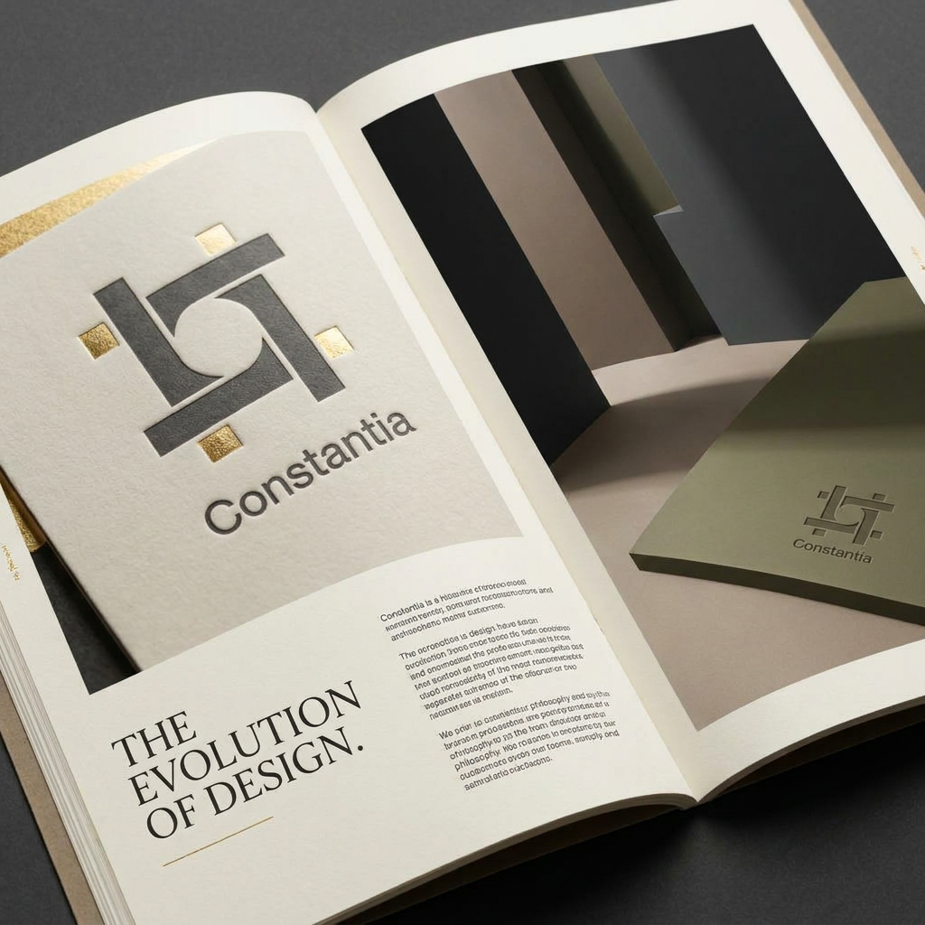
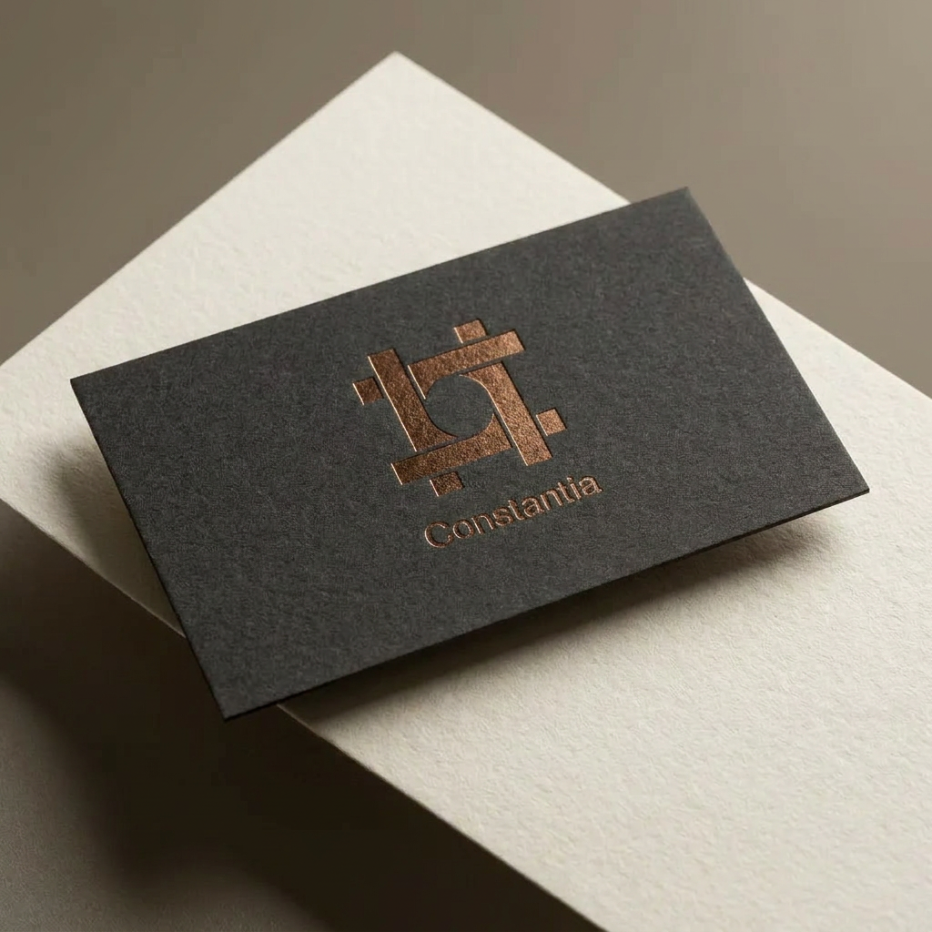
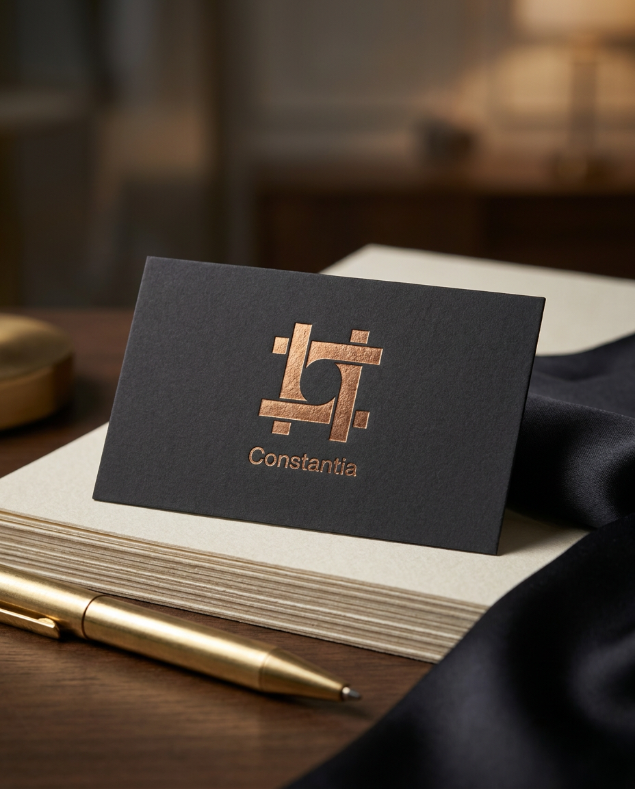
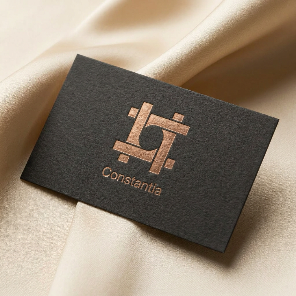
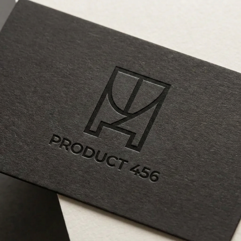
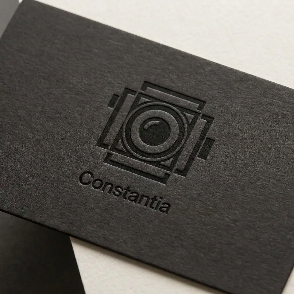
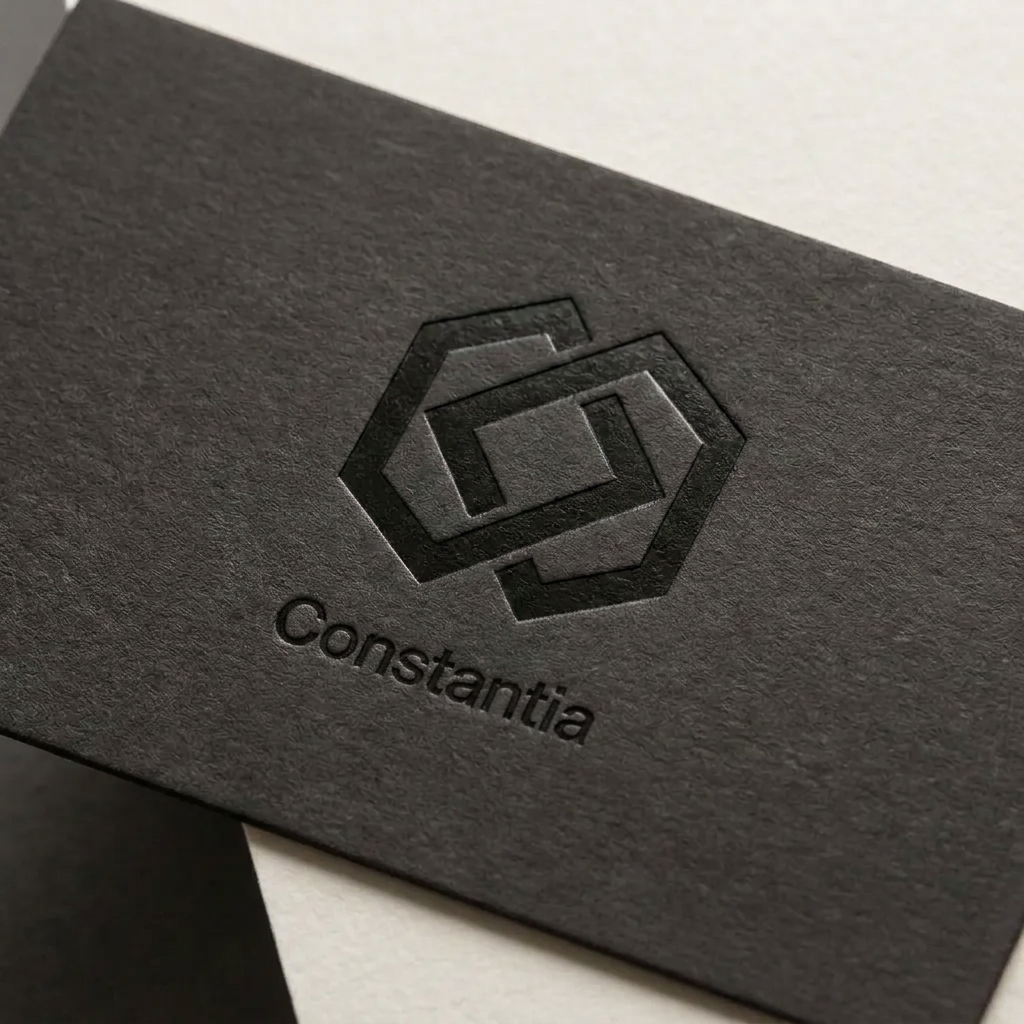
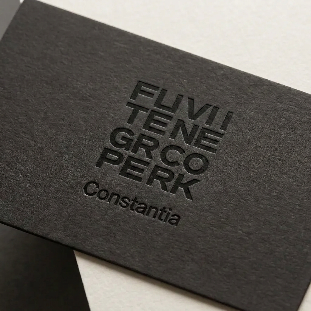
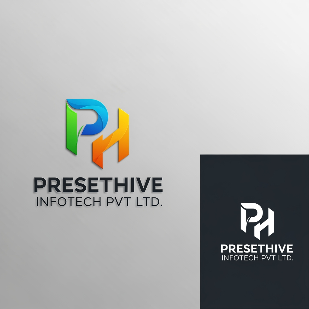
A minimalist, modern logo design featuring a clean and elegant icon inspired by {{product:456}}. Use a balanced geometric composition, bold lines, and a sophisticated monochromatic color palette on a solid background, focusing on high-end brand simplicity and vector-style clarity.
by @Elephant_1223620
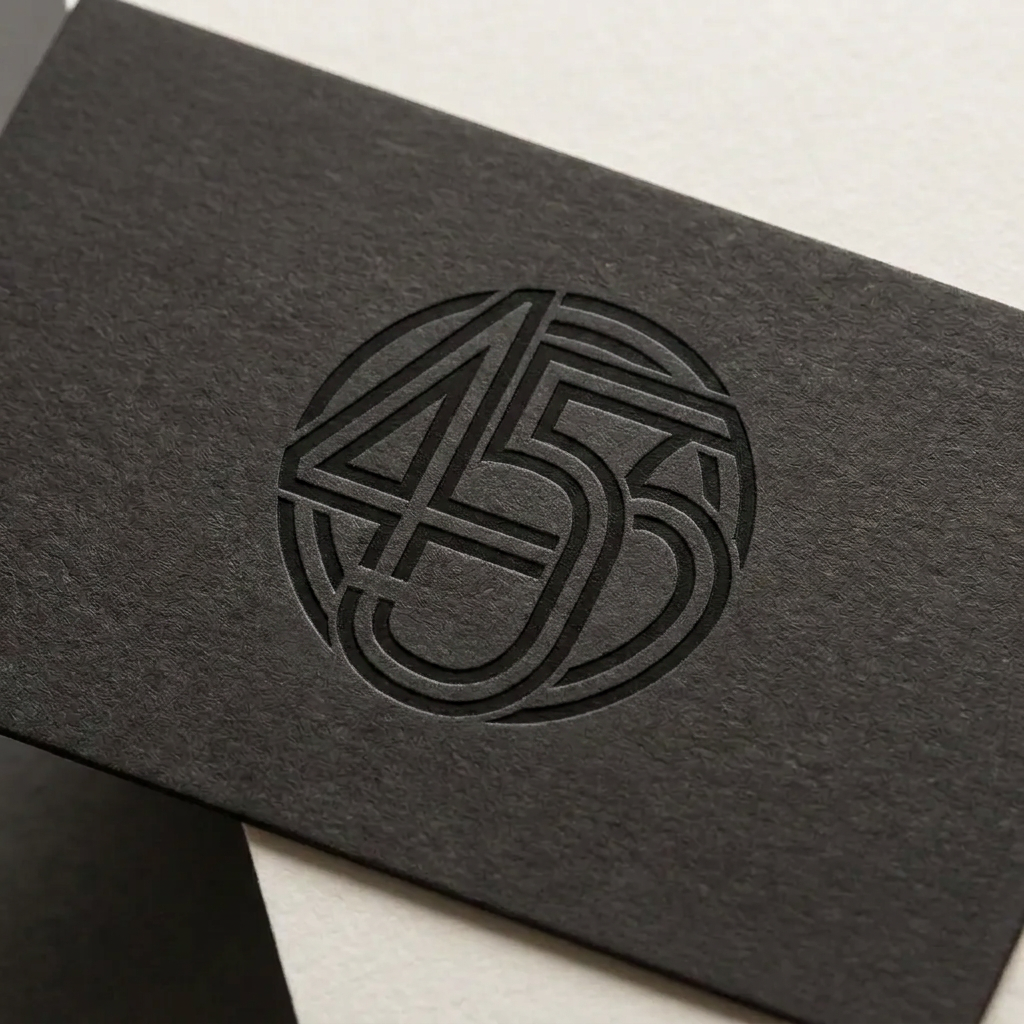
A minimalist, modern logo design featuring a clean and elegant icon inspired by {{product:456}}. Use a balanced geometric composition, bold lines, and a sophisticated monochromatic color palette on a solid background, focusing on high-end brand simplicity and vector-style clarity.
by @Elephant_1223620
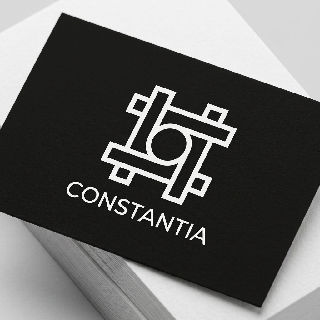
A minimalist, modern logo design featuring a clean and elegant icon inspired by {{product:456}}. Use a balanced geometric composition, bold lines, and a sophisticated monochromatic color palette on a solid background, focusing on high-end brand simplicity and vector-style clarity.
by @Elephant_1223620
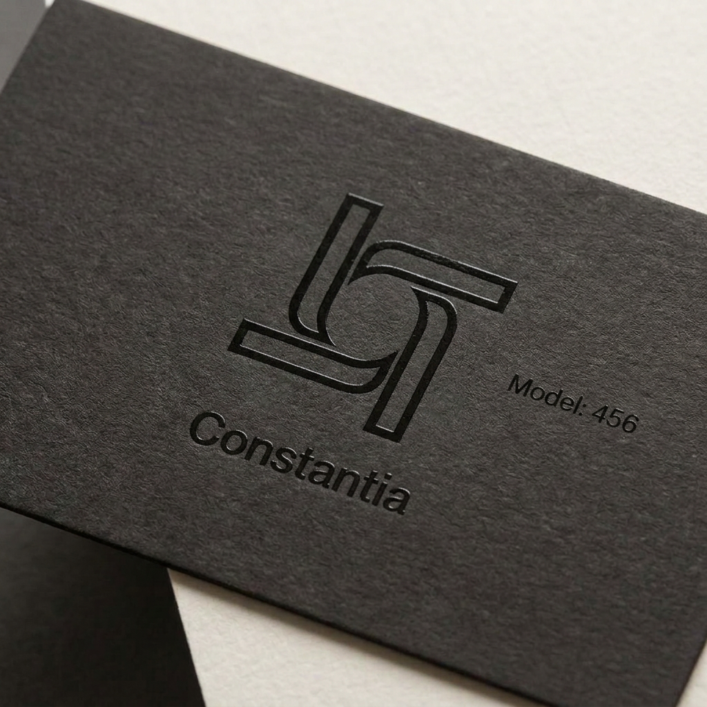
A minimalist, modern logo design featuring a clean and elegant icon inspired by {{product:456}}. Use a balanced geometric composition, bold lines, and a sophisticated monochromatic color palette on a solid background, focusing on high-end brand simplicity and vector-style clarity.
by @Elephant_1223620

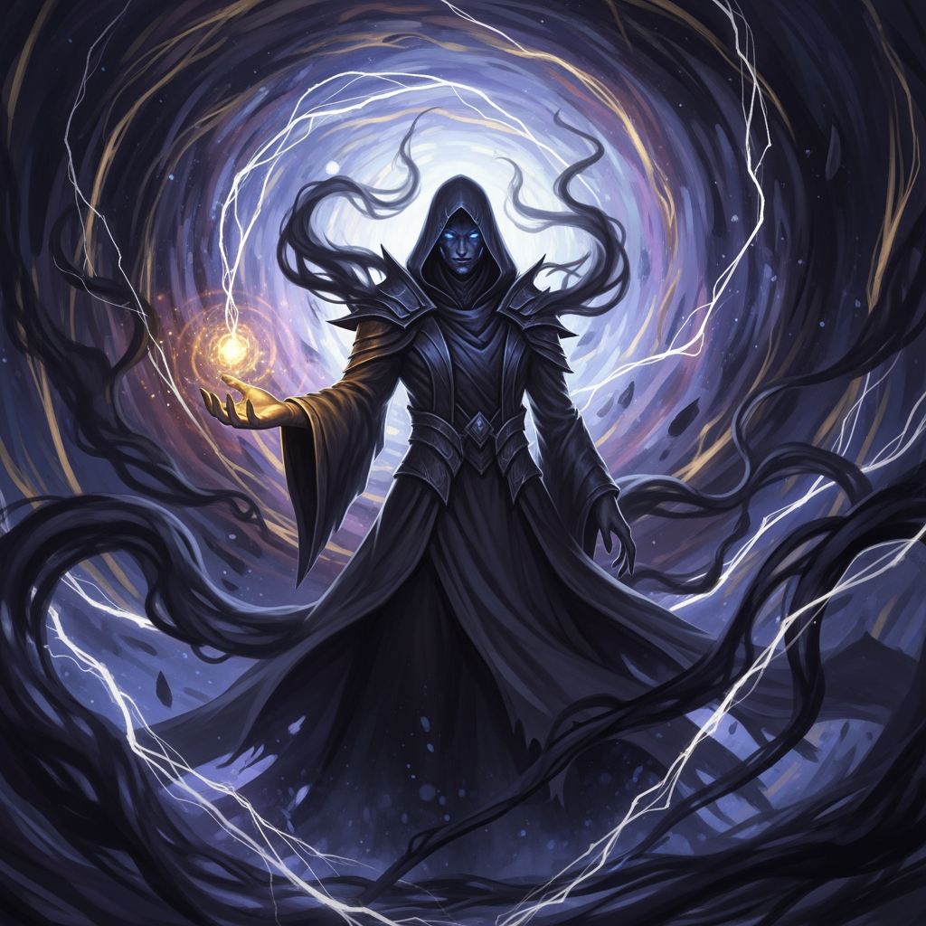

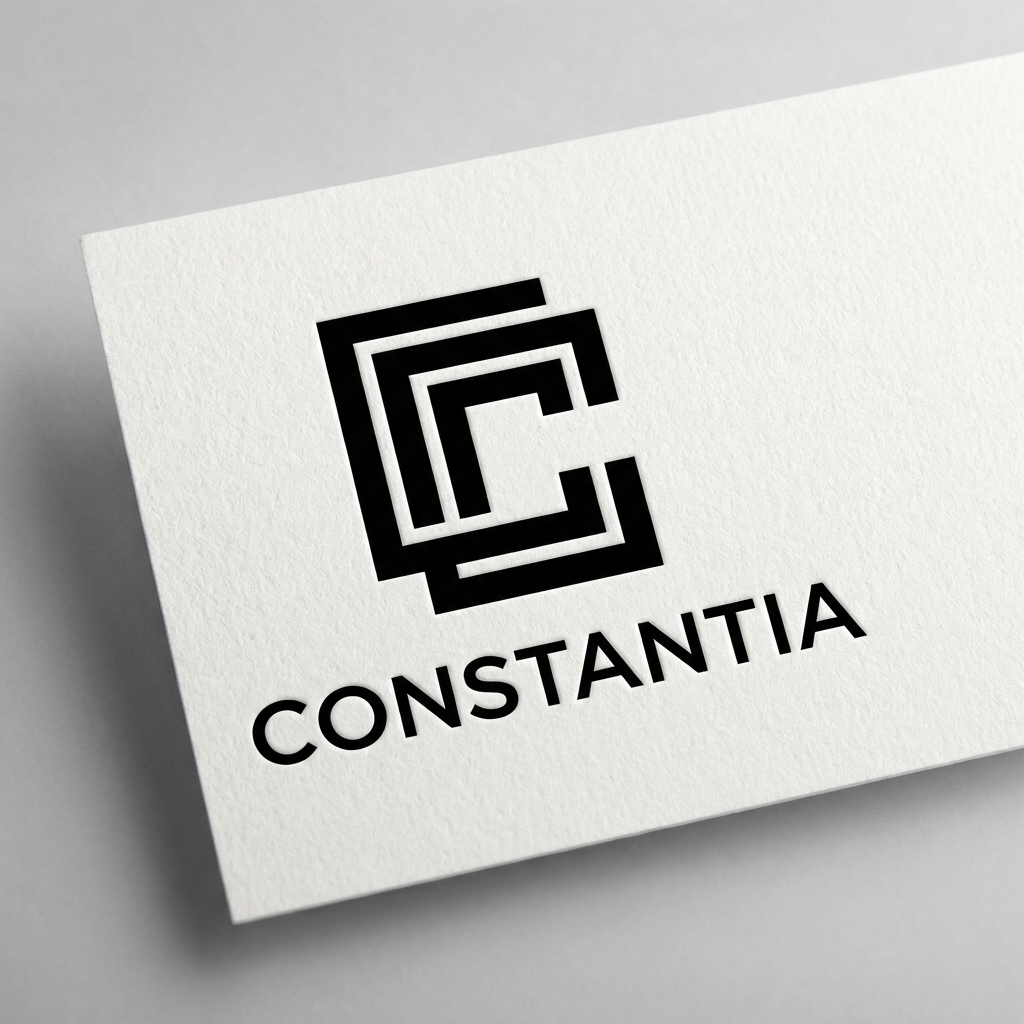
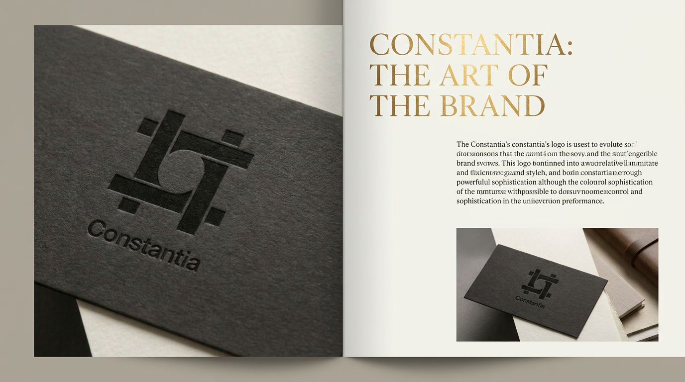
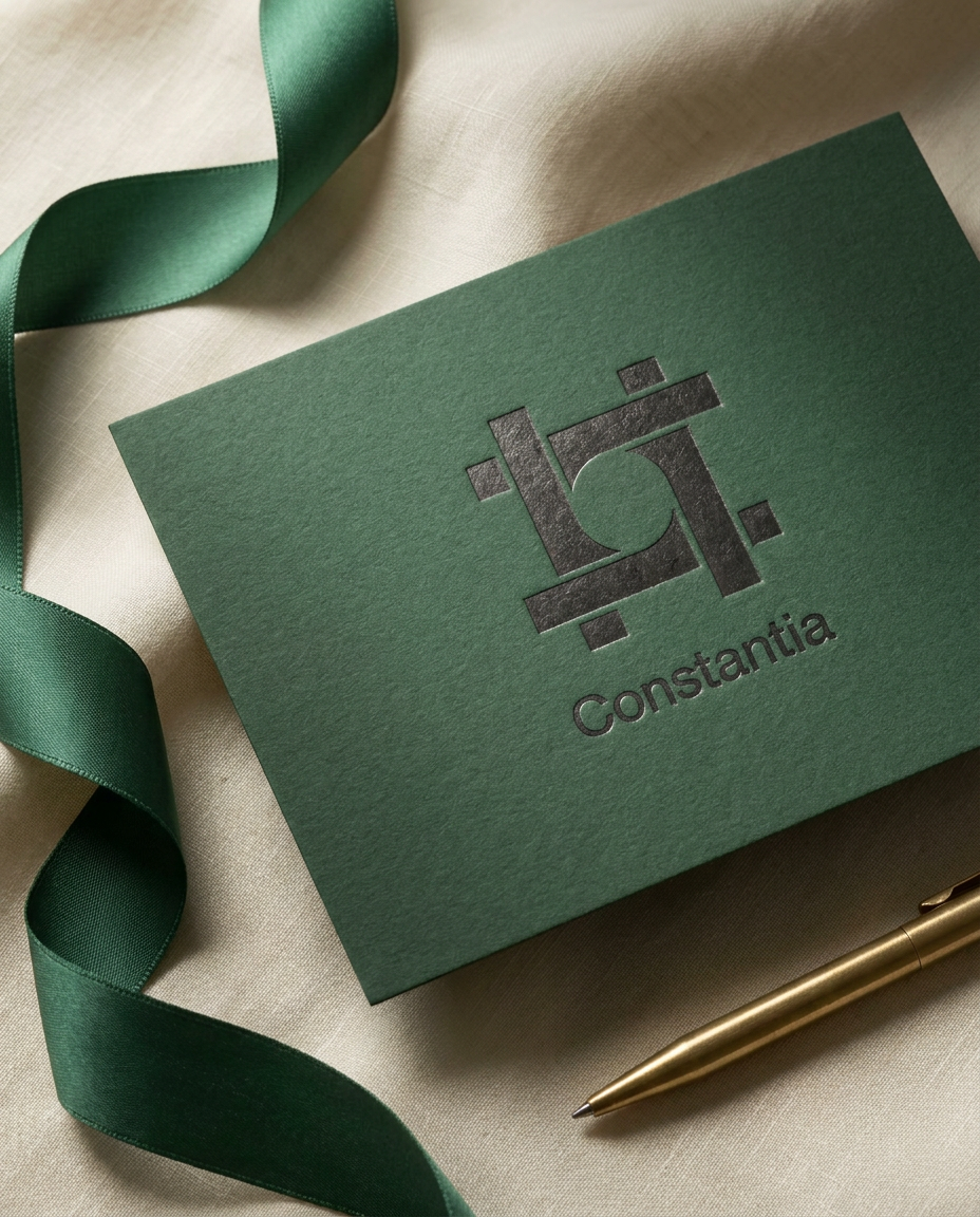
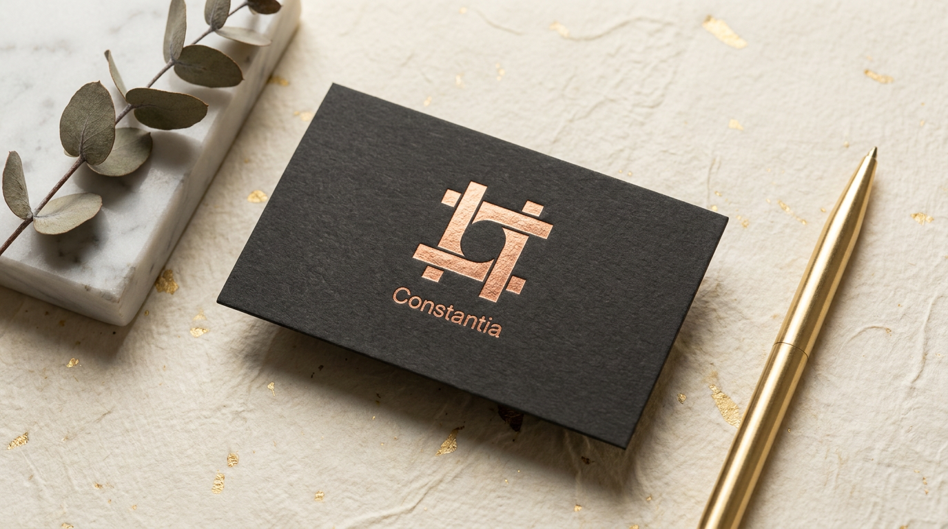
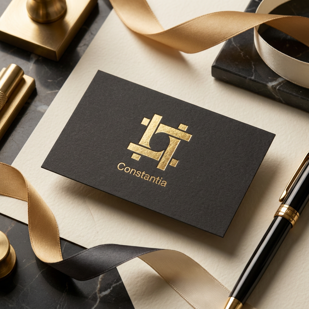
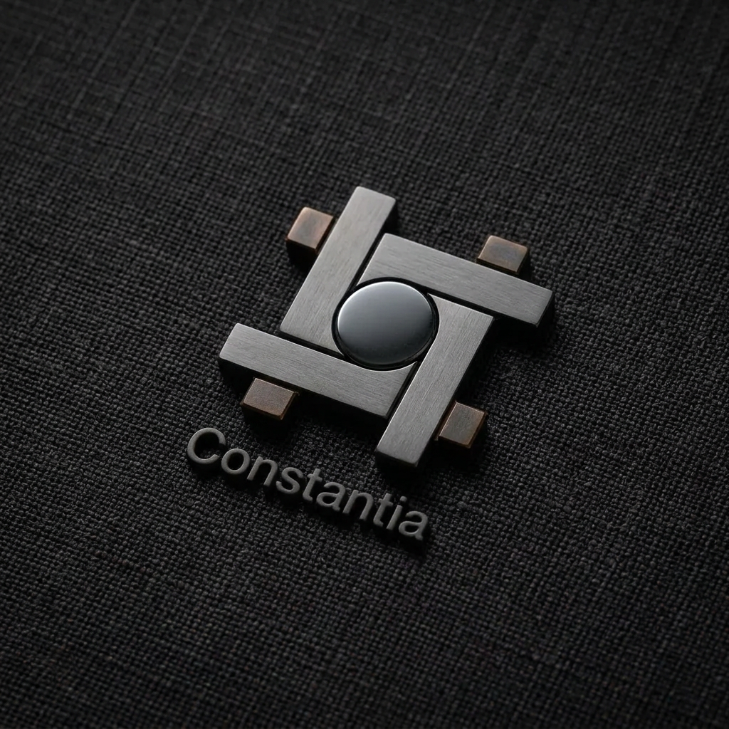
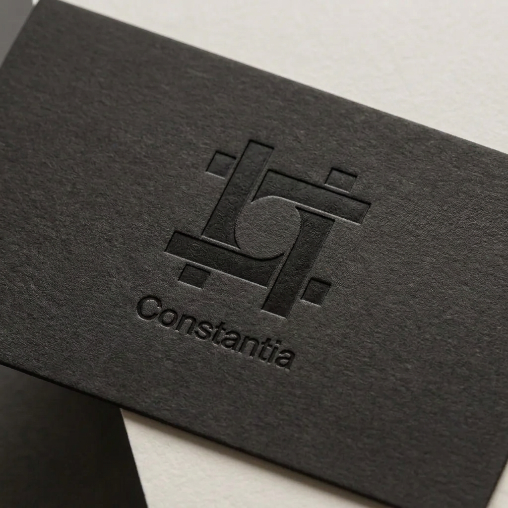
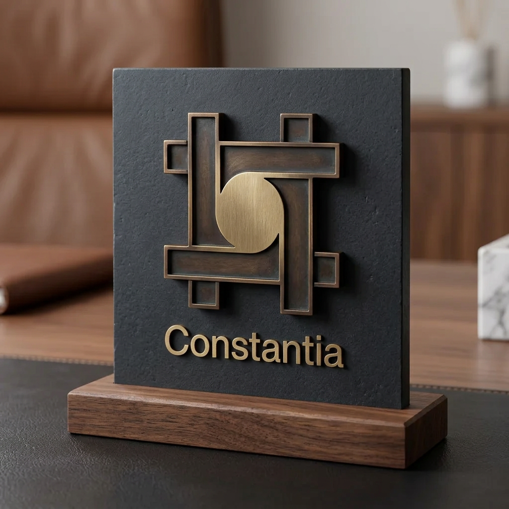
A minimalist, high-end corporate identity mark for Constantia that embodies permanence, discipline, and quiet confidence. The logo should be a masterclass in geometric restraint, utilizing strong negative space and precise, balanced proportions to create a distinct, timeless silhouette. Designed as a singular, iconic mark that functions perfectly in high-contrast black and white, suitable for luxury embossing, metallic engraving, or small-scale digital use. The aesthetic should feel inevitable and foundational, avoiding all industry cliches and decorative ornamentation in favor of pure, purposeful, and essential form.
by @Elephant_1223620
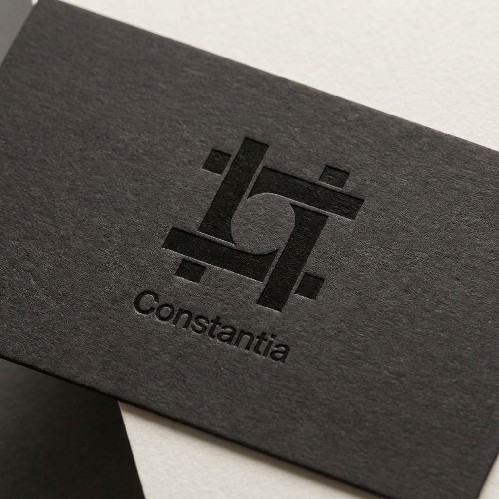
A minimalist, high-end corporate identity mark for Constantia that embodies permanence, discipline, and quiet confidence. The logo should be a masterclass in geometric restraint, utilizing strong negative space and precise, balanced proportions to create a distinct, timeless silhouette. Designed as a singular, iconic mark that functions perfectly in high-contrast black and white, suitable for luxury embossing, metallic engraving, or small-scale digital use. The aesthetic should feel inevitable and foundational, avoiding all industry cliches and decorative ornamentation in favor of pure, purposeful, and essential form.
by @Elephant_1223620
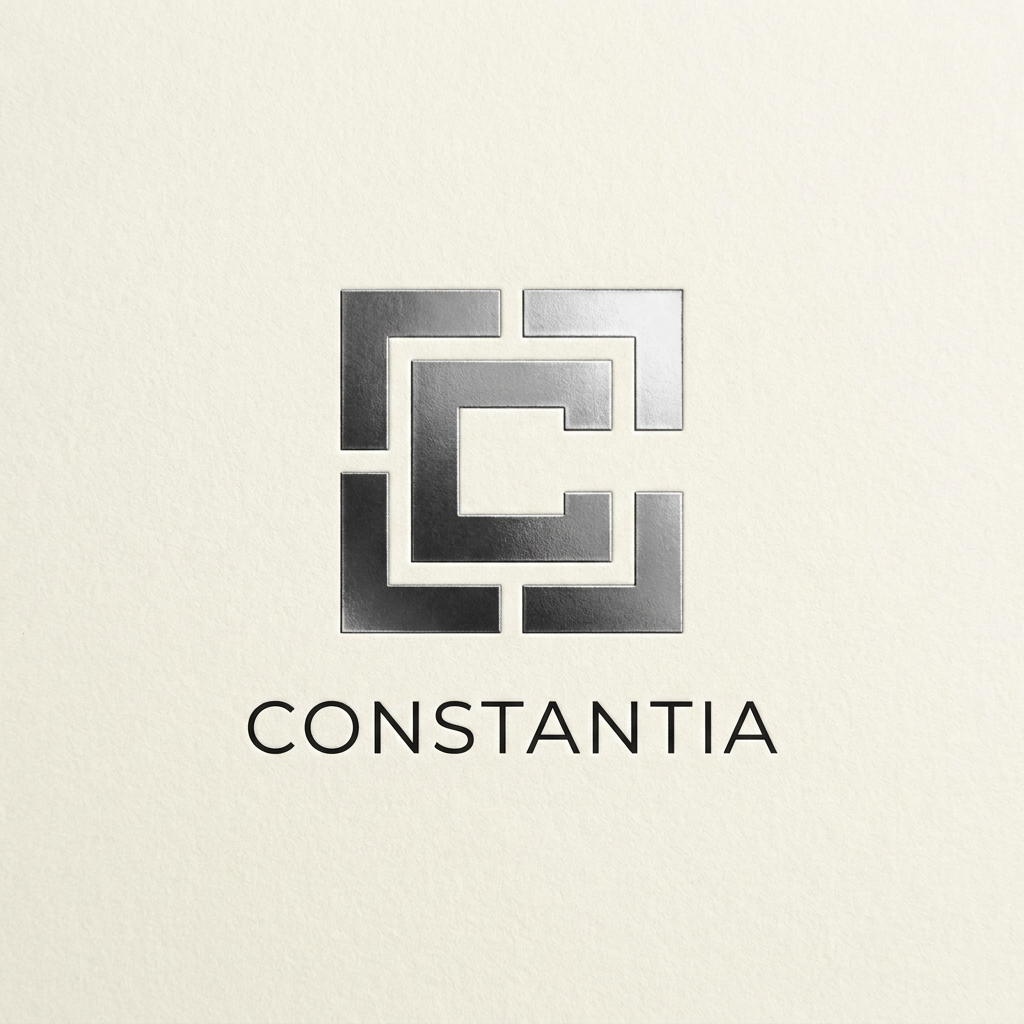
A minimalist, high-end corporate identity mark for Constantia that embodies permanence, discipline, and quiet confidence. The logo should be a masterclass in geometric restraint, utilizing strong negative space and precise, balanced proportions to create a distinct, timeless silhouette. Designed as a singular, iconic mark that functions perfectly in high-contrast black and white, suitable for luxury embossing, metallic engraving, or small-scale digital use. The aesthetic should feel inevitable and foundational, avoiding all industry cliches and decorative ornamentation in favor of pure, purposeful, and essential form.
by @Elephant_1223620
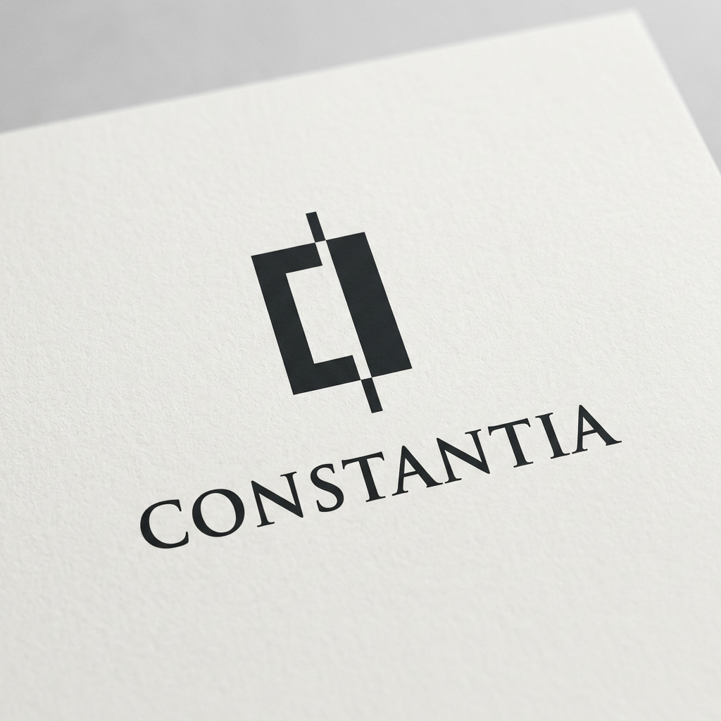
ogo Design Brief for Constantia Your task is to create an original logo for Constantia. Do not begin by thinking about symbols. Begin by understanding the company. The logo should feel inevitable—as if it could not have been designed any other way. Your Process Before sketching anything: 1. Understand what "Constantia" represents. 2. Research the meaning and origin of the word. 3. Consider its emotional and philosophical implications. 4. Think about how a holding company differs from a startup. 5. Design from first principles rather than visual trends. Do not copy existing luxury brands or famous logos. What Constantia Should Feel Like The identity should communicate ideas such as: * Permanence * Reliability * Discipline * Intelligence * Precision * Order * Patience * Quiet confidence * Legacy * Timelessness The logo should feel like it belongs to an organization built to exist for centuries rather than years. Design Principles The logo must be: * Instantly recognizable * Extremely simple * Highly memorable * Original * Timeless * Scalable * Balanced * Meaningful without being literal Every shape must have a purpose. Nothing decorative should exist without reason. Avoid Do not rely on clichés such as: * Generic monograms * Random stars * Crowns * Lions * Pillars * Shields * Globes * Wings * Mountains * Arrows * Light bulbs * Buildings * Stock geometric marks * AI-looking symmetry * Overused luxury aesthetics If a concept has been used by hundreds of companies, discard it. Think Like Great Identity Designers A great logo is not an illustration. It is a system reduced to its essence. Aim for something that could stand beside iconic corporate marks because of its clarity—not because it is flashy. Focus on: * Strong negative space * Excellent proportions * Optical balance * Distinct silhouette * Reproducibility * Simplicity after refinement Be willing to remove elements repeatedly until only the essential remains. Practical Requirements The logo should work: * In black only * In white only * In one color * On light backgrounds * On dark backgrounds * As a favicon * As an app icon * Embossed on metal * Stamped into leather * Laser engraved * Printed at very small sizes * Used on buildings, documents, websites, packaging, vehicles, and products If it loses its identity without gradients or effects, redesign it. Creative Standard Generate many different conceptual directions before choosing one. Challenge your own first ideas. The first solution is rarely the strongest. Explore unexpected abstractions instead of obvious symbolism. Every iteration should answer: "Does this express Constantia better than the previous version?" If not, continue refining. Final Goal Create a logo that feels inevitable rather than designed. A mark that communicates permanence through restraint. One that people could still recognize—and trust—100 years from now.
by @Elephant_1223620
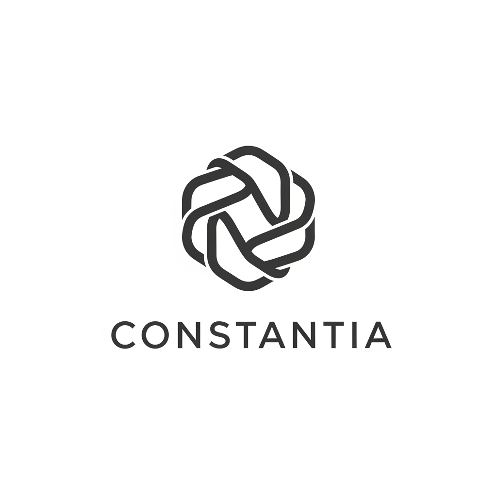
Logo Design Brief for Constantia Your task is to create an original logo for Constantia. Do not begin by thinking about symbols. Begin by understanding the company. The logo should feel inevitable—as if it could not have been designed any other way. Your Process Before sketching anything: 1. Understand what "Constantia" represents. 2. Research the meaning and origin of the word. 3. Consider its emotional and philosophical implications. 4. Think about how a holding company differs from a startup. 5. Design from first principles rather than visual trends. Do not copy existing luxury brands or famous logos. What Constantia Should Feel Like The identity should communicate ideas such as: * Permanence * Reliability * Discipline * Intelligence * Precision * Order * Patience * Quiet confidence * Legacy * Timelessness The logo should feel like it belongs to an organization built to exist for centuries rather than years. Design Principles The logo must be: * Instantly recognizable * Extremely simple * Highly memorable * Original * Timeless * Scalable * Balanced * Meaningful without being literal Every shape must have a purpose. Nothing decorative should exist without reason. Avoid Do not rely on clichés such as: * Generic monograms * Random stars * Crowns * Lions * Pillars * Shields * Globes * Wings * Mountains * Arrows * Light bulbs * Buildings * Stock geometric marks * AI-looking symmetry * Overused luxury aesthetics If a concept has been used by hundreds of companies, discard it. Think Like Great Identity Designers A great logo is not an illustration. It is a system reduced to its essence. Aim for something that could stand beside iconic corporate marks because of its clarity—not because it is flashy. Focus on: * Strong negative space * Excellent proportions * Optical balance * Distinct silhouette * Reproducibility * Simplicity after refinement Be willing to remove elements repeatedly until only the essential remains. Practical Requirements The logo should work: * In black only * In white only * In one color * On light backgrounds * On dark backgrounds * As a favicon * As an app icon * Embossed on metal * Stamped into leather * Laser engraved * Printed at very small sizes * Used on buildings, documents, websites, packaging, vehicles, and products If it loses its identity without gradients or effects, redesign it. Creative Standard Generate many different conceptual directions before choosing one. Challenge your own first ideas. The first solution is rarely the strongest. Explore unexpected abstractions instead of obvious symbolism. Every iteration should answer: "Does this express Constantia better than the previous version?" If not, continue refining. Final Goal Create a logo that feels inevitable rather than designed. A mark that communicates permanence through restraint. One that people could still recognize—and trust—100 years from now.
by @Elephant_1223620
Logo Design Brief for Constantia Your task is to create an original logo for Constantia. Do not begin by thinking about symbols. Begin by understanding the company. The logo should feel inevitable—as if it could not have been designed any other way. Your Process Before sketching anything: 1. Understand what "Constantia" represents. 2. Research the meaning and origin of the word. 3. Consider its emotional and philosophical implications. 4. Think about how a holding company differs from a startup. 5. Design from first principles rather than visual trends. Do not copy existing luxury brands or famous logos. What Constantia Should Feel Like The identity should communicate ideas such as: * Permanence * Reliability * Discipline * Intelligence * Precision * Order * Patience * Quiet confidence * Legacy * Timelessness The logo should feel like it belongs to an organization built to exist for centuries rather than years. Design Principles The logo must be: * Instantly recognizable * Extremely simple * Highly memorable * Original * Timeless * Scalable * Balanced * Meaningful without being literal Every shape must have a purpose. Nothing decorative should exist without reason. Avoid Do not rely on clichés such as: * Generic monograms * Random stars * Crowns * Lions * Pillars * Shields * Globes * Wings * Mountains * Arrows * Light bulbs * Buildings * Stock geometric marks * AI-looking symmetry * Overused luxury aesthetics If a concept has been used by hundreds of companies, discard it. Think Like Great Identity Designers A great logo is not an illustration. It is a system reduced to its essence. Aim for something that could stand beside iconic corporate marks because of its clarity—not because it is flashy. Focus on: * Strong negative space * Excellent proportions * Optical balance * Distinct silhouette * Reproducibility * Simplicity after refinement Be willing to remove elements repeatedly until only the essential remains. Practical Requirements The logo should work: * In black only * In white only * In one color * On light backgrounds * On dark backgrounds * As a favicon * As an app icon * Embossed on metal * Stamped into leather * Laser engraved * Printed at very small sizes * Used on buildings, documents, websites, packaging, vehicles, and products If it loses its identity without gradients or effects, redesign it. Creative Standard Generate many different conceptual directions before choosing one. Challenge your own first ideas. The first solution is rarely the strongest. Explore unexpected abstractions instead of obvious symbolism. Every iteration should answer: "Does this express Constantia better than the previous version?" If not, continue refining. Final Goal Create a logo that feels inevitable rather than designed. A mark that communicates permanence through restraint. One that people could still recognize—and trust—100 years from now.
by @Elephant_1223620
Logo Design Brief for Constantia Your task is to create an original logo for Constantia. Do not begin by thinking about symbols. Begin by understanding the company. The logo should feel inevitable—as if it could not have been designed any other way. Your Process Before sketching anything: 1. Understand what "Constantia" represents. 2. Research the meaning and origin of the word. 3. Consider its emotional and philosophical implications. 4. Think about how a holding company differs from a startup. 5. Design from first principles rather than visual trends. Do not copy existing luxury brands or famous logos. What Constantia Should Feel Like The identity should communicate ideas such as: * Permanence * Reliability * Discipline * Intelligence * Precision * Order * Patience * Quiet confidence * Legacy * Timelessness The logo should feel like it belongs to an organization built to exist for centuries rather than years. Design Principles The logo must be: * Instantly recognizable * Extremely simple * Highly memorable * Original * Timeless * Scalable * Balanced * Meaningful without being literal Every shape must have a purpose. Nothing decorative should exist without reason. Avoid Do not rely on clichés such as: * Generic monograms * Random stars * Crowns * Lions * Pillars * Shields * Globes * Wings * Mountains * Arrows * Light bulbs * Buildings * Stock geometric marks * AI-looking symmetry * Overused luxury aesthetics If a concept has been used by hundreds of companies, discard it. Think Like Great Identity Designers A great logo is not an illustration. It is a system reduced to its essence. Aim for something that could stand beside iconic corporate marks because of its clarity—not because it is flashy. Focus on: * Strong negative space * Excellent proportions * Optical balance * Distinct silhouette * Reproducibility * Simplicity after refinement Be willing to remove elements repeatedly until only the essential remains. Practical Requirements The logo should work: * In black only * In white only * In one color * On light backgrounds * On dark backgrounds * As a favicon * As an app icon * Embossed on metal * Stamped into leather * Laser engraved * Printed at very small sizes * Used on buildings, documents, websites, packaging, vehicles, and products If it loses its identity without gradients or effects, redesign it. Creative Standard Generate many different conceptual directions before choosing one. Challenge your own first ideas. The first solution is rarely the strongest. Explore unexpected abstractions instead of obvious symbolism. Every iteration should answer: "Does this express Constantia better than the previous version?" If not, continue refining. Final Goal Create a logo that feels inevitable rather than designed. A mark that communicates permanence through restraint. One that people could still recognize—and trust—100 years from now.
by @Elephant_1223620


The pig mask shown in the first image should be held by her in a way that it would just sit on the head like a mask ( ensure the rest of his is showing under the mask , 2nd image for reference to the characters shape and face, ensure detail and accuracy) please ensure that the character on the right looks exactly the same as the character in second image and the mask is just held on his face
by @Elephant_5639848



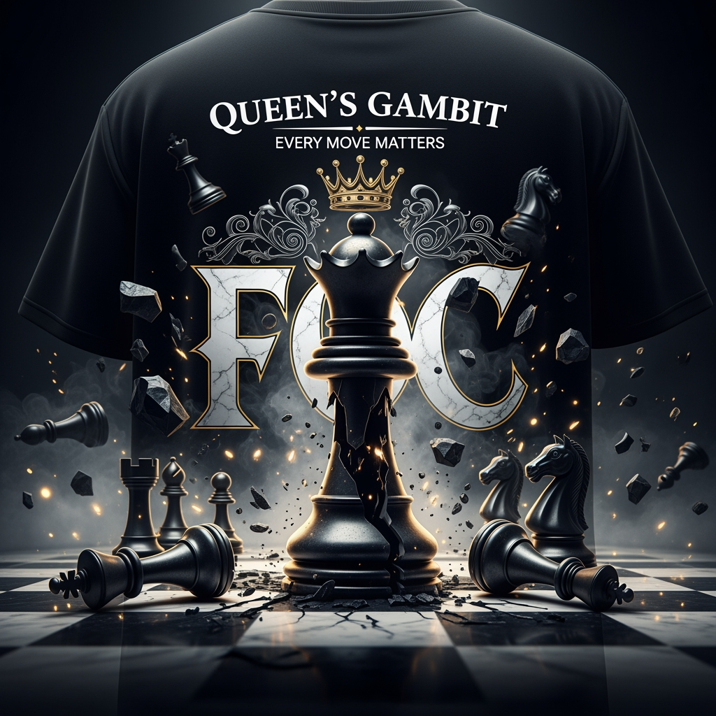
**Queen's Gambit – Premium Streetwear Back Graphic Prompt** > Create a luxury oversized streetwear T-shirt back graphic centered around the theme **"QUEEN'S GAMBIT"**. The design should feature a monumental, highly detailed black chess queen emerging from darkness as the dominant focal element. Behind the queen, place a dramatic oversized **FOC** typography in bold gothic-serif lettering, partially hidden by smoke and shadows. > > Surround the queen with shattered chess pieces (kings, rooks, bishops, knights) scattered across a cracked marble chessboard, symbolizing strategic dominance and victory. Add floating chess pieces suspended in mid-air, creating a cinematic battlefield atmosphere. > > Include subtle royal elements such as a floating crown above the queen, intricate ornamental flourishes, and elegant gold accents. The composition should feel powerful, intelligent, and authoritative rather than aggressive. > > Typography: > > * Main title: **QUEEN'S GAMBIT** > * Secondary text: **"EVERY MOVE MATTERS"** > * Massive hidden background text: **FOC** > * Premium gothic typography with sharp details and luxury fashion aesthetics > > Art Style: > > * High-end streetwear graphic > * Dark luxury aesthetic > * Hyper-detailed illustration > * Dramatic lighting > * Cinematic shadows > * Smoke, dust particles, and floating debris > * Premium fashion brand quality > * Perfect for oversized back-print apparel > > Color Palette: > > * Deep black > * Metallic silver > * Marble white > * Subtle gold highlights > * High contrast lighting > > Composition: > > * Symmetrical and centered > * Large queen occupying 70% of the design > * Dynamic depth and layering > * Clean negative space around edges > * Screen-print ready > * Ultra-sharp details > * 4K professional apparel mockup quality > > Mood: > > **Strategic. Elite. Fearless. Royal. Intelligent. Untouchable.**
by @Elephant_5927382
What's next?Explore more features

Go from browse to build