Product
Use Cases
How it Works
Pricing
Login
Community showcase

Designs made by our community

Explore unique graphic designs and images crafted by creators around the world using Hiding Elephant's AI design tools. Get inspired and start creating.
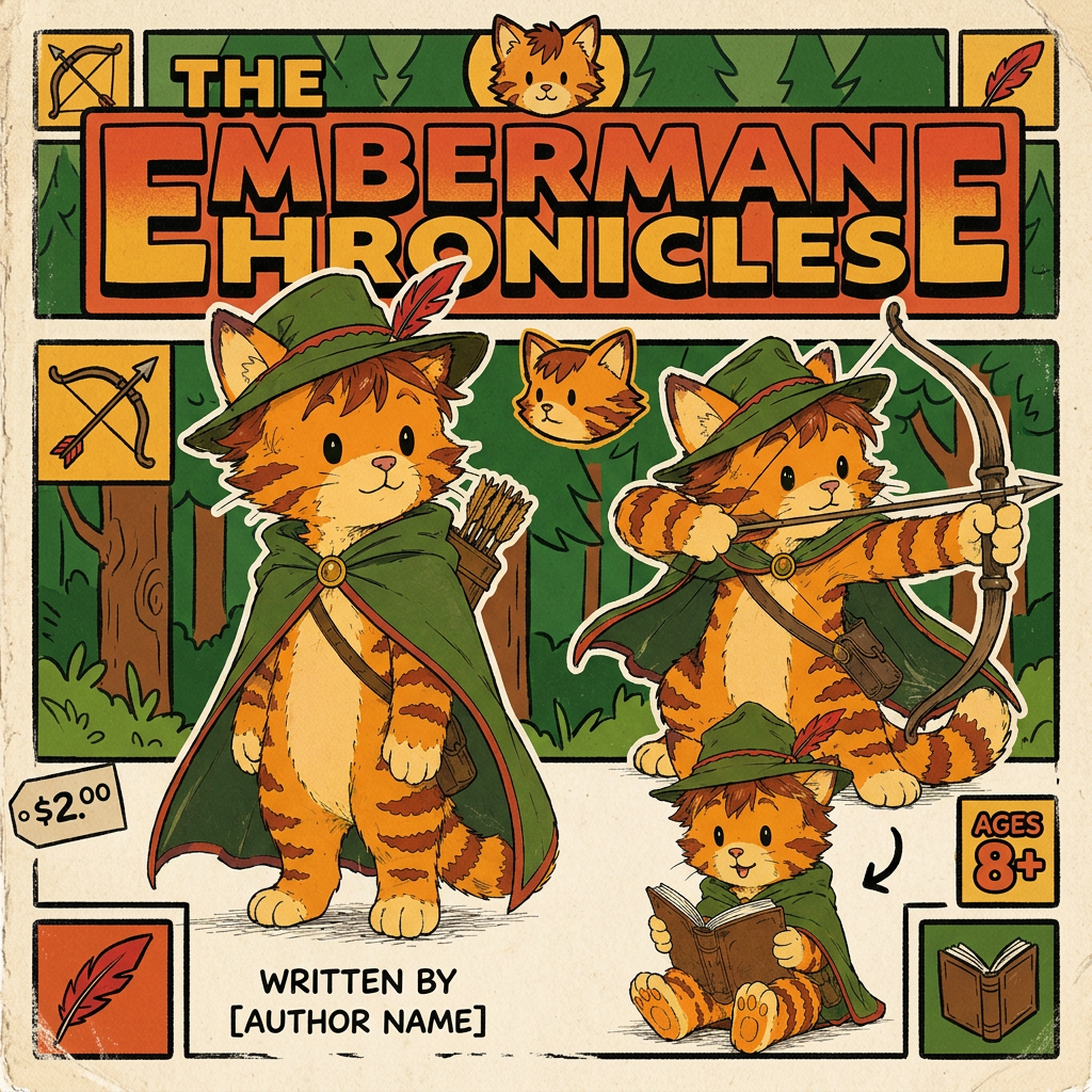
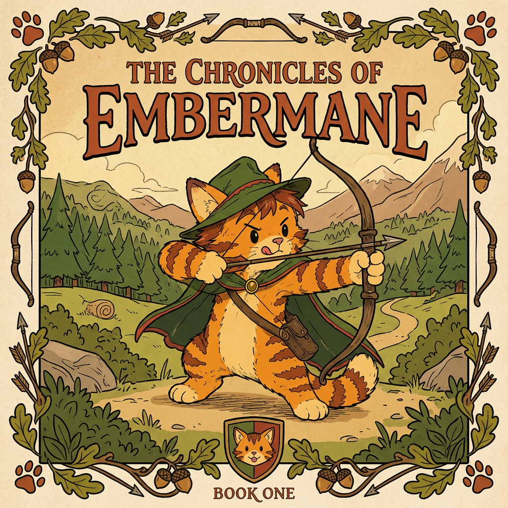
AI Design for Alright, let's imagine you're holding the book in your hands for the very first time.

---

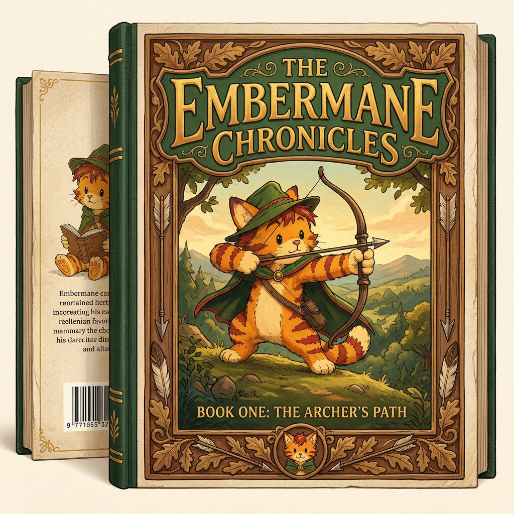
The book is **21 × 13.5 cm**, tall and elegant. Not oversized, not tiny. It feels like a real fantasy novel that has been sitting on a library shelf for years.

The cover is matte, not glossy. When light hits it, it doesn't shine like plastic. Instead, it has a soft, almost velvety appearance.

The first thing your eye notices is not the illustration.

It's the word:

# EMBERMANE

Large.

Bold.

Centered near the top.

Not written in a generic fantasy font.

The letters feel carved.

Ancient.

Like they belong on a castle gate or an old family banner.

Small decorative leaves and arrowheads subtly weave into the lettering.

Above it:

**THE**

Small and understated.

Below it:

**Chronicles**

Smaller, elegant, almost like a subtitle.

The eye reads:

> EMBERMANE

before anything else.

---

Then you notice the border.

Not a thin line.

A real frame.

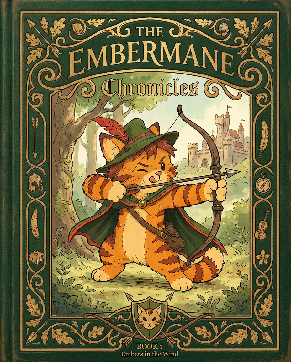
A thick, beautiful frame wrapping around the entire cover like a piece of artwork hanging in a gallery.

The frame is deep forest green.

Dark enough to feel noble.

Rich enough to feel warm.

Running through the frame are embossed details.

Oak leaves curl around the corners.

Tiny vines weave between them.

Arrows point inward toward the illustration.

Little feathers rest among the scrollwork.

The frame feels handcrafted.

Almost carved.

Like something belonging to an ancient family heirloom.

---

At the bottom center sits the Embermane crest.

Not huge.

Not flashy.

Just proud.

A stylized cat face on a shield.

Simple enough to recognize immediately.

Complex enough to feel historic.

The crest looks old.

Like generations of Embermanes have carried it.

---

Then your eyes move to the center illustration.

The illustration sits inside the frame like a painting.

The artwork isn't realistic.

It's storybook art.

Warm.

Inviting.

Timeless.

The colors are rich but controlled.

Nothing glows.

Nothing screams for attention.

Everything feels painted with care.

---

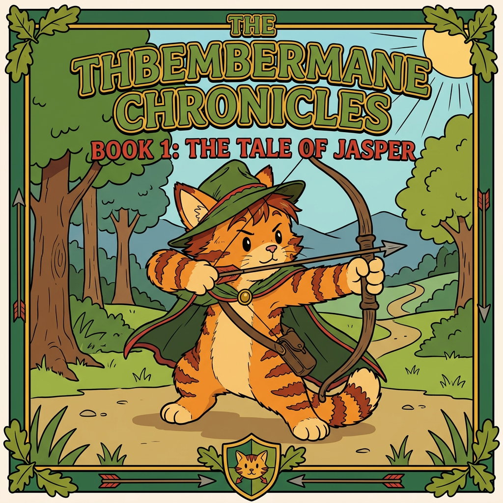
Standing in the center is Jasper.

Not posing heroically.

Not standing on a mountain with lightning behind him.

Not looking cool for the sake of looking cool.

He's simply aiming his bow.

And concentrating.

Really concentrating.

One eye is narrowed.

His tongue pokes slightly out of the corner of his mouth.

He's trying so hard to get the shot right.

That tiny detail tells you everything.

This isn't a legendary hero.

Not yet.

This is a kid trying to become one.

---

His green cloak catches the breeze.

The red trim along its edges creates a beautiful contrast.

His archer hat sits slightly tilted on his head.

The red feather curves upward.

His orange fur is warm and vibrant.

The red-brown markings on his cheeks, arms, legs, and ear tips stand out against the green.

The green and red-brown create a striking contrast that immediately becomes his visual identity.

You could recognize him from across a room.

---

Behind him stretches the world.

Not detailed enough to overwhelm the cover.

Just hints.

A distant forest.

Rolling hills.

A winding path.

Faraway mountains.

Maybe, barely visible in the distance, the rooflines of Embermane Hall.

The world feels large.

Like there are stories waiting beyond the edge of the page.

---

The corners of the illustration contain little details that reward observant readers.

A tiny compass hidden in some leaves.

A small fiddle carved into the frame.

A book tucked among the vines.

A miniature knight helmet.

A flower.

Readers won't notice them all at first.

They discover them over time.

---

The entire cover gives one feeling:

Not danger.

Not darkness.

Not war.

Wonder.

Adventure.

Friendship.

History.

A warm meal after a long journey.

An old story waiting to be discovered.

The kind of book a child finds in a library and remembers for the rest of their life.

When somebody sees it on a shelf, they don't think:

> "This looks epic."

They think:

> "I want to open this."

And that's exactly what a first book in **The Embermane Chronicles** should do. 📖🐱🏹🌲✨not realistic with bold black lines miinimal shading something from the 90s book

Alright, let's imagine you're holding the book in your hands for the very first time. --- The book is **21 × 13.5 cm**, tall and elegant. Not oversized, not tiny. It feels like a real fantasy novel that has been sitting on a library shelf for years. The cover is matte, not glossy. When light hits it, it doesn't shine like plastic. Instead, it has a soft, almost velvety appearance. The first thing your eye notices is not the illustration. It's the word: # EMBERMANE Large. Bold. Centered near the top. Not written in a generic fantasy font. The letters feel carved. Ancient. Like they belong on a castle gate or an old family banner. Small decorative leaves and arrowheads subtly weave into the lettering. Above it: **THE** Small and understated. Below it: **Chronicles** Smaller, elegant, almost like a subtitle. The eye reads: > EMBERMANE before anything else. --- Then you notice the border. Not a thin line. A real frame. A thick, beautiful frame wrapping around the entire cover like a piece of artwork hanging in a gallery. The frame is deep forest green. Dark enough to feel noble. Rich enough to feel warm. Running through the frame are embossed details. Oak leaves curl around the corners. Tiny vines weave between them. Arrows point inward toward the illustration. Little feathers rest among the scrollwork. The frame feels handcrafted. Almost carved. Like something belonging to an ancient family heirloom. --- At the bottom center sits the Embermane crest. Not huge. Not flashy. Just proud. A stylized cat face on a shield. Simple enough to recognize immediately. Complex enough to feel historic. The crest looks old. Like generations of Embermanes have carried it. --- Then your eyes move to the center illustration. The illustration sits inside the frame like a painting. The artwork isn't realistic. It's storybook art. Warm. Inviting. Timeless. The colors are rich but controlled. Nothing glows. Nothing screams for attention. Everything feels painted with care. --- Standing in the center is Jasper. Not posing heroically. Not standing on a mountain with lightning behind him. Not looking cool for the sake of looking cool. He's simply aiming his bow. And concentrating. Really concentrating. One eye is narrowed. His tongue pokes slightly out of the corner of his mouth. He's trying so hard to get the shot right. That tiny detail tells you everything. This isn't a legendary hero. Not yet. This is a kid trying to become one. --- His green cloak catches the breeze. The red trim along its edges creates a beautiful contrast. His archer hat sits slightly tilted on his head. The red feather curves upward. His orange fur is warm and vibrant. The red-brown markings on his cheeks, arms, legs, and ear tips stand out against the green. The green and red-brown create a striking contrast that immediately becomes his visual identity. You could recognize him from across a room. --- Behind him stretches the world. Not detailed enough to overwhelm the cover. Just hints. A distant forest. Rolling hills. A winding path. Faraway mountains. Maybe, barely visible in the distance, the rooflines of Embermane Hall. The world feels large. Like there are stories waiting beyond the edge of the page. --- The corners of the illustration contain little details that reward observant readers. A tiny compass hidden in some leaves. A small fiddle carved into the frame. A book tucked among the vines. A miniature knight helmet. A flower. Readers won't notice them all at first. They discover them over time. --- The entire cover gives one feeling: Not danger. Not darkness. Not war. Wonder. Adventure. Friendship. History. A warm meal after a long journey. An old story waiting to be discovered. The kind of book a child finds in a library and remembers for the rest of their life. When somebody sees it on a shelf, they don't think: > "This looks epic." They think: > "I want to open this." And that's exactly what a first book in **The Embermane Chronicles** should do. 📖🐱🏹🌲✨not realistic with bold black lines miinimal shading something from the 90s book

by @Elephant_8984916
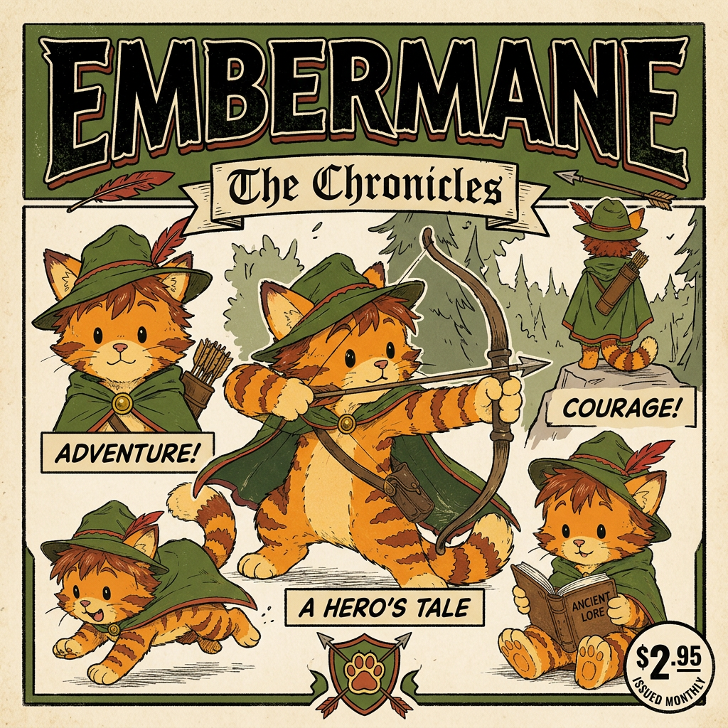
AI Design for Alright, let's imagine you're holding the book in your hands for the very first time.

---

The book is **21 × 13.5 cm**, tall and elegant. Not oversized, not tiny. It feels like a real fantasy novel that has been sitting on a library shelf for years.

The cover is matte, not glossy. When light hits it, it doesn't shine like plastic. Instead, it has a soft, almost velvety appearance.

The first thing your eye notices is not the illustration.

It's the word:

# EMBERMANE

Large.

Bold.

Centered near the top.

Not written in a generic fantasy font.

The letters feel carved.

Ancient.

Like they belong on a castle gate or an old family banner.

Small decorative leaves and arrowheads subtly weave into the lettering.

Above it:

**THE**

Small and understated.

Below it:

**Chronicles**

Smaller, elegant, almost like a subtitle.

The eye reads:

> EMBERMANE

before anything else.

---

Then you notice the border.

Not a thin line.

A real frame.

A thick, beautiful frame wrapping around the entire cover like a piece of artwork hanging in a gallery.

The frame is deep forest green.

Dark enough to feel noble.

Rich enough to feel warm.

Running through the frame are embossed details.

Oak leaves curl around the corners.

Tiny vines weave between them.

Arrows point inward toward the illustration.

Little feathers rest among the scrollwork.

The frame feels handcrafted.

Almost carved.

Like something belonging to an ancient family heirloom.

---

At the bottom center sits the Embermane crest.

Not huge.

Not flashy.

Just proud.

A stylized cat face on a shield.

Simple enough to recognize immediately.

Complex enough to feel historic.

The crest looks old.

Like generations of Embermanes have carried it.

---

Then your eyes move to the center illustration.

The illustration sits inside the frame like a painting.

The artwork isn't realistic.

It's storybook art.

Warm.

Inviting.

Timeless.

The colors are rich but controlled.

Nothing glows.

Nothing screams for attention.

Everything feels painted with care.

---

Standing in the center is Jasper.

Not posing heroically.

Not standing on a mountain with lightning behind him.

Not looking cool for the sake of looking cool.

He's simply aiming his bow.

And concentrating.

Really concentrating.

One eye is narrowed.

His tongue pokes slightly out of the corner of his mouth.

He's trying so hard to get the shot right.

That tiny detail tells you everything.

This isn't a legendary hero.

Not yet.

This is a kid trying to become one.

---

His green cloak catches the breeze.

The red trim along its edges creates a beautiful contrast.

His archer hat sits slightly tilted on his head.

The red feather curves upward.

His orange fur is warm and vibrant.

The red-brown markings on his cheeks, arms, legs, and ear tips stand out against the green.

The green and red-brown create a striking contrast that immediately becomes his visual identity.

You could recognize him from across a room.

---

Behind him stretches the world.

Not detailed enough to overwhelm the cover.

Just hints.

A distant forest.

Rolling hills.

A winding path.

Faraway mountains.

Maybe, barely visible in the distance, the rooflines of Embermane Hall.

The world feels large.

Like there are stories waiting beyond the edge of the page.

---

The corners of the illustration contain little details that reward observant readers.

A tiny compass hidden in some leaves.

A small fiddle carved into the frame.

A book tucked among the vines.

A miniature knight helmet.

A flower.

Readers won't notice them all at first.

They discover them over time.

---

The entire cover gives one feeling:

Not danger.

Not darkness.

Not war.

Wonder.

Adventure.

Friendship.

History.

A warm meal after a long journey.

An old story waiting to be discovered.

The kind of book a child finds in a library and remembers for the rest of their life.

When somebody sees it on a shelf, they don't think:

> "This looks epic."

They think:

> "I want to open this."

And that's exactly what a first book in **The Embermane Chronicles** should do. 📖🐱🏹🌲✨not realistic with bold black lines miinimal shading something from the 90s

Alright, let's imagine you're holding the book in your hands for the very first time. --- The book is **21 × 13.5 cm**, tall and elegant. Not oversized, not tiny. It feels like a real fantasy novel that has been sitting on a library shelf for years. The cover is matte, not glossy. When light hits it, it doesn't shine like plastic. Instead, it has a soft, almost velvety appearance. The first thing your eye notices is not the illustration. It's the word: # EMBERMANE Large. Bold. Centered near the top. Not written in a generic fantasy font. The letters feel carved. Ancient. Like they belong on a castle gate or an old family banner. Small decorative leaves and arrowheads subtly weave into the lettering. Above it: **THE** Small and understated. Below it: **Chronicles** Smaller, elegant, almost like a subtitle. The eye reads: > EMBERMANE before anything else. --- Then you notice the border. Not a thin line. A real frame. A thick, beautiful frame wrapping around the entire cover like a piece of artwork hanging in a gallery. The frame is deep forest green. Dark enough to feel noble. Rich enough to feel warm. Running through the frame are embossed details. Oak leaves curl around the corners. Tiny vines weave between them. Arrows point inward toward the illustration. Little feathers rest among the scrollwork. The frame feels handcrafted. Almost carved. Like something belonging to an ancient family heirloom. --- At the bottom center sits the Embermane crest. Not huge. Not flashy. Just proud. A stylized cat face on a shield. Simple enough to recognize immediately. Complex enough to feel historic. The crest looks old. Like generations of Embermanes have carried it. --- Then your eyes move to the center illustration. The illustration sits inside the frame like a painting. The artwork isn't realistic. It's storybook art. Warm. Inviting. Timeless. The colors are rich but controlled. Nothing glows. Nothing screams for attention. Everything feels painted with care. --- Standing in the center is Jasper. Not posing heroically. Not standing on a mountain with lightning behind him. Not looking cool for the sake of looking cool. He's simply aiming his bow. And concentrating. Really concentrating. One eye is narrowed. His tongue pokes slightly out of the corner of his mouth. He's trying so hard to get the shot right. That tiny detail tells you everything. This isn't a legendary hero. Not yet. This is a kid trying to become one. --- His green cloak catches the breeze. The red trim along its edges creates a beautiful contrast. His archer hat sits slightly tilted on his head. The red feather curves upward. His orange fur is warm and vibrant. The red-brown markings on his cheeks, arms, legs, and ear tips stand out against the green. The green and red-brown create a striking contrast that immediately becomes his visual identity. You could recognize him from across a room. --- Behind him stretches the world. Not detailed enough to overwhelm the cover. Just hints. A distant forest. Rolling hills. A winding path. Faraway mountains. Maybe, barely visible in the distance, the rooflines of Embermane Hall. The world feels large. Like there are stories waiting beyond the edge of the page. --- The corners of the illustration contain little details that reward observant readers. A tiny compass hidden in some leaves. A small fiddle carved into the frame. A book tucked among the vines. A miniature knight helmet. A flower. Readers won't notice them all at first. They discover them over time. --- The entire cover gives one feeling: Not danger. Not darkness. Not war. Wonder. Adventure. Friendship. History. A warm meal after a long journey. An old story waiting to be discovered. The kind of book a child finds in a library and remembers for the rest of their life. When somebody sees it on a shelf, they don't think: > "This looks epic." They think: > "I want to open this." And that's exactly what a first book in **The Embermane Chronicles** should do. 📖🐱🏹🌲✨not realistic with bold black lines miinimal shading something from the 90s

by @Elephant_8984916
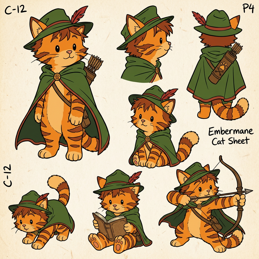
AI Design for Alright, let's imagine you're holding the book in your hands for the very first time.

---

The book is **21 × 13.5 cm**, tall and elegant. Not oversized, not tiny. It feels like a real fantasy novel that has been sitting on a library shelf for years.

The cover is matte, not glossy. When light hits it, it doesn't shine like plastic. Instead, it has a soft, almost velvety appearance.

The first thing your eye notices is not the illustration.

It's the word:

# EMBERMANE

Large.

Bold.

Centered near the top.

Not written in a generic fantasy font.

The letters feel carved.

Ancient.

Like they belong on a castle gate or an old family banner.

Small decorative leaves and arrowheads subtly weave into the lettering.

Above it:

**THE**

Small and understated.

Below it:

**Chronicles**

Smaller, elegant, almost like a subtitle.

The eye reads:

> EMBERMANE

before anything else.

---

Then you notice the border.

Not a thin line.

A real frame.

A thick, beautiful frame wrapping around the entire cover like a piece of artwork hanging in a gallery.

The frame is deep forest green.

Dark enough to feel noble.

Rich enough to feel warm.

Running through the frame are embossed details.

Oak leaves curl around the corners.

Tiny vines weave between them.

Arrows point inward toward the illustration.

Little feathers rest among the scrollwork.

The frame feels handcrafted.

Almost carved.

Like something belonging to an ancient family heirloom.

---

At the bottom center sits the Embermane crest.

Not huge.

Not flashy.

Just proud.

A stylized cat face on a shield.

Simple enough to recognize immediately.

Complex enough to feel historic.

The crest looks old.

Like generations of Embermanes have carried it.

---

Then your eyes move to the center illustration.

The illustration sits inside the frame like a painting.

The artwork isn't realistic.

It's storybook art.

Warm.

Inviting.

Timeless.

The colors are rich but controlled.

Nothing glows.

Nothing screams for attention.

Everything feels painted with care.

---

Standing in the center is Jasper.

Not posing heroically.

Not standing on a mountain with lightning behind him.

Not looking cool for the sake of looking cool.

He's simply aiming his bow.

And concentrating.

Really concentrating.

One eye is narrowed.

His tongue pokes slightly out of the corner of his mouth.

He's trying so hard to get the shot right.

That tiny detail tells you everything.

This isn't a legendary hero.

Not yet.

This is a kid trying to become one.

---

His green cloak catches the breeze.

The red trim along its edges creates a beautiful contrast.

His archer hat sits slightly tilted on his head.

The red feather curves upward.

His orange fur is warm and vibrant.

The red-brown markings on his cheeks, arms, legs, and ear tips stand out against the green.

The green and red-brown create a striking contrast that immediately becomes his visual identity.

You could recognize him from across a room.

---

Behind him stretches the world.

Not detailed enough to overwhelm the cover.

Just hints.

A distant forest.

Rolling hills.

A winding path.

Faraway mountains.

Maybe, barely visible in the distance, the rooflines of Embermane Hall.

The world feels large.

Like there are stories waiting beyond the edge of the page.

---

The corners of the illustration contain little details that reward observant readers.

A tiny compass hidden in some leaves.

A small fiddle carved into the frame.

A book tucked among the vines.

A miniature knight helmet.

A flower.

Readers won't notice them all at first.

They discover them over time.

---

The entire cover gives one feeling:

Not danger.

Not darkness.

Not war.

Wonder.

Adventure.

Friendship.

History.

A warm meal after a long journey.

An old story waiting to be discovered.

The kind of book a child finds in a library and remembers for the rest of their life.

When somebody sees it on a shelf, they don't think:

> "This looks epic."

They think:

> "I want to open this."

And that's exactly what a first book in **The Embermane Chronicles** should do. 📖🐱🏹🌲✨not realistic with bold black lines miinimal shading something from the 90s

Alright, let's imagine you're holding the book in your hands for the very first time. --- The book is **21 × 13.5 cm**, tall and elegant. Not oversized, not tiny. It feels like a real fantasy novel that has been sitting on a library shelf for years. The cover is matte, not glossy. When light hits it, it doesn't shine like plastic. Instead, it has a soft, almost velvety appearance. The first thing your eye notices is not the illustration. It's the word: # EMBERMANE Large. Bold. Centered near the top. Not written in a generic fantasy font. The letters feel carved. Ancient. Like they belong on a castle gate or an old family banner. Small decorative leaves and arrowheads subtly weave into the lettering. Above it: **THE** Small and understated. Below it: **Chronicles** Smaller, elegant, almost like a subtitle. The eye reads: > EMBERMANE before anything else. --- Then you notice the border. Not a thin line. A real frame. A thick, beautiful frame wrapping around the entire cover like a piece of artwork hanging in a gallery. The frame is deep forest green. Dark enough to feel noble. Rich enough to feel warm. Running through the frame are embossed details. Oak leaves curl around the corners. Tiny vines weave between them. Arrows point inward toward the illustration. Little feathers rest among the scrollwork. The frame feels handcrafted. Almost carved. Like something belonging to an ancient family heirloom. --- At the bottom center sits the Embermane crest. Not huge. Not flashy. Just proud. A stylized cat face on a shield. Simple enough to recognize immediately. Complex enough to feel historic. The crest looks old. Like generations of Embermanes have carried it. --- Then your eyes move to the center illustration. The illustration sits inside the frame like a painting. The artwork isn't realistic. It's storybook art. Warm. Inviting. Timeless. The colors are rich but controlled. Nothing glows. Nothing screams for attention. Everything feels painted with care. --- Standing in the center is Jasper. Not posing heroically. Not standing on a mountain with lightning behind him. Not looking cool for the sake of looking cool. He's simply aiming his bow. And concentrating. Really concentrating. One eye is narrowed. His tongue pokes slightly out of the corner of his mouth. He's trying so hard to get the shot right. That tiny detail tells you everything. This isn't a legendary hero. Not yet. This is a kid trying to become one. --- His green cloak catches the breeze. The red trim along its edges creates a beautiful contrast. His archer hat sits slightly tilted on his head. The red feather curves upward. His orange fur is warm and vibrant. The red-brown markings on his cheeks, arms, legs, and ear tips stand out against the green. The green and red-brown create a striking contrast that immediately becomes his visual identity. You could recognize him from across a room. --- Behind him stretches the world. Not detailed enough to overwhelm the cover. Just hints. A distant forest. Rolling hills. A winding path. Faraway mountains. Maybe, barely visible in the distance, the rooflines of Embermane Hall. The world feels large. Like there are stories waiting beyond the edge of the page. --- The corners of the illustration contain little details that reward observant readers. A tiny compass hidden in some leaves. A small fiddle carved into the frame. A book tucked among the vines. A miniature knight helmet. A flower. Readers won't notice them all at first. They discover them over time. --- The entire cover gives one feeling: Not danger. Not darkness. Not war. Wonder. Adventure. Friendship. History. A warm meal after a long journey. An old story waiting to be discovered. The kind of book a child finds in a library and remembers for the rest of their life. When somebody sees it on a shelf, they don't think: > "This looks epic." They think: > "I want to open this." And that's exactly what a first book in **The Embermane Chronicles** should do. 📖🐱🏹🌲✨not realistic with bold black lines miinimal shading something from the 90s

by @Elephant_8984916
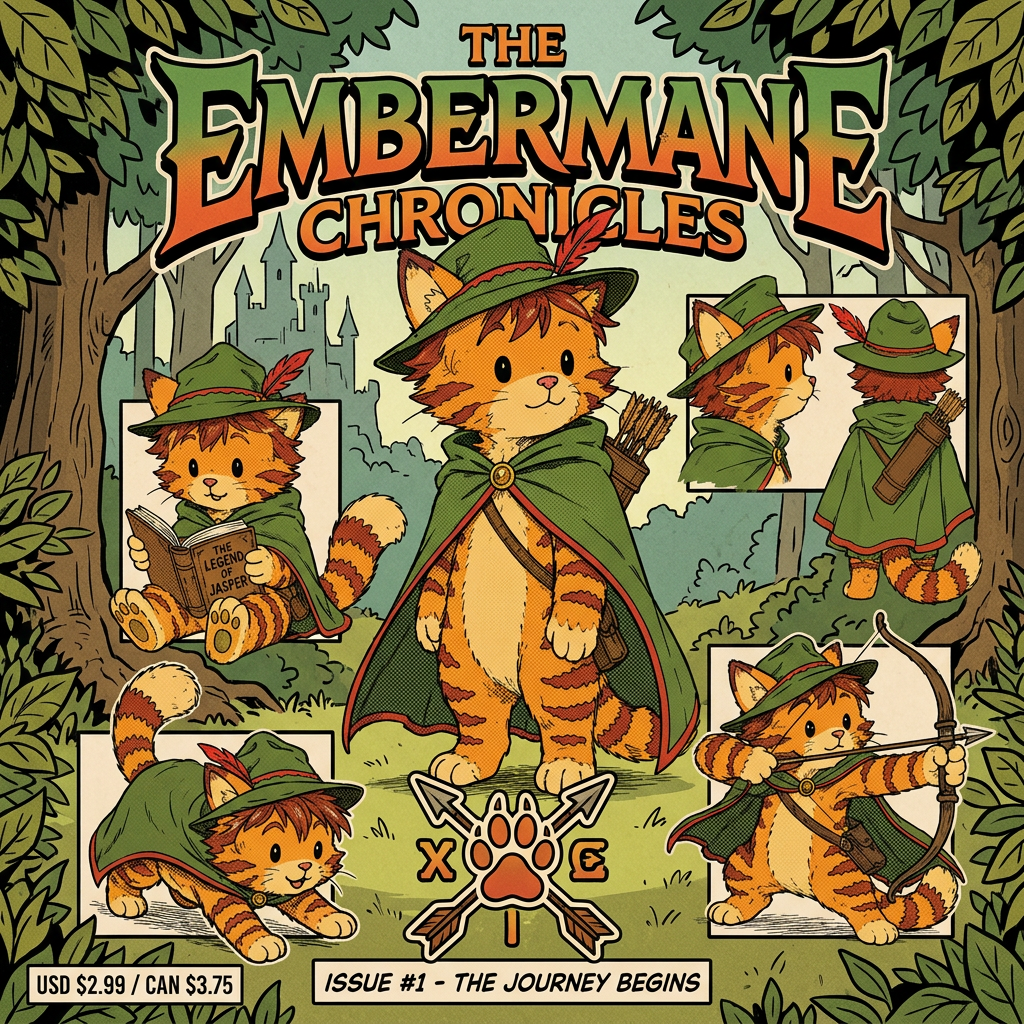
AI Design for Alright, let's imagine you're holding the book in your hands for the very first time.

---

The book is **21 × 13.5 cm**, tall and elegant. Not oversized, not tiny. It feels like a real fantasy novel that has been sitting on a library shelf for years.

The cover is matte, not glossy. When light hits it, it doesn't shine like plastic. Instead, it has a soft, almost velvety appearance.

The first thing your eye notices is not the illustration.

It's the word:

# EMBERMANE

Large.

Bold.

Centered near the top.

Not written in a generic fantasy font.

The letters feel carved.

Ancient.

Like they belong on a castle gate or an old family banner.

Small decorative leaves and arrowheads subtly weave into the lettering.

Above it:

**THE**

Small and understated.

Below it:

**Chronicles**

Smaller, elegant, almost like a subtitle.

The eye reads:

> EMBERMANE

before anything else.

---

Then you notice the border.

Not a thin line.

A real frame.

A thick, beautiful frame wrapping around the entire cover like a piece of artwork hanging in a gallery.

The frame is deep forest green.

Dark enough to feel noble.

Rich enough to feel warm.

Running through the frame are embossed details.

Oak leaves curl around the corners.

Tiny vines weave between them.

Arrows point inward toward the illustration.

Little feathers rest among the scrollwork.

The frame feels handcrafted.

Almost carved.

Like something belonging to an ancient family heirloom.

---

At the bottom center sits the Embermane crest.

Not huge.

Not flashy.

Just proud.

A stylized cat face on a shield.

Simple enough to recognize immediately.

Complex enough to feel historic.

The crest looks old.

Like generations of Embermanes have carried it.

---

Then your eyes move to the center illustration.

The illustration sits inside the frame like a painting.

The artwork isn't realistic.

It's storybook art.

Warm.

Inviting.

Timeless.

The colors are rich but controlled.

Nothing glows.

Nothing screams for attention.

Everything feels painted with care.

---

Standing in the center is Jasper.

Not posing heroically.

Not standing on a mountain with lightning behind him.

Not looking cool for the sake of looking cool.

He's simply aiming his bow.

And concentrating.

Really concentrating.

One eye is narrowed.

His tongue pokes slightly out of the corner of his mouth.

He's trying so hard to get the shot right.

That tiny detail tells you everything.

This isn't a legendary hero.

Not yet.

This is a kid trying to become one.

---

His green cloak catches the breeze.

The red trim along its edges creates a beautiful contrast.

His archer hat sits slightly tilted on his head.

The red feather curves upward.

His orange fur is warm and vibrant.

The red-brown markings on his cheeks, arms, legs, and ear tips stand out against the green.

The green and red-brown create a striking contrast that immediately becomes his visual identity.

You could recognize him from across a room.

---

Behind him stretches the world.

Not detailed enough to overwhelm the cover.

Just hints.

A distant forest.

Rolling hills.

A winding path.

Faraway mountains.

Maybe, barely visible in the distance, the rooflines of Embermane Hall.

The world feels large.

Like there are stories waiting beyond the edge of the page.

---

The corners of the illustration contain little details that reward observant readers.

A tiny compass hidden in some leaves.

A small fiddle carved into the frame.

A book tucked among the vines.

A miniature knight helmet.

A flower.

Readers won't notice them all at first.

They discover them over time.

---

The entire cover gives one feeling:

Not danger.

Not darkness.

Not war.

Wonder.

Adventure.

Friendship.

History.

A warm meal after a long journey.

An old story waiting to be discovered.

The kind of book a child finds in a library and remembers for the rest of their life.

When somebody sees it on a shelf, they don't think:

> "This looks epic."

They think:

> "I want to open this."

And that's exactly what a first book in **The Embermane Chronicles** should do. 📖🐱🏹🌲✨not realistic with bold black lines miinimal shading something from the 90s

Alright, let's imagine you're holding the book in your hands for the very first time. --- The book is **21 × 13.5 cm**, tall and elegant. Not oversized, not tiny. It feels like a real fantasy novel that has been sitting on a library shelf for years. The cover is matte, not glossy. When light hits it, it doesn't shine like plastic. Instead, it has a soft, almost velvety appearance. The first thing your eye notices is not the illustration. It's the word: # EMBERMANE Large. Bold. Centered near the top. Not written in a generic fantasy font. The letters feel carved. Ancient. Like they belong on a castle gate or an old family banner. Small decorative leaves and arrowheads subtly weave into the lettering. Above it: **THE** Small and understated. Below it: **Chronicles** Smaller, elegant, almost like a subtitle. The eye reads: > EMBERMANE before anything else. --- Then you notice the border. Not a thin line. A real frame. A thick, beautiful frame wrapping around the entire cover like a piece of artwork hanging in a gallery. The frame is deep forest green. Dark enough to feel noble. Rich enough to feel warm. Running through the frame are embossed details. Oak leaves curl around the corners. Tiny vines weave between them. Arrows point inward toward the illustration. Little feathers rest among the scrollwork. The frame feels handcrafted. Almost carved. Like something belonging to an ancient family heirloom. --- At the bottom center sits the Embermane crest. Not huge. Not flashy. Just proud. A stylized cat face on a shield. Simple enough to recognize immediately. Complex enough to feel historic. The crest looks old. Like generations of Embermanes have carried it. --- Then your eyes move to the center illustration. The illustration sits inside the frame like a painting. The artwork isn't realistic. It's storybook art. Warm. Inviting. Timeless. The colors are rich but controlled. Nothing glows. Nothing screams for attention. Everything feels painted with care. --- Standing in the center is Jasper. Not posing heroically. Not standing on a mountain with lightning behind him. Not looking cool for the sake of looking cool. He's simply aiming his bow. And concentrating. Really concentrating. One eye is narrowed. His tongue pokes slightly out of the corner of his mouth. He's trying so hard to get the shot right. That tiny detail tells you everything. This isn't a legendary hero. Not yet. This is a kid trying to become one. --- His green cloak catches the breeze. The red trim along its edges creates a beautiful contrast. His archer hat sits slightly tilted on his head. The red feather curves upward. His orange fur is warm and vibrant. The red-brown markings on his cheeks, arms, legs, and ear tips stand out against the green. The green and red-brown create a striking contrast that immediately becomes his visual identity. You could recognize him from across a room. --- Behind him stretches the world. Not detailed enough to overwhelm the cover. Just hints. A distant forest. Rolling hills. A winding path. Faraway mountains. Maybe, barely visible in the distance, the rooflines of Embermane Hall. The world feels large. Like there are stories waiting beyond the edge of the page. --- The corners of the illustration contain little details that reward observant readers. A tiny compass hidden in some leaves. A small fiddle carved into the frame. A book tucked among the vines. A miniature knight helmet. A flower. Readers won't notice them all at first. They discover them over time. --- The entire cover gives one feeling: Not danger. Not darkness. Not war. Wonder. Adventure. Friendship. History. A warm meal after a long journey. An old story waiting to be discovered. The kind of book a child finds in a library and remembers for the rest of their life. When somebody sees it on a shelf, they don't think: > "This looks epic." They think: > "I want to open this." And that's exactly what a first book in **The Embermane Chronicles** should do. 📖🐱🏹🌲✨not realistic with bold black lines miinimal shading something from the 90s

by @Elephant_8984916
AI Design for Alright, let's imagine you're holding the book in your hands for the very first time.

---

The book is **21 × 13.5 cm**, tall and elegant. Not oversized, not tiny. It feels like a real fantasy novel that has been sitting on a library shelf for years.

The cover is matte, not glossy. When light hits it, it doesn't shine like plastic. Instead, it has a soft, almost velvety appearance.

The first thing your eye notices is not the illustration.

It's the word:

# EMBERMANE

Large.

Bold.

Centered near the top.

Not written in a generic fantasy font.

The letters feel carved.

Ancient.

Like they belong on a castle gate or an old family banner.

Small decorative leaves and arrowheads subtly weave into the lettering.

Above it:

**THE**

Small and understated.

Below it:

**Chronicles**

Smaller, elegant, almost like a subtitle.

The eye reads:

> EMBERMANE

before anything else.

---

Then you notice the border.

Not a thin line.

A real frame.

A thick, beautiful frame wrapping around the entire cover like a piece of artwork hanging in a gallery.

The frame is deep forest green.

Dark enough to feel noble.

Rich enough to feel warm.

Running through the frame are embossed details.

Oak leaves curl around the corners.

Tiny vines weave between them.

Arrows point inward toward the illustration.

Little feathers rest among the scrollwork.

The frame feels handcrafted.

Almost carved.

Like something belonging to an ancient family heirloom.

---

At the bottom center sits the Embermane crest.

Not huge.

Not flashy.

Just proud.

A stylized cat face on a shield.

Simple enough to recognize immediately.

Complex enough to feel historic.

The crest looks old.

Like generations of Embermanes have carried it.

---

Then your eyes move to the center illustration.

The illustration sits inside the frame like a painting.

The artwork isn't realistic.

It's storybook art.

Warm.

Inviting.

Timeless.

The colors are rich but controlled.

Nothing glows.

Nothing screams for attention.

Everything feels painted with care.

---

Standing in the center is Jasper.

Not posing heroically.

Not standing on a mountain with lightning behind him.

Not looking cool for the sake of looking cool.

He's simply aiming his bow.

And concentrating.

Really concentrating.

One eye is narrowed.

His tongue pokes slightly out of the corner of his mouth.

He's trying so hard to get the shot right.

That tiny detail tells you everything.

This isn't a legendary hero.

Not yet.

This is a kid trying to become one.

---

His green cloak catches the breeze.

The red trim along its edges creates a beautiful contrast.

His archer hat sits slightly tilted on his head.

The red feather curves upward.

His orange fur is warm and vibrant.

The red-brown markings on his cheeks, arms, legs, and ear tips stand out against the green.

The green and red-brown create a striking contrast that immediately becomes his visual identity.

You could recognize him from across a room.

---

Behind him stretches the world.

Not detailed enough to overwhelm the cover.

Just hints.

A distant forest.

Rolling hills.

A winding path.

Faraway mountains.

Maybe, barely visible in the distance, the rooflines of Embermane Hall.

The world feels large.

Like there are stories waiting beyond the edge of the page.

---

The corners of the illustration contain little details that reward observant readers.

A tiny compass hidden in some leaves.

A small fiddle carved into the frame.

A book tucked among the vines.

A miniature knight helmet.

A flower.

Readers won't notice them all at first.

They discover them over time.

---

The entire cover gives one feeling:

Not danger.

Not darkness.

Not war.

Wonder.

Adventure.

Friendship.

History.

A warm meal after a long journey.

An old story waiting to be discovered.

The kind of book a child finds in a library and remembers for the rest of their life.

When somebody sees it on a shelf, they don't think:

> "This looks epic."

They think:

> "I want to open this."

And that's exactly what a first book in **The Embermane Chronicles** should do. 📖🐱🏹🌲✨not realistic with bold black lines miinimal shading something from the 90s

Alright, let's imagine you're holding the book in your hands for the very first time. --- The book is **21 × 13.5 cm**, tall and elegant. Not oversized, not tiny. It feels like a real fantasy novel that has been sitting on a library shelf for years. The cover is matte, not glossy. When light hits it, it doesn't shine like plastic. Instead, it has a soft, almost velvety appearance. The first thing your eye notices is not the illustration. It's the word: # EMBERMANE Large. Bold. Centered near the top. Not written in a generic fantasy font. The letters feel carved. Ancient. Like they belong on a castle gate or an old family banner. Small decorative leaves and arrowheads subtly weave into the lettering. Above it: **THE** Small and understated. Below it: **Chronicles** Smaller, elegant, almost like a subtitle. The eye reads: > EMBERMANE before anything else. --- Then you notice the border. Not a thin line. A real frame. A thick, beautiful frame wrapping around the entire cover like a piece of artwork hanging in a gallery. The frame is deep forest green. Dark enough to feel noble. Rich enough to feel warm. Running through the frame are embossed details. Oak leaves curl around the corners. Tiny vines weave between them. Arrows point inward toward the illustration. Little feathers rest among the scrollwork. The frame feels handcrafted. Almost carved. Like something belonging to an ancient family heirloom. --- At the bottom center sits the Embermane crest. Not huge. Not flashy. Just proud. A stylized cat face on a shield. Simple enough to recognize immediately. Complex enough to feel historic. The crest looks old. Like generations of Embermanes have carried it. --- Then your eyes move to the center illustration. The illustration sits inside the frame like a painting. The artwork isn't realistic. It's storybook art. Warm. Inviting. Timeless. The colors are rich but controlled. Nothing glows. Nothing screams for attention. Everything feels painted with care. --- Standing in the center is Jasper. Not posing heroically. Not standing on a mountain with lightning behind him. Not looking cool for the sake of looking cool. He's simply aiming his bow. And concentrating. Really concentrating. One eye is narrowed. His tongue pokes slightly out of the corner of his mouth. He's trying so hard to get the shot right. That tiny detail tells you everything. This isn't a legendary hero. Not yet. This is a kid trying to become one. --- His green cloak catches the breeze. The red trim along its edges creates a beautiful contrast. His archer hat sits slightly tilted on his head. The red feather curves upward. His orange fur is warm and vibrant. The red-brown markings on his cheeks, arms, legs, and ear tips stand out against the green. The green and red-brown create a striking contrast that immediately becomes his visual identity. You could recognize him from across a room. --- Behind him stretches the world. Not detailed enough to overwhelm the cover. Just hints. A distant forest. Rolling hills. A winding path. Faraway mountains. Maybe, barely visible in the distance, the rooflines of Embermane Hall. The world feels large. Like there are stories waiting beyond the edge of the page. --- The corners of the illustration contain little details that reward observant readers. A tiny compass hidden in some leaves. A small fiddle carved into the frame. A book tucked among the vines. A miniature knight helmet. A flower. Readers won't notice them all at first. They discover them over time. --- The entire cover gives one feeling: Not danger. Not darkness. Not war. Wonder. Adventure. Friendship. History. A warm meal after a long journey. An old story waiting to be discovered. The kind of book a child finds in a library and remembers for the rest of their life. When somebody sees it on a shelf, they don't think: > "This looks epic." They think: > "I want to open this." And that's exactly what a first book in **The Embermane Chronicles** should do. 📖🐱🏹🌲✨not realistic with bold black lines miinimal shading something from the 90s

by @Elephant_8984916
AI Design for Alright, let's imagine you're holding the book in your hands for the very first time.

---

The book is **21 × 13.5 cm**, tall and elegant. Not oversized, not tiny. It feels like a real fantasy novel that has been sitting on a library shelf for years.

The cover is matte, not glossy. When light hits it, it doesn't shine like plastic. Instead, it has a soft, almost velvety appearance.

The first thing your eye notices is not the illustration.

It's the word:

# EMBERMANE

Large.

Bold.

Centered near the top.

Not written in a generic fantasy font.

The letters feel carved.

Ancient.

Like they belong on a castle gate or an old family banner.

Small decorative leaves and arrowheads subtly weave into the lettering.

Above it:

**THE**

Small and understated.

Below it:

**Chronicles**

Smaller, elegant, almost like a subtitle.

The eye reads:

> EMBERMANE

before anything else.

---

Then you notice the border.

Not a thin line.

A real frame.

A thick, beautiful frame wrapping around the entire cover like a piece of artwork hanging in a gallery.

The frame is deep forest green.

Dark enough to feel noble.

Rich enough to feel warm.

Running through the frame are embossed details.

Oak leaves curl around the corners.

Tiny vines weave between them.

Arrows point inward toward the illustration.

Little feathers rest among the scrollwork.

The frame feels handcrafted.

Almost carved.

Like something belonging to an ancient family heirloom.

---

At the bottom center sits the Embermane crest.

Not huge.

Not flashy.

Just proud.

A stylized cat face on a shield.

Simple enough to recognize immediately.

Complex enough to feel historic.

The crest looks old.

Like generations of Embermanes have carried it.

---

Then your eyes move to the center illustration.

The illustration sits inside the frame like a painting.

The artwork isn't realistic.

It's storybook art.

Warm.

Inviting.

Timeless.

The colors are rich but controlled.

Nothing glows.

Nothing screams for attention.

Everything feels painted with care.

---

Standing in the center is Jasper.

Not posing heroically.

Not standing on a mountain with lightning behind him.

Not looking cool for the sake of looking cool.

He's simply aiming his bow.

And concentrating.

Really concentrating.

One eye is narrowed.

His tongue pokes slightly out of the corner of his mouth.

He's trying so hard to get the shot right.

That tiny detail tells you everything.

This isn't a legendary hero.

Not yet.

This is a kid trying to become one.

---

His green cloak catches the breeze.

The red trim along its edges creates a beautiful contrast.

His archer hat sits slightly tilted on his head.

The red feather curves upward.

His orange fur is warm and vibrant.

The red-brown markings on his cheeks, arms, legs, and ear tips stand out against the green.

The green and red-brown create a striking contrast that immediately becomes his visual identity.

You could recognize him from across a room.

---

Behind him stretches the world.

Not detailed enough to overwhelm the cover.

Just hints.

A distant forest.

Rolling hills.

A winding path.

Faraway mountains.

Maybe, barely visible in the distance, the rooflines of Embermane Hall.

The world feels large.

Like there are stories waiting beyond the edge of the page.

---

The corners of the illustration contain little details that reward observant readers.

A tiny compass hidden in some leaves.

A small fiddle carved into the frame.

A book tucked among the vines.

A miniature knight helmet.

A flower.

Readers won't notice them all at first.

They discover them over time.

---

The entire cover gives one feeling:

Not danger.

Not darkness.

Not war.

Wonder.

Adventure.

Friendship.

History.

A warm meal after a long journey.

An old story waiting to be discovered.

The kind of book a child finds in a library and remembers for the rest of their life.

When somebody sees it on a shelf, they don't think:

> "This looks epic."

They think:

> "I want to open this."

And that's exactly what a first book in **The Embermane Chronicles** should do. 📖🐱🏹🌲✨not realistic with bold black lines miinimal shading something from the 90s

Alright, let's imagine you're holding the book in your hands for the very first time. --- The book is **21 × 13.5 cm**, tall and elegant. Not oversized, not tiny. It feels like a real fantasy novel that has been sitting on a library shelf for years. The cover is matte, not glossy. When light hits it, it doesn't shine like plastic. Instead, it has a soft, almost velvety appearance. The first thing your eye notices is not the illustration. It's the word: # EMBERMANE Large. Bold. Centered near the top. Not written in a generic fantasy font. The letters feel carved. Ancient. Like they belong on a castle gate or an old family banner. Small decorative leaves and arrowheads subtly weave into the lettering. Above it: **THE** Small and understated. Below it: **Chronicles** Smaller, elegant, almost like a subtitle. The eye reads: > EMBERMANE before anything else. --- Then you notice the border. Not a thin line. A real frame. A thick, beautiful frame wrapping around the entire cover like a piece of artwork hanging in a gallery. The frame is deep forest green. Dark enough to feel noble. Rich enough to feel warm. Running through the frame are embossed details. Oak leaves curl around the corners. Tiny vines weave between them. Arrows point inward toward the illustration. Little feathers rest among the scrollwork. The frame feels handcrafted. Almost carved. Like something belonging to an ancient family heirloom. --- At the bottom center sits the Embermane crest. Not huge. Not flashy. Just proud. A stylized cat face on a shield. Simple enough to recognize immediately. Complex enough to feel historic. The crest looks old. Like generations of Embermanes have carried it. --- Then your eyes move to the center illustration. The illustration sits inside the frame like a painting. The artwork isn't realistic. It's storybook art. Warm. Inviting. Timeless. The colors are rich but controlled. Nothing glows. Nothing screams for attention. Everything feels painted with care. --- Standing in the center is Jasper. Not posing heroically. Not standing on a mountain with lightning behind him. Not looking cool for the sake of looking cool. He's simply aiming his bow. And concentrating. Really concentrating. One eye is narrowed. His tongue pokes slightly out of the corner of his mouth. He's trying so hard to get the shot right. That tiny detail tells you everything. This isn't a legendary hero. Not yet. This is a kid trying to become one. --- His green cloak catches the breeze. The red trim along its edges creates a beautiful contrast. His archer hat sits slightly tilted on his head. The red feather curves upward. His orange fur is warm and vibrant. The red-brown markings on his cheeks, arms, legs, and ear tips stand out against the green. The green and red-brown create a striking contrast that immediately becomes his visual identity. You could recognize him from across a room. --- Behind him stretches the world. Not detailed enough to overwhelm the cover. Just hints. A distant forest. Rolling hills. A winding path. Faraway mountains. Maybe, barely visible in the distance, the rooflines of Embermane Hall. The world feels large. Like there are stories waiting beyond the edge of the page. --- The corners of the illustration contain little details that reward observant readers. A tiny compass hidden in some leaves. A small fiddle carved into the frame. A book tucked among the vines. A miniature knight helmet. A flower. Readers won't notice them all at first. They discover them over time. --- The entire cover gives one feeling: Not danger. Not darkness. Not war. Wonder. Adventure. Friendship. History. A warm meal after a long journey. An old story waiting to be discovered. The kind of book a child finds in a library and remembers for the rest of their life. When somebody sees it on a shelf, they don't think: > "This looks epic." They think: > "I want to open this." And that's exactly what a first book in **The Embermane Chronicles** should do. 📖🐱🏹🌲✨not realistic with bold black lines miinimal shading something from the 90s

by @Elephant_8984916
AI Design for Alright, let's imagine you're holding the book in your hands for the very first time.

---

The book is **21 × 13.5 cm**, tall and elegant. Not oversized, not tiny. It feels like a real fantasy novel that has been sitting on a library shelf for years.

The cover is matte, not glossy. When light hits it, it doesn't shine like plastic. Instead, it has a soft, almost velvety appearance.

The first thing your eye notices is not the illustration.

It's the word:

# EMBERMANE

Large.

Bold.

Centered near the top.

Not written in a generic fantasy font.

The letters feel carved.

Ancient.

Like they belong on a castle gate or an old family banner.

Small decorative leaves and arrowheads subtly weave into the lettering.

Above it:

**THE**

Small and understated.

Below it:

**Chronicles**

Smaller, elegant, almost like a subtitle.

The eye reads:

> EMBERMANE

before anything else.

---

Then you notice the border.

Not a thin line.

A real frame.

A thick, beautiful frame wrapping around the entire cover like a piece of artwork hanging in a gallery.

The frame is deep forest green.

Dark enough to feel noble.

Rich enough to feel warm.

Running through the frame are embossed details.

Oak leaves curl around the corners.

Tiny vines weave between them.

Arrows point inward toward the illustration.

Little feathers rest among the scrollwork.

The frame feels handcrafted.

Almost carved.

Like something belonging to an ancient family heirloom.

---

At the bottom center sits the Embermane crest.

Not huge.

Not flashy.

Just proud.

A stylized cat face on a shield.

Simple enough to recognize immediately.

Complex enough to feel historic.

The crest looks old.

Like generations of Embermanes have carried it.

---

Then your eyes move to the center illustration.

The illustration sits inside the frame like a painting.

The artwork isn't realistic.

It's storybook art.

Warm.

Inviting.

Timeless.

The colors are rich but controlled.

Nothing glows.

Nothing screams for attention.

Everything feels painted with care.

---

Standing in the center is Jasper.

Not posing heroically.

Not standing on a mountain with lightning behind him.

Not looking cool for the sake of looking cool.

He's simply aiming his bow.

And concentrating.

Really concentrating.

One eye is narrowed.

His tongue pokes slightly out of the corner of his mouth.

He's trying so hard to get the shot right.

That tiny detail tells you everything.

This isn't a legendary hero.

Not yet.

This is a kid trying to become one.

---

His green cloak catches the breeze.

The red trim along its edges creates a beautiful contrast.

His archer hat sits slightly tilted on his head.

The red feather curves upward.

His orange fur is warm and vibrant.

The red-brown markings on his cheeks, arms, legs, and ear tips stand out against the green.

The green and red-brown create a striking contrast that immediately becomes his visual identity.

You could recognize him from across a room.

---

Behind him stretches the world.

Not detailed enough to overwhelm the cover.

Just hints.

A distant forest.

Rolling hills.

A winding path.

Faraway mountains.

Maybe, barely visible in the distance, the rooflines of Embermane Hall.

The world feels large.

Like there are stories waiting beyond the edge of the page.

---

The corners of the illustration contain little details that reward observant readers.

A tiny compass hidden in some leaves.

A small fiddle carved into the frame.

A book tucked among the vines.

A miniature knight helmet.

A flower.

Readers won't notice them all at first.

They discover them over time.

---

The entire cover gives one feeling:

Not danger.

Not darkness.

Not war.

Wonder.

Adventure.

Friendship.

History.

A warm meal after a long journey.

An old story waiting to be discovered.

The kind of book a child finds in a library and remembers for the rest of their life.

When somebody sees it on a shelf, they don't think:

> "This looks epic."

They think:

> "I want to open this."

And that's exactly what a first book in **The Embermane Chronicles** should do. 📖🐱🏹🌲✨

Alright, let's imagine you're holding the book in your hands for the very first time. --- The book is **21 × 13.5 cm**, tall and elegant. Not oversized, not tiny. It feels like a real fantasy novel that has been sitting on a library shelf for years. The cover is matte, not glossy. When light hits it, it doesn't shine like plastic. Instead, it has a soft, almost velvety appearance. The first thing your eye notices is not the illustration. It's the word: # EMBERMANE Large. Bold. Centered near the top. Not written in a generic fantasy font. The letters feel carved. Ancient. Like they belong on a castle gate or an old family banner. Small decorative leaves and arrowheads subtly weave into the lettering. Above it: **THE** Small and understated. Below it: **Chronicles** Smaller, elegant, almost like a subtitle. The eye reads: > EMBERMANE before anything else. --- Then you notice the border. Not a thin line. A real frame. A thick, beautiful frame wrapping around the entire cover like a piece of artwork hanging in a gallery. The frame is deep forest green. Dark enough to feel noble. Rich enough to feel warm. Running through the frame are embossed details. Oak leaves curl around the corners. Tiny vines weave between them. Arrows point inward toward the illustration. Little feathers rest among the scrollwork. The frame feels handcrafted. Almost carved. Like something belonging to an ancient family heirloom. --- At the bottom center sits the Embermane crest. Not huge. Not flashy. Just proud. A stylized cat face on a shield. Simple enough to recognize immediately. Complex enough to feel historic. The crest looks old. Like generations of Embermanes have carried it. --- Then your eyes move to the center illustration. The illustration sits inside the frame like a painting. The artwork isn't realistic. It's storybook art. Warm. Inviting. Timeless. The colors are rich but controlled. Nothing glows. Nothing screams for attention. Everything feels painted with care. --- Standing in the center is Jasper. Not posing heroically. Not standing on a mountain with lightning behind him. Not looking cool for the sake of looking cool. He's simply aiming his bow. And concentrating. Really concentrating. One eye is narrowed. His tongue pokes slightly out of the corner of his mouth. He's trying so hard to get the shot right. That tiny detail tells you everything. This isn't a legendary hero. Not yet. This is a kid trying to become one. --- His green cloak catches the breeze. The red trim along its edges creates a beautiful contrast. His archer hat sits slightly tilted on his head. The red feather curves upward. His orange fur is warm and vibrant. The red-brown markings on his cheeks, arms, legs, and ear tips stand out against the green. The green and red-brown create a striking contrast that immediately becomes his visual identity. You could recognize him from across a room. --- Behind him stretches the world. Not detailed enough to overwhelm the cover. Just hints. A distant forest. Rolling hills. A winding path. Faraway mountains. Maybe, barely visible in the distance, the rooflines of Embermane Hall. The world feels large. Like there are stories waiting beyond the edge of the page. --- The corners of the illustration contain little details that reward observant readers. A tiny compass hidden in some leaves. A small fiddle carved into the frame. A book tucked among the vines. A miniature knight helmet. A flower. Readers won't notice them all at first. They discover them over time. --- The entire cover gives one feeling: Not danger. Not darkness. Not war. Wonder. Adventure. Friendship. History. A warm meal after a long journey. An old story waiting to be discovered. The kind of book a child finds in a library and remembers for the rest of their life. When somebody sees it on a shelf, they don't think: > "This looks epic." They think: > "I want to open this." And that's exactly what a first book in **The Embermane Chronicles** should do. 📖🐱🏹🌲✨

by @Elephant_8984916
AI Design for Alright, let's imagine you're holding the book in your hands for the very first time.

---

The book is **21 × 13.5 cm**, tall and elegant. Not oversized, not tiny. It feels like a real fantasy novel that has been sitting on a library shelf for years.

The cover is matte, not glossy. When light hits it, it doesn't shine like plastic. Instead, it has a soft, almost velvety appearance.

The first thing your eye notices is not the illustration.

It's the word:

# EMBERMANE

Large.

Bold.

Centered near the top.

Not written in a generic fantasy font.

The letters feel carved.

Ancient.

Like they belong on a castle gate or an old family banner.

Small decorative leaves and arrowheads subtly weave into the lettering.

Above it:

**THE**

Small and understated.

Below it:

**Chronicles**

Smaller, elegant, almost like a subtitle.

The eye reads:

> EMBERMANE

before anything else.

---

Then you notice the border.

Not a thin line.

A real frame.

A thick, beautiful frame wrapping around the entire cover like a piece of artwork hanging in a gallery.

The frame is deep forest green.

Dark enough to feel noble.

Rich enough to feel warm.

Running through the frame are embossed details.

Oak leaves curl around the corners.

Tiny vines weave between them.

Arrows point inward toward the illustration.

Little feathers rest among the scrollwork.

The frame feels handcrafted.

Almost carved.

Like something belonging to an ancient family heirloom.

---

At the bottom center sits the Embermane crest.

Not huge.

Not flashy.

Just proud.

A stylized cat face on a shield.

Simple enough to recognize immediately.

Complex enough to feel historic.

The crest looks old.

Like generations of Embermanes have carried it.

---

Then your eyes move to the center illustration.

The illustration sits inside the frame like a painting.

The artwork isn't realistic.

It's storybook art.

Warm.

Inviting.

Timeless.

The colors are rich but controlled.

Nothing glows.

Nothing screams for attention.

Everything feels painted with care.

---

Standing in the center is Jasper.

Not posing heroically.

Not standing on a mountain with lightning behind him.

Not looking cool for the sake of looking cool.

He's simply aiming his bow.

And concentrating.

Really concentrating.

One eye is narrowed.

His tongue pokes slightly out of the corner of his mouth.

He's trying so hard to get the shot right.

That tiny detail tells you everything.

This isn't a legendary hero.

Not yet.

This is a kid trying to become one.

---

His green cloak catches the breeze.

The red trim along its edges creates a beautiful contrast.

His archer hat sits slightly tilted on his head.

The red feather curves upward.

His orange fur is warm and vibrant.

The red-brown markings on his cheeks, arms, legs, and ear tips stand out against the green.

The green and red-brown create a striking contrast that immediately becomes his visual identity.

You could recognize him from across a room.

---

Behind him stretches the world.

Not detailed enough to overwhelm the cover.

Just hints.

A distant forest.

Rolling hills.

A winding path.

Faraway mountains.

Maybe, barely visible in the distance, the rooflines of Embermane Hall.

The world feels large.

Like there are stories waiting beyond the edge of the page.

---

The corners of the illustration contain little details that reward observant readers.

A tiny compass hidden in some leaves.

A small fiddle carved into the frame.

A book tucked among the vines.

A miniature knight helmet.

A flower.

Readers won't notice them all at first.

They discover them over time.

---

The entire cover gives one feeling:

Not danger.

Not darkness.

Not war.

Wonder.

Adventure.

Friendship.

History.

A warm meal after a long journey.

An old story waiting to be discovered.

The kind of book a child finds in a library and remembers for the rest of their life.

When somebody sees it on a shelf, they don't think:

> "This looks epic."

They think:

> "I want to open this."

And that's exactly what a first book in **The Embermane Chronicles** should do. 📖🐱🏹🌲✨

Alright, let's imagine you're holding the book in your hands for the very first time. --- The book is **21 × 13.5 cm**, tall and elegant. Not oversized, not tiny. It feels like a real fantasy novel that has been sitting on a library shelf for years. The cover is matte, not glossy. When light hits it, it doesn't shine like plastic. Instead, it has a soft, almost velvety appearance. The first thing your eye notices is not the illustration. It's the word: # EMBERMANE Large. Bold. Centered near the top. Not written in a generic fantasy font. The letters feel carved. Ancient. Like they belong on a castle gate or an old family banner. Small decorative leaves and arrowheads subtly weave into the lettering. Above it: **THE** Small and understated. Below it: **Chronicles** Smaller, elegant, almost like a subtitle. The eye reads: > EMBERMANE before anything else. --- Then you notice the border. Not a thin line. A real frame. A thick, beautiful frame wrapping around the entire cover like a piece of artwork hanging in a gallery. The frame is deep forest green. Dark enough to feel noble. Rich enough to feel warm. Running through the frame are embossed details. Oak leaves curl around the corners. Tiny vines weave between them. Arrows point inward toward the illustration. Little feathers rest among the scrollwork. The frame feels handcrafted. Almost carved. Like something belonging to an ancient family heirloom. --- At the bottom center sits the Embermane crest. Not huge. Not flashy. Just proud. A stylized cat face on a shield. Simple enough to recognize immediately. Complex enough to feel historic. The crest looks old. Like generations of Embermanes have carried it. --- Then your eyes move to the center illustration. The illustration sits inside the frame like a painting. The artwork isn't realistic. It's storybook art. Warm. Inviting. Timeless. The colors are rich but controlled. Nothing glows. Nothing screams for attention. Everything feels painted with care. --- Standing in the center is Jasper. Not posing heroically. Not standing on a mountain with lightning behind him. Not looking cool for the sake of looking cool. He's simply aiming his bow. And concentrating. Really concentrating. One eye is narrowed. His tongue pokes slightly out of the corner of his mouth. He's trying so hard to get the shot right. That tiny detail tells you everything. This isn't a legendary hero. Not yet. This is a kid trying to become one. --- His green cloak catches the breeze. The red trim along its edges creates a beautiful contrast. His archer hat sits slightly tilted on his head. The red feather curves upward. His orange fur is warm and vibrant. The red-brown markings on his cheeks, arms, legs, and ear tips stand out against the green. The green and red-brown create a striking contrast that immediately becomes his visual identity. You could recognize him from across a room. --- Behind him stretches the world. Not detailed enough to overwhelm the cover. Just hints. A distant forest. Rolling hills. A winding path. Faraway mountains. Maybe, barely visible in the distance, the rooflines of Embermane Hall. The world feels large. Like there are stories waiting beyond the edge of the page. --- The corners of the illustration contain little details that reward observant readers. A tiny compass hidden in some leaves. A small fiddle carved into the frame. A book tucked among the vines. A miniature knight helmet. A flower. Readers won't notice them all at first. They discover them over time. --- The entire cover gives one feeling: Not danger. Not darkness. Not war. Wonder. Adventure. Friendship. History. A warm meal after a long journey. An old story waiting to be discovered. The kind of book a child finds in a library and remembers for the rest of their life. When somebody sees it on a shelf, they don't think: > "This looks epic." They think: > "I want to open this." And that's exactly what a first book in **The Embermane Chronicles** should do. 📖🐱🏹🌲✨

by @Elephant_8984916
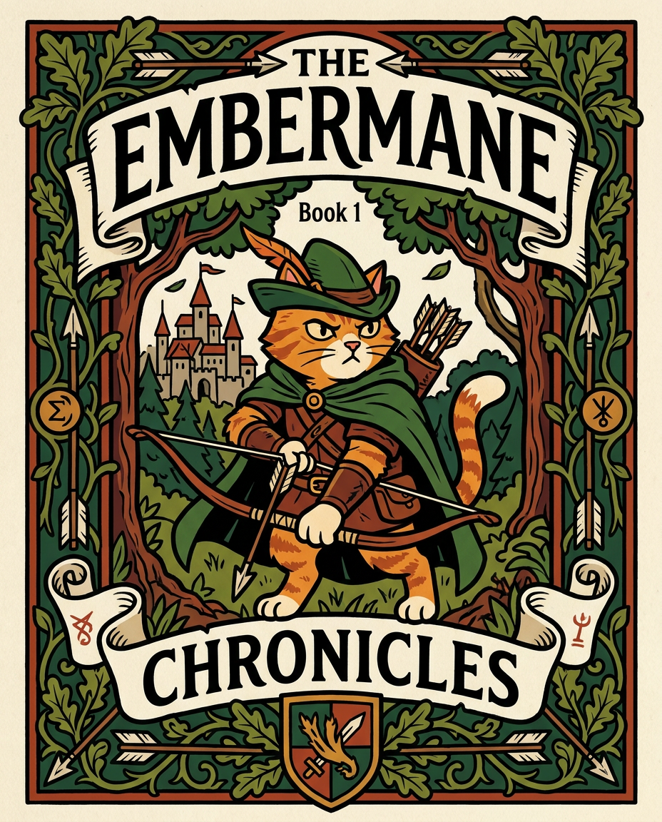
AI Design for Absolutely. Here's how I'd describe the entire cover as if it were written in a design document for an illustrator.

---

# 📖 THE EMBERMANE CHRONICLES

### Book 1 Cover Design Specification

## Overall Format

* Book size: **21 cm × 13.5 cm**
* Classic fantasy novel proportions.
* Matte finish.
* Storybook-inspired cover.
* Not realistic.
* Not modern.
* Warm, timeless, and iconic.

The cover should feel like something discovered in an old library, passed down through generations.

---

# Color Palette

### Primary Colors

🌲 Deep forest green

🔥 Warm red-brown

✨ Soft gold

📜 Cream

These colors should contrast strongly.

The green and red-brown should never blend together.

Instead:

* Green frames red-brown.
* Red-brown frames green.
* Gold highlights details.

The result should feel rich and elegant.

---

# Cover Layout

The cover is divided into two major sections:

## Outer Cover Frame

A thick decorative border surrounding the artwork.

This border is one of the defining visual features of the series.

When readers see this frame, they should instantly recognize:

> "That's an Embermane Chronicles book."

---

## Center Illustration Window

Inside the border sits a framed illustration.

Like a painting inside an old book cover.

The illustration occupies roughly:

60–70% of the front cover.

---

# The Border

### Main Border Color

Deep forest green.

### Border Decorations

The border contains elegant line art and embossing.

Features include:

🌿 Oak leaves

🌿 Vines

🏹 Arrows

🪶 Feathers

📜 Scrollwork

🌰 Acorns

The decorations should look inspired by medieval manuscripts.

Not overly complex.

Not cluttered.

Beautiful and readable.

---

# Hidden Symbols

The border contains tiny references to important characters.

Readers may not notice them immediately.

Examples:

📚 Milo's book

🛡 Rufus' tiny knight helmet

🗺 Shadow's compass

🎻 Ashen's fiddle

🌼 Pippa's flower

These should feel like little secrets.

---

# Title Placement

The title is integrated into the border.

Not floating over the artwork.

### Top Border

Small text:

**THE**

Below it:

# EMBERMANE

Large.

Very large.

The largest text on the cover.

The first thing people notice.

---

### Bottom Border

Smaller text:

**Chronicles**

Elegant.

Decorative.

Part of the frame itself.

---

# The Embermane Crest

Located at the bottom center.

Built into the border.

Not too large.

Not too small.

A symbol readers learn to recognize.

Possible design:

🐱 Stylized cat head

🔥 Red-brown mane

🌲 Green shield background

🏹 Small crossed bow behind it

Simple and iconic.

---

# Central Illustration

The illustration is framed by the border.

---

## Jasper Embermane

Standing slightly off-center.

The focus of the entire cover.

Features:

🐱 Orange tabby cat

🐱 Red-brown mane

🐱 Red-brown cheek stripes

🐱 Red-brown arm and leg markings

🐱 Red-brown ear tips

---

### Clothing

🌲 Green cloak

🌲 Green archer hat

🪶 Red feather

🔴 Thin red trim around the cloak edges

---

### Pose

Jasper is aiming his bow.

Not fighting.

Not dramatic.

Not angry.

Instead:

He is concentrating extremely hard.

One eye slightly squinted.

Tongue sticking out a little.

Like a kid trying his absolute best.

This detail makes him feel charming and relatable.

---

# Background

Soft storybook scenery.

Not detailed enough to distract.

Possible elements:

🌲 Forest

⛰ Distant mountains

🏰 Tiny glimpse of Embermane Hall

☁ Soft sky

The background exists only to support Jasper.

Jasper remains the star.

---

# Art Style

### Linework

* Clean outlines
* Storybook quality
* Slightly hand-drawn

### Coloring

* Flat colors
* Soft gradients
* Minimal shading

### Overall Feel

Somewhere between:

📖 Redwall

📖 Classic fantasy novels

📖 Illustrated children's adventure books

The goal is:

> A timeless fantasy storybook.

Not a movie poster.

Not a comic cover.

Not realism.

---

# Reader Impression

When someone sees the book for the first time, they should think:

> "Who is Embermane?"

Then:

> "Who is that cat?"

Then:

> "I want to know what's inside."

The cover should promise:

🌲 Adventure

🏹 Heroism

📜 Ancient history

🐱 Friendship

🍲 Warmth

✨ Wonder

And most importantly:

> The beginning of a very long chronicle.

That's how I imagine **The Embermane Chronicles** sitting on a bookshelf, looking like the first volume of a beloved fantasy saga. 🐱🏹📖🌲🔥 and make it so i can actually use it as a cover full screen and not sketch art syle do the ones u did just better and thicker bold lines make the cover fit the whole image and make the cat hero to have thicker black outlines and the cover too by vanja jovanović

Absolutely. Here's how I'd describe the entire cover as if it were written in a design document for an illustrator. --- # 📖 THE EMBERMANE CHRONICLES ### Book 1 Cover Design Specification ## Overall Format * Book size: **21 cm × 13.5 cm** * Classic fantasy novel proportions. * Matte finish. * Storybook-inspired cover. * Not realistic. * Not modern. * Warm, timeless, and iconic. The cover should feel like something discovered in an old library, passed down through generations. --- # Color Palette ### Primary Colors 🌲 Deep forest green 🔥 Warm red-brown ✨ Soft gold 📜 Cream These colors should contrast strongly. The green and red-brown should never blend together. Instead: * Green frames red-brown. * Red-brown frames green. * Gold highlights details. The result should feel rich and elegant. --- # Cover Layout The cover is divided into two major sections: ## Outer Cover Frame A thick decorative border surrounding the artwork. This border is one of the defining visual features of the series. When readers see this frame, they should instantly recognize: > "That's an Embermane Chronicles book." --- ## Center Illustration Window Inside the border sits a framed illustration. Like a painting inside an old book cover. The illustration occupies roughly: 60–70% of the front cover. --- # The Border ### Main Border Color Deep forest green. ### Border Decorations The border contains elegant line art and embossing. Features include: 🌿 Oak leaves 🌿 Vines 🏹 Arrows 🪶 Feathers 📜 Scrollwork 🌰 Acorns The decorations should look inspired by medieval manuscripts. Not overly complex. Not cluttered. Beautiful and readable. --- # Hidden Symbols The border contains tiny references to important characters. Readers may not notice them immediately. Examples: 📚 Milo's book 🛡 Rufus' tiny knight helmet 🗺 Shadow's compass 🎻 Ashen's fiddle 🌼 Pippa's flower These should feel like little secrets. --- # Title Placement The title is integrated into the border. Not floating over the artwork. ### Top Border Small text: **THE** Below it: # EMBERMANE Large. Very large. The largest text on the cover. The first thing people notice. --- ### Bottom Border Smaller text: **Chronicles** Elegant. Decorative. Part of the frame itself. --- # The Embermane Crest Located at the bottom center. Built into the border. Not too large. Not too small. A symbol readers learn to recognize. Possible design: 🐱 Stylized cat head 🔥 Red-brown mane 🌲 Green shield background 🏹 Small crossed bow behind it Simple and iconic. --- # Central Illustration The illustration is framed by the border. --- ## Jasper Embermane Standing slightly off-center. The focus of the entire cover. Features: 🐱 Orange tabby cat 🐱 Red-brown mane 🐱 Red-brown cheek stripes 🐱 Red-brown arm and leg markings 🐱 Red-brown ear tips --- ### Clothing 🌲 Green cloak 🌲 Green archer hat 🪶 Red feather 🔴 Thin red trim around the cloak edges --- ### Pose Jasper is aiming his bow. Not fighting. Not dramatic. Not angry. Instead: He is concentrating extremely hard. One eye slightly squinted. Tongue sticking out a little. Like a kid trying his absolute best. This detail makes him feel charming and relatable. --- # Background Soft storybook scenery. Not detailed enough to distract. Possible elements: 🌲 Forest ⛰ Distant mountains 🏰 Tiny glimpse of Embermane Hall ☁ Soft sky The background exists only to support Jasper. Jasper remains the star. --- # Art Style ### Linework * Clean outlines * Storybook quality * Slightly hand-drawn ### Coloring * Flat colors * Soft gradients * Minimal shading ### Overall Feel Somewhere between: 📖 Redwall 📖 Classic fantasy novels 📖 Illustrated children's adventure books The goal is: > A timeless fantasy storybook. Not a movie poster. Not a comic cover. Not realism. --- # Reader Impression When someone sees the book for the first time, they should think: > "Who is Embermane?" Then: > "Who is that cat?" Then: > "I want to know what's inside." The cover should promise: 🌲 Adventure 🏹 Heroism 📜 Ancient history 🐱 Friendship 🍲 Warmth ✨ Wonder And most importantly: > The beginning of a very long chronicle. That's how I imagine **The Embermane Chronicles** sitting on a bookshelf, looking like the first volume of a beloved fantasy saga. 🐱🏹📖🌲🔥 and make it so i can actually use it as a cover full screen and not sketch art syle do the ones u did just better and thicker bold lines make the cover fit the whole image and make the cat hero to have thicker black outlines and the cover too by vanja jovanović

by @Elephant_8984916
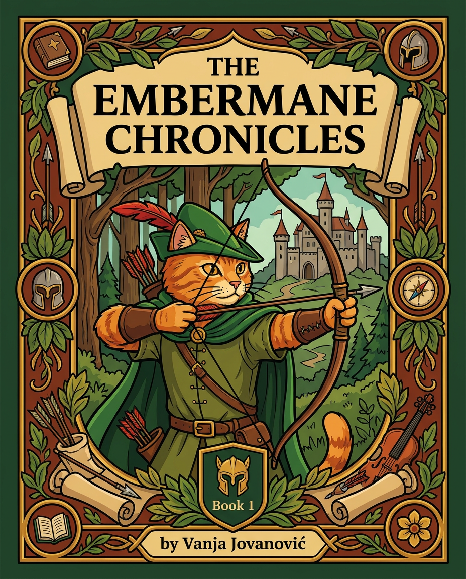
AI Design for Absolutely. Here's how I'd describe the entire cover as if it were written in a design document for an illustrator.

---

# 📖 THE EMBERMANE CHRONICLES

### Book 1 Cover Design Specification

## Overall Format

* Book size: **21 cm × 13.5 cm**
* Classic fantasy novel proportions.
* Matte finish.
* Storybook-inspired cover.
* Not realistic.
* Not modern.
* Warm, timeless, and iconic.

The cover should feel like something discovered in an old library, passed down through generations.

---

# Color Palette

### Primary Colors

🌲 Deep forest green

🔥 Warm red-brown

✨ Soft gold

📜 Cream

These colors should contrast strongly.

The green and red-brown should never blend together.

Instead:

* Green frames red-brown.
* Red-brown frames green.
* Gold highlights details.

The result should feel rich and elegant.

---

# Cover Layout

The cover is divided into two major sections:

## Outer Cover Frame

A thick decorative border surrounding the artwork.

This border is one of the defining visual features of the series.

When readers see this frame, they should instantly recognize:

> "That's an Embermane Chronicles book."

---

## Center Illustration Window

Inside the border sits a framed illustration.

Like a painting inside an old book cover.

The illustration occupies roughly:

60–70% of the front cover.

---

# The Border

### Main Border Color

Deep forest green.

### Border Decorations

The border contains elegant line art and embossing.

Features include:

🌿 Oak leaves

🌿 Vines

🏹 Arrows

🪶 Feathers

📜 Scrollwork

🌰 Acorns

The decorations should look inspired by medieval manuscripts.

Not overly complex.

Not cluttered.

Beautiful and readable.

---

# Hidden Symbols

The border contains tiny references to important characters.

Readers may not notice them immediately.

Examples:

📚 Milo's book

🛡 Rufus' tiny knight helmet

🗺 Shadow's compass

🎻 Ashen's fiddle

🌼 Pippa's flower

These should feel like little secrets.

---

# Title Placement

The title is integrated into the border.

Not floating over the artwork.

### Top Border

Small text:

**THE**

Below it:

# EMBERMANE

Large.

Very large.

The largest text on the cover.

The first thing people notice.

---

### Bottom Border

Smaller text:

**Chronicles**

Elegant.

Decorative.

Part of the frame itself.

---

# The Embermane Crest

Located at the bottom center.

Built into the border.

Not too large.

Not too small.

A symbol readers learn to recognize.

Possible design:

🐱 Stylized cat head

🔥 Red-brown mane

🌲 Green shield background

🏹 Small crossed bow behind it

Simple and iconic.

---

# Central Illustration

The illustration is framed by the border.

---

## Jasper Embermane

Standing slightly off-center.

The focus of the entire cover.

Features:

🐱 Orange tabby cat

🐱 Red-brown mane

🐱 Red-brown cheek stripes

🐱 Red-brown arm and leg markings

🐱 Red-brown ear tips

---

### Clothing

🌲 Green cloak

🌲 Green archer hat

🪶 Red feather

🔴 Thin red trim around the cloak edges

---

### Pose

Jasper is aiming his bow.

Not fighting.

Not dramatic.

Not angry.

Instead:

He is concentrating extremely hard.

One eye slightly squinted.

Tongue sticking out a little.

Like a kid trying his absolute best.

This detail makes him feel charming and relatable.

---

# Background

Soft storybook scenery.

Not detailed enough to distract.

Possible elements:

🌲 Forest

⛰ Distant mountains

🏰 Tiny glimpse of Embermane Hall

☁ Soft sky

The background exists only to support Jasper.

Jasper remains the star.

---

# Art Style

### Linework

* Clean outlines
* Storybook quality
* Slightly hand-drawn

### Coloring

* Flat colors
* Soft gradients
* Minimal shading

### Overall Feel

Somewhere between:

📖 Redwall

📖 Classic fantasy novels

📖 Illustrated children's adventure books

The goal is:

> A timeless fantasy storybook.

Not a movie poster.

Not a comic cover.

Not realism.

---

# Reader Impression

When someone sees the book for the first time, they should think:

> "Who is Embermane?"

Then:

> "Who is that cat?"

Then:

> "I want to know what's inside."

The cover should promise:

🌲 Adventure

🏹 Heroism

📜 Ancient history

🐱 Friendship

🍲 Warmth

✨ Wonder

And most importantly:

> The beginning of a very long chronicle.

That's how I imagine **The Embermane Chronicles** sitting on a bookshelf, looking like the first volume of a beloved fantasy saga. 🐱🏹📖🌲🔥 and make it so i can actually use it as a cover full screen and not sketch art syle do the ones u did just better and thicker bold lines make the cover fit the whole image and make the cat hero to have thicker black outlines and the cover too by vanja jovanović

Absolutely. Here's how I'd describe the entire cover as if it were written in a design document for an illustrator. --- # 📖 THE EMBERMANE CHRONICLES ### Book 1 Cover Design Specification ## Overall Format * Book size: **21 cm × 13.5 cm** * Classic fantasy novel proportions. * Matte finish. * Storybook-inspired cover. * Not realistic. * Not modern. * Warm, timeless, and iconic. The cover should feel like something discovered in an old library, passed down through generations. --- # Color Palette ### Primary Colors 🌲 Deep forest green 🔥 Warm red-brown ✨ Soft gold 📜 Cream These colors should contrast strongly. The green and red-brown should never blend together. Instead: * Green frames red-brown. * Red-brown frames green. * Gold highlights details. The result should feel rich and elegant. --- # Cover Layout The cover is divided into two major sections: ## Outer Cover Frame A thick decorative border surrounding the artwork. This border is one of the defining visual features of the series. When readers see this frame, they should instantly recognize: > "That's an Embermane Chronicles book." --- ## Center Illustration Window Inside the border sits a framed illustration. Like a painting inside an old book cover. The illustration occupies roughly: 60–70% of the front cover. --- # The Border ### Main Border Color Deep forest green. ### Border Decorations The border contains elegant line art and embossing. Features include: 🌿 Oak leaves 🌿 Vines 🏹 Arrows 🪶 Feathers 📜 Scrollwork 🌰 Acorns The decorations should look inspired by medieval manuscripts. Not overly complex. Not cluttered. Beautiful and readable. --- # Hidden Symbols The border contains tiny references to important characters. Readers may not notice them immediately. Examples: 📚 Milo's book 🛡 Rufus' tiny knight helmet 🗺 Shadow's compass 🎻 Ashen's fiddle 🌼 Pippa's flower These should feel like little secrets. --- # Title Placement The title is integrated into the border. Not floating over the artwork. ### Top Border Small text: **THE** Below it: # EMBERMANE Large. Very large. The largest text on the cover. The first thing people notice. --- ### Bottom Border Smaller text: **Chronicles** Elegant. Decorative. Part of the frame itself. --- # The Embermane Crest Located at the bottom center. Built into the border. Not too large. Not too small. A symbol readers learn to recognize. Possible design: 🐱 Stylized cat head 🔥 Red-brown mane 🌲 Green shield background 🏹 Small crossed bow behind it Simple and iconic. --- # Central Illustration The illustration is framed by the border. --- ## Jasper Embermane Standing slightly off-center. The focus of the entire cover. Features: 🐱 Orange tabby cat 🐱 Red-brown mane 🐱 Red-brown cheek stripes 🐱 Red-brown arm and leg markings 🐱 Red-brown ear tips --- ### Clothing 🌲 Green cloak 🌲 Green archer hat 🪶 Red feather 🔴 Thin red trim around the cloak edges --- ### Pose Jasper is aiming his bow. Not fighting. Not dramatic. Not angry. Instead: He is concentrating extremely hard. One eye slightly squinted. Tongue sticking out a little. Like a kid trying his absolute best. This detail makes him feel charming and relatable. --- # Background Soft storybook scenery. Not detailed enough to distract. Possible elements: 🌲 Forest ⛰ Distant mountains 🏰 Tiny glimpse of Embermane Hall ☁ Soft sky The background exists only to support Jasper. Jasper remains the star. --- # Art Style ### Linework * Clean outlines * Storybook quality * Slightly hand-drawn ### Coloring * Flat colors * Soft gradients * Minimal shading ### Overall Feel Somewhere between: 📖 Redwall 📖 Classic fantasy novels 📖 Illustrated children's adventure books The goal is: > A timeless fantasy storybook. Not a movie poster. Not a comic cover. Not realism. --- # Reader Impression When someone sees the book for the first time, they should think: > "Who is Embermane?" Then: > "Who is that cat?" Then: > "I want to know what's inside." The cover should promise: 🌲 Adventure 🏹 Heroism 📜 Ancient history 🐱 Friendship 🍲 Warmth ✨ Wonder And most importantly: > The beginning of a very long chronicle. That's how I imagine **The Embermane Chronicles** sitting on a bookshelf, looking like the first volume of a beloved fantasy saga. 🐱🏹📖🌲🔥 and make it so i can actually use it as a cover full screen and not sketch art syle do the ones u did just better and thicker bold lines make the cover fit the whole image and make the cat hero to have thicker black outlines and the cover too by vanja jovanović

by @Elephant_8984916
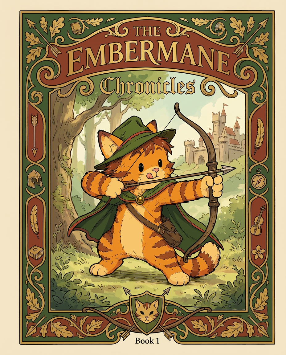
AI Design for Absolutely. Here's how I'd describe the entire cover as if it were written in a design document for an illustrator.

---

# 📖 THE EMBERMANE CHRONICLES

### Book 1 Cover Design Specification

## Overall Format

* Book size: **21 cm × 13.5 cm**
* Classic fantasy novel proportions.
* Matte finish.
* Storybook-inspired cover.
* Not realistic.
* Not modern.
* Warm, timeless, and iconic.

The cover should feel like something discovered in an old library, passed down through generations.

---

# Color Palette

### Primary Colors

🌲 Deep forest green

🔥 Warm red-brown

✨ Soft gold

📜 Cream

These colors should contrast strongly.

The green and red-brown should never blend together.

Instead:

* Green frames red-brown.
* Red-brown frames green.
* Gold highlights details.

The result should feel rich and elegant.

---

# Cover Layout

The cover is divided into two major sections:

## Outer Cover Frame

A thick decorative border surrounding the artwork.

This border is one of the defining visual features of the series.

When readers see this frame, they should instantly recognize:

> "That's an Embermane Chronicles book."

---

## Center Illustration Window

Inside the border sits a framed illustration.

Like a painting inside an old book cover.

The illustration occupies roughly:

60–70% of the front cover.

---

# The Border

### Main Border Color

Deep forest green.

### Border Decorations

The border contains elegant line art and embossing.

Features include:

🌿 Oak leaves

🌿 Vines

🏹 Arrows

🪶 Feathers

📜 Scrollwork

🌰 Acorns

The decorations should look inspired by medieval manuscripts.

Not overly complex.

Not cluttered.

Beautiful and readable.

---

# Hidden Symbols

The border contains tiny references to important characters.

Readers may not notice them immediately.

Examples:

📚 Milo's book

🛡 Rufus' tiny knight helmet

🗺 Shadow's compass

🎻 Ashen's fiddle

🌼 Pippa's flower

These should feel like little secrets.

---

# Title Placement

The title is integrated into the border.

Not floating over the artwork.

### Top Border

Small text:

**THE**

Below it:

# EMBERMANE

Large.

Very large.

The largest text on the cover.

The first thing people notice.

---

### Bottom Border

Smaller text:

**Chronicles**

Elegant.

Decorative.

Part of the frame itself.

---

# The Embermane Crest

Located at the bottom center.

Built into the border.

Not too large.

Not too small.

A symbol readers learn to recognize.

Possible design:

🐱 Stylized cat head

🔥 Red-brown mane

🌲 Green shield background

🏹 Small crossed bow behind it

Simple and iconic.

---

# Central Illustration

The illustration is framed by the border.

---

## Jasper Embermane

Standing slightly off-center.

The focus of the entire cover.

Features:

🐱 Orange tabby cat

🐱 Red-brown mane

🐱 Red-brown cheek stripes

🐱 Red-brown arm and leg markings

🐱 Red-brown ear tips

---

### Clothing

🌲 Green cloak

🌲 Green archer hat

🪶 Red feather

🔴 Thin red trim around the cloak edges

---

### Pose

Jasper is aiming his bow.

Not fighting.

Not dramatic.

Not angry.

Instead:

He is concentrating extremely hard.

One eye slightly squinted.

Tongue sticking out a little.

Like a kid trying his absolute best.

This detail makes him feel charming and relatable.

---

# Background

Soft storybook scenery.

Not detailed enough to distract.

Possible elements:

🌲 Forest

⛰ Distant mountains

🏰 Tiny glimpse of Embermane Hall

☁ Soft sky

The background exists only to support Jasper.

Jasper remains the star.

---

# Art Style

### Linework

* Clean outlines
* Storybook quality
* Slightly hand-drawn

### Coloring

* Flat colors
* Soft gradients
* Minimal shading

### Overall Feel

Somewhere between:

📖 Redwall

📖 Classic fantasy novels

📖 Illustrated children's adventure books

The goal is:

> A timeless fantasy storybook.

Not a movie poster.

Not a comic cover.

Not realism.

---

# Reader Impression

When someone sees the book for the first time, they should think:

> "Who is Embermane?"

Then:

> "Who is that cat?"

Then:

> "I want to know what's inside."

The cover should promise:

🌲 Adventure

🏹 Heroism

📜 Ancient history

🐱 Friendship

🍲 Warmth

✨ Wonder

And most importantly:

> The beginning of a very long chronicle.

That's how I imagine **The Embermane Chronicles** sitting on a bookshelf, looking like the first volume of a beloved fantasy saga. 🐱🏹📖🌲🔥 and make it so i can actually use it as a cover full screen and not sketch art syle do the ones u did just better and thicker bold lines make the cover fit the whole image and make the cat hero to have thicker black outlines and the cover too by vanja jovanović

Absolutely. Here's how I'd describe the entire cover as if it were written in a design document for an illustrator. --- # 📖 THE EMBERMANE CHRONICLES ### Book 1 Cover Design Specification ## Overall Format * Book size: **21 cm × 13.5 cm** * Classic fantasy novel proportions. * Matte finish. * Storybook-inspired cover. * Not realistic. * Not modern. * Warm, timeless, and iconic. The cover should feel like something discovered in an old library, passed down through generations. --- # Color Palette ### Primary Colors 🌲 Deep forest green 🔥 Warm red-brown ✨ Soft gold 📜 Cream These colors should contrast strongly. The green and red-brown should never blend together. Instead: * Green frames red-brown. * Red-brown frames green. * Gold highlights details. The result should feel rich and elegant. --- # Cover Layout The cover is divided into two major sections: ## Outer Cover Frame A thick decorative border surrounding the artwork. This border is one of the defining visual features of the series. When readers see this frame, they should instantly recognize: > "That's an Embermane Chronicles book." --- ## Center Illustration Window Inside the border sits a framed illustration. Like a painting inside an old book cover. The illustration occupies roughly: 60–70% of the front cover. --- # The Border ### Main Border Color Deep forest green. ### Border Decorations The border contains elegant line art and embossing. Features include: 🌿 Oak leaves 🌿 Vines 🏹 Arrows 🪶 Feathers 📜 Scrollwork 🌰 Acorns The decorations should look inspired by medieval manuscripts. Not overly complex. Not cluttered. Beautiful and readable. --- # Hidden Symbols The border contains tiny references to important characters. Readers may not notice them immediately. Examples: 📚 Milo's book 🛡 Rufus' tiny knight helmet 🗺 Shadow's compass 🎻 Ashen's fiddle 🌼 Pippa's flower These should feel like little secrets. --- # Title Placement The title is integrated into the border. Not floating over the artwork. ### Top Border Small text: **THE** Below it: # EMBERMANE Large. Very large. The largest text on the cover. The first thing people notice. --- ### Bottom Border Smaller text: **Chronicles** Elegant. Decorative. Part of the frame itself. --- # The Embermane Crest Located at the bottom center. Built into the border. Not too large. Not too small. A symbol readers learn to recognize. Possible design: 🐱 Stylized cat head 🔥 Red-brown mane 🌲 Green shield background 🏹 Small crossed bow behind it Simple and iconic. --- # Central Illustration The illustration is framed by the border. --- ## Jasper Embermane Standing slightly off-center. The focus of the entire cover. Features: 🐱 Orange tabby cat 🐱 Red-brown mane 🐱 Red-brown cheek stripes 🐱 Red-brown arm and leg markings 🐱 Red-brown ear tips --- ### Clothing 🌲 Green cloak 🌲 Green archer hat 🪶 Red feather 🔴 Thin red trim around the cloak edges --- ### Pose Jasper is aiming his bow. Not fighting. Not dramatic. Not angry. Instead: He is concentrating extremely hard. One eye slightly squinted. Tongue sticking out a little. Like a kid trying his absolute best. This detail makes him feel charming and relatable. --- # Background Soft storybook scenery. Not detailed enough to distract. Possible elements: 🌲 Forest ⛰ Distant mountains 🏰 Tiny glimpse of Embermane Hall ☁ Soft sky The background exists only to support Jasper. Jasper remains the star. --- # Art Style ### Linework * Clean outlines * Storybook quality * Slightly hand-drawn ### Coloring * Flat colors * Soft gradients * Minimal shading ### Overall Feel Somewhere between: 📖 Redwall 📖 Classic fantasy novels 📖 Illustrated children's adventure books The goal is: > A timeless fantasy storybook. Not a movie poster. Not a comic cover. Not realism. --- # Reader Impression When someone sees the book for the first time, they should think: > "Who is Embermane?" Then: > "Who is that cat?" Then: > "I want to know what's inside." The cover should promise: 🌲 Adventure 🏹 Heroism 📜 Ancient history 🐱 Friendship 🍲 Warmth ✨ Wonder And most importantly: > The beginning of a very long chronicle. That's how I imagine **The Embermane Chronicles** sitting on a bookshelf, looking like the first volume of a beloved fantasy saga. 🐱🏹📖🌲🔥 and make it so i can actually use it as a cover full screen and not sketch art syle do the ones u did just better and thicker bold lines make the cover fit the whole image and make the cat hero to have thicker black outlines and the cover too by vanja jovanović

by @Elephant_8984916
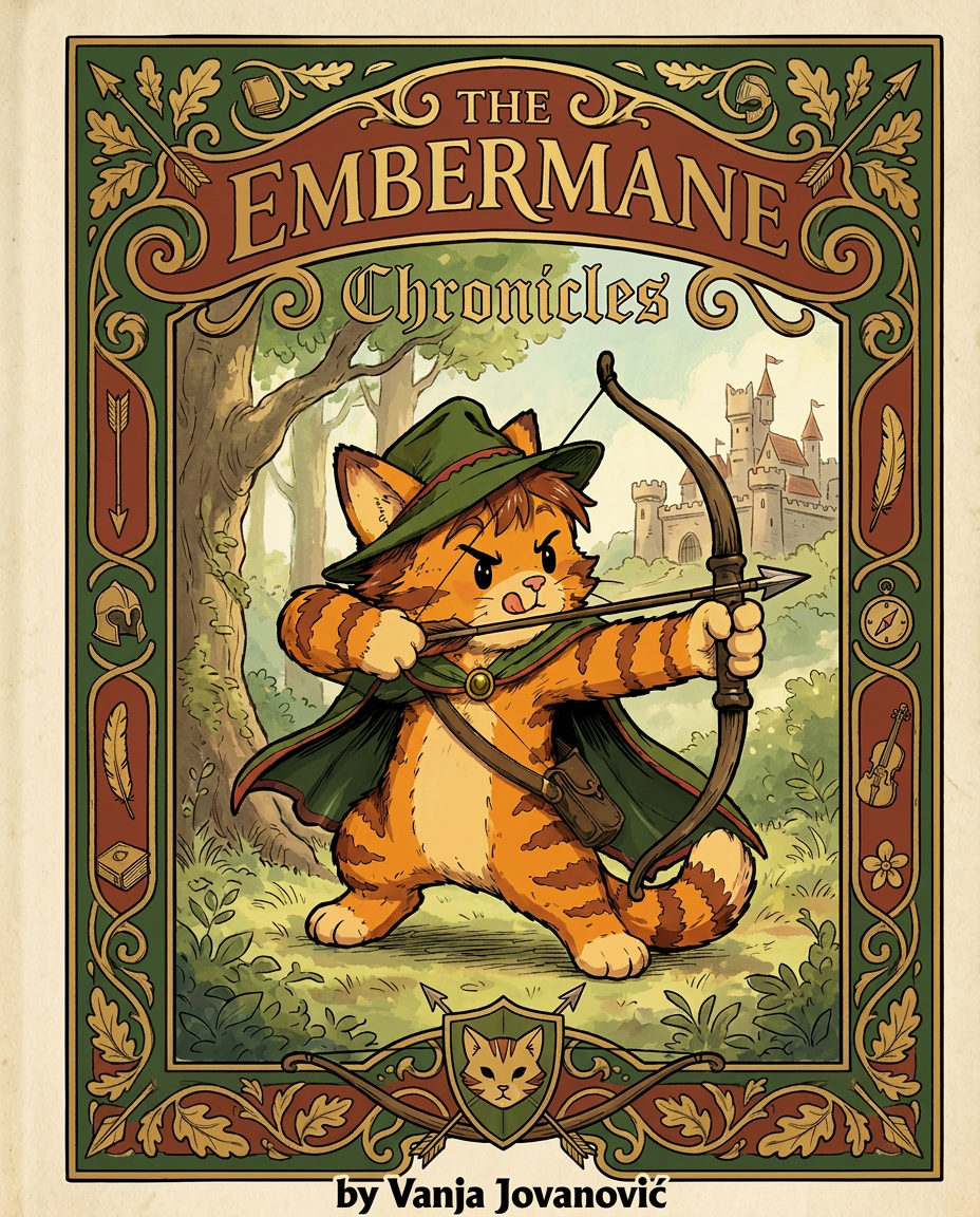
AI Design for Absolutely. Here's how I'd describe the entire cover as if it were written in a design document for an illustrator.

---

# 📖 THE EMBERMANE CHRONICLES

### Book 1 Cover Design Specification

## Overall Format

* Book size: **21 cm × 13.5 cm**
* Classic fantasy novel proportions.
* Matte finish.
* Storybook-inspired cover.
* Not realistic.
* Not modern.
* Warm, timeless, and iconic.

The cover should feel like something discovered in an old library, passed down through generations.

---

# Color Palette

### Primary Colors

🌲 Deep forest green

🔥 Warm red-brown

✨ Soft gold

📜 Cream

These colors should contrast strongly.

The green and red-brown should never blend together.

Instead:

* Green frames red-brown.
* Red-brown frames green.
* Gold highlights details.

The result should feel rich and elegant.

---

# Cover Layout

The cover is divided into two major sections:

## Outer Cover Frame

A thick decorative border surrounding the artwork.

This border is one of the defining visual features of the series.

When readers see this frame, they should instantly recognize:

> "That's an Embermane Chronicles book."

---

## Center Illustration Window

Inside the border sits a framed illustration.

Like a painting inside an old book cover.

The illustration occupies roughly:

60–70% of the front cover.

---

# The Border

### Main Border Color

Deep forest green.

### Border Decorations

The border contains elegant line art and embossing.

Features include:

🌿 Oak leaves

🌿 Vines

🏹 Arrows

🪶 Feathers

📜 Scrollwork

🌰 Acorns

The decorations should look inspired by medieval manuscripts.

Not overly complex.

Not cluttered.

Beautiful and readable.

---

# Hidden Symbols

The border contains tiny references to important characters.

Readers may not notice them immediately.

Examples:

📚 Milo's book

🛡 Rufus' tiny knight helmet

🗺 Shadow's compass

🎻 Ashen's fiddle

🌼 Pippa's flower

These should feel like little secrets.

---

# Title Placement

The title is integrated into the border.

Not floating over the artwork.

### Top Border

Small text:

**THE**

Below it:

# EMBERMANE

Large.

Very large.

The largest text on the cover.

The first thing people notice.

---

### Bottom Border

Smaller text:

**Chronicles**

Elegant.

Decorative.

Part of the frame itself.

---

# The Embermane Crest

Located at the bottom center.

Built into the border.

Not too large.

Not too small.

A symbol readers learn to recognize.

Possible design:

🐱 Stylized cat head

🔥 Red-brown mane

🌲 Green shield background

🏹 Small crossed bow behind it

Simple and iconic.

---

# Central Illustration

The illustration is framed by the border.

---

## Jasper Embermane

Standing slightly off-center.

The focus of the entire cover.

Features:

🐱 Orange tabby cat

🐱 Red-brown mane

🐱 Red-brown cheek stripes

🐱 Red-brown arm and leg markings

🐱 Red-brown ear tips

---

### Clothing

🌲 Green cloak

🌲 Green archer hat

🪶 Red feather

🔴 Thin red trim around the cloak edges

---

### Pose

Jasper is aiming his bow.

Not fighting.

Not dramatic.

Not angry.

Instead:

He is concentrating extremely hard.

One eye slightly squinted.

Tongue sticking out a little.

Like a kid trying his absolute best.

This detail makes him feel charming and relatable.

---

# Background

Soft storybook scenery.

Not detailed enough to distract.

Possible elements:

🌲 Forest

⛰ Distant mountains

🏰 Tiny glimpse of Embermane Hall

☁ Soft sky

The background exists only to support Jasper.

Jasper remains the star.

---

# Art Style

### Linework

* Clean outlines
* Storybook quality
* Slightly hand-drawn

### Coloring

* Flat colors
* Soft gradients
* Minimal shading

### Overall Feel

Somewhere between:

📖 Redwall

📖 Classic fantasy novels

📖 Illustrated children's adventure books

The goal is:

> A timeless fantasy storybook.

Not a movie poster.

Not a comic cover.

Not realism.

---

# Reader Impression

When someone sees the book for the first time, they should think:

> "Who is Embermane?"

Then:

> "Who is that cat?"

Then:

> "I want to know what's inside."

The cover should promise:

🌲 Adventure

🏹 Heroism

📜 Ancient history

🐱 Friendship

🍲 Warmth

✨ Wonder

And most importantly:

> The beginning of a very long chronicle.

That's how I imagine **The Embermane Chronicles** sitting on a bookshelf, looking like the first volume of a beloved fantasy saga. 🐱🏹📖🌲🔥 and make it so i can actually use it as a cover full screen and not sketch art syle do the ones u did just better and thicker bold lines make the cover fit the whole image and make the cat hero to have thicker black outlines and the cover too by vanja jovanović

Absolutely. Here's how I'd describe the entire cover as if it were written in a design document for an illustrator. --- # 📖 THE EMBERMANE CHRONICLES ### Book 1 Cover Design Specification ## Overall Format * Book size: **21 cm × 13.5 cm** * Classic fantasy novel proportions. * Matte finish. * Storybook-inspired cover. * Not realistic. * Not modern. * Warm, timeless, and iconic. The cover should feel like something discovered in an old library, passed down through generations. --- # Color Palette ### Primary Colors 🌲 Deep forest green 🔥 Warm red-brown ✨ Soft gold 📜 Cream These colors should contrast strongly. The green and red-brown should never blend together. Instead: * Green frames red-brown. * Red-brown frames green. * Gold highlights details. The result should feel rich and elegant. --- # Cover Layout The cover is divided into two major sections: ## Outer Cover Frame A thick decorative border surrounding the artwork. This border is one of the defining visual features of the series. When readers see this frame, they should instantly recognize: > "That's an Embermane Chronicles book." --- ## Center Illustration Window Inside the border sits a framed illustration. Like a painting inside an old book cover. The illustration occupies roughly: 60–70% of the front cover. --- # The Border ### Main Border Color Deep forest green. ### Border Decorations The border contains elegant line art and embossing. Features include: 🌿 Oak leaves 🌿 Vines 🏹 Arrows 🪶 Feathers 📜 Scrollwork 🌰 Acorns The decorations should look inspired by medieval manuscripts. Not overly complex. Not cluttered. Beautiful and readable. --- # Hidden Symbols The border contains tiny references to important characters. Readers may not notice them immediately. Examples: 📚 Milo's book 🛡 Rufus' tiny knight helmet 🗺 Shadow's compass 🎻 Ashen's fiddle 🌼 Pippa's flower These should feel like little secrets. --- # Title Placement The title is integrated into the border. Not floating over the artwork. ### Top Border Small text: **THE** Below it: # EMBERMANE Large. Very large. The largest text on the cover. The first thing people notice. --- ### Bottom Border Smaller text: **Chronicles** Elegant. Decorative. Part of the frame itself. --- # The Embermane Crest Located at the bottom center. Built into the border. Not too large. Not too small. A symbol readers learn to recognize. Possible design: 🐱 Stylized cat head 🔥 Red-brown mane 🌲 Green shield background 🏹 Small crossed bow behind it Simple and iconic. --- # Central Illustration The illustration is framed by the border. --- ## Jasper Embermane Standing slightly off-center. The focus of the entire cover. Features: 🐱 Orange tabby cat 🐱 Red-brown mane 🐱 Red-brown cheek stripes 🐱 Red-brown arm and leg markings 🐱 Red-brown ear tips --- ### Clothing 🌲 Green cloak 🌲 Green archer hat 🪶 Red feather 🔴 Thin red trim around the cloak edges --- ### Pose Jasper is aiming his bow. Not fighting. Not dramatic. Not angry. Instead: He is concentrating extremely hard. One eye slightly squinted. Tongue sticking out a little. Like a kid trying his absolute best. This detail makes him feel charming and relatable. --- # Background Soft storybook scenery. Not detailed enough to distract. Possible elements: 🌲 Forest ⛰ Distant mountains 🏰 Tiny glimpse of Embermane Hall ☁ Soft sky The background exists only to support Jasper. Jasper remains the star. --- # Art Style ### Linework * Clean outlines * Storybook quality * Slightly hand-drawn ### Coloring * Flat colors * Soft gradients * Minimal shading ### Overall Feel Somewhere between: 📖 Redwall 📖 Classic fantasy novels 📖 Illustrated children's adventure books The goal is: > A timeless fantasy storybook. Not a movie poster. Not a comic cover. Not realism. --- # Reader Impression When someone sees the book for the first time, they should think: > "Who is Embermane?" Then: > "Who is that cat?" Then: > "I want to know what's inside." The cover should promise: 🌲 Adventure 🏹 Heroism 📜 Ancient history 🐱 Friendship 🍲 Warmth ✨ Wonder And most importantly: > The beginning of a very long chronicle. That's how I imagine **The Embermane Chronicles** sitting on a bookshelf, looking like the first volume of a beloved fantasy saga. 🐱🏹📖🌲🔥 and make it so i can actually use it as a cover full screen and not sketch art syle do the ones u did just better and thicker bold lines make the cover fit the whole image and make the cat hero to have thicker black outlines and the cover too by vanja jovanović

by @Elephant_8984916
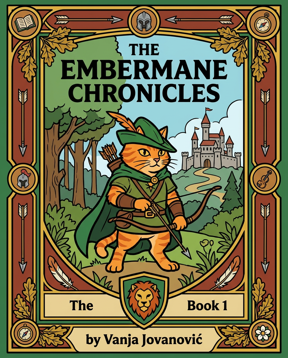
AI Design for Absolutely. Here's how I'd describe the entire cover as if it were written in a design document for an illustrator.

---

# 📖 THE EMBERMANE CHRONICLES

### Book 1 Cover Design Specification

## Overall Format

* Book size: **21 cm × 13.5 cm**
* Classic fantasy novel proportions.
* Matte finish.
* Storybook-inspired cover.
* Not realistic.
* Not modern.
* Warm, timeless, and iconic.

The cover should feel like something discovered in an old library, passed down through generations.

---

# Color Palette

### Primary Colors

🌲 Deep forest green

🔥 Warm red-brown

✨ Soft gold

📜 Cream

These colors should contrast strongly.

The green and red-brown should never blend together.

Instead:

* Green frames red-brown.
* Red-brown frames green.
* Gold highlights details.

The result should feel rich and elegant.

---

# Cover Layout

The cover is divided into two major sections:

## Outer Cover Frame

A thick decorative border surrounding the artwork.

This border is one of the defining visual features of the series.

When readers see this frame, they should instantly recognize:

> "That's an Embermane Chronicles book."

---

## Center Illustration Window

Inside the border sits a framed illustration.

Like a painting inside an old book cover.

The illustration occupies roughly:

60–70% of the front cover.

---

# The Border

### Main Border Color

Deep forest green.

### Border Decorations

The border contains elegant line art and embossing.

Features include:

🌿 Oak leaves

🌿 Vines

🏹 Arrows

🪶 Feathers

📜 Scrollwork

🌰 Acorns

The decorations should look inspired by medieval manuscripts.

Not overly complex.

Not cluttered.

Beautiful and readable.

---

# Hidden Symbols

The border contains tiny references to important characters.

Readers may not notice them immediately.

Examples:

📚 Milo's book

🛡 Rufus' tiny knight helmet

🗺 Shadow's compass

🎻 Ashen's fiddle

🌼 Pippa's flower

These should feel like little secrets.

---

# Title Placement

The title is integrated into the border.

Not floating over the artwork.

### Top Border

Small text:

**THE**

Below it:

# EMBERMANE

Large.

Very large.

The largest text on the cover.

The first thing people notice.

---

### Bottom Border

Smaller text:

**Chronicles**

Elegant.

Decorative.

Part of the frame itself.

---

# The Embermane Crest

Located at the bottom center.

Built into the border.

Not too large.

Not too small.

A symbol readers learn to recognize.

Possible design:

🐱 Stylized cat head

🔥 Red-brown mane

🌲 Green shield background

🏹 Small crossed bow behind it

Simple and iconic.

---

# Central Illustration

The illustration is framed by the border.

---

## Jasper Embermane

Standing slightly off-center.

The focus of the entire cover.

Features:

🐱 Orange tabby cat

🐱 Red-brown mane

🐱 Red-brown cheek stripes

🐱 Red-brown arm and leg markings

🐱 Red-brown ear tips

---

### Clothing

🌲 Green cloak

🌲 Green archer hat

🪶 Red feather

🔴 Thin red trim around the cloak edges

---

### Pose

Jasper is aiming his bow.

Not fighting.

Not dramatic.

Not angry.

Instead:

He is concentrating extremely hard.

One eye slightly squinted.

Tongue sticking out a little.

Like a kid trying his absolute best.

This detail makes him feel charming and relatable.

---

# Background

Soft storybook scenery.

Not detailed enough to distract.

Possible elements:

🌲 Forest

⛰ Distant mountains

🏰 Tiny glimpse of Embermane Hall

☁ Soft sky

The background exists only to support Jasper.

Jasper remains the star.

---

# Art Style

### Linework

* Clean outlines
* Storybook quality
* Slightly hand-drawn

### Coloring

* Flat colors
* Soft gradients
* Minimal shading

### Overall Feel

Somewhere between:

📖 Redwall

📖 Classic fantasy novels

📖 Illustrated children's adventure books

The goal is:

> A timeless fantasy storybook.

Not a movie poster.

Not a comic cover.

Not realism.

---

# Reader Impression

When someone sees the book for the first time, they should think:

> "Who is Embermane?"

Then:

> "Who is that cat?"

Then:

> "I want to know what's inside."

The cover should promise:

🌲 Adventure

🏹 Heroism

📜 Ancient history

🐱 Friendship

🍲 Warmth

✨ Wonder

And most importantly:

> The beginning of a very long chronicle.

That's how I imagine **The Embermane Chronicles** sitting on a bookshelf, looking like the first volume of a beloved fantasy saga. 🐱🏹📖🌲🔥 and make it so i can actually use it as a cover full screen and not sketch art syle do the ones u did just better and thicker bold lines make the cover fit the whole image and make the cat hero to have thicker black outlines and the cover too by vanja jovanović

Absolutely. Here's how I'd describe the entire cover as if it were written in a design document for an illustrator. --- # 📖 THE EMBERMANE CHRONICLES ### Book 1 Cover Design Specification ## Overall Format * Book size: **21 cm × 13.5 cm** * Classic fantasy novel proportions. * Matte finish. * Storybook-inspired cover. * Not realistic. * Not modern. * Warm, timeless, and iconic. The cover should feel like something discovered in an old library, passed down through generations. --- # Color Palette ### Primary Colors 🌲 Deep forest green 🔥 Warm red-brown ✨ Soft gold 📜 Cream These colors should contrast strongly. The green and red-brown should never blend together. Instead: * Green frames red-brown. * Red-brown frames green. * Gold highlights details. The result should feel rich and elegant. --- # Cover Layout The cover is divided into two major sections: ## Outer Cover Frame A thick decorative border surrounding the artwork. This border is one of the defining visual features of the series. When readers see this frame, they should instantly recognize: > "That's an Embermane Chronicles book." --- ## Center Illustration Window Inside the border sits a framed illustration. Like a painting inside an old book cover. The illustration occupies roughly: 60–70% of the front cover. --- # The Border ### Main Border Color Deep forest green. ### Border Decorations The border contains elegant line art and embossing. Features include: 🌿 Oak leaves 🌿 Vines 🏹 Arrows 🪶 Feathers 📜 Scrollwork 🌰 Acorns The decorations should look inspired by medieval manuscripts. Not overly complex. Not cluttered. Beautiful and readable. --- # Hidden Symbols The border contains tiny references to important characters. Readers may not notice them immediately. Examples: 📚 Milo's book 🛡 Rufus' tiny knight helmet 🗺 Shadow's compass 🎻 Ashen's fiddle 🌼 Pippa's flower These should feel like little secrets. --- # Title Placement The title is integrated into the border. Not floating over the artwork. ### Top Border Small text: **THE** Below it: # EMBERMANE Large. Very large. The largest text on the cover. The first thing people notice. --- ### Bottom Border Smaller text: **Chronicles** Elegant. Decorative. Part of the frame itself. --- # The Embermane Crest Located at the bottom center. Built into the border. Not too large. Not too small. A symbol readers learn to recognize. Possible design: 🐱 Stylized cat head 🔥 Red-brown mane 🌲 Green shield background 🏹 Small crossed bow behind it Simple and iconic. --- # Central Illustration The illustration is framed by the border. --- ## Jasper Embermane Standing slightly off-center. The focus of the entire cover. Features: 🐱 Orange tabby cat 🐱 Red-brown mane 🐱 Red-brown cheek stripes 🐱 Red-brown arm and leg markings 🐱 Red-brown ear tips --- ### Clothing 🌲 Green cloak 🌲 Green archer hat 🪶 Red feather 🔴 Thin red trim around the cloak edges --- ### Pose Jasper is aiming his bow. Not fighting. Not dramatic. Not angry. Instead: He is concentrating extremely hard. One eye slightly squinted. Tongue sticking out a little. Like a kid trying his absolute best. This detail makes him feel charming and relatable. --- # Background Soft storybook scenery. Not detailed enough to distract. Possible elements: 🌲 Forest ⛰ Distant mountains 🏰 Tiny glimpse of Embermane Hall ☁ Soft sky The background exists only to support Jasper. Jasper remains the star. --- # Art Style ### Linework * Clean outlines * Storybook quality * Slightly hand-drawn ### Coloring * Flat colors * Soft gradients * Minimal shading ### Overall Feel Somewhere between: 📖 Redwall 📖 Classic fantasy novels 📖 Illustrated children's adventure books The goal is: > A timeless fantasy storybook. Not a movie poster. Not a comic cover. Not realism. --- # Reader Impression When someone sees the book for the first time, they should think: > "Who is Embermane?" Then: > "Who is that cat?" Then: > "I want to know what's inside." The cover should promise: 🌲 Adventure 🏹 Heroism 📜 Ancient history 🐱 Friendship 🍲 Warmth ✨ Wonder And most importantly: > The beginning of a very long chronicle. That's how I imagine **The Embermane Chronicles** sitting on a bookshelf, looking like the first volume of a beloved fantasy saga. 🐱🏹📖🌲🔥 and make it so i can actually use it as a cover full screen and not sketch art syle do the ones u did just better and thicker bold lines make the cover fit the whole image and make the cat hero to have thicker black outlines and the cover too by vanja jovanović

by @Elephant_8984916
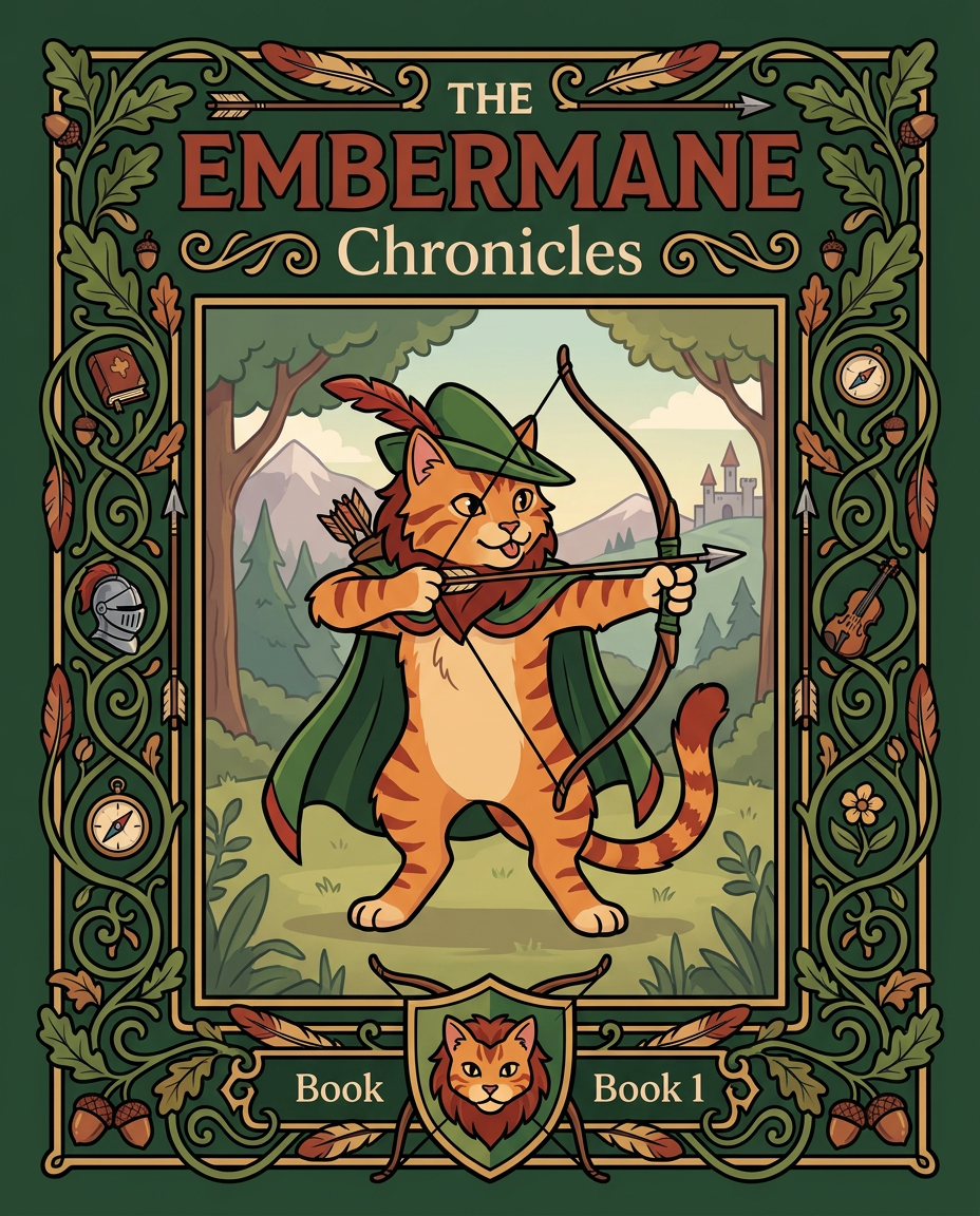
AI Design for Absolutely. Here's how I'd describe the entire cover as if it were written in a design document for an illustrator.

---

# 📖 THE EMBERMANE CHRONICLES

### Book 1 Cover Design Specification

## Overall Format

* Book size: **21 cm × 13.5 cm**
* Classic fantasy novel proportions.
* Matte finish.
* Storybook-inspired cover.
* Not realistic.
* Not modern.
* Warm, timeless, and iconic.

The cover should feel like something discovered in an old library, passed down through generations.

---

# Color Palette

### Primary Colors

🌲 Deep forest green

🔥 Warm red-brown

✨ Soft gold

📜 Cream

These colors should contrast strongly.

The green and red-brown should never blend together.

Instead:

* Green frames red-brown.
* Red-brown frames green.
* Gold highlights details.

The result should feel rich and elegant.

---

# Cover Layout

The cover is divided into two major sections:

## Outer Cover Frame

A thick decorative border surrounding the artwork.

This border is one of the defining visual features of the series.

When readers see this frame, they should instantly recognize:

> "That's an Embermane Chronicles book."

---

## Center Illustration Window

Inside the border sits a framed illustration.

Like a painting inside an old book cover.

The illustration occupies roughly:

60–70% of the front cover.

---

# The Border

### Main Border Color

Deep forest green.

### Border Decorations

The border contains elegant line art and embossing.

Features include:

🌿 Oak leaves

🌿 Vines

🏹 Arrows

🪶 Feathers

📜 Scrollwork

🌰 Acorns

The decorations should look inspired by medieval manuscripts.

Not overly complex.

Not cluttered.

Beautiful and readable.

---

# Hidden Symbols

The border contains tiny references to important characters.

Readers may not notice them immediately.

Examples:

📚 Milo's book

🛡 Rufus' tiny knight helmet

🗺 Shadow's compass

🎻 Ashen's fiddle

🌼 Pippa's flower

These should feel like little secrets.

---

# Title Placement

The title is integrated into the border.

Not floating over the artwork.

### Top Border

Small text:

**THE**

Below it:

# EMBERMANE

Large.

Very large.

The largest text on the cover.

The first thing people notice.

---

### Bottom Border

Smaller text:

**Chronicles**

Elegant.

Decorative.

Part of the frame itself.

---

# The Embermane Crest

Located at the bottom center.

Built into the border.

Not too large.

Not too small.

A symbol readers learn to recognize.

Possible design:

🐱 Stylized cat head

🔥 Red-brown mane

🌲 Green shield background

🏹 Small crossed bow behind it

Simple and iconic.

---

# Central Illustration

The illustration is framed by the border.

---

## Jasper Embermane

Standing slightly off-center.

The focus of the entire cover.

Features:

🐱 Orange tabby cat

🐱 Red-brown mane

🐱 Red-brown cheek stripes

🐱 Red-brown arm and leg markings

🐱 Red-brown ear tips

---

### Clothing

🌲 Green cloak

🌲 Green archer hat

🪶 Red feather

🔴 Thin red trim around the cloak edges

---

### Pose

Jasper is aiming his bow.

Not fighting.

Not dramatic.

Not angry.

Instead:

He is concentrating extremely hard.

One eye slightly squinted.

Tongue sticking out a little.

Like a kid trying his absolute best.

This detail makes him feel charming and relatable.

---

# Background

Soft storybook scenery.

Not detailed enough to distract.

Possible elements:

🌲 Forest

⛰ Distant mountains

🏰 Tiny glimpse of Embermane Hall

☁ Soft sky

The background exists only to support Jasper.

Jasper remains the star.

---

# Art Style

### Linework

* Clean outlines
* Storybook quality
* Slightly hand-drawn

### Coloring

* Flat colors
* Soft gradients
* Minimal shading

### Overall Feel

Somewhere between:

📖 Redwall

📖 Classic fantasy novels

📖 Illustrated children's adventure books

The goal is:

> A timeless fantasy storybook.

Not a movie poster.

Not a comic cover.

Not realism.

---

# Reader Impression

When someone sees the book for the first time, they should think:

> "Who is Embermane?"

Then:

> "Who is that cat?"

Then:

> "I want to know what's inside."

The cover should promise:

🌲 Adventure

🏹 Heroism

📜 Ancient history

🐱 Friendship

🍲 Warmth

✨ Wonder

And most importantly:

> The beginning of a very long chronicle.

That's how I imagine **The Embermane Chronicles** sitting on a bookshelf, looking like the first volume of a beloved fantasy saga. 🐱🏹📖🌲🔥 and make it so i can actually use it as a cover full screen and not sketch art syle do the ones u did just better and thicker bold lines make the cover fit the whole image and make the cat hero to have thicker black outlines and the cover too

Absolutely. Here's how I'd describe the entire cover as if it were written in a design document for an illustrator. --- # 📖 THE EMBERMANE CHRONICLES ### Book 1 Cover Design Specification ## Overall Format * Book size: **21 cm × 13.5 cm** * Classic fantasy novel proportions. * Matte finish. * Storybook-inspired cover. * Not realistic. * Not modern. * Warm, timeless, and iconic. The cover should feel like something discovered in an old library, passed down through generations. --- # Color Palette ### Primary Colors 🌲 Deep forest green 🔥 Warm red-brown ✨ Soft gold 📜 Cream These colors should contrast strongly. The green and red-brown should never blend together. Instead: * Green frames red-brown. * Red-brown frames green. * Gold highlights details. The result should feel rich and elegant. --- # Cover Layout The cover is divided into two major sections: ## Outer Cover Frame A thick decorative border surrounding the artwork. This border is one of the defining visual features of the series. When readers see this frame, they should instantly recognize: > "That's an Embermane Chronicles book." --- ## Center Illustration Window Inside the border sits a framed illustration. Like a painting inside an old book cover. The illustration occupies roughly: 60–70% of the front cover. --- # The Border ### Main Border Color Deep forest green. ### Border Decorations The border contains elegant line art and embossing. Features include: 🌿 Oak leaves 🌿 Vines 🏹 Arrows 🪶 Feathers 📜 Scrollwork 🌰 Acorns The decorations should look inspired by medieval manuscripts. Not overly complex. Not cluttered. Beautiful and readable. --- # Hidden Symbols The border contains tiny references to important characters. Readers may not notice them immediately. Examples: 📚 Milo's book 🛡 Rufus' tiny knight helmet 🗺 Shadow's compass 🎻 Ashen's fiddle 🌼 Pippa's flower These should feel like little secrets. --- # Title Placement The title is integrated into the border. Not floating over the artwork. ### Top Border Small text: **THE** Below it: # EMBERMANE Large. Very large. The largest text on the cover. The first thing people notice. --- ### Bottom Border Smaller text: **Chronicles** Elegant. Decorative. Part of the frame itself. --- # The Embermane Crest Located at the bottom center. Built into the border. Not too large. Not too small. A symbol readers learn to recognize. Possible design: 🐱 Stylized cat head 🔥 Red-brown mane 🌲 Green shield background 🏹 Small crossed bow behind it Simple and iconic. --- # Central Illustration The illustration is framed by the border. --- ## Jasper Embermane Standing slightly off-center. The focus of the entire cover. Features: 🐱 Orange tabby cat 🐱 Red-brown mane 🐱 Red-brown cheek stripes 🐱 Red-brown arm and leg markings 🐱 Red-brown ear tips --- ### Clothing 🌲 Green cloak 🌲 Green archer hat 🪶 Red feather 🔴 Thin red trim around the cloak edges --- ### Pose Jasper is aiming his bow. Not fighting. Not dramatic. Not angry. Instead: He is concentrating extremely hard. One eye slightly squinted. Tongue sticking out a little. Like a kid trying his absolute best. This detail makes him feel charming and relatable. --- # Background Soft storybook scenery. Not detailed enough to distract. Possible elements: 🌲 Forest ⛰ Distant mountains 🏰 Tiny glimpse of Embermane Hall ☁ Soft sky The background exists only to support Jasper. Jasper remains the star. --- # Art Style ### Linework * Clean outlines * Storybook quality * Slightly hand-drawn ### Coloring * Flat colors * Soft gradients * Minimal shading ### Overall Feel Somewhere between: 📖 Redwall 📖 Classic fantasy novels 📖 Illustrated children's adventure books The goal is: > A timeless fantasy storybook. Not a movie poster. Not a comic cover. Not realism. --- # Reader Impression When someone sees the book for the first time, they should think: > "Who is Embermane?" Then: > "Who is that cat?" Then: > "I want to know what's inside." The cover should promise: 🌲 Adventure 🏹 Heroism 📜 Ancient history 🐱 Friendship 🍲 Warmth ✨ Wonder And most importantly: > The beginning of a very long chronicle. That's how I imagine **The Embermane Chronicles** sitting on a bookshelf, looking like the first volume of a beloved fantasy saga. 🐱🏹📖🌲🔥 and make it so i can actually use it as a cover full screen and not sketch art syle do the ones u did just better and thicker bold lines make the cover fit the whole image and make the cat hero to have thicker black outlines and the cover too

by @Elephant_8984916
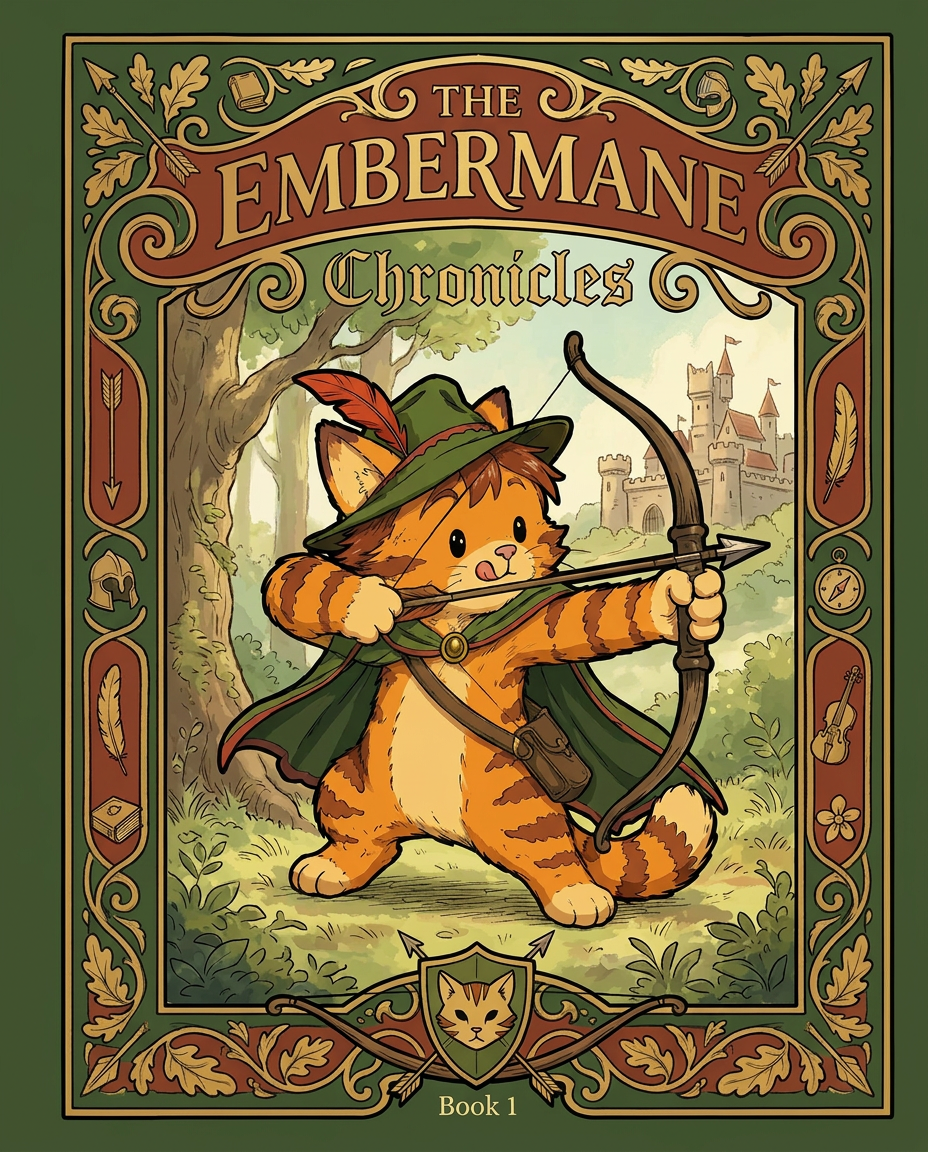
AI Design for Absolutely. Here's how I'd describe the entire cover as if it were written in a design document for an illustrator.

---

# 📖 THE EMBERMANE CHRONICLES

### Book 1 Cover Design Specification

## Overall Format

* Book size: **21 cm × 13.5 cm**
* Classic fantasy novel proportions.
* Matte finish.
* Storybook-inspired cover.
* Not realistic.
* Not modern.
* Warm, timeless, and iconic.

The cover should feel like something discovered in an old library, passed down through generations.

---

# Color Palette

### Primary Colors

🌲 Deep forest green

🔥 Warm red-brown

✨ Soft gold

📜 Cream

These colors should contrast strongly.

The green and red-brown should never blend together.

Instead:

* Green frames red-brown.
* Red-brown frames green.
* Gold highlights details.

The result should feel rich and elegant.

---

# Cover Layout

The cover is divided into two major sections:

## Outer Cover Frame

A thick decorative border surrounding the artwork.

This border is one of the defining visual features of the series.

When readers see this frame, they should instantly recognize:

> "That's an Embermane Chronicles book."

---

## Center Illustration Window

Inside the border sits a framed illustration.

Like a painting inside an old book cover.

The illustration occupies roughly:

60–70% of the front cover.

---

# The Border

### Main Border Color

Deep forest green.

### Border Decorations

The border contains elegant line art and embossing.

Features include:

🌿 Oak leaves

🌿 Vines

🏹 Arrows

🪶 Feathers

📜 Scrollwork

🌰 Acorns

The decorations should look inspired by medieval manuscripts.

Not overly complex.

Not cluttered.

Beautiful and readable.

---

# Hidden Symbols

The border contains tiny references to important characters.

Readers may not notice them immediately.

Examples:

📚 Milo's book

🛡 Rufus' tiny knight helmet

🗺 Shadow's compass

🎻 Ashen's fiddle

🌼 Pippa's flower

These should feel like little secrets.

---

# Title Placement

The title is integrated into the border.

Not floating over the artwork.

### Top Border

Small text:

**THE**

Below it:

# EMBERMANE

Large.

Very large.

The largest text on the cover.

The first thing people notice.

---

### Bottom Border

Smaller text:

**Chronicles**

Elegant.

Decorative.

Part of the frame itself.

---

# The Embermane Crest

Located at the bottom center.

Built into the border.

Not too large.

Not too small.

A symbol readers learn to recognize.

Possible design:

🐱 Stylized cat head

🔥 Red-brown mane

🌲 Green shield background

🏹 Small crossed bow behind it

Simple and iconic.

---

# Central Illustration

The illustration is framed by the border.

---

## Jasper Embermane

Standing slightly off-center.

The focus of the entire cover.

Features:

🐱 Orange tabby cat

🐱 Red-brown mane

🐱 Red-brown cheek stripes

🐱 Red-brown arm and leg markings

🐱 Red-brown ear tips

---

### Clothing

🌲 Green cloak

🌲 Green archer hat

🪶 Red feather

🔴 Thin red trim around the cloak edges

---

### Pose

Jasper is aiming his bow.

Not fighting.

Not dramatic.

Not angry.

Instead:

He is concentrating extremely hard.

One eye slightly squinted.

Tongue sticking out a little.

Like a kid trying his absolute best.

This detail makes him feel charming and relatable.

---

# Background

Soft storybook scenery.

Not detailed enough to distract.

Possible elements:

🌲 Forest

⛰ Distant mountains

🏰 Tiny glimpse of Embermane Hall

☁ Soft sky

The background exists only to support Jasper.

Jasper remains the star.

---

# Art Style

### Linework

* Clean outlines
* Storybook quality
* Slightly hand-drawn

### Coloring

* Flat colors
* Soft gradients
* Minimal shading

### Overall Feel

Somewhere between:

📖 Redwall

📖 Classic fantasy novels

📖 Illustrated children's adventure books

The goal is:

> A timeless fantasy storybook.

Not a movie poster.

Not a comic cover.

Not realism.

---

# Reader Impression

When someone sees the book for the first time, they should think:

> "Who is Embermane?"

Then:

> "Who is that cat?"

Then:

> "I want to know what's inside."

The cover should promise:

🌲 Adventure

🏹 Heroism

📜 Ancient history

🐱 Friendship

🍲 Warmth

✨ Wonder

And most importantly:

> The beginning of a very long chronicle.

That's how I imagine **The Embermane Chronicles** sitting on a bookshelf, looking like the first volume of a beloved fantasy saga. 🐱🏹📖🌲🔥 and make it so i can actually use it as a cover full screen and not sketch art syle do the ones u did just better and thicker bold lines make the cover fit the whole image and make the cat hero to have thicker black outlines and the cover too

Absolutely. Here's how I'd describe the entire cover as if it were written in a design document for an illustrator. --- # 📖 THE EMBERMANE CHRONICLES ### Book 1 Cover Design Specification ## Overall Format * Book size: **21 cm × 13.5 cm** * Classic fantasy novel proportions. * Matte finish. * Storybook-inspired cover. * Not realistic. * Not modern. * Warm, timeless, and iconic. The cover should feel like something discovered in an old library, passed down through generations. --- # Color Palette ### Primary Colors 🌲 Deep forest green 🔥 Warm red-brown ✨ Soft gold 📜 Cream These colors should contrast strongly. The green and red-brown should never blend together. Instead: * Green frames red-brown. * Red-brown frames green. * Gold highlights details. The result should feel rich and elegant. --- # Cover Layout The cover is divided into two major sections: ## Outer Cover Frame A thick decorative border surrounding the artwork. This border is one of the defining visual features of the series. When readers see this frame, they should instantly recognize: > "That's an Embermane Chronicles book." --- ## Center Illustration Window Inside the border sits a framed illustration. Like a painting inside an old book cover. The illustration occupies roughly: 60–70% of the front cover. --- # The Border ### Main Border Color Deep forest green. ### Border Decorations The border contains elegant line art and embossing. Features include: 🌿 Oak leaves 🌿 Vines 🏹 Arrows 🪶 Feathers 📜 Scrollwork 🌰 Acorns The decorations should look inspired by medieval manuscripts. Not overly complex. Not cluttered. Beautiful and readable. --- # Hidden Symbols The border contains tiny references to important characters. Readers may not notice them immediately. Examples: 📚 Milo's book 🛡 Rufus' tiny knight helmet 🗺 Shadow's compass 🎻 Ashen's fiddle 🌼 Pippa's flower These should feel like little secrets. --- # Title Placement The title is integrated into the border. Not floating over the artwork. ### Top Border Small text: **THE** Below it: # EMBERMANE Large. Very large. The largest text on the cover. The first thing people notice. --- ### Bottom Border Smaller text: **Chronicles** Elegant. Decorative. Part of the frame itself. --- # The Embermane Crest Located at the bottom center. Built into the border. Not too large. Not too small. A symbol readers learn to recognize. Possible design: 🐱 Stylized cat head 🔥 Red-brown mane 🌲 Green shield background 🏹 Small crossed bow behind it Simple and iconic. --- # Central Illustration The illustration is framed by the border. --- ## Jasper Embermane Standing slightly off-center. The focus of the entire cover. Features: 🐱 Orange tabby cat 🐱 Red-brown mane 🐱 Red-brown cheek stripes 🐱 Red-brown arm and leg markings 🐱 Red-brown ear tips --- ### Clothing 🌲 Green cloak 🌲 Green archer hat 🪶 Red feather 🔴 Thin red trim around the cloak edges --- ### Pose Jasper is aiming his bow. Not fighting. Not dramatic. Not angry. Instead: He is concentrating extremely hard. One eye slightly squinted. Tongue sticking out a little. Like a kid trying his absolute best. This detail makes him feel charming and relatable. --- # Background Soft storybook scenery. Not detailed enough to distract. Possible elements: 🌲 Forest ⛰ Distant mountains 🏰 Tiny glimpse of Embermane Hall ☁ Soft sky The background exists only to support Jasper. Jasper remains the star. --- # Art Style ### Linework * Clean outlines * Storybook quality * Slightly hand-drawn ### Coloring * Flat colors * Soft gradients * Minimal shading ### Overall Feel Somewhere between: 📖 Redwall 📖 Classic fantasy novels 📖 Illustrated children's adventure books The goal is: > A timeless fantasy storybook. Not a movie poster. Not a comic cover. Not realism. --- # Reader Impression When someone sees the book for the first time, they should think: > "Who is Embermane?" Then: > "Who is that cat?" Then: > "I want to know what's inside." The cover should promise: 🌲 Adventure 🏹 Heroism 📜 Ancient history 🐱 Friendship 🍲 Warmth ✨ Wonder And most importantly: > The beginning of a very long chronicle. That's how I imagine **The Embermane Chronicles** sitting on a bookshelf, looking like the first volume of a beloved fantasy saga. 🐱🏹📖🌲🔥 and make it so i can actually use it as a cover full screen and not sketch art syle do the ones u did just better and thicker bold lines make the cover fit the whole image and make the cat hero to have thicker black outlines and the cover too

by @Elephant_8984916
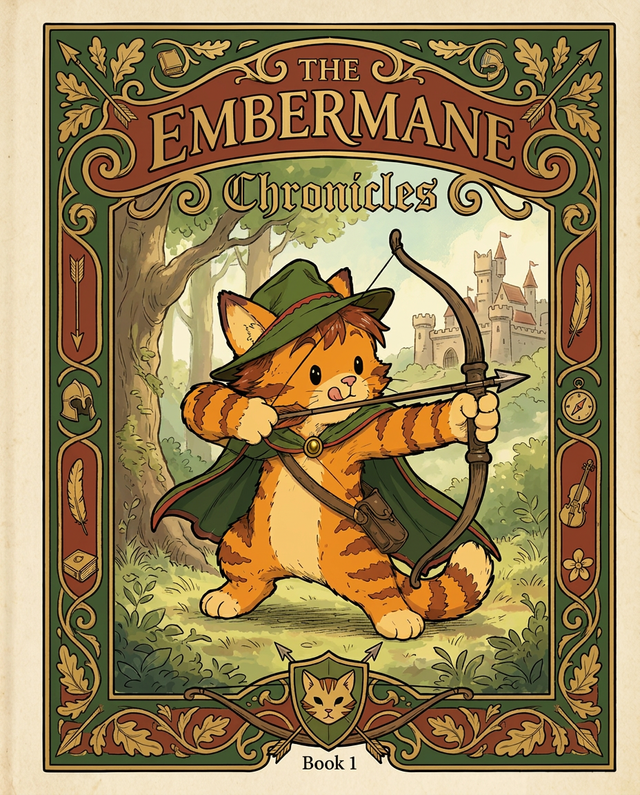
AI Design for Absolutely. Here's how I'd describe the entire cover as if it were written in a design document for an illustrator.

---

# 📖 THE EMBERMANE CHRONICLES

### Book 1 Cover Design Specification

## Overall Format

* Book size: **21 cm × 13.5 cm**
* Classic fantasy novel proportions.
* Matte finish.
* Storybook-inspired cover.
* Not realistic.
* Not modern.
* Warm, timeless, and iconic.

The cover should feel like something discovered in an old library, passed down through generations.

---

# Color Palette

### Primary Colors

🌲 Deep forest green

🔥 Warm red-brown

✨ Soft gold

📜 Cream

These colors should contrast strongly.

The green and red-brown should never blend together.

Instead:

* Green frames red-brown.
* Red-brown frames green.
* Gold highlights details.

The result should feel rich and elegant.

---

# Cover Layout

The cover is divided into two major sections:

## Outer Cover Frame

A thick decorative border surrounding the artwork.

This border is one of the defining visual features of the series.

When readers see this frame, they should instantly recognize:

> "That's an Embermane Chronicles book."

---

## Center Illustration Window

Inside the border sits a framed illustration.

Like a painting inside an old book cover.

The illustration occupies roughly:

60–70% of the front cover.

---

# The Border

### Main Border Color

Deep forest green.

### Border Decorations

The border contains elegant line art and embossing.

Features include:

🌿 Oak leaves

🌿 Vines

🏹 Arrows

🪶 Feathers

📜 Scrollwork

🌰 Acorns

The decorations should look inspired by medieval manuscripts.

Not overly complex.

Not cluttered.

Beautiful and readable.

---

# Hidden Symbols

The border contains tiny references to important characters.

Readers may not notice them immediately.

Examples:

📚 Milo's book

🛡 Rufus' tiny knight helmet

🗺 Shadow's compass

🎻 Ashen's fiddle

🌼 Pippa's flower

These should feel like little secrets.

---

# Title Placement

The title is integrated into the border.

Not floating over the artwork.

### Top Border

Small text:

**THE**

Below it:

# EMBERMANE

Large.

Very large.

The largest text on the cover.

The first thing people notice.

---

### Bottom Border

Smaller text:

**Chronicles**

Elegant.

Decorative.

Part of the frame itself.

---

# The Embermane Crest

Located at the bottom center.

Built into the border.

Not too large.

Not too small.

A symbol readers learn to recognize.

Possible design:

🐱 Stylized cat head

🔥 Red-brown mane

🌲 Green shield background

🏹 Small crossed bow behind it

Simple and iconic.

---

# Central Illustration

The illustration is framed by the border.

---

## Jasper Embermane

Standing slightly off-center.

The focus of the entire cover.

Features:

🐱 Orange tabby cat

🐱 Red-brown mane

🐱 Red-brown cheek stripes

🐱 Red-brown arm and leg markings

🐱 Red-brown ear tips

---

### Clothing

🌲 Green cloak

🌲 Green archer hat

🪶 Red feather

🔴 Thin red trim around the cloak edges

---

### Pose

Jasper is aiming his bow.

Not fighting.

Not dramatic.

Not angry.

Instead:

He is concentrating extremely hard.

One eye slightly squinted.

Tongue sticking out a little.

Like a kid trying his absolute best.

This detail makes him feel charming and relatable.

---

# Background

Soft storybook scenery.

Not detailed enough to distract.

Possible elements:

🌲 Forest

⛰ Distant mountains

🏰 Tiny glimpse of Embermane Hall

☁ Soft sky

The background exists only to support Jasper.

Jasper remains the star.

---

# Art Style

### Linework

* Clean outlines
* Storybook quality
* Slightly hand-drawn

### Coloring

* Flat colors
* Soft gradients
* Minimal shading

### Overall Feel

Somewhere between:

📖 Redwall

📖 Classic fantasy novels

📖 Illustrated children's adventure books

The goal is:

> A timeless fantasy storybook.

Not a movie poster.

Not a comic cover.

Not realism.

---

# Reader Impression

When someone sees the book for the first time, they should think:

> "Who is Embermane?"

Then:

> "Who is that cat?"

Then:

> "I want to know what's inside."

The cover should promise:

🌲 Adventure

🏹 Heroism

📜 Ancient history

🐱 Friendship

🍲 Warmth

✨ Wonder

And most importantly:

> The beginning of a very long chronicle.

That's how I imagine **The Embermane Chronicles** sitting on a bookshelf, looking like the first volume of a beloved fantasy saga. 🐱🏹📖🌲🔥 and make it so i can actually use it as a cover full screen and not sketch art syle do the ones u did just better and thicker bold lines make the cover fit the whole image and make the cat hero to have thicker black outlines and the cover too

Absolutely. Here's how I'd describe the entire cover as if it were written in a design document for an illustrator. --- # 📖 THE EMBERMANE CHRONICLES ### Book 1 Cover Design Specification ## Overall Format * Book size: **21 cm × 13.5 cm** * Classic fantasy novel proportions. * Matte finish. * Storybook-inspired cover. * Not realistic. * Not modern. * Warm, timeless, and iconic. The cover should feel like something discovered in an old library, passed down through generations. --- # Color Palette ### Primary Colors 🌲 Deep forest green 🔥 Warm red-brown ✨ Soft gold 📜 Cream These colors should contrast strongly. The green and red-brown should never blend together. Instead: * Green frames red-brown. * Red-brown frames green. * Gold highlights details. The result should feel rich and elegant. --- # Cover Layout The cover is divided into two major sections: ## Outer Cover Frame A thick decorative border surrounding the artwork. This border is one of the defining visual features of the series. When readers see this frame, they should instantly recognize: > "That's an Embermane Chronicles book." --- ## Center Illustration Window Inside the border sits a framed illustration. Like a painting inside an old book cover. The illustration occupies roughly: 60–70% of the front cover. --- # The Border ### Main Border Color Deep forest green. ### Border Decorations The border contains elegant line art and embossing. Features include: 🌿 Oak leaves 🌿 Vines 🏹 Arrows 🪶 Feathers 📜 Scrollwork 🌰 Acorns The decorations should look inspired by medieval manuscripts. Not overly complex. Not cluttered. Beautiful and readable. --- # Hidden Symbols The border contains tiny references to important characters. Readers may not notice them immediately. Examples: 📚 Milo's book 🛡 Rufus' tiny knight helmet 🗺 Shadow's compass 🎻 Ashen's fiddle 🌼 Pippa's flower These should feel like little secrets. --- # Title Placement The title is integrated into the border. Not floating over the artwork. ### Top Border Small text: **THE** Below it: # EMBERMANE Large. Very large. The largest text on the cover. The first thing people notice. --- ### Bottom Border Smaller text: **Chronicles** Elegant. Decorative. Part of the frame itself. --- # The Embermane Crest Located at the bottom center. Built into the border. Not too large. Not too small. A symbol readers learn to recognize. Possible design: 🐱 Stylized cat head 🔥 Red-brown mane 🌲 Green shield background 🏹 Small crossed bow behind it Simple and iconic. --- # Central Illustration The illustration is framed by the border. --- ## Jasper Embermane Standing slightly off-center. The focus of the entire cover. Features: 🐱 Orange tabby cat 🐱 Red-brown mane 🐱 Red-brown cheek stripes 🐱 Red-brown arm and leg markings 🐱 Red-brown ear tips --- ### Clothing 🌲 Green cloak 🌲 Green archer hat 🪶 Red feather 🔴 Thin red trim around the cloak edges --- ### Pose Jasper is aiming his bow. Not fighting. Not dramatic. Not angry. Instead: He is concentrating extremely hard. One eye slightly squinted. Tongue sticking out a little. Like a kid trying his absolute best. This detail makes him feel charming and relatable. --- # Background Soft storybook scenery. Not detailed enough to distract. Possible elements: 🌲 Forest ⛰ Distant mountains 🏰 Tiny glimpse of Embermane Hall ☁ Soft sky The background exists only to support Jasper. Jasper remains the star. --- # Art Style ### Linework * Clean outlines * Storybook quality * Slightly hand-drawn ### Coloring * Flat colors * Soft gradients * Minimal shading ### Overall Feel Somewhere between: 📖 Redwall 📖 Classic fantasy novels 📖 Illustrated children's adventure books The goal is: > A timeless fantasy storybook. Not a movie poster. Not a comic cover. Not realism. --- # Reader Impression When someone sees the book for the first time, they should think: > "Who is Embermane?" Then: > "Who is that cat?" Then: > "I want to know what's inside." The cover should promise: 🌲 Adventure 🏹 Heroism 📜 Ancient history 🐱 Friendship 🍲 Warmth ✨ Wonder And most importantly: > The beginning of a very long chronicle. That's how I imagine **The Embermane Chronicles** sitting on a bookshelf, looking like the first volume of a beloved fantasy saga. 🐱🏹📖🌲🔥 and make it so i can actually use it as a cover full screen and not sketch art syle do the ones u did just better and thicker bold lines make the cover fit the whole image and make the cat hero to have thicker black outlines and the cover too

by @Elephant_8984916
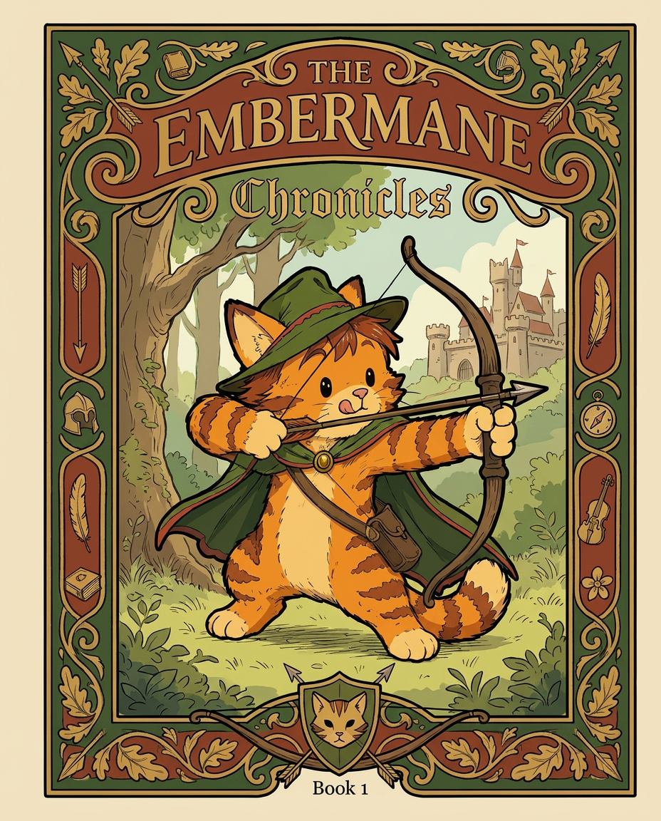
AI Design for Absolutely. Here's how I'd describe the entire cover as if it were written in a design document for an illustrator.

---

# 📖 THE EMBERMANE CHRONICLES

### Book 1 Cover Design Specification

## Overall Format

* Book size: **21 cm × 13.5 cm**
* Classic fantasy novel proportions.
* Matte finish.
* Storybook-inspired cover.
* Not realistic.
* Not modern.
* Warm, timeless, and iconic.

The cover should feel like something discovered in an old library, passed down through generations.

---

# Color Palette

### Primary Colors

🌲 Deep forest green

🔥 Warm red-brown

✨ Soft gold

📜 Cream

These colors should contrast strongly.

The green and red-brown should never blend together.

Instead:

* Green frames red-brown.
* Red-brown frames green.
* Gold highlights details.

The result should feel rich and elegant.

---

# Cover Layout

The cover is divided into two major sections:

## Outer Cover Frame

A thick decorative border surrounding the artwork.

This border is one of the defining visual features of the series.

When readers see this frame, they should instantly recognize:

> "That's an Embermane Chronicles book."

---

## Center Illustration Window

Inside the border sits a framed illustration.

Like a painting inside an old book cover.

The illustration occupies roughly:

60–70% of the front cover.

---

# The Border

### Main Border Color

Deep forest green.

### Border Decorations

The border contains elegant line art and embossing.

Features include:

🌿 Oak leaves

🌿 Vines

🏹 Arrows

🪶 Feathers

📜 Scrollwork

🌰 Acorns

The decorations should look inspired by medieval manuscripts.

Not overly complex.

Not cluttered.

Beautiful and readable.

---

# Hidden Symbols

The border contains tiny references to important characters.

Readers may not notice them immediately.

Examples:

📚 Milo's book

🛡 Rufus' tiny knight helmet

🗺 Shadow's compass

🎻 Ashen's fiddle

🌼 Pippa's flower

These should feel like little secrets.

---

# Title Placement

The title is integrated into the border.

Not floating over the artwork.

### Top Border

Small text:

**THE**

Below it:

# EMBERMANE

Large.

Very large.

The largest text on the cover.

The first thing people notice.

---

### Bottom Border

Smaller text:

**Chronicles**

Elegant.

Decorative.

Part of the frame itself.

---

# The Embermane Crest

Located at the bottom center.

Built into the border.

Not too large.

Not too small.

A symbol readers learn to recognize.

Possible design:

🐱 Stylized cat head

🔥 Red-brown mane

🌲 Green shield background

🏹 Small crossed bow behind it

Simple and iconic.

---

# Central Illustration

The illustration is framed by the border.

---

## Jasper Embermane

Standing slightly off-center.

The focus of the entire cover.

Features:

🐱 Orange tabby cat

🐱 Red-brown mane

🐱 Red-brown cheek stripes

🐱 Red-brown arm and leg markings

🐱 Red-brown ear tips

---

### Clothing

🌲 Green cloak

🌲 Green archer hat

🪶 Red feather

🔴 Thin red trim around the cloak edges

---

### Pose

Jasper is aiming his bow.

Not fighting.

Not dramatic.

Not angry.

Instead:

He is concentrating extremely hard.

One eye slightly squinted.

Tongue sticking out a little.

Like a kid trying his absolute best.

This detail makes him feel charming and relatable.

---

# Background

Soft storybook scenery.

Not detailed enough to distract.

Possible elements:

🌲 Forest

⛰ Distant mountains

🏰 Tiny glimpse of Embermane Hall

☁ Soft sky

The background exists only to support Jasper.

Jasper remains the star.

---

# Art Style

### Linework

* Clean outlines
* Storybook quality
* Slightly hand-drawn

### Coloring

* Flat colors
* Soft gradients
* Minimal shading

### Overall Feel

Somewhere between:

📖 Redwall

📖 Classic fantasy novels

📖 Illustrated children's adventure books

The goal is:

> A timeless fantasy storybook.

Not a movie poster.

Not a comic cover.

Not realism.

---

# Reader Impression

When someone sees the book for the first time, they should think:

> "Who is Embermane?"

Then:

> "Who is that cat?"

Then:

> "I want to know what's inside."

The cover should promise:

🌲 Adventure

🏹 Heroism

📜 Ancient history

🐱 Friendship

🍲 Warmth

✨ Wonder

And most importantly:

> The beginning of a very long chronicle.

That's how I imagine **The Embermane Chronicles** sitting on a bookshelf, looking like the first volume of a beloved fantasy saga. 🐱🏹📖🌲🔥 and make it so i can actually use it as a cover full screen and not sketch art syle do the ones u did just better and thicker bold lines make the cover fit the whole image and make the cat hero to have thicker black outlines and the cover too

Absolutely. Here's how I'd describe the entire cover as if it were written in a design document for an illustrator. --- # 📖 THE EMBERMANE CHRONICLES ### Book 1 Cover Design Specification ## Overall Format * Book size: **21 cm × 13.5 cm** * Classic fantasy novel proportions. * Matte finish. * Storybook-inspired cover. * Not realistic. * Not modern. * Warm, timeless, and iconic. The cover should feel like something discovered in an old library, passed down through generations. --- # Color Palette ### Primary Colors 🌲 Deep forest green 🔥 Warm red-brown ✨ Soft gold 📜 Cream These colors should contrast strongly. The green and red-brown should never blend together. Instead: * Green frames red-brown. * Red-brown frames green. * Gold highlights details. The result should feel rich and elegant. --- # Cover Layout The cover is divided into two major sections: ## Outer Cover Frame A thick decorative border surrounding the artwork. This border is one of the defining visual features of the series. When readers see this frame, they should instantly recognize: > "That's an Embermane Chronicles book." --- ## Center Illustration Window Inside the border sits a framed illustration. Like a painting inside an old book cover. The illustration occupies roughly: 60–70% of the front cover. --- # The Border ### Main Border Color Deep forest green. ### Border Decorations The border contains elegant line art and embossing. Features include: 🌿 Oak leaves 🌿 Vines 🏹 Arrows 🪶 Feathers 📜 Scrollwork 🌰 Acorns The decorations should look inspired by medieval manuscripts. Not overly complex. Not cluttered. Beautiful and readable. --- # Hidden Symbols The border contains tiny references to important characters. Readers may not notice them immediately. Examples: 📚 Milo's book 🛡 Rufus' tiny knight helmet 🗺 Shadow's compass 🎻 Ashen's fiddle 🌼 Pippa's flower These should feel like little secrets. --- # Title Placement The title is integrated into the border. Not floating over the artwork. ### Top Border Small text: **THE** Below it: # EMBERMANE Large. Very large. The largest text on the cover. The first thing people notice. --- ### Bottom Border Smaller text: **Chronicles** Elegant. Decorative. Part of the frame itself. --- # The Embermane Crest Located at the bottom center. Built into the border. Not too large. Not too small. A symbol readers learn to recognize. Possible design: 🐱 Stylized cat head 🔥 Red-brown mane 🌲 Green shield background 🏹 Small crossed bow behind it Simple and iconic. --- # Central Illustration The illustration is framed by the border. --- ## Jasper Embermane Standing slightly off-center. The focus of the entire cover. Features: 🐱 Orange tabby cat 🐱 Red-brown mane 🐱 Red-brown cheek stripes 🐱 Red-brown arm and leg markings 🐱 Red-brown ear tips --- ### Clothing 🌲 Green cloak 🌲 Green archer hat 🪶 Red feather 🔴 Thin red trim around the cloak edges --- ### Pose Jasper is aiming his bow. Not fighting. Not dramatic. Not angry. Instead: He is concentrating extremely hard. One eye slightly squinted. Tongue sticking out a little. Like a kid trying his absolute best. This detail makes him feel charming and relatable. --- # Background Soft storybook scenery. Not detailed enough to distract. Possible elements: 🌲 Forest ⛰ Distant mountains 🏰 Tiny glimpse of Embermane Hall ☁ Soft sky The background exists only to support Jasper. Jasper remains the star. --- # Art Style ### Linework * Clean outlines * Storybook quality * Slightly hand-drawn ### Coloring * Flat colors * Soft gradients * Minimal shading ### Overall Feel Somewhere between: 📖 Redwall 📖 Classic fantasy novels 📖 Illustrated children's adventure books The goal is: > A timeless fantasy storybook. Not a movie poster. Not a comic cover. Not realism. --- # Reader Impression When someone sees the book for the first time, they should think: > "Who is Embermane?" Then: > "Who is that cat?" Then: > "I want to know what's inside." The cover should promise: 🌲 Adventure 🏹 Heroism 📜 Ancient history 🐱 Friendship 🍲 Warmth ✨ Wonder And most importantly: > The beginning of a very long chronicle. That's how I imagine **The Embermane Chronicles** sitting on a bookshelf, looking like the first volume of a beloved fantasy saga. 🐱🏹📖🌲🔥 and make it so i can actually use it as a cover full screen and not sketch art syle do the ones u did just better and thicker bold lines make the cover fit the whole image and make the cat hero to have thicker black outlines and the cover too

by @Elephant_8984916
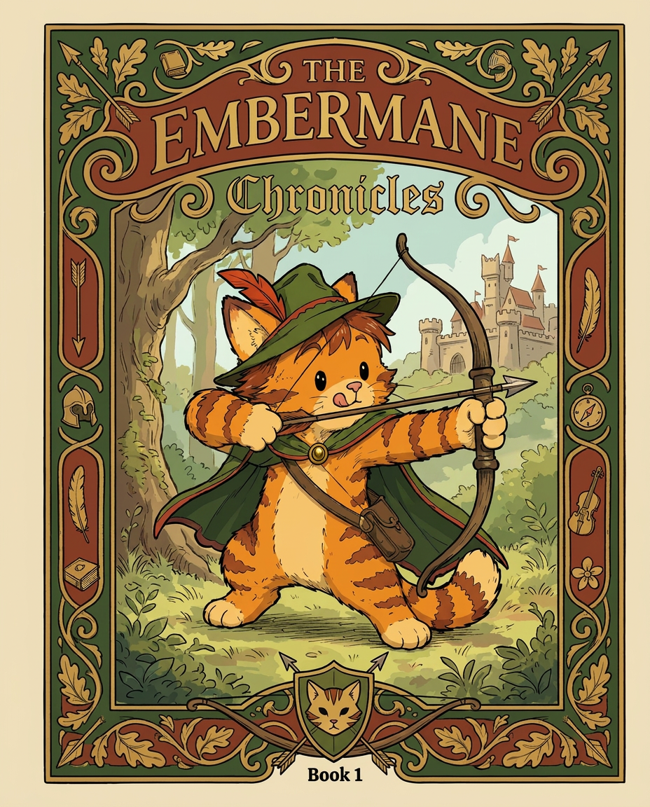
AI Design for Absolutely. Here's how I'd describe the entire cover as if it were written in a design document for an illustrator.

---

# 📖 THE EMBERMANE CHRONICLES

### Book 1 Cover Design Specification

## Overall Format

* Book size: **21 cm × 13.5 cm**
* Classic fantasy novel proportions.
* Matte finish.
* Storybook-inspired cover.
* Not realistic.
* Not modern.
* Warm, timeless, and iconic.

The cover should feel like something discovered in an old library, passed down through generations.

---

# Color Palette

### Primary Colors

🌲 Deep forest green

🔥 Warm red-brown

✨ Soft gold

📜 Cream

These colors should contrast strongly.

The green and red-brown should never blend together.

Instead:

* Green frames red-brown.
* Red-brown frames green.
* Gold highlights details.

The result should feel rich and elegant.

---

# Cover Layout

The cover is divided into two major sections:

## Outer Cover Frame

A thick decorative border surrounding the artwork.

This border is one of the defining visual features of the series.

When readers see this frame, they should instantly recognize:

> "That's an Embermane Chronicles book."

---

## Center Illustration Window

Inside the border sits a framed illustration.

Like a painting inside an old book cover.

The illustration occupies roughly:

60–70% of the front cover.

---

# The Border

### Main Border Color

Deep forest green.

### Border Decorations

The border contains elegant line art and embossing.

Features include:

🌿 Oak leaves

🌿 Vines

🏹 Arrows

🪶 Feathers

📜 Scrollwork

🌰 Acorns

The decorations should look inspired by medieval manuscripts.

Not overly complex.

Not cluttered.

Beautiful and readable.

---

# Hidden Symbols

The border contains tiny references to important characters.

Readers may not notice them immediately.

Examples:

📚 Milo's book

🛡 Rufus' tiny knight helmet

🗺 Shadow's compass

🎻 Ashen's fiddle

🌼 Pippa's flower

These should feel like little secrets.

---

# Title Placement

The title is integrated into the border.

Not floating over the artwork.

### Top Border

Small text:

**THE**

Below it:

# EMBERMANE

Large.

Very large.

The largest text on the cover.

The first thing people notice.

---

### Bottom Border

Smaller text:

**Chronicles**

Elegant.

Decorative.

Part of the frame itself.

---

# The Embermane Crest

Located at the bottom center.

Built into the border.

Not too large.

Not too small.

A symbol readers learn to recognize.

Possible design:

🐱 Stylized cat head

🔥 Red-brown mane

🌲 Green shield background

🏹 Small crossed bow behind it

Simple and iconic.

---

# Central Illustration

The illustration is framed by the border.

---

## Jasper Embermane

Standing slightly off-center.

The focus of the entire cover.

Features:

🐱 Orange tabby cat

🐱 Red-brown mane

🐱 Red-brown cheek stripes

🐱 Red-brown arm and leg markings

🐱 Red-brown ear tips

---

### Clothing

🌲 Green cloak

🌲 Green archer hat

🪶 Red feather

🔴 Thin red trim around the cloak edges

---

### Pose

Jasper is aiming his bow.

Not fighting.

Not dramatic.

Not angry.

Instead:

He is concentrating extremely hard.

One eye slightly squinted.

Tongue sticking out a little.

Like a kid trying his absolute best.

This detail makes him feel charming and relatable.

---

# Background

Soft storybook scenery.

Not detailed enough to distract.

Possible elements:

🌲 Forest

⛰ Distant mountains

🏰 Tiny glimpse of Embermane Hall

☁ Soft sky

The background exists only to support Jasper.

Jasper remains the star.

---

# Art Style

### Linework

* Clean outlines
* Storybook quality
* Slightly hand-drawn

### Coloring

* Flat colors
* Soft gradients
* Minimal shading

### Overall Feel

Somewhere between:

📖 Redwall

📖 Classic fantasy novels

📖 Illustrated children's adventure books

The goal is:

> A timeless fantasy storybook.

Not a movie poster.

Not a comic cover.

Not realism.

---

# Reader Impression

When someone sees the book for the first time, they should think:

> "Who is Embermane?"

Then:

> "Who is that cat?"

Then:

> "I want to know what's inside."

The cover should promise:

🌲 Adventure

🏹 Heroism

📜 Ancient history

🐱 Friendship

🍲 Warmth

✨ Wonder

And most importantly:

> The beginning of a very long chronicle.

That's how I imagine **The Embermane Chronicles** sitting on a bookshelf, looking like the first volume of a beloved fantasy saga. 🐱🏹📖🌲🔥 and make it so i can actually use it as a cover full screen and not sketch art syle do the ones u did just better and thicker bold lines make the cover fit the whole image and make the cat hero to have thicker black outlines and the cover too

Absolutely. Here's how I'd describe the entire cover as if it were written in a design document for an illustrator. --- # 📖 THE EMBERMANE CHRONICLES ### Book 1 Cover Design Specification ## Overall Format * Book size: **21 cm × 13.5 cm** * Classic fantasy novel proportions. * Matte finish. * Storybook-inspired cover. * Not realistic. * Not modern. * Warm, timeless, and iconic. The cover should feel like something discovered in an old library, passed down through generations. --- # Color Palette ### Primary Colors 🌲 Deep forest green 🔥 Warm red-brown ✨ Soft gold 📜 Cream These colors should contrast strongly. The green and red-brown should never blend together. Instead: * Green frames red-brown. * Red-brown frames green. * Gold highlights details. The result should feel rich and elegant. --- # Cover Layout The cover is divided into two major sections: ## Outer Cover Frame A thick decorative border surrounding the artwork. This border is one of the defining visual features of the series. When readers see this frame, they should instantly recognize: > "That's an Embermane Chronicles book." --- ## Center Illustration Window Inside the border sits a framed illustration. Like a painting inside an old book cover. The illustration occupies roughly: 60–70% of the front cover. --- # The Border ### Main Border Color Deep forest green. ### Border Decorations The border contains elegant line art and embossing. Features include: 🌿 Oak leaves 🌿 Vines 🏹 Arrows 🪶 Feathers 📜 Scrollwork 🌰 Acorns The decorations should look inspired by medieval manuscripts. Not overly complex. Not cluttered. Beautiful and readable. --- # Hidden Symbols The border contains tiny references to important characters. Readers may not notice them immediately. Examples: 📚 Milo's book 🛡 Rufus' tiny knight helmet 🗺 Shadow's compass 🎻 Ashen's fiddle 🌼 Pippa's flower These should feel like little secrets. --- # Title Placement The title is integrated into the border. Not floating over the artwork. ### Top Border Small text: **THE** Below it: # EMBERMANE Large. Very large. The largest text on the cover. The first thing people notice. --- ### Bottom Border Smaller text: **Chronicles** Elegant. Decorative. Part of the frame itself. --- # The Embermane Crest Located at the bottom center. Built into the border. Not too large. Not too small. A symbol readers learn to recognize. Possible design: 🐱 Stylized cat head 🔥 Red-brown mane 🌲 Green shield background 🏹 Small crossed bow behind it Simple and iconic. --- # Central Illustration The illustration is framed by the border. --- ## Jasper Embermane Standing slightly off-center. The focus of the entire cover. Features: 🐱 Orange tabby cat 🐱 Red-brown mane 🐱 Red-brown cheek stripes 🐱 Red-brown arm and leg markings 🐱 Red-brown ear tips --- ### Clothing 🌲 Green cloak 🌲 Green archer hat 🪶 Red feather 🔴 Thin red trim around the cloak edges --- ### Pose Jasper is aiming his bow. Not fighting. Not dramatic. Not angry. Instead: He is concentrating extremely hard. One eye slightly squinted. Tongue sticking out a little. Like a kid trying his absolute best. This detail makes him feel charming and relatable. --- # Background Soft storybook scenery. Not detailed enough to distract. Possible elements: 🌲 Forest ⛰ Distant mountains 🏰 Tiny glimpse of Embermane Hall ☁ Soft sky The background exists only to support Jasper. Jasper remains the star. --- # Art Style ### Linework * Clean outlines * Storybook quality * Slightly hand-drawn ### Coloring * Flat colors * Soft gradients * Minimal shading ### Overall Feel Somewhere between: 📖 Redwall 📖 Classic fantasy novels 📖 Illustrated children's adventure books The goal is: > A timeless fantasy storybook. Not a movie poster. Not a comic cover. Not realism. --- # Reader Impression When someone sees the book for the first time, they should think: > "Who is Embermane?" Then: > "Who is that cat?" Then: > "I want to know what's inside." The cover should promise: 🌲 Adventure 🏹 Heroism 📜 Ancient history 🐱 Friendship 🍲 Warmth ✨ Wonder And most importantly: > The beginning of a very long chronicle. That's how I imagine **The Embermane Chronicles** sitting on a bookshelf, looking like the first volume of a beloved fantasy saga. 🐱🏹📖🌲🔥 and make it so i can actually use it as a cover full screen and not sketch art syle do the ones u did just better and thicker bold lines make the cover fit the whole image and make the cat hero to have thicker black outlines and the cover too

by @Elephant_8984916
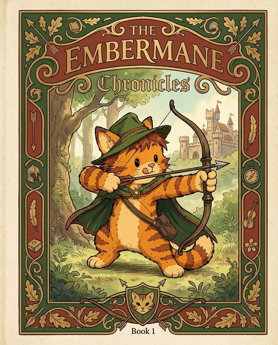
AI Design for Absolutely. Here's how I'd describe the entire cover as if it were written in a design document for an illustrator.

---

# 📖 THE EMBERMANE CHRONICLES

### Book 1 Cover Design Specification

## Overall Format

* Book size: **21 cm × 13.5 cm**
* Classic fantasy novel proportions.
* Matte finish.
* Storybook-inspired cover.
* Not realistic.
* Not modern.
* Warm, timeless, and iconic.

The cover should feel like something discovered in an old library, passed down through generations.

---

# Color Palette

### Primary Colors

🌲 Deep forest green

🔥 Warm red-brown

✨ Soft gold

📜 Cream

These colors should contrast strongly.

The green and red-brown should never blend together.

Instead:

* Green frames red-brown.
* Red-brown frames green.
* Gold highlights details.

The result should feel rich and elegant.

---

# Cover Layout

The cover is divided into two major sections:

## Outer Cover Frame

A thick decorative border surrounding the artwork.

This border is one of the defining visual features of the series.

When readers see this frame, they should instantly recognize:

> "That's an Embermane Chronicles book."

---

## Center Illustration Window

Inside the border sits a framed illustration.

Like a painting inside an old book cover.

The illustration occupies roughly:

60–70% of the front cover.

---

# The Border

### Main Border Color

Deep forest green.

### Border Decorations

The border contains elegant line art and embossing.

Features include:

🌿 Oak leaves

🌿 Vines

🏹 Arrows

🪶 Feathers

📜 Scrollwork

🌰 Acorns

The decorations should look inspired by medieval manuscripts.

Not overly complex.

Not cluttered.

Beautiful and readable.

---

# Hidden Symbols

The border contains tiny references to important characters.

Readers may not notice them immediately.

Examples:

📚 Milo's book

🛡 Rufus' tiny knight helmet

🗺 Shadow's compass

🎻 Ashen's fiddle

🌼 Pippa's flower

These should feel like little secrets.

---

# Title Placement

The title is integrated into the border.

Not floating over the artwork.

### Top Border

Small text:

**THE**

Below it:

# EMBERMANE

Large.

Very large.

The largest text on the cover.

The first thing people notice.

---

### Bottom Border

Smaller text:

**Chronicles**

Elegant.

Decorative.

Part of the frame itself.

---

# The Embermane Crest

Located at the bottom center.

Built into the border.

Not too large.

Not too small.

A symbol readers learn to recognize.

Possible design:

🐱 Stylized cat head

🔥 Red-brown mane

🌲 Green shield background

🏹 Small crossed bow behind it

Simple and iconic.

---

# Central Illustration

The illustration is framed by the border.

---

## Jasper Embermane

Standing slightly off-center.

The focus of the entire cover.

Features:

🐱 Orange tabby cat

🐱 Red-brown mane

🐱 Red-brown cheek stripes

🐱 Red-brown arm and leg markings

🐱 Red-brown ear tips

---

### Clothing

🌲 Green cloak

🌲 Green archer hat

🪶 Red feather

🔴 Thin red trim around the cloak edges

---

### Pose

Jasper is aiming his bow.

Not fighting.

Not dramatic.

Not angry.

Instead:

He is concentrating extremely hard.

One eye slightly squinted.

Tongue sticking out a little.

Like a kid trying his absolute best.

This detail makes him feel charming and relatable.

---

# Background

Soft storybook scenery.

Not detailed enough to distract.

Possible elements:

🌲 Forest

⛰ Distant mountains

🏰 Tiny glimpse of Embermane Hall

☁ Soft sky

The background exists only to support Jasper.

Jasper remains the star.

---

# Art Style

### Linework

* Clean outlines
* Storybook quality
* Slightly hand-drawn

### Coloring

* Flat colors
* Soft gradients
* Minimal shading

### Overall Feel

Somewhere between:

📖 Redwall

📖 Classic fantasy novels

📖 Illustrated children's adventure books

The goal is:

> A timeless fantasy storybook.

Not a movie poster.

Not a comic cover.

Not realism.

---

# Reader Impression

When someone sees the book for the first time, they should think:

> "Who is Embermane?"

Then:

> "Who is that cat?"

Then:

> "I want to know what's inside."

The cover should promise:

🌲 Adventure

🏹 Heroism

📜 Ancient history

🐱 Friendship

🍲 Warmth

✨ Wonder

And most importantly:

> The beginning of a very long chronicle.

That's how I imagine **The Embermane Chronicles** sitting on a bookshelf, looking like the first volume of a beloved fantasy saga. 🐱🏹📖🌲🔥 and make it so i can actually use it as a cover full screen and not sketch art syle do the ones u did just better and thicker bold lines

Absolutely. Here's how I'd describe the entire cover as if it were written in a design document for an illustrator. --- # 📖 THE EMBERMANE CHRONICLES ### Book 1 Cover Design Specification ## Overall Format * Book size: **21 cm × 13.5 cm** * Classic fantasy novel proportions. * Matte finish. * Storybook-inspired cover. * Not realistic. * Not modern. * Warm, timeless, and iconic. The cover should feel like something discovered in an old library, passed down through generations. --- # Color Palette ### Primary Colors 🌲 Deep forest green 🔥 Warm red-brown ✨ Soft gold 📜 Cream These colors should contrast strongly. The green and red-brown should never blend together. Instead: * Green frames red-brown. * Red-brown frames green. * Gold highlights details. The result should feel rich and elegant. --- # Cover Layout The cover is divided into two major sections: ## Outer Cover Frame A thick decorative border surrounding the artwork. This border is one of the defining visual features of the series. When readers see this frame, they should instantly recognize: > "That's an Embermane Chronicles book." --- ## Center Illustration Window Inside the border sits a framed illustration. Like a painting inside an old book cover. The illustration occupies roughly: 60–70% of the front cover. --- # The Border ### Main Border Color Deep forest green. ### Border Decorations The border contains elegant line art and embossing. Features include: 🌿 Oak leaves 🌿 Vines 🏹 Arrows 🪶 Feathers 📜 Scrollwork 🌰 Acorns The decorations should look inspired by medieval manuscripts. Not overly complex. Not cluttered. Beautiful and readable. --- # Hidden Symbols The border contains tiny references to important characters. Readers may not notice them immediately. Examples: 📚 Milo's book 🛡 Rufus' tiny knight helmet 🗺 Shadow's compass 🎻 Ashen's fiddle 🌼 Pippa's flower These should feel like little secrets. --- # Title Placement The title is integrated into the border. Not floating over the artwork. ### Top Border Small text: **THE** Below it: # EMBERMANE Large. Very large. The largest text on the cover. The first thing people notice. --- ### Bottom Border Smaller text: **Chronicles** Elegant. Decorative. Part of the frame itself. --- # The Embermane Crest Located at the bottom center. Built into the border. Not too large. Not too small. A symbol readers learn to recognize. Possible design: 🐱 Stylized cat head 🔥 Red-brown mane 🌲 Green shield background 🏹 Small crossed bow behind it Simple and iconic. --- # Central Illustration The illustration is framed by the border. --- ## Jasper Embermane Standing slightly off-center. The focus of the entire cover. Features: 🐱 Orange tabby cat 🐱 Red-brown mane 🐱 Red-brown cheek stripes 🐱 Red-brown arm and leg markings 🐱 Red-brown ear tips --- ### Clothing 🌲 Green cloak 🌲 Green archer hat 🪶 Red feather 🔴 Thin red trim around the cloak edges --- ### Pose Jasper is aiming his bow. Not fighting. Not dramatic. Not angry. Instead: He is concentrating extremely hard. One eye slightly squinted. Tongue sticking out a little. Like a kid trying his absolute best. This detail makes him feel charming and relatable. --- # Background Soft storybook scenery. Not detailed enough to distract. Possible elements: 🌲 Forest ⛰ Distant mountains 🏰 Tiny glimpse of Embermane Hall ☁ Soft sky The background exists only to support Jasper. Jasper remains the star. --- # Art Style ### Linework * Clean outlines * Storybook quality * Slightly hand-drawn ### Coloring * Flat colors * Soft gradients * Minimal shading ### Overall Feel Somewhere between: 📖 Redwall 📖 Classic fantasy novels 📖 Illustrated children's adventure books The goal is: > A timeless fantasy storybook. Not a movie poster. Not a comic cover. Not realism. --- # Reader Impression When someone sees the book for the first time, they should think: > "Who is Embermane?" Then: > "Who is that cat?" Then: > "I want to know what's inside." The cover should promise: 🌲 Adventure 🏹 Heroism 📜 Ancient history 🐱 Friendship 🍲 Warmth ✨ Wonder And most importantly: > The beginning of a very long chronicle. That's how I imagine **The Embermane Chronicles** sitting on a bookshelf, looking like the first volume of a beloved fantasy saga. 🐱🏹📖🌲🔥 and make it so i can actually use it as a cover full screen and not sketch art syle do the ones u did just better and thicker bold lines

by @Elephant_8984916
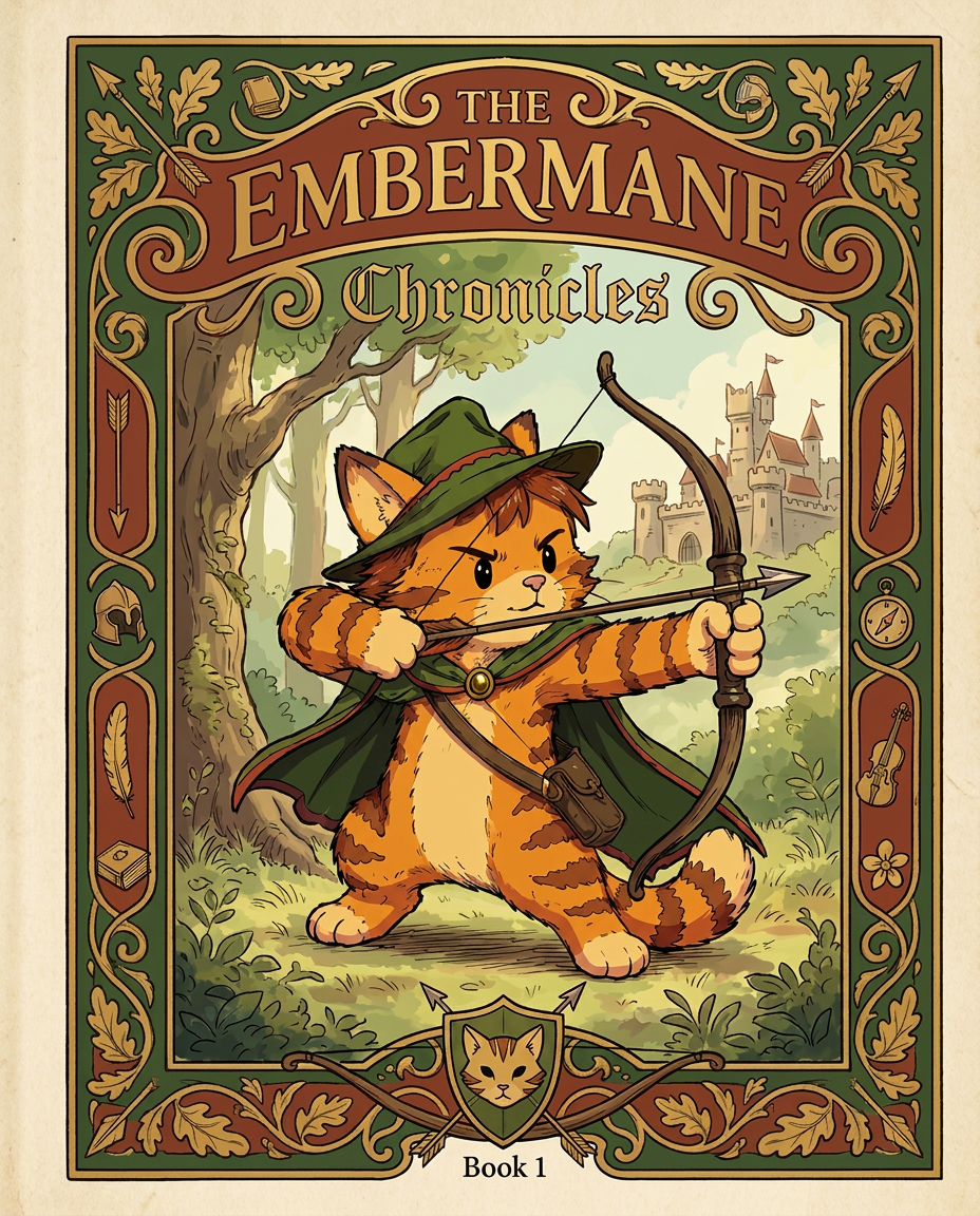
AI Design for Absolutely. Here's how I'd describe the entire cover as if it were written in a design document for an illustrator.

---

# 📖 THE EMBERMANE CHRONICLES

### Book 1 Cover Design Specification

## Overall Format

* Book size: **21 cm × 13.5 cm**
* Classic fantasy novel proportions.
* Matte finish.
* Storybook-inspired cover.
* Not realistic.
* Not modern.
* Warm, timeless, and iconic.

The cover should feel like something discovered in an old library, passed down through generations.

---

# Color Palette

### Primary Colors

🌲 Deep forest green

🔥 Warm red-brown

✨ Soft gold

📜 Cream

These colors should contrast strongly.

The green and red-brown should never blend together.

Instead:

* Green frames red-brown.
* Red-brown frames green.
* Gold highlights details.

The result should feel rich and elegant.

---

# Cover Layout

The cover is divided into two major sections:

## Outer Cover Frame

A thick decorative border surrounding the artwork.

This border is one of the defining visual features of the series.

When readers see this frame, they should instantly recognize:

> "That's an Embermane Chronicles book."

---

## Center Illustration Window

Inside the border sits a framed illustration.

Like a painting inside an old book cover.

The illustration occupies roughly:

60–70% of the front cover.

---

# The Border

### Main Border Color

Deep forest green.

### Border Decorations

The border contains elegant line art and embossing.

Features include:

🌿 Oak leaves

🌿 Vines

🏹 Arrows

🪶 Feathers

📜 Scrollwork

🌰 Acorns

The decorations should look inspired by medieval manuscripts.

Not overly complex.

Not cluttered.

Beautiful and readable.

---

# Hidden Symbols

The border contains tiny references to important characters.

Readers may not notice them immediately.

Examples:

📚 Milo's book

🛡 Rufus' tiny knight helmet

🗺 Shadow's compass

🎻 Ashen's fiddle

🌼 Pippa's flower

These should feel like little secrets.

---

# Title Placement

The title is integrated into the border.

Not floating over the artwork.

### Top Border

Small text:

**THE**

Below it:

# EMBERMANE

Large.

Very large.

The largest text on the cover.

The first thing people notice.

---

### Bottom Border

Smaller text:

**Chronicles**

Elegant.

Decorative.

Part of the frame itself.

---

# The Embermane Crest

Located at the bottom center.

Built into the border.

Not too large.

Not too small.

A symbol readers learn to recognize.

Possible design:

🐱 Stylized cat head

🔥 Red-brown mane

🌲 Green shield background

🏹 Small crossed bow behind it

Simple and iconic.

---

# Central Illustration

The illustration is framed by the border.

---

## Jasper Embermane

Standing slightly off-center.

The focus of the entire cover.

Features:

🐱 Orange tabby cat

🐱 Red-brown mane

🐱 Red-brown cheek stripes

🐱 Red-brown arm and leg markings

🐱 Red-brown ear tips

---

### Clothing

🌲 Green cloak

🌲 Green archer hat

🪶 Red feather

🔴 Thin red trim around the cloak edges

---

### Pose

Jasper is aiming his bow.

Not fighting.

Not dramatic.

Not angry.

Instead:

He is concentrating extremely hard.

One eye slightly squinted.

Tongue sticking out a little.

Like a kid trying his absolute best.

This detail makes him feel charming and relatable.

---

# Background

Soft storybook scenery.

Not detailed enough to distract.

Possible elements:

🌲 Forest

⛰ Distant mountains

🏰 Tiny glimpse of Embermane Hall

☁ Soft sky

The background exists only to support Jasper.

Jasper remains the star.

---

# Art Style

### Linework

* Clean outlines
* Storybook quality
* Slightly hand-drawn

### Coloring

* Flat colors
* Soft gradients
* Minimal shading

### Overall Feel

Somewhere between:

📖 Redwall

📖 Classic fantasy novels

📖 Illustrated children's adventure books

The goal is:

> A timeless fantasy storybook.

Not a movie poster.

Not a comic cover.

Not realism.

---

# Reader Impression

When someone sees the book for the first time, they should think:

> "Who is Embermane?"

Then:

> "Who is that cat?"

Then:

> "I want to know what's inside."

The cover should promise:

🌲 Adventure

🏹 Heroism

📜 Ancient history

🐱 Friendship

🍲 Warmth

✨ Wonder

And most importantly:

> The beginning of a very long chronicle.

That's how I imagine **The Embermane Chronicles** sitting on a bookshelf, looking like the first volume of a beloved fantasy saga. 🐱🏹📖🌲🔥 and make it so i can actually use it as a cover full screen and not sketch art syle do the ones u did just better and thicker bold lines

Absolutely. Here's how I'd describe the entire cover as if it were written in a design document for an illustrator. --- # 📖 THE EMBERMANE CHRONICLES ### Book 1 Cover Design Specification ## Overall Format * Book size: **21 cm × 13.5 cm** * Classic fantasy novel proportions. * Matte finish. * Storybook-inspired cover. * Not realistic. * Not modern. * Warm, timeless, and iconic. The cover should feel like something discovered in an old library, passed down through generations. --- # Color Palette ### Primary Colors 🌲 Deep forest green 🔥 Warm red-brown ✨ Soft gold 📜 Cream These colors should contrast strongly. The green and red-brown should never blend together. Instead: * Green frames red-brown. * Red-brown frames green. * Gold highlights details. The result should feel rich and elegant. --- # Cover Layout The cover is divided into two major sections: ## Outer Cover Frame A thick decorative border surrounding the artwork. This border is one of the defining visual features of the series. When readers see this frame, they should instantly recognize: > "That's an Embermane Chronicles book." --- ## Center Illustration Window Inside the border sits a framed illustration. Like a painting inside an old book cover. The illustration occupies roughly: 60–70% of the front cover. --- # The Border ### Main Border Color Deep forest green. ### Border Decorations The border contains elegant line art and embossing. Features include: 🌿 Oak leaves 🌿 Vines 🏹 Arrows 🪶 Feathers 📜 Scrollwork 🌰 Acorns The decorations should look inspired by medieval manuscripts. Not overly complex. Not cluttered. Beautiful and readable. --- # Hidden Symbols The border contains tiny references to important characters. Readers may not notice them immediately. Examples: 📚 Milo's book 🛡 Rufus' tiny knight helmet 🗺 Shadow's compass 🎻 Ashen's fiddle 🌼 Pippa's flower These should feel like little secrets. --- # Title Placement The title is integrated into the border. Not floating over the artwork. ### Top Border Small text: **THE** Below it: # EMBERMANE Large. Very large. The largest text on the cover. The first thing people notice. --- ### Bottom Border Smaller text: **Chronicles** Elegant. Decorative. Part of the frame itself. --- # The Embermane Crest Located at the bottom center. Built into the border. Not too large. Not too small. A symbol readers learn to recognize. Possible design: 🐱 Stylized cat head 🔥 Red-brown mane 🌲 Green shield background 🏹 Small crossed bow behind it Simple and iconic. --- # Central Illustration The illustration is framed by the border. --- ## Jasper Embermane Standing slightly off-center. The focus of the entire cover. Features: 🐱 Orange tabby cat 🐱 Red-brown mane 🐱 Red-brown cheek stripes 🐱 Red-brown arm and leg markings 🐱 Red-brown ear tips --- ### Clothing 🌲 Green cloak 🌲 Green archer hat 🪶 Red feather 🔴 Thin red trim around the cloak edges --- ### Pose Jasper is aiming his bow. Not fighting. Not dramatic. Not angry. Instead: He is concentrating extremely hard. One eye slightly squinted. Tongue sticking out a little. Like a kid trying his absolute best. This detail makes him feel charming and relatable. --- # Background Soft storybook scenery. Not detailed enough to distract. Possible elements: 🌲 Forest ⛰ Distant mountains 🏰 Tiny glimpse of Embermane Hall ☁ Soft sky The background exists only to support Jasper. Jasper remains the star. --- # Art Style ### Linework * Clean outlines * Storybook quality * Slightly hand-drawn ### Coloring * Flat colors * Soft gradients * Minimal shading ### Overall Feel Somewhere between: 📖 Redwall 📖 Classic fantasy novels 📖 Illustrated children's adventure books The goal is: > A timeless fantasy storybook. Not a movie poster. Not a comic cover. Not realism. --- # Reader Impression When someone sees the book for the first time, they should think: > "Who is Embermane?" Then: > "Who is that cat?" Then: > "I want to know what's inside." The cover should promise: 🌲 Adventure 🏹 Heroism 📜 Ancient history 🐱 Friendship 🍲 Warmth ✨ Wonder And most importantly: > The beginning of a very long chronicle. That's how I imagine **The Embermane Chronicles** sitting on a bookshelf, looking like the first volume of a beloved fantasy saga. 🐱🏹📖🌲🔥 and make it so i can actually use it as a cover full screen and not sketch art syle do the ones u did just better and thicker bold lines

by @Elephant_8984916
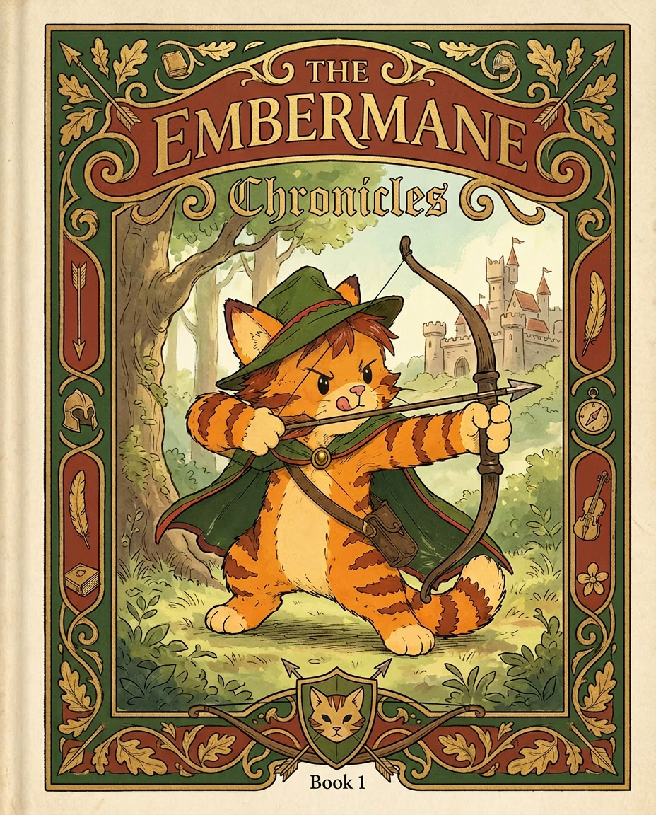
AI Design for Absolutely. Here's how I'd describe the entire cover as if it were written in a design document for an illustrator.

---

# 📖 THE EMBERMANE CHRONICLES

### Book 1 Cover Design Specification

## Overall Format

* Book size: **21 cm × 13.5 cm**
* Classic fantasy novel proportions.
* Matte finish.
* Storybook-inspired cover.
* Not realistic.
* Not modern.
* Warm, timeless, and iconic.

The cover should feel like something discovered in an old library, passed down through generations.

---

# Color Palette

### Primary Colors

🌲 Deep forest green

🔥 Warm red-brown

✨ Soft gold

📜 Cream

These colors should contrast strongly.

The green and red-brown should never blend together.

Instead:

* Green frames red-brown.
* Red-brown frames green.
* Gold highlights details.

The result should feel rich and elegant.

---

# Cover Layout

The cover is divided into two major sections:

## Outer Cover Frame

A thick decorative border surrounding the artwork.

This border is one of the defining visual features of the series.

When readers see this frame, they should instantly recognize:

> "That's an Embermane Chronicles book."

---

## Center Illustration Window

Inside the border sits a framed illustration.

Like a painting inside an old book cover.

The illustration occupies roughly:

60–70% of the front cover.

---

# The Border

### Main Border Color

Deep forest green.

### Border Decorations

The border contains elegant line art and embossing.

Features include:

🌿 Oak leaves

🌿 Vines

🏹 Arrows

🪶 Feathers

📜 Scrollwork

🌰 Acorns

The decorations should look inspired by medieval manuscripts.

Not overly complex.

Not cluttered.

Beautiful and readable.

---

# Hidden Symbols

The border contains tiny references to important characters.

Readers may not notice them immediately.

Examples:

📚 Milo's book

🛡 Rufus' tiny knight helmet

🗺 Shadow's compass

🎻 Ashen's fiddle

🌼 Pippa's flower

These should feel like little secrets.

---

# Title Placement

The title is integrated into the border.

Not floating over the artwork.

### Top Border

Small text:

**THE**

Below it:

# EMBERMANE

Large.

Very large.

The largest text on the cover.

The first thing people notice.

---

### Bottom Border

Smaller text:

**Chronicles**

Elegant.

Decorative.

Part of the frame itself.

---

# The Embermane Crest

Located at the bottom center.

Built into the border.

Not too large.

Not too small.

A symbol readers learn to recognize.

Possible design:

🐱 Stylized cat head

🔥 Red-brown mane

🌲 Green shield background

🏹 Small crossed bow behind it

Simple and iconic.

---

# Central Illustration

The illustration is framed by the border.

---

## Jasper Embermane

Standing slightly off-center.

The focus of the entire cover.

Features:

🐱 Orange tabby cat

🐱 Red-brown mane

🐱 Red-brown cheek stripes

🐱 Red-brown arm and leg markings

🐱 Red-brown ear tips

---

### Clothing

🌲 Green cloak

🌲 Green archer hat

🪶 Red feather

🔴 Thin red trim around the cloak edges

---

### Pose

Jasper is aiming his bow.

Not fighting.

Not dramatic.

Not angry.

Instead:

He is concentrating extremely hard.

One eye slightly squinted.

Tongue sticking out a little.

Like a kid trying his absolute best.

This detail makes him feel charming and relatable.

---

# Background

Soft storybook scenery.

Not detailed enough to distract.

Possible elements:

🌲 Forest

⛰ Distant mountains

🏰 Tiny glimpse of Embermane Hall

☁ Soft sky

The background exists only to support Jasper.

Jasper remains the star.

---

# Art Style

### Linework

* Clean outlines
* Storybook quality
* Slightly hand-drawn

### Coloring

* Flat colors
* Soft gradients
* Minimal shading

### Overall Feel

Somewhere between:

📖 Redwall

📖 Classic fantasy novels

📖 Illustrated children's adventure books

The goal is:

> A timeless fantasy storybook.

Not a movie poster.

Not a comic cover.

Not realism.

---

# Reader Impression

When someone sees the book for the first time, they should think:

> "Who is Embermane?"

Then:

> "Who is that cat?"

Then:

> "I want to know what's inside."

The cover should promise:

🌲 Adventure

🏹 Heroism

📜 Ancient history

🐱 Friendship

🍲 Warmth

✨ Wonder

And most importantly:

> The beginning of a very long chronicle.

That's how I imagine **The Embermane Chronicles** sitting on a bookshelf, looking like the first volume of a beloved fantasy saga. 🐱🏹📖🌲🔥 and make it so i can actually use it as a cover full screen and not sketch art syle do the ones u did just better and thicker bold lines

Absolutely. Here's how I'd describe the entire cover as if it were written in a design document for an illustrator. --- # 📖 THE EMBERMANE CHRONICLES ### Book 1 Cover Design Specification ## Overall Format * Book size: **21 cm × 13.5 cm** * Classic fantasy novel proportions. * Matte finish. * Storybook-inspired cover. * Not realistic. * Not modern. * Warm, timeless, and iconic. The cover should feel like something discovered in an old library, passed down through generations. --- # Color Palette ### Primary Colors 🌲 Deep forest green 🔥 Warm red-brown ✨ Soft gold 📜 Cream These colors should contrast strongly. The green and red-brown should never blend together. Instead: * Green frames red-brown. * Red-brown frames green. * Gold highlights details. The result should feel rich and elegant. --- # Cover Layout The cover is divided into two major sections: ## Outer Cover Frame A thick decorative border surrounding the artwork. This border is one of the defining visual features of the series. When readers see this frame, they should instantly recognize: > "That's an Embermane Chronicles book." --- ## Center Illustration Window Inside the border sits a framed illustration. Like a painting inside an old book cover. The illustration occupies roughly: 60–70% of the front cover. --- # The Border ### Main Border Color Deep forest green. ### Border Decorations The border contains elegant line art and embossing. Features include: 🌿 Oak leaves 🌿 Vines 🏹 Arrows 🪶 Feathers 📜 Scrollwork 🌰 Acorns The decorations should look inspired by medieval manuscripts. Not overly complex. Not cluttered. Beautiful and readable. --- # Hidden Symbols The border contains tiny references to important characters. Readers may not notice them immediately. Examples: 📚 Milo's book 🛡 Rufus' tiny knight helmet 🗺 Shadow's compass 🎻 Ashen's fiddle 🌼 Pippa's flower These should feel like little secrets. --- # Title Placement The title is integrated into the border. Not floating over the artwork. ### Top Border Small text: **THE** Below it: # EMBERMANE Large. Very large. The largest text on the cover. The first thing people notice. --- ### Bottom Border Smaller text: **Chronicles** Elegant. Decorative. Part of the frame itself. --- # The Embermane Crest Located at the bottom center. Built into the border. Not too large. Not too small. A symbol readers learn to recognize. Possible design: 🐱 Stylized cat head 🔥 Red-brown mane 🌲 Green shield background 🏹 Small crossed bow behind it Simple and iconic. --- # Central Illustration The illustration is framed by the border. --- ## Jasper Embermane Standing slightly off-center. The focus of the entire cover. Features: 🐱 Orange tabby cat 🐱 Red-brown mane 🐱 Red-brown cheek stripes 🐱 Red-brown arm and leg markings 🐱 Red-brown ear tips --- ### Clothing 🌲 Green cloak 🌲 Green archer hat 🪶 Red feather 🔴 Thin red trim around the cloak edges --- ### Pose Jasper is aiming his bow. Not fighting. Not dramatic. Not angry. Instead: He is concentrating extremely hard. One eye slightly squinted. Tongue sticking out a little. Like a kid trying his absolute best. This detail makes him feel charming and relatable. --- # Background Soft storybook scenery. Not detailed enough to distract. Possible elements: 🌲 Forest ⛰ Distant mountains 🏰 Tiny glimpse of Embermane Hall ☁ Soft sky The background exists only to support Jasper. Jasper remains the star. --- # Art Style ### Linework * Clean outlines * Storybook quality * Slightly hand-drawn ### Coloring * Flat colors * Soft gradients * Minimal shading ### Overall Feel Somewhere between: 📖 Redwall 📖 Classic fantasy novels 📖 Illustrated children's adventure books The goal is: > A timeless fantasy storybook. Not a movie poster. Not a comic cover. Not realism. --- # Reader Impression When someone sees the book for the first time, they should think: > "Who is Embermane?" Then: > "Who is that cat?" Then: > "I want to know what's inside." The cover should promise: 🌲 Adventure 🏹 Heroism 📜 Ancient history 🐱 Friendship 🍲 Warmth ✨ Wonder And most importantly: > The beginning of a very long chronicle. That's how I imagine **The Embermane Chronicles** sitting on a bookshelf, looking like the first volume of a beloved fantasy saga. 🐱🏹📖🌲🔥 and make it so i can actually use it as a cover full screen and not sketch art syle do the ones u did just better and thicker bold lines

by @Elephant_8984916
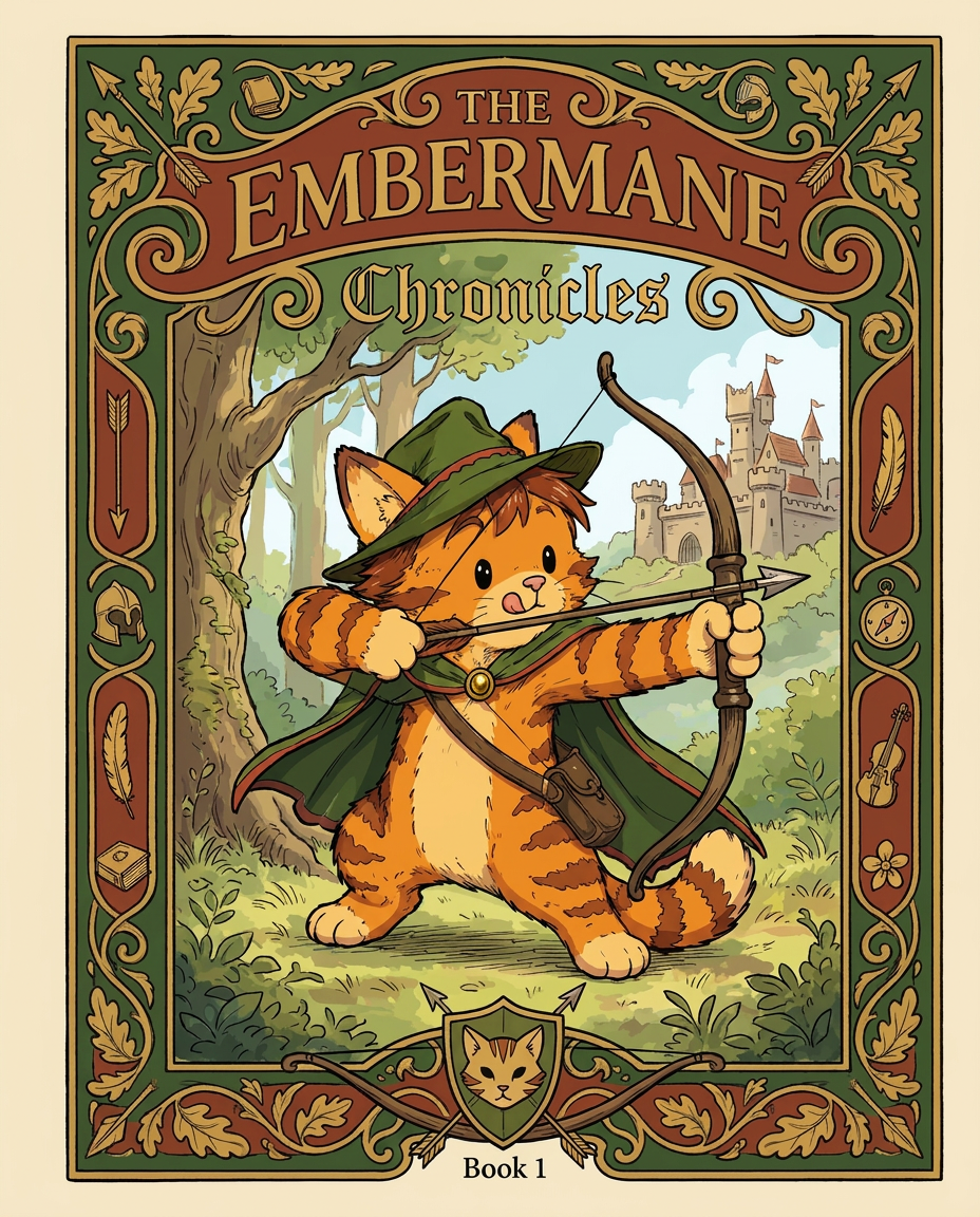
AI Design for Absolutely. Here's how I'd describe the entire cover as if it were written in a design document for an illustrator.

---

# 📖 THE EMBERMANE CHRONICLES

### Book 1 Cover Design Specification

## Overall Format

* Book size: **21 cm × 13.5 cm**
* Classic fantasy novel proportions.
* Matte finish.
* Storybook-inspired cover.
* Not realistic.
* Not modern.
* Warm, timeless, and iconic.

The cover should feel like something discovered in an old library, passed down through generations.

---

# Color Palette

### Primary Colors

🌲 Deep forest green

🔥 Warm red-brown

✨ Soft gold

📜 Cream

These colors should contrast strongly.

The green and red-brown should never blend together.

Instead:

* Green frames red-brown.
* Red-brown frames green.
* Gold highlights details.

The result should feel rich and elegant.

---

# Cover Layout

The cover is divided into two major sections:

## Outer Cover Frame

A thick decorative border surrounding the artwork.

This border is one of the defining visual features of the series.

When readers see this frame, they should instantly recognize:

> "That's an Embermane Chronicles book."

---

## Center Illustration Window

Inside the border sits a framed illustration.

Like a painting inside an old book cover.

The illustration occupies roughly:

60–70% of the front cover.

---

# The Border

### Main Border Color

Deep forest green.

### Border Decorations

The border contains elegant line art and embossing.

Features include:

🌿 Oak leaves

🌿 Vines

🏹 Arrows

🪶 Feathers

📜 Scrollwork

🌰 Acorns

The decorations should look inspired by medieval manuscripts.

Not overly complex.

Not cluttered.

Beautiful and readable.

---

# Hidden Symbols

The border contains tiny references to important characters.

Readers may not notice them immediately.

Examples:

📚 Milo's book

🛡 Rufus' tiny knight helmet

🗺 Shadow's compass

🎻 Ashen's fiddle

🌼 Pippa's flower

These should feel like little secrets.

---

# Title Placement

The title is integrated into the border.

Not floating over the artwork.

### Top Border

Small text:

**THE**

Below it:

# EMBERMANE

Large.

Very large.

The largest text on the cover.

The first thing people notice.

---

### Bottom Border

Smaller text:

**Chronicles**

Elegant.

Decorative.

Part of the frame itself.

---

# The Embermane Crest

Located at the bottom center.

Built into the border.

Not too large.

Not too small.

A symbol readers learn to recognize.

Possible design:

🐱 Stylized cat head

🔥 Red-brown mane

🌲 Green shield background

🏹 Small crossed bow behind it

Simple and iconic.

---

# Central Illustration

The illustration is framed by the border.

---

## Jasper Embermane

Standing slightly off-center.

The focus of the entire cover.

Features:

🐱 Orange tabby cat

🐱 Red-brown mane

🐱 Red-brown cheek stripes

🐱 Red-brown arm and leg markings

🐱 Red-brown ear tips

---

### Clothing

🌲 Green cloak

🌲 Green archer hat

🪶 Red feather

🔴 Thin red trim around the cloak edges

---

### Pose

Jasper is aiming his bow.

Not fighting.

Not dramatic.

Not angry.

Instead:

He is concentrating extremely hard.

One eye slightly squinted.

Tongue sticking out a little.

Like a kid trying his absolute best.

This detail makes him feel charming and relatable.

---

# Background

Soft storybook scenery.

Not detailed enough to distract.

Possible elements:

🌲 Forest

⛰ Distant mountains

🏰 Tiny glimpse of Embermane Hall

☁ Soft sky

The background exists only to support Jasper.

Jasper remains the star.

---

# Art Style

### Linework

* Clean outlines
* Storybook quality
* Slightly hand-drawn

### Coloring

* Flat colors
* Soft gradients
* Minimal shading

### Overall Feel

Somewhere between:

📖 Redwall

📖 Classic fantasy novels

📖 Illustrated children's adventure books

The goal is:

> A timeless fantasy storybook.

Not a movie poster.

Not a comic cover.

Not realism.

---

# Reader Impression

When someone sees the book for the first time, they should think:

> "Who is Embermane?"

Then:

> "Who is that cat?"

Then:

> "I want to know what's inside."

The cover should promise:

🌲 Adventure

🏹 Heroism

📜 Ancient history

🐱 Friendship

🍲 Warmth

✨ Wonder

And most importantly:

> The beginning of a very long chronicle.

That's how I imagine **The Embermane Chronicles** sitting on a bookshelf, looking like the first volume of a beloved fantasy saga. 🐱🏹📖🌲🔥 and make it so i can actually use it as a cover full screen and not sketch art syle do the ones u did just better and thicker bold lines

Absolutely. Here's how I'd describe the entire cover as if it were written in a design document for an illustrator. --- # 📖 THE EMBERMANE CHRONICLES ### Book 1 Cover Design Specification ## Overall Format * Book size: **21 cm × 13.5 cm** * Classic fantasy novel proportions. * Matte finish. * Storybook-inspired cover. * Not realistic. * Not modern. * Warm, timeless, and iconic. The cover should feel like something discovered in an old library, passed down through generations. --- # Color Palette ### Primary Colors 🌲 Deep forest green 🔥 Warm red-brown ✨ Soft gold 📜 Cream These colors should contrast strongly. The green and red-brown should never blend together. Instead: * Green frames red-brown. * Red-brown frames green. * Gold highlights details. The result should feel rich and elegant. --- # Cover Layout The cover is divided into two major sections: ## Outer Cover Frame A thick decorative border surrounding the artwork. This border is one of the defining visual features of the series. When readers see this frame, they should instantly recognize: > "That's an Embermane Chronicles book." --- ## Center Illustration Window Inside the border sits a framed illustration. Like a painting inside an old book cover. The illustration occupies roughly: 60–70% of the front cover. --- # The Border ### Main Border Color Deep forest green. ### Border Decorations The border contains elegant line art and embossing. Features include: 🌿 Oak leaves 🌿 Vines 🏹 Arrows 🪶 Feathers 📜 Scrollwork 🌰 Acorns The decorations should look inspired by medieval manuscripts. Not overly complex. Not cluttered. Beautiful and readable. --- # Hidden Symbols The border contains tiny references to important characters. Readers may not notice them immediately. Examples: 📚 Milo's book 🛡 Rufus' tiny knight helmet 🗺 Shadow's compass 🎻 Ashen's fiddle 🌼 Pippa's flower These should feel like little secrets. --- # Title Placement The title is integrated into the border. Not floating over the artwork. ### Top Border Small text: **THE** Below it: # EMBERMANE Large. Very large. The largest text on the cover. The first thing people notice. --- ### Bottom Border Smaller text: **Chronicles** Elegant. Decorative. Part of the frame itself. --- # The Embermane Crest Located at the bottom center. Built into the border. Not too large. Not too small. A symbol readers learn to recognize. Possible design: 🐱 Stylized cat head 🔥 Red-brown mane 🌲 Green shield background 🏹 Small crossed bow behind it Simple and iconic. --- # Central Illustration The illustration is framed by the border. --- ## Jasper Embermane Standing slightly off-center. The focus of the entire cover. Features: 🐱 Orange tabby cat 🐱 Red-brown mane 🐱 Red-brown cheek stripes 🐱 Red-brown arm and leg markings 🐱 Red-brown ear tips --- ### Clothing 🌲 Green cloak 🌲 Green archer hat 🪶 Red feather 🔴 Thin red trim around the cloak edges --- ### Pose Jasper is aiming his bow. Not fighting. Not dramatic. Not angry. Instead: He is concentrating extremely hard. One eye slightly squinted. Tongue sticking out a little. Like a kid trying his absolute best. This detail makes him feel charming and relatable. --- # Background Soft storybook scenery. Not detailed enough to distract. Possible elements: 🌲 Forest ⛰ Distant mountains 🏰 Tiny glimpse of Embermane Hall ☁ Soft sky The background exists only to support Jasper. Jasper remains the star. --- # Art Style ### Linework * Clean outlines * Storybook quality * Slightly hand-drawn ### Coloring * Flat colors * Soft gradients * Minimal shading ### Overall Feel Somewhere between: 📖 Redwall 📖 Classic fantasy novels 📖 Illustrated children's adventure books The goal is: > A timeless fantasy storybook. Not a movie poster. Not a comic cover. Not realism. --- # Reader Impression When someone sees the book for the first time, they should think: > "Who is Embermane?" Then: > "Who is that cat?" Then: > "I want to know what's inside." The cover should promise: 🌲 Adventure 🏹 Heroism 📜 Ancient history 🐱 Friendship 🍲 Warmth ✨ Wonder And most importantly: > The beginning of a very long chronicle. That's how I imagine **The Embermane Chronicles** sitting on a bookshelf, looking like the first volume of a beloved fantasy saga. 🐱🏹📖🌲🔥 and make it so i can actually use it as a cover full screen and not sketch art syle do the ones u did just better and thicker bold lines

by @Elephant_8984916
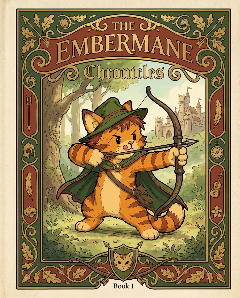
AI Design for Absolutely. Here's how I'd describe the entire cover as if it were written in a design document for an illustrator.

---

# 📖 THE EMBERMANE CHRONICLES

### Book 1 Cover Design Specification

## Overall Format

* Book size: **21 cm × 13.5 cm**
* Classic fantasy novel proportions.
* Matte finish.
* Storybook-inspired cover.
* Not realistic.
* Not modern.
* Warm, timeless, and iconic.

The cover should feel like something discovered in an old library, passed down through generations.

---

# Color Palette

### Primary Colors

🌲 Deep forest green

🔥 Warm red-brown

✨ Soft gold

📜 Cream

These colors should contrast strongly.

The green and red-brown should never blend together.

Instead:

* Green frames red-brown.
* Red-brown frames green.
* Gold highlights details.

The result should feel rich and elegant.

---

# Cover Layout

The cover is divided into two major sections:

## Outer Cover Frame

A thick decorative border surrounding the artwork.

This border is one of the defining visual features of the series.

When readers see this frame, they should instantly recognize:

> "That's an Embermane Chronicles book."

---

## Center Illustration Window

Inside the border sits a framed illustration.

Like a painting inside an old book cover.

The illustration occupies roughly:

60–70% of the front cover.

---

# The Border

### Main Border Color

Deep forest green.

### Border Decorations

The border contains elegant line art and embossing.

Features include:

🌿 Oak leaves

🌿 Vines

🏹 Arrows

🪶 Feathers

📜 Scrollwork

🌰 Acorns

The decorations should look inspired by medieval manuscripts.

Not overly complex.

Not cluttered.

Beautiful and readable.

---

# Hidden Symbols

The border contains tiny references to important characters.

Readers may not notice them immediately.

Examples:

📚 Milo's book

🛡 Rufus' tiny knight helmet

🗺 Shadow's compass

🎻 Ashen's fiddle

🌼 Pippa's flower

These should feel like little secrets.

---

# Title Placement

The title is integrated into the border.

Not floating over the artwork.

### Top Border

Small text:

**THE**

Below it:

# EMBERMANE

Large.

Very large.

The largest text on the cover.

The first thing people notice.

---

### Bottom Border

Smaller text:

**Chronicles**

Elegant.

Decorative.

Part of the frame itself.

---

# The Embermane Crest

Located at the bottom center.

Built into the border.

Not too large.

Not too small.

A symbol readers learn to recognize.

Possible design:

🐱 Stylized cat head

🔥 Red-brown mane

🌲 Green shield background

🏹 Small crossed bow behind it

Simple and iconic.

---

# Central Illustration

The illustration is framed by the border.

---

## Jasper Embermane

Standing slightly off-center.

The focus of the entire cover.

Features:

🐱 Orange tabby cat

🐱 Red-brown mane

🐱 Red-brown cheek stripes

🐱 Red-brown arm and leg markings

🐱 Red-brown ear tips

---

### Clothing

🌲 Green cloak

🌲 Green archer hat

🪶 Red feather

🔴 Thin red trim around the cloak edges

---

### Pose

Jasper is aiming his bow.

Not fighting.

Not dramatic.

Not angry.

Instead:

He is concentrating extremely hard.

One eye slightly squinted.

Tongue sticking out a little.

Like a kid trying his absolute best.

This detail makes him feel charming and relatable.

---

# Background

Soft storybook scenery.

Not detailed enough to distract.

Possible elements:

🌲 Forest

⛰ Distant mountains

🏰 Tiny glimpse of Embermane Hall

☁ Soft sky

The background exists only to support Jasper.

Jasper remains the star.

---

# Art Style

### Linework

* Clean outlines
* Storybook quality
* Slightly hand-drawn

### Coloring

* Flat colors
* Soft gradients
* Minimal shading

### Overall Feel

Somewhere between:

📖 Redwall

📖 Classic fantasy novels

📖 Illustrated children's adventure books

The goal is:

> A timeless fantasy storybook.

Not a movie poster.

Not a comic cover.

Not realism.

---

# Reader Impression

When someone sees the book for the first time, they should think:

> "Who is Embermane?"

Then:

> "Who is that cat?"

Then:

> "I want to know what's inside."

The cover should promise:

🌲 Adventure

🏹 Heroism

📜 Ancient history

🐱 Friendship

🍲 Warmth

✨ Wonder

And most importantly:

> The beginning of a very long chronicle.

That's how I imagine **The Embermane Chronicles** sitting on a bookshelf, looking like the first volume of a beloved fantasy saga. 🐱🏹📖🌲🔥 and make it so i can actually use it as a cover full screen and not sketch art syle do the ones u did just better and thicker bold lines

Absolutely. Here's how I'd describe the entire cover as if it were written in a design document for an illustrator. --- # 📖 THE EMBERMANE CHRONICLES ### Book 1 Cover Design Specification ## Overall Format * Book size: **21 cm × 13.5 cm** * Classic fantasy novel proportions. * Matte finish. * Storybook-inspired cover. * Not realistic. * Not modern. * Warm, timeless, and iconic. The cover should feel like something discovered in an old library, passed down through generations. --- # Color Palette ### Primary Colors 🌲 Deep forest green 🔥 Warm red-brown ✨ Soft gold 📜 Cream These colors should contrast strongly. The green and red-brown should never blend together. Instead: * Green frames red-brown. * Red-brown frames green. * Gold highlights details. The result should feel rich and elegant. --- # Cover Layout The cover is divided into two major sections: ## Outer Cover Frame A thick decorative border surrounding the artwork. This border is one of the defining visual features of the series. When readers see this frame, they should instantly recognize: > "That's an Embermane Chronicles book." --- ## Center Illustration Window Inside the border sits a framed illustration. Like a painting inside an old book cover. The illustration occupies roughly: 60–70% of the front cover. --- # The Border ### Main Border Color Deep forest green. ### Border Decorations The border contains elegant line art and embossing. Features include: 🌿 Oak leaves 🌿 Vines 🏹 Arrows 🪶 Feathers 📜 Scrollwork 🌰 Acorns The decorations should look inspired by medieval manuscripts. Not overly complex. Not cluttered. Beautiful and readable. --- # Hidden Symbols The border contains tiny references to important characters. Readers may not notice them immediately. Examples: 📚 Milo's book 🛡 Rufus' tiny knight helmet 🗺 Shadow's compass 🎻 Ashen's fiddle 🌼 Pippa's flower These should feel like little secrets. --- # Title Placement The title is integrated into the border. Not floating over the artwork. ### Top Border Small text: **THE** Below it: # EMBERMANE Large. Very large. The largest text on the cover. The first thing people notice. --- ### Bottom Border Smaller text: **Chronicles** Elegant. Decorative. Part of the frame itself. --- # The Embermane Crest Located at the bottom center. Built into the border. Not too large. Not too small. A symbol readers learn to recognize. Possible design: 🐱 Stylized cat head 🔥 Red-brown mane 🌲 Green shield background 🏹 Small crossed bow behind it Simple and iconic. --- # Central Illustration The illustration is framed by the border. --- ## Jasper Embermane Standing slightly off-center. The focus of the entire cover. Features: 🐱 Orange tabby cat 🐱 Red-brown mane 🐱 Red-brown cheek stripes 🐱 Red-brown arm and leg markings 🐱 Red-brown ear tips --- ### Clothing 🌲 Green cloak 🌲 Green archer hat 🪶 Red feather 🔴 Thin red trim around the cloak edges --- ### Pose Jasper is aiming his bow. Not fighting. Not dramatic. Not angry. Instead: He is concentrating extremely hard. One eye slightly squinted. Tongue sticking out a little. Like a kid trying his absolute best. This detail makes him feel charming and relatable. --- # Background Soft storybook scenery. Not detailed enough to distract. Possible elements: 🌲 Forest ⛰ Distant mountains 🏰 Tiny glimpse of Embermane Hall ☁ Soft sky The background exists only to support Jasper. Jasper remains the star. --- # Art Style ### Linework * Clean outlines * Storybook quality * Slightly hand-drawn ### Coloring * Flat colors * Soft gradients * Minimal shading ### Overall Feel Somewhere between: 📖 Redwall 📖 Classic fantasy novels 📖 Illustrated children's adventure books The goal is: > A timeless fantasy storybook. Not a movie poster. Not a comic cover. Not realism. --- # Reader Impression When someone sees the book for the first time, they should think: > "Who is Embermane?" Then: > "Who is that cat?" Then: > "I want to know what's inside." The cover should promise: 🌲 Adventure 🏹 Heroism 📜 Ancient history 🐱 Friendship 🍲 Warmth ✨ Wonder And most importantly: > The beginning of a very long chronicle. That's how I imagine **The Embermane Chronicles** sitting on a bookshelf, looking like the first volume of a beloved fantasy saga. 🐱🏹📖🌲🔥 and make it so i can actually use it as a cover full screen and not sketch art syle do the ones u did just better and thicker bold lines

by @Elephant_8984916
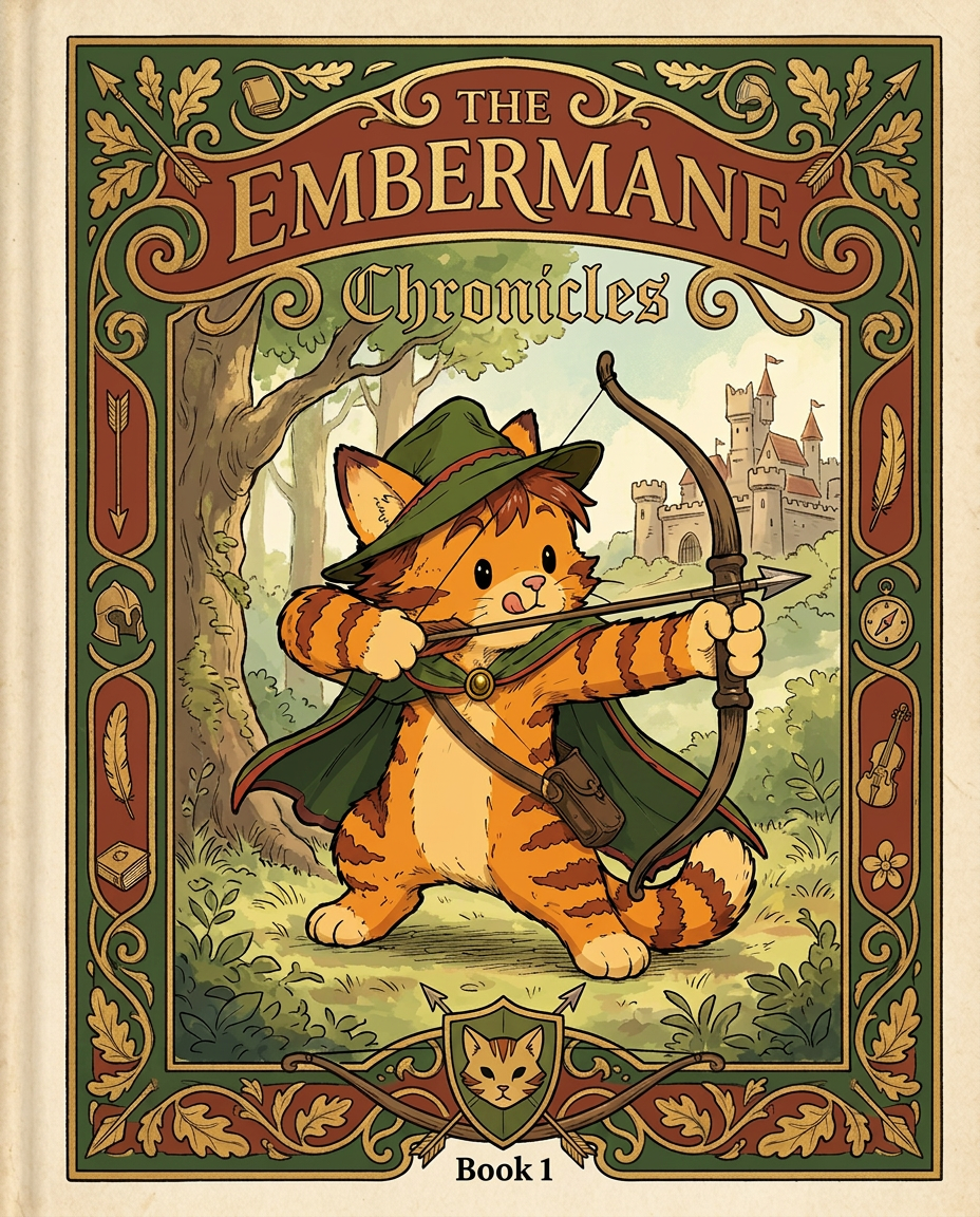
AI Design for Absolutely. Here's how I'd describe the entire cover as if it were written in a design document for an illustrator.

---

# 📖 THE EMBERMANE CHRONICLES

### Book 1 Cover Design Specification

## Overall Format

* Book size: **21 cm × 13.5 cm**
* Classic fantasy novel proportions.
* Matte finish.
* Storybook-inspired cover.
* Not realistic.
* Not modern.
* Warm, timeless, and iconic.

The cover should feel like something discovered in an old library, passed down through generations.

---

# Color Palette

### Primary Colors

🌲 Deep forest green

🔥 Warm red-brown

✨ Soft gold

📜 Cream

These colors should contrast strongly.

The green and red-brown should never blend together.

Instead:

* Green frames red-brown.
* Red-brown frames green.
* Gold highlights details.

The result should feel rich and elegant.

---

# Cover Layout

The cover is divided into two major sections:

## Outer Cover Frame

A thick decorative border surrounding the artwork.

This border is one of the defining visual features of the series.

When readers see this frame, they should instantly recognize:

> "That's an Embermane Chronicles book."

---

## Center Illustration Window

Inside the border sits a framed illustration.

Like a painting inside an old book cover.

The illustration occupies roughly:

60–70% of the front cover.

---

# The Border

### Main Border Color

Deep forest green.

### Border Decorations

The border contains elegant line art and embossing.

Features include:

🌿 Oak leaves

🌿 Vines

🏹 Arrows

🪶 Feathers

📜 Scrollwork

🌰 Acorns

The decorations should look inspired by medieval manuscripts.

Not overly complex.

Not cluttered.

Beautiful and readable.

---

# Hidden Symbols

The border contains tiny references to important characters.

Readers may not notice them immediately.

Examples:

📚 Milo's book

🛡 Rufus' tiny knight helmet

🗺 Shadow's compass

🎻 Ashen's fiddle

🌼 Pippa's flower

These should feel like little secrets.

---

# Title Placement

The title is integrated into the border.

Not floating over the artwork.

### Top Border

Small text:

**THE**

Below it:

# EMBERMANE

Large.

Very large.

The largest text on the cover.

The first thing people notice.

---

### Bottom Border

Smaller text:

**Chronicles**

Elegant.

Decorative.

Part of the frame itself.

---

# The Embermane Crest

Located at the bottom center.

Built into the border.

Not too large.

Not too small.

A symbol readers learn to recognize.

Possible design:

🐱 Stylized cat head

🔥 Red-brown mane

🌲 Green shield background

🏹 Small crossed bow behind it

Simple and iconic.

---

# Central Illustration

The illustration is framed by the border.

---

## Jasper Embermane

Standing slightly off-center.

The focus of the entire cover.

Features:

🐱 Orange tabby cat

🐱 Red-brown mane

🐱 Red-brown cheek stripes

🐱 Red-brown arm and leg markings

🐱 Red-brown ear tips

---

### Clothing

🌲 Green cloak

🌲 Green archer hat

🪶 Red feather

🔴 Thin red trim around the cloak edges

---

### Pose

Jasper is aiming his bow.

Not fighting.

Not dramatic.

Not angry.

Instead:

He is concentrating extremely hard.

One eye slightly squinted.

Tongue sticking out a little.

Like a kid trying his absolute best.

This detail makes him feel charming and relatable.

---

# Background

Soft storybook scenery.

Not detailed enough to distract.

Possible elements:

🌲 Forest

⛰ Distant mountains

🏰 Tiny glimpse of Embermane Hall

☁ Soft sky

The background exists only to support Jasper.

Jasper remains the star.

---

# Art Style

### Linework

* Clean outlines
* Storybook quality
* Slightly hand-drawn

### Coloring

* Flat colors
* Soft gradients
* Minimal shading

### Overall Feel

Somewhere between:

📖 Redwall

📖 Classic fantasy novels

📖 Illustrated children's adventure books

The goal is:

> A timeless fantasy storybook.

Not a movie poster.

Not a comic cover.

Not realism.

---

# Reader Impression

When someone sees the book for the first time, they should think:

> "Who is Embermane?"

Then:

> "Who is that cat?"

Then:

> "I want to know what's inside."

The cover should promise:

🌲 Adventure

🏹 Heroism

📜 Ancient history

🐱 Friendship

🍲 Warmth

✨ Wonder

And most importantly:

> The beginning of a very long chronicle.

That's how I imagine **The Embermane Chronicles** sitting on a bookshelf, looking like the first volume of a beloved fantasy saga. 🐱🏹📖🌲🔥 and make it so i can actually use it as a cover full screen and not sketch art syle do the ones u did just better and thicker bold lines

Absolutely. Here's how I'd describe the entire cover as if it were written in a design document for an illustrator. --- # 📖 THE EMBERMANE CHRONICLES ### Book 1 Cover Design Specification ## Overall Format * Book size: **21 cm × 13.5 cm** * Classic fantasy novel proportions. * Matte finish. * Storybook-inspired cover. * Not realistic. * Not modern. * Warm, timeless, and iconic. The cover should feel like something discovered in an old library, passed down through generations. --- # Color Palette ### Primary Colors 🌲 Deep forest green 🔥 Warm red-brown ✨ Soft gold 📜 Cream These colors should contrast strongly. The green and red-brown should never blend together. Instead: * Green frames red-brown. * Red-brown frames green. * Gold highlights details. The result should feel rich and elegant. --- # Cover Layout The cover is divided into two major sections: ## Outer Cover Frame A thick decorative border surrounding the artwork. This border is one of the defining visual features of the series. When readers see this frame, they should instantly recognize: > "That's an Embermane Chronicles book." --- ## Center Illustration Window Inside the border sits a framed illustration. Like a painting inside an old book cover. The illustration occupies roughly: 60–70% of the front cover. --- # The Border ### Main Border Color Deep forest green. ### Border Decorations The border contains elegant line art and embossing. Features include: 🌿 Oak leaves 🌿 Vines 🏹 Arrows 🪶 Feathers 📜 Scrollwork 🌰 Acorns The decorations should look inspired by medieval manuscripts. Not overly complex. Not cluttered. Beautiful and readable. --- # Hidden Symbols The border contains tiny references to important characters. Readers may not notice them immediately. Examples: 📚 Milo's book 🛡 Rufus' tiny knight helmet 🗺 Shadow's compass 🎻 Ashen's fiddle 🌼 Pippa's flower These should feel like little secrets. --- # Title Placement The title is integrated into the border. Not floating over the artwork. ### Top Border Small text: **THE** Below it: # EMBERMANE Large. Very large. The largest text on the cover. The first thing people notice. --- ### Bottom Border Smaller text: **Chronicles** Elegant. Decorative. Part of the frame itself. --- # The Embermane Crest Located at the bottom center. Built into the border. Not too large. Not too small. A symbol readers learn to recognize. Possible design: 🐱 Stylized cat head 🔥 Red-brown mane 🌲 Green shield background 🏹 Small crossed bow behind it Simple and iconic. --- # Central Illustration The illustration is framed by the border. --- ## Jasper Embermane Standing slightly off-center. The focus of the entire cover. Features: 🐱 Orange tabby cat 🐱 Red-brown mane 🐱 Red-brown cheek stripes 🐱 Red-brown arm and leg markings 🐱 Red-brown ear tips --- ### Clothing 🌲 Green cloak 🌲 Green archer hat 🪶 Red feather 🔴 Thin red trim around the cloak edges --- ### Pose Jasper is aiming his bow. Not fighting. Not dramatic. Not angry. Instead: He is concentrating extremely hard. One eye slightly squinted. Tongue sticking out a little. Like a kid trying his absolute best. This detail makes him feel charming and relatable. --- # Background Soft storybook scenery. Not detailed enough to distract. Possible elements: 🌲 Forest ⛰ Distant mountains 🏰 Tiny glimpse of Embermane Hall ☁ Soft sky The background exists only to support Jasper. Jasper remains the star. --- # Art Style ### Linework * Clean outlines * Storybook quality * Slightly hand-drawn ### Coloring * Flat colors * Soft gradients * Minimal shading ### Overall Feel Somewhere between: 📖 Redwall 📖 Classic fantasy novels 📖 Illustrated children's adventure books The goal is: > A timeless fantasy storybook. Not a movie poster. Not a comic cover. Not realism. --- # Reader Impression When someone sees the book for the first time, they should think: > "Who is Embermane?" Then: > "Who is that cat?" Then: > "I want to know what's inside." The cover should promise: 🌲 Adventure 🏹 Heroism 📜 Ancient history 🐱 Friendship 🍲 Warmth ✨ Wonder And most importantly: > The beginning of a very long chronicle. That's how I imagine **The Embermane Chronicles** sitting on a bookshelf, looking like the first volume of a beloved fantasy saga. 🐱🏹📖🌲🔥 and make it so i can actually use it as a cover full screen and not sketch art syle do the ones u did just better and thicker bold lines

by @Elephant_8984916
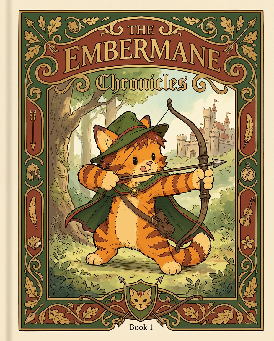
AI Design for Absolutely. Here's how I'd describe the entire cover as if it were written in a design document for an illustrator.

---

# 📖 THE EMBERMANE CHRONICLES

### Book 1 Cover Design Specification

## Overall Format

* Book size: **21 cm × 13.5 cm**
* Classic fantasy novel proportions.
* Matte finish.
* Storybook-inspired cover.
* Not realistic.
* Not modern.
* Warm, timeless, and iconic.

The cover should feel like something discovered in an old library, passed down through generations.

---

# Color Palette

### Primary Colors

🌲 Deep forest green

🔥 Warm red-brown

✨ Soft gold

📜 Cream

These colors should contrast strongly.

The green and red-brown should never blend together.

Instead:

* Green frames red-brown.
* Red-brown frames green.
* Gold highlights details.

The result should feel rich and elegant.

---

# Cover Layout

The cover is divided into two major sections:

## Outer Cover Frame

A thick decorative border surrounding the artwork.

This border is one of the defining visual features of the series.

When readers see this frame, they should instantly recognize:

> "That's an Embermane Chronicles book."

---

## Center Illustration Window

Inside the border sits a framed illustration.

Like a painting inside an old book cover.

The illustration occupies roughly:

60–70% of the front cover.

---

# The Border

### Main Border Color

Deep forest green.

### Border Decorations

The border contains elegant line art and embossing.

Features include:

🌿 Oak leaves

🌿 Vines

🏹 Arrows

🪶 Feathers

📜 Scrollwork

🌰 Acorns

The decorations should look inspired by medieval manuscripts.

Not overly complex.

Not cluttered.

Beautiful and readable.

---

# Hidden Symbols

The border contains tiny references to important characters.

Readers may not notice them immediately.

Examples:

📚 Milo's book

🛡 Rufus' tiny knight helmet

🗺 Shadow's compass

🎻 Ashen's fiddle

🌼 Pippa's flower

These should feel like little secrets.

---

# Title Placement

The title is integrated into the border.

Not floating over the artwork.

### Top Border

Small text:

**THE**

Below it:

# EMBERMANE

Large.

Very large.

The largest text on the cover.

The first thing people notice.

---

### Bottom Border

Smaller text:

**Chronicles**

Elegant.

Decorative.

Part of the frame itself.

---

# The Embermane Crest

Located at the bottom center.

Built into the border.

Not too large.

Not too small.

A symbol readers learn to recognize.

Possible design:

🐱 Stylized cat head

🔥 Red-brown mane

🌲 Green shield background

🏹 Small crossed bow behind it

Simple and iconic.

---

# Central Illustration

The illustration is framed by the border.

---

## Jasper Embermane

Standing slightly off-center.

The focus of the entire cover.

Features:

🐱 Orange tabby cat

🐱 Red-brown mane

🐱 Red-brown cheek stripes

🐱 Red-brown arm and leg markings

🐱 Red-brown ear tips

---

### Clothing

🌲 Green cloak

🌲 Green archer hat

🪶 Red feather

🔴 Thin red trim around the cloak edges

---

### Pose

Jasper is aiming his bow.

Not fighting.

Not dramatic.

Not angry.

Instead:

He is concentrating extremely hard.

One eye slightly squinted.

Tongue sticking out a little.

Like a kid trying his absolute best.

This detail makes him feel charming and relatable.

---

# Background

Soft storybook scenery.

Not detailed enough to distract.

Possible elements:

🌲 Forest

⛰ Distant mountains

🏰 Tiny glimpse of Embermane Hall

☁ Soft sky

The background exists only to support Jasper.

Jasper remains the star.

---

# Art Style

### Linework

* Clean outlines
* Storybook quality
* Slightly hand-drawn

### Coloring

* Flat colors
* Soft gradients
* Minimal shading

### Overall Feel

Somewhere between:

📖 Redwall

📖 Classic fantasy novels

📖 Illustrated children's adventure books

The goal is:

> A timeless fantasy storybook.

Not a movie poster.

Not a comic cover.

Not realism.

---

# Reader Impression

When someone sees the book for the first time, they should think:

> "Who is Embermane?"

Then:

> "Who is that cat?"

Then:

> "I want to know what's inside."

The cover should promise:

🌲 Adventure

🏹 Heroism

📜 Ancient history

🐱 Friendship

🍲 Warmth

✨ Wonder

And most importantly:

> The beginning of a very long chronicle.

That's how I imagine **The Embermane Chronicles** sitting on a bookshelf, looking like the first volume of a beloved fantasy saga. 🐱🏹📖🌲🔥 and make it so i can actually use it as a cover full screen and not sketch art syle do the ones u did just better and thicker bold lines

Absolutely. Here's how I'd describe the entire cover as if it were written in a design document for an illustrator. --- # 📖 THE EMBERMANE CHRONICLES ### Book 1 Cover Design Specification ## Overall Format * Book size: **21 cm × 13.5 cm** * Classic fantasy novel proportions. * Matte finish. * Storybook-inspired cover. * Not realistic. * Not modern. * Warm, timeless, and iconic. The cover should feel like something discovered in an old library, passed down through generations. --- # Color Palette ### Primary Colors 🌲 Deep forest green 🔥 Warm red-brown ✨ Soft gold 📜 Cream These colors should contrast strongly. The green and red-brown should never blend together. Instead: * Green frames red-brown. * Red-brown frames green. * Gold highlights details. The result should feel rich and elegant. --- # Cover Layout The cover is divided into two major sections: ## Outer Cover Frame A thick decorative border surrounding the artwork. This border is one of the defining visual features of the series. When readers see this frame, they should instantly recognize: > "That's an Embermane Chronicles book." --- ## Center Illustration Window Inside the border sits a framed illustration. Like a painting inside an old book cover. The illustration occupies roughly: 60–70% of the front cover. --- # The Border ### Main Border Color Deep forest green. ### Border Decorations The border contains elegant line art and embossing. Features include: 🌿 Oak leaves 🌿 Vines 🏹 Arrows 🪶 Feathers 📜 Scrollwork 🌰 Acorns The decorations should look inspired by medieval manuscripts. Not overly complex. Not cluttered. Beautiful and readable. --- # Hidden Symbols The border contains tiny references to important characters. Readers may not notice them immediately. Examples: 📚 Milo's book 🛡 Rufus' tiny knight helmet 🗺 Shadow's compass 🎻 Ashen's fiddle 🌼 Pippa's flower These should feel like little secrets. --- # Title Placement The title is integrated into the border. Not floating over the artwork. ### Top Border Small text: **THE** Below it: # EMBERMANE Large. Very large. The largest text on the cover. The first thing people notice. --- ### Bottom Border Smaller text: **Chronicles** Elegant. Decorative. Part of the frame itself. --- # The Embermane Crest Located at the bottom center. Built into the border. Not too large. Not too small. A symbol readers learn to recognize. Possible design: 🐱 Stylized cat head 🔥 Red-brown mane 🌲 Green shield background 🏹 Small crossed bow behind it Simple and iconic. --- # Central Illustration The illustration is framed by the border. --- ## Jasper Embermane Standing slightly off-center. The focus of the entire cover. Features: 🐱 Orange tabby cat 🐱 Red-brown mane 🐱 Red-brown cheek stripes 🐱 Red-brown arm and leg markings 🐱 Red-brown ear tips --- ### Clothing 🌲 Green cloak 🌲 Green archer hat 🪶 Red feather 🔴 Thin red trim around the cloak edges --- ### Pose Jasper is aiming his bow. Not fighting. Not dramatic. Not angry. Instead: He is concentrating extremely hard. One eye slightly squinted. Tongue sticking out a little. Like a kid trying his absolute best. This detail makes him feel charming and relatable. --- # Background Soft storybook scenery. Not detailed enough to distract. Possible elements: 🌲 Forest ⛰ Distant mountains 🏰 Tiny glimpse of Embermane Hall ☁ Soft sky The background exists only to support Jasper. Jasper remains the star. --- # Art Style ### Linework * Clean outlines * Storybook quality * Slightly hand-drawn ### Coloring * Flat colors * Soft gradients * Minimal shading ### Overall Feel Somewhere between: 📖 Redwall 📖 Classic fantasy novels 📖 Illustrated children's adventure books The goal is: > A timeless fantasy storybook. Not a movie poster. Not a comic cover. Not realism. --- # Reader Impression When someone sees the book for the first time, they should think: > "Who is Embermane?" Then: > "Who is that cat?" Then: > "I want to know what's inside." The cover should promise: 🌲 Adventure 🏹 Heroism 📜 Ancient history 🐱 Friendship 🍲 Warmth ✨ Wonder And most importantly: > The beginning of a very long chronicle. That's how I imagine **The Embermane Chronicles** sitting on a bookshelf, looking like the first volume of a beloved fantasy saga. 🐱🏹📖🌲🔥 and make it so i can actually use it as a cover full screen and not sketch art syle do the ones u did just better and thicker bold lines

by @Elephant_8984916
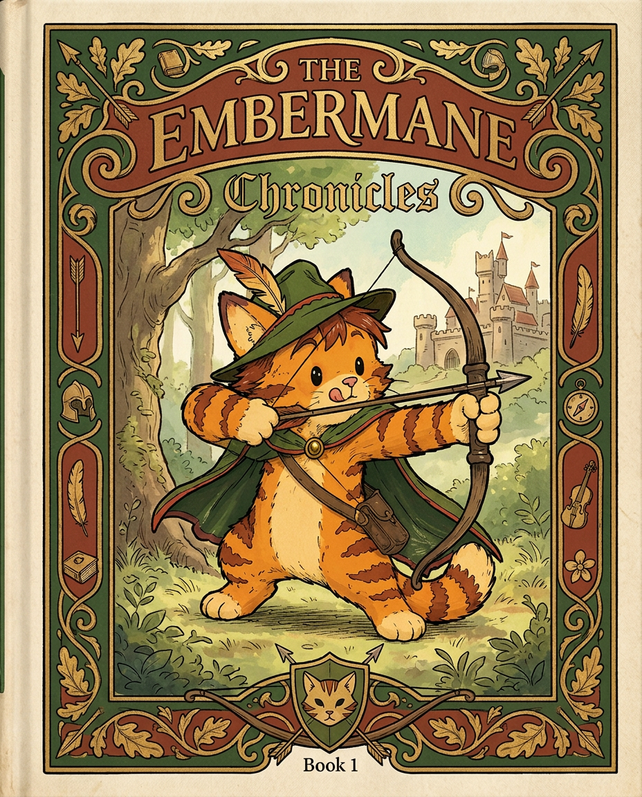
AI Design for Absolutely. Here's how I'd describe the entire cover as if it were written in a design document for an illustrator.

---

# 📖 THE EMBERMANE CHRONICLES

### Book 1 Cover Design Specification

## Overall Format

* Book size: **21 cm × 13.5 cm**
* Classic fantasy novel proportions.
* Matte finish.
* Storybook-inspired cover.
* Not realistic.
* Not modern.
* Warm, timeless, and iconic.

The cover should feel like something discovered in an old library, passed down through generations.

---

# Color Palette

### Primary Colors

🌲 Deep forest green

🔥 Warm red-brown

✨ Soft gold

📜 Cream

These colors should contrast strongly.

The green and red-brown should never blend together.

Instead:

* Green frames red-brown.
* Red-brown frames green.
* Gold highlights details.

The result should feel rich and elegant.

---

# Cover Layout

The cover is divided into two major sections:

## Outer Cover Frame

A thick decorative border surrounding the artwork.

This border is one of the defining visual features of the series.

When readers see this frame, they should instantly recognize:

> "That's an Embermane Chronicles book."

---

## Center Illustration Window

Inside the border sits a framed illustration.

Like a painting inside an old book cover.

The illustration occupies roughly:

60–70% of the front cover.

---

# The Border

### Main Border Color

Deep forest green.

### Border Decorations

The border contains elegant line art and embossing.

Features include:

🌿 Oak leaves

🌿 Vines

🏹 Arrows

🪶 Feathers

📜 Scrollwork

🌰 Acorns

The decorations should look inspired by medieval manuscripts.

Not overly complex.

Not cluttered.

Beautiful and readable.

---

# Hidden Symbols

The border contains tiny references to important characters.

Readers may not notice them immediately.

Examples:

📚 Milo's book

🛡 Rufus' tiny knight helmet

🗺 Shadow's compass

🎻 Ashen's fiddle

🌼 Pippa's flower

These should feel like little secrets.

---

# Title Placement

The title is integrated into the border.

Not floating over the artwork.

### Top Border

Small text:

**THE**

Below it:

# EMBERMANE

Large.

Very large.

The largest text on the cover.

The first thing people notice.

---

### Bottom Border

Smaller text:

**Chronicles**

Elegant.

Decorative.

Part of the frame itself.

---

# The Embermane Crest

Located at the bottom center.

Built into the border.

Not too large.

Not too small.

A symbol readers learn to recognize.

Possible design:

🐱 Stylized cat head

🔥 Red-brown mane

🌲 Green shield background

🏹 Small crossed bow behind it

Simple and iconic.

---

# Central Illustration

The illustration is framed by the border.

---

## Jasper Embermane

Standing slightly off-center.

The focus of the entire cover.

Features:

🐱 Orange tabby cat

🐱 Red-brown mane

🐱 Red-brown cheek stripes

🐱 Red-brown arm and leg markings

🐱 Red-brown ear tips

---

### Clothing

🌲 Green cloak

🌲 Green archer hat

🪶 Red feather

🔴 Thin red trim around the cloak edges

---

### Pose

Jasper is aiming his bow.

Not fighting.

Not dramatic.

Not angry.

Instead:

He is concentrating extremely hard.

One eye slightly squinted.

Tongue sticking out a little.

Like a kid trying his absolute best.

This detail makes him feel charming and relatable.

---

# Background

Soft storybook scenery.

Not detailed enough to distract.

Possible elements:

🌲 Forest

⛰ Distant mountains

🏰 Tiny glimpse of Embermane Hall

☁ Soft sky

The background exists only to support Jasper.

Jasper remains the star.

---

# Art Style

### Linework

* Clean outlines
* Storybook quality
* Slightly hand-drawn

### Coloring

* Flat colors
* Soft gradients
* Minimal shading

### Overall Feel

Somewhere between:

📖 Redwall

📖 Classic fantasy novels

📖 Illustrated children's adventure books

The goal is:

> A timeless fantasy storybook.

Not a movie poster.

Not a comic cover.

Not realism.

---

# Reader Impression

When someone sees the book for the first time, they should think:

> "Who is Embermane?"

Then:

> "Who is that cat?"

Then:

> "I want to know what's inside."

The cover should promise:

🌲 Adventure

🏹 Heroism

📜 Ancient history

🐱 Friendship

🍲 Warmth

✨ Wonder

And most importantly:

> The beginning of a very long chronicle.

That's how I imagine **The Embermane Chronicles** sitting on a bookshelf, looking like the first volume of a beloved fantasy saga. 🐱🏹📖🌲🔥 and make it so i can actually use it as a cover full screen and not sketch art syle do the ones u did just better and thicker bold lines

Absolutely. Here's how I'd describe the entire cover as if it were written in a design document for an illustrator. --- # 📖 THE EMBERMANE CHRONICLES ### Book 1 Cover Design Specification ## Overall Format * Book size: **21 cm × 13.5 cm** * Classic fantasy novel proportions. * Matte finish. * Storybook-inspired cover. * Not realistic. * Not modern. * Warm, timeless, and iconic. The cover should feel like something discovered in an old library, passed down through generations. --- # Color Palette ### Primary Colors 🌲 Deep forest green 🔥 Warm red-brown ✨ Soft gold 📜 Cream These colors should contrast strongly. The green and red-brown should never blend together. Instead: * Green frames red-brown. * Red-brown frames green. * Gold highlights details. The result should feel rich and elegant. --- # Cover Layout The cover is divided into two major sections: ## Outer Cover Frame A thick decorative border surrounding the artwork. This border is one of the defining visual features of the series. When readers see this frame, they should instantly recognize: > "That's an Embermane Chronicles book." --- ## Center Illustration Window Inside the border sits a framed illustration. Like a painting inside an old book cover. The illustration occupies roughly: 60–70% of the front cover. --- # The Border ### Main Border Color Deep forest green. ### Border Decorations The border contains elegant line art and embossing. Features include: 🌿 Oak leaves 🌿 Vines 🏹 Arrows 🪶 Feathers 📜 Scrollwork 🌰 Acorns The decorations should look inspired by medieval manuscripts. Not overly complex. Not cluttered. Beautiful and readable. --- # Hidden Symbols The border contains tiny references to important characters. Readers may not notice them immediately. Examples: 📚 Milo's book 🛡 Rufus' tiny knight helmet 🗺 Shadow's compass 🎻 Ashen's fiddle 🌼 Pippa's flower These should feel like little secrets. --- # Title Placement The title is integrated into the border. Not floating over the artwork. ### Top Border Small text: **THE** Below it: # EMBERMANE Large. Very large. The largest text on the cover. The first thing people notice. --- ### Bottom Border Smaller text: **Chronicles** Elegant. Decorative. Part of the frame itself. --- # The Embermane Crest Located at the bottom center. Built into the border. Not too large. Not too small. A symbol readers learn to recognize. Possible design: 🐱 Stylized cat head 🔥 Red-brown mane 🌲 Green shield background 🏹 Small crossed bow behind it Simple and iconic. --- # Central Illustration The illustration is framed by the border. --- ## Jasper Embermane Standing slightly off-center. The focus of the entire cover. Features: 🐱 Orange tabby cat 🐱 Red-brown mane 🐱 Red-brown cheek stripes 🐱 Red-brown arm and leg markings 🐱 Red-brown ear tips --- ### Clothing 🌲 Green cloak 🌲 Green archer hat 🪶 Red feather 🔴 Thin red trim around the cloak edges --- ### Pose Jasper is aiming his bow. Not fighting. Not dramatic. Not angry. Instead: He is concentrating extremely hard. One eye slightly squinted. Tongue sticking out a little. Like a kid trying his absolute best. This detail makes him feel charming and relatable. --- # Background Soft storybook scenery. Not detailed enough to distract. Possible elements: 🌲 Forest ⛰ Distant mountains 🏰 Tiny glimpse of Embermane Hall ☁ Soft sky The background exists only to support Jasper. Jasper remains the star. --- # Art Style ### Linework * Clean outlines * Storybook quality * Slightly hand-drawn ### Coloring * Flat colors * Soft gradients * Minimal shading ### Overall Feel Somewhere between: 📖 Redwall 📖 Classic fantasy novels 📖 Illustrated children's adventure books The goal is: > A timeless fantasy storybook. Not a movie poster. Not a comic cover. Not realism. --- # Reader Impression When someone sees the book for the first time, they should think: > "Who is Embermane?" Then: > "Who is that cat?" Then: > "I want to know what's inside." The cover should promise: 🌲 Adventure 🏹 Heroism 📜 Ancient history 🐱 Friendship 🍲 Warmth ✨ Wonder And most importantly: > The beginning of a very long chronicle. That's how I imagine **The Embermane Chronicles** sitting on a bookshelf, looking like the first volume of a beloved fantasy saga. 🐱🏹📖🌲🔥 and make it so i can actually use it as a cover full screen and not sketch art syle do the ones u did just better and thicker bold lines

by @Elephant_8984916
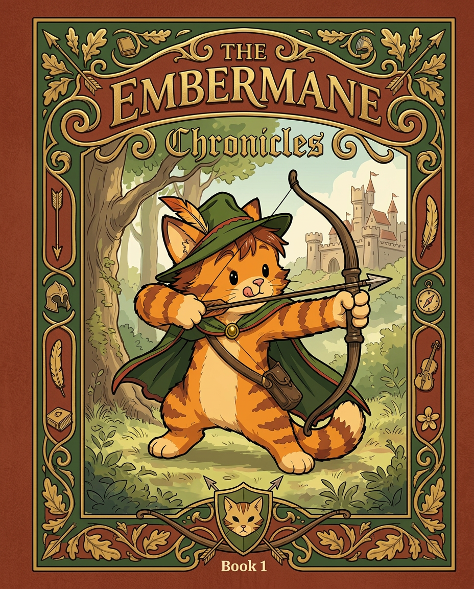
AI Design for Absolutely. Here's how I'd describe the entire cover as if it were written in a design document for an illustrator.

---

# 📖 THE EMBERMANE CHRONICLES

### Book 1 Cover Design Specification

## Overall Format

* Book size: **21 cm × 13.5 cm**
* Classic fantasy novel proportions.
* Matte finish.
* Storybook-inspired cover.
* Not realistic.
* Not modern.
* Warm, timeless, and iconic.

The cover should feel like something discovered in an old library, passed down through generations.

---

# Color Palette

### Primary Colors

🌲 Deep forest green

🔥 Warm red-brown

✨ Soft gold

📜 Cream

These colors should contrast strongly.

The green and red-brown should never blend together.

Instead:

* Green frames red-brown.
* Red-brown frames green.
* Gold highlights details.

The result should feel rich and elegant.

---

# Cover Layout

The cover is divided into two major sections:

## Outer Cover Frame

A thick decorative border surrounding the artwork.

This border is one of the defining visual features of the series.

When readers see this frame, they should instantly recognize:

> "That's an Embermane Chronicles book."

---

## Center Illustration Window

Inside the border sits a framed illustration.

Like a painting inside an old book cover.

The illustration occupies roughly:

60–70% of the front cover.

---

# The Border

### Main Border Color

Deep forest green.

### Border Decorations

The border contains elegant line art and embossing.

Features include:

🌿 Oak leaves

🌿 Vines

🏹 Arrows

🪶 Feathers

📜 Scrollwork

🌰 Acorns

The decorations should look inspired by medieval manuscripts.

Not overly complex.

Not cluttered.

Beautiful and readable.

---

# Hidden Symbols

The border contains tiny references to important characters.

Readers may not notice them immediately.

Examples:

📚 Milo's book

🛡 Rufus' tiny knight helmet

🗺 Shadow's compass

🎻 Ashen's fiddle

🌼 Pippa's flower

These should feel like little secrets.

---

# Title Placement

The title is integrated into the border.

Not floating over the artwork.

### Top Border

Small text:

**THE**

Below it:

# EMBERMANE

Large.

Very large.

The largest text on the cover.

The first thing people notice.

---

### Bottom Border

Smaller text:

**Chronicles**

Elegant.

Decorative.

Part of the frame itself.

---

# The Embermane Crest

Located at the bottom center.

Built into the border.

Not too large.

Not too small.

A symbol readers learn to recognize.

Possible design:

🐱 Stylized cat head

🔥 Red-brown mane

🌲 Green shield background

🏹 Small crossed bow behind it

Simple and iconic.

---

# Central Illustration

The illustration is framed by the border.

---

## Jasper Embermane

Standing slightly off-center.

The focus of the entire cover.

Features:

🐱 Orange tabby cat

🐱 Red-brown mane

🐱 Red-brown cheek stripes

🐱 Red-brown arm and leg markings

🐱 Red-brown ear tips

---

### Clothing

🌲 Green cloak

🌲 Green archer hat

🪶 Red feather

🔴 Thin red trim around the cloak edges

---

### Pose

Jasper is aiming his bow.

Not fighting.

Not dramatic.

Not angry.

Instead:

He is concentrating extremely hard.

One eye slightly squinted.

Tongue sticking out a little.

Like a kid trying his absolute best.

This detail makes him feel charming and relatable.

---

# Background

Soft storybook scenery.

Not detailed enough to distract.

Possible elements:

🌲 Forest

⛰ Distant mountains

🏰 Tiny glimpse of Embermane Hall

☁ Soft sky

The background exists only to support Jasper.

Jasper remains the star.

---

# Art Style

### Linework

* Clean outlines
* Storybook quality
* Slightly hand-drawn

### Coloring

* Flat colors
* Soft gradients
* Minimal shading

### Overall Feel

Somewhere between:

📖 Redwall

📖 Classic fantasy novels

📖 Illustrated children's adventure books

The goal is:

> A timeless fantasy storybook.

Not a movie poster.

Not a comic cover.

Not realism.

---

# Reader Impression

When someone sees the book for the first time, they should think:

> "Who is Embermane?"

Then:

> "Who is that cat?"

Then:

> "I want to know what's inside."

The cover should promise:

🌲 Adventure

🏹 Heroism

📜 Ancient history

🐱 Friendship

🍲 Warmth

✨ Wonder

And most importantly:

> The beginning of a very long chronicle.

That's how I imagine **The Embermane Chronicles** sitting on a bookshelf, looking like the first volume of a beloved fantasy saga. 🐱🏹📖🌲🔥 and make it so i can actually use it as a cover full screen and not sketch art syle do the ones u did just better and thicker bold lines

Absolutely. Here's how I'd describe the entire cover as if it were written in a design document for an illustrator. --- # 📖 THE EMBERMANE CHRONICLES ### Book 1 Cover Design Specification ## Overall Format * Book size: **21 cm × 13.5 cm** * Classic fantasy novel proportions. * Matte finish. * Storybook-inspired cover. * Not realistic. * Not modern. * Warm, timeless, and iconic. The cover should feel like something discovered in an old library, passed down through generations. --- # Color Palette ### Primary Colors 🌲 Deep forest green 🔥 Warm red-brown ✨ Soft gold 📜 Cream These colors should contrast strongly. The green and red-brown should never blend together. Instead: * Green frames red-brown. * Red-brown frames green. * Gold highlights details. The result should feel rich and elegant. --- # Cover Layout The cover is divided into two major sections: ## Outer Cover Frame A thick decorative border surrounding the artwork. This border is one of the defining visual features of the series. When readers see this frame, they should instantly recognize: > "That's an Embermane Chronicles book." --- ## Center Illustration Window Inside the border sits a framed illustration. Like a painting inside an old book cover. The illustration occupies roughly: 60–70% of the front cover. --- # The Border ### Main Border Color Deep forest green. ### Border Decorations The border contains elegant line art and embossing. Features include: 🌿 Oak leaves 🌿 Vines 🏹 Arrows 🪶 Feathers 📜 Scrollwork 🌰 Acorns The decorations should look inspired by medieval manuscripts. Not overly complex. Not cluttered. Beautiful and readable. --- # Hidden Symbols The border contains tiny references to important characters. Readers may not notice them immediately. Examples: 📚 Milo's book 🛡 Rufus' tiny knight helmet 🗺 Shadow's compass 🎻 Ashen's fiddle 🌼 Pippa's flower These should feel like little secrets. --- # Title Placement The title is integrated into the border. Not floating over the artwork. ### Top Border Small text: **THE** Below it: # EMBERMANE Large. Very large. The largest text on the cover. The first thing people notice. --- ### Bottom Border Smaller text: **Chronicles** Elegant. Decorative. Part of the frame itself. --- # The Embermane Crest Located at the bottom center. Built into the border. Not too large. Not too small. A symbol readers learn to recognize. Possible design: 🐱 Stylized cat head 🔥 Red-brown mane 🌲 Green shield background 🏹 Small crossed bow behind it Simple and iconic. --- # Central Illustration The illustration is framed by the border. --- ## Jasper Embermane Standing slightly off-center. The focus of the entire cover. Features: 🐱 Orange tabby cat 🐱 Red-brown mane 🐱 Red-brown cheek stripes 🐱 Red-brown arm and leg markings 🐱 Red-brown ear tips --- ### Clothing 🌲 Green cloak 🌲 Green archer hat 🪶 Red feather 🔴 Thin red trim around the cloak edges --- ### Pose Jasper is aiming his bow. Not fighting. Not dramatic. Not angry. Instead: He is concentrating extremely hard. One eye slightly squinted. Tongue sticking out a little. Like a kid trying his absolute best. This detail makes him feel charming and relatable. --- # Background Soft storybook scenery. Not detailed enough to distract. Possible elements: 🌲 Forest ⛰ Distant mountains 🏰 Tiny glimpse of Embermane Hall ☁ Soft sky The background exists only to support Jasper. Jasper remains the star. --- # Art Style ### Linework * Clean outlines * Storybook quality * Slightly hand-drawn ### Coloring * Flat colors * Soft gradients * Minimal shading ### Overall Feel Somewhere between: 📖 Redwall 📖 Classic fantasy novels 📖 Illustrated children's adventure books The goal is: > A timeless fantasy storybook. Not a movie poster. Not a comic cover. Not realism. --- # Reader Impression When someone sees the book for the first time, they should think: > "Who is Embermane?" Then: > "Who is that cat?" Then: > "I want to know what's inside." The cover should promise: 🌲 Adventure 🏹 Heroism 📜 Ancient history 🐱 Friendship 🍲 Warmth ✨ Wonder And most importantly: > The beginning of a very long chronicle. That's how I imagine **The Embermane Chronicles** sitting on a bookshelf, looking like the first volume of a beloved fantasy saga. 🐱🏹📖🌲🔥 and make it so i can actually use it as a cover full screen and not sketch art syle do the ones u did just better and thicker bold lines

by @Elephant_8984916
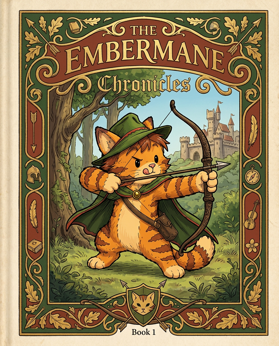
AI Design for Absolutely. Here's how I'd describe the entire cover as if it were written in a design document for an illustrator.

---

# 📖 THE EMBERMANE CHRONICLES

### Book 1 Cover Design Specification

## Overall Format

* Book size: **21 cm × 13.5 cm**
* Classic fantasy novel proportions.
* Matte finish.
* Storybook-inspired cover.
* Not realistic.
* Not modern.
* Warm, timeless, and iconic.

The cover should feel like something discovered in an old library, passed down through generations.

---

# Color Palette

### Primary Colors

🌲 Deep forest green

🔥 Warm red-brown

✨ Soft gold

📜 Cream

These colors should contrast strongly.

The green and red-brown should never blend together.

Instead:

* Green frames red-brown.
* Red-brown frames green.
* Gold highlights details.

The result should feel rich and elegant.

---

# Cover Layout

The cover is divided into two major sections:

## Outer Cover Frame

A thick decorative border surrounding the artwork.

This border is one of the defining visual features of the series.

When readers see this frame, they should instantly recognize:

> "That's an Embermane Chronicles book."

---

## Center Illustration Window

Inside the border sits a framed illustration.

Like a painting inside an old book cover.

The illustration occupies roughly:

60–70% of the front cover.

---

# The Border

### Main Border Color

Deep forest green.

### Border Decorations

The border contains elegant line art and embossing.

Features include:

🌿 Oak leaves

🌿 Vines

🏹 Arrows

🪶 Feathers

📜 Scrollwork

🌰 Acorns

The decorations should look inspired by medieval manuscripts.

Not overly complex.

Not cluttered.

Beautiful and readable.

---

# Hidden Symbols

The border contains tiny references to important characters.

Readers may not notice them immediately.

Examples:

📚 Milo's book

🛡 Rufus' tiny knight helmet

🗺 Shadow's compass

🎻 Ashen's fiddle

🌼 Pippa's flower

These should feel like little secrets.

---

# Title Placement

The title is integrated into the border.

Not floating over the artwork.

### Top Border

Small text:

**THE**

Below it:

# EMBERMANE

Large.

Very large.

The largest text on the cover.

The first thing people notice.

---

### Bottom Border

Smaller text:

**Chronicles**

Elegant.

Decorative.

Part of the frame itself.

---

# The Embermane Crest

Located at the bottom center.

Built into the border.

Not too large.

Not too small.

A symbol readers learn to recognize.

Possible design:

🐱 Stylized cat head

🔥 Red-brown mane

🌲 Green shield background

🏹 Small crossed bow behind it

Simple and iconic.

---

# Central Illustration

The illustration is framed by the border.

---

## Jasper Embermane

Standing slightly off-center.

The focus of the entire cover.

Features:

🐱 Orange tabby cat

🐱 Red-brown mane

🐱 Red-brown cheek stripes

🐱 Red-brown arm and leg markings

🐱 Red-brown ear tips

---

### Clothing

🌲 Green cloak

🌲 Green archer hat

🪶 Red feather

🔴 Thin red trim around the cloak edges

---

### Pose

Jasper is aiming his bow.

Not fighting.

Not dramatic.

Not angry.

Instead:

He is concentrating extremely hard.

One eye slightly squinted.

Tongue sticking out a little.

Like a kid trying his absolute best.

This detail makes him feel charming and relatable.

---

# Background

Soft storybook scenery.

Not detailed enough to distract.

Possible elements:

🌲 Forest

⛰ Distant mountains

🏰 Tiny glimpse of Embermane Hall

☁ Soft sky

The background exists only to support Jasper.

Jasper remains the star.

---

# Art Style

### Linework

* Clean outlines
* Storybook quality
* Slightly hand-drawn

### Coloring

* Flat colors
* Soft gradients
* Minimal shading

### Overall Feel

Somewhere between:

📖 Redwall

📖 Classic fantasy novels

📖 Illustrated children's adventure books

The goal is:

> A timeless fantasy storybook.

Not a movie poster.

Not a comic cover.

Not realism.

---

# Reader Impression

When someone sees the book for the first time, they should think:

> "Who is Embermane?"

Then:

> "Who is that cat?"

Then:

> "I want to know what's inside."

The cover should promise:

🌲 Adventure

🏹 Heroism

📜 Ancient history

🐱 Friendship

🍲 Warmth

✨ Wonder

And most importantly:

> The beginning of a very long chronicle.

That's how I imagine **The Embermane Chronicles** sitting on a bookshelf, looking like the first volume of a beloved fantasy saga. 🐱🏹📖🌲🔥 and make it so i can actually use it as a cover full screen and not sketch art syle do the ones u did just better and thicker bold lines

Absolutely. Here's how I'd describe the entire cover as if it were written in a design document for an illustrator. --- # 📖 THE EMBERMANE CHRONICLES ### Book 1 Cover Design Specification ## Overall Format * Book size: **21 cm × 13.5 cm** * Classic fantasy novel proportions. * Matte finish. * Storybook-inspired cover. * Not realistic. * Not modern. * Warm, timeless, and iconic. The cover should feel like something discovered in an old library, passed down through generations. --- # Color Palette ### Primary Colors 🌲 Deep forest green 🔥 Warm red-brown ✨ Soft gold 📜 Cream These colors should contrast strongly. The green and red-brown should never blend together. Instead: * Green frames red-brown. * Red-brown frames green. * Gold highlights details. The result should feel rich and elegant. --- # Cover Layout The cover is divided into two major sections: ## Outer Cover Frame A thick decorative border surrounding the artwork. This border is one of the defining visual features of the series. When readers see this frame, they should instantly recognize: > "That's an Embermane Chronicles book." --- ## Center Illustration Window Inside the border sits a framed illustration. Like a painting inside an old book cover. The illustration occupies roughly: 60–70% of the front cover. --- # The Border ### Main Border Color Deep forest green. ### Border Decorations The border contains elegant line art and embossing. Features include: 🌿 Oak leaves 🌿 Vines 🏹 Arrows 🪶 Feathers 📜 Scrollwork 🌰 Acorns The decorations should look inspired by medieval manuscripts. Not overly complex. Not cluttered. Beautiful and readable. --- # Hidden Symbols The border contains tiny references to important characters. Readers may not notice them immediately. Examples: 📚 Milo's book 🛡 Rufus' tiny knight helmet 🗺 Shadow's compass 🎻 Ashen's fiddle 🌼 Pippa's flower These should feel like little secrets. --- # Title Placement The title is integrated into the border. Not floating over the artwork. ### Top Border Small text: **THE** Below it: # EMBERMANE Large. Very large. The largest text on the cover. The first thing people notice. --- ### Bottom Border Smaller text: **Chronicles** Elegant. Decorative. Part of the frame itself. --- # The Embermane Crest Located at the bottom center. Built into the border. Not too large. Not too small. A symbol readers learn to recognize. Possible design: 🐱 Stylized cat head 🔥 Red-brown mane 🌲 Green shield background 🏹 Small crossed bow behind it Simple and iconic. --- # Central Illustration The illustration is framed by the border. --- ## Jasper Embermane Standing slightly off-center. The focus of the entire cover. Features: 🐱 Orange tabby cat 🐱 Red-brown mane 🐱 Red-brown cheek stripes 🐱 Red-brown arm and leg markings 🐱 Red-brown ear tips --- ### Clothing 🌲 Green cloak 🌲 Green archer hat 🪶 Red feather 🔴 Thin red trim around the cloak edges --- ### Pose Jasper is aiming his bow. Not fighting. Not dramatic. Not angry. Instead: He is concentrating extremely hard. One eye slightly squinted. Tongue sticking out a little. Like a kid trying his absolute best. This detail makes him feel charming and relatable. --- # Background Soft storybook scenery. Not detailed enough to distract. Possible elements: 🌲 Forest ⛰ Distant mountains 🏰 Tiny glimpse of Embermane Hall ☁ Soft sky The background exists only to support Jasper. Jasper remains the star. --- # Art Style ### Linework * Clean outlines * Storybook quality * Slightly hand-drawn ### Coloring * Flat colors * Soft gradients * Minimal shading ### Overall Feel Somewhere between: 📖 Redwall 📖 Classic fantasy novels 📖 Illustrated children's adventure books The goal is: > A timeless fantasy storybook. Not a movie poster. Not a comic cover. Not realism. --- # Reader Impression When someone sees the book for the first time, they should think: > "Who is Embermane?" Then: > "Who is that cat?" Then: > "I want to know what's inside." The cover should promise: 🌲 Adventure 🏹 Heroism 📜 Ancient history 🐱 Friendship 🍲 Warmth ✨ Wonder And most importantly: > The beginning of a very long chronicle. That's how I imagine **The Embermane Chronicles** sitting on a bookshelf, looking like the first volume of a beloved fantasy saga. 🐱🏹📖🌲🔥 and make it so i can actually use it as a cover full screen and not sketch art syle do the ones u did just better and thicker bold lines

by @Elephant_8984916
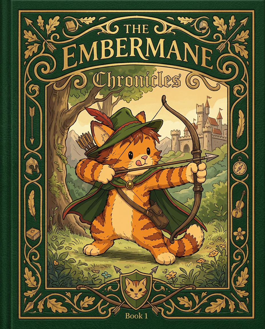
AI Design for Absolutely. Here's how I'd describe the entire cover as if it were written in a design document for an illustrator.

---

# 📖 THE EMBERMANE CHRONICLES

### Book 1 Cover Design Specification

## Overall Format

* Book size: **21 cm × 13.5 cm**
* Classic fantasy novel proportions.
* Matte finish.
* Storybook-inspired cover.
* Not realistic.
* Not modern.
* Warm, timeless, and iconic.

The cover should feel like something discovered in an old library, passed down through generations.

---

# Color Palette

### Primary Colors

🌲 Deep forest green

🔥 Warm red-brown

✨ Soft gold

📜 Cream

These colors should contrast strongly.

The green and red-brown should never blend together.

Instead:

* Green frames red-brown.
* Red-brown frames green.
* Gold highlights details.

The result should feel rich and elegant.

---

# Cover Layout

The cover is divided into two major sections:

## Outer Cover Frame

A thick decorative border surrounding the artwork.

This border is one of the defining visual features of the series.

When readers see this frame, they should instantly recognize:

> "That's an Embermane Chronicles book."

---

## Center Illustration Window

Inside the border sits a framed illustration.

Like a painting inside an old book cover.

The illustration occupies roughly:

60–70% of the front cover.

---

# The Border

### Main Border Color

Deep forest green.

### Border Decorations

The border contains elegant line art and embossing.

Features include:

🌿 Oak leaves

🌿 Vines

🏹 Arrows

🪶 Feathers

📜 Scrollwork

🌰 Acorns

The decorations should look inspired by medieval manuscripts.

Not overly complex.

Not cluttered.

Beautiful and readable.

---

# Hidden Symbols

The border contains tiny references to important characters.

Readers may not notice them immediately.

Examples:

📚 Milo's book

🛡 Rufus' tiny knight helmet

🗺 Shadow's compass

🎻 Ashen's fiddle

🌼 Pippa's flower

These should feel like little secrets.

---

# Title Placement

The title is integrated into the border.

Not floating over the artwork.

### Top Border

Small text:

**THE**

Below it:

# EMBERMANE

Large.

Very large.

The largest text on the cover.

The first thing people notice.

---

### Bottom Border

Smaller text:

**Chronicles**

Elegant.

Decorative.

Part of the frame itself.

---

# The Embermane Crest

Located at the bottom center.

Built into the border.

Not too large.

Not too small.

A symbol readers learn to recognize.

Possible design:

🐱 Stylized cat head

🔥 Red-brown mane

🌲 Green shield background

🏹 Small crossed bow behind it

Simple and iconic.

---

# Central Illustration

The illustration is framed by the border.

---

## Jasper Embermane

Standing slightly off-center.

The focus of the entire cover.

Features:

🐱 Orange tabby cat

🐱 Red-brown mane

🐱 Red-brown cheek stripes

🐱 Red-brown arm and leg markings

🐱 Red-brown ear tips

---

### Clothing

🌲 Green cloak

🌲 Green archer hat

🪶 Red feather

🔴 Thin red trim around the cloak edges

---

### Pose

Jasper is aiming his bow.

Not fighting.

Not dramatic.

Not angry.

Instead:

He is concentrating extremely hard.

One eye slightly squinted.

Tongue sticking out a little.

Like a kid trying his absolute best.

This detail makes him feel charming and relatable.

---

# Background

Soft storybook scenery.

Not detailed enough to distract.

Possible elements:

🌲 Forest

⛰ Distant mountains

🏰 Tiny glimpse of Embermane Hall

☁ Soft sky

The background exists only to support Jasper.

Jasper remains the star.

---

# Art Style

### Linework

* Clean outlines
* Storybook quality
* Slightly hand-drawn

### Coloring

* Flat colors
* Soft gradients
* Minimal shading

### Overall Feel

Somewhere between:

📖 Redwall

📖 Classic fantasy novels

📖 Illustrated children's adventure books

The goal is:

> A timeless fantasy storybook.

Not a movie poster.

Not a comic cover.

Not realism.

---

# Reader Impression

When someone sees the book for the first time, they should think:

> "Who is Embermane?"

Then:

> "Who is that cat?"

Then:

> "I want to know what's inside."

The cover should promise:

🌲 Adventure

🏹 Heroism

📜 Ancient history

🐱 Friendship

🍲 Warmth

✨ Wonder

And most importantly:

> The beginning of a very long chronicle.

That's how I imagine **The Embermane Chronicles** sitting on a bookshelf, looking like the first volume of a beloved fantasy saga. 🐱🏹📖🌲🔥 and make it so i can actually use it as a cover full screen and not sketch art syle do the ones u did just better and thicker bold lines

Absolutely. Here's how I'd describe the entire cover as if it were written in a design document for an illustrator. --- # 📖 THE EMBERMANE CHRONICLES ### Book 1 Cover Design Specification ## Overall Format * Book size: **21 cm × 13.5 cm** * Classic fantasy novel proportions. * Matte finish. * Storybook-inspired cover. * Not realistic. * Not modern. * Warm, timeless, and iconic. The cover should feel like something discovered in an old library, passed down through generations. --- # Color Palette ### Primary Colors 🌲 Deep forest green 🔥 Warm red-brown ✨ Soft gold 📜 Cream These colors should contrast strongly. The green and red-brown should never blend together. Instead: * Green frames red-brown. * Red-brown frames green. * Gold highlights details. The result should feel rich and elegant. --- # Cover Layout The cover is divided into two major sections: ## Outer Cover Frame A thick decorative border surrounding the artwork. This border is one of the defining visual features of the series. When readers see this frame, they should instantly recognize: > "That's an Embermane Chronicles book." --- ## Center Illustration Window Inside the border sits a framed illustration. Like a painting inside an old book cover. The illustration occupies roughly: 60–70% of the front cover. --- # The Border ### Main Border Color Deep forest green. ### Border Decorations The border contains elegant line art and embossing. Features include: 🌿 Oak leaves 🌿 Vines 🏹 Arrows 🪶 Feathers 📜 Scrollwork 🌰 Acorns The decorations should look inspired by medieval manuscripts. Not overly complex. Not cluttered. Beautiful and readable. --- # Hidden Symbols The border contains tiny references to important characters. Readers may not notice them immediately. Examples: 📚 Milo's book 🛡 Rufus' tiny knight helmet 🗺 Shadow's compass 🎻 Ashen's fiddle 🌼 Pippa's flower These should feel like little secrets. --- # Title Placement The title is integrated into the border. Not floating over the artwork. ### Top Border Small text: **THE** Below it: # EMBERMANE Large. Very large. The largest text on the cover. The first thing people notice. --- ### Bottom Border Smaller text: **Chronicles** Elegant. Decorative. Part of the frame itself. --- # The Embermane Crest Located at the bottom center. Built into the border. Not too large. Not too small. A symbol readers learn to recognize. Possible design: 🐱 Stylized cat head 🔥 Red-brown mane 🌲 Green shield background 🏹 Small crossed bow behind it Simple and iconic. --- # Central Illustration The illustration is framed by the border. --- ## Jasper Embermane Standing slightly off-center. The focus of the entire cover. Features: 🐱 Orange tabby cat 🐱 Red-brown mane 🐱 Red-brown cheek stripes 🐱 Red-brown arm and leg markings 🐱 Red-brown ear tips --- ### Clothing 🌲 Green cloak 🌲 Green archer hat 🪶 Red feather 🔴 Thin red trim around the cloak edges --- ### Pose Jasper is aiming his bow. Not fighting. Not dramatic. Not angry. Instead: He is concentrating extremely hard. One eye slightly squinted. Tongue sticking out a little. Like a kid trying his absolute best. This detail makes him feel charming and relatable. --- # Background Soft storybook scenery. Not detailed enough to distract. Possible elements: 🌲 Forest ⛰ Distant mountains 🏰 Tiny glimpse of Embermane Hall ☁ Soft sky The background exists only to support Jasper. Jasper remains the star. --- # Art Style ### Linework * Clean outlines * Storybook quality * Slightly hand-drawn ### Coloring * Flat colors * Soft gradients * Minimal shading ### Overall Feel Somewhere between: 📖 Redwall 📖 Classic fantasy novels 📖 Illustrated children's adventure books The goal is: > A timeless fantasy storybook. Not a movie poster. Not a comic cover. Not realism. --- # Reader Impression When someone sees the book for the first time, they should think: > "Who is Embermane?" Then: > "Who is that cat?" Then: > "I want to know what's inside." The cover should promise: 🌲 Adventure 🏹 Heroism 📜 Ancient history 🐱 Friendship 🍲 Warmth ✨ Wonder And most importantly: > The beginning of a very long chronicle. That's how I imagine **The Embermane Chronicles** sitting on a bookshelf, looking like the first volume of a beloved fantasy saga. 🐱🏹📖🌲🔥 and make it so i can actually use it as a cover full screen and not sketch art syle do the ones u did just better and thicker bold lines

by @Elephant_8984916
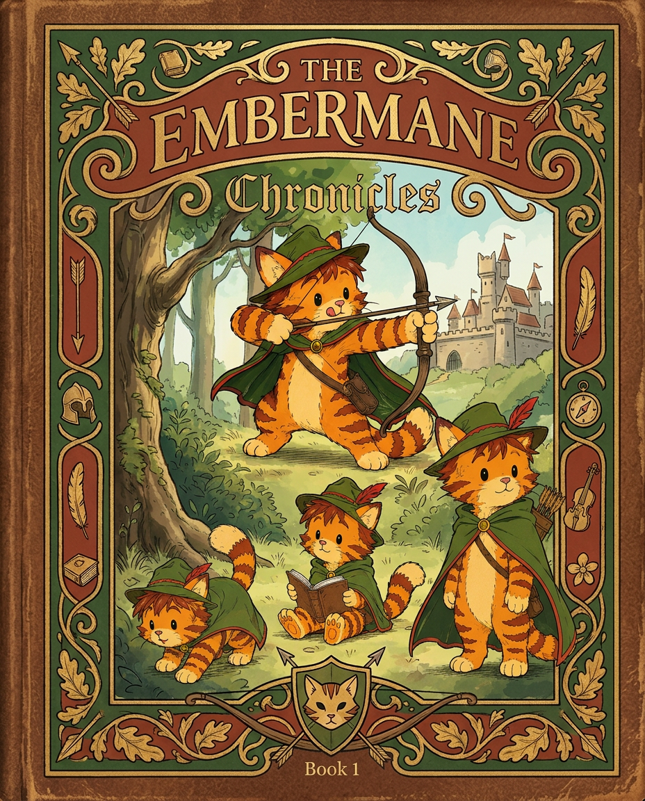
AI Design for Absolutely. Here's how I'd describe the entire cover as if it were written in a design document for an illustrator.

---

# 📖 THE EMBERMANE CHRONICLES

### Book 1 Cover Design Specification

## Overall Format

* Book size: **21 cm × 13.5 cm**
* Classic fantasy novel proportions.
* Matte finish.
* Storybook-inspired cover.
* Not realistic.
* Not modern.
* Warm, timeless, and iconic.

The cover should feel like something discovered in an old library, passed down through generations.

---

# Color Palette

### Primary Colors

🌲 Deep forest green

🔥 Warm red-brown

✨ Soft gold

📜 Cream

These colors should contrast strongly.

The green and red-brown should never blend together.

Instead:

* Green frames red-brown.
* Red-brown frames green.
* Gold highlights details.

The result should feel rich and elegant.

---

# Cover Layout

The cover is divided into two major sections:

## Outer Cover Frame

A thick decorative border surrounding the artwork.

This border is one of the defining visual features of the series.

When readers see this frame, they should instantly recognize:

> "That's an Embermane Chronicles book."

---

## Center Illustration Window

Inside the border sits a framed illustration.

Like a painting inside an old book cover.

The illustration occupies roughly:

60–70% of the front cover.

---

# The Border

### Main Border Color

Deep forest green.

### Border Decorations

The border contains elegant line art and embossing.

Features include:

🌿 Oak leaves

🌿 Vines

🏹 Arrows

🪶 Feathers

📜 Scrollwork

🌰 Acorns

The decorations should look inspired by medieval manuscripts.

Not overly complex.

Not cluttered.

Beautiful and readable.

---

# Hidden Symbols

The border contains tiny references to important characters.

Readers may not notice them immediately.

Examples:

📚 Milo's book

🛡 Rufus' tiny knight helmet

🗺 Shadow's compass

🎻 Ashen's fiddle

🌼 Pippa's flower

These should feel like little secrets.

---

# Title Placement

The title is integrated into the border.

Not floating over the artwork.

### Top Border

Small text:

**THE**

Below it:

# EMBERMANE

Large.

Very large.

The largest text on the cover.

The first thing people notice.

---

### Bottom Border

Smaller text:

**Chronicles**

Elegant.

Decorative.

Part of the frame itself.

---

# The Embermane Crest

Located at the bottom center.

Built into the border.

Not too large.

Not too small.

A symbol readers learn to recognize.

Possible design:

🐱 Stylized cat head

🔥 Red-brown mane

🌲 Green shield background

🏹 Small crossed bow behind it

Simple and iconic.

---

# Central Illustration

The illustration is framed by the border.

---

## Jasper Embermane

Standing slightly off-center.

The focus of the entire cover.

Features:

🐱 Orange tabby cat

🐱 Red-brown mane

🐱 Red-brown cheek stripes

🐱 Red-brown arm and leg markings

🐱 Red-brown ear tips

---

### Clothing

🌲 Green cloak

🌲 Green archer hat

🪶 Red feather

🔴 Thin red trim around the cloak edges

---

### Pose

Jasper is aiming his bow.

Not fighting.

Not dramatic.

Not angry.

Instead:

He is concentrating extremely hard.

One eye slightly squinted.

Tongue sticking out a little.

Like a kid trying his absolute best.

This detail makes him feel charming and relatable.

---

# Background

Soft storybook scenery.

Not detailed enough to distract.

Possible elements:

🌲 Forest

⛰ Distant mountains

🏰 Tiny glimpse of Embermane Hall

☁ Soft sky

The background exists only to support Jasper.

Jasper remains the star.

---

# Art Style

### Linework

* Clean outlines
* Storybook quality
* Slightly hand-drawn

### Coloring

* Flat colors
* Soft gradients
* Minimal shading

### Overall Feel

Somewhere between:

📖 Redwall

📖 Classic fantasy novels

📖 Illustrated children's adventure books

The goal is:

> A timeless fantasy storybook.

Not a movie poster.

Not a comic cover.

Not realism.

---

# Reader Impression

When someone sees the book for the first time, they should think:

> "Who is Embermane?"

Then:

> "Who is that cat?"

Then:

> "I want to know what's inside."

The cover should promise:

🌲 Adventure

🏹 Heroism

📜 Ancient history

🐱 Friendship

🍲 Warmth

✨ Wonder

And most importantly:

> The beginning of a very long chronicle.

That's how I imagine **The Embermane Chronicles** sitting on a bookshelf, looking like the first volume of a beloved fantasy saga. 🐱🏹📖🌲🔥 and make it so i can actually use it as a cover full screen and not sketch art syle do the ones u did just better and thicker bold lines

Absolutely. Here's how I'd describe the entire cover as if it were written in a design document for an illustrator. --- # 📖 THE EMBERMANE CHRONICLES ### Book 1 Cover Design Specification ## Overall Format * Book size: **21 cm × 13.5 cm** * Classic fantasy novel proportions. * Matte finish. * Storybook-inspired cover. * Not realistic. * Not modern. * Warm, timeless, and iconic. The cover should feel like something discovered in an old library, passed down through generations. --- # Color Palette ### Primary Colors 🌲 Deep forest green 🔥 Warm red-brown ✨ Soft gold 📜 Cream These colors should contrast strongly. The green and red-brown should never blend together. Instead: * Green frames red-brown. * Red-brown frames green. * Gold highlights details. The result should feel rich and elegant. --- # Cover Layout The cover is divided into two major sections: ## Outer Cover Frame A thick decorative border surrounding the artwork. This border is one of the defining visual features of the series. When readers see this frame, they should instantly recognize: > "That's an Embermane Chronicles book." --- ## Center Illustration Window Inside the border sits a framed illustration. Like a painting inside an old book cover. The illustration occupies roughly: 60–70% of the front cover. --- # The Border ### Main Border Color Deep forest green. ### Border Decorations The border contains elegant line art and embossing. Features include: 🌿 Oak leaves 🌿 Vines 🏹 Arrows 🪶 Feathers 📜 Scrollwork 🌰 Acorns The decorations should look inspired by medieval manuscripts. Not overly complex. Not cluttered. Beautiful and readable. --- # Hidden Symbols The border contains tiny references to important characters. Readers may not notice them immediately. Examples: 📚 Milo's book 🛡 Rufus' tiny knight helmet 🗺 Shadow's compass 🎻 Ashen's fiddle 🌼 Pippa's flower These should feel like little secrets. --- # Title Placement The title is integrated into the border. Not floating over the artwork. ### Top Border Small text: **THE** Below it: # EMBERMANE Large. Very large. The largest text on the cover. The first thing people notice. --- ### Bottom Border Smaller text: **Chronicles** Elegant. Decorative. Part of the frame itself. --- # The Embermane Crest Located at the bottom center. Built into the border. Not too large. Not too small. A symbol readers learn to recognize. Possible design: 🐱 Stylized cat head 🔥 Red-brown mane 🌲 Green shield background 🏹 Small crossed bow behind it Simple and iconic. --- # Central Illustration The illustration is framed by the border. --- ## Jasper Embermane Standing slightly off-center. The focus of the entire cover. Features: 🐱 Orange tabby cat 🐱 Red-brown mane 🐱 Red-brown cheek stripes 🐱 Red-brown arm and leg markings 🐱 Red-brown ear tips --- ### Clothing 🌲 Green cloak 🌲 Green archer hat 🪶 Red feather 🔴 Thin red trim around the cloak edges --- ### Pose Jasper is aiming his bow. Not fighting. Not dramatic. Not angry. Instead: He is concentrating extremely hard. One eye slightly squinted. Tongue sticking out a little. Like a kid trying his absolute best. This detail makes him feel charming and relatable. --- # Background Soft storybook scenery. Not detailed enough to distract. Possible elements: 🌲 Forest ⛰ Distant mountains 🏰 Tiny glimpse of Embermane Hall ☁ Soft sky The background exists only to support Jasper. Jasper remains the star. --- # Art Style ### Linework * Clean outlines * Storybook quality * Slightly hand-drawn ### Coloring * Flat colors * Soft gradients * Minimal shading ### Overall Feel Somewhere between: 📖 Redwall 📖 Classic fantasy novels 📖 Illustrated children's adventure books The goal is: > A timeless fantasy storybook. Not a movie poster. Not a comic cover. Not realism. --- # Reader Impression When someone sees the book for the first time, they should think: > "Who is Embermane?" Then: > "Who is that cat?" Then: > "I want to know what's inside." The cover should promise: 🌲 Adventure 🏹 Heroism 📜 Ancient history 🐱 Friendship 🍲 Warmth ✨ Wonder And most importantly: > The beginning of a very long chronicle. That's how I imagine **The Embermane Chronicles** sitting on a bookshelf, looking like the first volume of a beloved fantasy saga. 🐱🏹📖🌲🔥 and make it so i can actually use it as a cover full screen and not sketch art syle do the ones u did just better and thicker bold lines

by @Elephant_8984916
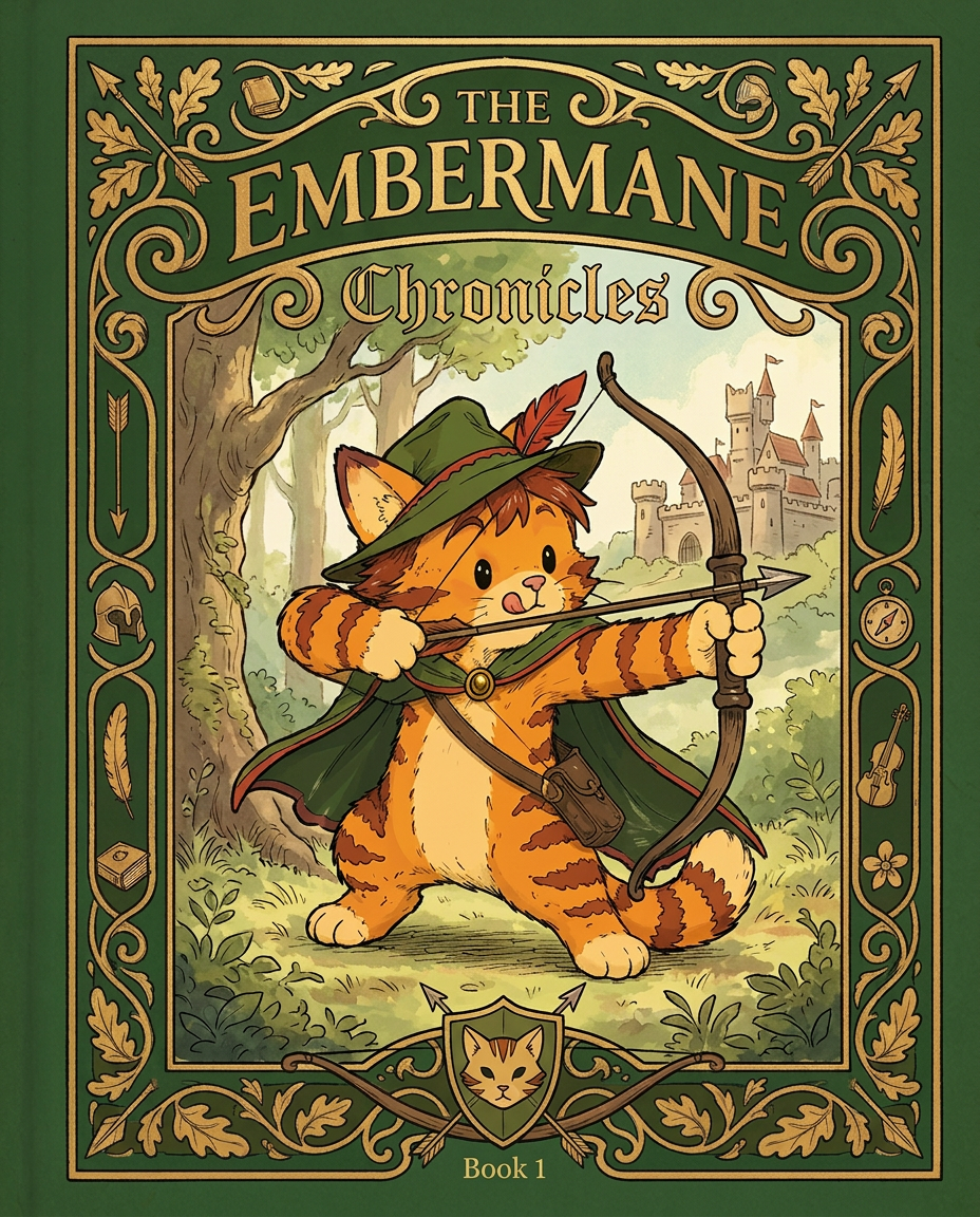
AI Design for Absolutely. Here's how I'd describe the entire cover as if it were written in a design document for an illustrator.

---

# 📖 THE EMBERMANE CHRONICLES

### Book 1 Cover Design Specification

## Overall Format

* Book size: **21 cm × 13.5 cm**
* Classic fantasy novel proportions.
* Matte finish.
* Storybook-inspired cover.
* Not realistic.
* Not modern.
* Warm, timeless, and iconic.

The cover should feel like something discovered in an old library, passed down through generations.

---

# Color Palette

### Primary Colors

🌲 Deep forest green

🔥 Warm red-brown

✨ Soft gold

📜 Cream

These colors should contrast strongly.

The green and red-brown should never blend together.

Instead:

* Green frames red-brown.
* Red-brown frames green.
* Gold highlights details.

The result should feel rich and elegant.

---

# Cover Layout

The cover is divided into two major sections:

## Outer Cover Frame

A thick decorative border surrounding the artwork.

This border is one of the defining visual features of the series.

When readers see this frame, they should instantly recognize:

> "That's an Embermane Chronicles book."

---

## Center Illustration Window

Inside the border sits a framed illustration.

Like a painting inside an old book cover.

The illustration occupies roughly:

60–70% of the front cover.

---

# The Border

### Main Border Color

Deep forest green.

### Border Decorations

The border contains elegant line art and embossing.

Features include:

🌿 Oak leaves

🌿 Vines

🏹 Arrows

🪶 Feathers

📜 Scrollwork

🌰 Acorns

The decorations should look inspired by medieval manuscripts.

Not overly complex.

Not cluttered.

Beautiful and readable.

---

# Hidden Symbols

The border contains tiny references to important characters.

Readers may not notice them immediately.

Examples:

📚 Milo's book

🛡 Rufus' tiny knight helmet

🗺 Shadow's compass

🎻 Ashen's fiddle

🌼 Pippa's flower

These should feel like little secrets.

---

# Title Placement

The title is integrated into the border.

Not floating over the artwork.

### Top Border

Small text:

**THE**

Below it:

# EMBERMANE

Large.

Very large.

The largest text on the cover.

The first thing people notice.

---

### Bottom Border

Smaller text:

**Chronicles**

Elegant.

Decorative.

Part of the frame itself.

---

# The Embermane Crest

Located at the bottom center.

Built into the border.

Not too large.

Not too small.

A symbol readers learn to recognize.

Possible design:

🐱 Stylized cat head

🔥 Red-brown mane

🌲 Green shield background

🏹 Small crossed bow behind it

Simple and iconic.

---

# Central Illustration

The illustration is framed by the border.

---

## Jasper Embermane

Standing slightly off-center.

The focus of the entire cover.

Features:

🐱 Orange tabby cat

🐱 Red-brown mane

🐱 Red-brown cheek stripes

🐱 Red-brown arm and leg markings

🐱 Red-brown ear tips

---

### Clothing

🌲 Green cloak

🌲 Green archer hat

🪶 Red feather

🔴 Thin red trim around the cloak edges

---

### Pose

Jasper is aiming his bow.

Not fighting.

Not dramatic.

Not angry.

Instead:

He is concentrating extremely hard.

One eye slightly squinted.

Tongue sticking out a little.

Like a kid trying his absolute best.

This detail makes him feel charming and relatable.

---

# Background

Soft storybook scenery.

Not detailed enough to distract.

Possible elements:

🌲 Forest

⛰ Distant mountains

🏰 Tiny glimpse of Embermane Hall

☁ Soft sky

The background exists only to support Jasper.

Jasper remains the star.

---

# Art Style

### Linework

* Clean outlines
* Storybook quality
* Slightly hand-drawn

### Coloring

* Flat colors
* Soft gradients
* Minimal shading

### Overall Feel

Somewhere between:

📖 Redwall

📖 Classic fantasy novels

📖 Illustrated children's adventure books

The goal is:

> A timeless fantasy storybook.

Not a movie poster.

Not a comic cover.

Not realism.

---

# Reader Impression

When someone sees the book for the first time, they should think:

> "Who is Embermane?"

Then:

> "Who is that cat?"

Then:

> "I want to know what's inside."

The cover should promise:

🌲 Adventure

🏹 Heroism

📜 Ancient history

🐱 Friendship

🍲 Warmth

✨ Wonder

And most importantly:

> The beginning of a very long chronicle.

That's how I imagine **The Embermane Chronicles** sitting on a bookshelf, looking like the first volume of a beloved fantasy saga. 🐱🏹📖🌲🔥 and make it so i can actually use it as a cover full screen and not sketch art syle do the ones u did just better and thicker bold lines

Absolutely. Here's how I'd describe the entire cover as if it were written in a design document for an illustrator. --- # 📖 THE EMBERMANE CHRONICLES ### Book 1 Cover Design Specification ## Overall Format * Book size: **21 cm × 13.5 cm** * Classic fantasy novel proportions. * Matte finish. * Storybook-inspired cover. * Not realistic. * Not modern. * Warm, timeless, and iconic. The cover should feel like something discovered in an old library, passed down through generations. --- # Color Palette ### Primary Colors 🌲 Deep forest green 🔥 Warm red-brown ✨ Soft gold 📜 Cream These colors should contrast strongly. The green and red-brown should never blend together. Instead: * Green frames red-brown. * Red-brown frames green. * Gold highlights details. The result should feel rich and elegant. --- # Cover Layout The cover is divided into two major sections: ## Outer Cover Frame A thick decorative border surrounding the artwork. This border is one of the defining visual features of the series. When readers see this frame, they should instantly recognize: > "That's an Embermane Chronicles book." --- ## Center Illustration Window Inside the border sits a framed illustration. Like a painting inside an old book cover. The illustration occupies roughly: 60–70% of the front cover. --- # The Border ### Main Border Color Deep forest green. ### Border Decorations The border contains elegant line art and embossing. Features include: 🌿 Oak leaves 🌿 Vines 🏹 Arrows 🪶 Feathers 📜 Scrollwork 🌰 Acorns The decorations should look inspired by medieval manuscripts. Not overly complex. Not cluttered. Beautiful and readable. --- # Hidden Symbols The border contains tiny references to important characters. Readers may not notice them immediately. Examples: 📚 Milo's book 🛡 Rufus' tiny knight helmet 🗺 Shadow's compass 🎻 Ashen's fiddle 🌼 Pippa's flower These should feel like little secrets. --- # Title Placement The title is integrated into the border. Not floating over the artwork. ### Top Border Small text: **THE** Below it: # EMBERMANE Large. Very large. The largest text on the cover. The first thing people notice. --- ### Bottom Border Smaller text: **Chronicles** Elegant. Decorative. Part of the frame itself. --- # The Embermane Crest Located at the bottom center. Built into the border. Not too large. Not too small. A symbol readers learn to recognize. Possible design: 🐱 Stylized cat head 🔥 Red-brown mane 🌲 Green shield background 🏹 Small crossed bow behind it Simple and iconic. --- # Central Illustration The illustration is framed by the border. --- ## Jasper Embermane Standing slightly off-center. The focus of the entire cover. Features: 🐱 Orange tabby cat 🐱 Red-brown mane 🐱 Red-brown cheek stripes 🐱 Red-brown arm and leg markings 🐱 Red-brown ear tips --- ### Clothing 🌲 Green cloak 🌲 Green archer hat 🪶 Red feather 🔴 Thin red trim around the cloak edges --- ### Pose Jasper is aiming his bow. Not fighting. Not dramatic. Not angry. Instead: He is concentrating extremely hard. One eye slightly squinted. Tongue sticking out a little. Like a kid trying his absolute best. This detail makes him feel charming and relatable. --- # Background Soft storybook scenery. Not detailed enough to distract. Possible elements: 🌲 Forest ⛰ Distant mountains 🏰 Tiny glimpse of Embermane Hall ☁ Soft sky The background exists only to support Jasper. Jasper remains the star. --- # Art Style ### Linework * Clean outlines * Storybook quality * Slightly hand-drawn ### Coloring * Flat colors * Soft gradients * Minimal shading ### Overall Feel Somewhere between: 📖 Redwall 📖 Classic fantasy novels 📖 Illustrated children's adventure books The goal is: > A timeless fantasy storybook. Not a movie poster. Not a comic cover. Not realism. --- # Reader Impression When someone sees the book for the first time, they should think: > "Who is Embermane?" Then: > "Who is that cat?" Then: > "I want to know what's inside." The cover should promise: 🌲 Adventure 🏹 Heroism 📜 Ancient history 🐱 Friendship 🍲 Warmth ✨ Wonder And most importantly: > The beginning of a very long chronicle. That's how I imagine **The Embermane Chronicles** sitting on a bookshelf, looking like the first volume of a beloved fantasy saga. 🐱🏹📖🌲🔥 and make it so i can actually use it as a cover full screen and not sketch art syle do the ones u did just better and thicker bold lines

by @Elephant_8984916
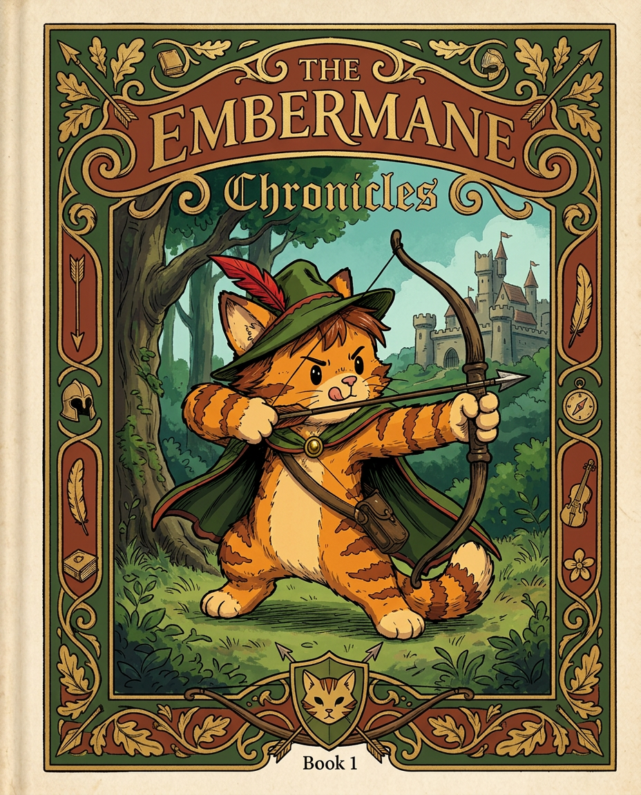
AI Design for Absolutely. Here's how I'd describe the entire cover as if it were written in a design document for an illustrator.

---

# 📖 THE EMBERMANE CHRONICLES

### Book 1 Cover Design Specification

## Overall Format

* Book size: **21 cm × 13.5 cm**
* Classic fantasy novel proportions.
* Matte finish.
* Storybook-inspired cover.
* Not realistic.
* Not modern.
* Warm, timeless, and iconic.

The cover should feel like something discovered in an old library, passed down through generations.

---

# Color Palette

### Primary Colors

🌲 Deep forest green

🔥 Warm red-brown

✨ Soft gold

📜 Cream

These colors should contrast strongly.

The green and red-brown should never blend together.

Instead:

* Green frames red-brown.
* Red-brown frames green.
* Gold highlights details.

The result should feel rich and elegant.

---

# Cover Layout

The cover is divided into two major sections:

## Outer Cover Frame

A thick decorative border surrounding the artwork.

This border is one of the defining visual features of the series.

When readers see this frame, they should instantly recognize:

> "That's an Embermane Chronicles book."

---

## Center Illustration Window

Inside the border sits a framed illustration.

Like a painting inside an old book cover.

The illustration occupies roughly:

60–70% of the front cover.

---

# The Border

### Main Border Color

Deep forest green.

### Border Decorations

The border contains elegant line art and embossing.

Features include:

🌿 Oak leaves

🌿 Vines

🏹 Arrows

🪶 Feathers

📜 Scrollwork

🌰 Acorns

The decorations should look inspired by medieval manuscripts.

Not overly complex.

Not cluttered.

Beautiful and readable.

---

# Hidden Symbols

The border contains tiny references to important characters.

Readers may not notice them immediately.

Examples:

📚 Milo's book

🛡 Rufus' tiny knight helmet

🗺 Shadow's compass

🎻 Ashen's fiddle

🌼 Pippa's flower

These should feel like little secrets.

---

# Title Placement

The title is integrated into the border.

Not floating over the artwork.

### Top Border

Small text:

**THE**

Below it:

# EMBERMANE

Large.

Very large.

The largest text on the cover.

The first thing people notice.

---

### Bottom Border

Smaller text:

**Chronicles**

Elegant.

Decorative.

Part of the frame itself.

---

# The Embermane Crest

Located at the bottom center.

Built into the border.

Not too large.

Not too small.

A symbol readers learn to recognize.

Possible design:

🐱 Stylized cat head

🔥 Red-brown mane

🌲 Green shield background

🏹 Small crossed bow behind it

Simple and iconic.

---

# Central Illustration

The illustration is framed by the border.

---

## Jasper Embermane

Standing slightly off-center.

The focus of the entire cover.

Features:

🐱 Orange tabby cat

🐱 Red-brown mane

🐱 Red-brown cheek stripes

🐱 Red-brown arm and leg markings

🐱 Red-brown ear tips

---

### Clothing

🌲 Green cloak

🌲 Green archer hat

🪶 Red feather

🔴 Thin red trim around the cloak edges

---

### Pose

Jasper is aiming his bow.

Not fighting.

Not dramatic.

Not angry.

Instead:

He is concentrating extremely hard.

One eye slightly squinted.

Tongue sticking out a little.

Like a kid trying his absolute best.

This detail makes him feel charming and relatable.

---

# Background

Soft storybook scenery.

Not detailed enough to distract.

Possible elements:

🌲 Forest

⛰ Distant mountains

🏰 Tiny glimpse of Embermane Hall

☁ Soft sky

The background exists only to support Jasper.

Jasper remains the star.

---

# Art Style

### Linework

* Clean outlines
* Storybook quality
* Slightly hand-drawn

### Coloring

* Flat colors
* Soft gradients
* Minimal shading

### Overall Feel

Somewhere between:

📖 Redwall

📖 Classic fantasy novels

📖 Illustrated children's adventure books

The goal is:

> A timeless fantasy storybook.

Not a movie poster.

Not a comic cover.

Not realism.

---

# Reader Impression

When someone sees the book for the first time, they should think:

> "Who is Embermane?"

Then:

> "Who is that cat?"

Then:

> "I want to know what's inside."

The cover should promise:

🌲 Adventure

🏹 Heroism

📜 Ancient history

🐱 Friendship

🍲 Warmth

✨ Wonder

And most importantly:

> The beginning of a very long chronicle.

That's how I imagine **The Embermane Chronicles** sitting on a bookshelf, looking like the first volume of a beloved fantasy saga. 🐱🏹📖🌲🔥 and make it so i can actually use it as a cover full screen and not sketch art syle do the ones u did just better and thicker bold lines

Absolutely. Here's how I'd describe the entire cover as if it were written in a design document for an illustrator. --- # 📖 THE EMBERMANE CHRONICLES ### Book 1 Cover Design Specification ## Overall Format * Book size: **21 cm × 13.5 cm** * Classic fantasy novel proportions. * Matte finish. * Storybook-inspired cover. * Not realistic. * Not modern. * Warm, timeless, and iconic. The cover should feel like something discovered in an old library, passed down through generations. --- # Color Palette ### Primary Colors 🌲 Deep forest green 🔥 Warm red-brown ✨ Soft gold 📜 Cream These colors should contrast strongly. The green and red-brown should never blend together. Instead: * Green frames red-brown. * Red-brown frames green. * Gold highlights details. The result should feel rich and elegant. --- # Cover Layout The cover is divided into two major sections: ## Outer Cover Frame A thick decorative border surrounding the artwork. This border is one of the defining visual features of the series. When readers see this frame, they should instantly recognize: > "That's an Embermane Chronicles book." --- ## Center Illustration Window Inside the border sits a framed illustration. Like a painting inside an old book cover. The illustration occupies roughly: 60–70% of the front cover. --- # The Border ### Main Border Color Deep forest green. ### Border Decorations The border contains elegant line art and embossing. Features include: 🌿 Oak leaves 🌿 Vines 🏹 Arrows 🪶 Feathers 📜 Scrollwork 🌰 Acorns The decorations should look inspired by medieval manuscripts. Not overly complex. Not cluttered. Beautiful and readable. --- # Hidden Symbols The border contains tiny references to important characters. Readers may not notice them immediately. Examples: 📚 Milo's book 🛡 Rufus' tiny knight helmet 🗺 Shadow's compass 🎻 Ashen's fiddle 🌼 Pippa's flower These should feel like little secrets. --- # Title Placement The title is integrated into the border. Not floating over the artwork. ### Top Border Small text: **THE** Below it: # EMBERMANE Large. Very large. The largest text on the cover. The first thing people notice. --- ### Bottom Border Smaller text: **Chronicles** Elegant. Decorative. Part of the frame itself. --- # The Embermane Crest Located at the bottom center. Built into the border. Not too large. Not too small. A symbol readers learn to recognize. Possible design: 🐱 Stylized cat head 🔥 Red-brown mane 🌲 Green shield background 🏹 Small crossed bow behind it Simple and iconic. --- # Central Illustration The illustration is framed by the border. --- ## Jasper Embermane Standing slightly off-center. The focus of the entire cover. Features: 🐱 Orange tabby cat 🐱 Red-brown mane 🐱 Red-brown cheek stripes 🐱 Red-brown arm and leg markings 🐱 Red-brown ear tips --- ### Clothing 🌲 Green cloak 🌲 Green archer hat 🪶 Red feather 🔴 Thin red trim around the cloak edges --- ### Pose Jasper is aiming his bow. Not fighting. Not dramatic. Not angry. Instead: He is concentrating extremely hard. One eye slightly squinted. Tongue sticking out a little. Like a kid trying his absolute best. This detail makes him feel charming and relatable. --- # Background Soft storybook scenery. Not detailed enough to distract. Possible elements: 🌲 Forest ⛰ Distant mountains 🏰 Tiny glimpse of Embermane Hall ☁ Soft sky The background exists only to support Jasper. Jasper remains the star. --- # Art Style ### Linework * Clean outlines * Storybook quality * Slightly hand-drawn ### Coloring * Flat colors * Soft gradients * Minimal shading ### Overall Feel Somewhere between: 📖 Redwall 📖 Classic fantasy novels 📖 Illustrated children's adventure books The goal is: > A timeless fantasy storybook. Not a movie poster. Not a comic cover. Not realism. --- # Reader Impression When someone sees the book for the first time, they should think: > "Who is Embermane?" Then: > "Who is that cat?" Then: > "I want to know what's inside." The cover should promise: 🌲 Adventure 🏹 Heroism 📜 Ancient history 🐱 Friendship 🍲 Warmth ✨ Wonder And most importantly: > The beginning of a very long chronicle. That's how I imagine **The Embermane Chronicles** sitting on a bookshelf, looking like the first volume of a beloved fantasy saga. 🐱🏹📖🌲🔥 and make it so i can actually use it as a cover full screen and not sketch art syle do the ones u did just better and thicker bold lines

by @Elephant_8984916
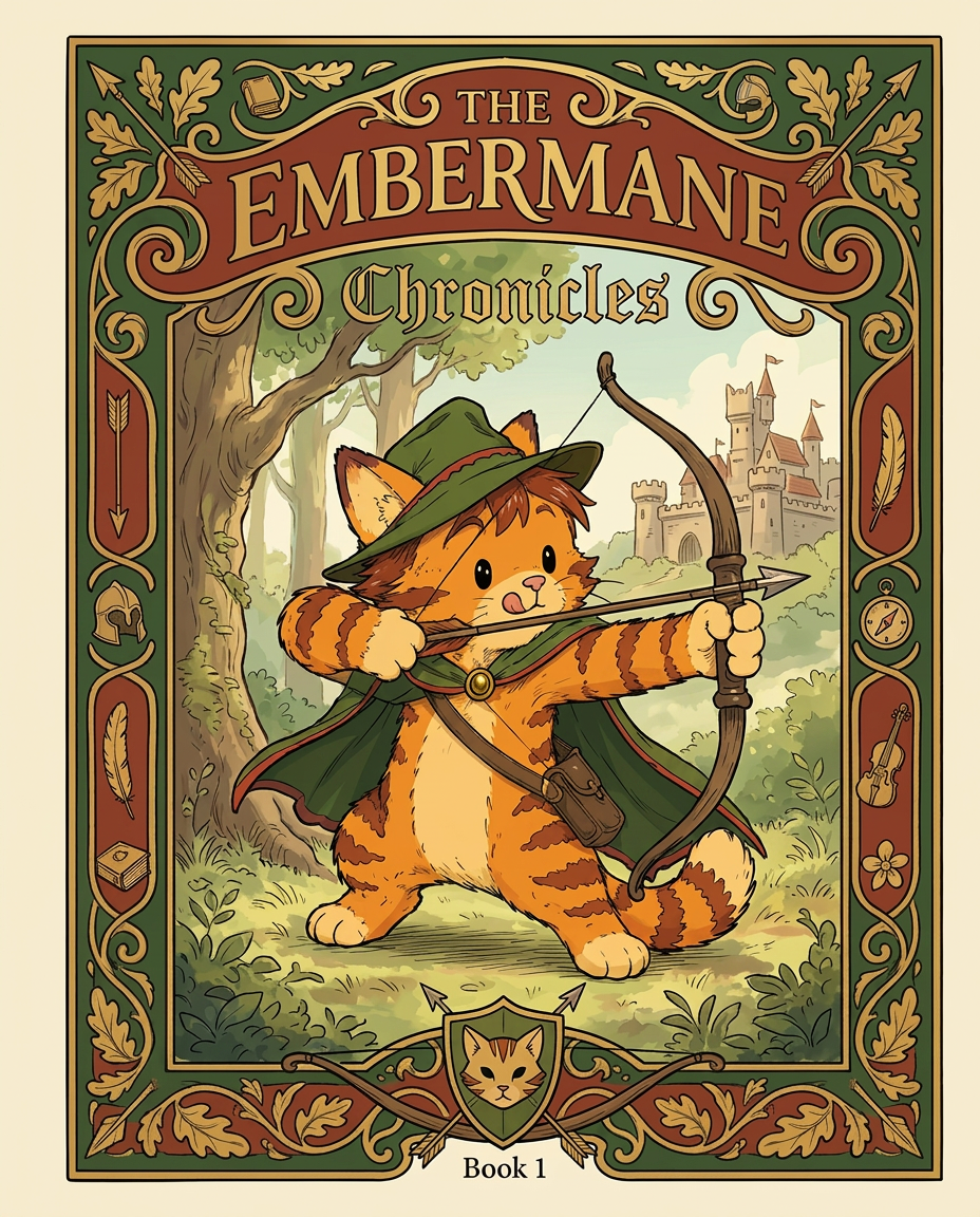
AI Design for Absolutely. Here's how I'd describe the entire cover as if it were written in a design document for an illustrator.

---

# 📖 THE EMBERMANE CHRONICLES

### Book 1 Cover Design Specification

## Overall Format

* Book size: **21 cm × 13.5 cm**
* Classic fantasy novel proportions.
* Matte finish.
* Storybook-inspired cover.
* Not realistic.
* Not modern.
* Warm, timeless, and iconic.

The cover should feel like something discovered in an old library, passed down through generations.

---

# Color Palette

### Primary Colors

🌲 Deep forest green

🔥 Warm red-brown

✨ Soft gold

📜 Cream

These colors should contrast strongly.

The green and red-brown should never blend together.

Instead:

* Green frames red-brown.
* Red-brown frames green.
* Gold highlights details.

The result should feel rich and elegant.

---

# Cover Layout

The cover is divided into two major sections:

## Outer Cover Frame

A thick decorative border surrounding the artwork.

This border is one of the defining visual features of the series.

When readers see this frame, they should instantly recognize:

> "That's an Embermane Chronicles book."

---

## Center Illustration Window

Inside the border sits a framed illustration.

Like a painting inside an old book cover.

The illustration occupies roughly:

60–70% of the front cover.

---

# The Border

### Main Border Color

Deep forest green.

### Border Decorations

The border contains elegant line art and embossing.

Features include:

🌿 Oak leaves

🌿 Vines

🏹 Arrows

🪶 Feathers

📜 Scrollwork

🌰 Acorns

The decorations should look inspired by medieval manuscripts.

Not overly complex.

Not cluttered.

Beautiful and readable.

---

# Hidden Symbols

The border contains tiny references to important characters.

Readers may not notice them immediately.

Examples:

📚 Milo's book

🛡 Rufus' tiny knight helmet

🗺 Shadow's compass

🎻 Ashen's fiddle

🌼 Pippa's flower

These should feel like little secrets.

---

# Title Placement

The title is integrated into the border.

Not floating over the artwork.

### Top Border

Small text:

**THE**

Below it:

# EMBERMANE

Large.

Very large.

The largest text on the cover.

The first thing people notice.

---

### Bottom Border

Smaller text:

**Chronicles**

Elegant.

Decorative.

Part of the frame itself.

---

# The Embermane Crest

Located at the bottom center.

Built into the border.

Not too large.

Not too small.

A symbol readers learn to recognize.

Possible design:

🐱 Stylized cat head

🔥 Red-brown mane

🌲 Green shield background

🏹 Small crossed bow behind it

Simple and iconic.

---

# Central Illustration

The illustration is framed by the border.

---

## Jasper Embermane

Standing slightly off-center.

The focus of the entire cover.

Features:

🐱 Orange tabby cat

🐱 Red-brown mane

🐱 Red-brown cheek stripes

🐱 Red-brown arm and leg markings

🐱 Red-brown ear tips

---

### Clothing

🌲 Green cloak

🌲 Green archer hat

🪶 Red feather

🔴 Thin red trim around the cloak edges

---

### Pose

Jasper is aiming his bow.

Not fighting.

Not dramatic.

Not angry.

Instead:

He is concentrating extremely hard.

One eye slightly squinted.

Tongue sticking out a little.

Like a kid trying his absolute best.

This detail makes him feel charming and relatable.

---

# Background

Soft storybook scenery.

Not detailed enough to distract.

Possible elements:

🌲 Forest

⛰ Distant mountains

🏰 Tiny glimpse of Embermane Hall

☁ Soft sky

The background exists only to support Jasper.

Jasper remains the star.

---

# Art Style

### Linework

* Clean outlines
* Storybook quality
* Slightly hand-drawn

### Coloring

* Flat colors
* Soft gradients
* Minimal shading

### Overall Feel

Somewhere between:

📖 Redwall

📖 Classic fantasy novels

📖 Illustrated children's adventure books

The goal is:

> A timeless fantasy storybook.

Not a movie poster.

Not a comic cover.

Not realism.

---

# Reader Impression

When someone sees the book for the first time, they should think:

> "Who is Embermane?"

Then:

> "Who is that cat?"

Then:

> "I want to know what's inside."

The cover should promise:

🌲 Adventure

🏹 Heroism

📜 Ancient history

🐱 Friendship

🍲 Warmth

✨ Wonder

And most importantly:

> The beginning of a very long chronicle.

That's how I imagine **The Embermane Chronicles** sitting on a bookshelf, looking like the first volume of a beloved fantasy saga. 🐱🏹📖🌲🔥 and make it so i can actually use it as a cover full screen and not sketch art syle do the ones u did just better and thicker bold lines

Absolutely. Here's how I'd describe the entire cover as if it were written in a design document for an illustrator. --- # 📖 THE EMBERMANE CHRONICLES ### Book 1 Cover Design Specification ## Overall Format * Book size: **21 cm × 13.5 cm** * Classic fantasy novel proportions. * Matte finish. * Storybook-inspired cover. * Not realistic. * Not modern. * Warm, timeless, and iconic. The cover should feel like something discovered in an old library, passed down through generations. --- # Color Palette ### Primary Colors 🌲 Deep forest green 🔥 Warm red-brown ✨ Soft gold 📜 Cream These colors should contrast strongly. The green and red-brown should never blend together. Instead: * Green frames red-brown. * Red-brown frames green. * Gold highlights details. The result should feel rich and elegant. --- # Cover Layout The cover is divided into two major sections: ## Outer Cover Frame A thick decorative border surrounding the artwork. This border is one of the defining visual features of the series. When readers see this frame, they should instantly recognize: > "That's an Embermane Chronicles book." --- ## Center Illustration Window Inside the border sits a framed illustration. Like a painting inside an old book cover. The illustration occupies roughly: 60–70% of the front cover. --- # The Border ### Main Border Color Deep forest green. ### Border Decorations The border contains elegant line art and embossing. Features include: 🌿 Oak leaves 🌿 Vines 🏹 Arrows 🪶 Feathers 📜 Scrollwork 🌰 Acorns The decorations should look inspired by medieval manuscripts. Not overly complex. Not cluttered. Beautiful and readable. --- # Hidden Symbols The border contains tiny references to important characters. Readers may not notice them immediately. Examples: 📚 Milo's book 🛡 Rufus' tiny knight helmet 🗺 Shadow's compass 🎻 Ashen's fiddle 🌼 Pippa's flower These should feel like little secrets. --- # Title Placement The title is integrated into the border. Not floating over the artwork. ### Top Border Small text: **THE** Below it: # EMBERMANE Large. Very large. The largest text on the cover. The first thing people notice. --- ### Bottom Border Smaller text: **Chronicles** Elegant. Decorative. Part of the frame itself. --- # The Embermane Crest Located at the bottom center. Built into the border. Not too large. Not too small. A symbol readers learn to recognize. Possible design: 🐱 Stylized cat head 🔥 Red-brown mane 🌲 Green shield background 🏹 Small crossed bow behind it Simple and iconic. --- # Central Illustration The illustration is framed by the border. --- ## Jasper Embermane Standing slightly off-center. The focus of the entire cover. Features: 🐱 Orange tabby cat 🐱 Red-brown mane 🐱 Red-brown cheek stripes 🐱 Red-brown arm and leg markings 🐱 Red-brown ear tips --- ### Clothing 🌲 Green cloak 🌲 Green archer hat 🪶 Red feather 🔴 Thin red trim around the cloak edges --- ### Pose Jasper is aiming his bow. Not fighting. Not dramatic. Not angry. Instead: He is concentrating extremely hard. One eye slightly squinted. Tongue sticking out a little. Like a kid trying his absolute best. This detail makes him feel charming and relatable. --- # Background Soft storybook scenery. Not detailed enough to distract. Possible elements: 🌲 Forest ⛰ Distant mountains 🏰 Tiny glimpse of Embermane Hall ☁ Soft sky The background exists only to support Jasper. Jasper remains the star. --- # Art Style ### Linework * Clean outlines * Storybook quality * Slightly hand-drawn ### Coloring * Flat colors * Soft gradients * Minimal shading ### Overall Feel Somewhere between: 📖 Redwall 📖 Classic fantasy novels 📖 Illustrated children's adventure books The goal is: > A timeless fantasy storybook. Not a movie poster. Not a comic cover. Not realism. --- # Reader Impression When someone sees the book for the first time, they should think: > "Who is Embermane?" Then: > "Who is that cat?" Then: > "I want to know what's inside." The cover should promise: 🌲 Adventure 🏹 Heroism 📜 Ancient history 🐱 Friendship 🍲 Warmth ✨ Wonder And most importantly: > The beginning of a very long chronicle. That's how I imagine **The Embermane Chronicles** sitting on a bookshelf, looking like the first volume of a beloved fantasy saga. 🐱🏹📖🌲🔥 and make it so i can actually use it as a cover full screen and not sketch art syle do the ones u did just better and thicker bold lines

by @Elephant_8984916
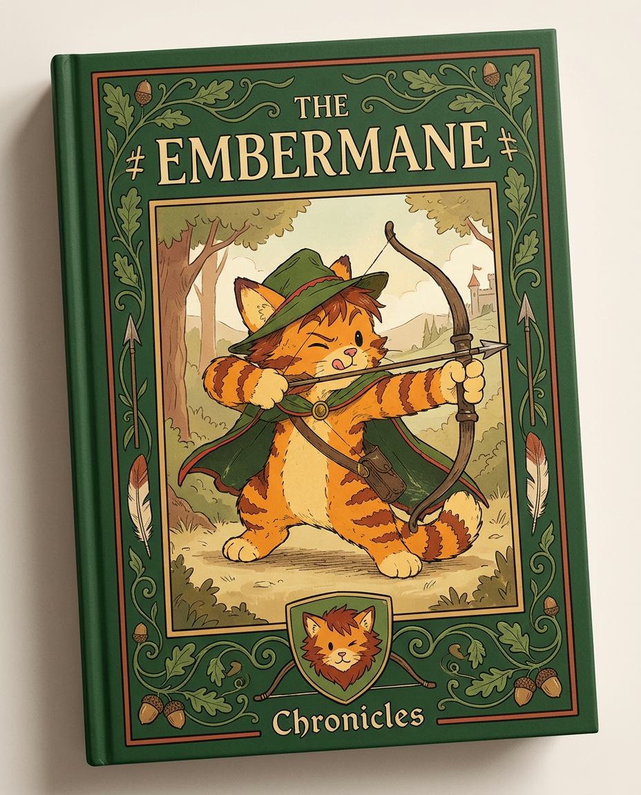
AI Design for Absolutely. Here's how I'd describe the entire cover as if it were written in a design document for an illustrator.

---

# 📖 THE EMBERMANE CHRONICLES

### Book 1 Cover Design Specification

## Overall Format

* Book size: **21 cm × 13.5 cm**
* Classic fantasy novel proportions.
* Matte finish.
* Storybook-inspired cover.
* Not realistic.
* Not modern.
* Warm, timeless, and iconic.

The cover should feel like something discovered in an old library, passed down through generations.

---

# Color Palette

### Primary Colors

🌲 Deep forest green

🔥 Warm red-brown

✨ Soft gold

📜 Cream

These colors should contrast strongly.

The green and red-brown should never blend together.

Instead:

* Green frames red-brown.
* Red-brown frames green.
* Gold highlights details.

The result should feel rich and elegant.

---

# Cover Layout

The cover is divided into two major sections:

## Outer Cover Frame

A thick decorative border surrounding the artwork.

This border is one of the defining visual features of the series.

When readers see this frame, they should instantly recognize:

> "That's an Embermane Chronicles book."

---

## Center Illustration Window

Inside the border sits a framed illustration.

Like a painting inside an old book cover.

The illustration occupies roughly:

60–70% of the front cover.

---

# The Border

### Main Border Color

Deep forest green.

### Border Decorations

The border contains elegant line art and embossing.

Features include:

🌿 Oak leaves

🌿 Vines

🏹 Arrows

🪶 Feathers

📜 Scrollwork

🌰 Acorns

The decorations should look inspired by medieval manuscripts.

Not overly complex.

Not cluttered.

Beautiful and readable.

---

# Hidden Symbols

The border contains tiny references to important characters.

Readers may not notice them immediately.

Examples:

📚 Milo's book

🛡 Rufus' tiny knight helmet

🗺 Shadow's compass

🎻 Ashen's fiddle

🌼 Pippa's flower

These should feel like little secrets.

---

# Title Placement

The title is integrated into the border.

Not floating over the artwork.

### Top Border

Small text:

**THE**

Below it:

# EMBERMANE

Large.

Very large.

The largest text on the cover.

The first thing people notice.

---

### Bottom Border

Smaller text:

**Chronicles**

Elegant.

Decorative.

Part of the frame itself.

---

# The Embermane Crest

Located at the bottom center.

Built into the border.

Not too large.

Not too small.

A symbol readers learn to recognize.

Possible design:

🐱 Stylized cat head

🔥 Red-brown mane

🌲 Green shield background

🏹 Small crossed bow behind it

Simple and iconic.

---

# Central Illustration

The illustration is framed by the border.

---

## Jasper Embermane

Standing slightly off-center.

The focus of the entire cover.

Features:

🐱 Orange tabby cat

🐱 Red-brown mane

🐱 Red-brown cheek stripes

🐱 Red-brown arm and leg markings

🐱 Red-brown ear tips

---

### Clothing

🌲 Green cloak

🌲 Green archer hat

🪶 Red feather

🔴 Thin red trim around the cloak edges

---

### Pose

Jasper is aiming his bow.

Not fighting.

Not dramatic.

Not angry.

Instead:

He is concentrating extremely hard.

One eye slightly squinted.

Tongue sticking out a little.

Like a kid trying his absolute best.

This detail makes him feel charming and relatable.

---

# Background

Soft storybook scenery.

Not detailed enough to distract.

Possible elements:

🌲 Forest

⛰ Distant mountains

🏰 Tiny glimpse of Embermane Hall

☁ Soft sky

The background exists only to support Jasper.

Jasper remains the star.

---

# Art Style

### Linework

* Clean outlines
* Storybook quality
* Slightly hand-drawn

### Coloring

* Flat colors
* Soft gradients
* Minimal shading

### Overall Feel

Somewhere between:

📖 Redwall

📖 Classic fantasy novels

📖 Illustrated children's adventure books

The goal is:

> A timeless fantasy storybook.

Not a movie poster.

Not a comic cover.

Not realism.

---

# Reader Impression

When someone sees the book for the first time, they should think:

> "Who is Embermane?"

Then:

> "Who is that cat?"

Then:

> "I want to know what's inside."

The cover should promise:

🌲 Adventure

🏹 Heroism

📜 Ancient history

🐱 Friendship

🍲 Warmth

✨ Wonder

And most importantly:

> The beginning of a very long chronicle.

That's how I imagine **The Embermane Chronicles** sitting on a bookshelf, looking like the first volume of a beloved fantasy saga. 🐱🏹📖🌲🔥

Absolutely. Here's how I'd describe the entire cover as if it were written in a design document for an illustrator. --- # 📖 THE EMBERMANE CHRONICLES ### Book 1 Cover Design Specification ## Overall Format * Book size: **21 cm × 13.5 cm** * Classic fantasy novel proportions. * Matte finish. * Storybook-inspired cover. * Not realistic. * Not modern. * Warm, timeless, and iconic. The cover should feel like something discovered in an old library, passed down through generations. --- # Color Palette ### Primary Colors 🌲 Deep forest green 🔥 Warm red-brown ✨ Soft gold 📜 Cream These colors should contrast strongly. The green and red-brown should never blend together. Instead: * Green frames red-brown. * Red-brown frames green. * Gold highlights details. The result should feel rich and elegant. --- # Cover Layout The cover is divided into two major sections: ## Outer Cover Frame A thick decorative border surrounding the artwork. This border is one of the defining visual features of the series. When readers see this frame, they should instantly recognize: > "That's an Embermane Chronicles book." --- ## Center Illustration Window Inside the border sits a framed illustration. Like a painting inside an old book cover. The illustration occupies roughly: 60–70% of the front cover. --- # The Border ### Main Border Color Deep forest green. ### Border Decorations The border contains elegant line art and embossing. Features include: 🌿 Oak leaves 🌿 Vines 🏹 Arrows 🪶 Feathers 📜 Scrollwork 🌰 Acorns The decorations should look inspired by medieval manuscripts. Not overly complex. Not cluttered. Beautiful and readable. --- # Hidden Symbols The border contains tiny references to important characters. Readers may not notice them immediately. Examples: 📚 Milo's book 🛡 Rufus' tiny knight helmet 🗺 Shadow's compass 🎻 Ashen's fiddle 🌼 Pippa's flower These should feel like little secrets. --- # Title Placement The title is integrated into the border. Not floating over the artwork. ### Top Border Small text: **THE** Below it: # EMBERMANE Large. Very large. The largest text on the cover. The first thing people notice. --- ### Bottom Border Smaller text: **Chronicles** Elegant. Decorative. Part of the frame itself. --- # The Embermane Crest Located at the bottom center. Built into the border. Not too large. Not too small. A symbol readers learn to recognize. Possible design: 🐱 Stylized cat head 🔥 Red-brown mane 🌲 Green shield background 🏹 Small crossed bow behind it Simple and iconic. --- # Central Illustration The illustration is framed by the border. --- ## Jasper Embermane Standing slightly off-center. The focus of the entire cover. Features: 🐱 Orange tabby cat 🐱 Red-brown mane 🐱 Red-brown cheek stripes 🐱 Red-brown arm and leg markings 🐱 Red-brown ear tips --- ### Clothing 🌲 Green cloak 🌲 Green archer hat 🪶 Red feather 🔴 Thin red trim around the cloak edges --- ### Pose Jasper is aiming his bow. Not fighting. Not dramatic. Not angry. Instead: He is concentrating extremely hard. One eye slightly squinted. Tongue sticking out a little. Like a kid trying his absolute best. This detail makes him feel charming and relatable. --- # Background Soft storybook scenery. Not detailed enough to distract. Possible elements: 🌲 Forest ⛰ Distant mountains 🏰 Tiny glimpse of Embermane Hall ☁ Soft sky The background exists only to support Jasper. Jasper remains the star. --- # Art Style ### Linework * Clean outlines * Storybook quality * Slightly hand-drawn ### Coloring * Flat colors * Soft gradients * Minimal shading ### Overall Feel Somewhere between: 📖 Redwall 📖 Classic fantasy novels 📖 Illustrated children's adventure books The goal is: > A timeless fantasy storybook. Not a movie poster. Not a comic cover. Not realism. --- # Reader Impression When someone sees the book for the first time, they should think: > "Who is Embermane?" Then: > "Who is that cat?" Then: > "I want to know what's inside." The cover should promise: 🌲 Adventure 🏹 Heroism 📜 Ancient history 🐱 Friendship 🍲 Warmth ✨ Wonder And most importantly: > The beginning of a very long chronicle. That's how I imagine **The Embermane Chronicles** sitting on a bookshelf, looking like the first volume of a beloved fantasy saga. 🐱🏹📖🌲🔥

by @Elephant_8984916
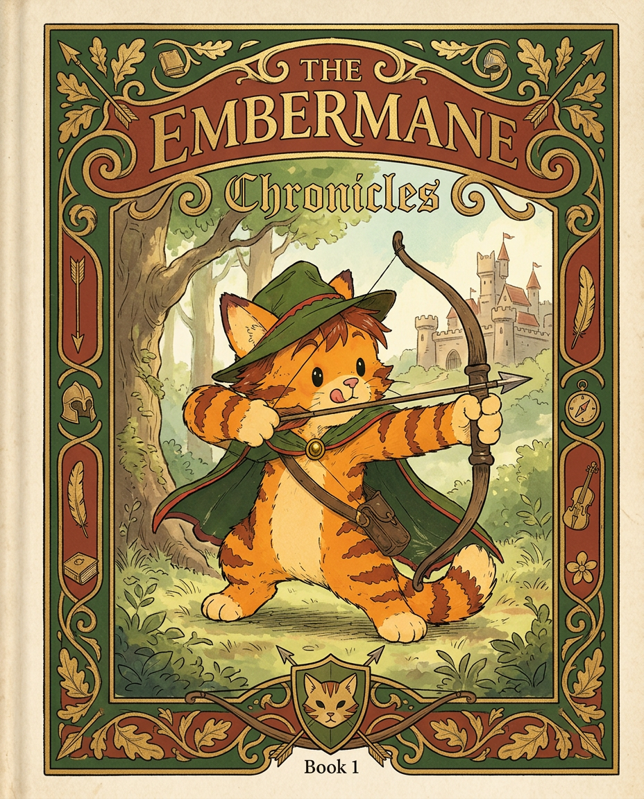
AI Design for Absolutely. Here's how I'd describe the entire cover as if it were written in a design document for an illustrator.

---

# 📖 THE EMBERMANE CHRONICLES

### Book 1 Cover Design Specification

## Overall Format

* Book size: **21 cm × 13.5 cm**
* Classic fantasy novel proportions.
* Matte finish.
* Storybook-inspired cover.
* Not realistic.
* Not modern.
* Warm, timeless, and iconic.

The cover should feel like something discovered in an old library, passed down through generations.

---

# Color Palette

### Primary Colors

🌲 Deep forest green

🔥 Warm red-brown

✨ Soft gold

📜 Cream

These colors should contrast strongly.

The green and red-brown should never blend together.

Instead:

* Green frames red-brown.
* Red-brown frames green.
* Gold highlights details.

The result should feel rich and elegant.

---

# Cover Layout

The cover is divided into two major sections:

## Outer Cover Frame

A thick decorative border surrounding the artwork.

This border is one of the defining visual features of the series.

When readers see this frame, they should instantly recognize:

> "That's an Embermane Chronicles book."

---

## Center Illustration Window

Inside the border sits a framed illustration.

Like a painting inside an old book cover.

The illustration occupies roughly:

60–70% of the front cover.

---

# The Border

### Main Border Color

Deep forest green.

### Border Decorations

The border contains elegant line art and embossing.

Features include:

🌿 Oak leaves

🌿 Vines

🏹 Arrows

🪶 Feathers

📜 Scrollwork

🌰 Acorns

The decorations should look inspired by medieval manuscripts.

Not overly complex.

Not cluttered.

Beautiful and readable.

---

# Hidden Symbols

The border contains tiny references to important characters.

Readers may not notice them immediately.

Examples:

📚 Milo's book

🛡 Rufus' tiny knight helmet

🗺 Shadow's compass

🎻 Ashen's fiddle

🌼 Pippa's flower

These should feel like little secrets.

---

# Title Placement

The title is integrated into the border.

Not floating over the artwork.

### Top Border

Small text:

**THE**

Below it:

# EMBERMANE

Large.

Very large.

The largest text on the cover.

The first thing people notice.

---

### Bottom Border

Smaller text:

**Chronicles**

Elegant.

Decorative.

Part of the frame itself.

---

# The Embermane Crest

Located at the bottom center.

Built into the border.

Not too large.

Not too small.

A symbol readers learn to recognize.

Possible design:

🐱 Stylized cat head

🔥 Red-brown mane

🌲 Green shield background

🏹 Small crossed bow behind it

Simple and iconic.

---

# Central Illustration

The illustration is framed by the border.

---

## Jasper Embermane

Standing slightly off-center.

The focus of the entire cover.

Features:

🐱 Orange tabby cat

🐱 Red-brown mane

🐱 Red-brown cheek stripes

🐱 Red-brown arm and leg markings

🐱 Red-brown ear tips

---

### Clothing

🌲 Green cloak

🌲 Green archer hat

🪶 Red feather

🔴 Thin red trim around the cloak edges

---

### Pose

Jasper is aiming his bow.

Not fighting.

Not dramatic.

Not angry.

Instead:

He is concentrating extremely hard.

One eye slightly squinted.

Tongue sticking out a little.

Like a kid trying his absolute best.

This detail makes him feel charming and relatable.

---

# Background

Soft storybook scenery.

Not detailed enough to distract.

Possible elements:

🌲 Forest

⛰ Distant mountains

🏰 Tiny glimpse of Embermane Hall

☁ Soft sky

The background exists only to support Jasper.

Jasper remains the star.

---

# Art Style

### Linework

* Clean outlines
* Storybook quality
* Slightly hand-drawn

### Coloring

* Flat colors
* Soft gradients
* Minimal shading

### Overall Feel

Somewhere between:

📖 Redwall

📖 Classic fantasy novels

📖 Illustrated children's adventure books

The goal is:

> A timeless fantasy storybook.

Not a movie poster.

Not a comic cover.

Not realism.

---

# Reader Impression

When someone sees the book for the first time, they should think:

> "Who is Embermane?"

Then:

> "Who is that cat?"

Then:

> "I want to know what's inside."

The cover should promise:

🌲 Adventure

🏹 Heroism

📜 Ancient history

🐱 Friendship

🍲 Warmth

✨ Wonder

And most importantly:

> The beginning of a very long chronicle.

That's how I imagine **The Embermane Chronicles** sitting on a bookshelf, looking like the first volume of a beloved fantasy saga. 🐱🏹📖🌲🔥

Absolutely. Here's how I'd describe the entire cover as if it were written in a design document for an illustrator. --- # 📖 THE EMBERMANE CHRONICLES ### Book 1 Cover Design Specification ## Overall Format * Book size: **21 cm × 13.5 cm** * Classic fantasy novel proportions. * Matte finish. * Storybook-inspired cover. * Not realistic. * Not modern. * Warm, timeless, and iconic. The cover should feel like something discovered in an old library, passed down through generations. --- # Color Palette ### Primary Colors 🌲 Deep forest green 🔥 Warm red-brown ✨ Soft gold 📜 Cream These colors should contrast strongly. The green and red-brown should never blend together. Instead: * Green frames red-brown. * Red-brown frames green. * Gold highlights details. The result should feel rich and elegant. --- # Cover Layout The cover is divided into two major sections: ## Outer Cover Frame A thick decorative border surrounding the artwork. This border is one of the defining visual features of the series. When readers see this frame, they should instantly recognize: > "That's an Embermane Chronicles book." --- ## Center Illustration Window Inside the border sits a framed illustration. Like a painting inside an old book cover. The illustration occupies roughly: 60–70% of the front cover. --- # The Border ### Main Border Color Deep forest green. ### Border Decorations The border contains elegant line art and embossing. Features include: 🌿 Oak leaves 🌿 Vines 🏹 Arrows 🪶 Feathers 📜 Scrollwork 🌰 Acorns The decorations should look inspired by medieval manuscripts. Not overly complex. Not cluttered. Beautiful and readable. --- # Hidden Symbols The border contains tiny references to important characters. Readers may not notice them immediately. Examples: 📚 Milo's book 🛡 Rufus' tiny knight helmet 🗺 Shadow's compass 🎻 Ashen's fiddle 🌼 Pippa's flower These should feel like little secrets. --- # Title Placement The title is integrated into the border. Not floating over the artwork. ### Top Border Small text: **THE** Below it: # EMBERMANE Large. Very large. The largest text on the cover. The first thing people notice. --- ### Bottom Border Smaller text: **Chronicles** Elegant. Decorative. Part of the frame itself. --- # The Embermane Crest Located at the bottom center. Built into the border. Not too large. Not too small. A symbol readers learn to recognize. Possible design: 🐱 Stylized cat head 🔥 Red-brown mane 🌲 Green shield background 🏹 Small crossed bow behind it Simple and iconic. --- # Central Illustration The illustration is framed by the border. --- ## Jasper Embermane Standing slightly off-center. The focus of the entire cover. Features: 🐱 Orange tabby cat 🐱 Red-brown mane 🐱 Red-brown cheek stripes 🐱 Red-brown arm and leg markings 🐱 Red-brown ear tips --- ### Clothing 🌲 Green cloak 🌲 Green archer hat 🪶 Red feather 🔴 Thin red trim around the cloak edges --- ### Pose Jasper is aiming his bow. Not fighting. Not dramatic. Not angry. Instead: He is concentrating extremely hard. One eye slightly squinted. Tongue sticking out a little. Like a kid trying his absolute best. This detail makes him feel charming and relatable. --- # Background Soft storybook scenery. Not detailed enough to distract. Possible elements: 🌲 Forest ⛰ Distant mountains 🏰 Tiny glimpse of Embermane Hall ☁ Soft sky The background exists only to support Jasper. Jasper remains the star. --- # Art Style ### Linework * Clean outlines * Storybook quality * Slightly hand-drawn ### Coloring * Flat colors * Soft gradients * Minimal shading ### Overall Feel Somewhere between: 📖 Redwall 📖 Classic fantasy novels 📖 Illustrated children's adventure books The goal is: > A timeless fantasy storybook. Not a movie poster. Not a comic cover. Not realism. --- # Reader Impression When someone sees the book for the first time, they should think: > "Who is Embermane?" Then: > "Who is that cat?" Then: > "I want to know what's inside." The cover should promise: 🌲 Adventure 🏹 Heroism 📜 Ancient history 🐱 Friendship 🍲 Warmth ✨ Wonder And most importantly: > The beginning of a very long chronicle. That's how I imagine **The Embermane Chronicles** sitting on a bookshelf, looking like the first volume of a beloved fantasy saga. 🐱🏹📖🌲🔥

by @Elephant_8984916
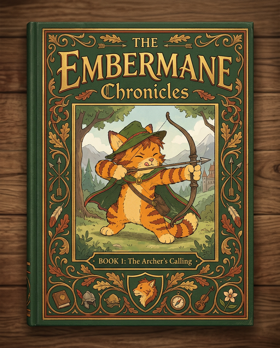
AI Design for Absolutely. Here's how I'd describe the entire cover as if it were written in a design document for an illustrator.

---

# 📖 THE EMBERMANE CHRONICLES

### Book 1 Cover Design Specification

## Overall Format

* Book size: **21 cm × 13.5 cm**
* Classic fantasy novel proportions.
* Matte finish.
* Storybook-inspired cover.
* Not realistic.
* Not modern.
* Warm, timeless, and iconic.

The cover should feel like something discovered in an old library, passed down through generations.

---

# Color Palette

### Primary Colors

🌲 Deep forest green

🔥 Warm red-brown

✨ Soft gold

📜 Cream

These colors should contrast strongly.

The green and red-brown should never blend together.

Instead:

* Green frames red-brown.
* Red-brown frames green.
* Gold highlights details.

The result should feel rich and elegant.

---

# Cover Layout

The cover is divided into two major sections:

## Outer Cover Frame

A thick decorative border surrounding the artwork.

This border is one of the defining visual features of the series.

When readers see this frame, they should instantly recognize:

> "That's an Embermane Chronicles book."

---

## Center Illustration Window

Inside the border sits a framed illustration.

Like a painting inside an old book cover.

The illustration occupies roughly:

60–70% of the front cover.

---

# The Border

### Main Border Color

Deep forest green.

### Border Decorations

The border contains elegant line art and embossing.

Features include:

🌿 Oak leaves

🌿 Vines

🏹 Arrows

🪶 Feathers

📜 Scrollwork

🌰 Acorns

The decorations should look inspired by medieval manuscripts.

Not overly complex.

Not cluttered.

Beautiful and readable.

---

# Hidden Symbols

The border contains tiny references to important characters.

Readers may not notice them immediately.

Examples:

📚 Milo's book

🛡 Rufus' tiny knight helmet

🗺 Shadow's compass

🎻 Ashen's fiddle

🌼 Pippa's flower

These should feel like little secrets.

---

# Title Placement

The title is integrated into the border.

Not floating over the artwork.

### Top Border

Small text:

**THE**

Below it:

# EMBERMANE

Large.

Very large.

The largest text on the cover.

The first thing people notice.

---

### Bottom Border

Smaller text:

**Chronicles**

Elegant.

Decorative.

Part of the frame itself.

---

# The Embermane Crest

Located at the bottom center.

Built into the border.

Not too large.

Not too small.

A symbol readers learn to recognize.

Possible design:

🐱 Stylized cat head

🔥 Red-brown mane

🌲 Green shield background

🏹 Small crossed bow behind it

Simple and iconic.

---

# Central Illustration

The illustration is framed by the border.

---

## Jasper Embermane

Standing slightly off-center.

The focus of the entire cover.

Features:

🐱 Orange tabby cat

🐱 Red-brown mane

🐱 Red-brown cheek stripes

🐱 Red-brown arm and leg markings

🐱 Red-brown ear tips

---

### Clothing

🌲 Green cloak

🌲 Green archer hat

🪶 Red feather

🔴 Thin red trim around the cloak edges

---

### Pose

Jasper is aiming his bow.

Not fighting.

Not dramatic.

Not angry.

Instead:

He is concentrating extremely hard.

One eye slightly squinted.

Tongue sticking out a little.

Like a kid trying his absolute best.

This detail makes him feel charming and relatable.

---

# Background

Soft storybook scenery.

Not detailed enough to distract.

Possible elements:

🌲 Forest

⛰ Distant mountains

🏰 Tiny glimpse of Embermane Hall

☁ Soft sky

The background exists only to support Jasper.

Jasper remains the star.

---

# Art Style

### Linework

* Clean outlines
* Storybook quality
* Slightly hand-drawn

### Coloring

* Flat colors
* Soft gradients
* Minimal shading

### Overall Feel

Somewhere between:

📖 Redwall

📖 Classic fantasy novels

📖 Illustrated children's adventure books

The goal is:

> A timeless fantasy storybook.

Not a movie poster.

Not a comic cover.

Not realism.

---

# Reader Impression

When someone sees the book for the first time, they should think:

> "Who is Embermane?"

Then:

> "Who is that cat?"

Then:

> "I want to know what's inside."

The cover should promise:

🌲 Adventure

🏹 Heroism

📜 Ancient history

🐱 Friendship

🍲 Warmth

✨ Wonder

And most importantly:

> The beginning of a very long chronicle.

That's how I imagine **The Embermane Chronicles** sitting on a bookshelf, looking like the first volume of a beloved fantasy saga. 🐱🏹📖🌲🔥

Absolutely. Here's how I'd describe the entire cover as if it were written in a design document for an illustrator. --- # 📖 THE EMBERMANE CHRONICLES ### Book 1 Cover Design Specification ## Overall Format * Book size: **21 cm × 13.5 cm** * Classic fantasy novel proportions. * Matte finish. * Storybook-inspired cover. * Not realistic. * Not modern. * Warm, timeless, and iconic. The cover should feel like something discovered in an old library, passed down through generations. --- # Color Palette ### Primary Colors 🌲 Deep forest green 🔥 Warm red-brown ✨ Soft gold 📜 Cream These colors should contrast strongly. The green and red-brown should never blend together. Instead: * Green frames red-brown. * Red-brown frames green. * Gold highlights details. The result should feel rich and elegant. --- # Cover Layout The cover is divided into two major sections: ## Outer Cover Frame A thick decorative border surrounding the artwork. This border is one of the defining visual features of the series. When readers see this frame, they should instantly recognize: > "That's an Embermane Chronicles book." --- ## Center Illustration Window Inside the border sits a framed illustration. Like a painting inside an old book cover. The illustration occupies roughly: 60–70% of the front cover. --- # The Border ### Main Border Color Deep forest green. ### Border Decorations The border contains elegant line art and embossing. Features include: 🌿 Oak leaves 🌿 Vines 🏹 Arrows 🪶 Feathers 📜 Scrollwork 🌰 Acorns The decorations should look inspired by medieval manuscripts. Not overly complex. Not cluttered. Beautiful and readable. --- # Hidden Symbols The border contains tiny references to important characters. Readers may not notice them immediately. Examples: 📚 Milo's book 🛡 Rufus' tiny knight helmet 🗺 Shadow's compass 🎻 Ashen's fiddle 🌼 Pippa's flower These should feel like little secrets. --- # Title Placement The title is integrated into the border. Not floating over the artwork. ### Top Border Small text: **THE** Below it: # EMBERMANE Large. Very large. The largest text on the cover. The first thing people notice. --- ### Bottom Border Smaller text: **Chronicles** Elegant. Decorative. Part of the frame itself. --- # The Embermane Crest Located at the bottom center. Built into the border. Not too large. Not too small. A symbol readers learn to recognize. Possible design: 🐱 Stylized cat head 🔥 Red-brown mane 🌲 Green shield background 🏹 Small crossed bow behind it Simple and iconic. --- # Central Illustration The illustration is framed by the border. --- ## Jasper Embermane Standing slightly off-center. The focus of the entire cover. Features: 🐱 Orange tabby cat 🐱 Red-brown mane 🐱 Red-brown cheek stripes 🐱 Red-brown arm and leg markings 🐱 Red-brown ear tips --- ### Clothing 🌲 Green cloak 🌲 Green archer hat 🪶 Red feather 🔴 Thin red trim around the cloak edges --- ### Pose Jasper is aiming his bow. Not fighting. Not dramatic. Not angry. Instead: He is concentrating extremely hard. One eye slightly squinted. Tongue sticking out a little. Like a kid trying his absolute best. This detail makes him feel charming and relatable. --- # Background Soft storybook scenery. Not detailed enough to distract. Possible elements: 🌲 Forest ⛰ Distant mountains 🏰 Tiny glimpse of Embermane Hall ☁ Soft sky The background exists only to support Jasper. Jasper remains the star. --- # Art Style ### Linework * Clean outlines * Storybook quality * Slightly hand-drawn ### Coloring * Flat colors * Soft gradients * Minimal shading ### Overall Feel Somewhere between: 📖 Redwall 📖 Classic fantasy novels 📖 Illustrated children's adventure books The goal is: > A timeless fantasy storybook. Not a movie poster. Not a comic cover. Not realism. --- # Reader Impression When someone sees the book for the first time, they should think: > "Who is Embermane?" Then: > "Who is that cat?" Then: > "I want to know what's inside." The cover should promise: 🌲 Adventure 🏹 Heroism 📜 Ancient history 🐱 Friendship 🍲 Warmth ✨ Wonder And most importantly: > The beginning of a very long chronicle. That's how I imagine **The Embermane Chronicles** sitting on a bookshelf, looking like the first volume of a beloved fantasy saga. 🐱🏹📖🌲🔥

by @Elephant_8984916
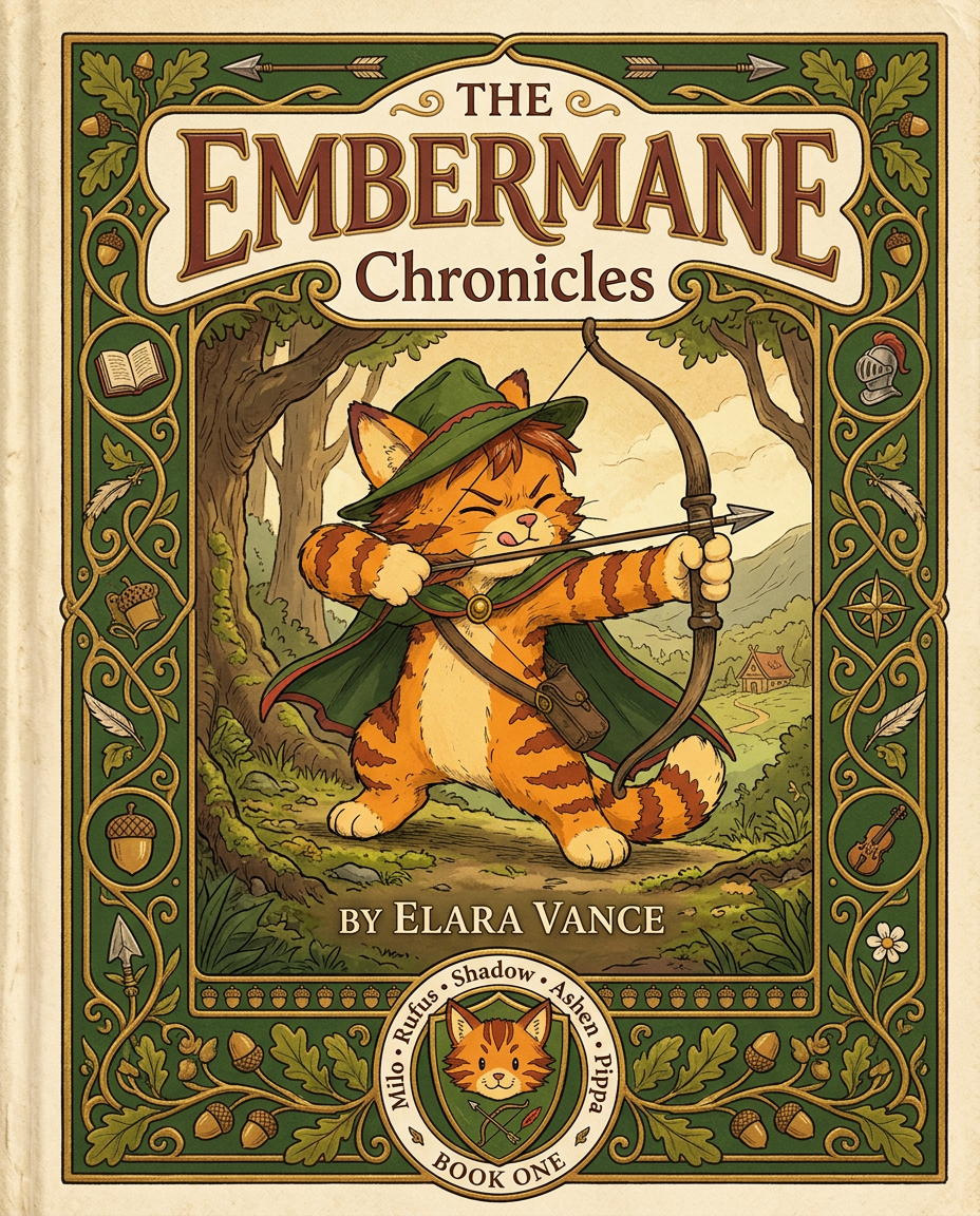
AI Design for Absolutely. Here's how I'd describe the entire cover as if it were written in a design document for an illustrator.

---

# 📖 THE EMBERMANE CHRONICLES

### Book 1 Cover Design Specification

## Overall Format

* Book size: **21 cm × 13.5 cm**
* Classic fantasy novel proportions.
* Matte finish.
* Storybook-inspired cover.
* Not realistic.
* Not modern.
* Warm, timeless, and iconic.

The cover should feel like something discovered in an old library, passed down through generations.

---

# Color Palette

### Primary Colors

🌲 Deep forest green

🔥 Warm red-brown

✨ Soft gold

📜 Cream

These colors should contrast strongly.

The green and red-brown should never blend together.

Instead:

* Green frames red-brown.
* Red-brown frames green.
* Gold highlights details.

The result should feel rich and elegant.

---

# Cover Layout

The cover is divided into two major sections:

## Outer Cover Frame

A thick decorative border surrounding the artwork.

This border is one of the defining visual features of the series.

When readers see this frame, they should instantly recognize:

> "That's an Embermane Chronicles book."

---

## Center Illustration Window

Inside the border sits a framed illustration.

Like a painting inside an old book cover.

The illustration occupies roughly:

60–70% of the front cover.

---

# The Border

### Main Border Color

Deep forest green.

### Border Decorations

The border contains elegant line art and embossing.

Features include:

🌿 Oak leaves

🌿 Vines

🏹 Arrows

🪶 Feathers

📜 Scrollwork

🌰 Acorns

The decorations should look inspired by medieval manuscripts.

Not overly complex.

Not cluttered.

Beautiful and readable.

---

# Hidden Symbols

The border contains tiny references to important characters.

Readers may not notice them immediately.

Examples:

📚 Milo's book

🛡 Rufus' tiny knight helmet

🗺 Shadow's compass

🎻 Ashen's fiddle

🌼 Pippa's flower

These should feel like little secrets.

---

# Title Placement

The title is integrated into the border.

Not floating over the artwork.

### Top Border

Small text:

**THE**

Below it:

# EMBERMANE

Large.

Very large.

The largest text on the cover.

The first thing people notice.

---

### Bottom Border

Smaller text:

**Chronicles**

Elegant.

Decorative.

Part of the frame itself.

---

# The Embermane Crest

Located at the bottom center.

Built into the border.

Not too large.

Not too small.

A symbol readers learn to recognize.

Possible design:

🐱 Stylized cat head

🔥 Red-brown mane

🌲 Green shield background

🏹 Small crossed bow behind it

Simple and iconic.

---

# Central Illustration

The illustration is framed by the border.

---

## Jasper Embermane

Standing slightly off-center.

The focus of the entire cover.

Features:

🐱 Orange tabby cat

🐱 Red-brown mane

🐱 Red-brown cheek stripes

🐱 Red-brown arm and leg markings

🐱 Red-brown ear tips

---

### Clothing

🌲 Green cloak

🌲 Green archer hat

🪶 Red feather

🔴 Thin red trim around the cloak edges

---

### Pose

Jasper is aiming his bow.

Not fighting.

Not dramatic.

Not angry.

Instead:

He is concentrating extremely hard.

One eye slightly squinted.

Tongue sticking out a little.

Like a kid trying his absolute best.

This detail makes him feel charming and relatable.

---

# Background

Soft storybook scenery.

Not detailed enough to distract.

Possible elements:

🌲 Forest

⛰ Distant mountains

🏰 Tiny glimpse of Embermane Hall

☁ Soft sky

The background exists only to support Jasper.

Jasper remains the star.

---

# Art Style

### Linework

* Clean outlines
* Storybook quality
* Slightly hand-drawn

### Coloring

* Flat colors
* Soft gradients
* Minimal shading

### Overall Feel

Somewhere between:

📖 Redwall

📖 Classic fantasy novels

📖 Illustrated children's adventure books

The goal is:

> A timeless fantasy storybook.

Not a movie poster.

Not a comic cover.

Not realism.

---

# Reader Impression

When someone sees the book for the first time, they should think:

> "Who is Embermane?"

Then:

> "Who is that cat?"

Then:

> "I want to know what's inside."

The cover should promise:

🌲 Adventure

🏹 Heroism

📜 Ancient history

🐱 Friendship

🍲 Warmth

✨ Wonder

And most importantly:

> The beginning of a very long chronicle.

That's how I imagine **The Embermane Chronicles** sitting on a bookshelf, looking like the first volume of a beloved fantasy saga. 🐱🏹📖🌲🔥

Absolutely. Here's how I'd describe the entire cover as if it were written in a design document for an illustrator. --- # 📖 THE EMBERMANE CHRONICLES ### Book 1 Cover Design Specification ## Overall Format * Book size: **21 cm × 13.5 cm** * Classic fantasy novel proportions. * Matte finish. * Storybook-inspired cover. * Not realistic. * Not modern. * Warm, timeless, and iconic. The cover should feel like something discovered in an old library, passed down through generations. --- # Color Palette ### Primary Colors 🌲 Deep forest green 🔥 Warm red-brown ✨ Soft gold 📜 Cream These colors should contrast strongly. The green and red-brown should never blend together. Instead: * Green frames red-brown. * Red-brown frames green. * Gold highlights details. The result should feel rich and elegant. --- # Cover Layout The cover is divided into two major sections: ## Outer Cover Frame A thick decorative border surrounding the artwork. This border is one of the defining visual features of the series. When readers see this frame, they should instantly recognize: > "That's an Embermane Chronicles book." --- ## Center Illustration Window Inside the border sits a framed illustration. Like a painting inside an old book cover. The illustration occupies roughly: 60–70% of the front cover. --- # The Border ### Main Border Color Deep forest green. ### Border Decorations The border contains elegant line art and embossing. Features include: 🌿 Oak leaves 🌿 Vines 🏹 Arrows 🪶 Feathers 📜 Scrollwork 🌰 Acorns The decorations should look inspired by medieval manuscripts. Not overly complex. Not cluttered. Beautiful and readable. --- # Hidden Symbols The border contains tiny references to important characters. Readers may not notice them immediately. Examples: 📚 Milo's book 🛡 Rufus' tiny knight helmet 🗺 Shadow's compass 🎻 Ashen's fiddle 🌼 Pippa's flower These should feel like little secrets. --- # Title Placement The title is integrated into the border. Not floating over the artwork. ### Top Border Small text: **THE** Below it: # EMBERMANE Large. Very large. The largest text on the cover. The first thing people notice. --- ### Bottom Border Smaller text: **Chronicles** Elegant. Decorative. Part of the frame itself. --- # The Embermane Crest Located at the bottom center. Built into the border. Not too large. Not too small. A symbol readers learn to recognize. Possible design: 🐱 Stylized cat head 🔥 Red-brown mane 🌲 Green shield background 🏹 Small crossed bow behind it Simple and iconic. --- # Central Illustration The illustration is framed by the border. --- ## Jasper Embermane Standing slightly off-center. The focus of the entire cover. Features: 🐱 Orange tabby cat 🐱 Red-brown mane 🐱 Red-brown cheek stripes 🐱 Red-brown arm and leg markings 🐱 Red-brown ear tips --- ### Clothing 🌲 Green cloak 🌲 Green archer hat 🪶 Red feather 🔴 Thin red trim around the cloak edges --- ### Pose Jasper is aiming his bow. Not fighting. Not dramatic. Not angry. Instead: He is concentrating extremely hard. One eye slightly squinted. Tongue sticking out a little. Like a kid trying his absolute best. This detail makes him feel charming and relatable. --- # Background Soft storybook scenery. Not detailed enough to distract. Possible elements: 🌲 Forest ⛰ Distant mountains 🏰 Tiny glimpse of Embermane Hall ☁ Soft sky The background exists only to support Jasper. Jasper remains the star. --- # Art Style ### Linework * Clean outlines * Storybook quality * Slightly hand-drawn ### Coloring * Flat colors * Soft gradients * Minimal shading ### Overall Feel Somewhere between: 📖 Redwall 📖 Classic fantasy novels 📖 Illustrated children's adventure books The goal is: > A timeless fantasy storybook. Not a movie poster. Not a comic cover. Not realism. --- # Reader Impression When someone sees the book for the first time, they should think: > "Who is Embermane?" Then: > "Who is that cat?" Then: > "I want to know what's inside." The cover should promise: 🌲 Adventure 🏹 Heroism 📜 Ancient history 🐱 Friendship 🍲 Warmth ✨ Wonder And most importantly: > The beginning of a very long chronicle. That's how I imagine **The Embermane Chronicles** sitting on a bookshelf, looking like the first volume of a beloved fantasy saga. 🐱🏹📖🌲🔥

by @Elephant_8984916
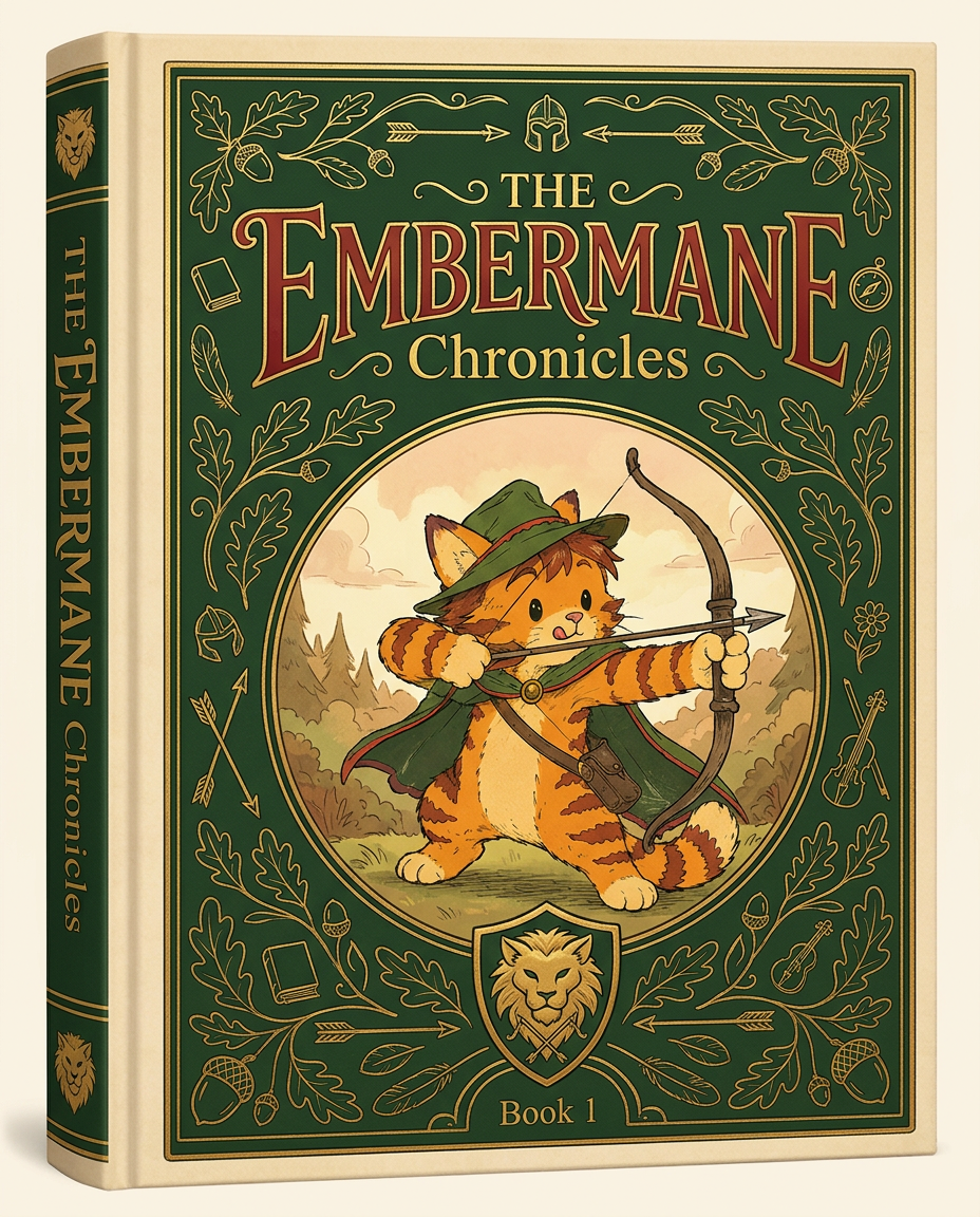
AI Design for Absolutely. Here's how I'd describe the entire cover as if it were written in a design document for an illustrator.

---

# 📖 THE EMBERMANE CHRONICLES

### Book 1 Cover Design Specification

## Overall Format

* Book size: **21 cm × 13.5 cm**
* Classic fantasy novel proportions.
* Matte finish.
* Storybook-inspired cover.
* Not realistic.
* Not modern.
* Warm, timeless, and iconic.

The cover should feel like something discovered in an old library, passed down through generations.

---

# Color Palette

### Primary Colors

🌲 Deep forest green

🔥 Warm red-brown

✨ Soft gold

📜 Cream

These colors should contrast strongly.

The green and red-brown should never blend together.

Instead:

* Green frames red-brown.
* Red-brown frames green.
* Gold highlights details.

The result should feel rich and elegant.

---

# Cover Layout

The cover is divided into two major sections:

## Outer Cover Frame

A thick decorative border surrounding the artwork.

This border is one of the defining visual features of the series.

When readers see this frame, they should instantly recognize:

> "That's an Embermane Chronicles book."

---

## Center Illustration Window

Inside the border sits a framed illustration.

Like a painting inside an old book cover.

The illustration occupies roughly:

60–70% of the front cover.

---

# The Border

### Main Border Color

Deep forest green.

### Border Decorations

The border contains elegant line art and embossing.

Features include:

🌿 Oak leaves

🌿 Vines

🏹 Arrows

🪶 Feathers

📜 Scrollwork

🌰 Acorns

The decorations should look inspired by medieval manuscripts.

Not overly complex.

Not cluttered.

Beautiful and readable.

---

# Hidden Symbols

The border contains tiny references to important characters.

Readers may not notice them immediately.

Examples:

📚 Milo's book

🛡 Rufus' tiny knight helmet

🗺 Shadow's compass

🎻 Ashen's fiddle

🌼 Pippa's flower

These should feel like little secrets.

---

# Title Placement

The title is integrated into the border.

Not floating over the artwork.

### Top Border

Small text:

**THE**

Below it:

# EMBERMANE

Large.

Very large.

The largest text on the cover.

The first thing people notice.

---

### Bottom Border

Smaller text:

**Chronicles**

Elegant.

Decorative.

Part of the frame itself.

---

# The Embermane Crest

Located at the bottom center.

Built into the border.

Not too large.

Not too small.

A symbol readers learn to recognize.

Possible design:

🐱 Stylized cat head

🔥 Red-brown mane

🌲 Green shield background

🏹 Small crossed bow behind it

Simple and iconic.

---

# Central Illustration

The illustration is framed by the border.

---

## Jasper Embermane

Standing slightly off-center.

The focus of the entire cover.

Features:

🐱 Orange tabby cat

🐱 Red-brown mane

🐱 Red-brown cheek stripes

🐱 Red-brown arm and leg markings

🐱 Red-brown ear tips

---

### Clothing

🌲 Green cloak

🌲 Green archer hat

🪶 Red feather

🔴 Thin red trim around the cloak edges

---

### Pose

Jasper is aiming his bow.

Not fighting.

Not dramatic.

Not angry.

Instead:

He is concentrating extremely hard.

One eye slightly squinted.

Tongue sticking out a little.

Like a kid trying his absolute best.

This detail makes him feel charming and relatable.

---

# Background

Soft storybook scenery.

Not detailed enough to distract.

Possible elements:

🌲 Forest

⛰ Distant mountains

🏰 Tiny glimpse of Embermane Hall

☁ Soft sky

The background exists only to support Jasper.

Jasper remains the star.

---

# Art Style

### Linework

* Clean outlines
* Storybook quality
* Slightly hand-drawn

### Coloring

* Flat colors
* Soft gradients
* Minimal shading

### Overall Feel

Somewhere between:

📖 Redwall

📖 Classic fantasy novels

📖 Illustrated children's adventure books

The goal is:

> A timeless fantasy storybook.

Not a movie poster.

Not a comic cover.

Not realism.

---

# Reader Impression

When someone sees the book for the first time, they should think:

> "Who is Embermane?"

Then:

> "Who is that cat?"

Then:

> "I want to know what's inside."

The cover should promise:

🌲 Adventure

🏹 Heroism

📜 Ancient history

🐱 Friendship

🍲 Warmth

✨ Wonder

And most importantly:

> The beginning of a very long chronicle.

That's how I imagine **The Embermane Chronicles** sitting on a bookshelf, looking like the first volume of a beloved fantasy saga. 🐱🏹📖🌲🔥

Absolutely. Here's how I'd describe the entire cover as if it were written in a design document for an illustrator. --- # 📖 THE EMBERMANE CHRONICLES ### Book 1 Cover Design Specification ## Overall Format * Book size: **21 cm × 13.5 cm** * Classic fantasy novel proportions. * Matte finish. * Storybook-inspired cover. * Not realistic. * Not modern. * Warm, timeless, and iconic. The cover should feel like something discovered in an old library, passed down through generations. --- # Color Palette ### Primary Colors 🌲 Deep forest green 🔥 Warm red-brown ✨ Soft gold 📜 Cream These colors should contrast strongly. The green and red-brown should never blend together. Instead: * Green frames red-brown. * Red-brown frames green. * Gold highlights details. The result should feel rich and elegant. --- # Cover Layout The cover is divided into two major sections: ## Outer Cover Frame A thick decorative border surrounding the artwork. This border is one of the defining visual features of the series. When readers see this frame, they should instantly recognize: > "That's an Embermane Chronicles book." --- ## Center Illustration Window Inside the border sits a framed illustration. Like a painting inside an old book cover. The illustration occupies roughly: 60–70% of the front cover. --- # The Border ### Main Border Color Deep forest green. ### Border Decorations The border contains elegant line art and embossing. Features include: 🌿 Oak leaves 🌿 Vines 🏹 Arrows 🪶 Feathers 📜 Scrollwork 🌰 Acorns The decorations should look inspired by medieval manuscripts. Not overly complex. Not cluttered. Beautiful and readable. --- # Hidden Symbols The border contains tiny references to important characters. Readers may not notice them immediately. Examples: 📚 Milo's book 🛡 Rufus' tiny knight helmet 🗺 Shadow's compass 🎻 Ashen's fiddle 🌼 Pippa's flower These should feel like little secrets. --- # Title Placement The title is integrated into the border. Not floating over the artwork. ### Top Border Small text: **THE** Below it: # EMBERMANE Large. Very large. The largest text on the cover. The first thing people notice. --- ### Bottom Border Smaller text: **Chronicles** Elegant. Decorative. Part of the frame itself. --- # The Embermane Crest Located at the bottom center. Built into the border. Not too large. Not too small. A symbol readers learn to recognize. Possible design: 🐱 Stylized cat head 🔥 Red-brown mane 🌲 Green shield background 🏹 Small crossed bow behind it Simple and iconic. --- # Central Illustration The illustration is framed by the border. --- ## Jasper Embermane Standing slightly off-center. The focus of the entire cover. Features: 🐱 Orange tabby cat 🐱 Red-brown mane 🐱 Red-brown cheek stripes 🐱 Red-brown arm and leg markings 🐱 Red-brown ear tips --- ### Clothing 🌲 Green cloak 🌲 Green archer hat 🪶 Red feather 🔴 Thin red trim around the cloak edges --- ### Pose Jasper is aiming his bow. Not fighting. Not dramatic. Not angry. Instead: He is concentrating extremely hard. One eye slightly squinted. Tongue sticking out a little. Like a kid trying his absolute best. This detail makes him feel charming and relatable. --- # Background Soft storybook scenery. Not detailed enough to distract. Possible elements: 🌲 Forest ⛰ Distant mountains 🏰 Tiny glimpse of Embermane Hall ☁ Soft sky The background exists only to support Jasper. Jasper remains the star. --- # Art Style ### Linework * Clean outlines * Storybook quality * Slightly hand-drawn ### Coloring * Flat colors * Soft gradients * Minimal shading ### Overall Feel Somewhere between: 📖 Redwall 📖 Classic fantasy novels 📖 Illustrated children's adventure books The goal is: > A timeless fantasy storybook. Not a movie poster. Not a comic cover. Not realism. --- # Reader Impression When someone sees the book for the first time, they should think: > "Who is Embermane?" Then: > "Who is that cat?" Then: > "I want to know what's inside." The cover should promise: 🌲 Adventure 🏹 Heroism 📜 Ancient history 🐱 Friendship 🍲 Warmth ✨ Wonder And most importantly: > The beginning of a very long chronicle. That's how I imagine **The Embermane Chronicles** sitting on a bookshelf, looking like the first volume of a beloved fantasy saga. 🐱🏹📖🌲🔥

by @Elephant_8984916

AI Design for make it full screen and keep the guy middle of the frame

make it full screen and keep the guy middle of the frame

by @Elephant_4884988

AI Design for make it futuristic

make it futuristic

by @Elephant_8017673

AI Design for make it futuristic

make it futuristic

by @Elephant_8017673

AI Design for make it futuristic

make it futuristic

by @Elephant_8017673

AI Design for make it futuristic

make it futuristic

by @Elephant_8017673

AI Design for make it futuristic

make it futuristic

by @Elephant_8017673

AI Design for make it futuristic

make it futuristic

by @Elephant_8017673

AI Design for make it futuristic

make it futuristic

by @Elephant_8017673

AI Design for make it futuristic

make it futuristic

by @Elephant_8017673

AI Design for Landscape launch announcement visual concept for Carousel posts for a product launch. Energetic campaign image, strong focal object or scene, clean branded atmosphere, generous open space for announcement copy to be added later, no rendered typography.

Landscape launch announcement visual concept for Carousel posts for a product launch. Energetic campaign image, strong focal object or scene, clean branded atmosphere, generous open space for announcement copy to be added later, no rendered typography.

by @Elephant_9831540

AI Design for Portrait social feed visual concept for Carousel posts for a product launch. Scroll-stopping focal point, editorial crop, balanced foreground and background, designed for a 4:5 feed placement, no generated text or UI elements.

Portrait social feed visual concept for Carousel posts for a product launch. Scroll-stopping focal point, editorial crop, balanced foreground and background, designed for a 4:5 feed placement, no generated text or UI elements.

by @Elephant_9831540

AI Design for Square social feed visual concept for Carousel posts for a product launch. Strong central subject, clean composition, platform-ready crop, cohesive color and mood, clear empty area for caption or headline to be added later, no readable text generated.

Square social feed visual concept for Carousel posts for a product launch. Strong central subject, clean composition, platform-ready crop, cohesive color and mood, clear empty area for caption or headline to be added later, no readable text generated.

by @Elephant_9831540

AI Design for লোগো ডিটেইলস:
লোগোর নাম: Comizely
কোম্পানি টাইপ: Modern SaaS Platform | No-Code ECommerce Store Builder
০
ব্র্যান্ড সম্পর্কে: Comizely হলো LeanCore Technologies-এর একটি আধুনিক SaaS প্রোডাক্ট। এটি একটি No-Code E-Commerce Website Builder, যার মাধ্যমে Coding ছাড়াই খুব সহজে Professional Website এবং Online Store তৈরি, পরিচালনা ও Grow করা যায়।
আমাদের লক্ষ্য হলো South Asia-এর উদ্যোক্তাদের জন্য অনলাইন ব্যবসা শুরু করা এবং পরিচালনা করা আরও সহজ, দ্রুত ও স্মার্ট করে তোলা।
লোগো স্টাইল: আমরা এমন একটি লোগো খুঁজছি যা হবে—
Clean
Modern
Premium
Minimal
Memorable
Timeless
International Standard
লোগোটি দেখলেই যেন একটি আধুনিক Global SaaS Brand–এর অনুভূতি আসে।
ব্র্যান্ড পার্সোনালিটি: লোগোর মাধ্যমে ফুটে উঠতে হবে—
Smart
Innovative
Fast
Professional
Reliable
Modern
Scalable
ডিজাইন রেফারেন্স: নিচের ব্র্যান্ডগুলোর ডিজাইন দর্শন ও মিনিমাল স্টাইল থেকে অনুপ্রেরণা নেওয়া যেতে পারে—
Framer
Linear
Vercel
Webflow
Stripe
Notion
অনুপ্রেরণা নেওয়া যাবে, তবে কোনোভাবেই কপি করা যাবে না।
লোগো প্রেফারেন্স:
Clean & Minimal
Modern SaaS Feel
Geometric Style
Unique & Memorable
Professional
Scalable
Strong Wordmark
Lettermark / Icon-Based Logo: একটি শক্তিশালী Brand Icon থাকলে অগ্রাধিকার দেওয়া হবে, যা ভবিষ্যতে App Icon, Favicon এবং Brand Symbol হিসেবে আলাদাভাবে ব্যবহার করা যাবে।
আইকন রিকোয়ারমেন্ট: আইকনটি হবে Simple, Unique এবং Brandable। প্রয়োজনে নিচের কনসেপ্টগুলো ব্যবহার করা যেতে পারে—
Letter C
Letter CZ
Abstract Technology Symbol
Connection
Growth
Digital Platform
Automation
Innovation
Building Blocks
Modular System
যা ব্যবহার করা যাবে না: নিচের Generic Element-গুলো ব্যবহার না করার জন্য অনুরোধ করা হচ্ছে—
Shopping Cart
Shopping Bag
Storefront
Trolley
Globe Icon
Generic Marketplace Graphics
Stock Icon
Clipart
AI Template
অতিরিক্ত জটিল বা হিজিবিজি ডিজাইন
আমরা এমন একটি লোগো চাই যা E-Commerce নয়, বরং Technology ও SaaS Platform–এর পরিচয় বহন করবে।
কালার নির্দেশনা: Designer's Choice
Vibrant RGB Color Palette ব্যবহার করতে পারেন।
ব্র্যান্ডের সাথে মানানসই Creative, Premium এবং Modern Color Combination-কে অগ্রাধিকার দেওয়া হবে।
টার্গেট অডিয়েন্স:
Online Entrepreneurs
E-Commerce Business Owners
Facebook Sellers
Instagram Business
WhatsApp Business
TikTok Sellers
Small & Medium Businesses (SMEs)
Startups
Digital Agencies
ব্যবহার: লোগোটি ব্যবহার করা হবে—
Website
Mobile App
Dashboard
Favicon
Social Media
Business Card
Presentation
Marketing Materials
Product UI
Software Interface
তাই লোগোটি ছোট-বড় সব সাইজেই পরিষ্কার, স্কেলেবল এবং সহজে চেনা যায় এমন হতে হবে।
Mockup Presentation (Preferred): ডিজাইনটি নিচের যেকোনো বা একাধিক Mockup-এ উপস্থাপন করলে অগ্রাধিকার দেওয়া হবে—
বিশেষ নির্দেশনা: ডিজাইনারকে সম্পূর্ণ Creative Freedom দেওয়া হলো।
আমরা এমন একটি Original, Premium, Timeless এবং Memorable Brand Identity খুঁজছি, যা ভবিষ্যতে South Asia-এর অন্যতম শীর্ষ No-Code Commerce Platform হিসেবে Comizely-এর পরিচয় বহন করবে।
creat a professional logo

লোগো ডিটেইলস: লোগোর নাম: Comizely কোম্পানি টাইপ: Modern SaaS Platform | No-Code ECommerce Store Builder ০ ব্র্যান্ড সম্পর্কে: Comizely হলো LeanCore Technologies-এর একটি আধুনিক SaaS প্রোডাক্ট। এটি একটি No-Code E-Commerce Website Builder, যার মাধ্যমে Coding ছাড়াই খুব সহজে Professional Website এবং Online Store তৈরি, পরিচালনা ও Grow করা যায়। আমাদের লক্ষ্য হলো South Asia-এর উদ্যোক্তাদের জন্য অনলাইন ব্যবসা শুরু করা এবং পরিচালনা করা আরও সহজ, দ্রুত ও স্মার্ট করে তোলা। লোগো স্টাইল: আমরা এমন একটি লোগো খুঁজছি যা হবে— Clean Modern Premium Minimal Memorable Timeless International Standard লোগোটি দেখলেই যেন একটি আধুনিক Global SaaS Brand–এর অনুভূতি আসে। ব্র্যান্ড পার্সোনালিটি: লোগোর মাধ্যমে ফুটে উঠতে হবে— Smart Innovative Fast Professional Reliable Modern Scalable ডিজাইন রেফারেন্স: নিচের ব্র্যান্ডগুলোর ডিজাইন দর্শন ও মিনিমাল স্টাইল থেকে অনুপ্রেরণা নেওয়া যেতে পারে— Framer Linear Vercel Webflow Stripe Notion অনুপ্রেরণা নেওয়া যাবে, তবে কোনোভাবেই কপি করা যাবে না। লোগো প্রেফারেন্স: Clean & Minimal Modern SaaS Feel Geometric Style Unique & Memorable Professional Scalable Strong Wordmark Lettermark / Icon-Based Logo: একটি শক্তিশালী Brand Icon থাকলে অগ্রাধিকার দেওয়া হবে, যা ভবিষ্যতে App Icon, Favicon এবং Brand Symbol হিসেবে আলাদাভাবে ব্যবহার করা যাবে। আইকন রিকোয়ারমেন্ট: আইকনটি হবে Simple, Unique এবং Brandable। প্রয়োজনে নিচের কনসেপ্টগুলো ব্যবহার করা যেতে পারে— Letter C Letter CZ Abstract Technology Symbol Connection Growth Digital Platform Automation Innovation Building Blocks Modular System যা ব্যবহার করা যাবে না: নিচের Generic Element-গুলো ব্যবহার না করার জন্য অনুরোধ করা হচ্ছে— Shopping Cart Shopping Bag Storefront Trolley Globe Icon Generic Marketplace Graphics Stock Icon Clipart AI Template অতিরিক্ত জটিল বা হিজিবিজি ডিজাইন আমরা এমন একটি লোগো চাই যা E-Commerce নয়, বরং Technology ও SaaS Platform–এর পরিচয় বহন করবে। কালার নির্দেশনা: Designer's Choice Vibrant RGB Color Palette ব্যবহার করতে পারেন। ব্র্যান্ডের সাথে মানানসই Creative, Premium এবং Modern Color Combination-কে অগ্রাধিকার দেওয়া হবে। টার্গেট অডিয়েন্স: Online Entrepreneurs E-Commerce Business Owners Facebook Sellers Instagram Business WhatsApp Business TikTok Sellers Small & Medium Businesses (SMEs) Startups Digital Agencies ব্যবহার: লোগোটি ব্যবহার করা হবে— Website Mobile App Dashboard Favicon Social Media Business Card Presentation Marketing Materials Product UI Software Interface তাই লোগোটি ছোট-বড় সব সাইজেই পরিষ্কার, স্কেলেবল এবং সহজে চেনা যায় এমন হতে হবে। Mockup Presentation (Preferred): ডিজাইনটি নিচের যেকোনো বা একাধিক Mockup-এ উপস্থাপন করলে অগ্রাধিকার দেওয়া হবে— বিশেষ নির্দেশনা: ডিজাইনারকে সম্পূর্ণ Creative Freedom দেওয়া হলো। আমরা এমন একটি Original, Premium, Timeless এবং Memorable Brand Identity খুঁজছি, যা ভবিষ্যতে South Asia-এর অন্যতম শীর্ষ No-Code Commerce Platform হিসেবে Comizely-এর পরিচয় বহন করবে। creat a professional logo

by @Elephant_5681999

AI Design for লোগো ডিটেইলস:
লোগোর নাম: Comizely
কোম্পানি টাইপ: Modern SaaS Platform | No-Code ECommerce Store Builder
০
ব্র্যান্ড সম্পর্কে: Comizely হলো LeanCore Technologies-এর একটি আধুনিক SaaS প্রোডাক্ট। এটি একটি No-Code E-Commerce Website Builder, যার মাধ্যমে Coding ছাড়াই খুব সহজে Professional Website এবং Online Store তৈরি, পরিচালনা ও Grow করা যায়।
আমাদের লক্ষ্য হলো South Asia-এর উদ্যোক্তাদের জন্য অনলাইন ব্যবসা শুরু করা এবং পরিচালনা করা আরও সহজ, দ্রুত ও স্মার্ট করে তোলা।
লোগো স্টাইল: আমরা এমন একটি লোগো খুঁজছি যা হবে—
Clean
Modern
Premium
Minimal
Memorable
Timeless
International Standard
লোগোটি দেখলেই যেন একটি আধুনিক Global SaaS Brand–এর অনুভূতি আসে।
ব্র্যান্ড পার্সোনালিটি: লোগোর মাধ্যমে ফুটে উঠতে হবে—
Smart
Innovative
Fast
Professional
Reliable
Modern
Scalable
ডিজাইন রেফারেন্স: নিচের ব্র্যান্ডগুলোর ডিজাইন দর্শন ও মিনিমাল স্টাইল থেকে অনুপ্রেরণা নেওয়া যেতে পারে—
Framer
Linear
Vercel
Webflow
Stripe
Notion
অনুপ্রেরণা নেওয়া যাবে, তবে কোনোভাবেই কপি করা যাবে না।
লোগো প্রেফারেন্স:
Clean & Minimal
Modern SaaS Feel
Geometric Style
Unique & Memorable
Professional
Scalable
Strong Wordmark
Lettermark / Icon-Based Logo: একটি শক্তিশালী Brand Icon থাকলে অগ্রাধিকার দেওয়া হবে, যা ভবিষ্যতে App Icon, Favicon এবং Brand Symbol হিসেবে আলাদাভাবে ব্যবহার করা যাবে।
আইকন রিকোয়ারমেন্ট: আইকনটি হবে Simple, Unique এবং Brandable। প্রয়োজনে নিচের কনসেপ্টগুলো ব্যবহার করা যেতে পারে—
Letter C
Letter CZ
Abstract Technology Symbol
Connection
Growth
Digital Platform
Automation
Innovation
Building Blocks
Modular System
যা ব্যবহার করা যাবে না: নিচের Generic Element-গুলো ব্যবহার না করার জন্য অনুরোধ করা হচ্ছে—
Shopping Cart
Shopping Bag
Storefront
Trolley
Globe Icon
Generic Marketplace Graphics
Stock Icon
Clipart
AI Template
অতিরিক্ত জটিল বা হিজিবিজি ডিজাইন
আমরা এমন একটি লোগো চাই যা E-Commerce নয়, বরং Technology ও SaaS Platform–এর পরিচয় বহন করবে।
কালার নির্দেশনা: Designer's Choice
Vibrant RGB Color Palette ব্যবহার করতে পারেন।
ব্র্যান্ডের সাথে মানানসই Creative, Premium এবং Modern Color Combination-কে অগ্রাধিকার দেওয়া হবে।
টার্গেট অডিয়েন্স:
Online Entrepreneurs
E-Commerce Business Owners
Facebook Sellers
Instagram Business
WhatsApp Business
TikTok Sellers
Small & Medium Businesses (SMEs)
Startups
Digital Agencies
ব্যবহার: লোগোটি ব্যবহার করা হবে—
Website
Mobile App
Dashboard
Favicon
Social Media
Business Card
Presentation
Marketing Materials
Product UI
Software Interface
তাই লোগোটি ছোট-বড় সব সাইজেই পরিষ্কার, স্কেলেবল এবং সহজে চেনা যায় এমন হতে হবে।
Mockup Presentation (Preferred): ডিজাইনটি নিচের যেকোনো বা একাধিক Mockup-এ উপস্থাপন করলে অগ্রাধিকার দেওয়া হবে—
বিশেষ নির্দেশনা: ডিজাইনারকে সম্পূর্ণ Creative Freedom দেওয়া হলো।
আমরা এমন একটি Original, Premium, Timeless এবং Memorable Brand Identity খুঁজছি, যা ভবিষ্যতে South Asia-এর অন্যতম শীর্ষ No-Code Commerce Platform হিসেবে Comizely-এর পরিচয় বহন করবে।
creat a professional logo

লোগো ডিটেইলস: লোগোর নাম: Comizely কোম্পানি টাইপ: Modern SaaS Platform | No-Code ECommerce Store Builder ০ ব্র্যান্ড সম্পর্কে: Comizely হলো LeanCore Technologies-এর একটি আধুনিক SaaS প্রোডাক্ট। এটি একটি No-Code E-Commerce Website Builder, যার মাধ্যমে Coding ছাড়াই খুব সহজে Professional Website এবং Online Store তৈরি, পরিচালনা ও Grow করা যায়। আমাদের লক্ষ্য হলো South Asia-এর উদ্যোক্তাদের জন্য অনলাইন ব্যবসা শুরু করা এবং পরিচালনা করা আরও সহজ, দ্রুত ও স্মার্ট করে তোলা। লোগো স্টাইল: আমরা এমন একটি লোগো খুঁজছি যা হবে— Clean Modern Premium Minimal Memorable Timeless International Standard লোগোটি দেখলেই যেন একটি আধুনিক Global SaaS Brand–এর অনুভূতি আসে। ব্র্যান্ড পার্সোনালিটি: লোগোর মাধ্যমে ফুটে উঠতে হবে— Smart Innovative Fast Professional Reliable Modern Scalable ডিজাইন রেফারেন্স: নিচের ব্র্যান্ডগুলোর ডিজাইন দর্শন ও মিনিমাল স্টাইল থেকে অনুপ্রেরণা নেওয়া যেতে পারে— Framer Linear Vercel Webflow Stripe Notion অনুপ্রেরণা নেওয়া যাবে, তবে কোনোভাবেই কপি করা যাবে না। লোগো প্রেফারেন্স: Clean & Minimal Modern SaaS Feel Geometric Style Unique & Memorable Professional Scalable Strong Wordmark Lettermark / Icon-Based Logo: একটি শক্তিশালী Brand Icon থাকলে অগ্রাধিকার দেওয়া হবে, যা ভবিষ্যতে App Icon, Favicon এবং Brand Symbol হিসেবে আলাদাভাবে ব্যবহার করা যাবে। আইকন রিকোয়ারমেন্ট: আইকনটি হবে Simple, Unique এবং Brandable। প্রয়োজনে নিচের কনসেপ্টগুলো ব্যবহার করা যেতে পারে— Letter C Letter CZ Abstract Technology Symbol Connection Growth Digital Platform Automation Innovation Building Blocks Modular System যা ব্যবহার করা যাবে না: নিচের Generic Element-গুলো ব্যবহার না করার জন্য অনুরোধ করা হচ্ছে— Shopping Cart Shopping Bag Storefront Trolley Globe Icon Generic Marketplace Graphics Stock Icon Clipart AI Template অতিরিক্ত জটিল বা হিজিবিজি ডিজাইন আমরা এমন একটি লোগো চাই যা E-Commerce নয়, বরং Technology ও SaaS Platform–এর পরিচয় বহন করবে। কালার নির্দেশনা: Designer's Choice Vibrant RGB Color Palette ব্যবহার করতে পারেন। ব্র্যান্ডের সাথে মানানসই Creative, Premium এবং Modern Color Combination-কে অগ্রাধিকার দেওয়া হবে। টার্গেট অডিয়েন্স: Online Entrepreneurs E-Commerce Business Owners Facebook Sellers Instagram Business WhatsApp Business TikTok Sellers Small & Medium Businesses (SMEs) Startups Digital Agencies ব্যবহার: লোগোটি ব্যবহার করা হবে— Website Mobile App Dashboard Favicon Social Media Business Card Presentation Marketing Materials Product UI Software Interface তাই লোগোটি ছোট-বড় সব সাইজেই পরিষ্কার, স্কেলেবল এবং সহজে চেনা যায় এমন হতে হবে। Mockup Presentation (Preferred): ডিজাইনটি নিচের যেকোনো বা একাধিক Mockup-এ উপস্থাপন করলে অগ্রাধিকার দেওয়া হবে— বিশেষ নির্দেশনা: ডিজাইনারকে সম্পূর্ণ Creative Freedom দেওয়া হলো। আমরা এমন একটি Original, Premium, Timeless এবং Memorable Brand Identity খুঁজছি, যা ভবিষ্যতে South Asia-এর অন্যতম শীর্ষ No-Code Commerce Platform হিসেবে Comizely-এর পরিচয় বহন করবে। creat a professional logo

by @Elephant_5681999

AI Design for লোগো ডিটেইলস:
লোগোর নাম: Comizely
কোম্পানি টাইপ: Modern SaaS Platform | No-Code ECommerce Store Builder
০
ব্র্যান্ড সম্পর্কে: Comizely হলো LeanCore Technologies-এর একটি আধুনিক SaaS প্রোডাক্ট। এটি একটি No-Code E-Commerce Website Builder, যার মাধ্যমে Coding ছাড়াই খুব সহজে Professional Website এবং Online Store তৈরি, পরিচালনা ও Grow করা যায়।
আমাদের লক্ষ্য হলো South Asia-এর উদ্যোক্তাদের জন্য অনলাইন ব্যবসা শুরু করা এবং পরিচালনা করা আরও সহজ, দ্রুত ও স্মার্ট করে তোলা।
লোগো স্টাইল: আমরা এমন একটি লোগো খুঁজছি যা হবে—
Clean
Modern
Premium
Minimal
Memorable
Timeless
International Standard
লোগোটি দেখলেই যেন একটি আধুনিক Global SaaS Brand–এর অনুভূতি আসে।
ব্র্যান্ড পার্সোনালিটি: লোগোর মাধ্যমে ফুটে উঠতে হবে—
Smart
Innovative
Fast
Professional
Reliable
Modern
Scalable
ডিজাইন রেফারেন্স: নিচের ব্র্যান্ডগুলোর ডিজাইন দর্শন ও মিনিমাল স্টাইল থেকে অনুপ্রেরণা নেওয়া যেতে পারে—
Framer
Linear
Vercel
Webflow
Stripe
Notion
অনুপ্রেরণা নেওয়া যাবে, তবে কোনোভাবেই কপি করা যাবে না।
লোগো প্রেফারেন্স:
Clean & Minimal
Modern SaaS Feel
Geometric Style
Unique & Memorable
Professional
Scalable
Strong Wordmark
Lettermark / Icon-Based Logo: একটি শক্তিশালী Brand Icon থাকলে অগ্রাধিকার দেওয়া হবে, যা ভবিষ্যতে App Icon, Favicon এবং Brand Symbol হিসেবে আলাদাভাবে ব্যবহার করা যাবে।
আইকন রিকোয়ারমেন্ট: আইকনটি হবে Simple, Unique এবং Brandable। প্রয়োজনে নিচের কনসেপ্টগুলো ব্যবহার করা যেতে পারে—
Letter C
Letter CZ
Abstract Technology Symbol
Connection
Growth
Digital Platform
Automation
Innovation
Building Blocks
Modular System
যা ব্যবহার করা যাবে না: নিচের Generic Element-গুলো ব্যবহার না করার জন্য অনুরোধ করা হচ্ছে—
Shopping Cart
Shopping Bag
Storefront
Trolley
Globe Icon
Generic Marketplace Graphics
Stock Icon
Clipart
AI Template
অতিরিক্ত জটিল বা হিজিবিজি ডিজাইন
আমরা এমন একটি লোগো চাই যা E-Commerce নয়, বরং Technology ও SaaS Platform–এর পরিচয় বহন করবে।
কালার নির্দেশনা: Designer's Choice
Vibrant RGB Color Palette ব্যবহার করতে পারেন।
ব্র্যান্ডের সাথে মানানসই Creative, Premium এবং Modern Color Combination-কে অগ্রাধিকার দেওয়া হবে।
টার্গেট অডিয়েন্স:
Online Entrepreneurs
E-Commerce Business Owners
Facebook Sellers
Instagram Business
WhatsApp Business
TikTok Sellers
Small & Medium Businesses (SMEs)
Startups
Digital Agencies
ব্যবহার: লোগোটি ব্যবহার করা হবে—
Website
Mobile App
Dashboard
Favicon
Social Media
Business Card
Presentation
Marketing Materials
Product UI
Software Interface
তাই লোগোটি ছোট-বড় সব সাইজেই পরিষ্কার, স্কেলেবল এবং সহজে চেনা যায় এমন হতে হবে।
Mockup Presentation (Preferred): ডিজাইনটি নিচের যেকোনো বা একাধিক Mockup-এ উপস্থাপন করলে অগ্রাধিকার দেওয়া হবে—
বিশেষ নির্দেশনা: ডিজাইনারকে সম্পূর্ণ Creative Freedom দেওয়া হলো।
আমরা এমন একটি Original, Premium, Timeless এবং Memorable Brand Identity খুঁজছি, যা ভবিষ্যতে South Asia-এর অন্যতম শীর্ষ No-Code Commerce Platform হিসেবে Comizely-এর পরিচয় বহন করবে।
creat a professional logo

লোগো ডিটেইলস: লোগোর নাম: Comizely কোম্পানি টাইপ: Modern SaaS Platform | No-Code ECommerce Store Builder ০ ব্র্যান্ড সম্পর্কে: Comizely হলো LeanCore Technologies-এর একটি আধুনিক SaaS প্রোডাক্ট। এটি একটি No-Code E-Commerce Website Builder, যার মাধ্যমে Coding ছাড়াই খুব সহজে Professional Website এবং Online Store তৈরি, পরিচালনা ও Grow করা যায়। আমাদের লক্ষ্য হলো South Asia-এর উদ্যোক্তাদের জন্য অনলাইন ব্যবসা শুরু করা এবং পরিচালনা করা আরও সহজ, দ্রুত ও স্মার্ট করে তোলা। লোগো স্টাইল: আমরা এমন একটি লোগো খুঁজছি যা হবে— Clean Modern Premium Minimal Memorable Timeless International Standard লোগোটি দেখলেই যেন একটি আধুনিক Global SaaS Brand–এর অনুভূতি আসে। ব্র্যান্ড পার্সোনালিটি: লোগোর মাধ্যমে ফুটে উঠতে হবে— Smart Innovative Fast Professional Reliable Modern Scalable ডিজাইন রেফারেন্স: নিচের ব্র্যান্ডগুলোর ডিজাইন দর্শন ও মিনিমাল স্টাইল থেকে অনুপ্রেরণা নেওয়া যেতে পারে— Framer Linear Vercel Webflow Stripe Notion অনুপ্রেরণা নেওয়া যাবে, তবে কোনোভাবেই কপি করা যাবে না। লোগো প্রেফারেন্স: Clean & Minimal Modern SaaS Feel Geometric Style Unique & Memorable Professional Scalable Strong Wordmark Lettermark / Icon-Based Logo: একটি শক্তিশালী Brand Icon থাকলে অগ্রাধিকার দেওয়া হবে, যা ভবিষ্যতে App Icon, Favicon এবং Brand Symbol হিসেবে আলাদাভাবে ব্যবহার করা যাবে। আইকন রিকোয়ারমেন্ট: আইকনটি হবে Simple, Unique এবং Brandable। প্রয়োজনে নিচের কনসেপ্টগুলো ব্যবহার করা যেতে পারে— Letter C Letter CZ Abstract Technology Symbol Connection Growth Digital Platform Automation Innovation Building Blocks Modular System যা ব্যবহার করা যাবে না: নিচের Generic Element-গুলো ব্যবহার না করার জন্য অনুরোধ করা হচ্ছে— Shopping Cart Shopping Bag Storefront Trolley Globe Icon Generic Marketplace Graphics Stock Icon Clipart AI Template অতিরিক্ত জটিল বা হিজিবিজি ডিজাইন আমরা এমন একটি লোগো চাই যা E-Commerce নয়, বরং Technology ও SaaS Platform–এর পরিচয় বহন করবে। কালার নির্দেশনা: Designer's Choice Vibrant RGB Color Palette ব্যবহার করতে পারেন। ব্র্যান্ডের সাথে মানানসই Creative, Premium এবং Modern Color Combination-কে অগ্রাধিকার দেওয়া হবে। টার্গেট অডিয়েন্স: Online Entrepreneurs E-Commerce Business Owners Facebook Sellers Instagram Business WhatsApp Business TikTok Sellers Small & Medium Businesses (SMEs) Startups Digital Agencies ব্যবহার: লোগোটি ব্যবহার করা হবে— Website Mobile App Dashboard Favicon Social Media Business Card Presentation Marketing Materials Product UI Software Interface তাই লোগোটি ছোট-বড় সব সাইজেই পরিষ্কার, স্কেলেবল এবং সহজে চেনা যায় এমন হতে হবে। Mockup Presentation (Preferred): ডিজাইনটি নিচের যেকোনো বা একাধিক Mockup-এ উপস্থাপন করলে অগ্রাধিকার দেওয়া হবে— বিশেষ নির্দেশনা: ডিজাইনারকে সম্পূর্ণ Creative Freedom দেওয়া হলো। আমরা এমন একটি Original, Premium, Timeless এবং Memorable Brand Identity খুঁজছি, যা ভবিষ্যতে South Asia-এর অন্যতম শীর্ষ No-Code Commerce Platform হিসেবে Comizely-এর পরিচয় বহন করবে। creat a professional logo

by @Elephant_5681999

AI Design for Social campaign preview concept for Brand identity directions for a client. Portrait campaign visual that feels ready for client approval, clear focal image, cohesive art direction, clean space for copy to be added later, no generated text.

Social campaign preview concept for Brand identity directions for a client. Portrait campaign visual that feels ready for client approval, clear focal image, cohesive art direction, clean space for copy to be added later, no generated text.

by @Elephant_5681999

AI Design for Main campaign hero visual concept for Brand identity directions for a client. Cinematic advertising image with a clear subject, memorable visual idea, strong depth and lighting, premium art direction, clean negative space for headline and CTA to be added later, no generated text.

Main campaign hero visual concept for Brand identity directions for a client. Cinematic advertising image with a clear subject, memorable visual idea, strong depth and lighting, premium art direction, clean negative space for headline and CTA to be added later, no generated text.

by @Elephant_5681999
AI Design for Premium logo presentation mockup concept for Brand identity directions for a client. Logo or brand mark displayed on a clean neutral surface with subtle depth, refined shadow, precise alignment, elegant design-studio presentation, no extra readable text.

Premium logo presentation mockup concept for Brand identity directions for a client. Logo or brand mark displayed on a clean neutral surface with subtle depth, refined shadow, precise alignment, elegant design-studio presentation, no extra readable text.

by @Elephant_5681999

AI Design for remove the top two time written 1991 and put only below 1991

remove the top two time written 1991 and put only below 1991

by @Elephant_5661873

AI Design for WRITE YEAR 1991

WRITE YEAR 1991

by @Elephant_5661873

AI Design for WRITE YEAR 1991

WRITE YEAR 1991

by @Elephant_5661873

AI Design for PLEASE PUT THE YEAR 1991 ONLY ONE TIME  DO NOT PUT IT TWO TIME

PLEASE PUT THE YEAR 1991 ONLY ONE TIME DO NOT PUT IT TWO TIME

by @Elephant_5661873

  • 1
  • 2
  • 3
  • ...
  • 161
  • 162
  • 163
  • 164
  • 165
  • ...
  • 6703
  • 6704
  • 6705

What's next?Explore more features
Hiding Elephant product features overview

Explore features

AI generation, vector tools, workflows, catalogs, and collaboration in one workspace.

How Hiding Elephant works

How it works

See how the AI canvas, automation, and teamwork fit together end to end.

Get started with Hiding Elephant

Try it free

Sign in and turn inspiration into projects you can edit, export, and share.

Go from browse to build

Explore what else the Elephant can do.You'll love it

AI image generation

AI Generation

Image tools

Image Tools

Workflow builder

Workflows

Brand and style templates

Brand Management

Product catalog

Product Catalog

Collaboration

Collaboration

Batch image generation

Batch generation

Explore community

Community workflows

The AI designworkspace forfast-moving ideas.

Product

  • AI Generation
  • Vector Canvas
  • Image Tools
  • Workflows
  • Brand Management
  • Product Catalog
  • My Assets
  • Collaboration

Use Cases

  • E-commerce teams
  • Design agencies
  • Marketing teams
  • Content creators

Quick tools

  • All quick tools
  • Background Remover
  • Image Upscaler
  • Image Vectorizer
  • Image Optimizer
  • Image Reframer

Resources

  • About
  • Pricing
  • FAQ
  • Compare
  • Enterprise
  • Explore
  • Blog
  • Contact Us
  • Book a Demo
  • Affiliates

© 2026 Hiding Elephant. All rights reserved

Cookie PolicyPrivacy PolicyTerms of Service
Hiding Elephant