Designs made by our community
Explore unique graphic designs and images crafted by creators around the world using Hiding Elephant's AI design tools. Get inspired and start creating.


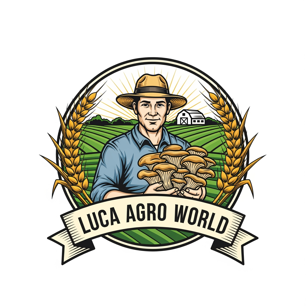
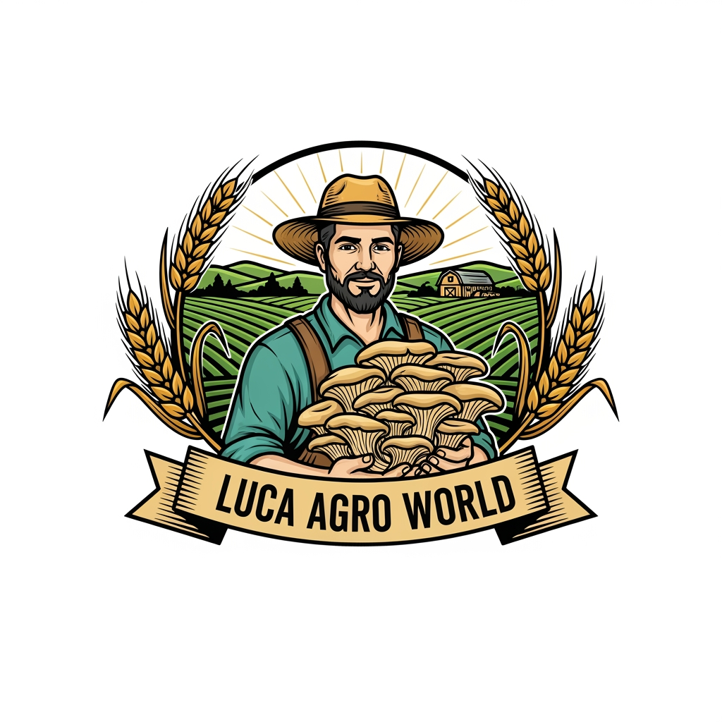
Create a premium vintage-style agricultural logo for "LUCA AGRO WORLD". A confident farmer wearing a straw hat is holding a large bunch of fresh oyster mushrooms in the center. Include golden ripe wheat branches elegantly surrounding the logo on both sides, symbolizing agriculture and prosperity. In the background, show a clean farm landscape with green fields, a barn, and subtle sunrise rays. Use a circular emblem design with detailed line art, natural green, gold, and earthy brown colors. Add a professional ribbon banner displaying "LUCA AGRO WORLD" in bold classic serif typography. High-detail vector logo, balanced composition, premium branding, vintage farm badge style, clean white background, scalable, professional company identity, award-winning logo design.
by @Elephant_8902856
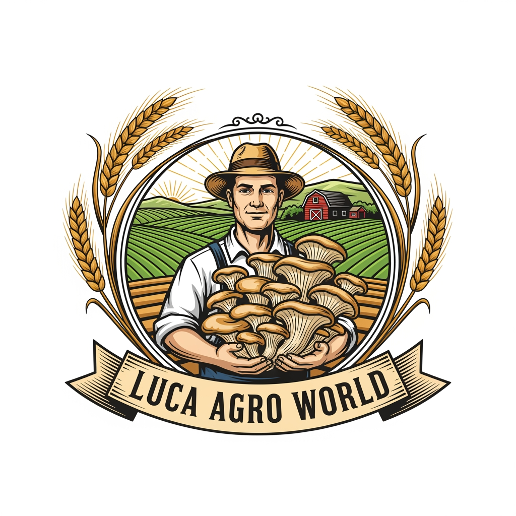
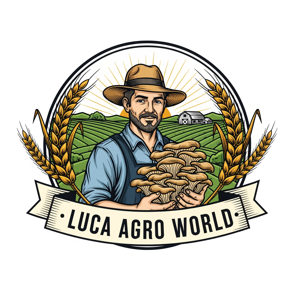
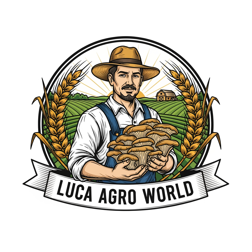
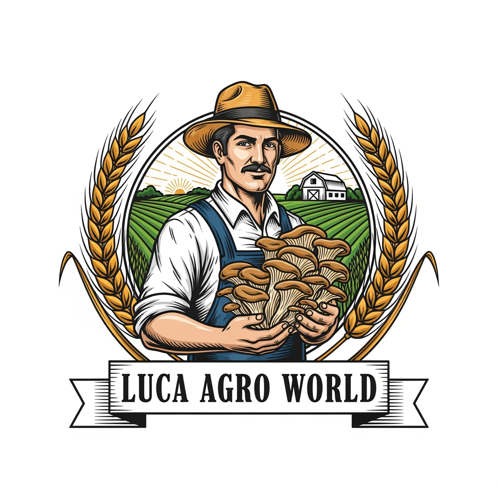


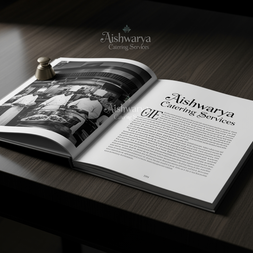
A sophisticated, high-end event management and wedding planning workspace featuring elegant floral arrangements, modern digital planning tablets, and luxury wedding brochures laid out on a clean, professional desk. Soft, warm ambient lighting illuminates the scene, creating an inviting and organized atmosphere suitable for premium event coordination services.
by @Elephant_5684461
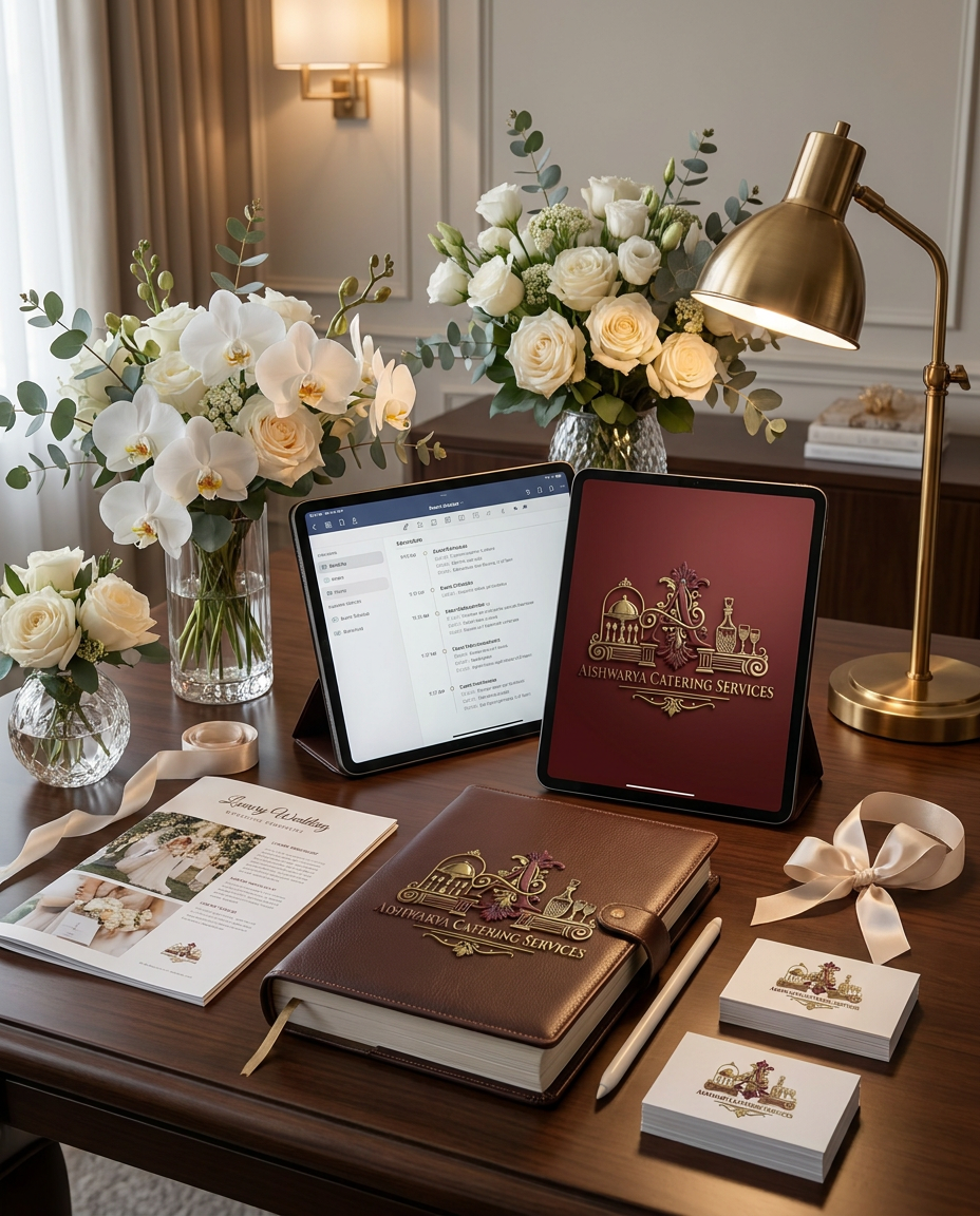


What's next?Explore more features

Go from browse to build