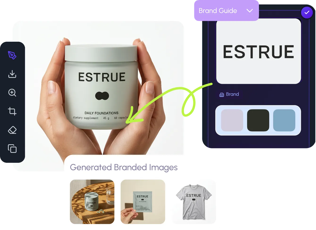
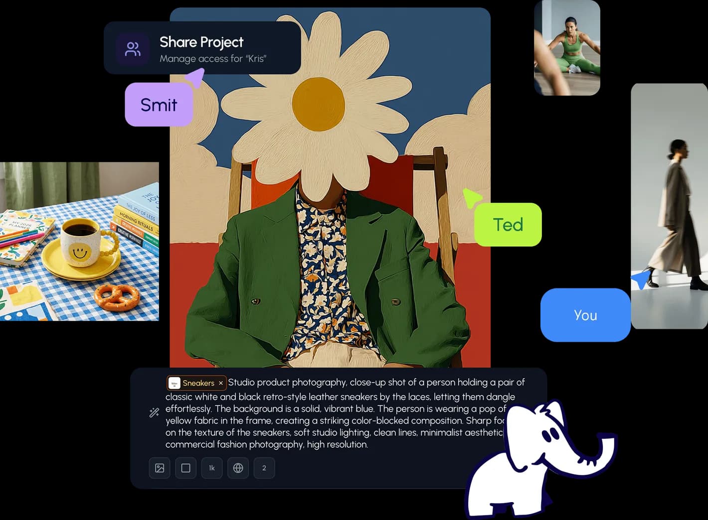
AI image design: Use both attached images as references, but do not reproduce either image exactly. Use the first reference as inspiratio…
Community
Design detail

Creator
@Elephant_3756952
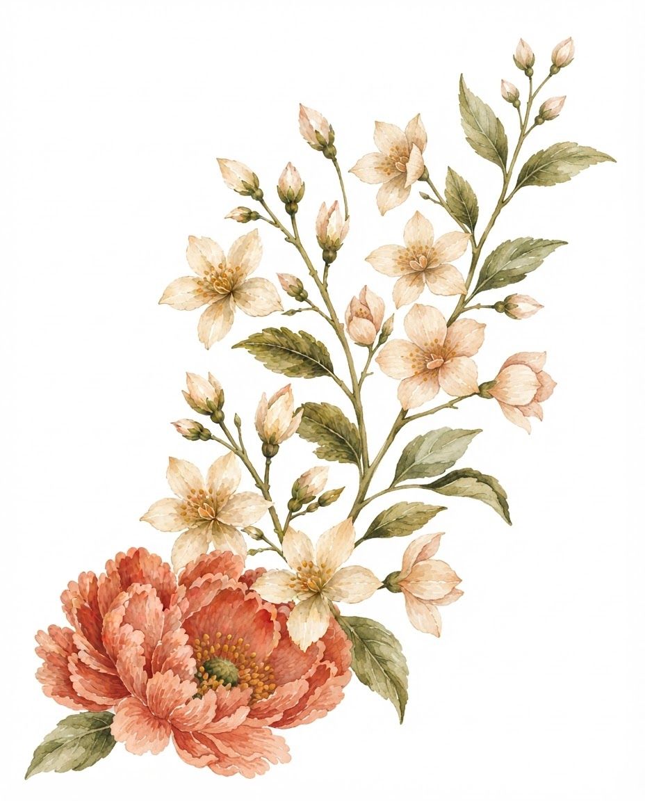
Use both attached images as references, but do not reproduce either image exactly. Use the first reference as inspiration for the floral subject matter and overall botanical direction, and use the second reference as the primary reference for the watercolor painting style, brushwork, color handling, botanical detail, and handmade quality. Create an original premium botanical watercolor illustration for tea packaging, featuring an elegant vertical arrangement of flowering branches, blossoms, unopened buds, and leaves. The composition should feel naturally arranged and artistically balanced, rather than being an exact recreation of the first reference. Introduce a fresh arrangement with different flower positions, stem curves, proportions, overlaps, and spacing. The flowers should feel like they were individually observed and painted by a botanical watercolor artist. Artistic style Match the hand-painted watercolor character of the second reference: traditional transparent watercolor delicate but confident brushwork visible individual brushstrokes softly feathered pigment edges subtle pigment pooling natural watercolor blooms and variations translucent overlapping washes slightly imperfect hand-painted contours delicate paper-and-pigment texture fine botanical detailing without looking digitally rendered natural variation in every petal and leaf soft transitions between colors expressive but controlled watercolor marks The illustration should look like a real artist painted it with watercolor on paper, then professionally scanned for commercial packaging. Flowers Create a harmonious collection of warm botanical flowers inspired by the reference, but make the actual arrangement original. Include: several open five-petaled cream and ivory flowers warm peach and blush undertones delicate golden-orange stamens multiple pale blush and cream unopened buds a few smaller partially opened flowers one larger coral-peach flower as a visual anchor subtle variation in flower size and orientation Do not make the flowers perfectly symmetrical. Petals should have naturally irregular edges, varying lengths, slight folds, translucent areas, and uneven watercolor pigmentation. Leaves and stems Use slender organically curved stems in olive, moss, muted sage, and warm brown-green. Include several elongated botanical leaves with: visible watercolor brush marks subtle veins varied green pigmentation slightly irregular silhouettes transparent layered washes natural light and dark areas Avoid overly detailed or hyper-realistic foliage. The leaves should retain the loose elegance of traditional botanical watercolor. Composition Create a new composition, not a copy of the previous image. The arrangement can flow diagonally or vertically, with flowers distributed naturally along branching stems. Leave some intentional white negative space around the botanical cluster so that it can work elegantly on a tea sleeve. The composition should feel: delicate, artisanal, botanical, warm, sophisticated, organic, understated, and premium. Do not recreate the exact flower placement, cropping, stem geometry, or proportions of the previous reference. Color palette Use a restrained natural palette inspired by the references: coral, salmon, dusty peach, blush pink, warm ivory, cream, pale beige, muted terracotta, golden ochre, olive green, sage green, moss, and muted brown. Keep the colors softly layered and slightly translucent. Avoid neon or highly saturated digital colors. Commercial packaging aesthetic The final artwork should look appropriate for a premium artisanal tea brand. It should have the refinement of professionally commissioned botanical packaging artwork while retaining the warmth and imperfections of handmade watercolor. Pure white background. No text. No typography. No logo. No border. No decorative graphic elements. No vase or container. Botanical illustration only. Important reference instruction Reference image 2 controls the artistic medium and watercolor style. Reference image 1 controls the general botanical inspiration only. Create a distinctly new floral composition rather than combining or tracing the references. Negative prompt photorealistic, digital painting, vector art, flat illustration, 3D render, CGI, airbrush, glossy petals, perfectly symmetrical flowers, identical petals, mechanical repetition, overly sharp digital edges, black outlines, heavy ink outlines, neon colors, excessive saturation, artificial gradients, plastic texture, cluttered composition, copied composition, exact recreation of reference, text, lettering, logo, watermark, colored background
Remix this design
Start for free with full control over models, settings, and canvas tools.
- Generate with full control over models and settings
- Save projects and share back to the community
- No design experience required
What's next?Explore more features



Go from browse to build