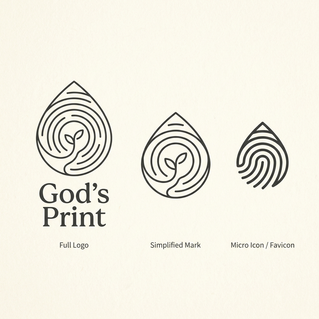
AI image design: Create a refined **line-art logo concept for a spiritual digital product called “God’s Print.”** The core symbol should…
Community
Design detail

Creator
@LedoM
Create a refined **line-art logo concept for a spiritual digital product called “God’s Print.”** The core symbol should combine several meanings into **one coherent abstract mark**, not look like several separate icons placed together. ### Core concept The overall silhouette should subtly resemble a **droplet**, but it must simultaneously read as a **fingerprint**. Inside the droplet, use flowing concentric linework that can be interpreted in three ways: * **fingerprint ridges** — uniqueness, individuality, the personal mark that God leaves in every person; * **tree growth rings** — time, accumulated experience, personal and spiritual growth; * **a journey / path** — a person’s evolving relationship with God. At the center of the mark, integrate a **very minimal young sprout with two small leaves**, representing growth, life, hope and faith being cultivated over time. The path should lead visually toward the sprout, but it should **emerge naturally from the fingerprint/tree-ring line system**. It must not look like a separate road drawn on top of the symbol. The relationship between the elements should feel like: **God’s unique imprint → personal journey → growth over time.** ### Visual direction Use a sophisticated, minimal **monoline / line-art aesthetic**. The logo should feel: * premium; * quiet; * intimate; * contemporary; * timeless; * organic but controlled; * spiritual without relying on obvious religious clichés; * elegant enough for a modern wellbeing / faith application. Avoid illustrative detail. Think of a carefully designed identity mark rather than an illustration. Use: * consistent line weight; * generous negative space; * smooth but controlled curves; * relatively few internal lines; * clear silhouette; * strong visual balance; * enough spacing between lines for the mark to remain readable at smaller sizes. The droplet silhouette should be **subtle rather than literal**. It should feel as though a fingerprint naturally evolved into a droplet shape. The fingerprint should remain the strongest immediate visual association. The tree-ring association should reveal itself more subtly on a second look. The sprout should be small and integrated into the structure rather than becoming the dominant element. ### Important: avoid ambiguous or sensual shapes Be extremely careful to avoid any visual form that could be interpreted as anatomical, erotic, sensual or suggestive, even through an exaggerated imagination. Specifically avoid: * central vertical slits; * vaginal or vulva-like geometry; * phallic silhouettes; * breast-like forms; * buttock-like symmetry; * womb-like symbolism; * sensual body curves; * overly soft fleshy forms; * suggestive openings or cavities; * shapes resembling reproductive organs; * a winding path that looks like a body part; * strongly symmetrical openings at the bottom of the symbol. Do **not** create a large open gap running upward through the center. Instead, make the journey/path appear through **subtle changes in spacing, interruptions or redirection of the fingerprint lines**. The result should feel clearly associated with **nature, identity, growth and spiritual journey**, with no bodily or sexual reading. ### Scalability Design the symbol as a proper responsive identity system. Show three levels next to each other: **1. Full logo** * complete fingerprint / tree-ring line system; * subtle droplet silhouette; * tiny central sprout; * subtle path incorporated into the line structure; * wordmark: **God’s Print**. **2. Simplified mark** * fewer fingerprint/tree-ring lines; * wider negative spaces; * stronger silhouette; * simplified or extremely subtle sprout; * no small decorative details. **3. Micro icon / favicon** * reduce the concept to approximately 3–5 strong internal lines; * no tiny sprout if it harms readability; * preserve the unique droplet + fingerprint character; * clearly recognizable at 16×16 and 32×32 px. Present all three versions **side by side on one clean brand-concept sheet** so their scalability can be compared immediately. ### Style Warm ivory or neutral background. Dark charcoal or deep desaturated forest-green linework. No gradients. No 3D. No shadows. No glossy effects. No realistic fingerprint texture. No stock-logo appearance. No cross, church, Bible, praying hands, dove, halo or other obvious Christian iconography. The final result should look like a **distinctive premium identity for a modern spiritual product**, not a generic church logo or wellness brand.
Remix this design
Start for free with full control over models, settings, and canvas tools.
- Generate with full control over models and settings
- Save projects and share back to the community
- No design experience required
What's next?Explore more features

Go from browse to build