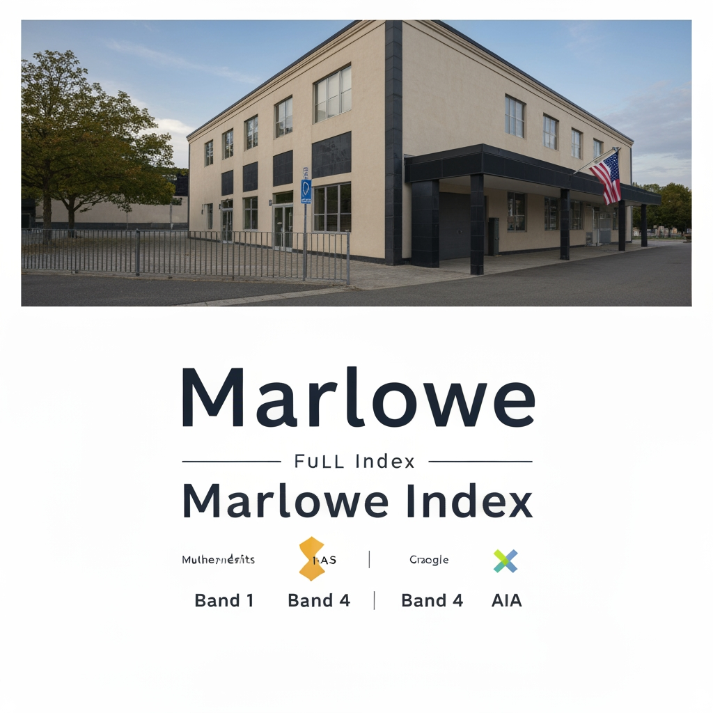
AI image design: Logo Design Brief — Marlowe Index The company in one line Marlowe Index independently measures and publishes which pro…
Community
Design detail

Creator
@Elephant_5207921
Logo Design Brief — Marlowe Index The company in one line Marlowe Index independently measures and publishes which professional-service firms (architects, cosmetic dentists, plastic surgeons, and similar high-end providers) get recommended by AI systems like ChatGPT and Google. We rank firms in Bands 1–4, publish the rankings publicly, and firms treat a top ranking as a credential. What the logo has to do This is the single most important instruction in the brief, so read it twice: We must look like a decades-old research institution, not a tech startup. Our entire product is trust in an independent ranking. If we look like a SaaS tool or a marketing app, we lose. The visual reference points are financial-data publishers and professional-ranking bodies — Morningstar, Chambers & Partners, S&P, The Economist, Michelin, Barron's, Moody's — not Silicon Valley software brands. A firm ranked "Marlowe Band 1" should feel comfortable putting our mark on their website next to their AACD or AIA credentials. If the logo doesn't belong in that company, it's wrong. Brand personality Five words, in priority order: authoritative, independent, precise, editorial, timeless. What we are NOT: playful, trendy, colourful, gradient-heavy, "AI-looking" (no circuit boards, no neural-net motifs, no robot imagery, no glowing orbs). Avoid anything that will look dated in three years — this brand has to hold up for a decade. The name and how to treat it Primary wordmark: Marlowe (this is the brand people will say) Full lockup: Marlowe Index (Index in a lighter weight or smaller size, subordinate to Marlowe) We also use the term "Band 1" through "Band 4" as our rating device — the designer should propose a small badge/seal treatment for these (see deliverables). Note on the name: Marlowe is meant to read like an established surname — think of how "Chambers," "Morningstar," or "Nielsen" sound like institutions. Lean into that heritage feel. Typography direction Strongly prefer a serif or a high-contrast transitional typeface for the wordmark — serifs read as editorial, credible, and permanent (this is why financial publications and ranking bodies use them). A clean grotesque sans is acceptable as a secondary option to present, but the serif direction is our lead. Think: the masthead of a respected publication or the wordmark of a ratings agency. Custom letterform refinement on the wordmark is welcome — subtle, not decorative. Colour Restrained and serious. Our working palette: Deep navy / ink (#1B2A4A as a starting point) — primary Off-white / warm paper (#F7F5F0 or similar) — background A single restrained accent — propose one. Options we lean toward: a deep burgundy, a muted brass/gold (good for the "Band 1" seal — evokes a medal/award without being gaudy), or a forest/ink green. One accent only. No multi-colour palettes, no gradients. The logo must work in pure single-colour (all navy, and all white for reverse) before any accent is added. If it only works in colour, it fails. The mark itself Open to either a wordmark-only solution (many great ranking/publishing brands are wordmark-only — this is a legitimate and often stronger route) or a wordmark + small symbol. If a symbol is proposed, concepts that fit our meaning — offered as directions to explore, not prescriptions: A datum / reference point — Marlowe is the fixed point everything is measured against. A precise geometric mark suggesting a benchmark, a plumb line, a survey marker, or a fixed reference. A band / tier motif — subtle nod to our Bands 1–4 (horizontal strata, a subtle rule system). An "M" monogram with editorial, engraved, or seal-like character. A seal / medallion feel — evokes certification and authority (used sparingly, this reinforces "credential"). Avoid: magnifying glasses, charts/graphs, upward arrows, speech bubbles, anything literal about "AI" or "search." Deliverables Primary logo (horizontal lockup: Marlowe Index) Wordmark-only (Marlowe) Monogram / icon mark (for favicon, social avatar, app icon) — must be legible at 32×32px Reverse versions (white on navy) Single-colour versions (all-navy, all-black, all-white) A "Band" seal/badge system — a small circular or shield-shaped mark reading "Marlowe Band 1" (through 4) that ranked firms will display on their own websites. This is a real product surface — firms embed it — so it needs to look like a genuine credential/award seal, on par with a "Top Doctor" or "AD100" badge. Clear-space and minimum-size rules All files in vector (SVG + editable source: AI or Figma), plus PNG exports Practical constraints Must be legible at favicon size (the monogram especially) Must survive being placed small on a third-party firm's website (the badge) Must photograph/print well in single colour (press, letterhead, awards) Web-first but should hold up in print What to hand back for review Please present 2–3 distinct directions, not near-identical variations. For each, show: the wordmark, one badge concept, and a one-line rationale for why it reads as "trusted independent institution." We'll pick a direction, then refine. One-sentence gut check for every option Would a $10M/year architecture firm feel proud, not embarrassed, to display this badge next to their industry awards? If yes, it's on track.
Remix this design
Start for free with full control over models, settings, and canvas tools.
- Generate with full control over models and settings
- Save projects and share back to the community
- No design experience required
What's next?Explore more features
Go from browse to build