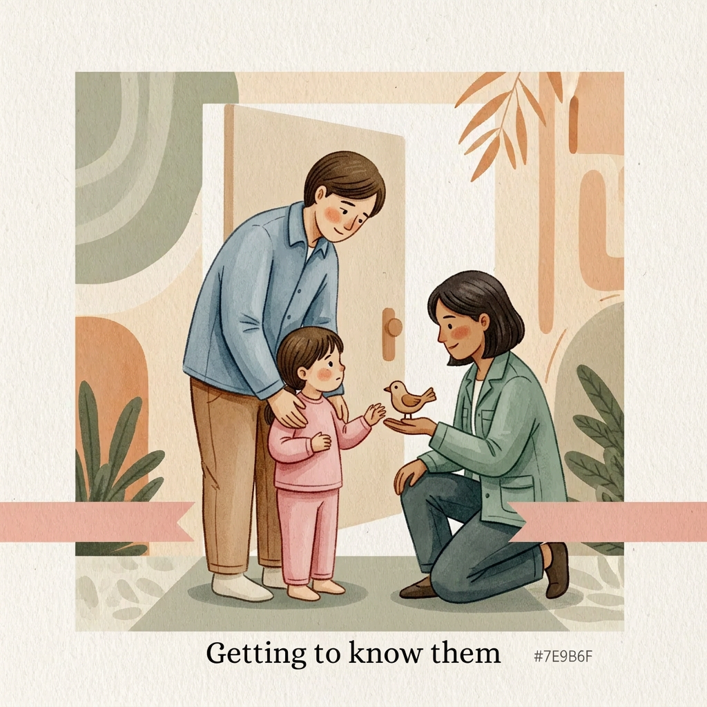
AI image design: A handcrafted editorial illustration for a children’s wellbeing centre interior wall, painted by a human illustrator. So…
Community
Design detail

Creator
@Elephant_5639848
A handcrafted editorial illustration for a children’s wellbeing centre interior wall, painted by a human illustrator. Soft watercolour washes combined with textured gouache and delicate hand-drawn ink outlines. Visible brush edges, subtle paper grain, imperfect organic contours, tactile handmade surface. Minimal but emotionally expressive composition. Avoid digital vector appearance. Warm natural materials aesthetic designed to sit against pale yellowish wooden panels under warm spotlight illumination. Surface and colour treatment: Soft warm cream background (#F7F1E4), never bright white. Warm sage accents (#7E9B6F), deep green typography area (#3F6B3B), charcoal ink details (#2C2C2A). Warm honey neutrals, terracotta-leaning skin tones. Colours gradually transition from quieter muted tones on Board 1 to brighter warmer tones on Board 5. Matte printed artwork appearance, subtle canvas/paper texture. Character consistency lock: Parent: same adult character across all boards. Gentle facial features, warm expression, wearing signature muted warm blue clothing. Always present. Supportive but gradually stepping back. Child: same child across all boards. Wearing signature pink clothing. The child grows physically and emotionally through the sequence: Board 1: small, curled inward, holding tightly. Board 2: slightly opening up. Board 3: engaged and playful. Board 4: upright and independent. Board 5: confident, taller, walking forward. Therapist: same character whenever present. Wearing warm sage/teal clothing. Calm, approachable, gentle presence. Appears first in Board 2. Composition rules: Square artwork, designed as one of five connected wall panels. Characters always face and move left-to-right. Maintain a consistent soft hand-painted ground ribbon at the same height across all boards. The ribbon should feel like a continuous path through the entire wall. Keep generous negative space for headline placement. No clutter. BOARD 2 PROMPT “Getting to know them” AI Image Generation Prompt: A square handcrafted watercolor and gouache illustration continuing the same story and characters from Board 1. The therapist enters for the first time. The same parent in warm blue clothing stands slightly behind the child, remaining close and supportive. The same child in pink clothing is still hesitant but beginning to open up. A warm sage/teal-clothed therapist kneels down at the child’s eye level, creating a gentle equal connection. The therapist offers an open hand or a simple toy, not as an assessment tool but as an invitation to connect. The child looks outward for the first time, showing cautious curiosity. The scene should communicate being welcomed and understood rather than being examined. The therapist occupies a supportive position, never dominating the child. The parent remains emotionally present. Soft ground ribbon continues across the bottom. Emotion: first trust, curiosity, first moment of connection. Colour palette: slightly warmer than Board 1. More honey tones, warmer cream, gentle sage accents begin appearing. Composition: Child remains slightly small and close to parent. Therapist creates a bridge between them. Style: Hand-painted children’s therapy centre mural, textured paper grain, loose organic linework, warm human storytelling illustration. Avoid: medical assessment clipboards therapy equipment clinical office appearance forced interaction
Remix this design
Start for free with full control over models, settings, and canvas tools.
- Generate with full control over models and settings
- Save projects and share back to the community
- No design experience required
What's next?Explore more features
Go from browse to build