AI image design: Can you create a nice social media post of the @product[Fancy Speaker:80] in our brand style with the price 59 USD The …
![Can you create a nice social media post of the @product[Fancy Speaker:80] in our brand style with the price 59 USD
The attached logo reference is the selected primary logo. Use it to understand brand identity. Do not place the logo in the generated image unless the user explicitly asks for logo placement.
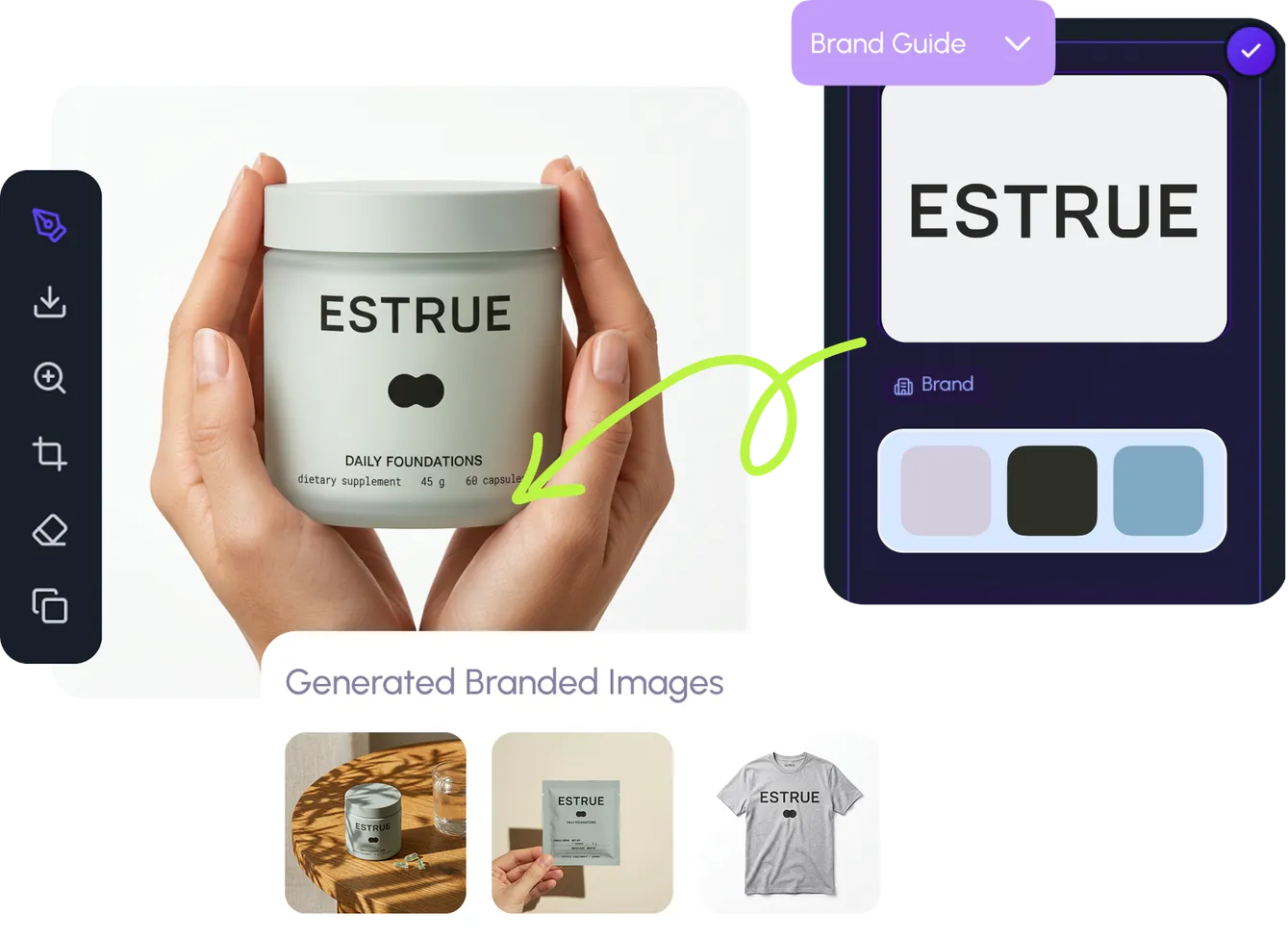
The attached style guide board shows the brand logo, colors, and visual system. Use it as a brand aesthetic reference.
Make the colors in these exact hex codes: **Primary Color (#b0315e):** **Primary Color (#a63559):** **Primary Color (#af3253):** **Primary Color (#9a3859):** Do not include the hex numbers in the image itself.
Brand context: Identity: WITH LOVE INTERNET is a boutique digital marketing and web development agency that helps businesses navigate complex online landscapes to achieve growth. They combine strategic storytelling, high-performance web development, and creative design to help their clients clarify their message and amplify their digital presence.
### **Brand Voice:**
* **Empathetic/Human-Centric:** The agency positions itself as a partner that genuinely cares about the client's journey, emphasizing "love" and meaningful relationships as the core of their business model.
* **Confident/Expert:** They communicate with an authoritative tone regarding technical prowess, framing themselves as the solution to "digital noise" and the complexity of modern technology.
* **Action-Oriented:** Their messaging is heavily focused on tangible outcomes and growth, frequently using power words like "results," "domination," "scaling," and "thriving" to signal a high-performance mindset.
### **Core Messaging:**
WLI promises to eliminate the confusion and "digital noise" businesses face by providing a holistic, tailor-made digital strategy that turns their brand story into a profitable asset. Their value proposition is centered on the "HeroGuide" methodology, which prioritizes placing the customer at the center of the story to drive engagement and sustainable business growth.
### **Visual Keywords:**
Modern, Clean, Human-Centric, Bold, Strategic
### **Color Palette Description:**
The brand utilizes a vibrant, deep magenta/berry-pink as its primary brand color. This choice is highly intentional: it bridges the gap between the professional, results-driven nature of a tech agency and the emotional, "human" element of their brand name ("With Love").
* **Magenta/Berry:** Represents passion, creativity, and energy, standing out against the more clinical, neutral blues and grays often found in the tech and digital marketing industry.
* **Black/White (Supporting):** Used for structure and contrast, providing a clean, sophisticated, and high-end feel that allows the vibrant pink to serve as an emotional focal point.
The overall effect is one of warmth and approachability, suggesting that while the agency is technically rigorous, their primary motivation is the success and care of their clients. Brand voice: * **Empathetic/Human-Centric:** The agency positions itself as a partner that genuinely cares about the client's journey, emphasizing "love" and meaningful relationships as the core of their business model.
* **Confident/Expert:** They communicate with an authoritative tone regarding technical prowess, framing themselves as the solution to "digital noise" and the complexity of modern technology.
* **Action-Oriented:** Their messaging is heavily focused on tangible outcomes and growth, frequently using power words like "results," "domination," "scaling," and "thriving" to signal a high-performance mindset.
### **Core Messaging:**
WLI promises to eliminate the confusion and "digital noise" businesses face by providing a holistic, tailor-made digital strategy that turns their brand story into a profitable asset. Their value proposition is centered on the "HeroGuide" methodology, which prioritizes placing the customer at the center of the story to drive engagement and sustainable business growth.
### **Visual Keywords:**
Modern, Clean, Human-Centric, Bold, Strategic
### **Color Palette Description:**
The brand utilizes a vibrant, deep magenta/berry-pink as its primary brand color. This choice is highly intentional: it bridges the gap between the professional, results-driven nature of a tech agency and the emotional, "human" element of their brand name ("With Love").
* **Magenta/Berry:** Represents passion, creativity, and energy, standing out against the more clinical, neutral blues and grays often found in the tech and digital marketing industry.
* **Black/White (Supporting):** Used for structure and contrast, providing a clean, sophisticated, and high-end feel that allows the vibrant pink to serve as an emotional focal point.
The overall effect is one of warmth and approachability, suggesting that while the agency is technically rigorous, their primary motivation is the success and care of their clients. Core messaging: WLI promises to eliminate the confusion and "digital noise" businesses face by providing a holistic, tailor-made digital strategy that turns their brand story into a profitable asset. Their value proposition is centered on the "HeroGuide" methodology, which prioritizes placing the customer at the center of the story to drive engagement and sustainable business growth.
### **Visual Keywords:**
Modern, Clean, Human-Centric, Bold, Strategic
### **Color Palette Description:**
The brand utilizes a vibrant, deep magenta/berry-pink as its primary brand color. This choice is highly intentional: it bridges the gap between the professional, results-driven nature of a tech agency and the emotional, "human" element of their brand name ("With Love").
* **Magenta/Berry:** Represents passion, creativity, and energy, standing out against the more clinical, neutral blues and grays often found in the tech and digital marketing industry.
* **Black/White (Supporting):** Used for structure and contrast, providing a clean, sophisticated, and high-end feel that allows the vibrant pink to serve as an emotional focal point.
The overall effect is one of warmth and approachability, suggesting that while the agency is technically rigorous, their primary motivation is the success and care of their clients. Visual keywords: Modern, Clean, Human-Centric, Bold, Strategic
### **Color Palette Description:**
The brand utilizes a vibrant, deep magenta/berry-pink as its primary brand color. This choice is highly intentional: it bridges the gap between the professional, results-driven nature of a tech agency and the emotional, "human" element of their brand name ("With Love").
* **Magenta/Berry:** Represents passion, creativity, and energy, standing out against the more clinical, neutral blues and grays often found in the tech and digital marketing industry.
* **Black/White (Supporting):** Used for structure and contrast, providing a clean, sophisticated, and high-end feel that allows the vibrant pink to serve as an emotional focal point.
The overall effect is one of warmth and approachability, suggesting that while the agency is technically rigorous, their primary motivation is the success and care of their clients. Palette direction: The brand utilizes a vibrant, deep magenta/berry-pink as its primary brand color. This choice is highly intentional: it bridges the gap between the professional, results-driven nature of a tech agency and the emotional, "human" element of their brand name ("With Love").
* **Magenta/Berry:** Represents passion, creativity, and energy, standing out against the more clinical, neutral blues and grays often found in the tech and digital marketing industry.
* **Black/White (Supporting):** Used for structure and contrast, providing a clean, sophisticated, and high-end feel that allows the vibrant pink to serve as an emotional focal point.
The overall effect is one of warmth and approachability, suggesting that while the agency is technically rigorous, their primary motivation is the success and care of their clients.
The attached image is a product reference photo. Use it to ensure accurate product representation, including colors, shapes, logos, and details. Maintain product fidelity while adapting to the creative context.](https://images.hidingelephant.com/77736/83554/83554/3e58e10b-8e8d-49e4-8ed1-1d0e579595fc/e4363f02-325b-4765-b43e-8f8006d9efc9.png)
Community
Design detail

Creator
@Elephant_1578961
Can you create a nice social media post of the @product[Fancy Speaker:80] in our brand style with the price 59 USD The attached logo reference is the selected primary logo. Use it to understand brand identity. Do not place the logo in the generated image unless the user explicitly asks for logo placement. The attached style guide board shows the brand logo, colors, and visual system. Use it as a brand aesthetic reference. Make the colors in these exact hex codes: **Primary Color (#b0315e):** **Primary Color (#a63559):** **Primary Color (#af3253):** **Primary Color (#9a3859):** Do not include the hex numbers in the image itself. Brand context: Identity: WITH LOVE INTERNET is a boutique digital marketing and web development agency that helps businesses navigate complex online landscapes to achieve growth. They combine strategic storytelling, high-performance web development, and creative design to help their clients clarify their message and amplify their digital presence. ### **Brand Voice:** * **Empathetic/Human-Centric:** The agency positions itself as a partner that genuinely cares about the client's journey, emphasizing "love" and meaningful relationships as the core of their business model. * **Confident/Expert:** They communicate with an authoritative tone regarding technical prowess, framing themselves as the solution to "digital noise" and the complexity of modern technology. * **Action-Oriented:** Their messaging is heavily focused on tangible outcomes and growth, frequently using power words like "results," "domination," "scaling," and "thriving" to signal a high-performance mindset. ### **Core Messaging:** WLI promises to eliminate the confusion and "digital noise" businesses face by providing a holistic, tailor-made digital strategy that turns their brand story into a profitable asset. Their value proposition is centered on the "HeroGuide" methodology, which prioritizes placing the customer at the center of the story to drive engagement and sustainable business growth. ### **Visual Keywords:** Modern, Clean, Human-Centric, Bold, Strategic ### **Color Palette Description:** The brand utilizes a vibrant, deep magenta/berry-pink as its primary brand color. This choice is highly intentional: it bridges the gap between the professional, results-driven nature of a tech agency and the emotional, "human" element of their brand name ("With Love"). * **Magenta/Berry:** Represents passion, creativity, and energy, standing out against the more clinical, neutral blues and grays often found in the tech and digital marketing industry. * **Black/White (Supporting):** Used for structure and contrast, providing a clean, sophisticated, and high-end feel that allows the vibrant pink to serve as an emotional focal point. The overall effect is one of warmth and approachability, suggesting that while the agency is technically rigorous, their primary motivation is the success and care of their clients. Brand voice: * **Empathetic/Human-Centric:** The agency positions itself as a partner that genuinely cares about the client's journey, emphasizing "love" and meaningful relationships as the core of their business model. * **Confident/Expert:** They communicate with an authoritative tone regarding technical prowess, framing themselves as the solution to "digital noise" and the complexity of modern technology. * **Action-Oriented:** Their messaging is heavily focused on tangible outcomes and growth, frequently using power words like "results," "domination," "scaling," and "thriving" to signal a high-performance mindset. ### **Core Messaging:** WLI promises to eliminate the confusion and "digital noise" businesses face by providing a holistic, tailor-made digital strategy that turns their brand story into a profitable asset. Their value proposition is centered on the "HeroGuide" methodology, which prioritizes placing the customer at the center of the story to drive engagement and sustainable business growth. ### **Visual Keywords:** Modern, Clean, Human-Centric, Bold, Strategic ### **Color Palette Description:** The brand utilizes a vibrant, deep magenta/berry-pink as its primary brand color. This choice is highly intentional: it bridges the gap between the professional, results-driven nature of a tech agency and the emotional, "human" element of their brand name ("With Love"). * **Magenta/Berry:** Represents passion, creativity, and energy, standing out against the more clinical, neutral blues and grays often found in the tech and digital marketing industry. * **Black/White (Supporting):** Used for structure and contrast, providing a clean, sophisticated, and high-end feel that allows the vibrant pink to serve as an emotional focal point. The overall effect is one of warmth and approachability, suggesting that while the agency is technically rigorous, their primary motivation is the success and care of their clients. Core messaging: WLI promises to eliminate the confusion and "digital noise" businesses face by providing a holistic, tailor-made digital strategy that turns their brand story into a profitable asset. Their value proposition is centered on the "HeroGuide" methodology, which prioritizes placing the customer at the center of the story to drive engagement and sustainable business growth. ### **Visual Keywords:** Modern, Clean, Human-Centric, Bold, Strategic ### **Color Palette Description:** The brand utilizes a vibrant, deep magenta/berry-pink as its primary brand color. This choice is highly intentional: it bridges the gap between the professional, results-driven nature of a tech agency and the emotional, "human" element of their brand name ("With Love"). * **Magenta/Berry:** Represents passion, creativity, and energy, standing out against the more clinical, neutral blues and grays often found in the tech and digital marketing industry. * **Black/White (Supporting):** Used for structure and contrast, providing a clean, sophisticated, and high-end feel that allows the vibrant pink to serve as an emotional focal point. The overall effect is one of warmth and approachability, suggesting that while the agency is technically rigorous, their primary motivation is the success and care of their clients. Visual keywords: Modern, Clean, Human-Centric, Bold, Strategic ### **Color Palette Description:** The brand utilizes a vibrant, deep magenta/berry-pink as its primary brand color. This choice is highly intentional: it bridges the gap between the professional, results-driven nature of a tech agency and the emotional, "human" element of their brand name ("With Love"). * **Magenta/Berry:** Represents passion, creativity, and energy, standing out against the more clinical, neutral blues and grays often found in the tech and digital marketing industry. * **Black/White (Supporting):** Used for structure and contrast, providing a clean, sophisticated, and high-end feel that allows the vibrant pink to serve as an emotional focal point. The overall effect is one of warmth and approachability, suggesting that while the agency is technically rigorous, their primary motivation is the success and care of their clients. Palette direction: The brand utilizes a vibrant, deep magenta/berry-pink as its primary brand color. This choice is highly intentional: it bridges the gap between the professional, results-driven nature of a tech agency and the emotional, "human" element of their brand name ("With Love"). * **Magenta/Berry:** Represents passion, creativity, and energy, standing out against the more clinical, neutral blues and grays often found in the tech and digital marketing industry. * **Black/White (Supporting):** Used for structure and contrast, providing a clean, sophisticated, and high-end feel that allows the vibrant pink to serve as an emotional focal point. The overall effect is one of warmth and approachability, suggesting that while the agency is technically rigorous, their primary motivation is the success and care of their clients. The attached image is a product reference photo. Use it to ensure accurate product representation, including colors, shapes, logos, and details. Maintain product fidelity while adapting to the creative context.
Remix this design
Start for free with full control over models, settings, and canvas tools.
- Generate with full control over models and settings
- Save projects and share back to the community
- No design experience required
What's next?Explore more features
Go from browse to build