Product
Use Cases
How it Works
Pricing
Login

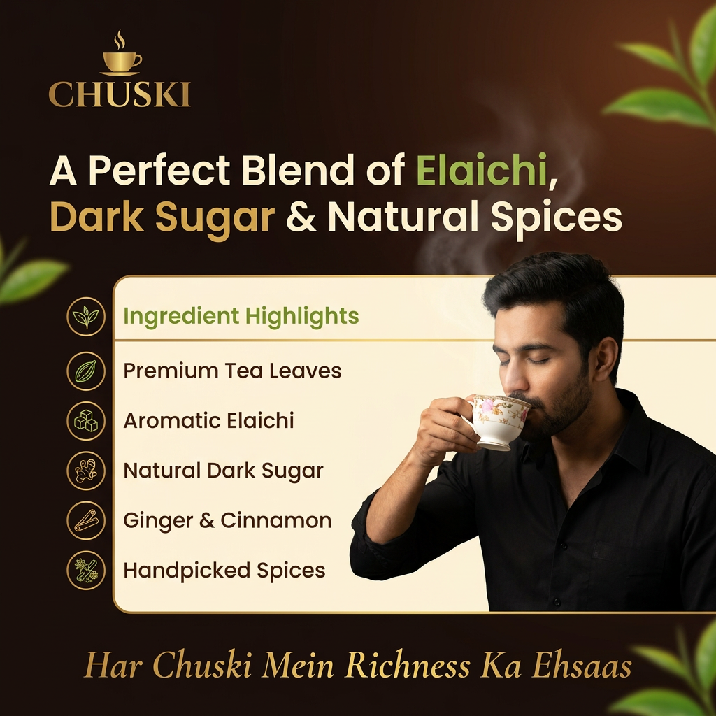
AI image design: For a premium, luxurious, and authentic chai brand, limit yourself to 4–5 core colors and use them consistently. Too man…

Back to community
For a premium, luxurious, and authentic chai brand, limit yourself to 4–5 core colors and use them consistently. Too many colors reduce the premium feel.

Chuski Premium Color Palette
Element	Color	Hex Code	Usage
Primary Background	Deep Espresso Brown	#2E1C12	Main poster background
Secondary Background	Warm Ivory	#F5EFE6	Content sections or highlights
Brand Accent	Antique Gold	#C9A35A	Logo accents, dividers, icons
Freshness Accent	Elaichi Green	#5E7D3A	Ingredient highlights, leaves
Primary Text	Soft Cream	#F8F4ED	Headlines on dark backgrounds
Secondary Text	Rich Cocoa	#4A3528	Body text on light backgrounds
Poster Element Color Guide
Background
Main Background: #2E1C12
Add a subtle radial gradient:
Center: #4A2C1D
Edges: #1B120D

This creates depth and richness.

Logo
"CHUSKI" Text: #C9A35A
Tea Cup Icon: #D8B46A
Add a subtle gold gradient:
Top: #E0C17A
Bottom: #B8873D
Headline

Example:

"A Perfect Blend of Elaichi, Dark Sugar & Natural Spices"

Text color: #F8F4ED
Highlight words:
Elaichi: #7B9B4A
Dark Sugar: #C9A35A
Body Copy
Color: #D9D0C5
Use 85% opacity for a softer look.
Ingredient Icons
Ingredient	Color
Elaichi	#5E7D3A
Dark Sugar	#8B5A2B
Tea Leaves	#355E3B
Cinnamon	#9A5A2A
Ginger	#C6923F

Use gold outline icons (#C9A35A) for consistency.

Hero Chai Cup
Cup (clay): #8B5A3C
Highlights: #B87A4A
Shadows: #5C3823
Chai color: #C68642
Foam details: #E2B87C
Steam Effect

Use a gradient:

Start: #FFF8F0 at 30% opacity
Fade to transparent

Apply a soft Gaussian blur.

Dividers and Borders
Color: #C9A35A
Opacity: 40%

Thin lines feel more premium than thick borders.

CTA/Footer Strip

Background: #1B120D

Text:

"Har Chuski Mein Richness Ka Ehsaas."

Color: #D8B46A
Luxury Design Rule: 60–30–10
60%: Deep Brown (#2E1C12)
30%: Warm Ivory (#F5EFE6)
10%: Antique Gold (#C9A35A)

Use Elaichi Green (#5E7D3A) sparingly as a freshness accent.

This balance creates a sophisticated, premium tea brand aesthetic without overwhelming the design.

and typography also

For a premium luxury tea brand like Chuski, typography should communicate richness, authenticity, and warmth. Limit yourself to two font families—one for branding and one for all supporting text.

Typography Pairing
1. Logo & Brand Name

Font: Cormorant Garamond SemiBold or Playfair Display Bold

Style: Elegant serif
Feel: Premium, traditional, sophisticated

Settings:

Weight: SemiBold / Bold
Letter Spacing: +2%
Color: #C9A35A (Antique Gold)
2. Headlines

Examples:

A Perfect Blend of Elaichi, Dark Sugar & Natural Spices
Authentic Taste. Luxurious Experience.

Font: Poppins SemiBold or Montserrat SemiBold

Style: Clean sans-serif
Feel: Modern luxury

Settings:

Weight: 600
Line Height: 110–120%
Letter Spacing: -1%
Color: #F8F4ED

Font Size Guide:

A4 Poster: 48–60 pt
Instagram Post: 36–48 pt
3. Highlight Words

Examples:

Elaichi
Dark Sugar
Freshness

Use a contrasting font style.

Font: Cormorant Garamond Italic

Settings:

Weight: Medium
Color: #7B9B4A (Elaichi Green) or #C9A35A (Gold)
Size: 110–120% of surrounding text
4. Body Copy

Example:

"Expertly crafted with premium tea leaves, aromatic elaichi, and natural dark sugar."

Font: Inter Regular or Lato Regular

Settings:

Weight: 400
Line Height: 140–150%
Letter Spacing: 0%
Color: #D9D0C5

Font Size Guide:

A4 Poster: 14–18 pt
Instagram Post: 12–14 pt
5. Ingredient Labels & Icons

Examples:

Premium Tea Leaves
Aromatic Elaichi

Font: Montserrat Medium

Settings:

Weight: 500
Letter Spacing: +4%
Use ALL CAPS for luxury feel
Color: #C9A35A
6. Tagline

Examples:

Har Chuski Mein Richness Ka Ehsaas.
Sip the Tradition, Savor the Luxury.

Font: Cormorant Garamond Italic

Settings:

Weight: Medium Italic
Color: #D8B46A
Letter Spacing: +2%
Typography Hierarchy
Logo: Cormorant Garamond Bold — 64–80 pt
Headline: Poppins SemiBold — 48–60 pt
Subheadline: Poppins Medium — 24–30 pt
Body Copy: Inter Regular — 14–18 pt
Ingredients: Montserrat Medium — 12–14 pt
Tagline: Cormorant Garamond Italic — 20–28 pt
Golden Rules for a Premium Look
Use only two font families consistently.
Maintain generous spacing around text.
Avoid more than three font weights.
Keep text alignment consistent (left-aligned works best).
Use gold sparingly for emphasis.
Let the imagery and whitespace create the luxury feel.
Use only two font families consistently.

For Chuski, using only two font families will make the brand look more premium, consistent, and memorable.

Recommended Font Pairing
1. Cormorant Garamond

Use for:

Logo (CHUSKI)
Taglines
Highlight words like "Elaichi", "Richness", "Freshness"

Why?
It has an elegant, heritage-inspired look that communicates authenticity and luxury.

Weights:

SemiBold (600)
Bold (700)
Italic (for taglines and emphasis)
2. Poppins

Use for:

Headlines
Ingredient list
Body copy
Call-to-action text
Product details

Why?
Its clean, modern appearance balances the traditional feel of Cormorant Garamond.

Weights:

Medium (500)
SemiBold (600)
Regular (400)
Typography System
Element	Font	Weight	Size
Logo	Cormorant Garamond	Bold	64–80 pt
Main Headline	Poppins	SemiBold	48–60 pt
Subheadline	Poppins	Medium	24–30 pt
Body Copy	Poppins	Regular	14–18 pt
Ingredient Labels	Poppins	Medium	12–14 pt
Tagline	Cormorant Garamond Italic	Medium	20–28 pt
Example Usage

Logo:
CHUSKI → Cormorant Garamond Bold

Headline:
A Perfect Blend of Elaichi, Dark Sugar & Natural Spices → Poppins SemiBold

Tagline:
Har Chuski Mein Richness Ka Ehsaas. → Cormorant Garamond Italic

Body Copy:
Crafted with premium tea leaves, aromatic elaichi, and natural dark sugar. → Poppins Regular

Design Rule
Use Cormorant Garamond for emotion and brand personality.
Use Poppins for clarity and readability.

Avoid introducing any third font. Consistency is what creates a premium identity.    


create a poster accordint to the promt taking sample as photo attached.

Community

Design detail

Elephant_6220114

Creator

@Elephant_6220114

Created June 16, 2026
Prompt

For a premium, luxurious, and authentic chai brand, limit yourself to 4–5 core colors and use them consistently. Too many colors reduce the premium feel. Chuski Premium Color Palette Element Color Hex Code Usage Primary Background Deep Espresso Brown #2E1C12 Main poster background Secondary Background Warm Ivory #F5EFE6 Content sections or highlights Brand Accent Antique Gold #C9A35A Logo accents, dividers, icons Freshness Accent Elaichi Green #5E7D3A Ingredient highlights, leaves Primary Text Soft Cream #F8F4ED Headlines on dark backgrounds Secondary Text Rich Cocoa #4A3528 Body text on light backgrounds Poster Element Color Guide Background Main Background: #2E1C12 Add a subtle radial gradient: Center: #4A2C1D Edges: #1B120D This creates depth and richness. Logo "CHUSKI" Text: #C9A35A Tea Cup Icon: #D8B46A Add a subtle gold gradient: Top: #E0C17A Bottom: #B8873D Headline Example: "A Perfect Blend of Elaichi, Dark Sugar & Natural Spices" Text color: #F8F4ED Highlight words: Elaichi: #7B9B4A Dark Sugar: #C9A35A Body Copy Color: #D9D0C5 Use 85% opacity for a softer look. Ingredient Icons Ingredient Color Elaichi #5E7D3A Dark Sugar #8B5A2B Tea Leaves #355E3B Cinnamon #9A5A2A Ginger #C6923F Use gold outline icons (#C9A35A) for consistency. Hero Chai Cup Cup (clay): #8B5A3C Highlights: #B87A4A Shadows: #5C3823 Chai color: #C68642 Foam details: #E2B87C Steam Effect Use a gradient: Start: #FFF8F0 at 30% opacity Fade to transparent Apply a soft Gaussian blur. Dividers and Borders Color: #C9A35A Opacity: 40% Thin lines feel more premium than thick borders. CTA/Footer Strip Background: #1B120D Text: "Har Chuski Mein Richness Ka Ehsaas." Color: #D8B46A Luxury Design Rule: 60–30–10 60%: Deep Brown (#2E1C12) 30%: Warm Ivory (#F5EFE6) 10%: Antique Gold (#C9A35A) Use Elaichi Green (#5E7D3A) sparingly as a freshness accent. This balance creates a sophisticated, premium tea brand aesthetic without overwhelming the design. and typography also For a premium luxury tea brand like Chuski, typography should communicate richness, authenticity, and warmth. Limit yourself to two font families—one for branding and one for all supporting text. Typography Pairing 1. Logo & Brand Name Font: Cormorant Garamond SemiBold or Playfair Display Bold Style: Elegant serif Feel: Premium, traditional, sophisticated Settings: Weight: SemiBold / Bold Letter Spacing: +2% Color: #C9A35A (Antique Gold) 2. Headlines Examples: A Perfect Blend of Elaichi, Dark Sugar & Natural Spices Authentic Taste. Luxurious Experience. Font: Poppins SemiBold or Montserrat SemiBold Style: Clean sans-serif Feel: Modern luxury Settings: Weight: 600 Line Height: 110–120% Letter Spacing: -1% Color: #F8F4ED Font Size Guide: A4 Poster: 48–60 pt Instagram Post: 36–48 pt 3. Highlight Words Examples: Elaichi Dark Sugar Freshness Use a contrasting font style. Font: Cormorant Garamond Italic Settings: Weight: Medium Color: #7B9B4A (Elaichi Green) or #C9A35A (Gold) Size: 110–120% of surrounding text 4. Body Copy Example: "Expertly crafted with premium tea leaves, aromatic elaichi, and natural dark sugar." Font: Inter Regular or Lato Regular Settings: Weight: 400 Line Height: 140–150% Letter Spacing: 0% Color: #D9D0C5 Font Size Guide: A4 Poster: 14–18 pt Instagram Post: 12–14 pt 5. Ingredient Labels & Icons Examples: Premium Tea Leaves Aromatic Elaichi Font: Montserrat Medium Settings: Weight: 500 Letter Spacing: +4% Use ALL CAPS for luxury feel Color: #C9A35A 6. Tagline Examples: Har Chuski Mein Richness Ka Ehsaas. Sip the Tradition, Savor the Luxury. Font: Cormorant Garamond Italic Settings: Weight: Medium Italic Color: #D8B46A Letter Spacing: +2% Typography Hierarchy Logo: Cormorant Garamond Bold — 64–80 pt Headline: Poppins SemiBold — 48–60 pt Subheadline: Poppins Medium — 24–30 pt Body Copy: Inter Regular — 14–18 pt Ingredients: Montserrat Medium — 12–14 pt Tagline: Cormorant Garamond Italic — 20–28 pt Golden Rules for a Premium Look Use only two font families consistently. Maintain generous spacing around text. Avoid more than three font weights. Keep text alignment consistent (left-aligned works best). Use gold sparingly for emphasis. Let the imagery and whitespace create the luxury feel. Use only two font families consistently. For Chuski, using only two font families will make the brand look more premium, consistent, and memorable. Recommended Font Pairing 1. Cormorant Garamond Use for: Logo (CHUSKI) Taglines Highlight words like "Elaichi", "Richness", "Freshness" Why? It has an elegant, heritage-inspired look that communicates authenticity and luxury. Weights: SemiBold (600) Bold (700) Italic (for taglines and emphasis) 2. Poppins Use for: Headlines Ingredient list Body copy Call-to-action text Product details Why? Its clean, modern appearance balances the traditional feel of Cormorant Garamond. Weights: Medium (500) SemiBold (600) Regular (400) Typography System Element Font Weight Size Logo Cormorant Garamond Bold 64–80 pt Main Headline Poppins SemiBold 48–60 pt Subheadline Poppins Medium 24–30 pt Body Copy Poppins Regular 14–18 pt Ingredient Labels Poppins Medium 12–14 pt Tagline Cormorant Garamond Italic Medium 20–28 pt Example Usage Logo: CHUSKI → Cormorant Garamond Bold Headline: A Perfect Blend of Elaichi, Dark Sugar & Natural Spices → Poppins SemiBold Tagline: Har Chuski Mein Richness Ka Ehsaas. → Cormorant Garamond Italic Body Copy: Crafted with premium tea leaves, aromatic elaichi, and natural dark sugar. → Poppins Regular Design Rule Use Cormorant Garamond for emotion and brand personality. Use Poppins for clarity and readability. Avoid introducing any third font. Consistency is what creates a premium identity. create a poster accordint to the promt taking sample as photo attached.

Remix this design

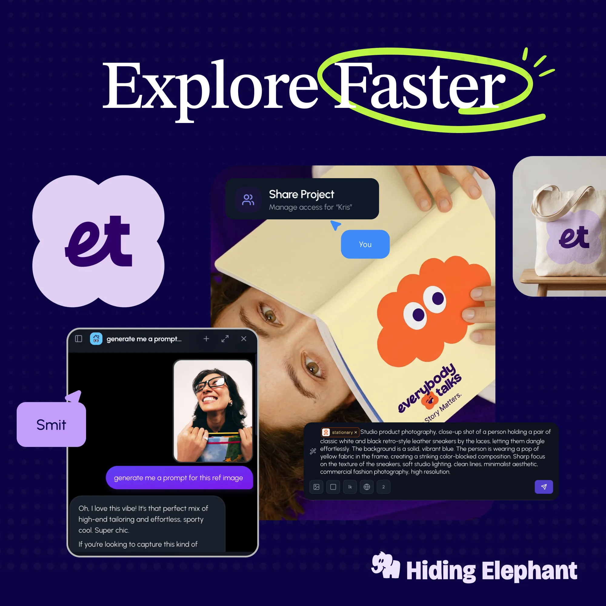
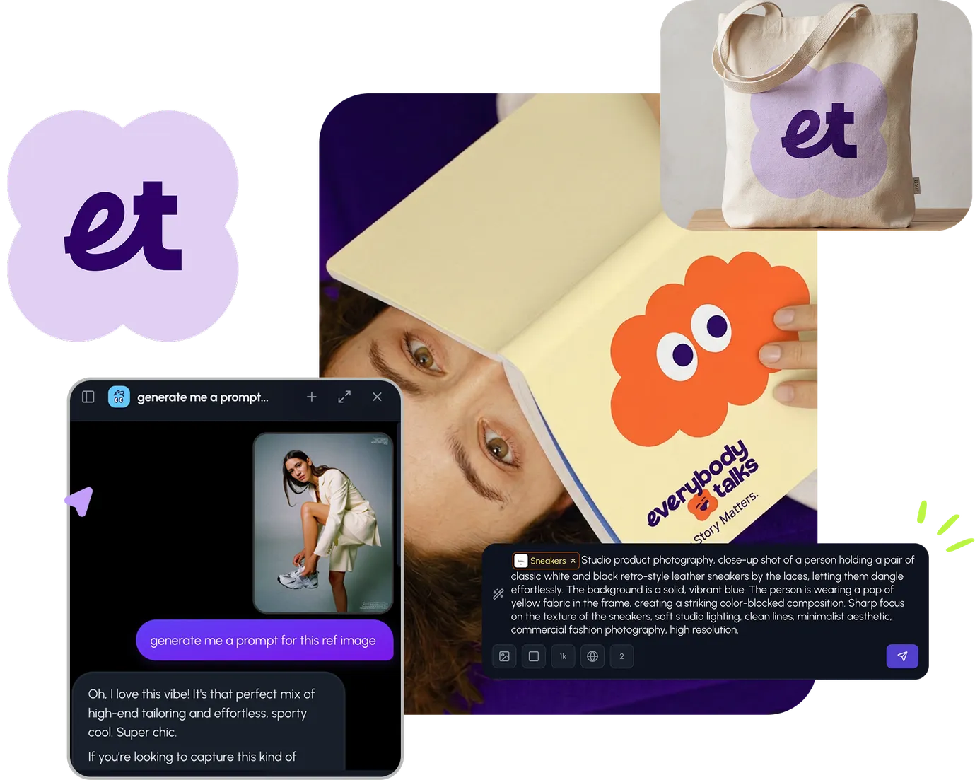
Start for free with full control over models, settings, and canvas tools.

  • ·Generate with full control over models and settings
  • ·Save projects and share back to the community
  • ·No design experience required
Start free — use this prompt
Browse more community designs →
Start free — remix this

What's next?Explore more features

Hiding Elephant product features overview

Explore features

AI generation, vector tools, workflows, catalogs, and collaboration in one workspace.

How Hiding Elephant works

How it works

See how the AI canvas, automation, and teamwork fit together end to end.

Get started with Hiding Elephant

Try it free

Sign in and turn inspiration into projects you can edit, export, and share.

Go from browse to build

Explore what else the Elephant can do.You'll love it

AI image generation

AI Generation

Image tools

Image Tools

Workflow builder

Workflows

Brand and style templates

Brand Management

Product catalog

Product Catalog

Collaboration

Collaboration

Batch image generation

Batch generation

Explore community

Community workflows

The AI designworkspace forfast-moving ideas.

Product

  • AI Generation
  • Vector Canvas
  • Image Tools
  • Workflows
  • Brand Management
  • Product Catalog
  • My Assets
  • Collaboration

Use Cases

  • E-commerce teams
  • Design agencies
  • Marketing teams
  • Content creators

Quick tools

  • All quick tools
  • Background Remover
  • Image Upscaler
  • Image Vectorizer
  • Image Optimizer
  • Image Reframer

Resources

  • About
  • Pricing
  • Enterprise
  • Explore
  • Blog
  • Contact Us
  • Book a Demo
  • Affiliates

© 2026 Hiding Elephant. All rights reserved

Cookie PolicyPrivacy PolicyTerms of Service
Hiding Elephant