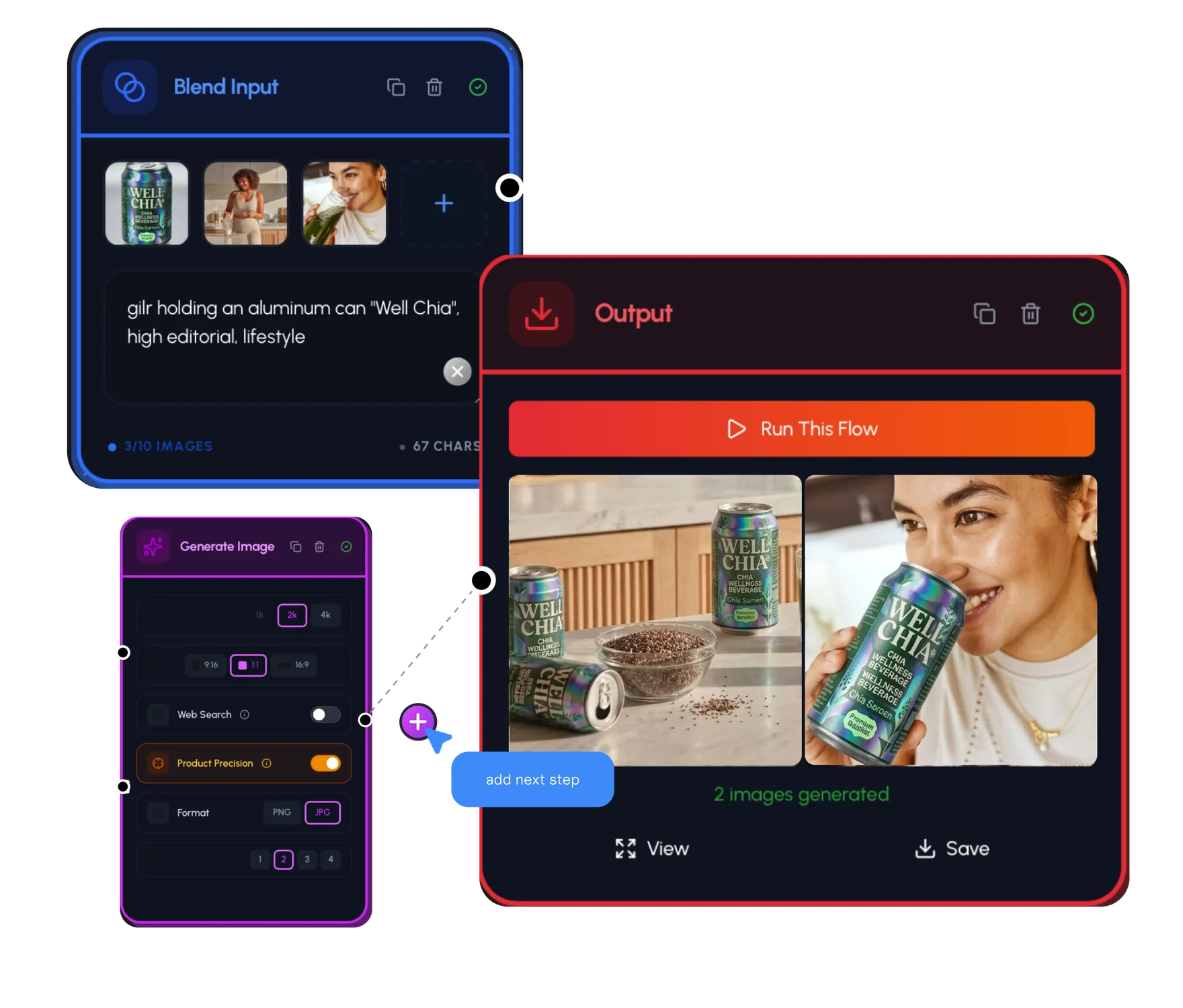
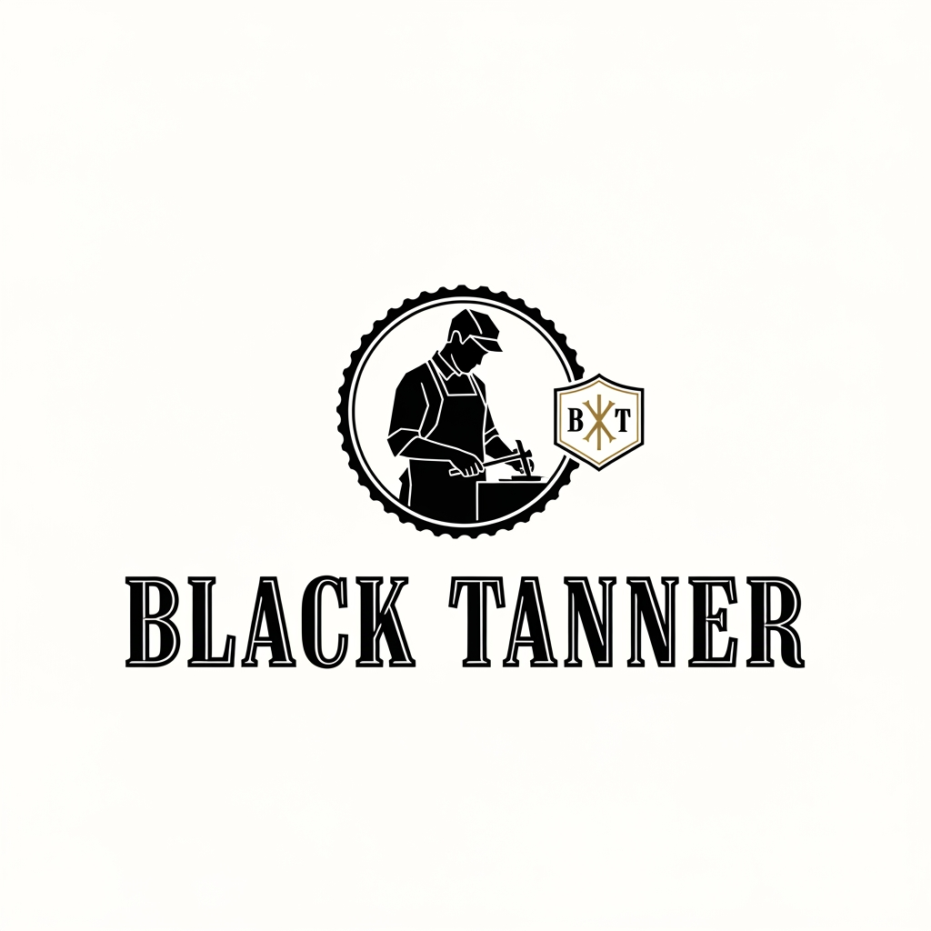
AI image design: Love the direction—"Black Tanner" sounds like a brand with real weight. That mix of old-world heritage and high-end mini…
Community
Design detail
Creator
@Elephant_6232526
Love the direction—"Black Tanner" sounds like a brand with real weight. That mix of old-world heritage and high-end minimalism is a classic for a reason. Before we dive into the visuals, just a heads-up: I don't have a saved logo or reference for your craftsman yet. We can definitely keep building this out conceptually, or if you want to get specific later, you can add those references to your brand kit or assets. To capture that "Berluti meets Coach" vibe, here’s how I’d approach the design: The Emblem: Keep the silhouette of the craftsman strictly geometric. Think clean, negative space—maybe just the outline of his posture and the tool, rather than filling in details. If you use a stamp-style border (like a circle or shield), it’ll immediately feel more "heritage." The Wordmark: Since you’re going for a bold serif, look for high-contrast fonts (thick and thin lines). A "Didone" style font (like Bodoni or similar) would lean into that high-fashion luxury feel, while a slab-serif would lean into the "rugged craftsman" aesthetic. The Monogram: Instead of a complex lockup, try interlocking the "B" and "T" inside a small, subtle crest on the side, or use a customized ligature where the crossbar of the 'T' extends over the 'B'. If you're ready to try generating some visual options, head over to the prompt bar. If you want me to help you tighten up the prompt for that, just say the word! Want to refine the typography style or the emblem shape first?
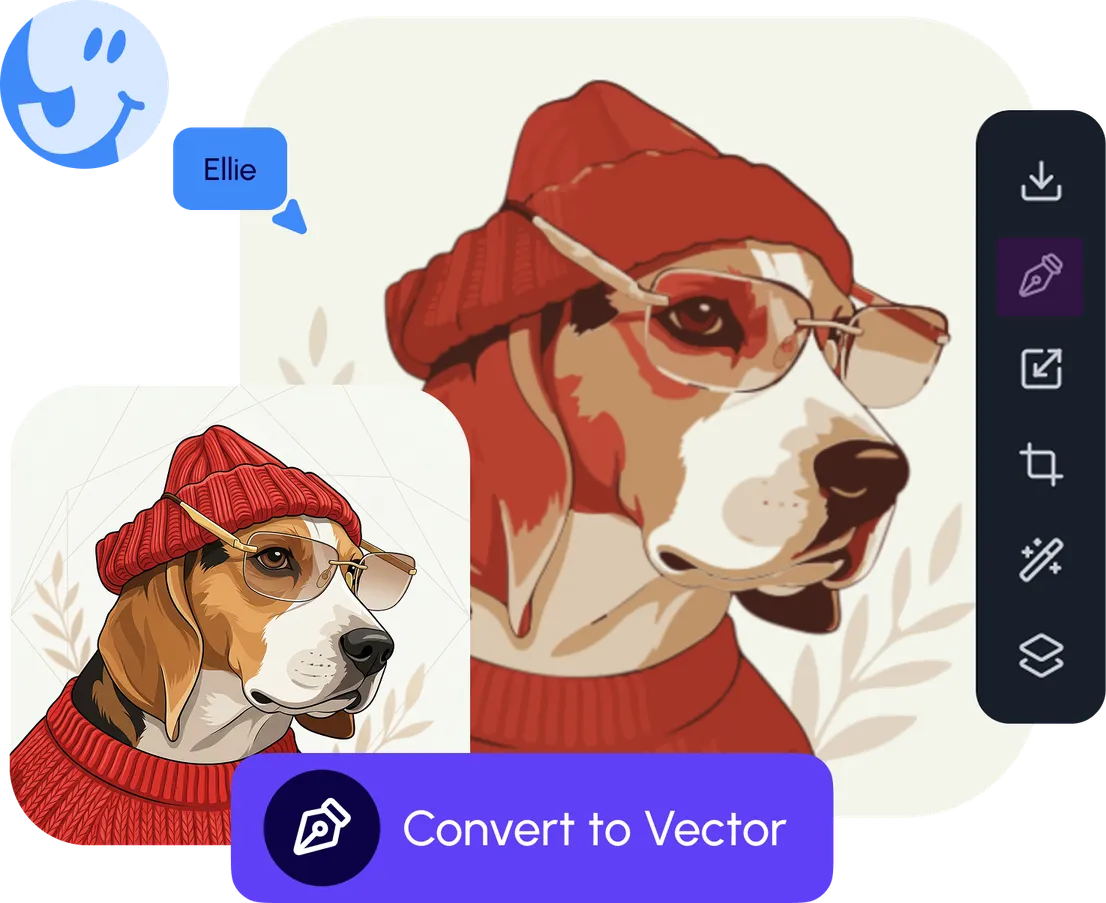
Remix this design
Start for free with full control over models, settings, and canvas tools.
- Generate with full control over models and settings
- Save projects and share back to the community
- No design experience required
What's next?Explore more features

Go from browse to build