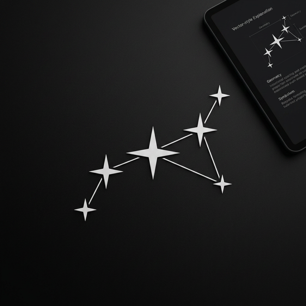
AI image design: Build on the observatory/star-chart direction and evolve it into a true constellation. Create a premium, minimal logo…
Community
Design detail

Creator
@Elephant_6347809
Build on the observatory/star-chart direction and evolve it into a true constellation. Create a premium, minimal logo made from a small number of stars connected by precise, elegant lines to form a unique constellation. ## Core Direction * 3–7 stars maximum. * Stars should be rendered as precise four-point star forms (equal-armed, with linear tapering) — not circles, sparkles, or decorative shapes. * Connect the stars with thin, refined geometric lines to create a single balanced constellation. * The constellation should feel intentional and ownable, not random or generic. * The structure should communicate alignment, discovery, and meaningful connection through geometry and spacing alone. ## Design Principles * Premium. * Minimal. * Timeless. * Elegant. * Sophisticated. Inspired by: * Real astronomy * Celestial maps * Observatory charts * Star clusters The beauty should come from: * Geometry * Proportion * Spacing * Balance * Silhouette Not from: * Effects * Decoration * Complexity ## Visual Requirements * Vary star sizes slightly to represent different magnitudes. * Use a constellation structure that feels naturally discovered rather than artificially designed. * The constellation should be memorable enough to function as a standalone brand symbol. * The lines should feel secondary to the stars and exist only to reveal the relationship between them. * The overall silhouette should be recognizable even when viewed from a distance. ## Avoid * Hidden letters * Hidden K * Monograms * Circles or generic nodes * Network graph aesthetics * Blockchain-style connected dots * Cartoon stars * Sparkles or twinkles * Orbit paths * Galaxy illustrations * Gradients * Glows * Shadows * Visual effects * Overly dense or crowded constellations ## Goal Create an original constellation symbol that embodies the essence of a cluster of stars becoming something greater together. The final mark should feel like it belongs beside Apple, Nike, Airbnb, Linear, Stripe, Vercel, and Notion — simple, iconic, scalable, and timeless. ## Deliver Provide: 1. One strongest logo direction. 2. Geometry explanation. 3. Symbolism explanation. 4. Scalability analysis. 5. Why it is memorable. 6. Why it could remain relevant for 20+ years as a brand symbol.
Remix this design
Start for free with full control over models, settings, and canvas tools.
- Generate with full control over models and settings
- Save projects and share back to the community
- No design experience required
What's next?Explore more features
Go from browse to build