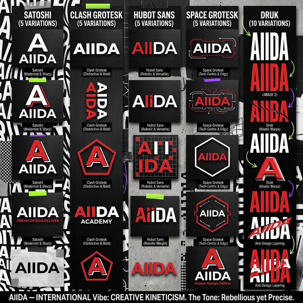
AI image design: The "Modern & Cutting-Edge" (Geometric Sans) If the college focuses on digital art, UI/UX, or fashion, a high-contrast …
Community
Design detail

Creator
@Elephant_3440619
The "Modern & Cutting-Edge" (Geometric Sans) If the college focuses on digital art, UI/UX, or fashion, a high-contrast sans-serif with sharp angles reflects a futuristic and bold attitude. Font Vibe: Super-heavy weights with narrow spacing. Recommendation: Humane (clean but bold) or Vemoir. Why it works: It looks premium and professional while maintaining the "energetic" feel Gen Z prefers over boring, traditional fonts. use it for logo typyface AIIDA use red white black only give more design options with same font add the tagline A AIIDA Dream.Design.Deliver Satoshi (Modernist & Sharp) use this for 5 variations . Clash Grotesk (Distinctive & Bold) use this for next 5 5 variations in Hubot Sans (Robotic & Versatile) Hubot Sans was designed in collaboration with GitHub for a high-tech, geometric look. Untitled UI +1 Vibe: It has a "robotic" sidekick feel—clean, structured, and very modern. Why it works: With 24 styles and variable axes, you can stretch or compress it to create a custom, "Anti-Design" look for your headers. 5 in Space Grotesk (Tech-Centric & Edgy) Space Grotesk is a geometric sans-serif that retains a "techy" and slightly industrial edge. UX Planet Vibe: It is derived from a monospaced font, giving it a structured, "hacker-meets-designer" aesthetic. Why it works: It signals a digital-first, innovative curriculum—ideal for a college teaching UI/UX or digital art. now focus deeply on this vibe "AIIDA" International Vibe: Creative KineticismTo establish AIIDA as a world-class institute, your brand personality should be "The Organized Riot."The Tone: Rebellious yet Precise. It’s not just about making a mess; it’s about the science of art. Use "Type-as-Graphic" to turn the name AIIDA into a visual texture rather than just a logo.Visual Strategy:Motion-First: Use kinetic typography on the website where the word "AIIDA" stretches or warps as students scroll.Color Pop: Pair high-contrast black/white typography with acid green or electric violet accents to break the "minimalist beige" stereotype.Anti-Design Accents: Incorporate hand-drawn "process" scribbles, tape textures, and overlapping layers to signal that this is a place where students actually do work, not just sit in lectures. use Druk Gen Z / Alpha "The Main Character." Its ultra-bold, compressed look is the standard for high-impact social media and "Anti-Design" posters. give me ten variations
Remix this design
Start for free with full control over models, settings, and canvas tools.
- Generate with full control over models and settings
- Save projects and share back to the community
- No design experience required
What's next?Explore more features
Go from browse to build