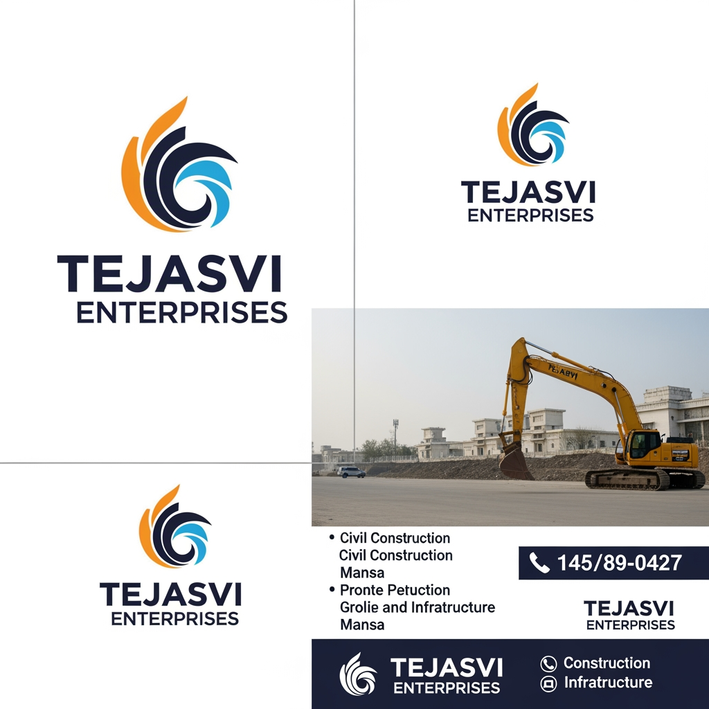
AI image design: Create a complete brand identity system for TEJASVI ENTERPRISES, a GST-verified civil construction and infrastructure co…
Community
Design detail

Creator
@Elephant_3068532
Create a complete brand identity system for TEJASVI ENTERPRISES, a GST-verified civil construction and infrastructure company based in Mansa, Punjab, India, established 2017. Proprietor: Sharuti Gupta. Specializations: civil construction, Airtel telecom tower erection, underground cable laying, Think Gas city gas pipeline distribution, industrial and commercial buildings. Brand Personality: Strong. Rooted. Ambitious. Trustworthy. A company that shows up at dawn and delivers. Not flashy — dependable. Like Punjab itself — hardworking, warm, and proud. Brand Voice: Direct, confident, warm. Speaks in facts not fluff. 'We built Airtel's towers across Punjab. We are laying Think Gas pipelines in Ludhiana today.' No corporate jargon. Primary Logo: Triangle icon built from three structural steel beams (orange left, yellow right, brown base) with hidden T monogram in negative space. Wordmark TEJASVI ENTERPRISES below. Tagline: Building Infrastructure. Building Trust. Logo Variations needed: — Primary: icon + horizontal wordmark (for website header) — Stacked: icon above wordmark (for square formats, app icon) — Monogram only: the T-triangle mark alone (for hard hats, stamps, vehicle stickers) — Reversed: all white version for dark backgrounds (site boards, uniforms) — Favicon: simplified T-triangle at 32×32px Color Palette: — Primary Orange #E8620A — energy, ambition, construction — Golden Yellow #F5C518 — prosperity, Punjab harvest, sunlight — Rich Brown #6B3F1A — earth, foundation, roots in Mansa — Charcoal #1A1A1A — strength, professionalism, structure — Warm White #FFFDF9 — clean, honest, trustworthy — Cream #FDF6EC — warmth, approachability, Punjab warmth Typography: — Display/Headings: Playfair Display Bold 900 (authoritative, established) — Body/UI: Inter Regular 400 + Semi-Bold 600 (modern, readable) — Label/Tags: Inter uppercase tracked 700 (industrial feel) Stationery design (all using above logo + colors): — A4 Letterhead: logo top-left, orange top border line 4px, company details footer, GST 03AMKPG6565E1Z6, address Mansa Punjab — Business Card (85×55mm): front — logo large center, name + role bottom; back — orange solid background, white T-triangle monogram large, contact details — Site Board / Hoarding (8×4 feet): large logo top-center, project name center, 'Ongoing Project' badge, Tejasvi Enterprises contact bottom — Hard Hat sticker (circular): T-triangle monogram + TEJASVI around the circle arc — Vehicle decal: horizontal logo white reversed on orange strip for trucks, JCBs, site vehicles — Quotation/Invoice template: letterhead format, orange header, table with brown accent row — Email signature: logo 200px wide, name, role, phone, GST, address, orange divider line — WhatsApp/Social profile picture: T-triangle monogram on charcoal square, orange + yellow icon — Instagram post template: warm white bg, orange top bar, project image center, logo bottom-right — Site safety poster: bold orange header, charcoal body, brown footer, T-triangle watermark Brand Don'ts: — Never use blue, green, or purple anywhere in brand materials — Never use thin/light weight fonts — always bold or semi-bold — Never place logo on busy photo backgrounds without a white/dark overlay — Never stretch or recolor the triangle icon — Never use gradients inside the logo mark itself
Remix this design
Start for free with full control over models, settings, and canvas tools.
- Generate with full control over models and settings
- Save projects and share back to the community
- No design experience required
What's next?Explore more features
Go from browse to build