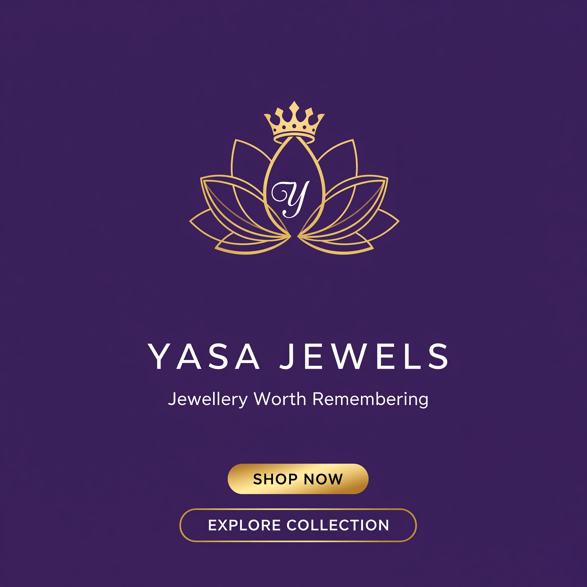
AI image design: YASA JEWELS — BRANDING EXPLORATION Brand Positioning YASA Jewels "You Are Simply Awesome" YASA is not simply a jewelle…
Community
Design detail

Creator
@Elephant_3892254
YASA JEWELS — BRANDING EXPLORATION Brand Positioning YASA Jewels "You Are Simply Awesome" YASA is not simply a jewellery brand. It sits between: Modern Luxury Contemporary Femininity Affordable Royalty The goal is to create a visual identity that feels: ✓ Premium ✓ Trustworthy ✓ Feminine ✓ Timeless ✓ Giftable ✓ Bridal-Friendly ✓ Instagram-Worthy The brand archetypes are: Primary: Lover Secondary: Ruler This means the identity should balance: Emotional elegance Royal sophistication Avoid: Fast fashion aesthetics Excessive ornamentation Traditional jewellery store branding Discount-retail visual language DIRECTION 01 ROYAL PURPLE LUXE Positioning Modern Royalty For women who want to feel elegant, powerful and memorable. This direction leans heavily into YASA's existing equity and creates the strongest luxury perception. Color Palette Role Color Hex Primary Royal Purple #43245F Secondary Deep Purple #311A45 Accent Luxury Gold #C79A3B Light Ivory #F7F4EF Accent 2 Dark Teal #1F4954 Psychology Purple is strongly associated with: Luxury Exclusivity Creativity Femininity Gold introduces: Prestige Celebration Premium craftsmanship This combination is commonly used by luxury beauty, jewellery and couture brands because it immediately signals elevated value. Typography Heading Cormorant Garamond Reason: Editorial Sophisticated High-fashion feel Excellent luxury perception Example: YASA JEWELS Jewellery Worth Remembering Body Lato Reason: Modern Clean Easy to read Balances ornate serif headlines The serif + sans pairing creates luxury contrast and improves readability. CTA System Primary CTA Background: #C79A3B Text: #FFFFFF Style: Rounded Rectangle Text: SHOP NOW Secondary CTA Outline: #C79A3B Text: #C79A3B Style: Ghost Button Text: EXPLORE COLLECTION Brand Personality Keywords: Royal Elegant Feminine Sophisticated Timeless Best For Bridal Collections Kundan Polki Wedding Campaigns Festive Campaigns DIRECTION 02 IVORY & GOLD ELEGANCE Positioning Quiet Luxury Inspired by luxury fashion houses and premium boutiques. This direction focuses on refinement instead of richness. Color Palette Role Color Hex Primary Ivory White #F7F4EF Secondary Soft Beige #EAE3DA Accent Luxury Gold #C79A3B Text Deep Purple #43245F Support Charcoal #555555 Psychology This palette creates: Clean luxury Trust Premium minimalism Editorial elegance Large amounts of negative space increase perceived value and sophistication. Typography Heading Cinzel Reason: Luxury Roman-inspired proportions. Feels: Heritage Prestige High-end Body Lato Reason: Keeps the system contemporary and ecommerce-friendly. CTA System Primary CTA Fill: #43245F Text: #FFFFFF Rounded Pill Secondary CTA Outline: #C79A3B Text: #C79A3B Brand Personality Keywords: Elegant Minimal Premium Sophisticated Timeless Best For Website redesign Silver collection Contemporary collection Premium gifting DIRECTION 03 REGAL TEAL Positioning Modern Heritage A more distinctive luxury territory. Most jewellery brands use burgundy, black or purple. Teal creates instant differentiation. Color Palette Role Color Hex Primary Dark Teal #1F4954 Secondary Royal Purple #43245F Accent Luxury Gold #C79A3B Light Ivory #F7F4EF Support Soft Beige #EAE3DA Psychology Teal communicates: Trust Sophistication Exclusivity Modern luxury Combined with gold, it creates a unique premium signature that stands apart from competitors. Typography Heading Cormorant Garamond Body Lato Navigation Montserrat Reason: Balances traditional luxury with modern ecommerce usability. CTA System Primary CTA Fill: #1F4954 Text: #FFFFFF Secondary CTA Fill: #C79A3B Text: #FFFFFF Brand Personality Keywords: Distinctive Refined Contemporary Confident Premium Best For Contemporary Jewellery Younger luxury buyers Instagram campaigns Influencer collaborations NEW LOGO OPTION 01 MONOGRAM LOTUS CROWN Concept Combine: Lotus = femininity + beauty Crown = royalty Y monogram = memorability Strategic Meaning Represents: Modern Queen Self-worth Celebration of womanhood This option is strongest if YASA wants to become a national luxury jewellery brand. Advantages ✓ Premium appearance ✓ Highly recognizable ✓ Strong packaging potential ✓ Works on jewellery boxes and tags NEW LOGO OPTION 02 JEWEL CREST WORDMARK Concept Luxury wordmark with gemstone-inspired crest. Strategic Meaning Represents: Craftsmanship Heritage Luxury detailing Feels closer to: Cartier Graff Luxury European jewellery houses Advantages ✓ Luxury-first perception ✓ Elegant website appearance ✓ Strong upscale positioning ✓ Better for international expansion Recommendation If keeping the current logo Choose: 🥇 Direction 01 — Royal Purple Luxe Why: Matches existing brand equity Highest luxury perception Strongest recognition Most aligned with bridal and festive jewellery If rebranding completely Choose: 🥇 Logo Option 01 + Direction 01 This combination creates the strongest long-term luxury brand system and aligns best with YASA's "You Are Simply Awesome" positioning by combining femininity, confidence, and royalty into one visual identity.
Remix this design
Start for free with full control over models, settings, and canvas tools.
- Generate with full control over models and settings
- Save projects and share back to the community
- No design experience required
What's next?Explore more features
Go from browse to build