Creator
@Lorian
Remix this design
Free account — run this prompt in your workspace, refine it, and save your own versions.
- ·Generate with full control over models and settings
- ·Save projects and share back to the community
- ·No design experience required
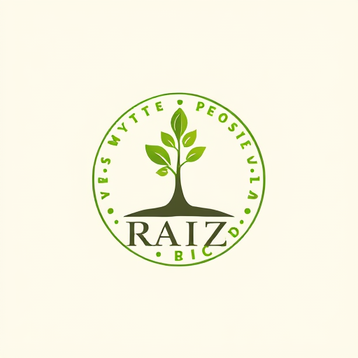
Professional logo design. We love the idea of having the tree circles and a new sprout coming - it shows the trees capacity to regrow after harvest. However, it looks clumsy and not elegant. Maybe you could find a way to incorporate this in a more organic way - we love the “R” you created for Raiz.Maybe also experiment with incorporating a crown (for example the little growing leaf grows into a mini crown). We’re also open to experiment with the color lilac (the tree blossom colours) as a highlight color. Not mandatory, though.Maybe also try to incorporate elements to show the mystical/magical.The sprout could also be in another place than the O. What we like about the sprout in the O is, that the O can be used as a stand-alone logo icon.To show stability, the bottom of the font letters could have a little foundation/grounding. Or the outside of the circle is much bolder than the inside - the stability representationIdeally, the logo is a great embodiment of all of our company values as shown in the beginning of this presentation
Tip: copy the prompt here, or sign up free to run it directly in Hiding Elephant after you log in.